
 By
By
The subgrid feature of the CSS Grid Specification is not yet shipping in any browser, but is now available for testing in Firefox Nightly. This is a feature that, if you have used CSS Grid for a layout of any complexity, you are likely to be pretty excited about. In this article I’m going to introduce the feature and some of the use cases it solves.
So what is subgrid exactly? In terms of syntax, it is a new keyword value for the grid-template-columns and grid-template-rows properties. These properties normally accept a track listing, or to put it another way, a listing of sizes of the tracks you want in your grid. For example, the following CSS would create a three column track grid with a 200px column, a column sized as max-content, and a final 1fr column.
grid-template-columns: 200px max-content 1fr;You can find out more about track sizing in general, and the basics of grid layout via the MDN Guide Basic concepts of Grid Layout.
If we define a track as a subgrid, however, we replace the track listing with the keyword subgrid.
grid-template-columns: subgrid;This instructs the grid-template-columns property to use the tracks defined on the parent as the track sizing and number used by this nested grid.
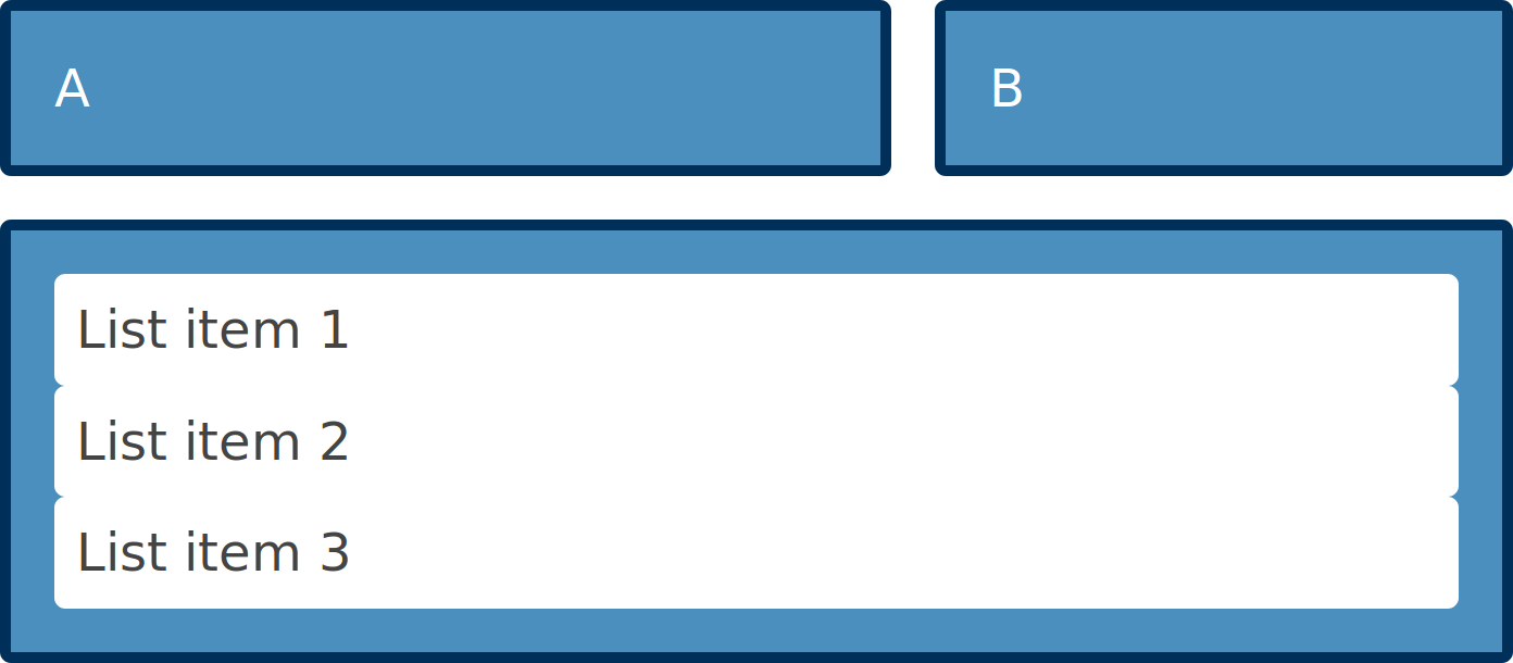
In the example below I have an element which is a grid container. It contains three child elements — two <div> elements and a <ul>.
<div class="wrapper">
  <div class="box1">A</div>
  <div class="box2">B</div>
  <ul class="box3">
    <li>List item 1</li>
    <li>List item 2</li>
    <li>List item 3</li>
  </ul>
</div>
I create a grid on .wrapper, and the direct children are laid out on the grid I have created, but the list items go back to displaying as list items.
.wrapper {
  display: grid;
  grid-template-columns: 2.5fr 1fr 0.5fr;
  gap: 20px;
}

.box1 {
  grid-column: 1;
  grid-row: 1;
}

.box2 {
  grid-column: 2 / 4;
  grid-row: 1;
}

.box3 {
  grid-column: 1 / -1;
  grid-row: 2;
}
The list items do not participate in grid layout.
If we make the <ul> with a class of box3 a grid, and set grid-template-columns to subgrid, the <ul> is now a three-column track grid. The list items are laid out using the tracks of the parent.
.box3 {
  grid-column: 1 / -1;
  grid-row: 2;
  <b>display: grid;</b>
  <b>grid-template-columns: subgrid;</b>
}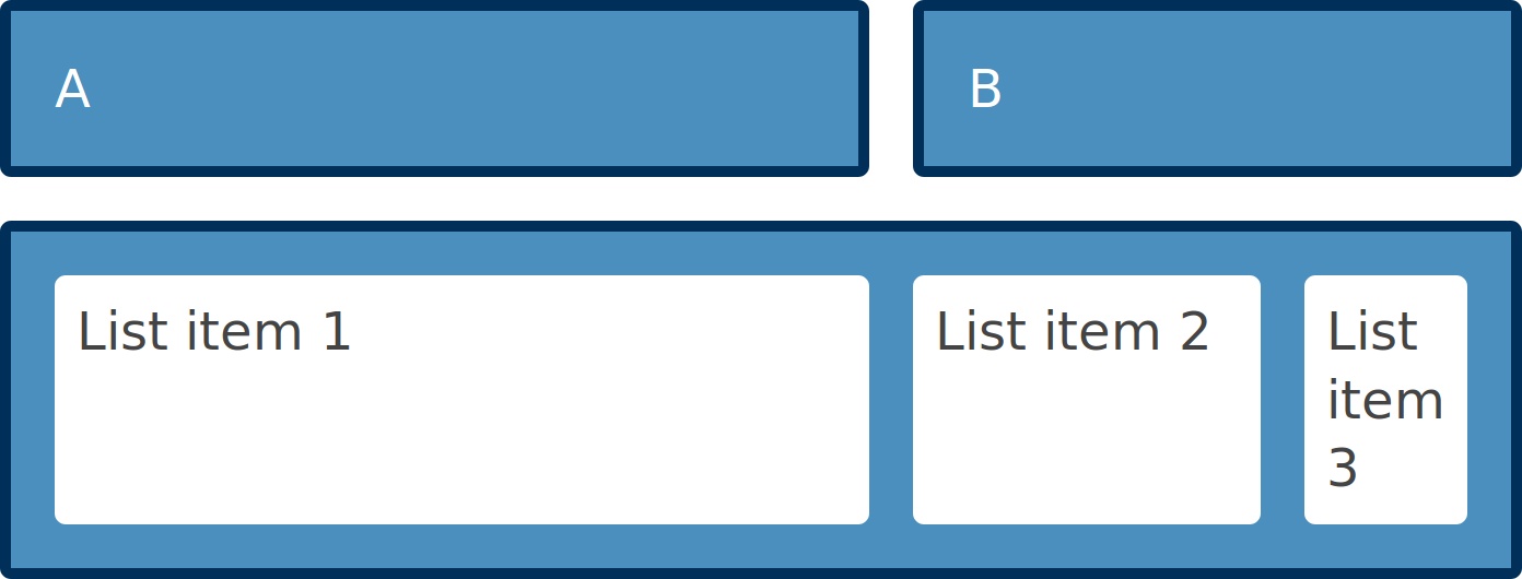
The list items use the grid of the parent of the list.
CodePen (needs Firefox Nightly)
There are some additional nice features that make subgrid useful for patterns you might need to build. The *-gap properties are inherited by default into subgrids, however you can override this behavior by setting a gap, row-gap, or column-gap value on the subgrid itself.
The lines in your subgrid will inherit the line names set on the parent grid. This means that you can position items in the subgrid with the line names on your main grid. You can however also add line names just for the subgrid and these will be added to any inherited names.
Take a look at the guide to subgrid on MDN to read about all of these features and see example code.
What will subgrid be useful for?
In terms of new syntax, and new things to learn, this is a very small change for web developers who have learned grid layout. A grid defined as a subgrid is pretty much the same as a regular nested grid, albeit with its own track listings. However it makes a number of previously difficult patterns possible.
For example, if you have a card layout, and the cards have headers and footers with uneven amounts of content, you might want the card headers and footers to align across the rows. However, with a standard nested grid this isn’t possible. The grid on each card is independent, therefore the track sizing in card A can’t respond to change of height inside card B.
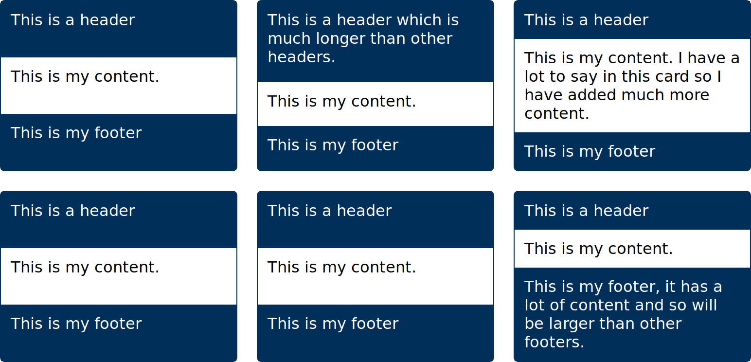
The card internal elements do not line up
If we cause each card to span across three rows however, we can then change the value of grid-template-rows to subgrid.
.card {
  grid-row: auto / span 3;
  display: grid;
  grid-template-rows: subgrid;
}
The card still spans three row tracks, but those rows are defined on the parent and therefore each footer is in the same row. If one footer gets taller, it makes the whole row taller.
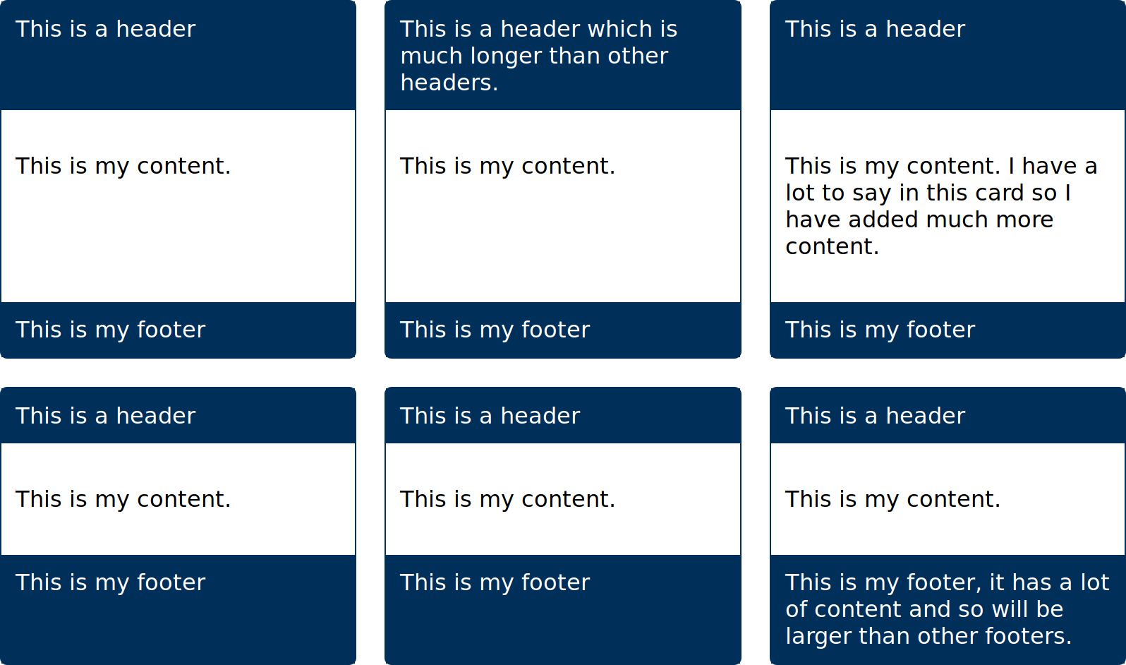
The card internal elements now line up.
You might want to work to a standard 12-column layout. Without subgrid, components that are not direct children of the grid container can’t be laid out on that parent grid. Instead, you need to be careful with track sizing in the nested components in order to get the layout to work. With subgrid we can opt nested grids into that parent grid as far into the structure as is required.
This means that in the below wireframe example, all elements are using the tracks defined on the main element — even things that are nested inside two grids such as the links inside a list inside a <nav> element. The screenshot below has the lines of that parent grid displayed using the Firefox Grid Inspector.
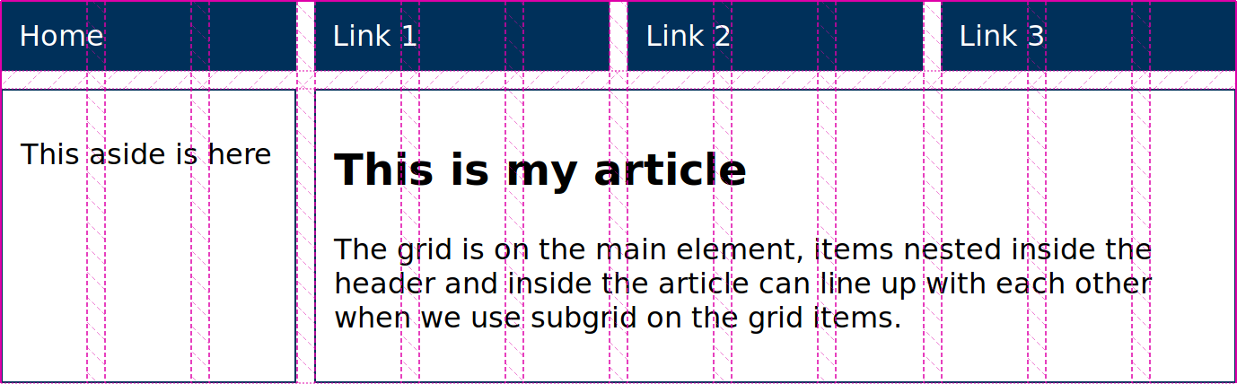
The twelve column grid highlighted by the Grid Inspector
A less obvious use case for subgrid is to help in the situation where you have an unknown amount of repeated content in your layout, and want to be able to place an item from the start to the end of the grid.
We can target the end of an explicit grid with -1, so an item placed with grid-row: 1 / -1 will stretch from the first to the last row line. The below grid has two row tracks defined. The block on the left stretches over both as it is spanning from column line 1 to column line -1.
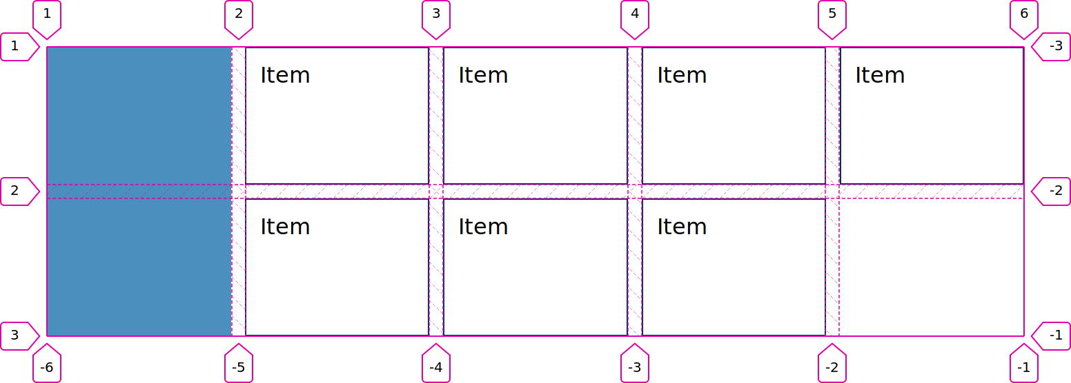
The explicit grid highlighted with the Grid Inspector
However, if you are creating implicit row tracks, because you don’t know how many items there will be you can’t target the end of the implicit grid with -1. As we do not have explicit tracks after the first track (a grid always has one explicit track in each dimension) the blue item can’t span to the end line after all of the auto-placed items have been laid out.
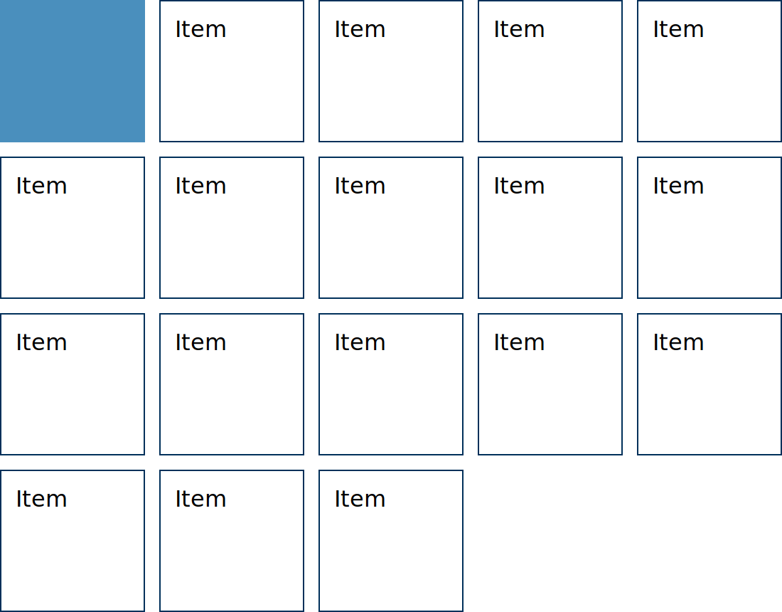
Without an explicit grid the item cannot stretch to the end line
If you make the repeating section a subgrid for columns, with implicit rows, all of those rows fit into the same grid area of the parent, rather than creating more rows on the parent. This means that you can have a fully explicit parent grid and know exactly where the end line is no matter how many items are added in the subgridded part.
The only compromise would be the addition of an extra wrapper if your markup didn’t have a container for these repeating elements, however a single wrapping <div> is not going to cause any problems and enables this pattern.
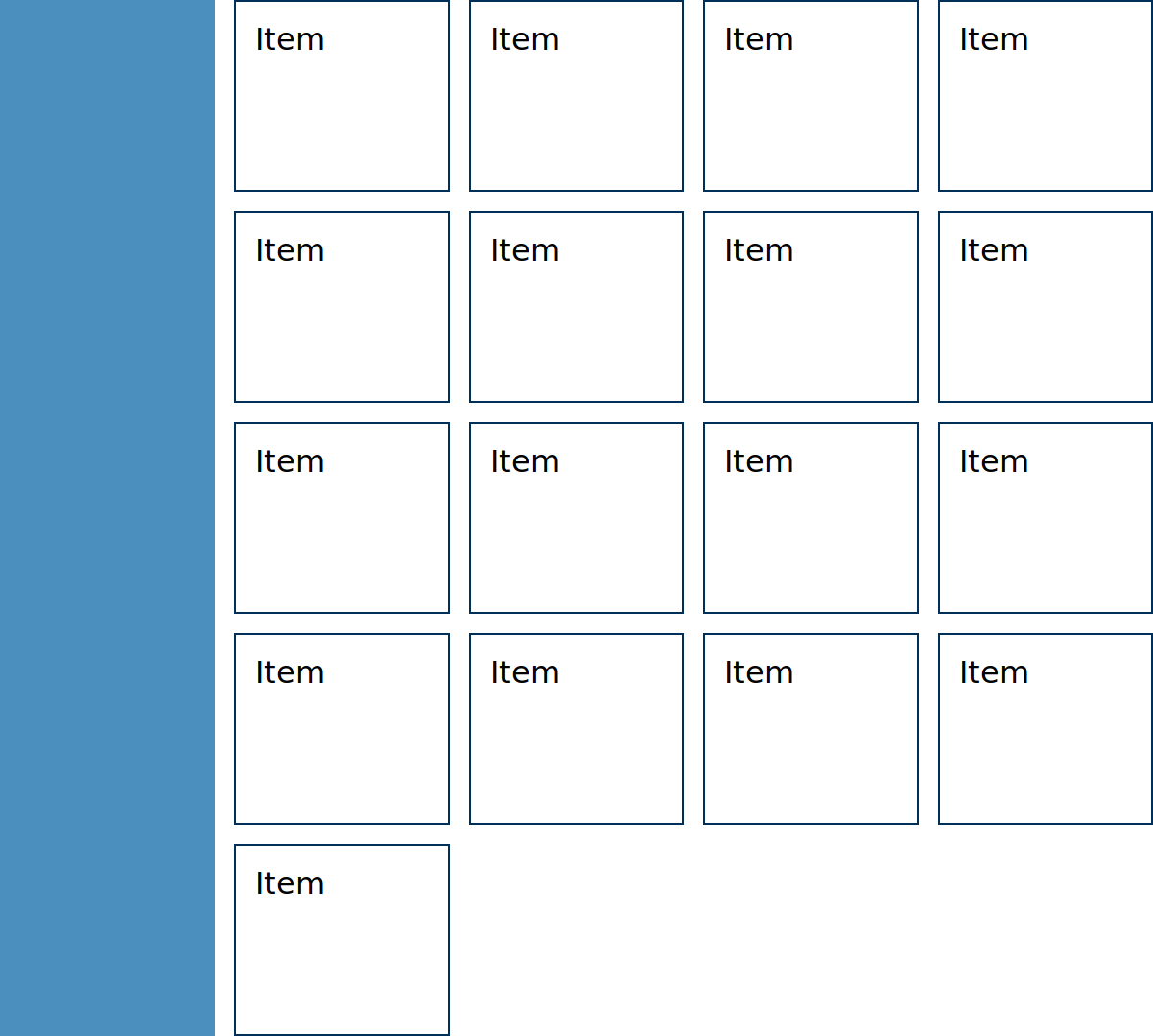
The sidebar stretches to the height of the content
Firefox DevTools and subgrid
The DevTools team have been working on adding features to DevTools that will make it easier to work with multiple grids, including subgrid.
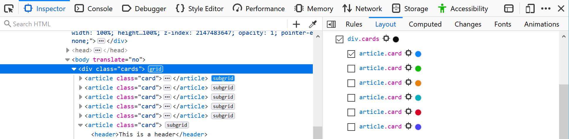
You can now highlight multiple grids with DevTools. This can be helpful to see how the grid lines up with each other. You can see this in action by highlighting multiple grids in the cards example above, letting you see how the lines of the rows on our cards align with the parent rows.

Two grids are highlighted here, one on the parent and one on a child
In the Grid Inspector subgrids have a little subgrid badge, and appear nested inside their parent. These things should help you to identify them better when working with complex arrangements of grids.
DevTools makes it easy to see your subgrids.
The team are still working on features, including the ability to highlight a parent when a subgrid is selected.
Status of the subgrid feature
Subgrid is now available in Firefox Nightly, so you can test it out, and we would love you to do so. Firefox will have the first implementation of the specification, so feedback from web developers is vital both for the Firefox implementation, the DevTools, and for the CSS specification itself.
More resources can be found in the MDN guide, and I have started to build some more examples at Grid by Example — my website of CSS Grid examples. In addition, read CSS Grid Level 2: Here Comes Subgrid — an article I wrote about the specification before we had any implementations.
About Rachel Andrew
Rachel Andrew is a front and back-end web developer, one half of the company behind Perch CMS, and Editor in Chief of Smashing Magazine. She is a Google Developer Expert for web technologies and a member of the CSS Working Group representing Fronteers, where she is co-editor of the Multi-column Layout spec. Author of 22 books, and a frequent public speaker at conferences worldwide, you can find out what she is up to at https://rachelandrew.co.uk.