Share on
Data Driven Design Systems in Practice

Patrick Suzuki
Share on

Romina from designstrategy.guide shared that on average only 30% of internal teams adopted their Design System. Sobering news, but it also lines up with what I hear and it’s the main reason we set out to build a tool to help with Design System adoption at Zeplin.
To discover a solution to the adoption problem, we spoke to a ton of teams to learn how they currently approached solving this challenge. While the topic ranged from culture, processes and tools, one recurring theme stood out— leveraging data.
Once a team has a Design System, they are faced with many questions. Yet, they typically go unanswered:
- How is my design system used over time?
- Which team and projects are using my components?
- How can I identify emerging patterns to improve my components?
- How can I be confident while updating a component?
These questions point to the need to get feedback from the Design System and its users to measure progress and continuously improve it. However this data is very difficult to get without some heavy lifting and it’s typically not a focus until they are seriously needed or serious adoption barriers have already set in.
In hopes of raising awareness of the importance of data and offer hints for readers looking for solutions, I’ve summarized some of the use cases for leveraging data and examples of different teams collecting and using data for their Design System. I also talk a little bit at the end on what we’re building to address this challenge.
Measuring adoption
Tracking adoption ensures that each initiative a team takes has measurable impact. Showing concrete progress also helps secure the ongoing resources necessary to maintain the Design System. As Steve, one of the Design Leads from Onfido points out in his article, even manually tracking component usage in a spreadsheet proved valuable in getting buy-in from stakeholders. A recommendation that came-up often was to start tracking early when starting off a Design System initiative.
As the number of components and their usages scaled, I observed more teams automating their usage tracking. Thankfully teams like Segment have written about how this can be done and even open sourced their solution. React Scanner is also an open source project that folks commonly cited as a solution they used in my conversations.
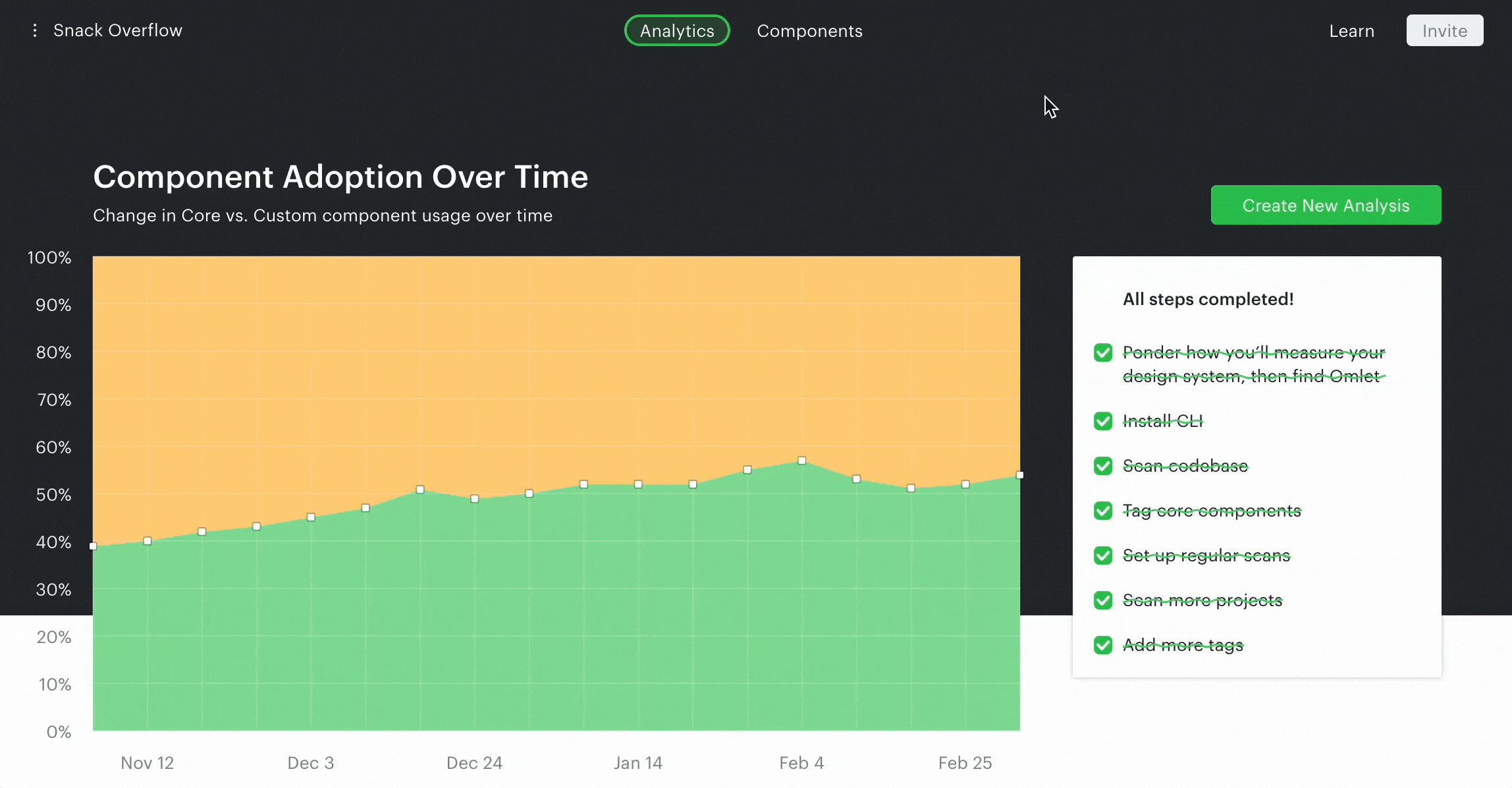
For more mature teams, they also tracked adoption using reference points. Without one, it’s difficult to understand how much progress is being made in relation to the entire code base or product. For instance, Segment compared their latest Design System library version compared to their legacy libraries. This provided a clearer measurement of progress. 👇

Some teams are also comparing Design System component usage against one-off components. Arseny at Rangle.io has built an open source project experimenting with this approach and delivered a presentation at React Summit. Using a tool like this, a team can understand what % of their code is using Design System components vs. custom code.
Beyond tracking for components, usage of icons, text styles, colors were also commonly tracked as well.
Identifying Usage Gaps & Opportunities
Once high level adoption tracking was in place, teams moved on to understand Design System adoption at a per product, project, team, user or page level. This is key to understand where there are gaps in usage and then use this as an opportunity to evangelize your Design System or understand what blockers exist.
A simple step is to report component adoption at each code repository level. For more accurate insights, data from CODEOWNER files can be scraped to identify the team if you are using GitHub. For George at Xero where they have dozens of product teams with over a hundred repos, this type of solution helped them understand where the Design System is used or not and create a plan to engage each product team differently
Another interesting approach I learned was actually visualizing usage of the Design System at a page level. I have spoken to both Onfido & Productboard and they have both written great articles on this topic. This is an example from Onfido where they took advantage of the fact that their Design System colors had consistent naming and used color overrides to visualize usage. With this tool, Onfido was able to quickly identify areas where Design System components could be used and provide concrete guidance to individual developers.
Getting Feedback on Individual Components
Gathering data also helped teams get feedback on specific components. For instance, if usage of individual components are tracked consistently over time, you can verify if a component is adopted after it is released. If it’s not adopted as expected, that’s reason for further investigation.
Beyond this, some teams have built ESLint rules to suggest Design System usage. Not only does this help developers automatically follow Design System guidelines, it can be used to track where styles or components are not meeting the need of individual developers. Mae at Amplitude and Filip, previously with Productboard, were doing exactly this by reporting the number of ESLint rules being overridden. If you are interested, the folks at Backlight.dev have written a detailed how to article on how to setup ESLint rules.
Over at GitHub, they offer a way for developers to override a component for flexibility. Cole at GitHub explained how they reported on how often this is happening for each component to understand where there is user friction.
David at Adverity also pointed out how prop usage tracking also comes in handy. For instance, if a certain prop is not being used at all, this is a good candidate to remove this property and simplify the component.
Assessing Impact of a Change
Broad adoption of a Design System comes with its own challenges. Matthew at argodesign points out that as components or styles are adopted by more teams and product locations, the impact of a change becomes larger and trickier to assess. This makes it increasingly difficult to continuously adapt to your users needs. If changes have unintended negative impact to teams enough times, the Design System may end-up causing more friction than efficiency.
This is where it becomes useful to pinpoint exactly where components are used in code. A starting point would be to write custom scripts to parse and track imports of components. Without a solution, I found teams spending a huge amount of time manually searching through the codebase to get this information.
A Proxy for ROI
Last but not least, some teams have ventured into building metrics to measure the ROI (return of investment) of their Design System. Below are a few approaches I observed teams experimenting with:
- Time saved per component: Sparkbox ran a great experiment to measure the efficiency of using a reusable component vs. building one from scratch. Some folks leveraged this metric with how many times components were used to quantify time saved.
- Reduced code changes: Cristiano at Bumble has written-up a great article on measuring how code changes were reduced after component adoption.
- Improvements in Accessibility/Test Coverage: Some teams also measured improvements in accessibility and test coverage gained from using components.
Overall the consensus was that data can only act as one piece of the puzzle, but it does help a lot in showcasing ROI especially if multiple metrics are used.
Limitations and Opportunities Ahead
It’s important to acknowledge that gathering data requires upfront and ongoing engineering resources which takes away focus from other important tasks. Even for teams who have custom tooling in place, they often can’t improve it further or in some cases had to deprecate it as team members moved on. It’s no surprise that less than 16% of teams track metrics even though measurement is highly correlated with success (2022 Sparkbox’s survey results).
This is a big reason why we started a new product called Omlet which provides analytics about how component are used across projects by analyzing a team’s code base. If you are interested you can start a free 30-day trial from: omlet.dev. Our goal is to provide a solution that solves a lot of the use cases we reviewed here.
There are also limitations to what data can do. Speaking to individual developers using Design Systems, they often cite challenges in finding the right component or understanding how to use it. Hence, good onboarding, training, support, evangelism, communication and documentation are critical but also where data & tools are less helpful — at least currently.
But what if data and tooling can recommend the right components to a developer in context of their feature delivery work? Already teams like Pinterest have shared their success with using ES Lint to drive adoption. I believe there’s more potential in reducing the siloed nature of a Design System by actively helping individual developers discover and learn how to use components while also requiring less manual maintenance. An area we are excited to explore next.
Well that’s a wrap! I hope you found this summary and reflection helpful. If you are still interested in learning more, Jan from Supernova.io also delivered a great session sharing his experience at Productboard tackling the same problems. I recommend checking it out.
If you have examples of using data to drive your Design System initiative, we are looking to showcase case studies in the future. Contact me at hi@omlet.dev if you are open to share your story.
Share on
Special thanks to the folks at Amplitude, Adverity, GitHub, Gusto, Pinterest, Plaid, Productboard, Primer.io, Xero, Onfido, Optimizely, The Times and many more for sharing their insights!