9 Steps To Building A Must-Have Pre-Launch App Landing Page
This is part 2/5 in the Buzinga crash course Mobile App Marketing: How To Get 100,000 Downloads In A Month.
Part 1: User Personas: Marketing To A Mobile Audience
Part 3: How To Generate Buzz Before Launch
Part 4: Customer Acquisition: How To Reel In Your First 5,000 Users
Part 5: How To Engage And Retain Your Current And Future Users
Gaining awareness among your target audience is one of the toughest marketing challenges for a new app.
There’s nothing worse than pouring months or even years of effort into building an engaging, intuitive product only to launch it to the app store, and…
Crickets.
No one knew you were developing this product, and now no one is excited that it’s finally launched…
That’s why we recommend to all our clients that they start marketing their apps at least 2-3 months before launch.
Recommended: The Ultimate App Launch Checklist You Must Complete Before Going Live
There’s an old wive’s tale in the startup world, that goes something like “If you tell people about your startup before its launched, your idea will be stolen, and IP recklessly stolen.”
Well, here’s the reality of today:
IP IS DEAD!
I repeat…
DEAD!
Understandably if you haven’t started developing your product yet, it’s best if you keep it on the DL (down-low) so it isn’t stolen by a “friend” or colleague.
But 2-3 months out from launch, I guarantee that no-one has the talent, speed or marketing power behind them to overtake your momentum.
That’s why we urge our clients to start marketing at that 2-3 month mark to capitalise on pre-launch excitement and buzz.
If you haven’t read How To Generate Buzz Before Launch then open this up to read next.
It’s a great way to capture a loyal following of interested parties to ensure your app launch doesn’t end up an anti-climax.
Why you need a pre-launch database
You’ll hopefully be doing some hardcore digital marketing activities to build hype around your brand and gain awareness with your potential users. (Again, see How To Generate Buzz Before Launch for what pre-launch activities to undertake)
But what do you do with all that hype and interest?
Funnel these potential users into your app’s website or landing page, collect their emails, and nurture them with exclusive content and updates leading up to your app launch.
These people who have signed up to receive emails from you are your pre-launch database.
They have the potential to become your first app users, your die-hard evangelists, and your brand spokespeople who will spread word of mouth about your app.
Free marketing! Woo!
This post will show you the top 9 tactics of high-converting pre launch app landing pages, so when you do launch your app you will have a flood of downloads from your army of followers.
What’s a landing page?
A landing page is a web page which serves as the entry point for a website or a particular section of a website (like a blog or about us page)
Even if you don’t have the resources to build an entire website for your app, you should at the very least have a landing page you link to in all your pre-launch marketing efforts (press releases, social media posts, etc).
The goal of a pre-launch app landing page is to collect emails.
Landing pages are cheap or free to build, and most don’t require any coding at all.
There are dozens of services to choose from – You simply choose from hundreds of customisable templates and drag and drop your own elements.
Check out this blog from Crazy Egg for the top 7 free landing page services you can easily build yourself.
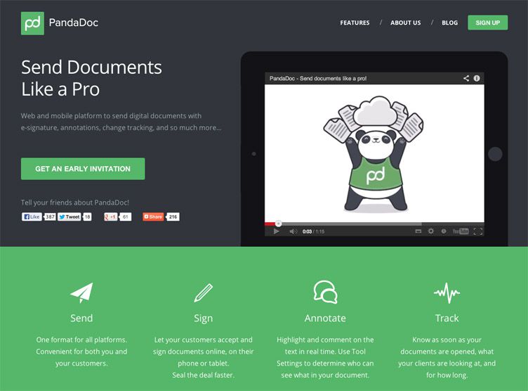
Your landing page MUST look stunning, or people will exit and you’ve just lost a potential user.
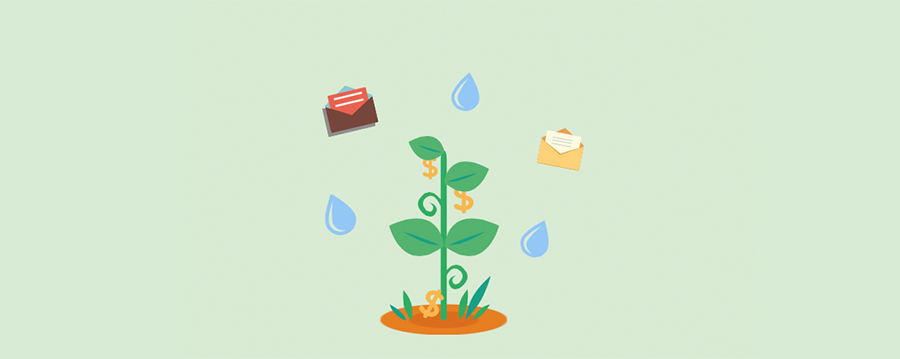
Luckily for you, current trends in landing pages include a big pretty image, 1 to 4 folds, and as little words as possible. (See above)
High-converting landing pages for lead generation have the following elements:
- Screenshots/visuals – demonstrates the functioning of the app
- Punchy Unique Selling Proposition – the elevator pitch that says why not clicking ‘signup’ is the dumbest mistake they’ll ever make
- Link to further content/info – This may be a pre-launch video, a blog, a press release, or any other publicity your app has received.
- Invite list call-to-action – The most important part! This gets emails of interested people.
- Refer a friend link –Gets more emails and creates a viral effect
- Social profiles – Links to follow your app on all your social media pages
Bonus: 4 Apps Killing It On Social Media
The top 9 tactics of app landing pages that get thousands of sign ups
-
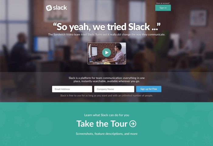
They’re not stealthy or coy
Don’t hold back on sharing what your app is about.
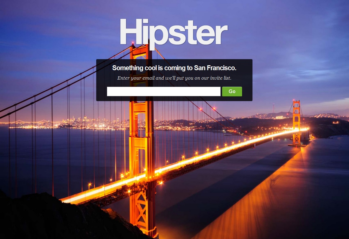
The above example for Hipster is nice to look at, very mysterious and enticing, but it misses the opportunity to inform the customer about the brand.
If you’ve already got a lot of hype and awareness about the product because of a stunt or a high profile celebrity endorsement, this strategy could be powerful.
For the rest of us mere mortals, however, using this strategy will likely just set you up for a LOT of unsubscribes once your first email goes out.
Why?
Because without forthcoming information from you, everyone will have signed up with something different in mind! Your product can’t please everyone!
Make sure your database is full of high quality leads (ie: Ones that are actually likely to become app users) by telling them exactly why they should express interest.
What problem will you solve for them?
2. Their copy is emotional and problem-focused
High-quality images and design will get you initial attention, but it’s your words that will make the visitor leave their email.
The best web copy writing:
- Injects emotion
- Creates anticipation or urgency
- Makes a promise
- Drives action
Line 1: Your first headline needs to stop readers dead in their tracks.
It might be a big claim, a common problem, or a question, but it must be powerful enough to make the visitor read the next line.
Line 2: How does your app address the statement or question you made in your headline?
The copy needs to make your app’s unique selling proposition irresistable, but short enough to hold the internet’s limited attention span!
Benefits are better than features, and if you can work the customer’s problems into the benefits statements, that’s great copy writing.
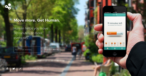
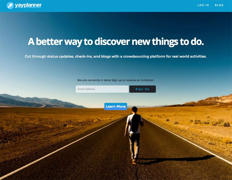
I like how YayPlanner does this in their pre-launch landing page – it tells the visitor what the app does, but spares them the details of how it does it, keeping them wanting more.
3. Their call-to-actions aren’t ‘sign up’
The primary goal of your landing page is not to look pretty, it’s to get emails!
This is why the call to actions (CTAs) are the most important part of any landing page, because they actually get the visitor to complete the desired action.
Dos and don’ts of landing page CTAs:
- DON’T confuse or distract the visitor with multiple CTAs in the copy other than to sign up (For example, CTAs to follow you on social media or find out more)
- DON’T make the user hunt for the ‘sign up’ button (if in fact, you are using the signup CTA, but that’s not very creative, is it?).
- DO use bright, contrasting colours and BIG buttons that naturally draw the eye
- DO use wording that is consumer-centric, urgent, or benefit-focused. ‘Notify me when it’s ready‘, ‘Sign up for exclusive access’, ‘I want it’ and ‘keep me posted‘ are all great examples.
- DO make the CTA button as close to the sign-up field as possible, so the viewer intuitively knows to click it as the next step.
4. They don’t ask for too much information
If you can, only ask for an email address.
You’ve probably seen that some brands use their sign-up forms to ask for other details like name, gender and where you heard about them.
These are great insights for customer profiling, but just be aware that the longer it takes for people to fill in a form, and the more personal information they have to leave, the lower your conversions will be.
Expedia found that by removing just one data field from their purchase form (the address confirmation field) resulted in an extra $12 million annually.
Weigh up the pros and cons and decide on the minimum amount of information you can ask for that will offer maximum insight.
5. They incentivise
We all receive too much email, so what can you offer the visitor RIGHT NOW in exchange for their precious email address?
Some ideas:
- Exclusive content (articles, videos, quizzes)
- Early access to the beta launch
- A free trial or download if your app costs money to use
- Complimentary in-app features they’d normally have to pay for
- Going in the draw to win a prize
Just keep the offer relevant to your brand values and your app’s core function.
For example, if you have an app that lets users locate their nearest vegan restaurant, offering to send them an article you’ve written called ’35 Mouth Watering Vegan Eats For The Melbourne Foodie’ would be pretty enticing for a new visitor.
6. They say thankyou
Don’t just stop at ‘you’re now subscribed‘ after someone leaves their details.
Be creative with your thankyou copy so it confirms that the visitor made the right decision to sign up, and make them want to head straight to their inbox!
You can also use the thankyou page as an opportunity to push the sign-up to complete another action, like read your blog or watch a product demo video.
Bonus: Use the automated confirmation email to link to further content which may have been too cluttered to put on your thankyou page.
This brings me to my next point…
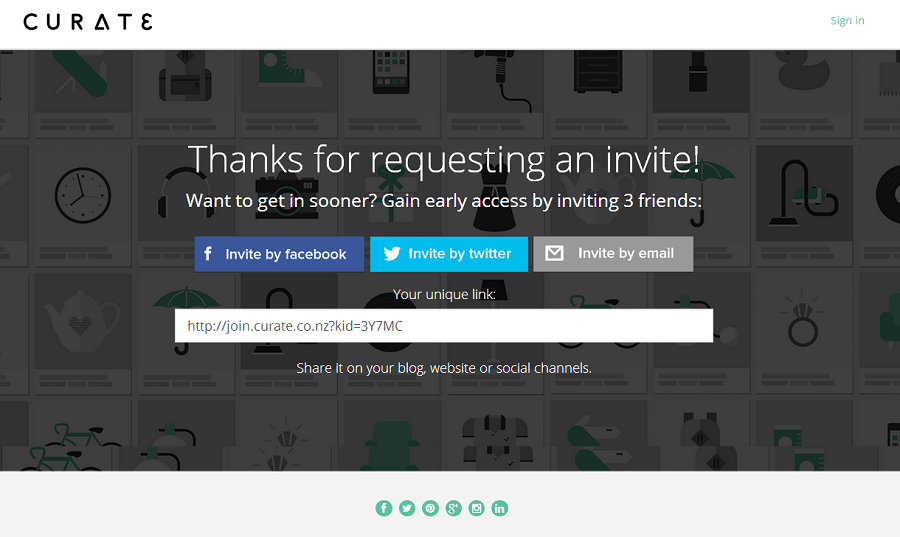
7. They ask for social shares and referrals after sign up
Why would someone recommend an app that they haven’t even indicated interest in yet?
Landing pages that prompt social activity or referrals after someone has left an email get higher conversions than those who ask for them before.
Curate has perfectly optimised its ‘confirmed submission’ page to push people to complete the next desired action – to refer 3 friends.
And again, they offer an incentive for completing the new action – two thumbs up!
8. They’re designed for their target user
More often than not, you are not the target user for your app.
This means that what you think looks good on a landing page, or what would make you fill in a sign-up form, would not necessarily have the same effect on your target audience.
Of course, there are best practices and some fantastic examples you can use for landing page inspiration.
But ultimately, knowing your user is the best arsenal you have for designing something that will appeal to their emotions, pain points and benefits sought.
Take the task-managing app Tassky.
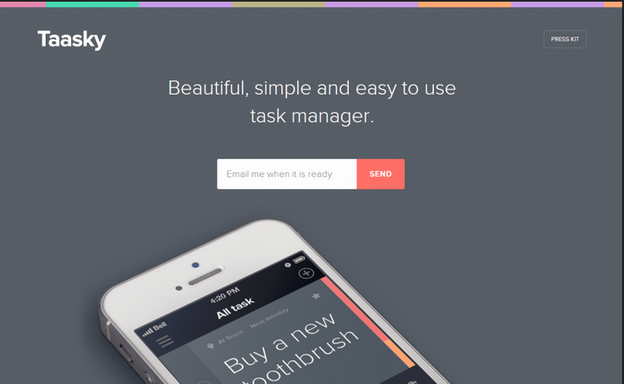
This simple, minimalist design wouldn’t work for every app, but it appeals to their target market who are probably organisational ‘to-do list’ types, or who are looking to unclutter their mundane tasks.
9. They do A/B testing
A/B testing describes experiments where you compare two versions of a web page to see which one performs better.
Small changes to design, layout and prominence of certain elements can have a significant effect on conversions.
You should optimise your landing page by testing as many design and copy decisions as you can.
What gets more emails:
- An orange CTA button or a blue one?
- The headline ‘Weather is
unpredictable’ or ‘Never get caught in the rain again’? - A product demo video or a carousel of images?
Just make sure you’re only testing one variant at a time, otherwise you won’t know which element caused which effect.
Set up and track different campaigns, and then choose the best performing one after a clear winner has emerged!
The wrap up
Your app’s pre launch landing page is the simplest tool you have to collect top-of-funnel contacts.
A thoroughly tested, optimised page will allow you to collect emails from leads that you can nurture into valuable first users.
When you do finally launch your app, it won’t be to crickets!
Continue the crash course…
Go back to part 1: User Personas: Marketing To A Mobile Audience
Part 3: How To Generate Buzz Before Launch
Part 4: Customer Acquisition: How To Reel In Your First 5,000 Users
Part 5: How To Engage And Retain Your Current And Future Users

