Recently I attended a wonderful talk by Jake VanderPlas (and hosted by the always astute Eli Bressert) about a wonderful package he has been working on to make visualization in python easier.
As a long time ggplot2 user, I’m quick to bemoan the challenges of succinctly visualizing data in python. While there are many visualization packages out there, none of them seem to approach the intuitiveness, completeness, and consistency found in R’s go-to tooling.
I’m happy to say that this new python package Altair might put an end to my grumblings (and yours) once and for all.
I’d like to take you through the basics of experimenting with Altair to show a bit of what it can do. None of my ramblings is really more than what you will find in the documentation, but I will describe some of my experiences in starting to learn how to use this tool.
What is Altair?
Altair provides a way to write declarative data visualization code in python by harnessing the power of Vega and Vega-Lite. Ok, so what is Vega?
Vega is a visualization grammer (think Grammar of Graphics the concepts that ggplot2 is built around) that can be written as a JSON specification. Vega-lite provides most of the power of Vega in a much more compact form by relying on smart defaults and simpler encodings.
Vega-lite provides a format to specify data, data encodings, and even interactions, all in a relatively simple and intuitive specification.
These packages and many more have been created out of the blood, sweat, and tears of the UW Interactive Data Lab. Arvind, Ham, Dom, Jeff, and all the rest: we can’t thank you enough for this vision and these amazing tools!
Anyway, back to Altair.
Altair provides a way to generate these Vega-lite specifications using an intuitive and pythonic API. So we can write python, but get out Vega-Lite. Intrigued? Then let’s get started!
JupyterLab Experimentation
All my experimentation has been done using the newly-ready-for-use JupyterLab, the successor to Jupyter Notebooks.
JupyterLab provides an updated and richer IDE-like experience for building interactive notebooks. While the new features, like an integrated text editor and terminal console, are interesting, the real exciting stuff is under the hood!
It has been built from the ground up using a plugin-based architecture providing consistent and powerful ways to integrate new features through different types of plugins. One type of plugin, Mime Renderer Extensions allows for custom Javascript-based views of different filetypes.
It is exactly this new feature that Altair leverages. It generates the Vega-Lite spec and passes it off to the built-in Vega renderer to be visualized.
Installation and Setup
These instructions are based on:
- jupyterlab v0.31.8
- altair v2.0.0rc1
And might need a bit of updating as Altair is developed. First, I created a new python 3 conda environment to work in. Then installed jupyterlab via pip:
pip install jupyterlab
To install the latest Altair, you need to supply the specific version at the moment:
pip install altair==2.0.0rc1
Finally, I had to add the vega3 JupyterLab extension, but this step won’t be necessary for future JupyterLab versions:
jupyter labextension install @jupyterlab/vega3-extension
Now open your lab with jupyter lab and start a new Python 3 notebook to get started!
Our First Altair
We can start with the ‘Hello World’ of Altair. To do this we first need to import the package.
import altair as alt
And then load some data. Handily, Altair provides some default datasets. We will start with the classic cars dataset.
cars = alt.load_dataset('cars')
Now let’s visualize this dataset.
alt.Chart(cars).mark_point().encode(
    x='Horsepower',
    y='Miles_per_Gallon',
    color='Origin',
)
Note: The result is a Vega-Lite specification that is rendered automatically inside of JupyterLab. To show the result in this post, I will use the handy-dandy Vega Embed to display the spec below.
Pretty impressive, right? Let’s break this code down a bit.
First, we are creating a Chart instance and passing it the data that will be visualized. Next, we indicate what kind of Mark to use in the visualization. For a dot plot, we want the ‘point’ mark, but as we will see, there is a suite of marks to choose from. Finally, each mark has a number of possible ‘channels’ to encode data with. We set these in the encoding() method, passing in attributes (columns) of our data to use to encode x, y, and color.
Again, if you are a ggplot2 user, you can start to see why I was so excited to try Altair! Marks are just another word for Geoms, and encodings look almost exactly like your typical aes() mapping! If you’re not a ggplot2 user, ignore all that - and just marvel at the intuitive reading of the Altair code!
Same Chart, Different Data
Now I know these test datasets are boring and dumb and boring and useless and boring. Robert Kosara is one of many voices I have heard in the recent past driving this point home.
If there is one rational to possibly hide my laziness behind, it is that when using a boring dataset for an introductory tutorial we can focus more on the tool used to visualize it, rather than spend time looking for insights in the data. A pitiful rational, I know, so before we move on, I wanted to show how easy it can be to load up your own data and visualize with Altair.
So we will use the wonderful FiveThirtyEight data repository to pick out a dataset about people’s favorite candy.
Here’s how you would load and visualize this data using pandas and Altair:
import pandas as pd

candy = pd.read_csv('candy-data.csv')

alt.Chart(candy).mark_point().encode(
    x='sugarpercent',
    y='winpercent',
    color='hard:N',
)
Nearly the same command, but completely different data (we will explain that :N in a second).
Most of the rest of this tutorial will be using the cars dataset because of my slovenliness, but keep in mind the ideas can be applied to any data.
Marks Marks Everywhere
This marks and encodings pattern starts to really shine when you want to visualize the same data differently, using different marks. Let’s make a bad visualization by replacing our points with bars:
alt.Chart(cars).mark_bar().encode(
    x=alt.value(0),
    x2='Horsepower',
    y='Miles_per_Gallon',
    color='Origin',
)
We can see the only things that have changed are the use of mark_bar() instead of mark_point(), and the additional x2 encoding. And with those small changes, we have a whole visualization!
Each chart can be further customized with constants provided at the mark or encoding level. For example, the opacity for each bar can be reduced by just passing in the opacity option to the mark_bar().
alt.Chart(cars).mark_bar(opacity=0.2).encode(
    x=alt.value(0),
    x2='Horsepower',
    y='Miles_per_Gallon',
    color='Origin',
)
Faceting
One feature I always look for in a new visualization tool or package is faceting based on a categorical variable. When dealing with matplotlib, this kind of visualization typically requires loops to create, which I feel takes you out of the ‘what’ you are trying to visualize and keeps you stuck in the ‘how’. Fortunately, Altair doesn’t require this cognitive break.
You can just use the facet() method!
alt.Chart(cars).mark_point().encode(
    x='Horsepower',
    y='Miles_per_Gallon',
    color='Origin',
).facet(column='Origin:N')
Notice the strange :Q trailing our data attribute. This is a special shorthand to indicate to Vega-Lite what type of data value Origin is. While you might think that the tool should be able to figure this out automatically, remember we are ultimately just building up a JSON specification - and so some of these nuances need to be supplied explicitly.
A Grammar of Interaction
Ok. Grammar of Graphics, big deal right? You could imagine any number of tools and specifications to implement these concepts, so what makes Vega, and thus Altair any different?
Recently, through some amazing work by the Vega team, Vega and Vega-lite now include a sort of “Grammar of Interaction”.
This means our specifications can encode not just our data visualizations, but what happens when people interact with our visualizations!
We can get a simple pan-and-zoom interaction on any chart in Altair by simply adding the interactive() method:
alt.Chart(cars).mark_point().encode(
    x='Horsepower',
    y='Miles_per_Gallon',
    color='Origin',
).facet(column='Origin:N').interactive()
But this is only the beginning! With Altair, we can build up much more complex interactions using selections. As the Vega-Lite documentation puts it:
They map user input (e.g., mouse moves and clicks, touch presses, etc.) into data queries, which can subsequently be used to drive conditional encoding rules, filter data points, or determine scale domains.
Altair comes with 3 basic selection types:
selection_single()- for interacting with a single element at a time.selection_multi()- for selecting multiple items at once through clicking or mouseover.selection_interval()- for selecting multiple items through a brushing interaction.
Here’s an example of using a selection_interval() to make a brush interaction that works across our previously faceted chart.
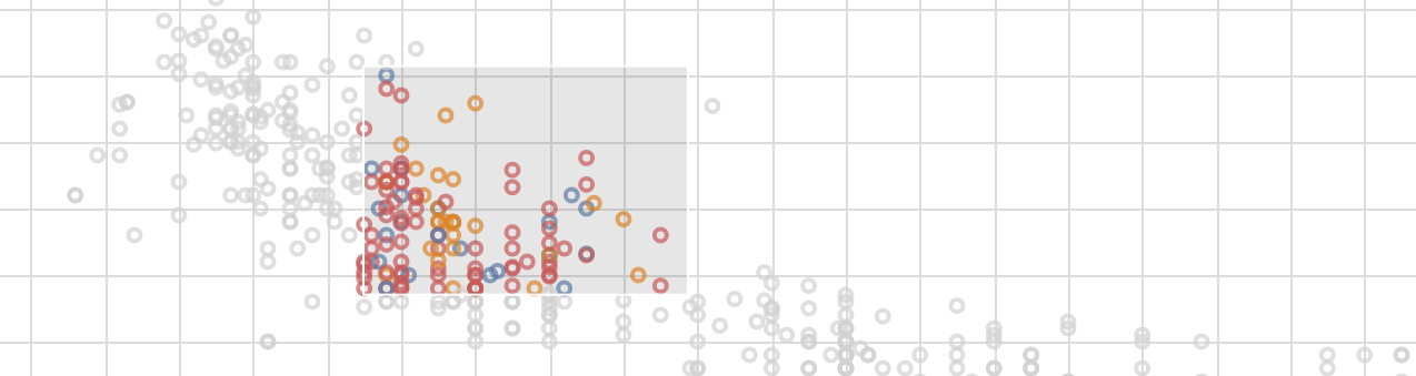
brush = alt.selection_interval()

alt.Chart(cars).mark_point().encode(
    x='Horsepower',
    y='Miles_per_Gallon',
    color=alt.condition(brush, 'Origin', alt.value('lightgray')),
).properties(
    selection=brush
).facet(column='Origin:N')
A few interesting pieces come out of this example. First, we can see we pass this brush into our chart as its selection property. Next, we use it as part of a condition - which allows us to use an if-else concept to encode the color channel. If the point is included in the current brush, it will be colored based on its Origin, else it will be lightgray. Try it out below by clicking and dragging the mouse.
We will play a bit more with selections later on in the tutorial.
Summarizing Your Data
Often times we are interested in visualizing an aggregation of the data, rather then just raw values. Altair comes equipped with a number of aggregation and binning functions that can be applied to specific encoding.
For example, we can use the count() aggregation to turn our faceted scatterplot into a histogram.
alt.Chart(cars).mark_bar().encode(
    alt.X('Horsepower', bin=True),
    y='count(*):Q',
    color='Origin',
).facet(column='Origin:N')
In this example we also see an alternative way to specify encodings. Using alt.X() we can provide options to the encoding, like the bin flag.
And, as you might expect, this default binning can be customized. Altair provides the BinParams object to manage binning specifics.
Here’s the same chart, but with 40 bins per facet.
alt.Chart(cars).mark_bar().encode(
    alt.X('Horsepower', bin=alt.BinParams(maxbins=40)),
    y='count(*):Q',
    color='Origin',
).facet(column='Origin:N')
Layering Marks
We will wrap up this tutorial with a look at how to combine charts to make much more sophisticated visualizations.
First, we can layer charts on top of one another to make Marks that are available by default.
Altair provides the layer() method to do this, as well as a shorthand version using the + operator.
Here is an example of using this capability to create a box-and-whisker plot (derived from one of the newly created examples). It uses layer() so that the data doesn’t have to be repeated over and over in the chart. Also note the use of a base chart that each piece of the box plot reuse.
def boxplot(data, x, y, ytype='Q', xtype='N'):
    # make all the aggregation strings up front
    min_agg = f'min({y}):{ytype}'
    max_agg = f'max({y}):{ytype}'
    median_agg = f'median({y}):{ytype}'
    q1_agg = f'q1({y}):{ytype}'
    q3_agg = f'q3({y}):{ytype}'
    x_val = f'{x}:{xtype}'

    # create a single base chart
    # which the other layers will
    # be augmented from
    base = alt.Chart().encode(
        x=x_val
    ).properties(
        width=400
    )

    # now we only need to specify what is unique
    # to each layer!
    whisker_low = base.mark_rule().encode(
        y=alt.Y(min_agg, axis=alt.Axis(title=y)),
        y2=q1_agg
    )

    box = base.mark_bar().encode(
        y=q1_agg,
        y2=q3_agg
    )

    midline = base.mark_tick(
        color='white',
    ).encode(
        y=median_agg,
        y2=median_agg
    )

    whisker_high = base.mark_rule().encode(
        y=max_agg,
        y2=q3_agg
    )

    # combine with layer()
    return alt.layer(whisker_low, box, whisker_high, midline, data=data)

# now we can use this function
boxplot(cars, x='Origin', y='Horsepower')
Pretty cool, right?
Layers and Interactions
We can use interaction with layered charts too!
Here is a quick attempt at an scatterplot that shows more details when hovering over each point. The text is a separate layer that is conditionally displayed.
We get to see selection_single() in action, which allows us to select one thing at a time. We can customize it to make it work on mouseover.
# the 'empty' setting makes all text hidden before any mouseover occurs.
pointer = alt.selection_single(on='mouseover', nearest=True, empty='none')

base = alt.Chart().encode(
    x='Miles_per_Gallon', y='Horsepower'
)

chart = alt.layer(
    base.mark_point().properties(selection=pointer).encode(color='Origin'),
    base.mark_text(dx=8, dy=3, align='left').encode(text=alt.condition(pointer, 'Name', alt.value(''))),
    data=cars
)

chart
As for real tooltips, the relevant parties are still discussing the details, but I’m sure something will be figured out soon.
Concatenating Charts
Another way charts can be combined in Altair is through concatenation. We can concatenate charts either vertically or horizontally.
- The
alt.vconcat()method or the&operand is used to vertically concat. - The
alt.hconcat()method or the|operand is used to horizontally concat.
Let’s finish with an interactive dashboard made from two charts. Brushing on the top chart filters the bottom one. This chart uses Altair’s data transformation to filter the bottom chart based on the selection. We won’t discuss this feature more, but definitely worth exploring!
brush = alt.selection(type='interval')

# the top scatterplot
points = alt.Chart().mark_point().encode(
    x='Horsepower:Q',
    y='Miles_per_Gallon:Q',
    color=alt.condition(brush, 'Origin:N', alt.value('lightgray'))
).properties(
    selection=brush,
    width=800
)

# the bottom bar plot
bars = alt.Chart().mark_bar().encode(
    y='Origin:N',
    color='Origin:N',
    x='count(Origin):Q'
).transform_filter(
    brush.ref() # the filter transform uses the selection
                # to filter the input data to this chart
)

chart = alt.vconcat(points, bars, data=cars)
chart
Make sure to brush around on the top chart!
Limitations and Looking Forward
Hopefully this long drawn out demo of Altair at least gets people excited about the potential for this tool and the promise of declarative chart making in python.
That being said, like any great thing, there are some caveats. Here are a few:
- The API is still pretty new. Some of this could break!
- The documentation is still incomplete. Sometimes you need to look at Altair and Vega-Lite docs to find an answer.
- The number of data points Altair can handle is currently pretty low. Right now it is capped at 5,000, but that is modifiable.
- As noted above, tooltips are still on the way.
- It would be cool to have the ability to extend Altair to make new Mark/encoding types. The
boxplotfunction above would then be created inline asalt.mark_boxplot()or something similar.
But even with these slight short-comings, I am excited about this great new package, and can’t wait to try it on more interesting datasets in the future. I hope you are excited too!