Over the past two years at Wealthfront we’ve been building a design system from the ground up across all our frontend platforms: Android, iOS, and web. If you’re a Wealthfront client you may have noticed sweeping, iterative visual changes across our apps as we introduced new components and migrated features to adopt these components.
At this point, the core design system components have been implemented on all platforms, so we wanted to share a bit about our journey building a multi-platform design system.
Motivation
In the past, design patterns, reusable components, and other shared utilities grew organically on all platforms. If this was already happening, why create a design system in the first place?
An organic, bottoms-up approach led by individual designers and engineers can work well for small, nimble teams but begins to break down as teams scale.
First, there is no guarantee that components are always being built with reusability in mind, nor that they solve all the necessary product use cases. This can lead to code duplication and extra effort which can result in an overall lower development velocity and an inconsistent user experience.
Furthermore, when reusable components are built, there is no guarantee that the equivalent components are built on other platforms. For example, if iOS builds a Button component but Android and web don’t have this same component, it can introduce more confusion and inconsistency for engineers and designers.
If these reusable components are built on all platforms, there is no guarantee that designers are aware, nor that an equivalent component exists in their design tool: Figma. This can lead to churn redesigning an existing component, which in turn can lead to further code duplication and a fractured user experience.
Finally, even if all platforms have implemented a component and designers are aware of each platform’s individual capabilities, there is still no guarantee that the components are implemented with the same look and feel on all platforms. This too can lead to confusion, asymmetrical effort spent on different platforms depending on the state of the component, and an inconsistent user experience across platforms.
In the face of these growing challenges, we decided it was the right time to begin a concerted design system effort at Wealthfront.
The design vision
Before immediately jumping into building the design system it was important to set the stage. The design team explored various future states and an overall design direction for the product. This initial exploration directly inspired many of the components that are currently being used in our design system and the current state of the product.
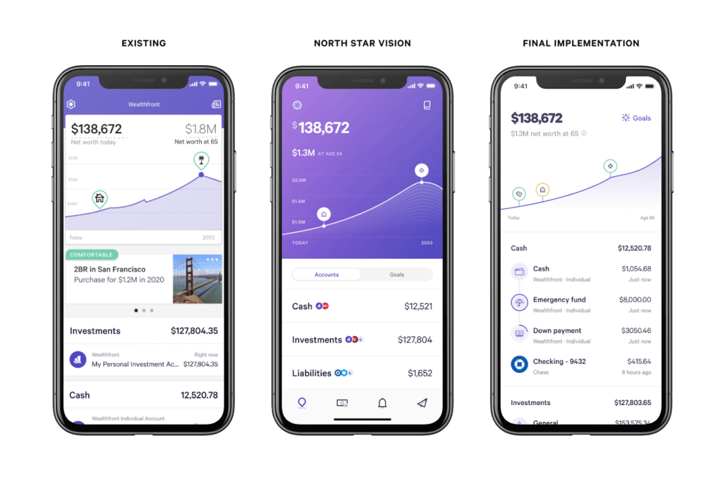
The design vision solidified the north star for the initial phase of building the design system. It also helped gather support and excitement from engineers, designers, product, and leadership.
Usually, coupling two large initiatives – the initial phase of the design system and a product-wide refresh – can be a recipe for disaster. However, in this scenario, it actually helped to showcase design system progress and encourage adoption of components. If the design system standardized on the existing product it would be hard to differentiate what is and is not using the design system. It also quickly demonstrated the benefits of a design system to iteratively uplevel the entire product instead of a single feature.
With this design vision in mind, the next step was to define the design system team’s mission to determine how to prioritize this and future work.
The design system mission
The team vision has evolved since initially setting out, but the core tenets remain the same:
“The Design System team’s mission is to raise the quality bar of our products while improving consistency for our clients and productivity of both engineers & designers. We do this by building tools, frameworks, and processes that empower our product teams to deliver more cohesive experiences and make our products easier to maintain.“
This mission guides prioritization and decision making within the design system team. For example, which components to work on before others, which frameworks would be most beneficial, or how to improve processes.
With a clear vision and mission, it was time to execute.
Building a multi-platform design system
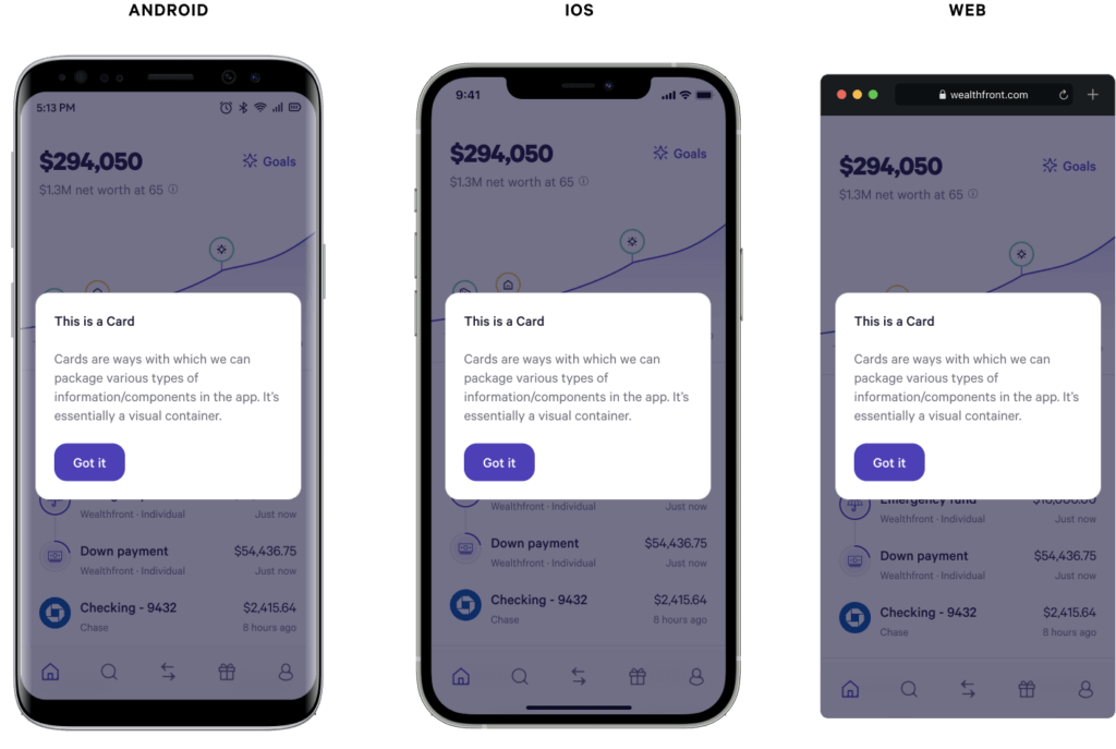
In the past, there were often significant visual or functional product feature differences between the platforms. In addition to unifying features across a platform, an initial motivation for the design system was to unify features across platforms. Providing the same fundamental building blocks – design system components – on all platforms makes this possible.
Therefore, we aimed to build a multi-platform, cohesive design system. When creating new components or frameworks we start from a single point, and then consider modifications that respect each platform’s standards when appropriate. This helps ensure a unified experience across platforms, as opposed to starting from multiple points and working backwards. It provides a predictable experience for clients (even when switching between platforms), and allows designers to design once, instead of two or three times. While not entirely accurate, you might say this is a “design once, build anywhere” approach.
For example, the Dialog on web floats in the center of the screen on desktop, but its counterpart BottomSheet on mobile is attached to the sides and bottom of the screen.
They are still cohesive since they share the same design tokens: padding, border radius, colors, and typography. However, the exact positioning respects each platform’s existing standards to match user expectations.
In the same way we aim to create cohesive components across platforms, we aim to do the same for each component’s API across platforms.
Multi-platform API design
One of the most important parts of a successful multi-platform design system component library is a cohesive API on all platforms, ideally identical. This has two primary motivations.
First, it guarantees all components have similar options which means it can support the same functionalities and will likely have similar edge cases. The chances that something else is visually or functionally different increases if the API is different across platforms.
A second but equally important motivation is to create a standardized vocabulary for all designers and engineers. For example, when a designer describes “a callout card with a small heading, body text, and primary button with large spacing between”, other designers and engineers should be able to easily translate this into code on their respective platform. Below is an example of how this might be translated into design system components on web and how similar code would be rendered on each platform.
Android and iOS have equivalent component counterparts that can be used to construct the same UI.
The exact process we follow for drafting these APIs is shared further below. Before that, let’s discuss the advantages and disadvantages of building a multi-platform design system.
Advantages
Arguably the biggest benefit of multi-platform design systems is that it requires taking a step back from platform specifics and thinking through components from first principles. If building a web-only design system, it can be easy to never question web standards or specifications. However, in order to build an effective multi-platform design system, you must do so.
For example, a Button and Link can be popular components on web that map to native button and a (anchor) elements. From a design perspective these can often be treated as conceptually equivalent: a user clicks something and it does something. Implementing this only on web may result in two components with duplicated styling. However, when also considering Android and iOS which don’t make this same distinction, it raises the question if two distinct components on web are necessary.
As a result of taking a step back and considering all platforms, we instead have a single Button component on web that supports rendering as either an anchor or button element for the important semantic differentiation. This allows designers to conceptually think about one component, without needing to consider whether they are linking to another webpage or performing an action on web.
Another benefit of building a multi-platform design system is sharing platform or framework patterns across platforms. For example, the flexibility and composition that React provides encourages a certain way of thinking about components that can inspire API patterns which impacts the component on all platforms. Longer term, we’re excited about Jetpack Compose and SwiftUI which have more in common with React, potentially leading to even further component cohesion across all platforms.
While the platform differences can provide plenty of advantages, they bring with them their own disadvantages.
Disadvantages
Each platform has differences that can arise in various situations and impact visuals, functionality, or API design. Some of the more common differences include:
- Differing standards: for example, each platform has slightly different specifications and exceptions for tap area targets. When designing smaller components that get close to these minimum sizes we need to reconcile these differences. The simplest is to pick the largest minimum since this guarantees the others are met as well. Accessibility is only one aspect; every platform has varying standards across the spectrum.
- Differing languages: Kotlin on Android, Swift on iOS, and TypeScript on web. They each provide some level of type safety which is always a benefit when consuming or refactoring components in a design system. However, the differences in the type systems can introduce their own API design challenges. For example, on Android we avoid XML for complex APIs due to limited type safety. Instead, the API is written in Kotlin to take advantage of powerful language-level constructs like sealed types. On web with React and TypeScript, it’s not possible to restrict child components to only certain types. As a result, the type definitions are more permissive than what is allowed in practice so some of these constraints are runtime checks which run only in development builds.
- Differing frameworks and paradigms: while having different frameworks or paradigms can be an advantage to provide multiple perspectives and provide inspiration, it also requires reconciling these differences. For example, React and TypeScript are less strict so it’s easy to provide flexible APIs. This is convenient for APIs that need to be flexible, but becomes a challenge for APIs that need to be more restrictive.
At the end of the day, while building a multi-platform design system may require additional effort, it does result in an overall better design system.
Component creation process
One of the first and most important processes to define early on was for component creation. We experimented with a few approaches, but settled on the process we’re using today.
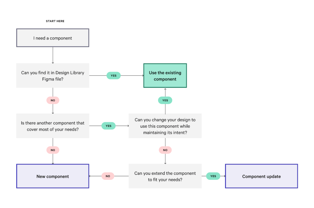
The first decision is where something should live. Should it be a new design system component? Should it be added to an existing design system component? Should it be a feature-specific custom component?
The following flow chart is a high-level summary of how we approach thinking about adding new components to the design system.
Once a decision has been made to add or update a design system component, the next step is a design-focused component sheet proposal.
Design component sheet proposal
The component sheet proposal is a design-led exercise to explicitly list the specifications, or design tokens, to use for typography, spacing, and colors. It also includes an exhaustive exploration of use cases and the variants those different use cases introduce.
The specifications expedite implementation and ensure all platforms are using the same design tokens, which results in a cohesive experience across platforms and across the design system. The variants define exactly which options will need to be supported which ties directly into the next step.
Engineering component API proposal
This step is an engineering-led exercise to explicitly define the public API based on all the variants defined in the design component sheet.
Naming is one of the critical parts of this step. We survey existing design systems, existing platform specifications, and anywhere else we can draw inspiration. There isn’t a single rule, but we usually follow these guidelines:
- If there is an existing, widely accepted component name that maps well on all platforms, it will be used. For example, a
Cardcomponent. - If there is not an existing name that maps well on all platforms, we intentionally avoid any existing platform-specific names to avoid confusion. For example, the
SummaryListcomponent is similar to the description list element on web, so we chose not to use that name. This avoids confusion by overloading this meaning on web and by bringing web specifications to mobile platforms. Instead,SummaryListprovides a similar meaning without implying any existing definitions. - If there are existing but unique names per platform that also align with the component and platform differences, they will be used. Some examples include the
Dialogon web and theBottomSheeton Android and iOS.
This naming strategy also applies to all the options and values for each component, although that’s typically easier. Without this process, it wouldn’t be possible to have the shared vocabulary mentioned earlier.
The other critical part of this step is the actual API and options. Typically, we brainstorm several API proposals that approach the component from different perspectives. Some are more general, whereas others are more specific. Exploring multiple APIs and perspectives can uncover interesting insights such as additional use cases or unexpected connections to other components.
There are a few principles we keep in mind when designing component APIs:
- Consistency: for example, when there is a generic slot for any component, we use the term “content.” This can show up in component options as
primaryContent,secondaryContent,helperContent, ortrailingContent. This cross-component consistency can help imply how a component’s option should be used before reading any documentation or relying on types. - Simplicity: ideally, the API is simple. This means there are minimal options, impossible states are impossible, and the API is self explanatory. Typically, this comes down to iteration. Simplicity takes time.
- Flexible versus opinionated: the design requirement should be reflected in the API. If the design has loose requirements or treats things as containers, a generic slot that accepts arbitrary content is a flexible pattern. It inverts the control of what is rendered to the consumer of the component. On the other hand, if the design has strict requirements, the API should be restricted to only those options. While it may seem obvious, this is important to get right. Providing an API that is too flexible for something intended to be opinionated can result in unexpected uses, maintenance headaches, and frustration for engineers consuming the design system. The opposite is also true: providing an API that is too opinionated that was intended to be flexible leads to the same problems.
- Accessibility: it’s important to intentionally consider accessibility while designing the API. This can surface in many ways, such as the actual naming of options, removing potentially inaccessible functionality, or adding new options specifically for accessibility. For example, on web, a single component can map to multiple HTML elements so we expose an
asoption to control which underlying element is rendered. We do this for both theButtonandTextcomponents. - Platform implications: for example, avoiding reserved keywords on different platforms. With the
SummaryList, we considered akeyoption, but this isn’t possible on web since that is one of only two special React props that can’t be used.
The exact design and engineering process and patterns are constantly evolving, but these are the core themes that are commonly considered or commonly arise.
Component prototype
A component prototype is typically done on at least one platform with the proposed API. It can help uncover unexpected edge cases, challenges with the API, or challenges with the way the component was designed. It’s also a good opportunity to test different interactions or animations that can be challenging in Figma.
This step is usually done in parallel with the previous engineering API proposal step.
Implementation
Once all of the previous steps have been completed and finalized with the team, the last step is implementation.
The design component sheet proposal and engineering API proposal provide all of the visual, functional, and technical details to implement the component on all platforms. The implementation step also includes appropriate testing (unit tests, screenshot tests, screen reader tests), documentation (component galleries in the mobile apps, Storybook on web), and migration if necessary.
There are commonly unknowns that arise during implementation, so we loop back to the appropriate previous step depending on the issue.
We’ve found this general process balances the overall effort with multi-platform cohesion. Skipping one of these steps can result in inconsistent components, behavior, or API on the different platforms.
Current state of the design system
Since the inception of the design system, we’ve built many of the core components needed across the app such as the Button, Card, and TextField. There are always new components to build, but we’ve recently been spending more time outside of only building components.
The blog post Creating Components For Mature Design Systems provides the following categorization for different design system stages.
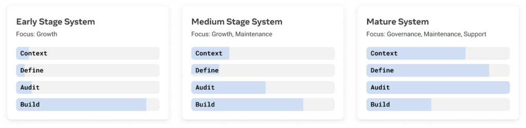
According to this framework, we’re probably somewhere between an early stage system and a medium stage system. This means we spend less time building components and more time gathering context, (re)defining, and auditing. Recently, we have spent more of our time building the broader design system ecosystem, such as tooling and frameworks.
Examples
That covers a lot of the history and processes, but doesn’t provide any concrete examples. Below are a few examples of design system components and related projects.
TextField component
The TextField is one of the most common types of input. It’s fairly standard in that it’s similar to many other text field components in other design systems. For example, it contains a label, optional placeholder, optional leading icon, optional trailing content, optional helper content, and optional error message.
By default, the TextField allows any typed input. At Wealthfront, there are several types of inputs that are common across the product and can benefit from additional formatting to improve the client experience.
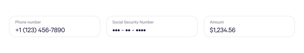
As a result, there are also several formatted TextField components for telephone input, social security number input, and a dollar amount input. These are all extensions on top of the TextField so additional formatted input types can be easily added as needed.
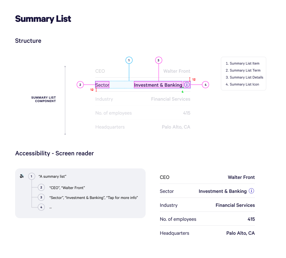
SummaryList component
A less common component seen in other design systems is the SummaryList component. It’s used to display a summary of data in a list. This is commonly used to display metadata about an entity.
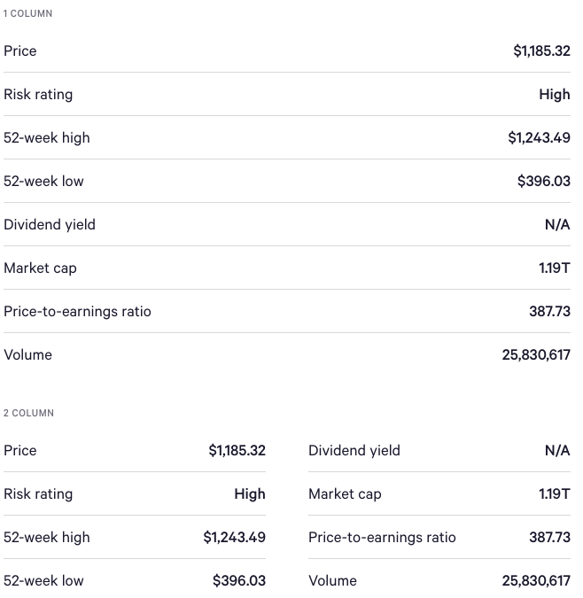
On smaller screens, each item’s key and value are on the same row with the items stacked. However, on larger screens like desktop web this can result in a lot of wasted space. Therefore, this component contains a column option that only applies on larger screens to take advantage of this additional space by rendering the items in more than one column. This is an example of taking platform considerations into account to improve components on a given platform.
Color system and theming
A recent non-component based example of a larger design system project was revamping our color system. Last year, the brand colors were revised and are now widely used on the marketing site. Before now, these colors hadn’t made their way into the design system.
The motivation of this project was to introduce these new brand colors as distinct themes. While mobile already supported light and dark mode theming, web did not. Before this project could even begin, we had to deprecate IE 11 support and adopt CSS Variables which enable theming on web. Once all platforms supported theming, the next step was to update those themes.
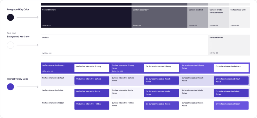
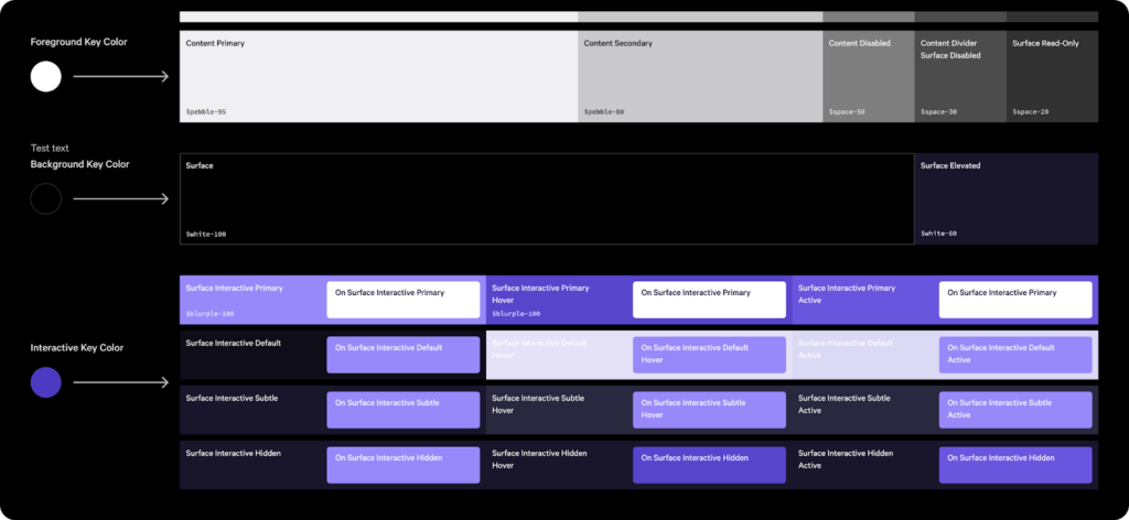
Design defined an algorithm that accepted a handful of our brand colors and generated a robust, accessible theme based on those inputs. The algorithm was converted to a script which allows us to generate arbitrary themes based on our brand colors. It includes contrast checking common background and foreground color pairings and output for all platforms: XML for Android, JSON for iOS, and a Stylesheet with CSS Variables for web.
Another big benefit of this new color system is nested theming. With the way the color system was structured and designed, it’s possible to theme subsections of pages or individual components. For example, a theme can be applied directly to the Card component to make it visually unique while still being accessible and visually aligned with the rest of the product.
Conclusion
While a design system is constantly evolving, we are excited to share the progress we have made so far on this journey. It’s helped improve the consistency throughout the product across platforms, provided a standardized vocabulary, and increased our velocity.
If working on an evolving design system sounds interesting to you, or you want to help build a financial system that favors people, not institutions in another way, check out our careers page for current opportunities!
Disclosures
The information contained in this communication is provided for general informational purposes only, and should not be construed as investment or tax advice. Nothing in this communication should be construed as a solicitation or offer, or recommendation, to buy or sell any security. Any links provided to other server sites are offered as a matter of convenience and are not intended to imply that Wealthfront Advisers or its affiliates endorses, sponsors, promotes and/or is affiliated with the owners of or participants in those sites, or endorses any information contained on those sites, unless expressly stated otherwise.
All investing involves risk, including the possible loss of money you invest, and past performance does not guarantee future performance. Please see our Full Disclosure for important details.
Wealthfront offers a free software-based financial advice engine that delivers automated financial planning tools to help users achieve better outcomes. Investment management and advisory services are provided by Wealthfront Advisers LLC, an SEC registered investment adviser, and brokerage related products are provided by Wealthfront Brokerage LLC, a member of FINRA/SIPC.
Wealthfront, Wealthfront Advisers and Wealthfront Brokerage are wholly owned subsidiaries of Wealthfront Corporation.
© 2022 Wealthfront Corporation. All rights reserved.