
What’s the best way to understand Flexbox? Learn the fundamentals, then build lots of stuff. And that’s exactly what we’re going to do in this article.
A few things to note
- This article was written with intermediate developers in mind, and assumes you already know a bit about Flexbox. But…
- If you know some CSS, but don’t know Flexbox at all, I wrote a comprehensive guide here (free article, 46 minute read).
- And if you don’t know CSS very well, I recommend taking my Complete (practical) Introduction to CSS (paid course with 74 lessons).
- You don’t have to follow the examples in this article in the order listed here.
- Flexbox is only a layout technique. Real world projects require more than layouts.
- When you see a notation such as
div.ohansit refers to a div with a class name ofohans
Example 1: How to Make a Photo Gallery with Flexbox
Making photos run in rows and columns with Flexbox is easier than most persons perceive.
Consider a simple markup, like so:
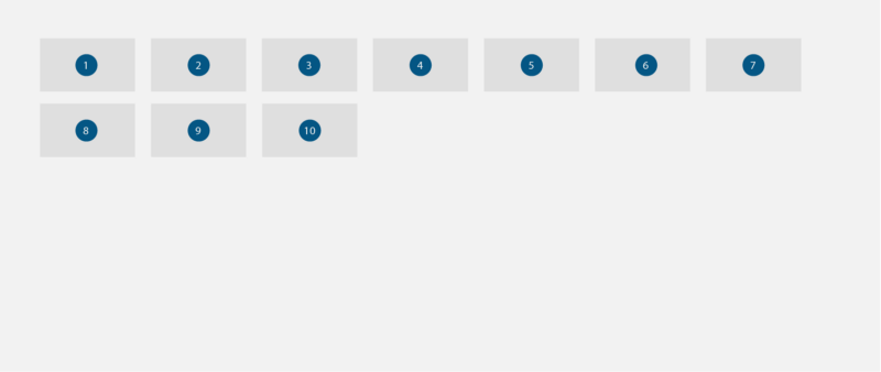
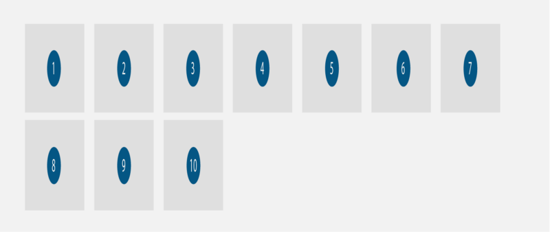
<main class="gallery"> <img src="/sample.jpg"> <img src="/sample.jpg"> <img src="/sample.jpg"> <img src="/sample.jpg"> <img src="/sample.jpg"> <img src="/sample.jpg"> <img src="/sample.jpg"> <img src="/sample.jpg"> <img src="/sample.jpg"> <img src="/sample.jpg"></main>We have 10 images within a main.gallery.
Assume the main.gallery was styled to cover the available screen.
.gallery { min-height: 100vh}A Quick Note on Images
By default, images are inline-block elements. They have a width and height. They will remain on a line except when constrained by size such as the images being too big to fit on a line.
The Starting point
Putting everything together, the result of all the markup and style above is this:
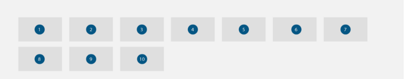
Now, get Flexbox on the scene:
.gallery { display: flex }At this point, the default behavior of the images has altered. They go from being inline-block elements to being flex-items.
As a result of the Flexbox context initiated within .gallery, the images will now be squashed unto a single line. Plus, they would stretch along the vertical like so:
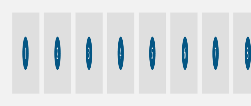
This is a result of the Flexbox default behavior:
- Squash all child elements unto a single line. Do not wrap the elements.
This is bad for a gallery, so we change this behavior like so:
.gallery { flex-wrap: wrap}This will now wrap the elements and break them unto multiple lines when appropriate.
2. The images now wrap unto the next line. But they still stretch along the vertical. We certainly do not want that behavior as it distorts the images.
The stretch behavior is due to the default align-items value on flex containers.
align-items: stretchLet’s change that:
.gallery { ... align-items: flex-start}This will keep the images from stretching. They’ll assume their default width and height values.
They will also align to the start of the vertical axis as seen below:
Now we have our Flexbox powered gallery.
The Advantage of Using Flexbox
At this point there’s not much advantage to using Flexbox. We have the same look we had before initiating the Flexbox model.
Apart from getting a responsive gallery for free, the other advantages of using Flexbox come from the alignment options it brings.
Remember that the flex container, .gallery assumes the following property values.flex-direction: row justify-content: flex-start and align-items: flex-start.
The layout of the gallery can be switched in an instant by toying with the default values as shown below:
.gallery { ... justify-content:center;}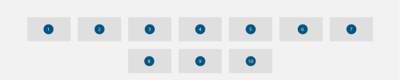
As seen in the image above, this will align the images to the center, along the horizontal:
.gallery { ... justify-content:center; align-items: center;}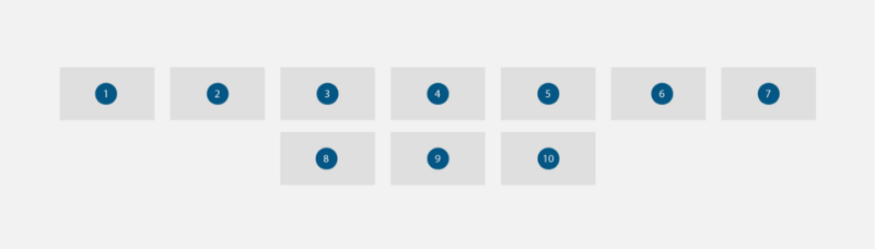
As seen in the image above, this align the images both horizontally and vertically to the center of .gallery
With Flexbox comes a lot of alignment options. Feel free to toy with some more alignment options as you deem fit.
You may view the actual Flexbox gallery in this CodePen.
Example 2: How to Build Cards with Flexbox
Cards have become popular on the internet. Google, Twitter, Pinterest, and it seems, everyone else is moving to cards.
A Card is a UI design pattern that groups related information in a flexible-size container. It visually resembles a playing card.
There are many good uses for cards. A common one is the infamous pricing grid.
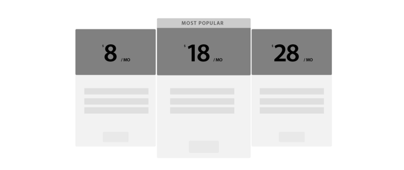
Let’s build one.
The Markup
Each card will assume a markup like below:
<section class="card"> <header> </header> <ul> <li></li> <li></li> <li></li> </ul> <button></button></section>There will be at least 3 cards. Wrap the cards in a div.cards
<div class="cards"></div>Now we’ve got a parent element.
For this example, the parent element has been set up to fill the entire viewport.
.cards { min-height: 100vh}Set up Flexbox
The following code block will initiate a Flexbox formatting context within .cards
.cards { display: flex; flex-wrap: wrap}If you remember the last example, flex-wrap will allow for the flex-items to break onto another line.
This happens when the child elements cannot fit into the parent element. This is due to the larger computed width size of the combined child elements.
Go ahead and give the .card an initial width.
Using Flexbox:
.card { flex: 0 0 250px}This will set the flex-grow and flex-shrink values to 0. The flex-basis value will be set to 250px
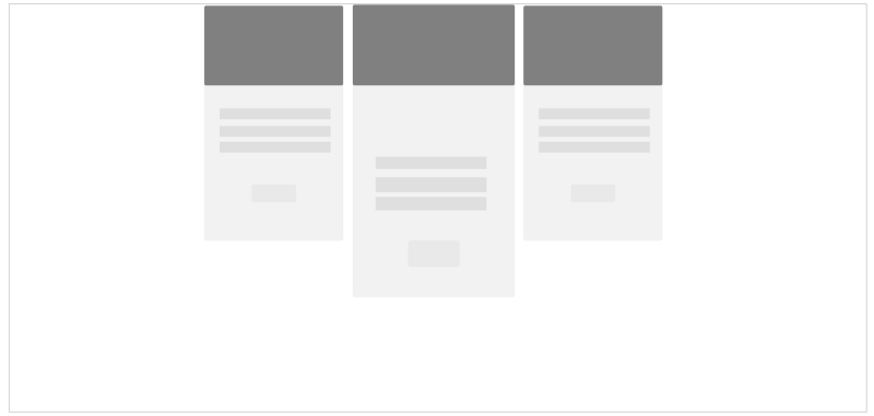
At this point, the cards will be aligned to the start of the page. They will also stretch along the vertical.

In some cases this may be ideal for your use case. But for most cases, it won’t.
The Default Behavior of Flex Containers
The result above is due to the default behavior of flex containers.
The cards begin at the start of the page on the top left because justify-content is set to the value flex-start .
Also, the cards stretch to fill the entire height of the parent element because align-items is set to stretch by default.
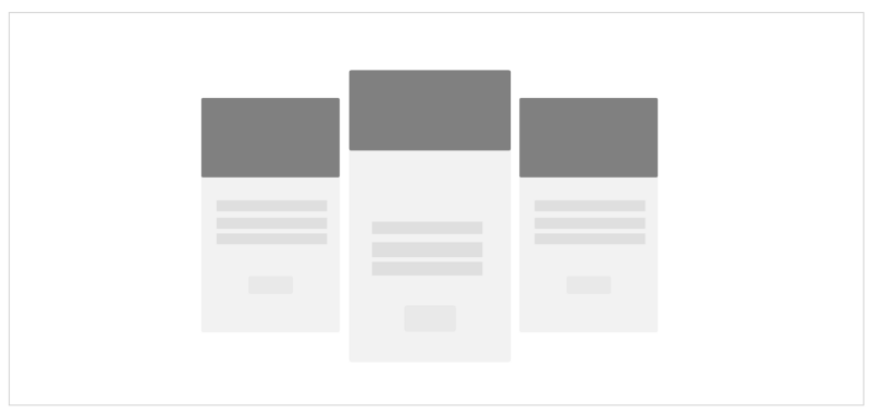
Altering the default values
We can achieve pretty impressive results by changing the default values that Flexbox offers.
See below:

To view the final project, see this CodePen.
Example 3: How to Build Grids with Flexbox
Entire CSS frameworks are built on the concept to be discussed in this example. It is pretty important stuff.
What is a Grid?
A grid is a series of intersecting straight vertical and horizontal guide lines used to structure content.
If you’re familiar with CSS frameworks such as Bootstrap, then you sure have used grids before now.
Your mileage may differ, but we will consider varying grid types in this example.
Let’s start with the first one, basic grids.
Basic Grids
These are grids with the following characteristics:
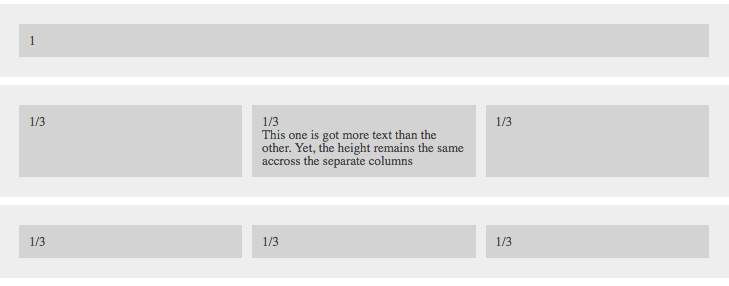
- The grid cells should be spaced equally and expand to fit the entire row.
- The grid cells should be of equal heights.
It is easy to achieve this with Flexbox. Consider the markup below:
<div class="row"> <div class="row_cell">1</div></div>Each .row will be its own flex container.
Each element within .row then becomes a flex item. All flex items distribute evenly across the row.
By design, it shouldn’t matter whether we have 3 child elements
<div class="row"> <div class="row_cell">1/3</div> <div class="row_cell">1/3</div> <div class="row_cell">1/3</div></div>Or 6 child elements
<div class="row"> <div class="row_cell">1/6</div> <div class="row_cell">1/6</div> <div class="row_cell">1/6</div> <div class="row_cell">1/6</div> <div class="row_cell">1/6</div> <div class="row_cell">1/6</div></div>Or 12 elements
<div class="row"> <div class="row_cell">1/12</div> <div class="row_cell">1/12</div> <div class="row_cell">1/12</div> <div class="row_cell">1/12</div> <div class="row_cell">1/12</div> <div class="row_cell">1/12</div> <div class="row_cell">1/12</div> <div class="row_cell">1/12</div> <div class="row_cell">1/12</div> <div class="row_cell">1/12</div> <div class="row_cell">1/12</div> <div class="row_cell">1/12</div></div>The Solution
There are just two steps to doing this.
- Initiate a Flexbox formatting context:
.row { display: flex;}2. Have each flex-item expand to fit the entire row in equal proportions:
.row_cell { flex: 1}And that’s it.
The Solution Explained.
flex: 1flex is a shorthand property name for setting three distinct Flexbox properties, the flex-grow , flex-shrink and flex-basis properties, in the order stated.
flex: 1 only has the value 1 set. This value is attributed to the flex-grow property.
The flex-shrink and flex-basis properties will be set to 1 and 0.
flex: 1 === flex: 1 1 0Grid Cells with Specific Sizes
Sometimes what you want isn’t a grid row of equal cells.
You may want cells that are double the other cells, or any fraction for that matter.
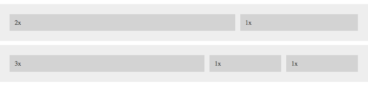
The solution is pretty simple.
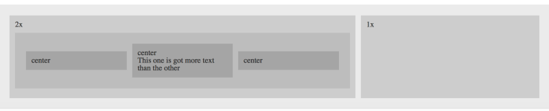
To these specific grid cells, add a modifier class like so:
.row_cell--2 { flex: 2}Have the class included in the markup. See the first child div in the markup below:
<div class="row"> <div class="row_cell row_cell--2">2x</div> <div class="row_cell">1/3</div> <div class="row_cell">1/3</div></div>The cell with the class .row__cell--2 will be 2 times the default cells.
For a cell that takes up 3 times the available space:
.row_cell--3 { flex: 3}
Grid Cells with Specific Alignments
Thanks to Flexbox, each cell doesn’t have to tied to a certain alignment value. You may specify the specific alignment for any cell.
To do so, use modifier classes like this:
.row_cell--top { align-self: flex-start}This will align the specific cell to the top of the row.
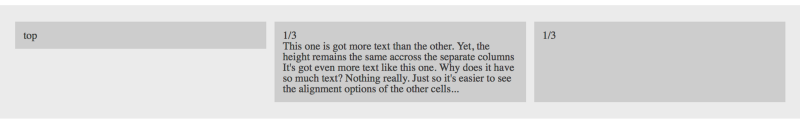
rowYou must have also added the class to the specific cell in the markup. See the first child div in the markup below:
<div class="row"> <div class="row_cell row_cell--top"></div> <div class="row_cell"></div> <div class="row_cell"></div></div>Below are the other alignment options available:
.row_cell--bottom { align-self: flex-end}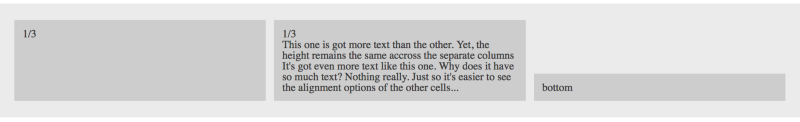
row.row_cell--center { align-self: center}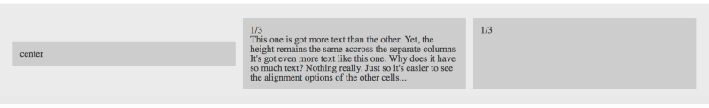
rowOverall Alignment within the Rows
As specific cells can be aligned, so can the entire child elements within the row.
To do this, use a modifier class like so:
.row--top { align-items: flex-start}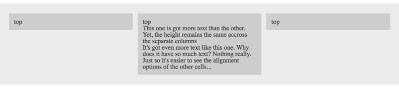
It is important to note that the modifier class, .row--top must be added to the row or the parent flex-container
<div class="row row--top"> <div class="row_cell"></div> <div class="row_cell"></div> <div class="row_cell"></div></div>The other alignment options may be seen below:
.row--center { align-items: center}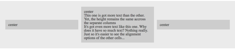
.row--bottom { align-items: flex-end}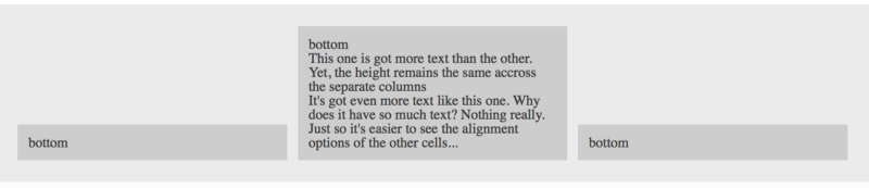
Nested Grids
Without doing anything in particular, these rows can be nested within themselves.
You may view the final grids created here.
Even More Grids
While you can get fancy building grids with Flexbox vertical grids and even more complex configurations, use the best tool for the job. Learn, master and use the CSS Grid Layout. It is the ultimate CSS solution to Grids.
Example 4: How to Build Website Layouts with Flexbox
The community generally frowns upon using Flexbox for full blown web layouts.
While I agree with this, I also think in certain cases you can get away with it.
The single most important advice I can give here would be:
Use Flexbox where it makes sense
I’ll explain that statement in the following example.
The Holy Grail Layout
What better website layout to build than the infamous “holy grail”?

There are 2 ways to attempt building this layout with Flexbox.
The first is to have the layout built with Flexbox. Place the header, footer, nav, article and aside all in one flex-container.
Let’s begin with that.
The Markup
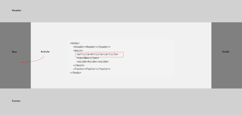
Consider the basic markup below:
<body> <header>Header</header> <main> <article>Article</article> <nav>Nav</nav> <aside>Aside</aside> </main> <footer>Footer</footer></body>Among others, there is a particular rule the holy grail adheres to. This rule has inspired the markup above:
The center column, article should appear first in the markup, before the two sidebars, nav and aside.
Initiate the Flexbox Formatting Context
body { display: flex}Because the child elements should stack from top to bottom, the default direction of the Flexbox must be changed.
body { ... flex-direction: column}1. header and footer should have a fixed width.
header,footer { width: 20vh /*you can use pixels e.g. 200px*/}2.main must be made to fill the available remaining space within the flex-container
main { flex: 1}Assuming you didn’t forget, flex: 1 is equivalent to flex-grow: 1 , flex-shrink: 1 and flex-basis: 0
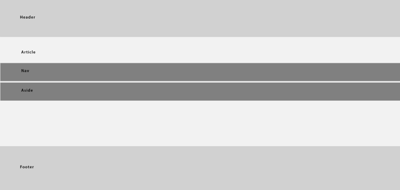
main to “grow” and contain the available remaining space.At this point, we need to take care of the contents within main which are article, nav and aside.
Set up main as a flex-container :
main { display: flex}Have the nav and aside take up fixed widths:
nav,aside { width: 20vw}Ensure that article takes up the remaining available space:
article { flex: 1}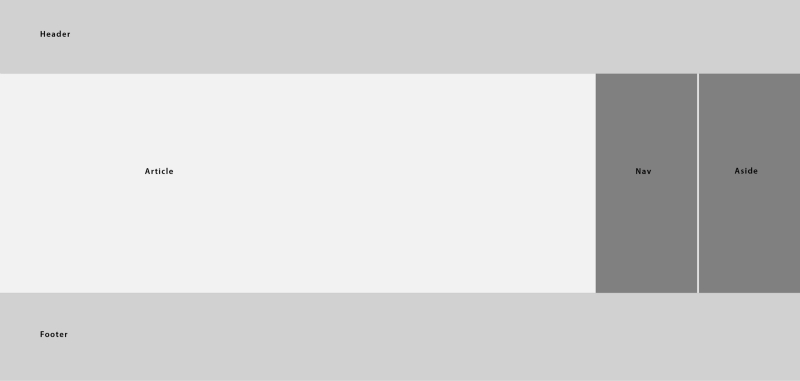
"article" now takes up the remaining available spaceThere’s just one more thing to do now.
Re-order the flex-items so nav is displayed first:
nav { order: -1}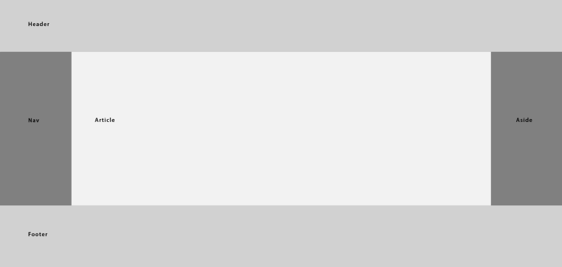
The order property is used to re-order the position of flex-items.
All flex-items within a container will be displayed in increasing order values. The flex-item with the lowest order values appear first.
All flex-items have a default order value of 0.
The Holy Grail Layout (another solution)
The previous solution used a flex-container as the overall container. The layout is heavily dependent on Flexbox.
Let’s see a more “sane” approach. Take a look at the supposed final result again:

header and footer could be treated as block elements. Without any intervention, they will fill up the width of their containing element, and stack from top to bottom.
<body> <header>Header</header> <main> <article>Article</article> <nav>Nav</nav> <aside>Aside</aside> </main> <footer>Footer</footer></body>With this approach, the only flex-container needed would be main.
The singular challenge with this approach is that you have to compute the height of main yourself. main should fill the available space besides the space taken up by the header and footer.
main { height: calc(100vh - 40vh);}Consider the code block above. It uses the CSS calc function to compute the height of main.
Whatever your mileage, the height of main must be equal to calc(100vh — height of header — height of footer ).
As in the previous solution, you must have given header and footer a fixed height. Then go ahead and treat main the same way as in the previous solution.
You may view the actual results here.
2 column website layouts
Two column layouts are pretty common. They are also easily achieved using Flexbox.
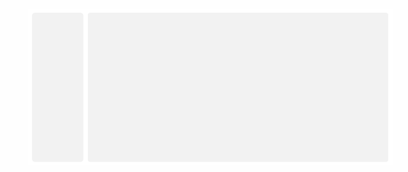
Consider the markup below:
<body> <aside>sidebar</aside> <main>main</main></body>Initiate the Flexbox formatting context:
body { display: flex;}Give aside a fixed width:
aside { width: 20vw}Finally, ensure that main fills up the remaining available space:
main { flex: 1}That’s pretty much all there is to it.
Example 5: Media Objects with Flexbox
Media Objects are everywhere. From tweets to Facebook posts, they seem to be the go to choice for most UI designs.
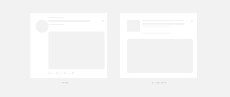
Consider the markup below:
<div class="media"> <img class="media-object" src="/pic.jpg"> <div class="media-body"> <h3 class="media-heading"> Header </h3> <p></p> </div></div>As you have guessed, .media will establish the Flexbox formatting context:
.media { display: flex}By default, the flex-items of a container are stretched along the vertical to fill the available height within the flex-container.
Make sure the .media-body takes up all the remaining available space:
.media-body { flex: 1}
Let’s fix the stretched box.
.media { ... align-items: flex-start}
And that’s it.
A flipped Media Object

You do not have the change the html source order to create a flipped media object.
Just re-order the flex-items like so:
.media-object { order: 1}This will have the image displayed after the .media-body and media-heading
A Nested Media Object
You may even go on to nest the Media object. Without changing any of the CSS styles we have written.
<div class="media"> <img class="media-object" src="/pic.jpg"> <div class="media-body"> <h3 class="media-heading"> Header </h3> <p></p> <!--nested--> <div class="media"> <img class="media-object" src="/pic.jpg"> <div class="media-body"> <h3 class="media-heading"> Header </h3> <p></p> </div> </div><!--end nested--> </div> </div>It works!

A Unicode Media Object
It appears we are not restricted to just images.
Without changing any of the CSS styles written, you can have a unicode represent the image.
<div class="media"> <div class="media-object">?</div> <div class="media-body"> <h3 class="media-heading"> Header </h3> <p></p> </div></div>I have snugged in an emoji there.

Taking away the img and replacing it with a div containing the desired unicode yields the output above.You may grab some more emoji unicodes here.
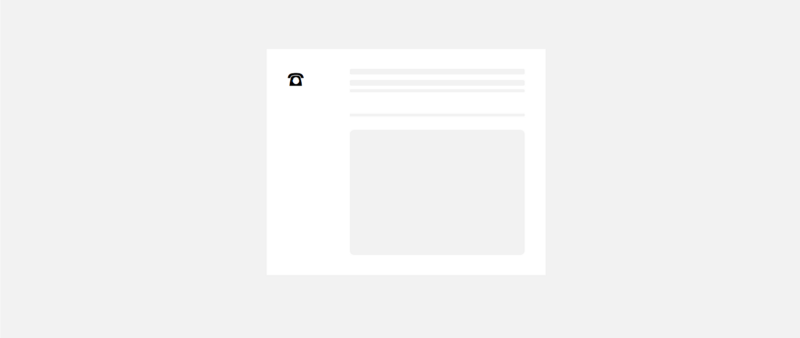
An HTML Entity Media Object
You may have also use html entities as seen below.
<div class="media"> <div class="media-object">☎</div> <div class="media-body"> <h3 class="media-heading"> Header </h3> <p></p> </div></div>The html entity used in this example is ☎ and you may see the result below.
You can view the result of these examples in this CodePen.
Example 6: How to Build Form Elements with Flexbox
It is difficult to find any website that does not have a form or two these days.
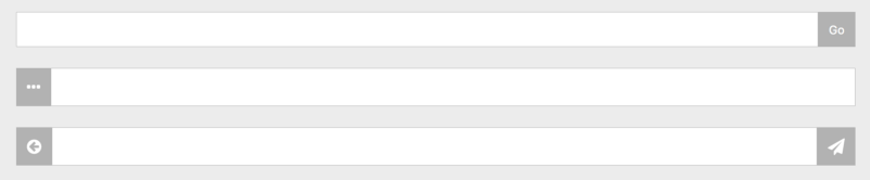
Consider the markup below:
<form class="form"> <input class="form__field"> <button class="form__item">…</button></form><form class="form"> <span class="form__item">…</span> <input class="form__field"></form><form class="form"> <span class="form__item">…</span> <input class="form__field"> <button class="form__item">…</button></form>This example shows the combination of aligning input fields with buttons or spans of text. The solution again is quite easy with Flexbox.
Initiate the Flexbox formatting context:
.form { display: flex}Ensure the input field takes up the available space:
.form__field { flex: 1}Finally, you may style the appended or prepended texts and buttons whichever way you seem fit.
.form__item { ... }You may view the complete result of this example in this CodePen.
Example 7: How to Build a Mobile App Layout with Flexbox
In this example, I will walk you the process the mobile app layout below:
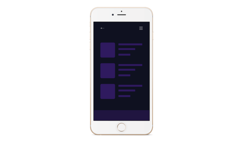
However, this example is different.
I will explain the process of building the mobile layout in pseudo code, and you’ll go ahead to build it.
This will be a form of practice to get your hands wet.
Step 1
Strip the layout off the iPhone, and we have this:
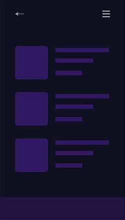
Step 2
Define the containing body as a flex-container
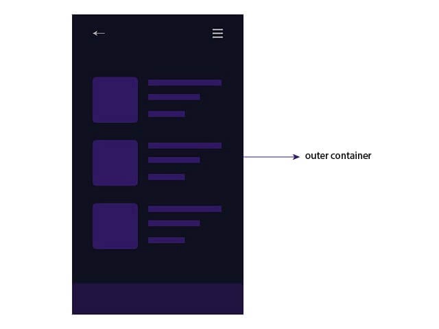
Step 3
By default, the flex-direction of a flex-container is set to row. In this case, change it to column .
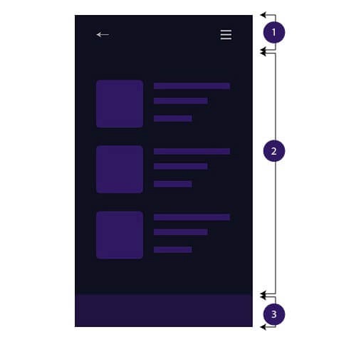
flex-itemsStep 4
Give Item 1 and 3 fixed heights such as height: 50px.
Step 5
Item 2 must have a height that fills up the available space. Use flex-grow or the flex shorthand flex: 1.
Step 6
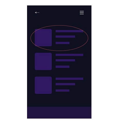
Finally, treat each block of content as a Media Object as seen in an earlier example.
Follow the six steps above to successfully build the mobile app layout successfully.
Want to become Pro?
Download my free CSS Grid cheat sheet, and also get two quality interactive Flexbox courses for free!