React Native components based on the concept of Neumorphism (iOS only)


This package is available on npm, install it with:
npm install --save neumorphism-ui
-
Import neumorphism-ui to your project:
import { NeuButton , NeuView} from 'neumorphism-ui' -
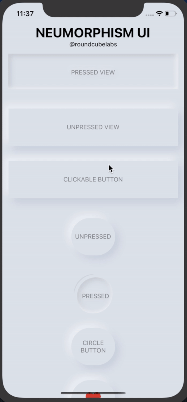
Set background color of container to #e0e5ec, other colors are not supported yet but you can modify it on your own by passing the background and shadow colors with style prop
import React, { Component } from "react";
import { View, Text, TouchableOpacity } from "react-native";
import { NeuView } from "neumorphism-ui";
export default class App extends Component {
  render() {
    return (
        <View style={{width:'100%',height:'100%',backgroundColor:'#e0e5ec'}}>

              {/*NeuView Unpressed with containerStyles*/}
              <NeuView pressed={false} containerStyle={{ marginTop: 30 }} >
                <Text style={{ opacity: 0.4 }}>UNPRESSED</Text>
              </NeuView>

              {/*NeuView pressed with viewStyles*/}
              <NeuView pressed={true}  style={{ height: 100, width: 100, borderRadius: 50 }}>
                <Text style={{ opacity: 0.4 }}>PRESSED</Text>
              </NeuView>

              {/*NeuView pressed with contentStyles*/}
              <NeuView pressed={true}  style={{ height: 400,}} contentStyle={{ justifyContent: 'center', alignItems: 'center' }}>
                <Text style={{ opacity: 0.4 }}>PRESSED</Text>
              </NeuView>
      </View>
    );
  }
}
For a much detailed example take a look at the /example directory.
import React, { Component } from "react";
import { View, Text, TouchableOpacity ,Image,Alert} from "react-native";
import { NeuButton } from "neumorphism-ui";
export default class App extends Component {
  render() {
    return (
      <View style={{width:'100%',height:'100%',backgroundColor:'#e0e5ec',justifyContent:'center',alignItems:'center'}}>

          {/* Circle NeuButton that stays pressed once clicked */}
            <NeuButton style={{ height: 150, width: 150, borderRadius: 75 }}
                onPress={() => {
                  Alert.alert("I was pressed")
                }}
                onUnpress={() => {
                  Alert.alert("I was unpressed")
                }}
              >
                <Text style={{ opacity: 0.4, textAlign: 'center' }}>NeuButton with listeners</Text>
            </NeuButton>

            {/* Rectangular NeuButton that doesn't stay pressed once clicked */}
            <NeuButton style={{ height: 70, width: 120, borderRadius: 50 }} noPressedState={true}
                onPress={() => {
                  Alert.alert("I was pressed")
                }}
              >
                <View style={{ flexDirection: 'row', alignItems: 'center', justifyContent: 'space-between', width: '60%' }}>
                  <Image
                    resizeMode="contain"
                    style={{ height: 30, width: 30 }}
                    source={{ uri: "https://www.freepnglogos.com/uploads/heart-png/emoji-heart-33.png" }} />
                  <Text style={{ fontWeight: 'bold', opacity: 0.4 }}>LIKE</Text>
                </View>
            </NeuButton>

      </View>
    );
  }
}
For a much detailed example take a look at the /example directory.
PRs, suggestions and feedbacks are welcome!