


 Anastasia Marinicheva is UI/UX Designer with a heavy focus on awesome interfaces, creative solutions, and great user experience. She has over 5 years of experience in design and is a Young Judge at Awwwards. Find tips, freebies, & giveaways on her Instagram.
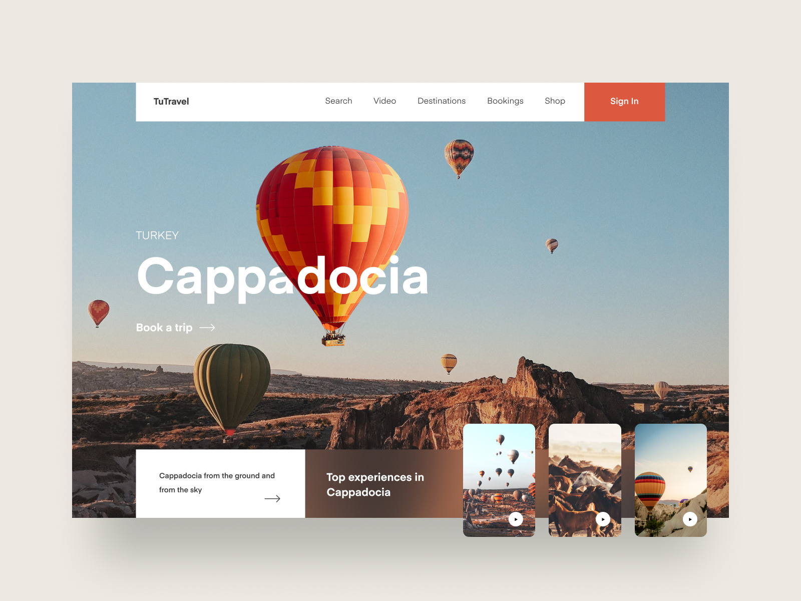
Many designers underrate the value of photography in web design. To be honest, I spend hours searching for really good photos. The problem is, you need to know what you’re looking for. In this article, I’ll show you the best kinds of photos to use in UI design, and the kind of photos you should steer clear of.
Why is this important? Photography can set the mood of a design. When it comes to web and mobile digital products, photography is one of the most powerful tools to establish how a brand is expressed. A well-placed photo can tell a story in a single glance, much more efficiently than words can.
Here are a few tips to keep in mind when using photography in user interface design:
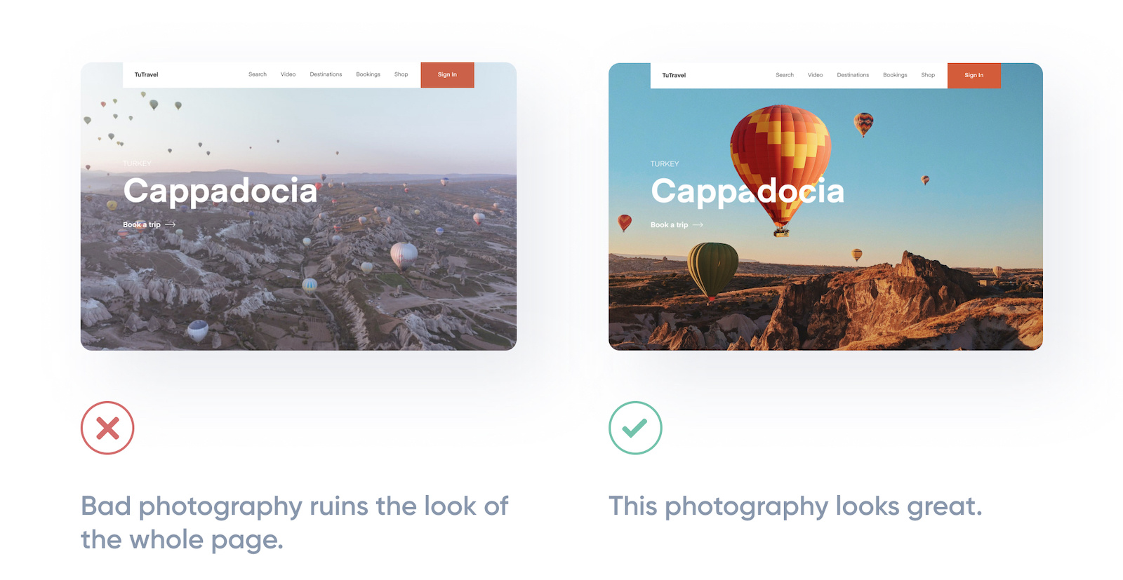
1. Stick to high-quality photos
Bad photos will ruin a design—even if everything else looks great.
If your design needs photography and you’re not a talented photographer, you’ve got two options: hire a professional photographer or use high-quality stock photography. Almost every time, I choose the latter. This option works best if your needs are more generic.
There are tons of great resources out there where you can purchase quality stock photos. There are even sites that offer beautiful photography for free. I’ll provide you with a list of resources at the end of this article.
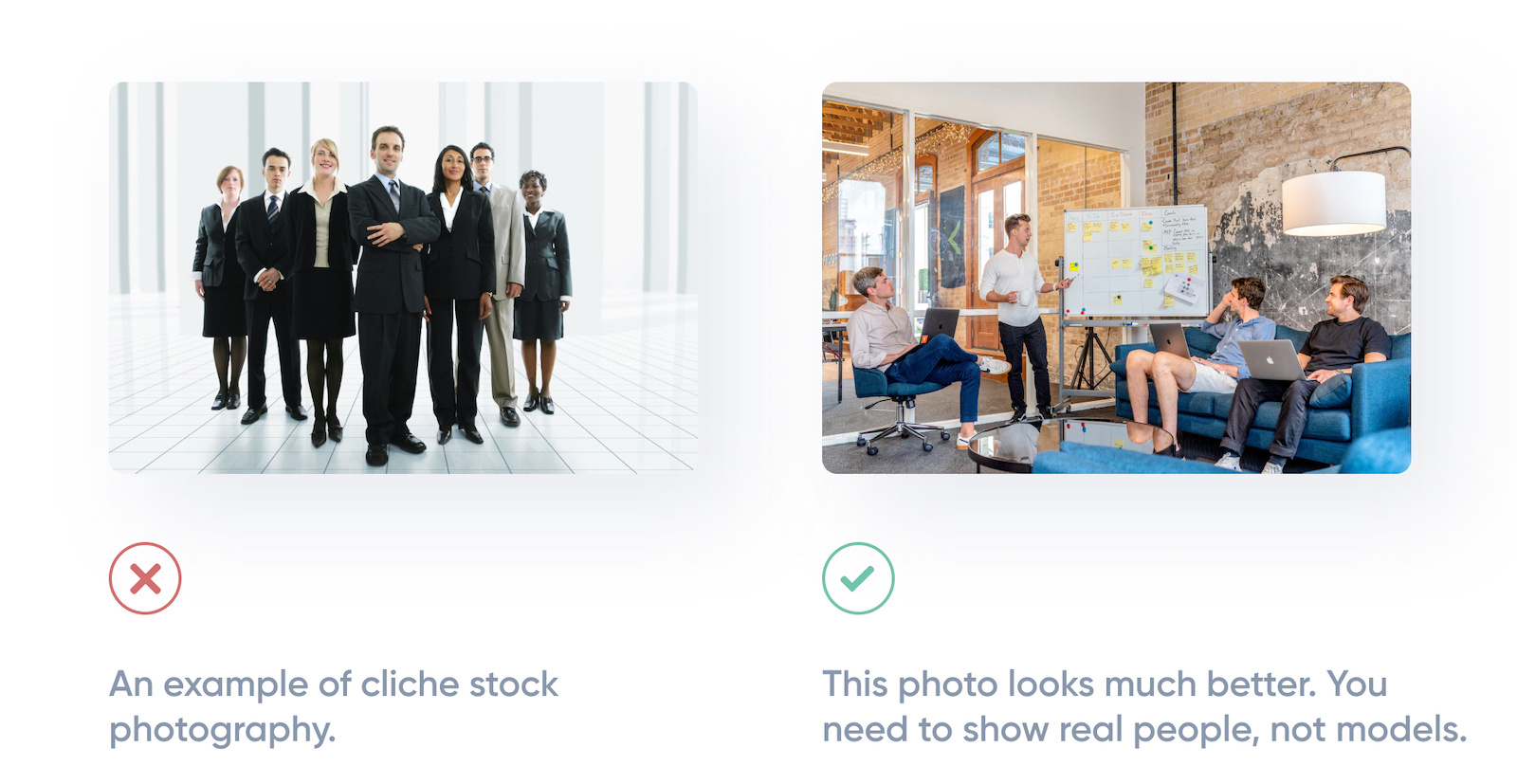
2. Leave the ‘stock’ out of the stock photography
While stock photography is a great option for sourcing high-quality photos, it’s important that you choose your photos thoughtfully.
How many web screens have you seen showing the same happy, smiling faces? Competent-looking business people in crisp suits? Try to avoid clichés and generic-looking stock photography when you can. This will help your designs feel more authentic and human.
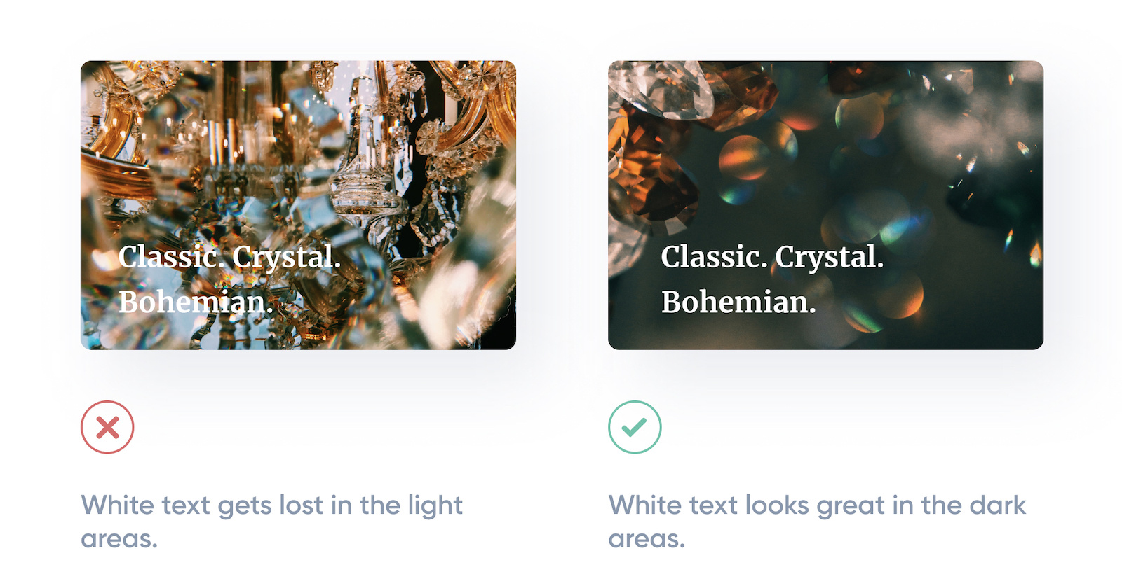
3. Ensure any text has consistent contrast
Have you ever tried slapping a headline onto a big hero image and it was hard to read? That’s because the problem is the image. Photos can be very dynamic, with a lot of really light areas, and a lot of really dark areas.
If you must use a certain photo, you can solve the contrast problem with one of these techniques:
- Adding an overlay
- Lowering the image contrast
- Colorizing the image
- Adding a drop shadow to your text
4. Only use relevant imagery
Not all images improve the experience. Some of them just take up space or, in the worst case, confuse the user.
Users react to visuals faster than text, so make sure your content matches the supporting visuals. You should select images that have a strong relationship with your product goals and ensure that they are context-relevant.

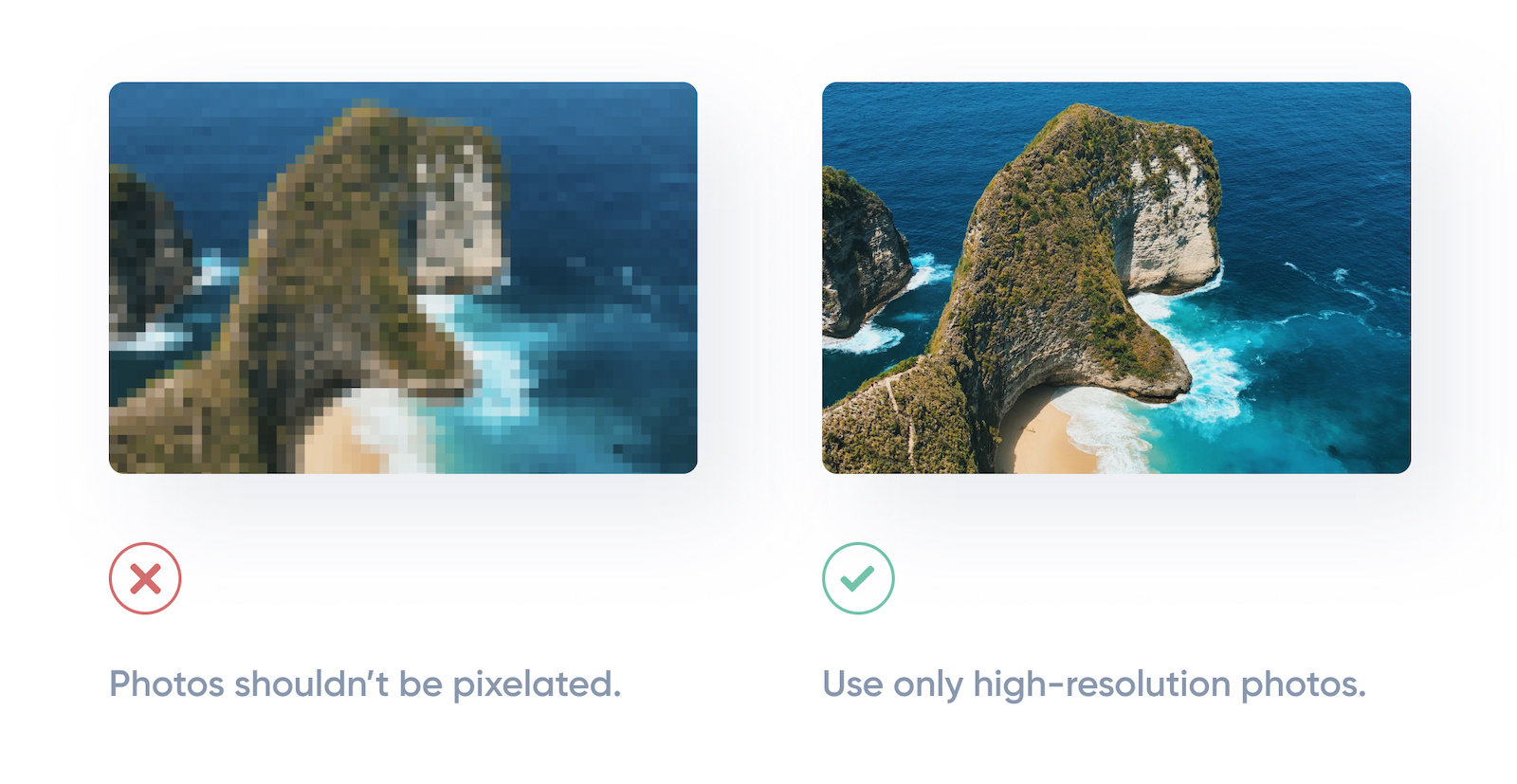
5. Use high-resolution photos
Low-resolution images can have a significant impact on your users. Sometimes this can be a result of not optimizing your images properly or choosing small images and then scaling up.
In any case, make sure your photos are not blurred or pixelated. When downloading a photo you must remember: the higher the resolution, the better.
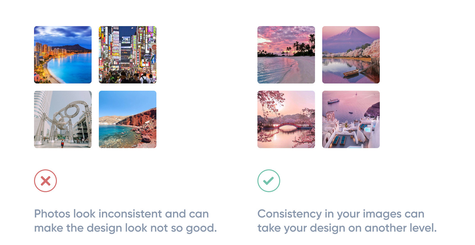
6. Repeated visual motifs
Good design has unity: it binds together as one entity, with each element supporting the others structurally and viscerally. That’s a challenging goal to achieve. But I promise that your design will look much better if you try to make your photography look similar.
You can check out my Dribbble Profile for inspiration. I try to ensure all photos complement each other and every design is uniform.
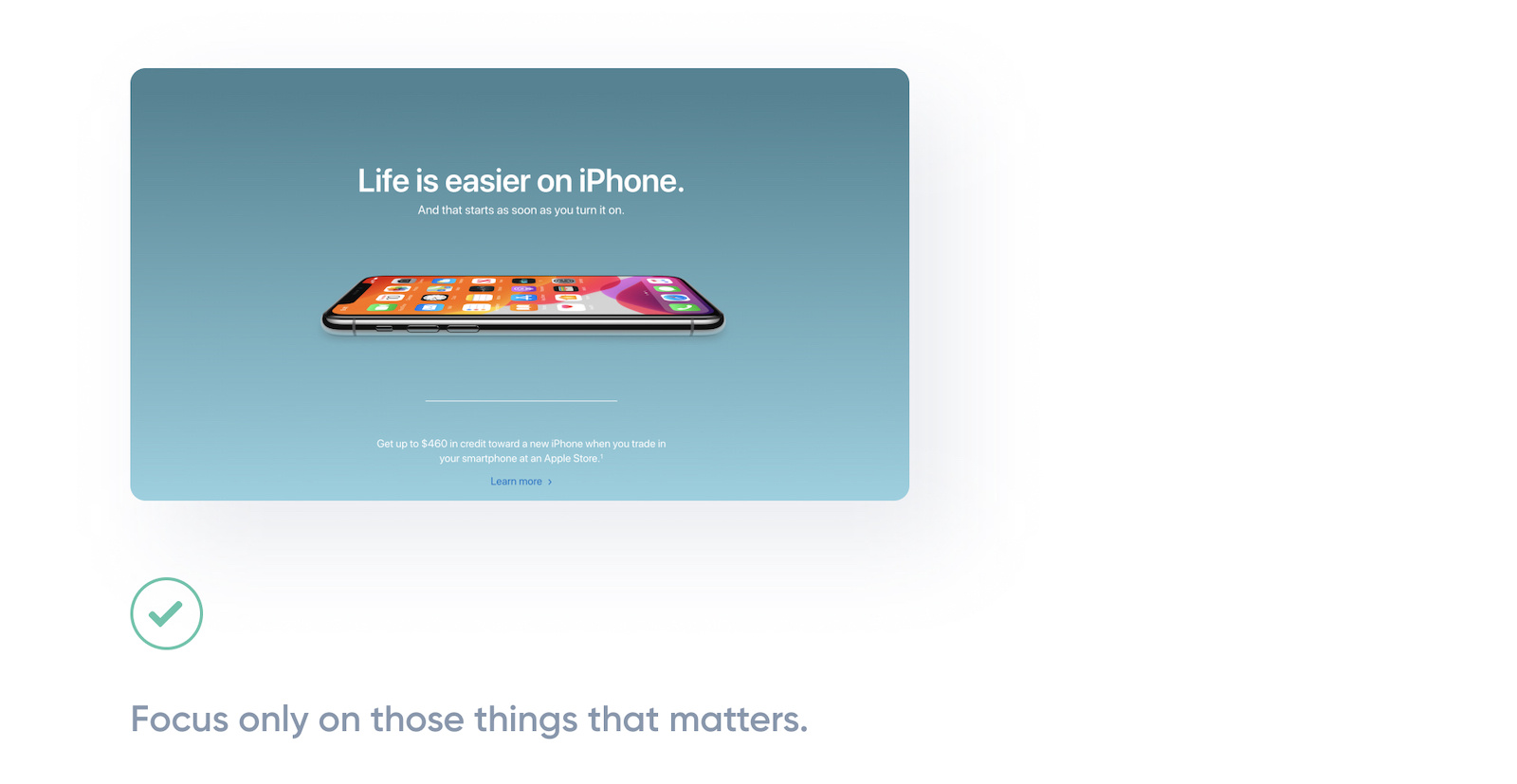
7. Less is more
You’ve probably heard this phrase before, right? Sometimes the best decision you can make is to focus on your product, so you can easily grab the user’s attention.
Apple’s homepage is a good example of a focus on imagery. It’s elegant, clean, and uses a huge amount of white space and large, full-screen images to create a bold design. You can visit any page on their website and see “less is more” being practiced—obviously a favorite rule for Apple.
Amazing resources with breathtaking free stock photos:
Hopefully, after reading this article you feel much more confident about using photography effectively in UI design. As promised, here are a few stock photography sites to explore if you don’t have the means to hire a photographer. These are also my personal favorites:
1. Unsplash
This is my absolute favorite. The photos are so professional and good looking you may not believe it’s all for free! You can see that they hand-select every photo and accept only the best.
2. Pexels
Also a great website with photos that are nicely tagged, searchable, and easy to discover through their discover pages.
3. Pixabay
If you didn’t find what you wanted on the previous websites, you can try Pixabay. They’ve got over 1.7 million+ high-quality stock images.
Anastasia Marinicheva is UI/UX Designer with a heavy focus on awesome interfaces, creative solutions, and great user experience. She has over 5 years of experience in design and is a Young Judge at Awwwards. Tips, freebies, & giveaways are waiting for you on her Instagram.
More UI Design Resources
- How to improve your UI design skills: 5 tips from the pros
- 3 useful tips for designing neumorphic interfaces (soft UI)
- How to experiment with asymmetrical grids & layouts in UI design
Find more Process stories on our blog Courtside. Have a suggestion? Contact stories@dribbble.com.


