How to Organize Your CSS with a Modular Architecture (OOCSS, BEM, SMACSS)
I loved Lego blocks.
They were by far my favorite toys—had loads of ‘em!
See, I’m a designer, son of a designer. Lego blocks were our first creativity sandbox: they allowed us to assemble all sorts of crazy things.
I didn’t know why I loved them so much back then. But now I do.
It wasn’t their colors, or their 7K pieces Millennium Falcon. Nope.

It was how perfectly each piece fit together, in every possible way.
This would speed up our frontend development, making it more robust, more organized. Our HTML would get smaller, and our CSS would get MUCH more manageable.
In this article, I’ll show you how to organize your CSS architecture into HTML/CSS blocks that behave more like Lego blocks.
To do so, I’ll introduce three important modular CSS methodologies:
OOCSS
BEM
SMACSS
These will help us create interface components that are easier to understand, maintain and reuse.
I’m betting these will become part of your workflow, regardless of the frontend framework you’re using. If you’re using one, that is.
Know thy acronyms (OOCSS, BEM, SMACSS)
Ancient CSS Joke - Two CSS rules enter a bar. A bottle falls in a totally different bar.
What is OOCSS?

Object Oriented CSS (OOCSS)—and everything that comes with this paradigm shift—is the conceptual foundation for better interface design and development. It states that interfaces are made of multiple components, which should be re-used as much as possible.
Similar to object-oriented programming, OOCSS focuses on flexible and reusable components, each doing one thing well. This alone encompasses basic programming principles such as single responsibility principle, separation of concerns and DRY.
It also checks one essential UX and Graphic Design box: Consistency. By re-using a similar button design throughout the interface, users get familiar with it, and the app feels more intuitive each new session. With OOCSS, we’re merely re-using code, making it faster and easier to create more things, without adding significant overhead to the codebase. DRY CSS, people!
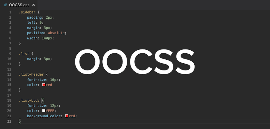
Nicole Sullivan wrote this post back in 2010 (never too late to catch up 🤷♂️), explaining the power of OOCSS in the media object. The main takeaway from that article is the ability to isolate and abstract interface patterns into self-contained code blocks for both HTML and CSS. Here is an example of Nicole’s Media Object:
<div class="media">
  <a href="#" class="img">
    <img src="" alt="" />
  </a>
  <div class="bd"></div>
</div>
.media {...}
.media .img {...}
.media .img img{...}
.media .imgExt{...}
.bd {...}The idea here? Encapsulate the component so it won’t require styles from anywhere else in your CSS to work properly. Once you have that, you can start putting the Media component everywhere in your interface, and it should behave consistently in every instance.
What is BEM?
BEM is a concrete application of the OOCSS principles, created by Yandex.
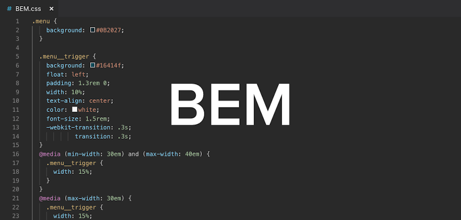
It stands for Block, Element and Modifier, and is a crazy complicated framework. Nicolas Gallagher simplified BEM’s naming convention, which was then made famous by Harry Roberts. IMO, the simplified version is already powerful enough for most needs. I personally never used the original one.
Here is the previous code example, using BEM namespaces.
<div class="media media--inverted">
  <a href="#" class="media__image-wrapper">
    <img class="media__image" src="" alt="" />
  </a>
  <div class="media__content"></div>
</div>
.media {...}
.media--inverter {...}
.media__image-wrapper {...}
.media__image {...}
.media__content {...}
// With SASS - which will output the code above
.media {
...
&--inverter {...}
&__image-wrapper {...}
&__image {...}
&__content {...}
}One great thing about BEM is specificity control. By using the naming convention stated above, we are automatically flattening our specificity to .class single selectors, or [0 0 1 0]. If you find the cascade specificity too complicated—you’re not the only one—keep this in mind:
ALWAYS USE .class SINGLE SELECTORS.
For the next few paragraphs, I assume you understand what [0 0 1 0] means. If you don’t, read this first.
Specificity is hard, but once you understand it, you can leverage it pretty quickly. By following BEM’s naming convention, we’ll already have 90% of our styles at [0 0 1 0]. This alone will make our lives way easier. If you stick to that, the order of your @imports will matter a lot, so keep an eye out for that.
By switching to a semi-strict regime of only using single CSS selectors, you’ll be able to tame specificity fairly easily.
Assuming you have your components at [0 0 1 0], you could add an ID to the body of each page and scope some overrides for that page. Scoping your overrides with that ID will ensure they all work regardless of the order of the styles in your code since they are at a much higher specificity [0 1 1 0].
Quick note: If you use the same override in two different pages, it probably makes sense to abstract that into a &--modifier.
Again, these overrides should be pretty minimal. This technique I use is based on concepts I took from SMACSS and Atomic Design by Brad Frost.
What is SMACSS?
SMACSS is the acronym for Scalable and Modular Architecture for CSS, created by Jonathan Snook with large projects CSS codebases and teams in mind—he used to work at Yahoo and Shopify. Jonathan came up with several neat ideas and CSS file structure best practices, which he compiled in the SMACSS book.
SMACSS 2nd edition is from 2012, long before the components & React craze. To me, the most exciting part in SMACSS is the clever use of wrappers and containers to make components fit perfectly everywhere. These techniques are fundamental to the component approach—remember the Lego blocks. However, these techniques require a lot of discipline when writing CSS properties so they don’t interfere with how components interact together.
CSS Component Modularity Theory
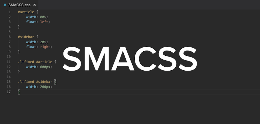
.block
  .block__element
  .block__slot
.block would never have CSS properties such as float:left or margin-top: 20px. These would interfere with the external components, making them behave inconsistently in more than one instance.
Another best SMACSS practice I find useful is the concept of the container or slot. This works like the <slot> element in Vue.js, from where I pulled the name. You create a “safe space” in which you can drop components. It will follow the same idea from the previous example, where we wouldn’t add properties such as padding to the .block__container. Adding a padding would interfere with the components inside. We don’t want that.
These two CSS architecture best practices will already make our CSS pretty modular and “well-behaved.” As you can see, we’re only applying a component approach to the creation of HTML and CSS that’s independent of the framework we’re using.
So SMACSS is about more than how to organize CSS properties: its main advantage is modularity.
If you follow these guidelines, your HTML/CSS can be easily implemented in any of the major JS frameworks, since it already follows the conceptual structure.
Framework-agnostic, modular CSS for the win
My goal is simple: organized, maintainable CSS.
I study these methodologies to be a better interface designer and developer. Being able to effectively build isolated components is absolutely necessary for modern interfaces. Because of the multitude of frameworks, I tried to step back and see what the minimum requirements to develop “framework agnostic” interface components were. Currently, I use a Jekyll boilerplate: it provides me with the tools I need to create interfaces and styleguides, and isn’t locked into any specific framework.
The concept of OOCSS and web components are pretty much the same thing when it comes to styling. Creating independent interface components is the best solution we came up with so far, and there are hundreds of articles on it.
BEM is especially useful when working on a more traditional setup, where it serves the double purpose of scoping the styles for that component and adding the context information to the elements. But now that I got used to it, I end up using BEM classnames even in React or Vue.
SMACSS` clever use of containers and wrappers, makes sure components work well with each other and fit anywhere. Also, its excellent CSS file organization can be used somewhat like Atomic Design, but simpler. For smaller projects, this works like a charm.
OOCSS coupled with BEM & SMACSS, will help you kiss spaghetti code goodbye, regardless of your stack or framework!
(Don’t) Follow the white rabbit
https://www.datocms-assets.com/48401/1627663167-follow-the-white-rabbit.webm
You know one thing I realized? Us humans have a tendency to go down rabbit holes and, once inside, get our judgment distorted.
What does this have to do with CSS?
The methodologies I explained here are fairly simple and already powerful enough for most of our projects. However, the people that created them were trying to solve bigger problems than ours—think styling for Yahoo, or Yandex. They were dealing with huge codebases and millions of pageviews, so maintenance was really tricky. From there, theories were created and then perfected, turning into very strict frameworks. This, in my opinion, is where things get unnecessarily complex for the rest of us. Since most of us are not dealing with this level of complexity, one could even argue that OOCSS is not necessary. Maybe. But it helps, a lot.
Implementing a full BEM modular system on a small website is definitely killing a mosquito with a bazooka. Still, understanding OOCSS concepts and applying them lightly on a small project will help you get up to speed with these theories. One step at a time, you will see the benefits to your workflow.
The critical part of OOCSS is the paradigm shift, not which tool or methodology you use. Learning to think in components, identifying them, and coding them independently will drastically improve your work.
The learning curve is not steep at all. I was able to teach these basic concepts to an intern here at my studio throughout a few conversations. Obviously, she didn’t become a ninja on the next morning, but the concepts started to sink in, and a few weeks later, she was already writing pretty decent components.
In my opinion, identifying CSS architecture patterns is the most important skill, while the hardest one to learn is the Modularity one from SMACSS. The latter requires lots of discipline to carefully evaluate which CSS rules will interfere where, especially with the “slots.”
Once the BEM naming kicks in, you’ll start to read the patterns in many Codepen and StackOverflow posts, and you will really understand the value of the extra context information they carry.
Resources to help organize your CSS architecture
These are the official theories for BEM. I recommend starting with the simplified version. It already contains more than most of us need.à
This is the official documentation for this methodology. I also recommend this CSS architecture course at Frontend Masters.
Now for similar concepts that will make sense once you start to get involved in the whole component way of designing interfaces:
Atomic Design book by Brad Frost
Styleguid.es is an adjacent subject to this, but is a very good collection of styleguides, which are mostly written using OOCSS in mind. Here you will be able to see the end result of these techniques.
Closing thoughts
I stumbled upon SMACSS and BEM a few years ago, while looking for better ways to write CSS. I rejected BEM at first, thinking it was overkill and that the classnames were too weird.
A few months later I was working on a Styleguide project, in which I used the naming convention from SMACSS. That worked reasonably well, but once other developers started to use it, some issues began to pop. Specifically, issues with nesting and conflicting styles. These were my cues to switch to BEM classnames. No need to mention the pain of re-writing the whole styleguide in a different naming system. Now, this styleguide is being used by developers all over the world, and it seems to me that nothing is breaking. (Sorry for not sharing the styleguide link, it’s a private one)
Nowadays, I have roughly 10 projects running simultaneously, and an archive of about 30 projects designed and developed using the component mindset. I can’t say how many times I just opened up a folder from 2016 with an elegant component, like a table or card, and only imported that SASS partial into my new project. Once you use modular CSS, it becomes a no-brainer to use your past projects as a decently organized archive of interface components.
After getting the hang of it, there is almost no effort to understand the HTML and CSS structure: it is so nicely organized, following a very straight-forward concept with most of its pieces isolated.
Have you ever spent a few hours trying to understand WTH you did in that project two years ago? That stopped happening in my team.
So I strongly invite you to experiment with the methodologies I discussed.
Who knows, it might just future-proof your CSS architecture for 2018 and beyond!
If you've enjoyed this post, please take a second to share it on Twitter. Got comments, questions? Hit the section below!


