
To mark each mid-year and end-of-year milestone I take a reflective glance over the previous 6-month period in the data visualisation field and compile a collection of some of the most significant developments. These are the main projects, events, new sites, trends, personalities and general observations that have struck me as being important to help further the development of this field or are things I simply liked a great deal. Here’s the full compilation of all my collections.
At the end of last year I published a collection for the latter 6 months of 2015 and now I’d like to reflect on the first 6 months of 2016. I look forward to hearing from you with suggestions for the developments you believe have been most significant.
And so, as ever, in no particular order…
1. Climate spirals
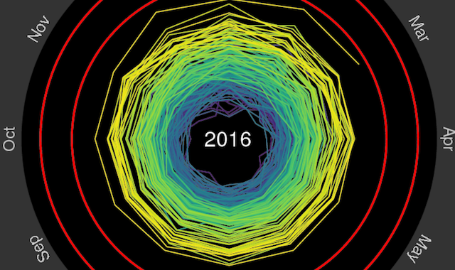
Produced by Dr Ed Hawkins, Climate scientist at the University of Reading, this animated spiral plot of global temperatures since 1850 to date went viral on social media, providing what some observers described as the most compelling illustration of the dramatic changes in our climate.
2. PolicyViz podcast
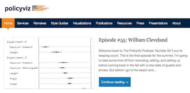
Whilst the PolicyViz podcast, hosted by Jon Schwabish, has been going for over a year, I feel it is has really established deserved prominence across the field over the past 6 months in particular. Jon is a natural, charismatic host and interviewer and he has developed a terrific rhythm, both within the episodes – through the style, angle and pace of the conversations – and between episodes – skilfully navigating around his Rolodex of contacts to cover the field’s diversity from all angles. He’s also landed some major names rarely heard elsewhere, with appearances from Edward Tufte and William Cleveland to mention just a couple. At roughly 20/25 minutes in length it offers a bite-sized companion to the enduringly popular Data Stories episodes that tend to be closer to 60 minutes in duration.
3. Lisa Rost
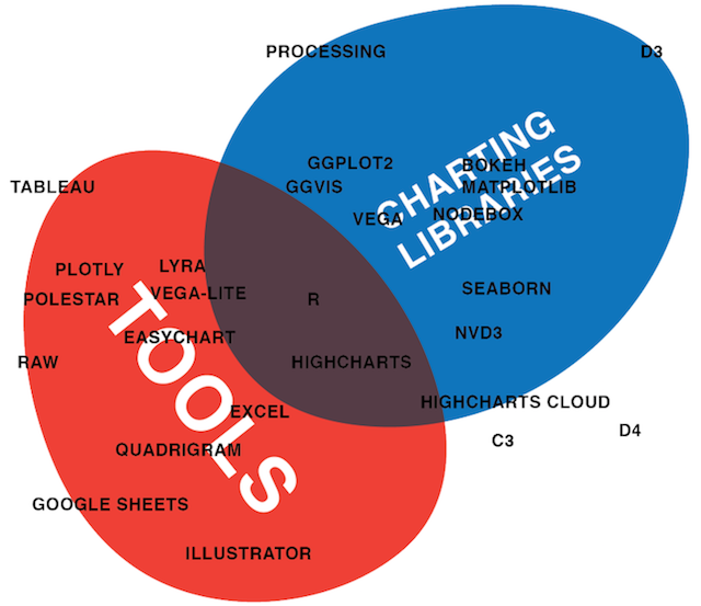
Lisa is a Knight-Mozilla OpenNews fellow in the NPR visuals team, based in Washington, DC. Whilst I’ve been aware of Lisa and her work long before this recent period, it is certainly over this last 6-months that she has become increasingly prolific and visible in her contributions to discourse around the subject. Just two contrasting examples of her outputs include (1) a truly wonderful piece of work comparing the task of creating the same chart in 12 different tools and using 12 different libraries and (2) during her time at NPR she is blogging every single day about her work. I also loved this comparison of the latitudes of notable cities across the planet’s continents.
4. Polygraph
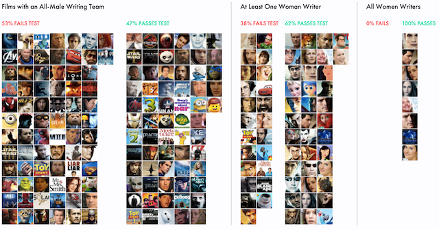
Polygraph is not new to me but I feel the quality and ‘interestingness’ (genuine word) of work emerging from Matt Daniels and his team of collaborators during 2016 has been really superb. The purpose of Polygraph is to offer “a publication that incites water cooler discussion about complex topics”. What separates their from many others, in my opinion, is the clarity of the core curiosities that drive their fascinating array of data-driven investigations into subjects around popular culture, looking into subjects like the evolution of music taste, Hollywood’s gender divide and its effects on films and the most timeless songs of all time. There is a terrific Data Stories episode 74 profiling and discussing Matt’s work.
5. Lena Groeger’s ‘Visual Evidence’ articles
For eagle-eyed readers of my site, it will come as no surprise to hear I am a huge fan of Lena Groeger’s thinking around data vis. I’ve celebrated her work in previous review posts (2014, 2015) and have included her again this time because of her excellent new series of astute, long-form ‘Visual Evidence’ articles (Update: Flipboard collection also here) where she goes in to depth about quite niche slices of interest about ‘data and visual design in everyday life’. Put the kettle on, make yourself a cuppa and set aside some time to read them.
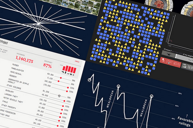
6. Spies in the Skies
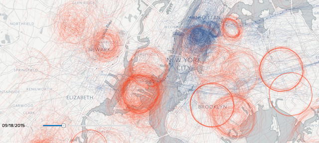
This is already an award-winning data journalism project by Peter Aldhous and Charles Seife of Buzzfeed News, analysing the patterns of U.S. government aircraft, piloted by agents of the FBI and the Department of Homeland Security (DHS), that routinely take to the skies over American cities. As the project article explains “the government’s airborne surveillance has received little public scrutiny — until now. BuzzFeed News has assembled an unprecedented picture of the operation’s scale and sweep…”. It has justifiably received many plaudits from across the spectrum of commentators for hitting that sweet-spot again of excellence in data handling, compelling angle of investigation and terrific visuals.
7. Makeover Monday
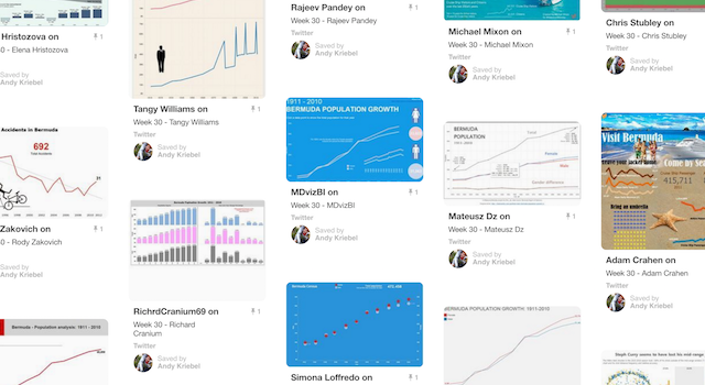
This has been a super concept developed by Andy Kriebel and Andy Cotgreave based on a weekly challenge to take the data from an existing project and invite the Tableau community to propose makeover redesigns to explore the different potential creative avenues. Over the course of the year it has grown a loyal and committed following of people creating redesigns of works, importantly, in the entirely appropriate spirit of constructive critique rather than unsubstantiated criticism.
8. Pie chart studies
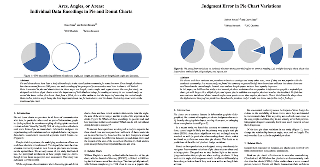
Co-authored by Robert Kosara and Drew Skau, some important new research about pie charts. “Pie charts? Don’t we know everything about why pie charts are evil and really dumb?”, might be the words uttered by a few. However, this work is really significant because, in response to the question “do we know how we read pie charts? Is it actually angle, as is usually claimed, or is it really arc length or maybe area?”, Robert and Drew discovered that there was no actual research to back up the claims that it was indeed angle. Furthermore, “the common wisdom about how we read these charts is almost certainly wrong, and that things are much more complicated than we thought”. The pair of research papers looked at (1) ‘Arcs, Angles, or Areas: Individual Data Encodings in Pie and Donut Charts’ and (2) ‘Judgment Error in Pie Chart Variations’.
9. Interactive approaches at the (New York) Times, they are a changin’
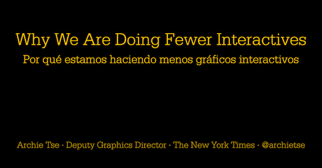
When any folks from the New York Times speak, you listen and you learn, but when Archie Tse speaks at Malofiej 24, and the title of his talk is about ‘Why we are doing fewer interactives?‘, you really know it is time to listen and learn. I wasn’t there to watch this talk, let me establish that upfront, but it is clear from the contents that this is something significant. I’m not going to repeat the main takeaways from this, just go through it yourself (it is quite short) and you’ll learn about ‘three rules for visual storytelling’ and the main ways the NYT graphics team are changing their approach to creating the types of experiences their users are clearly demanding/responding to.
10. Data Journalism’s ‘Dirty little secret…’
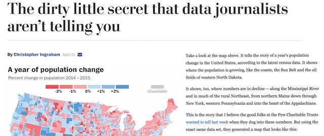
On the topic of newspaper based visual journalism, this article by Christopher Ingraham on the Wasington Post’s Wonk Blog really struck a chord with me. It talks about the ‘veneer of authority and objectivity’ that numbers and graphical representations can convey to readers, despite the fact that, as makers of these things, we introduce so many subjective decisions about what to show, what to include and how to show it.
Special mentions…
Here are the other highlights from the first half of 2016 that deserve a special mention:
Kennedy Elliott’s OpenVis talk | Whilst we are discussing the Washington Post, two more special mentions for their work/colleagues. Firstly, this super interesting talk/article created by Kennedy discussing her reflections on investigating ’39 studies about human perception’.
NFL Draft History | Secondly (or should it be thirdly), this incredibly in-depth, highly customisable and hugely varied analysis of the NFL’s draft history.
FT’s changing approach | I already noted the changes and quality of visualisation work coming out of the FT in last year’s 6-monthly review but this is a really nice account, a few months on, of the changes being made, in particular, since the arrival of Alan Smith to the team.
Chriming | Just a beautiful piece of work by Seoul-based Sook Ko visualising bird song through the metaphor of branches, trees and forests.
Nadieh Bremer | Like Lisa, mentioned above, Nadieh is a (self-described) ‘Astronomer-turned-Data-Scientist-turned-self-taught-Data-Visualization-Designer’ who has been very active and visible this year, producing a wide range of fascinating visual projects, tutorials, talks and resources reviews.
WSJ’s Hamilton | A really innovative piece about the musical “Hamilton” and looking at “how some of the most densely packed, complex rhyming lyrics in the history of musicals actuallyl work”.
Nicholas Rougeux | Nicholas is another designer who has really appeared consistently on my radar in recent months with his interesting, inventive and wonderfully elegant visualisation explorations.
Flag Stories | A very simple subject in theory but a super nice and super dense array of visual analysis studying the attributes of the flags of the world, created by Denmark-based studio, ferdio
Tamara Munzner’s new blog | Tamara has started a blog and things are better because of it.