A real HorizontalListView for Xamarin Forms

WARNING the HorizontalListView has been renamed to CollectionView since version 2.0.
 |
https://github.com/roubachof/Sharpnado.CollectionView |
 |
As I said in my previous Xamarin Forms: it works post , during the making of the Exalt Training app, I had to implement a "real" HorizontalListView, with snap effect.
As I was looking for a decent horizontal listview, I realized that none really existed so far, there were some tricks to achieve something close (like the modified Grid by miguel). Or some naive implementations (https://causerexception.com/2018/02/06/xamarin-forms-ultimate-horizontal-list-guide/).
But we wanted snap (to first item), and view recycling as we could have many views (50+). So I had to implement one.
So I present you Sharpnado's HorizontalListView with features such as:
- Snapping on first or middle element
- Padding and item spacing
- Handle
NotifyCollectionChangedActionAdd/Remove/Reset actions - View recycling
- Grid or linear layout
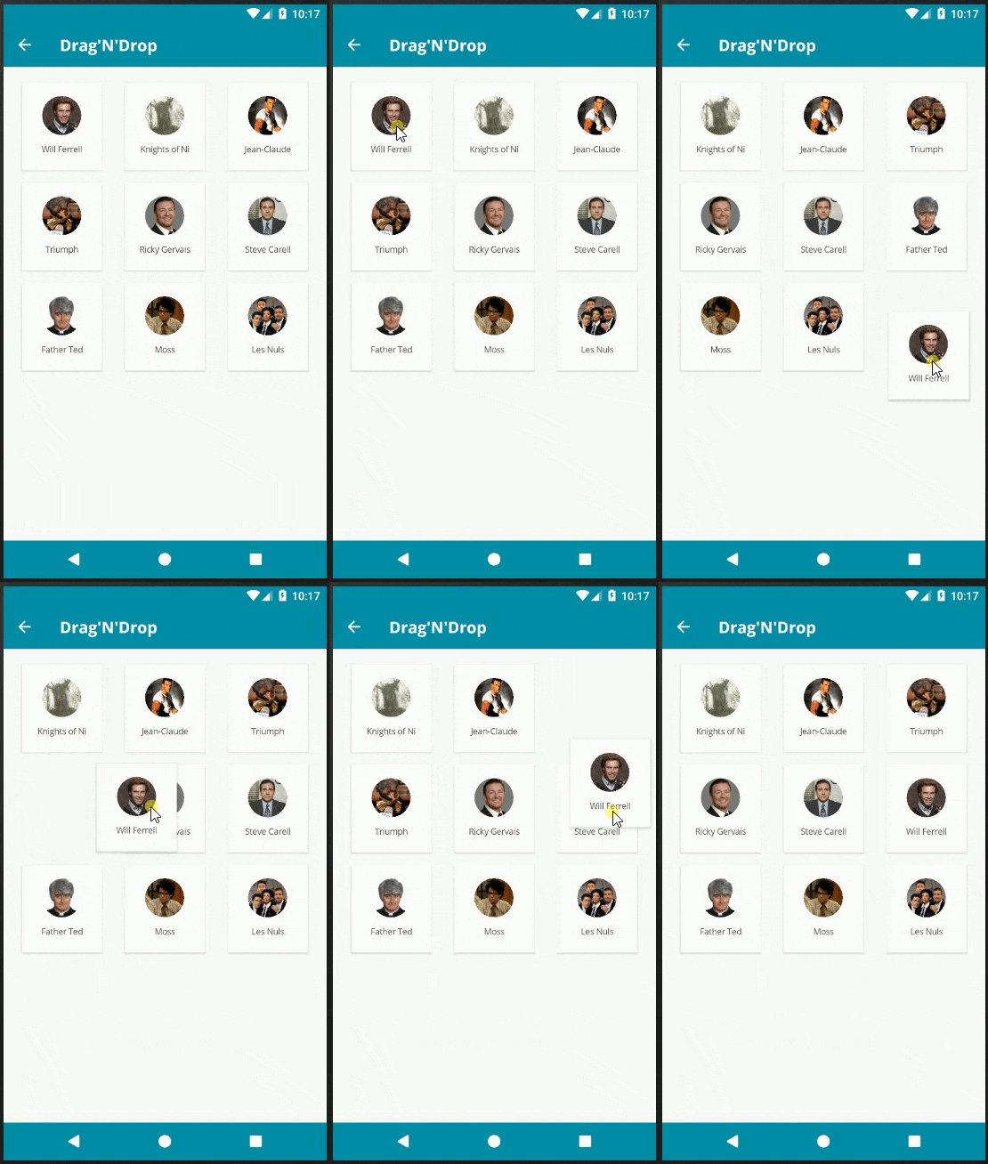
- Drap and drop in Grid layout
- Implemented by
RecyclerViewon Android andUICollectionViewon iOS
This item collection is in fact very close in terms of philosophy and implementation to what will provide the future Xamarin CollectionView. So if you need a horizontal list view or a grid view and can't wait for the release, the HorizontalListView is here to fill the gap ;)
It's available in 2 Nuget flavors:
- Sharpnado.Presentation.Forms (which include several others components like the increeeedible
TaskLoaderView) - Sharpnado.Forms.HorizontalListView (
HorizontalListViewwith onlyTapCommandandMaterialFrame)
You can also find the source code here:
https://github.com/roubachof/Sharpnado.Presentation.Forms
User manual: the Silly! app
I created a test app demonstrating the list's features:
https://github.com/roubachof/Xamarin-Forms-Practices
You will find there examples of components usage, and it's the best way to understand how to use the components.
Linear layout
public HorizontalListViewLayout ListLayout { get; set; } = HorizontalListViewLayout.Linear;
By default the layout is in Linear mode, which means you will have only one row.
You'll need to specify the ItemWidth and ItemHeight.
You can also specify ItemSpacing and CollectionPadding.
<renderedViews:HorizontalListView
    Grid.Row="3"
    Margin="-16,8"
    CollectionPadding="0,8"
    ItemSpacing="8"
    ItemHeight="144"
    ItemWidth="144"
    ItemsSource="{Binding SillyPeopleLoader.Result}"
    SnapStyle="Center">
    <renderedViews:HorizontalListView.ItemTemplate>
        <DataTemplate>
            <ViewCell>
                <views:SillySquareCell
                    effects:TapCommandEffect.Tap="{Binding OnItemTappedCommand}"
                    effects:TapCommandEffect.TapParameter="{Binding .}"
                    effects:ViewEffect.TouchFeedbackColor="{StaticResource Accent}" />
            </ViewCell>
        </DataTemplate>
    </renderedViews:HorizontalListView.ItemTemplate>
</renderedViews:HorizontalListView>
As you can see TapCommand and TouchFeedbackColor (aka Ripple) are brought to you by the awesome effects created by mrxten (https://github.com/mrxten/XamEffects). The class effects are directly integrated in the Sharpnado projects so you don't have to reference another nuget package.

Grid Layout
If you set the ListLayout property to Grid, you will have access to the same properties.
<renderedViews:HorizontalListView
    CollectionPadding="16"
    ItemSpacing="8"
    EnableDragAndDrop="True"
    ItemWidth="110"
    ItemHeight="120"
    ItemsSource="{Binding SillyPeople}"
    ListLayout="Grid">
    <renderedViews:HorizontalListView.ItemTemplate>
        <DataTemplate>
            <renderedViews:DraggableViewCell x:Name="DraggableViewCell">
                <ContentView>
                    <renderedViews:MaterialFrame
                        Margin="4"
                        Padding="{StaticResource StandardThickness}"
                        Elevation="4">

                        <Frame.Triggers>
                            <DataTrigger
                                Binding="{Binding Source={x:Reference DraggableViewCell}, Path=IsDragAndDropping}"
                                TargetType="renderedViews:MaterialFrame"
                                Value="True">
                                <Setter Property="Elevation" Value="8" />
                            </DataTrigger>
                        </Frame.Triggers>

                        <Grid ColumnSpacing="0" RowSpacing="0">
                            <Grid.RowDefinitions>
                                <RowDefinition Height="2*" />
                                <RowDefinition Height="*" />
                            </Grid.RowDefinitions>
                            <abstractions:CircleImage
                                Grid.Row="0"
                                Style="{StaticResource SmallAvatar}"
                                Aspect="AspectFill"
                                Source="{Binding ImageUrl}" />
                            <Label
                                Grid.Row="1"
                                Margin="{StaticResource MediumTopThickness}"
                                Style="{StaticResource TextSmallCaption}"
                                HorizontalTextAlignment="Center"
                                Text="{Binding Name}" />
                        </Grid>
                    </renderedViews:MaterialFrame>
                </ContentView>
            </renderedViews:DraggableViewCell>
        </DataTemplate>
    </renderedViews:HorizontalListView.ItemTemplate>
</renderedViews:HorizontalListView>
The nuget package comes also with a MaterialFrame view with Elevation property. Some code has been taken from Alex Dunn work.

You can use the IsDragAndDropping property of the DraggableViewCell to achieve an Elevation effect while dragging your view with a simple DataTrigger.
Others properties
Properties available with both layout mode
public int ViewCacheSize { get; set; } = 0;
In certain scenarios, the first scroll of the list can be smoothen by pre-building some views.
Properties available with Linear ListLayout
public static readonly BindableProperty ScrollBeganCommandProperty = BindableProperty.Create(
    nameof(ScrollBeganCommand),
    typeof(ICommand),
    typeof(HorizontalListView));

public static readonly BindableProperty ScrollEndedCommandProperty = BindableProperty.Create(
    nameof(ScrollEndedCommand),
    typeof(ICommand),
    typeof(HorizontalListView));

public static readonly BindableProperty CurrentIndexProperty = BindableProperty.Create(
    nameof(CurrentIndex),
    typeof(int),
    typeof(HorizontalListView),
    defaultValue: 0,
    defaultBindingMode: BindingMode.TwoWay,
    propertyChanged: OnCurrentIndexChanged);

public static readonly BindableProperty VisibleCellCountProperty = BindableProperty.Create(
    nameof(VisibleCellCount),
    typeof(int),
    typeof(HorizontalListView),
    defaultValue: 0,
    defaultBindingMode: BindingMode.TwoWay,
    propertyChanged: OnVisibleCellCountChanged);

public static readonly BindableProperty DisableScrollProperty = BindableProperty.Create(
    nameof(DisableScroll),
    typeof(bool),
    typeof(HorizontalListView),
    defaultValue: false,
    defaultBindingMode: BindingMode.TwoWay);
Properties available with Grid ListLayout
public bool EnableDragAndDrop { get; set; } = false;

public static readonly BindableProperty DragAndDropEndedCommandProperty = BindableProperty.Create(
    nameof(DragAndDropEndedCommand),
    typeof(ICommand),
    typeof(HorizontalListView));

public static readonly BindableProperty IsDragAndDroppingProperty = BindableProperty.Create(
    nameof(IsDragAndDropping),
    typeof(bool),
    typeof(HorizontalListView),
    defaultValue: false);
Some implementation details
Android
The Android renderer is implemented with a RecyclerView.
Padding and item spacing is computed by an extension of ItemDecoration.
While column computing and item distribution is achieved by a custom GridLayoutManager.
The Snap to first item is implemented with a custom LinearSnapHelper. Drag and drop is handled by an ItemTouchHelper.Callback.
iOS
The iOS renderer is implemented by a UICollectionView.
Padding and item spacing are natively provided by the UICollectionViewFlowLayout.
Snap to Center item is brought by a little trick on DecelerationEnded callback.
Darg and drop is handled by a UILongPressGestureRecognizer followed by calls to the xxxInteractiveMovementxxx methods.
Open Source licenses and inspirations
- Special thanks to Daniel John Causer (https://causerexception.com) for inspiring this list,
- Thanks to Alex Dunn for his
MaterialFrameidea, - Thanks to Vladislav Zhukov (https://github.com/mrxten/XamEffects) for its
TapCommandandTouchFeedbackColoreffects.
