Solar panel analysis pt 3: Scanning for objects
Intro
In the first post on my solar panel dataset we did some exploration and found a number of interesting patterns. One of these was the effect of temperature on the efficiency of the panels which we investigated further in the second post. Another interesting pattern found while exploring the data was that for a number of months the maximal power throughout the day did not follow the expected bell shaped curve. Let’s load the data and visualize the maximal values per time of the day for June and December so you get an idea of what I’m talking about.
library(rprojroot)
library(tidyverse)
library(lubridate)
rt <- rprojroot::is_rstudio_project

solarplant_df <- read_csv2(rt$find_file("static/files/solar_power.csv"))%>%
  # the times in the raw dataset have CET/CEST timezones
  # by default they will be read as UTC
  # we undo this by forcing the correct timezone
  # (without changing the times)
  mutate(timestamp = force_tz(timestamp, tzone = 'CET'))%>%
  # Since we don't want summer vs winter hour differences
  # we now transform to UTC and add one hour.
  # This puts all hours in CET winter time
  mutate(timestamp = with_tz(timestamp, tzone = 'UTC') + 3600)%>%
  # temperature not selected for this post
  select(timestamp, power)%>%
  # round the timestamps to 10 minutes.
  # +95% of the data is allready in this format
  mutate(timestamp = round_date(timestamp, unit = "10 minutes"))

solarplant_df%>%
  mutate(hour = hour(timestamp) + minute(timestamp) / 60,
         month = month(timestamp, label = T, abbr = F))%>%
  filter(month %in% c('December', 'June'))%>%
  select(month, hour, power)%>%
  group_by(month, hour)%>%
  mutate(power = max(power))%>%
  ggplot(aes(x = hour, y = power)) +
  geom_point(alpha = 0.8, size = rel(0.8), shape = 21) +
  facet_wrap(~month) +
  labs(x = 'Time of day (h)',
       y = 'Power (W)') +
  theme_minimal() +
  theme(text = element_text(colour = "grey40"),
        strip.text.x = element_text(colour = "grey40"),
        panel.grid.minor = element_blank(),
        panel.border = element_rect(colour = "grey40",
                                    size = rel(0.3),
                                    fill = NA),
        legend.position = 'top',
        legend.justification = 'left')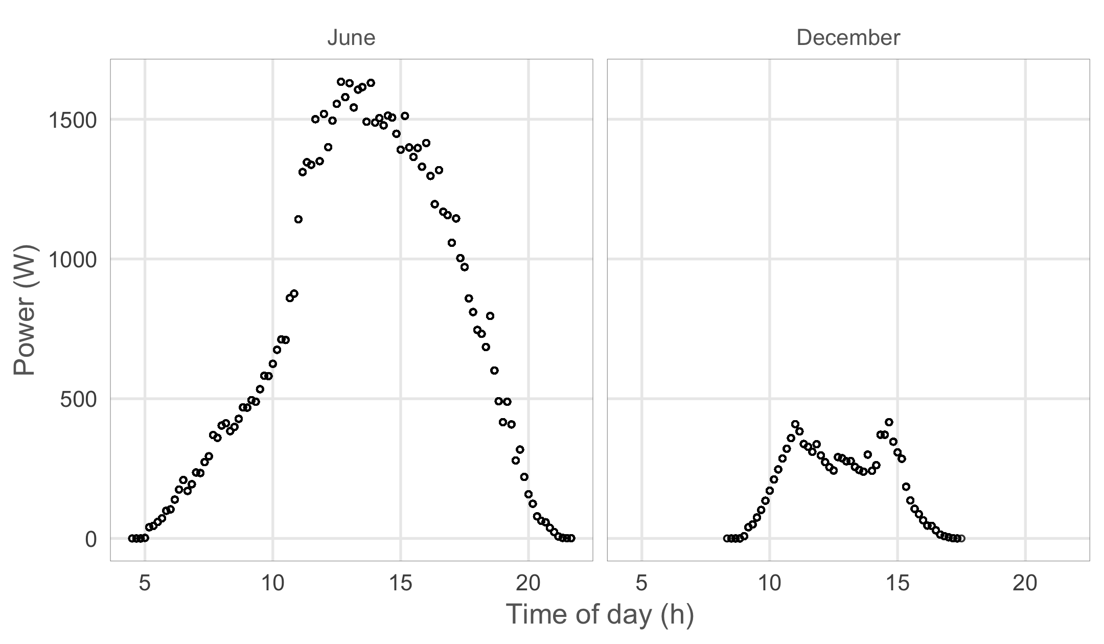
Looking at the highest values for each time of the day we get an asymmetrical shape with lower maximum values in the morning in June while we get less than expected maximum values around noon in December. This pattern is caused by two trees to the east and south of my home which cast a shade on the roof during different times of the day. The tree to the south is not too close to the house and only when the Sun’s elevation is very low in winter does it’s shade reach the roof.
Visualising the obscuring objects
While I know that the trees are behind this pattern I was wondering if we could derive their location and shape from the data. If we could somehow get a value for the power loss for each timestamp in the dataset we should be able to couple this data to a position of the Sun at that time using the solarpos function from the maptools package. Then we could create a panoramic picture where each pixel is a position of the Sun throughout the year as seen by the panels. The solar positions that consistently yield too little power should then match the trees. This sounds like a fun idea, but to get there we first need to get an idea of the power loss per timestamp. We’ll have to create a model that gives us the theoretical maximum output for each timestamp and then calculate the difference with the observed values.
Visualising a full year of solar positions
Before we dive into modelling the maximal power outputs let’s look at the solar positions we will bind the power loss data to. We get all solar positions for a full year in 10 minute intervals and filter out the values where the Sun is below the horizon.
library(sp)
library(maptools)
library(viridis)
# My home coordinates, needed to calculate the solar elevation
home_coords <- sp::SpatialPoints(matrix(c(4.401168, 51.220305), nrow=1),
proj4string = sp::CRS("+proj=longlat +datum=WGS84"))
# create a dataframe with 10 minute time intervals for a whole year
solar_position_df <- tibble(
timestamp = seq(from = ymd_hms("1970-01-01 00:00:00", tz = "UTC"),
to = ymd_hms("1970-12-31 23:50:00", tz = "UTC"),
by = '10 min'))%>%
# calculate the solar position for each timestamp at my home coordinates
# the solarpos function from the maptools package returns a list with 2 elements
# 1 = the solar azimuth angle (degrees from north), 2 = the solar altitude
mutate(solar_azimuth_angle = solarpos(home_coords, timestamp)[,1],
solar_elevation = solarpos(home_coords, timestamp)[,2])%>%
# we only care about solar elevations > 0
filter(solar_elevation > 0)%>%
# The solar panel dataframe uses UTC + 1h
# so lets set this data up the same way
mutate(timestamp = timestamp + 3600)
# visualise the position of the Sun per hour and give each month a colour
solar_position_df%>%
# only visualise values on round hours
filter(minute(timestamp) == 0)%>%
ggplot(aes(x = solar_azimuth_angle,
y = solar_elevation,
colour = month(timestamp, label = T, abbr = F)))+
geom_point(alpha = 0.8)+
scale_x_continuous(breaks = seq(45, 315, 45),
labels = c("Northeast", "East",
"Southeast", "South",
"Southwest", "West",
"Northwest"))+
viridis::scale_colour_viridis(discrete = T)+
scale_y_continuous(expand = c(0, 0))+
labs(y = "Solar elevation (°)")+
theme_minimal()+
theme(text = element_text(colour = "grey40"),
strip.text.y = element_text(angle = 0, hjust = 0),
axis.title.x = element_blank(),
axis.ticks = element_line(colour = "grey40", size = rel(0.4)),
legend.title = element_blank(),
legend.justification = 'top',
panel.grid.minor = element_blank(),
panel.background = element_rect(fill = NA, colour = "grey40"))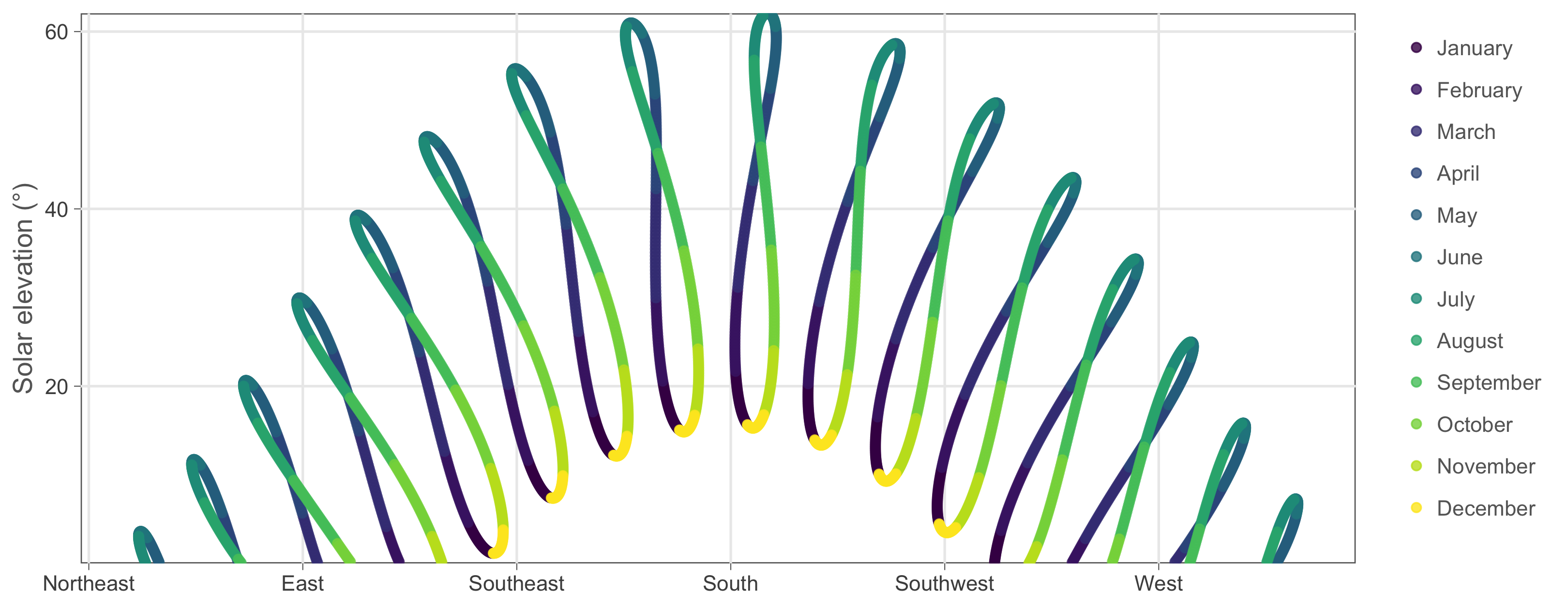 These are the Sun’s positions throughout the year on each round hour (the 10 minute intervals are a bit too much to plot). The resulting shapes are called analemmas and they are really interesting. Back in ancient times they gave astronomers headaches since they cause small deviations in the time read from sundials throughout the year. The issue was eventually resolved when they came up with the equation of time. I recommend a dive down this Wikipedia rabbit hole but for now, let’s get back to our solar panel data!
Modelling maximal power output
We want a model that produces nice, symmetrical, bell shaped curves that are bigger in summer and smaller in winter. We could go for an approach where we simply try to create the expected curves using, for example, a normal distribution and some seasonal variable. While this approach would certainly work, it would treat the underlying effects as a black box. Wouldn’t it be more interesting if we could actualy simulate the effects at play and let the expected curve emerge by combining them? To do this we have to think about what is behind the variation in power yield. In winter the Sun transfers less energy to the panels because of it’s lower elevation but what exactly causes this power loss?
Energy loss due to spreading
Image you carry a flashlight in a dark room. When you point it directly at the wall (90° angle) you get a small circle that is intensely lit. However, if you stand close to the wall and point the flashlight somewhat sideways you light a bigger surface. The same energy emitted by the flashlight is now spread out and each square centimeter in the lit area now receives less. We can calculate this effect with cos(pi/2 - angle). When we transform a 90° angle to radials we get pi/2 and when we enter this in the function we get the cosine of zero which is 1 or 100% spreading efficiency. In Belgium the Sun has a maximal elevation of 62° which has a spreading efficiency of 88%. During the winter solstice the Sun only reaches 15.3° at noon which has a spreading efficiency of only 26%. Fortunately, the panels themselves are somewhat inclined (20°) towards the south so that even in winter the angle of arrival is closer to 35° (57% efficiency). However, this inclination results in a more complex spreading effect because the panels now point in a particular direction. Both effects are estimated in the code below.
# angles in degrees to angles in radials
# the '_deg' part of the variable name shows it's in degrees
deg_to_rad <- function(angle_deg){pi * angle_deg / 180}

# vertical spreading effect
get_vertical_spreading <- function(angle_deg){
  cos(pi / 2 - deg_to_rad(angle_deg))
  }

# When the Sun points to the south we should add 20° to the
# solar elevation to get the correct angle since the panels
# are inclined by 20° towards the south.
# However if the Sun were to shine from the north we should
# detract 20° from the elevation. The negative cosine
# should do just this for us.
adjust_horizontal_angle <- function(angle_deg, azimuth_deg){
  angle_deg + 20 * -cos(deg_to_rad(azimuth_deg))
}
Energy loss due to traveling through the atmosphere
A second, less straightforward, effect that decreases the energy transfer from the Sun to the panels at lower solar elevations is the fact that the distance traveled through the atmosphere becomes larger. As the light rays make their way through this mass of air they often collide with the molecules and become scattered. It is this effect that makes sunsets so beautiful and makes the sky above above us appear blue instead of black. Some clever people have studied this effect in great detail and we can take their equations from Wikipedia to learn that at a 90° angle the energy per square meter is about 1051 Watts. At 62° (Belgium summer solstice) we get 1019 Watts/m² which is still quite good. However at 15.3° in winter we fall back to 628 Watts/m². While we lose a lot of energy due to this scattering effect a little bit may be recuperated. Some of the scattered light from rays passing overhead now reaches our panels.
# calulate Air Mass (AM) according to Karsten & Young
# https://en.wikipedia.org/wiki/Air_mass_(solar_energy)#math_I.1
# https://en.wikipedia.org/wiki/Solar_irradiance
get_air_mass <- function(angle_deg){
  1 / (cos(deg_to_rad(angle_deg)) + 0.506 * (96.08 - angle_deg) ^ -1.6364)
}

# this function calculates how much power (W/m²)
# is left in Sun rays reaching the surface
# the only effect weakening solar power is air mass at this point
# incoming solar power on top of atmosphere = 1366 W/m²
get_solar_intensity <- function(angle_deg){
  # extract from 90 to get correct z angle (see wikipedia)
  1.1 * 1366 * 0.7 ^ get_air_mass(90 - angle_deg) ^ 0.678
}

# Raw estimation of the scattered light reaching the panels
get_scatterlight_intensity <- function(angle_deg){

  # The solar intensity of rays passing overhead
  solar_intensity <- get_solar_intensity(angle_deg + 3)
  # The percentage of max energy (at 90°) that remains
  pct_intensity <- solar_intensity / get_solar_intensity(90)
  # Scattered light is a fraction of the lost energy
  scatter_intensity <- solar_intensity * (1 - pct_intensity) * 0.15

  return(scatter_intensity)
}
Putting it all together
Now that we have created functions for the most important effects at play it’s time to put them together and create a master function that will estimate the maximal power yield of the solar installation when we feed it the position of the Sun.
solar_position_to_max_power <- function(angle_deg,
                                        azimuth_angle_deg){

  # how much of the solar intensity is left
  # after travelling through the air mass?
  solar_intensity <- get_solar_intensity(angle_deg)

  # light spreading out because of sideways spreading
  horizontal_angle_adjusted <- adjust_horizontal_angle(angle_deg,
                                                       azimuth_angle_deg)

  # panels are inclined at 20°
  vertical_spreading <- get_vertical_spreading(horizontal_angle_adjusted)

  surface_power <- {solar_intensity * vertical_spreading +
                    get_scatterlight_intensity(angle_deg)}

  # 7 panels with 1.6 m²
  panel_surface <- 1.6 * 7

  # 16% efficiency of panels
  efficieny <- 0.18

  # eventual power is the panel surface times
  # the power left in the Sun's rays on the panel times
  # the efficiency of the panels
  max_plant_power <- panel_surface * surface_power * efficieny

  return(max_plant_power)
}
We can now call this function on the dataset with solar positions for a full year which we created earlier on.
solar_position_max_power_df <- solar_position_df%>%
  # calculate the maximal power of the solar panels per timestamp
  # we need this to check if the maximal observed power is much lower
  # than the maximal theoretical power
  mutate(max_power = solar_position_to_max_power(solar_elevation,
                                                 solar_azimuth_angle))%>%
  filter(max_power >= 0)
Now let’s bring both datasets together and calculate the ratio between the power observed and the estimated maximal power.
combined_df <- solarplant_df%>%
  # add the solar plant data to the solar position data
  # standardise the time to 1970 to allow joing the solar position dataset
  mutate(timestamp_basic = lubridate::origin + (yday(timestamp) - 1) * 3600 * 24 +
                           hour(timestamp) * 3600 + minute(timestamp) * 60)%>%
  right_join(solar_position_max_power_df, by = c("timestamp_basic" = "timestamp"))%>%
  replace_na(list(power = 0))%>%
  # efficiency is power / max power but can't be higher than 1 (100%)
  mutate(efficiency = ifelse(power / max_power > 1, 1, power / max_power),
         # some time variables we need later on
         hour = hour(timestamp) + minute(timestamp) / 60,
         week_date = round_date(timestamp_basic, unit = "week"))
To check if our theoretical model delivers acceptable results let’s visualize both observed and estimated maximal power for some sunny days in winter and summer.
combined_df%>%
mutate(date = as_date(timestamp))%>%
filter(date %in% as_date(c("2017-06-01", "2016-12-04")))%>%
ggplot(aes(x = hour(timestamp) + minute(timestamp) / 60, y = max_power))+
geom_line()+
geom_point(aes(y = power))+
facet_wrap(~date)+
labs(y = 'Power (W)',
x = 'Time of day (h)')+
theme_minimal()+
theme(text = element_text(colour = "grey40"),
strip.text.x = element_text(colour = "grey40"),
panel.grid.minor = element_blank(),
panel.border = element_rect(colour = "grey40",
size = rel(0.3),
fill = NA))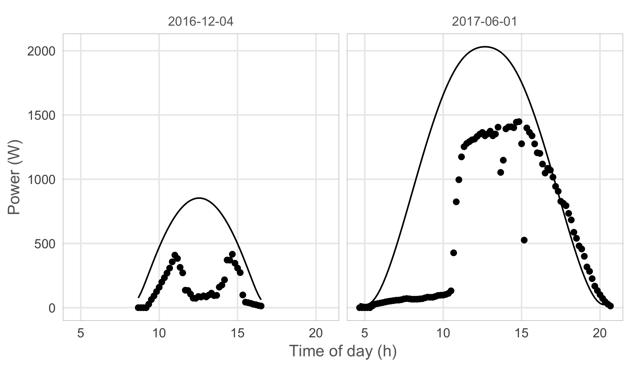 As you can see our theoretical estimation fits the observed values quite well both in winter and summer. While not perfect, this estimation should now allow us to detect solar positions that never result in maximal efficiency values due to an obstacle blocking the light.
Visualizing maximal efficieny per solar position
Most of the time when the panels yield less than what is theoretically possible, clouds are spoiling the party. To filter out this noise and let the effect of stationary objects emerge we will look at the maximal efficiency for each time of the day, per week of the year. Since we have 2 years of solar data in the dataset we now have registered 14 days for each week of the year. For clouds to appear as a stationary object in our analysis it would have to be cloudy on a particular time of the day for all 14 days measured. Even for Belgium this is rarely the case.
max_efficiency_df <- combined_df%>%
# for each week of the year we hope the Sun shined at
# least once per 10 minute interval this way we can get
# an accurate maximal efficiency estimate by grouping
# on the week and hour variables and calculating
# the maximal values for all relevant variables
group_by(week_date, hour)%>%
summarise(solar_azimuth_angle = max(solar_azimuth_angle),
solar_elevation = max(solar_elevation),
efficiency = max(efficiency))%>%
ungroup()
max_efficiency_df%>%
ggplot(aes(x = solar_azimuth_angle,
y = solar_elevation,
colour = efficiency,
alpha = efficiency,
size = efficiency))+
geom_point()+
scale_color_gradient2(low = "darkgreen",
mid = "lightblue",
high = "lightblue",
midpoint = 0.7,
labels = scales::percent)+
scale_alpha_continuous(range = c(1, 0.2),
labels = scales::percent)+
scale_size_continuous(range = c(8, 1),
labels = scales::percent)+
scale_x_continuous(breaks = seq(45, 315, 45),
expand = c(0, 0),
labels = c("Northeast", "East",
"Southeast", "South",
"Southwest", "West",
"Northwest"))+
scale_y_continuous(expand = c(0, 0), limits = c(0, 65))+
labs(y = "Solar elevation (°)")+
theme(text = element_text(colour = "grey40"),
panel.background = element_blank(),
panel.grid.minor = element_blank(),
axis.title.x = element_blank(),
legend.key = element_blank(),
legend.justification = 'top')+
guides(colour = guide_legend(title.position = "top",
reverse = T,
ncol = 1),
alpha = guide_legend(title.position = "top",
reverse = T,
ncol = 1),
size = guide_legend(title.position = "top",
reverse = T,
ncol = 1))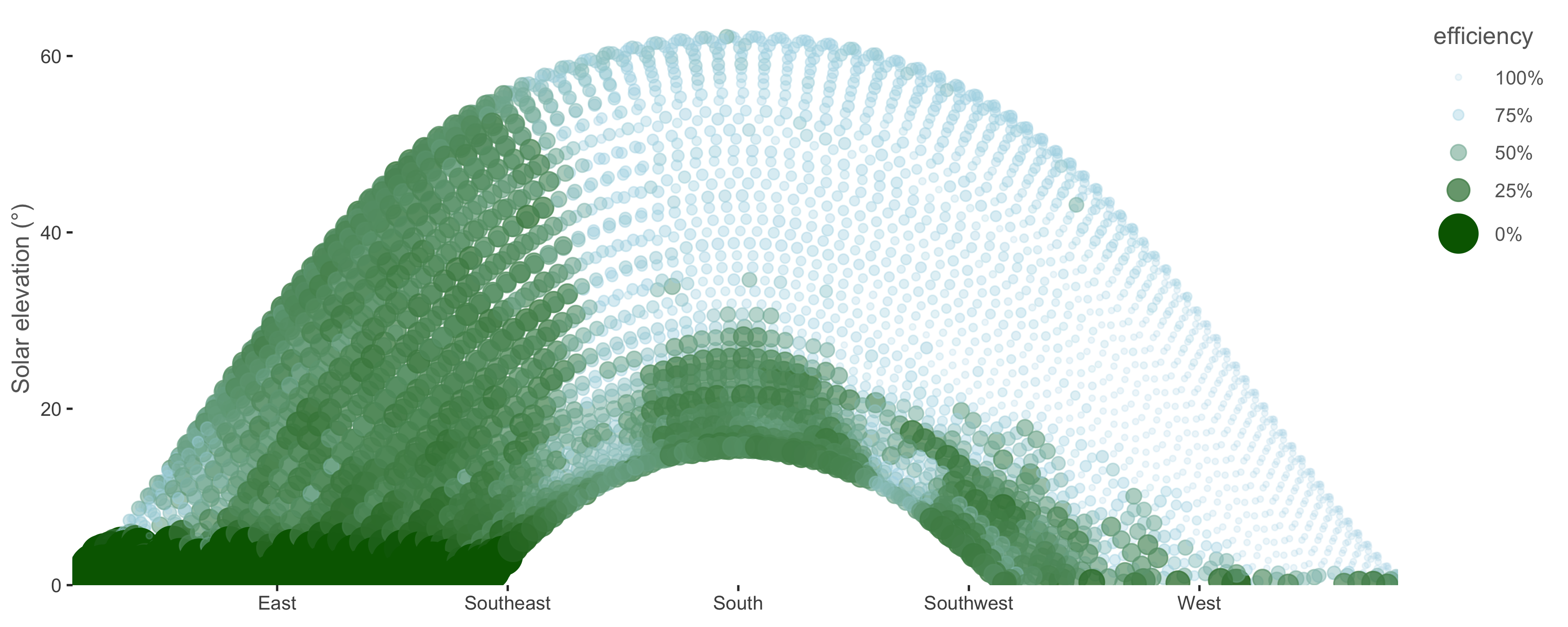 As you can see I’ve taken some artistic liberty while creating this plot. Low maximal efficiencies are colored in green and high values maximal values get a blue color + higher transparency and smaller circles.
To verify this result I got up on my roof and took a panoramic picture. Let’s first look at this picture without the data. 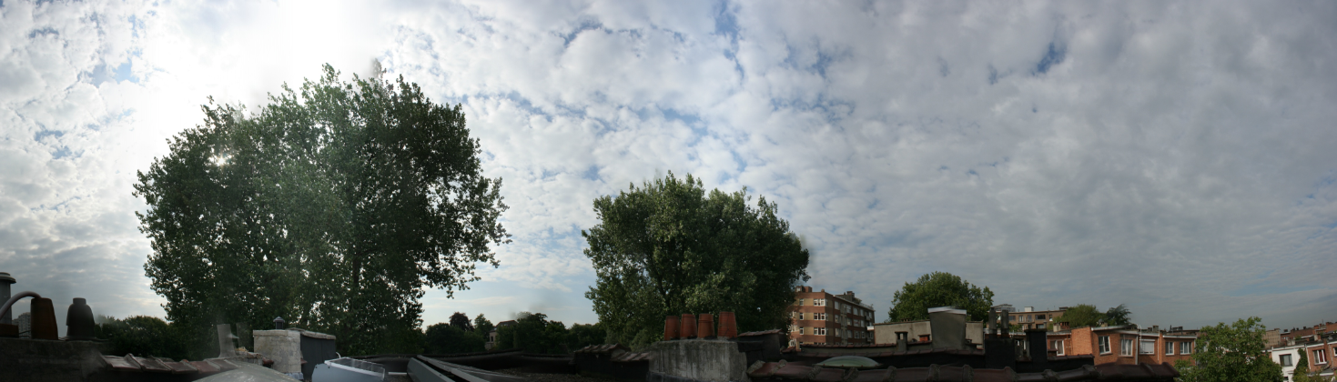
And now let’s use it as the background for our plot.
library(jpeg)
library(grid)
img <- jpeg::readJPEG(rt$find_file("static/figs/roof_panorama.jpg"))

g <- rasterGrob(img, interpolate = TRUE)

max_efficiency_df%>%
  ggplot(aes(x = solar_azimuth_angle,
             y = solar_elevation,
             colour = efficiency,
             alpha = efficiency,
             size = efficiency))+
  annotation_custom(g, xmin = -50, xmax = 320,
                    ymin = -15, ymax = 65)+
  geom_point()+
  scale_color_gradient2(low = "darkgreen",
                        mid = "lightblue",
                        high = "lightblue",
                        midpoint = 0.7,
                        labels = scales::percent)+
  scale_alpha_continuous(range = c(1, 0.2),
                        labels = scales::percent)+
  scale_size_continuous(range = c(8, 1),
                         labels = scales::percent)+
  scale_x_continuous(breaks = seq(45, 315, 45),
                     labels = c("Northeast", "East",
                                "Southeast", "South",
                                "Southwest", "West",
                                "Northwest"))+
  scale_y_continuous(expand = c(0, 0), limits = c(0, 65))+
  labs(y = "Solar elevation (°)")+
  theme(text = element_text(colour = "grey40"),
        panel.background = element_blank(),
        panel.grid = element_blank(),
        legend.position = 'none',
        axis.title.x = element_blank())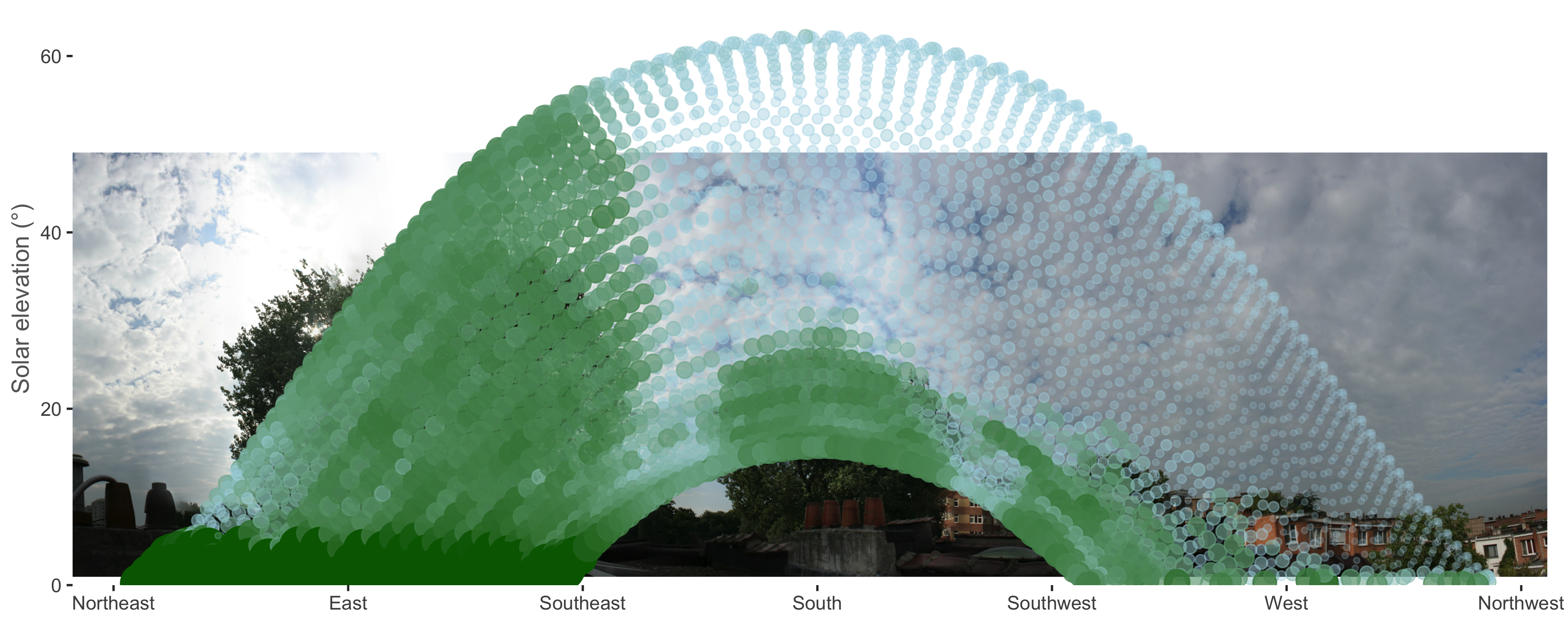
Et voilà! The objects we detected do indeed match the trees we suspected all along. We’ve successfully used the Sun to scan the surroundings for objects using solar panel data! The panels estimate the tree to the east to be taller but this is because the picture was taken on the side of the roof furthest from the tree. To the panels on the other side of the roof the tree seems taller.
I expect this to be the final post on this dataset and hope you enjoyed the analysis as much as I did. Time for a new pet project. Cheers!