
Principle 6: Reconstruct the absent user
Originally published in 2018.
A question: “How do you know if your docs are good?”
While I was at Amazon, our group was shuffled around in a reorganization. In the new structure, an upper manager, trying to feel out how to manage the doc group, asked us this question: How do you know if your documentation is good?
It’s a straightforward question, and one that presumably we should have been able to answer. But the question prompted shrugs and meandering responses. We soon started looking at different efforts — metrics, surveys, support tickets, and more. But really, we didn’t know if our docs were any good.
This question gets to the heart of many challenges with tech comm. If you don’t know if your docs are good, how do you know whether users value or despise the docs, or if they even use the docs? If you don’t know your documentation’s value, then how do you know your team’s value? If your team’s value is unclear in the organization, how do you get funding, and headcount, and inclusion? So much depends on understanding and measuring your documentation’s value to the user.
The question of measuring documentation’s value has been mostly unanswerable since the beginning of tech comm — not just the value of documentation, but by association the value of tech comm. Saul Carliner, in an in-depth article on metrics and measurement, writes:
Since the middle of the 19th century, then, technical communicators have been concerned about the value of our work. Almost 150 years later, our concern extends beyond whether the documentation is well-received. It focuses on justifying the need for organizations to continue employing technical communicators. More than being well-received, technical communication must provide tangible value to organizations by contributing to revenues, containing expenses, or helping an organization comply with regulations. (“What Do We Manage?”)
Why has the question of documentation’s value been such a constant theme for 150 years? Why don’t we have a better response to the value question?
In this post, I’ll argue that the reason it’s hard to measure the value of docs is because the user is absent from the tech writer’s environment. Without the user present (or without copious feedback from users), judging or measuring the impact of the docs is difficult.
To write good documentation, you have to follow the most basic rule of writing: know your reader. If you don’t know your reader, your docs will likely miss the user’s information needs, technical level, and other concerns.
Reconstructing an absent user is a complex task. But because most interactions take place online, users leave digital trails tech writers can follow. Web analytics, embedded surveys, support cases, milestone completions, and satisfaction surveys can provide clues about this absent user’s wants, needs, and concerns. By reconstructing as much of the user experience as possible, we can begin to write documentation that meets the users’ needs. Documentation that meets the users’ needs can be considered “good documentation.”
As far as concrete measures for documentation, I don’t provide any special insights here. Most metrics are a response to managerial reporting requirements and not necessarily gathered with an intent to improve docs. If we focus on a better goal — understanding the user experience with docs — the qualitative (rather than quantitative) result might outweigh the need to report specific numbers.
The problem: The absent user
Many professions have a tangible outcome to measure their work, often gathered through direct interaction with users or from the user transactions. For example:
- Doctors look at the health recovery rates of patients
- Teachers look at the grades and progress of their students
- Coaches look at their number of wins of their team
- Marketers look at conversion rates for campaigns
- Detectives look at the number of criminals they catch
- Product managers look at product adoption rates
- Support agents look at the number of tickets resolved
- Business managers look at the number of products sold, and so forth
What do documentation professionals look at to measure their success? Logically, we should measure the number of users helped by our documentation. The problem is that these users aren’t present, and their experience isn’t captured, so it’s difficult to know if these users even exist, and if so, what their experience was. They are in the ether, so to speak, and technical writers often end up looking at a wide, empty expanse, with little sense of the experience of the documentation.
If we could observe users consulting the documentation as they struggled through a task or scratched their heads in confusion, finding or not finding the answer, we could get immediate feedback about the usefulness of our documentation. But about the only time you can get this type of feedback is through a usability lab, or by asking to informally observe a user in action. Even if you were to bring users into a usability lab and watch them interact with docs, the scenario would be artificial. The tasks would likely be constructed and prompted, and not natural actions.
Because the user is absent, we tend to be unaware of the impact of our documentation. Imagine this same absence in other professions:
- A teacher provides instruction to a room full of students positioned on the other side of a dark, soundproof mirror; the teacher gives instruction and administers tests but never hears student questions or sees test results. How can the teacher evaluate his or her effectiveness?
- A salesperson gives his or her pitch to mute, invisible customers behind a wall, never hearing feedback or concerns from the customers, nor learning whether the customers make purchases. How does the salesperson know whether he or she is good at sales?
- A doctor provides health advice to a patient hidden behind an invisibility wall, with no ability to ask questions or receive answers, nor learn whether the advice given had an impact. Instead, the doctor just receives a piece of paper with a short list of symptoms. Is the doctor a good doctor, providing helpful advice? How would he or she possibly know?
In each of these scenarios, it’s clear that the teacher, salesperson, or doctor would likely give the wrong advice or address topics irrelevant and unhelpful to users. It’s absurd to even consider these scenarios. Yet this is the scenario that tech writers face, and it’s why documentation so often misses the mark.
Typically, when it comes time for release, we throw our documentation over a wall to users, and then return to our tech writing caves to continue working on the next batch of information. But we don’t really see the users consume or interact with the information we heaved over the wall. We don’t know if the information lays rotting and unused on the ground, or if it was eagerly consumed, or if the information made them sick, or healthy with understanding. Without this knowledge of the user, we keep on churning out the same kind of information, waiting for the next release window to once again throw our docs over the wall.
Despite the need to understand the user, the technical writing profession is mostly a solitary one, separated from end users. As a technical writer, I spend the majority of my day sitting at my computer, working alone on documentation. I’m writing for a user I almost never interact with. I make decisions about the language and terms the user will speak with, the tasks the user will want to do, the questions and problems the user will encounter, the business scenario and purpose the user will follow, and more — all without the user present.
The most fundamental rule of writing is that you write for a reader, but if you have very little understanding or interaction with that reader, how can you possibly hope to connect with what the reader wants and needs to know? How can you write documentation that the user considers good? We have to close the gap between these invisible, absent readers and make them present.
A thousand influencing genes rather than several
Part of the problem with reconstructing the absent reader is that he or she is hard to find. Users and their trails are not clearly visible, so we often focus on the product and use ourselves as a proxy. Or perhaps we make do with high-level personas from the UX team, or general descriptions of users from field engineers and product managers. But in order to find and reconstruct the absent user, we have to work much more diligently, piecing together information from a variety of indirect clues and sources.
To understand the effort, consider this analogy from the field of genomics. In a recent Freakonomics podcast titled Evolution, Accelerated, the hosts discuss the emerging science of gene editing. With gene editing, genetic engineers try to identify a corrupt gene and then catalyze the body’s own repair process to fix it.
In the podcast, Jason Fletcher, economist and co-author of The Genome Factor, explains that when the human genome was first mapped, many assumed we would quickly be able to “find single, easily identifiable genes that controlled cancer, or depression, or intelligence, or even just height” — for example, the Alzheimer’s gene, the Gambling Addiction gene, the Depression gene.
Fletcher says this assumption was wrong, explaining that it “turns out to be an exception rather than a rule.” Instead of single, easily identifiable genes responsible for our maladies, there are actually hundreds of thousands of genes contributing in microscopic ways to the result. Fletcher explains,
Most of what we care about, most of life’s important outcomes, are not one gene and one disease. They’re more like hundreds or thousands of genes all with really tiny effects, if you can even find them.
Thus, even though the first human genome was sequenced in 2003, we still don’t have gene editing. Why? Because finding the thousands of genes responsible turned out to be much more complex than initially thought.
As technical writers, we’re not mapping the human genome, but we are doing something similar: we’re mapping the end-user; we’re reconstructing the absent user. In the genome scenario above, replace the word “gene” with “user.” There aren’t simply a few clearly identifiable user types, like the novice user, the advanced user, and the administrative user. Instead, there are thousands of users, with many different questions and needs and backgrounds. Their collective experiences determine the overall reception of the docs.
We need to reconstruct these absent readers in the same way a genetic engineer looks at variant DNA strands under a powerful microscope, figuratively trying to understand how the users’ brain chemistry and wiring work, and how the users interact with our docs. By following the digital trails that users leave, we ask what they need to know, want to know, or do not seem to know. We ask what actions or behaviors and thoughts drive their behavior. Who are the users, and what did they do with the information in the docs? Did they find their answers? Did the docs help them?
By examining a thousand strands of DNA, we begin to get a clear picture of the genome, or user experience. Closing this gap between the writer and reader constitutes one of the most important and complex tasks in technical communication. In the following sections, I’ll explore five ways to follow digital trails to reconstruct the absent user:
- Web analytics
- Surveys
- Support tickets and user forums
- Customer milestones completions
- Customer satisfaction scores
The digital trail visible from web analytics
Web analytics provide the first, easiest clues about the user experience. Whether using Google Analytics, Adobe Analytics, or some other web analytics service, we can collect some basic information that lets us know the following:
- Number of page visits
- Number of pages viewed per visit
- Unique visitors versus returning visitors
- Time on page
- Referring pages, and more
Though basic, these metrics at least let you know what documentation pages users are hitting. They address whether the documentation is at least relevant to users. Metrics don’t reveal whether the documentation successfully helped the users with those tasks or answers — you only get a sense of the following:
- Which topics seem to matter most to users
- How much time users are spending on those topics
- How users are arriving at the topics
- The location the users are originating from
- Other pages the user visits
When I look at documentation metrics gathered through analytics, here’s what I learn. Users are mostly interested in specification information and getting started tutorials. They mostly arrive from general search results, and they come from all over the world. Users spend less time on the page than I assume, and they might visit another half a page during their visit. If search queries are available (from site search), their queries tend to be short and general.
In looking at metrics, it’s tempting to dismiss them for their lack of insight, or to look toward collecting even more information, something along the lines of big data. Could we find more answers if we had gigabytes of user data rolling in?
Several years ago, there was a lot of buzz about big data and the insights it would bring. With the ability to capture so much information, the unexpected correlations and predictions were highly anticipated. If you can capture information from every page event (every click, every scroll, every eye movement, every parameter from the user’s browser, every action at every decision point, and more), and then number crunch this data to look for meaningful correlations, we might “be able to predict huge areas of the future with far greater accuracy than ever before in human history, including events long thought to be beyond the realm of human inference” (“Nine large problems with big data”).
But big data doesn’t seem to have delivered on its promises, and the term appears less these days. Why? Michael Salvo and Adam Strantz explain that “Big Data remains specialized, obfuscated, and elite. There is not yet a clear way forward. There is lots of potential evident in technology and analytic methods, but no clear, direct benefit for end-users” (“Wayfinding Big Data in Technical Communication”).
Instead of looking for answers in big data, we need to do a better job acting on the basic information we already have. In an article in the Harvard Business Review, Jeanne Ross and others say companies that invest in big data often don’t realize the payoffs because they can’t make use of the basic analytic information they already have. The authors explain:
The biggest reason that investments in big data fail to pay off, though, is that most companies don’t do a good job with the information they already have. They don’t know how to manage it, analyze it in ways that enhance their understanding, and then make changes in response to new insights. Companies don’t magically develop those competencies just because they’ve invested in high-end analytics tools. They first need to learn how to use the data already embedded in their core operating systems, much the way people must master arithmetic before they tackle algebra. (“You May Not Need Big Data After All”).
Ross et al give a simple example of how 7-11 Japan decides what to stock on their shelves. Instead of relying on big data correlations, sales directors simply ask the 7-11 store clerks, the ones who greet and interact with customers, ringing up products they buy for hours on end, what the store should stock. The results are surprisingly successful. Ross et al say that “Approximately 70% of the products on the shelves each year are new, designed by salesclerks in response to customers’ preferences.” You don’t need big data to make insightful decisions — you just need to watch what users buy. In the tech comm world, each click on a topic is the equivalent of buying an item in a store — your strategy can be as simple as stocking more of those kinds of items/topics.
In Simplexity, Jeffrey Kluger explains a similar strategy in Seattle’s “M Coy Books & Espresso” run by Michal Coy and Michael Brasky. Coy and Brasky recognize that the most powerful incentive for customers is to deliver an insightful recommendation about a book. As a result, Coy and Brasky carefully observe users in their store to gather information. Kluger writes:
Following the meandering customers with their eyes, [Coy and Brasky] note who stops where, who pauses at which shelf, who picks up a book and puts it down quickly, and who picks up another one and gives it more attention. … Coy and Brasky stir all these thoughts together, adding this or that odd detail or this or that strategy from a lifetime spent bookselling … Then they approach a shopper with the most important thing they have to offer, a recommendation, a suggestion for a single one of the twenty thousand volumes they keep on their shelves. (pages 8-9)
Kluger says that although other recommendation engines like Amazon rely on many digital factors of user behavior to arrive at a recommendation, these Coy and Brasky booksellers take this information in through simple user observation. (Unfortunately, Coy Books has since closed, as have most small bookstores.)
Contenting ourselves with the analytics we have, let us pause for a few extra moments at the top-viewed pages and see if we can pull out more details around the user experience. Here are a few questions to ask:
- Why do these popular topics matter so much to readers? Are there trending problems or questions users are running into that lead them to these topics?
- Do the topics in these popular topics align with any particular user demographic or business scenario?
- What can users actually do with the information on these pages? Can we get a sense of their coding workflows and scenarios based on these topics?
- Conversely, what topics are users not viewing? What pages have the shortest page view time and the highest bounce rates?
- Can our popular topics be expanded with more in-depth information, further serving the user’s information needs? For example, could we double the number of articles on these topics?
- Can we minimize the information no one is viewing in order to increase focus on the content that matters to users?
While at Amazon, the most popular topic in our docs was the Fire TV specifications. But … why specifications? Specifications aren’t tutorials, nor do they seem all that significant in the scope of how-to tasks and other troubleshooting information. In our investigation, I realized that it could be end-users (customers) that were inadvertently landing on this page rather than developers. But if the users were, in fact, developers, perhaps it meant our users were advanced engineers, looking only for reference material rather than tutorials that hold their hand through a process. Perhaps it meant they were coding features that depended on particular specification information (Android levels, OpenGL levels, Dolby support, processing speed, and so forth). Maybe their biggest decisions were around cross-platform compatibility and having the same experience across devices despite different device specifications?
You get the point. Rather than just glancing at the top pages and shrugging our shoulders, we can dive into the reasons why the topics are popular, and also expand on this information as well. When I comprehensively reviewed the 2017 metrics for my blog, I found that many users were landing on my Swagger tutorial page. Because of that, I added extensive OpenAPI tutorials and other content in this same area to deepen the focus. It seems to be paying off, because the traffic is increasing.
Despite teasing more information out of the analytics data, we still can’t entirely answer the question, “Are my docs any good?” But analytics does help us determine whether we’re addressing the right topics. If we don’t address the right topics, then no matter how well a topic explains a procedure, the docs won’t satisfy the user’s needs.
Surveys as a means of getting user evaluations
Another way to gather more evaluative feedback about our documentation is to ask users to provide feedback in the same context in which they’re consuming the information. Through simple surveys embedded in each topic, we can collect feedback from users.
It’s not uncommon to see “Feedback” buttons on doc pages, giving users the ability to provide thumbs-up or thumbs-down reactions, or other simple responses. Here’s an example from YouTube:
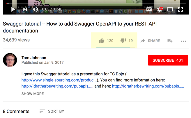
Every documentation page should probably have some type of feedback mechanism. In addition to simply letting the users give a thumbs up or down, a free-form response field can capture more actionable information.
I once experimented by adding a simple Feedback form in some of our docs. In our initial implementation, we simply ask if the doc meets the user’s needs and then provide a comment form. In about three weeks, for this particular doc set (which had about 60 topics), we received around 30 responses. Sure, the number was small. But at least it gave us some glimpse of the user experience.
Survey tools can be more powerful. Take a look at Usabilla.com, for example. When you click the Feedback button Usabilla provides, you’re prompted with options to either provide specific feedback or general feedback.
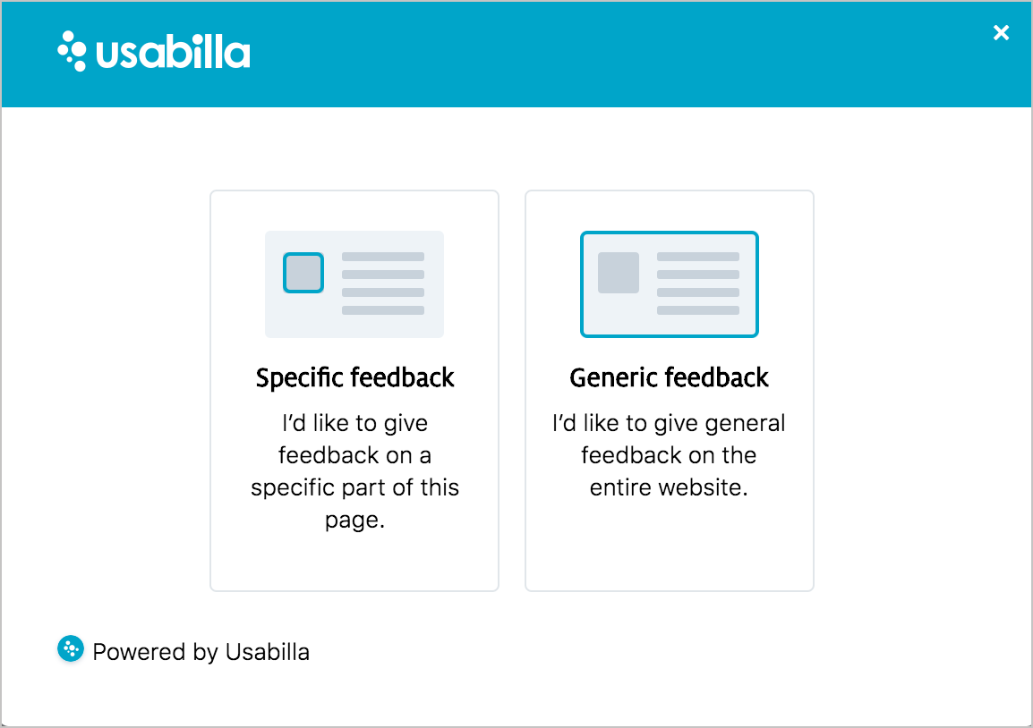
If you choose to provide specific feedback, you can then highlight an area of the page you want to provide feedback about.
Generalizing results from a small sample
Admittedly, the number of users who provide feedback is an extremely small percentage of the page’s traffic. If we capture only 0.1% of the user experience on these pages, how can we draw conclusions about the overall effectiveness of the documentation?
With user testing, Jakob Nielsen says that you don’t need many respondents to conduct a successful UX review. For most UX evaluations, you only need about five people. With five people evaluating a UI, you will capture most of the feedback that you’ll get with much larger responses. There’s an effort-versus-value tradeoff that tends to drop off in efficiency after that. Nielsen explains:
“The main argument for small tests is simply return on investment: testing costs increase with each additional study participant, yet the number of findings quickly reaches the point of diminishing returns” (How Many Test Users in a Usability Study?).
You could schedule dozens or hundreds of users in to evaluate an interface, but if, after the fifth user, you start seeing the same responses over and over, with little variation, then you’re mostly wasting your time. You’re spending lots of effort to confirm the feedback from the initial sample size.
I’ve seen similar results from my blogging metrics. I’ve been blogging for a decade now, and after I publish a post, I’m eager to answer a similar question: was the post any good? Was the post a dud or a home run, or just okay? I mostly measure the results through link tracking with Bitly, particularly via my newsletter, Twitter, and Linkedin. For a previous post, Stoplight – creating a single source of truth to drive the API lifecycle, Bitly indicates that it received 400+ clicks.
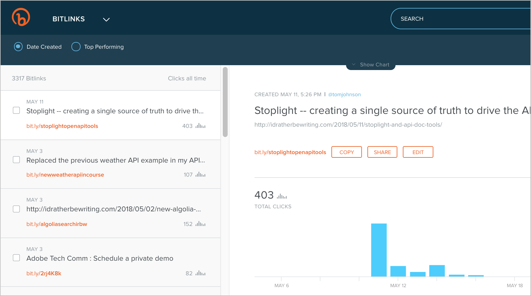
Just looking at the clicks in Bitly usually tells me whether the post connected with the audience or not. For more info, I can correlate these clicks with page views in Google Analytics, but the analytics usually just confirms the popularity of the post from the Bitly metrics. Any post that gets more than 300 clicks I consider successful. The page views for the post will be much higher than the clicks from Bitly, and so might interactions on other channels, but this small sample size from the initial Bitly tracking almost always answers my initial question about whether the post was good.
The same proportions might be true for docs. How many users do you need to evaluate documentation? Do you need the responses for hundreds of thousands of users, metrics from half a dozen different angles, outreach groups and other feedback tools? What if you really only need the survey responses from a small percentage of people (like five) in order to arrive at a conclusion that is mostly accurate? That sample size is completely viable through embedded surveys in docs, especially if those surveys are visible and well-integrated into the user’s space. And when corroborated by numbers from web analytics, you can be more certain about the conclusions you draw.
Support tickets and user forums
Another way to reconstruct the absent user is by looking at support tickets and forum threads. Not every support ticket or forum thread contains an instance where the user consulted the documentation. Many support tickets might be filed in cases where users didn’t use the documentation at all. But for those tickets that do show evidence of documentation usage (either from the user or from the support agent), the tickets can provide a more detailed narrative about the user experience.
Many times, before users contact Support, they feel like they should do their due diligence in figuring out the answer for themselves. They might have tried using the docs but found they could not follow the task. Maybe the task was out of date, or missing some steps, or designed for a user in a different environment. The support ticket or thread usually provides a detailed exchange because it allows a back-and-forth dialogue with the user.
It’s not always easy to access support information. First, you might not have access to all the support tickets. For example, when users reach out through contact email, this exchange might go right into the support’s case management tool, which only the support group can access. Even if you could sort through the tickets with perfect transparency, you’d have to weed out tickets where docs weren’t a factor. Then you’d also need to decide whether the docs weren’t a factor because of the following:
- The answer wasn’t something that should be in docs.
- The answer existed in the docs but the user couldn’t find it.
- The answer didn’t exist in the docs but it should have been included.
Finally, remember that support logs and forum threads show only instances where users had problems. There could be thousands of experiences where users found the docs helpful and did have success — hence, they didn’t need to reach out to support. Thus, support provides a one-sided picture where docs usually come up short. Still, the information support provides is often more valuable because of its detailed, actionable information. Almost no other channel contains these back-and-forth dialogues.
Even a lack of support tickets or forum threads can be telling. Few support tickets/threads combined with a low amount of doc page views might mean no one is using the product. But few support tickets/threads combined with a high number of doc page views might mean that people are using the product and are finding the docs to be all right.
Customer milestones completions
Another data point to examine, as we reconstruct the absent user, is whether users completed a particular milestone with the product. For example, did the user complete the setup, submit an app, start calling the API, or finish another specific end goal that you can track or measure? Because I worked in Appstore-related docs, I would receive a weekly report about newly published Fire TV apps. This is what most of my documentation aimed to achieve — more published apps, which would lead to greater selection in the Appstore.
However, in evaluating this milestone, we didn’t know whether the users consulted the docs to publish their apps or not. Maybe they had handholding from a field engineer; maybe they figured out the process on their own. Maybe they glanced at the docs only briefly; maybe they relied on the docs extensively from the start to end. Maybe they used docs from another source (such as a blog or other company). Exactly what value and part our docs played in these milestones was an unknown.
When users complete a milestone, we can reach out to users to find out if they used the docs, how much, whether they found the docs helpful, and so on. This kind of outreach to customers is usually done by specific teams (such as Support or Sales or Marketing). But you could work through these teams to request specific questions that involve docs, and in so doing, start putting together a larger picture of the user experience.
Note that not every milestone is trackable. Often times, the documentation’s scope is broader than simply publishing apps. In fact, most of the Appstore field engineers worked with partners who already had published apps. They simply updated their existing apps with enhancements — for example, implementing recommendations, or in-app purchasing, or voice-enabled playback, and so on. How could we know when users relied on our documentation for their enhancements?
Sorting through the releases that leveraged documentation versus releases would have been quite time consuming. Additionally, this approach would neglect all the users never actually achieved these milestones. For example, how do you identify the users who failed to publish apps?
Although tracking milestones can provide more details about the absent reader of your docs, this method can’t be relied on for a full and complete picture. But again, it is another strand of DNA that you add to the user picture you’re continually drawing.
Customer satisfaction scores
The customer satisfaction survey is another area of feedback for reconstructing the absent user. In these surveys, outreach groups ask customers a series of questions about their experience. You can often include some documentation-related questions in these surveys to get an overall sense of their experience.
Note that when you collect satisfaction feedback from users, users will invariably mix any feedback about the docs with feedback about the product, process, and other details. Saul Carliner notes some of the issues that occur when looking at customer satisfaction surveys as a way to measure documentation:
… many of the prevailing definitions of quality do not lend themselves to easy measurement if they lend themselves to measurement at all. For example, one group of definitions of quality pertains to customer satisfaction. But whose? Should technical communicators measure the satisfaction of the sponsors who commission the technical communication products (after all, these are the ones who authorize payment), of the executives who purchase the products and services that the technical communication products describe, or of the content’s end users, who often have little or no say in the choice of the products and services they use? Or do technical communicators assess the satisfaction of all these groups, even though such an approach would be time consuming? (“What Do We Manage?”)
In other words, a customer might not be satisfied with the product. These satisfaction responses — even if specifically about documentation — are hard to separate from overall product feedback, which is beyond the control of the technical writer. Users rarely isolate their feedback to the documentation only. What would you imagine users would say? Although I hated your product, I did feel that the language in the documentation was exquisite!
Another problem with customer satisfaction surveys is that they’re usually distributed only quarterly or yearly — hardly enough time for regular review and measurement. And the responses are so general, they’re not often actionable. Still, if you can sync with the outreach team that conducts these surveys, perhaps you can expand the documentation-related questions to gather more long-term strategic feedback.
While at Amazon, after reviewing customer satisfaction surveys, we found that tutorials were the most preferred documentation format, and also that videos would also be welcome (the video format ranked higher than we anticipated). This kind of feedback helped with long-term planning and prioritization.
Conclusion
Unlike other professions that have more direct interactions with users, technical writers have to go out of their way to gather and interpret user data. Web metrics, embedded surveys, customer support, customer milestones, and customer satisfaction surveys can all help reconstruct the absent user. Understanding the users and their experience with docs is essential for determining whether the documentation is any good.
One or two methods in isolation might provide distorted results, but the combined picture across these various approaches will fill in gaps and corroborate data in a more balanced and credible way. Especially as you look at this information through multiple iterations and feedback cycles, you’ll begin to feel more confident about your interpretation of the user’s experience. When you know your user, you can then write and shape your documentation in more user-specific ways.
If you need a specific measurement, you could perhaps quantify the responses in each of these areas, preparing a kind of scorecard for the product’s documentation. This scorecard, which draws upon each of these approaches (analytics, surveys, etc.) might provide a way to consolidate more qualitative information into specific numbers. Still, it’s the narrative and qualitative information that is much more helpful in writing docs, so that’s where our focus should be. Sometimes, the qualitative information (in the form of highlighted comments, anecdotes, and other details and insights) can be more persuasive, since numbers can always be manipulated.
In a more recent article on metrics and measurement, Saul Carliner and others conclude that when it comes to measuring value, word-of-mouth feedback is often more persuasive:
“… instead of quantifiable measures, the most common means of assessing the productivity and effectiveness of technical communicators is word-of-mouth and service quality — that is, perceptions of the quality and responsiveness of the service provided by technical communicators to the people who hire them, not the users who ultimately benefit from the end products” (“What Measures of Productivity and Effectiveness Do Technical Communication Managers Track and Report?”).
As a result, Carliner et al discourage any quantitative ROI and instead suggest focusing on more qualitative, word-of-mouth type information. Information that paints a picture of the absent user’s experience with docs will be aligned in the right direction and with the right purpose. Rather than simply reporting numbers for reporting purposes, the qualitative information will carry weight that has its own tangible value.
Questions for reconstructing the absent user
- Who is the user? What do you know about the user? For example, what are their goals, what’s their technical level, what are they building, how are they reading your information, what language do they speak fluently?
- What do metrics tell you about how users are interacting with this content?
- Are you capturing any feedback about this content based on your feedback mechanisms?
- What kind of support tickets have been filed against the topic?
- Can you reach out to a target group of users to gather more information about their experience with the topic?
References
Carliner, Saul. “What Do We Manage? A Survey of the Management Portfolios of Large Technical Communication Groups.” Technical Communication, Vol. 51, No. 1, February 2004.
Carliner, Saul; Qayyum, Adnan; Sanchez-Lozano, Juan Carlos. “What Measures of Productivity and Effectiveness Do Technical Communication Managers Track and Report?”. Technical Communication, Vol 61, No 3., August 2014.
Kluger, Jeffrey. Simplexity: Why Simple Things Become Complex (and How Complex Things Become Simple. Hyperion, New York. 2008.
Marcus, Gary and Davis, Ernest. “Nine large problems with big data”. Financial Review. April 10, 2014.
Nielsen, Jakob. “How Many Test Users in a Usability Study?”. June 4, 2012.
Ross, Jeanne W., Beath, Cynthia M., and Quaadgras, Anne. “You May Not Need Big Data After All”, Harvard Business Review 2013).
Salvo, Michael and Strantz, Adam. “Wayfinding Big Data in Technical Communication”, STC Intercom 2015.
About Tom Johnson

I'm an API technical writer based in the Seattle area. On this blog, I write about topics related to technical writing and communication — such as software documentation, API documentation, AI, information architecture, content strategy, writing processes, plain language, tech comm careers, and more. Check out my API documentation course if you're looking for more info about documenting APIs. Or see my posts on AI and AI course section for more on the latest in AI and tech comm.
If you're a technical writer and want to keep on top of the latest trends in the tech comm, be sure to subscribe to email updates below. You can also learn more about me or contact me. Finally, note that the opinions I express on my blog are my own points of view, not that of my employer.