At NSConference 2010 I delivered a presentation on developing the iPhone game Sumo Master using the Core Animation framework. It covered the usual bag of tips and tricks, but also the process of development, from twinkle-in-the-eye to App-Store reality.
I personally find articles and talks about the evolution of a concept particularly interesting, so I thought I would write up a similar experience I had building an advanced custom control for the study app Mental Case. The control was used in the iPad version of the app, but could just as easily be found on the Mac. (The iPhone screen would be too small.)
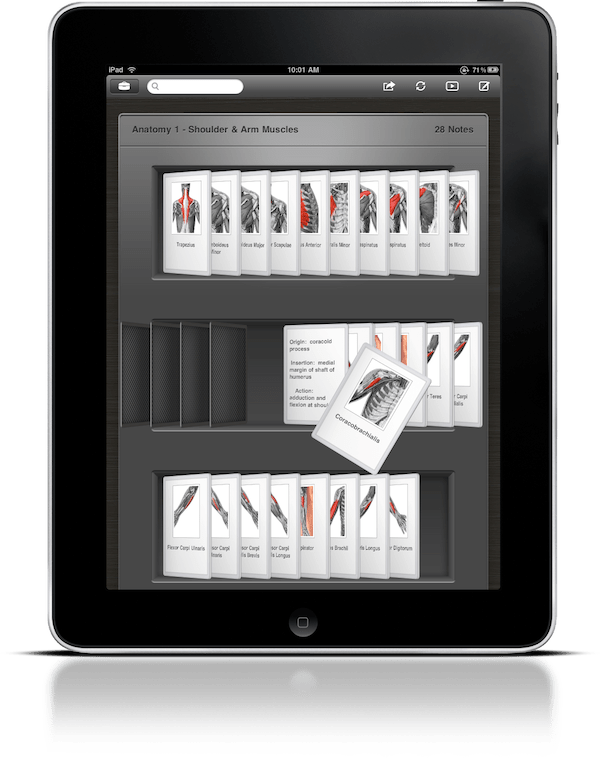
Table of Contents
Mac Origin of Concept
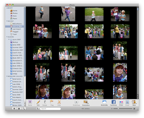
In another presentation at NSConference — yes, I was busy this year — I discussed the various ways of presenting data to the user. This talk was born largely of my own struggles coming up with the user interface for future versions Mental Case. It was clear to me that the traditional table view-based approach used to present cards in the current Mac release is sub-optimal and dated. At the time of my presentation, I was considering a grid view approach, as used in apps like iPhoto and Delicious Library.
But this threw up a problem: Mental Case is often used to study subjects with a low density of content. Someone learning a language, for example, may only have a single word on each card. A grid view would likely lead to a low density of information on the screen, meaning you would need to scroll around a lot to find stuff.
What I really wanted was something more like cover flow, where by stacking tiles in 3D you can present information more densely. But cover flow was only designed for a single row of data. I really needed something between cover flow and a grid view.
At this time, I came up with the analogy of drawers or trays of cards. It appealed to me because it was based on a real world object, which is becoming an important design concept on the iPad, and yet was practical, allowing for a higher density of browsable information.

On the way back from the NSConference Atlanta meeting I had some good fortune, because I got to spend an hour or so hanging around in the airport with UI-guru Matt Gemmell (“G-E-double M-E-double L”). I ran the idea past him, and he was encouraging. He was a bit worried that text may not be recognizable, suggesting a lot depended on the spacing and inclination of the cards. For images, he had no concerns: according to Matt, humans can recognize images with much less visible input than text.
Brainstorming
Encouraged by Matt’s analysis, I decided to go ahead with it. A custom control like this is by no means the easiest path to take, and involves some risk, but it’s also challenging and interesting, so I was enthusiastic.
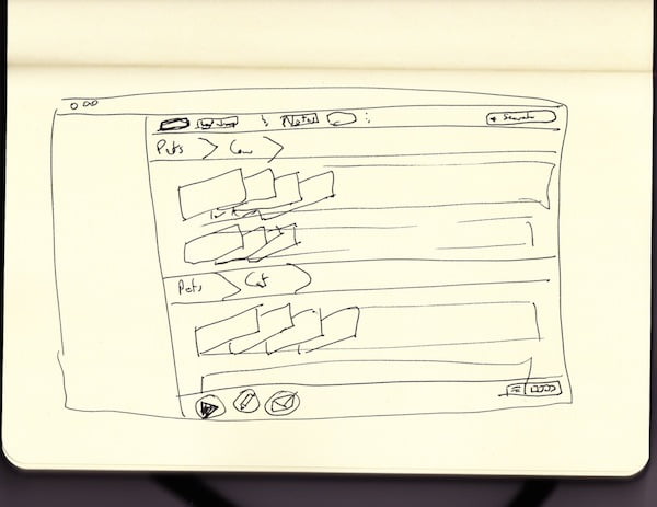
I started by trying to visualize the look of the card view by making drawings in a sketchbook. There were many questions to answer, and not much to guide me. How would the cards be stacked? How would they be rotated on screen? Should there be perspective? How will you flick through the cards to make them more visible? How can you ‘peek’ at other sides of a study note when it has more than one, such as in a question-answer note? Even though I’m lousy with a pen, sketching helped me to imagine solutions to some of these issues. Others could only be answered later when I had something on the screen to play with.
Prototype for Mac
The first prototype I built was really just a test to see how difficult it would be to do what I needed with Core Animation. I took Apple’s cover flow sample code (“Covert Flow”), and modified it to show a row of layers each containing an image. I then setup some event handling so I could skim through them, a bit like in iMovie. This simple test gave me confidence that what I wanted was achievable. You can download the source code and Xcode project of this prototype.
Class Design
With the preparation complete, all that was left to do was build it. This took a couple of weeks in total, leading to around 2500 lines of code.
The main class, MCNoteCollectionView, was based on UITableView, with a data source and delegate. Like the table view class, the data source provides the main view with cell objects, though for MCNoteCollectionView I used a CALayer subclass for the cell, rather than a full UIView class.
The data of the note collection view has one extra level of structure than a table view, because a single note can have multiple facets (eg question and answer). Where a table view’s data is characterized by sections and rows, the note view has sections, notes, and facets. A single cell corresponds to a facet in a note in a section. You do not stipulate the row of a note: this is an implementation detail and is determined by how many notes the collection view allows in each row.
Here is the MCNoteCollectionViewDataSource protocol:
@protocol MCNoteCollectionViewDataSource <NSObject>

@optional
-(NSUInteger)numberOfSectionsInNoteCollectionView:(MCNoteCollectionView *)collectionView;

@required
-(NSUInteger)noteCollectionView:(MCNoteCollectionView *)collectionView
    numberOfNotesInSection:(NSUInteger)sectionIndex;
-(NSUInteger)noteCollectionView:(MCNoteCollectionView *)collectionView
    numberOfFacetsAtNoteIndexPath:(NSIndexPath *)indexPath;

-(MCNoteCollectionViewCell *)noteCollectionView:(MCNoteCollectionView *)collectionView
    cellAtIndexPath:(NSIndexPath *)indexPath;

@optional
-(NSString *)noteCollectionView:(MCNoteCollectionView *)collectionView
    titleForSection:(NSUInteger)sectionIndex;

@end
An NSIndexPath category made working with index paths more straightforward.
@interface NSIndexPath (MCNoteCollectionView)

@property (readonly) NSUInteger facet, note, section;

+(NSIndexPath *)indexPathForNote:(NSUInteger)noteIndex
    inSection:(NSUInteger)sectionIndex;
+(NSIndexPath *)indexPathForFacet:(NSUInteger)facetIndex
    inNote:(NSUInteger)noteIndex
    inSection:(NSUInteger)sectionIndex;

@end
Layout
Laying out the view is largely a question of dividing things into rectangles. To keep your sanity, it is vital that you write a set of simple methods that can be used to determine the location of any entity in the view. I wrote methods to give me the location of any section, row, or note. Having these methods greatly simplifies writing the rest of the class.
-(CGRect)rectForSection:(NSUInteger)sectionIndex;
-(CGRect)rectForHeaderInSection:(NSUInteger)sectionIndex;
-(CGRect)rectForRow:(NSUInteger)rowIndex inSection:(NSUInteger)sectionIndex;
-(CGPoint)positionOfNote:(NSUInteger)noteIndex inSection:(NSUInteger)sectionIndex;
In order to be able to determine the layout of the view, you need to be able to easily traverse the data. For this, I created private model classes such as MCNoteCollectionSection and MCNoteCollectionNote. These were initialized in the reloadData method and used when determining layout.
These internal classes also stored other state, such as whether a note was flipped over, and which facet of the note the user was peeking at. (The terminology I used in the class for ‘peeking’ was ‘flapping’, because of the way the front cell flaps up to reveal the underlying cells.)
The internal model classes were very important, because they represented the view’s entire data hierarchy, in enough detail to determine layout of any entity. Just as in UITableView, the onscreen cells were created lazily as they came into view. Storing all cells would be infeasible when there are many notes.
Cells and Transforms
The next most important class after MCNoteCollectionView itself is the MCNoteCollectionViewCell class. As mentioned earlier, it is a subclass of CALayer. A lot of effort was put into getting this class working properly. The cells give the view its 3D look, and they have to be capable of flipping over, and flapping up. And all of this had to be achieved efficiently, even when there are notes with image content.
Getting the 3D appearance was not too difficult, though I did take a wrong turn. To get perspective, I ended up setting the transform of each cell as follows:
// Perspective
CGFloat zDistance = 1500.0f;
CATransform3D perspective = CATransform3DIdentity;
perspective.m34 = 1. / -zDistance;

cell.transform = CATransform3DConcat(transform, perspective);
My first attempt involved not setting the cell transform, but setting the sublayer transform of the cells parent layer. This approach leads to perspective relative to the anchor point of the parent layer, which doesn’t look right in this case.
The transforms of the onscreen cells were updated whenever an event occurred that required it, such as scrolling, or flipping of notes. By setting the transform property of the cells, Core Animation automatically updates their appearance in an animated fashion, making effects like flipping an flapping reasonably trivial to realize.
The method that updates the cells transforms looks like this:
-(void)updateTransformOfCellsForNotes:(NSSet *)notes
{
    [CATransaction begin];
    for ( MCNoteCollectionNote *note in notes ) {
        NSInteger cellIndex = 0;
        BOOL isOnLeft = !( maximumNotesPerRow - note.indexInRow < 4 );
        for ( MCNoteCollectionViewCell *cell in note.cells ) {
            CATransform3D transform =
                CATransform3DMakeScale(1.0f / MCNoteCollectionCellShrinkFactor,
                    1.0f / MCNoteCollectionCellShrinkFactor, 1.0f);

            CATransform3D translate = CATransform3DMakeTranslation(0.0f, 0.0f, cellIndex * -5.0f);
            transform = CATransform3DConcat(translate, transform);

            // Rotation
            CGFloat angle = -1.0f * (cell.isFlipped ? flippedNoteTiltAngle : noteTiltAngle);
            angle += 0.5 * pow(note.squashFactor, 3) * noteTiltAngle;
            CATransform3D rotation = CATransform3DMakeRotation(angle, 0.0f, 1.0f, 0.0f);
            transform = CATransform3DConcat(rotation, transform);

            // Flap
            if ( cell.flappedUp ) {
                CGFloat xTranslation = floorf( (isOnLeft ? 1.0f : -0.4f) * cell.bounds.size.width );
                CGFloat zTranslation = (isOnLeft ? 100.0f : 200.0f) * MCNoteCollectionCellShrinkFactor;
                CATransform3D translate =
                    CATransform3DMakeTranslation(xTranslation, cell.bounds.size.height * 0.1f, zTranslation);
                transform = CATransform3DConcat(translate, transform);

                CGFloat angle = (isOnLeft ? 10.0f : 50.0f) / 180.0f * M_PI;
                CATransform3D rotation = CATransform3DMakeRotation(angle, 0.0f, 1.0f, 0.0f);
                transform = CATransform3DConcat(rotation, transform);

                angle = (isOnLeft ? 30.0f : -30.0f) / 180.0f * M_PI;
                rotation = CATransform3DMakeRotation(angle, 0.0f, 0.0f, 1.0f);
                transform = CATransform3DConcat(rotation, transform);
            }

            // Perspective
            CGFloat zDistance = 1500.0f * MCNoteCollectionCellShrinkFactor;
            CATransform3D perspective = CATransform3DIdentity;
            perspective.m34 = 1. / -zDistance;

            cell.transform = CATransform3DConcat(transform, perspective);

            cellIndex++;
        }
    }
    [CATransaction commit];
}
Basically, building the transform involves concatenating various sub-transforms — rotations, translations, and scalings. After combining all of these into a single CATransform3D, the cell layer property transform is set, and Core Animation handles the rest for you.
When you flip a card over, you see an image of its back. To achieve this, the contents of the cell layer was set to a different image, and the text and image content of the cell, which was rendered in a sublayer, was hidden.
The flapping effect just involves setting an appropriate transform for the cell, ie, moving it out of the screen by setting zPosition, and rotating it a bit. Trial and error was used to find something that felt right.
However, there is some sleight of hand going on. If a note has more than one facet, it appears that all its cells are onscreen, one behind the other. This is not actually the case. To reduce the number of layers onscreen at any one time, we only display the first cell of any note. The appearance of a second cell is achieved by changing the background of the image in the first cell, to give the illusion that there is a second cell behind. When you flap up a note, all cells in the note are generated on-the-fly, with the transition between single cell and multiple cells happening so fast, it is imperceptible.
Lazy Loading
As I mentioned earlier, it is not generally feasible to load cells for all notes at once. Like UITableView, MCNoteCollectionView uses lazy loading of cells, requesting them only when they are onscreen, or just offscreen. Even then, rendering the cells content can be expensive, so you can’t do it synchronously, or you will get poor scrolling performance. If you look at cover flow, it displays placeholder images while it is loading content, and a similar approach was needed for the notes collection view.
If you have worked with Core Animation before, this should make you think of CATiledLayer. CATiledLayer has facilities for background loading, so it would seem to fit the bill. Unfortunately, it has a few shortcomings for this particular application. In particular, you can’t force a tiled layer to load when it is offscreen, and you can’t simply display a placeholder image.
To improve user experience, I wanted to have some offscreen notes ready for viewing as soon as they scrolled onto the screen. The tiled layers only start loading when they move onscreen, and you can’t force them to load. (You can ‘trick’ them into loading by making the layers very large, with a transparent margin, but I didn’t feel for this hack.)
The alternative is to make your own background-loading layer class. To do this, you override the display method (or displayLayer: if you are using a delegate). You first set the contents property of the layer to your placeholder image, and then begin the process of generating the actual layer content in the background.
-(void)displayLayer:(CALayer *)layer
{
    if ( layer == frontLayer ) {
        MCNoteCellRenderOperation *newDrawingOperation = [[MCNoteCellRenderOperation alloc] init];
        newDrawingOperation.layer = layer;
        if ( layer.contents == nil ) layer.contents = (id)[placeholderImage CGImage];
        self.frontDrawingOperation = newDrawingOperation;
        self.frontDrawingOperation.queuePriority =
            self.isOnScreen ? NSOperationQueuePriorityHigh : NSOperationQueuePriorityLow;
        if ( self.canDrawInBackground ) {
            [sharedQueue addOperation:newDrawingOperation];
        }
        else {
            [newDrawingOperation start];
        }
        [newDrawingOperation release];
    }
}
I created an NSOperation subclass for drawing cell content.
@interface MCNoteCellRenderOperation : NSOperation {
    CALayer *layer;
    MCNoteCollectionViewCell *cell;
}

@property (readwrite, retain) CALayer *layer;
@property (readwrite, retain) CALayer *cell;

@end
The operation draws any text and images into a CGImage, and then sets the contents property of the cell, replacing the placeholder.
@implementation MCNoteCellRenderOperation

...

-(void)main {
    @synchronized (self) {
        if ( self.isCancelled ) goto cleanup;
        if ( !layer ) goto cleanup;

        CGColorSpaceRef colorSpace = CGColorSpaceCreateDeviceRGB();
        CGContextRef context =
            CGBitmapContextCreate (NULL, layer.bounds.size.width, layer.bounds.size.height, 8, 0,
                colorSpace, kCGImageAlphaPremultipliedLast);
        CGContextSetInterpolationQuality(context, kCGInterpolationLow);
        CGColorSpaceRelease(colorSpace);

        [layer drawInContext:context];

        CGImageRef newCGImage = CGBitmapContextCreateImage(context);
        CGContextRelease(context);
        layer.contents = (id)newCGImage;
        CGImageRelease(newCGImage);
    }
    cleanup: [cell renderOperationDidComplete:self];
}

@end
The only catch to drawing in the background is that you can’t use UIKit drawing code, because it is not thread safe. You are limited to Core Graphics drawing. In general, this is not so bad, but when it comes to drawing text, it can be limiting, because the Core Graphics text routines do not support unicode, or have any built-in support for text layout.
In the note collection view, I really needed unicode support (What would a flashcard app be if it could not render foreign languages?), and I preferred not to have to do my own text layout. In the end I compromised, calling back to the main thread just to do the text drawing, and doing the rest in the background. This seems not to disrupt scrolling too much, and hopefully a future update of Cocoa Touch will remove this restriction on string drawing.
-(void)drawFrontInContext:(CGContextRef)context
{
    // Text
    if ( text ) [self performSelectorOnMainThread:@selector(drawTextInContext:)
        withObject:[NSValue valueWithPointer:context] waitUntilDone:YES];

    // Image
    if ( image ) {
        CGContextSaveGState(context);
        CGFloat borderThickness = (text ? MCNoteCollectionViewCellImageBorderThicknessWithText :
            MCNoteCollectionViewCellImageBorderThickness);
        [image drawBorderedImageInContext:context inRect:self.imageRect
            borderColor:[UIColor whiteColor] borderThickness:borderThickness];
        CGContextRestoreGState(context);
    }

    // Audio
    if ( hasAudio ) {
        CGContextDrawImage(context, self.audioBadgeRect, audioBadgeImage.CGImage);
    }
}
Quartz 2D versus CALayers Mac
I spent a lot of time optimizing performance of the note collection view. Initially, I drew the background of the view directly with Quartz 2D code in the drawRect: method of MCNoteCollectionView, which itself is a subclass of UIScrollView. But this requires a complete redraw every time the view bounds change, which is often when scrolling.
Performance was dramatically improved by drawing the scrollable part of the background into layers. Layers were created for each row in the view, as well as the section headers and footers. These could be drawn once, added to the content view, and removed again when they left the screen. If you are really pedantic, you can even reuse the layers, reducing the overhead of drawing still more.
I often hear the wisdom that you should use as few layers as possible on the iPhone and iPad, and that rather than having many layers, you can get better performance by using direct drawing with Quartz 2D. This would seem to contradict my experiences with the note collection view. So which advice is correct?
Actually, both are. Performance is rarely as simple as adhering to a hard and fast formula. It’s more like a balancing act. If performance is not sufficient, you need to identify the bottleneck: the hardware component that is saturated and preventing things going faster.
In the note view class, the CPU was the bottleneck, because it had to handle scrolling and drawing of background images. The GPU was not saturated, so shifting some of the rendering load from the CPU to the GPU, by using static layers for the background, improved performance.
In other cases, it could be the other way around. For example, if you have many transparent layers in a UITableViewCell subclass, the GPU may become the bottleneck, as it has to composite all of those layers, and store them in its memory. In this case, merging layers using Quartz 2D drawing can push some of the load back to the CPU, and achieve better performance.
Related to this is the question of whether or not you should cache drawing in static images. For example, if you need an onscreen gradient, should you redraw it as needed with Quartz 2D? Should you use a CAGradientLayer? Or should you rasterize the gradient and other drawing in a static image and composite that as needed? There is no answer that will fit all situations. In the note view, I used static images to cache repetitive drawing in many places, but this will not always be the best solution.
Polish
If you want to make an attractive app, you need a good designer. I always work with Marcello Luppi, of Wrinkly Pea Design. Marcello had a few ideas for the note collection view which took it from a cool but clinical demo, to something that feels like a real tray of cards.
The problem is that while Core Animation gives you the tools to make 2.5D scenes, it is not a full 3D drawing environment like OpenGL. In particular, you have no control over lighting. To make a view or control feel like a true 3D object, you need to be a bit crafty.
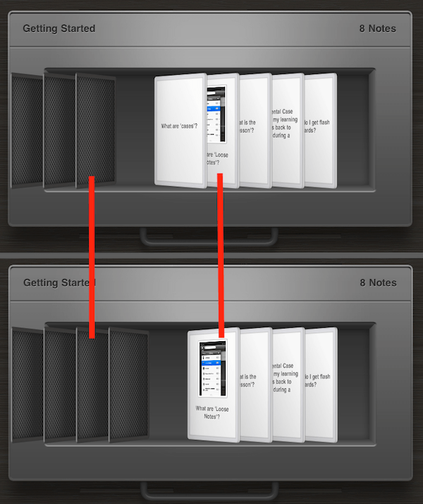
Marcello’s idea was to add lighting gradients to the front and back of cards, and to have these gradients change depending on the position of a card relative to others. To give a concrete example, an exposed note has a much lighter gradient than the others, because in the real world, it would be more exposed to the light. Cards that are behind other cards have a darker gradient, to make it look like they are shaded by the card in front. As a card goes from one state to another — eg, it becomes exposed — the background image is swapped to make it appear the lighting on the card is changing. Unless you look closely, you probably won’t even notice it, but it does make a big difference. The whole view feels more real with these subtle lighting effects.
Consider the comparison below. The red lines show corresponding cards. If you look closely, you should see that the gradients of the cards in the top screen grab are different to those in the bottom one, due to the shading effects.
Another aspect of the cards that adds realism is that when you push a card to expose it, the cards behind it do not all push down by the same amount. Instead, a parabolic formula is used, with notes closer to the exposed card ‘flatter’ than those further away. This is designed to mimic the way a box of physical cards behave when you flick through them.
Click here to view a movie of the flick effect.
To complete the illusion, a flicking sound is played when a card flips over. The sound is quite subtle, so as not to be annoying, but it does add further to the realism of the view, and the perception that it is actually a box of cards.
One final issue that we had to solve was blurriness. When you apply a perspective transform like we do, parts of the cards are stretched and become distractingly blurry. To get around this, we made the cells twice as large as they appear onscreen, and then applied a scaling transform of 1/2. The layer then appears on screen the normal size, but has a higher resolution and is thus less blurry.
Timeline
A project like this is rarely a linear journey from A to B. There are many detours and false starts. It is interesting to look back at the evolution of the note view as a series of screenshots. It gives a much more vivid picture of how our ideas changed over time. Hope you enjoyed the journey as much as we did.
Stay connected