

Lately, there has been a lot of talk about scoring in the NBA because LeBron James surpassed Kareem Abdul-Jabbar with 38,390 career points. I have noticed that there is not much discussion about post-season scoring, so I searched for this dataset on Kaggle (nba_playoffs.csv) which contains the top 25 all-time post-season scoring leaders. Post-season scoring is its own beast. Since teams face one opponent multiple times in a row, they can better concentrate on the opposing team and its individual players, particularly star players. This results in improved defenses across the board. However, the post-season also means players improving their game. What is the result of improved defenses and players alike? Only elite players score consistently and thus, only the NBA's elite are on this list. This post will first examine the dataset using Pandas and then use Seaborn to graph such data.
Pandas is a library for data manipulation and analysis - for more on Pandas see Colin Copeland's post. Pandas can help us make data understandable - particularly large datasets. Seaborn, is a Python data visualization library based on Matplotlib; Seaborn allows us to graph and show correlations between data.
We will use a Jupyter Notebook to run our code. First, let’s import Pandas, Seaborn, and our dataset:
import pandas as pd # it is common to shorten pandas as pd
import seaborn as sns # Shorten seaborn as sns
nba = pd.read_csv('nba_playoffs.csv') # Our dataset will be called nba
Our dataset looks like this:
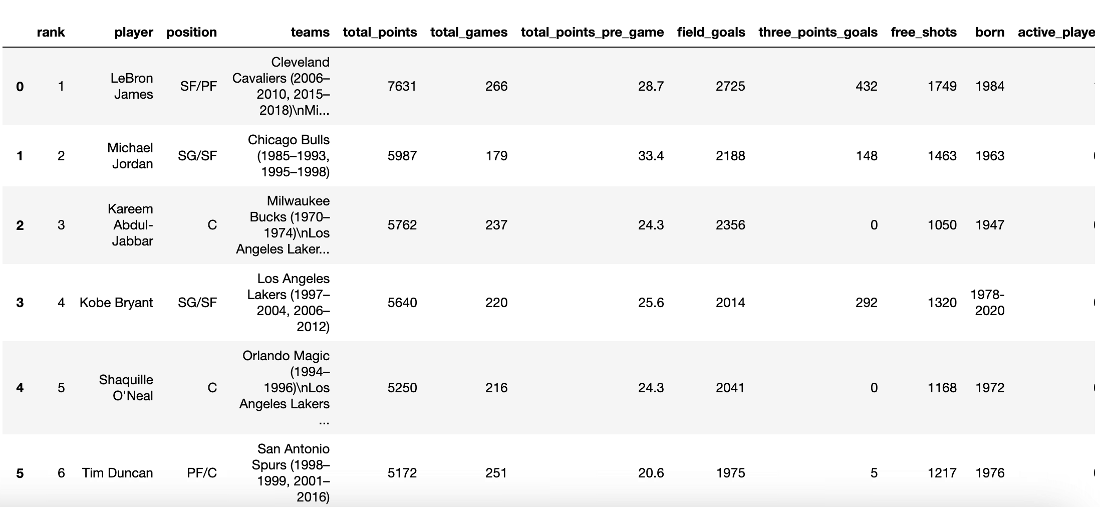
By default, the dataset is sorted by the total points scored column, starting with LeBron James. Immediately, I noticed some things I want to change from our dataset, for which we’ll use Pandas. I don't think for our purpose all existing columns are needed, so we can go ahead and remove some of them. Let’s remove:
* born - column of type _int_ containing the year when a player was born
* hall_of_fame - column of type _float_ containing the year the player became a hall of fame
* country - column of type _object_ containing where the player was born
* recording_year - column of type _int_ containing the year the data was captured
Note: .info provides us with a concise summary of our dataset, including each column’s type.
Let’s use Pandas' .drop method. There are three keyword arguments we must specify:
* labels - name of the column(s) to drop
* axis - denoting dropping a column or a row
* inplace - whether to return a copy or to alter the current dataset
Our command looks like this:
nba.drop(labels=['born', 'hall_of_fame', 'country', 'recording_year'], axis=1, inplace=True)
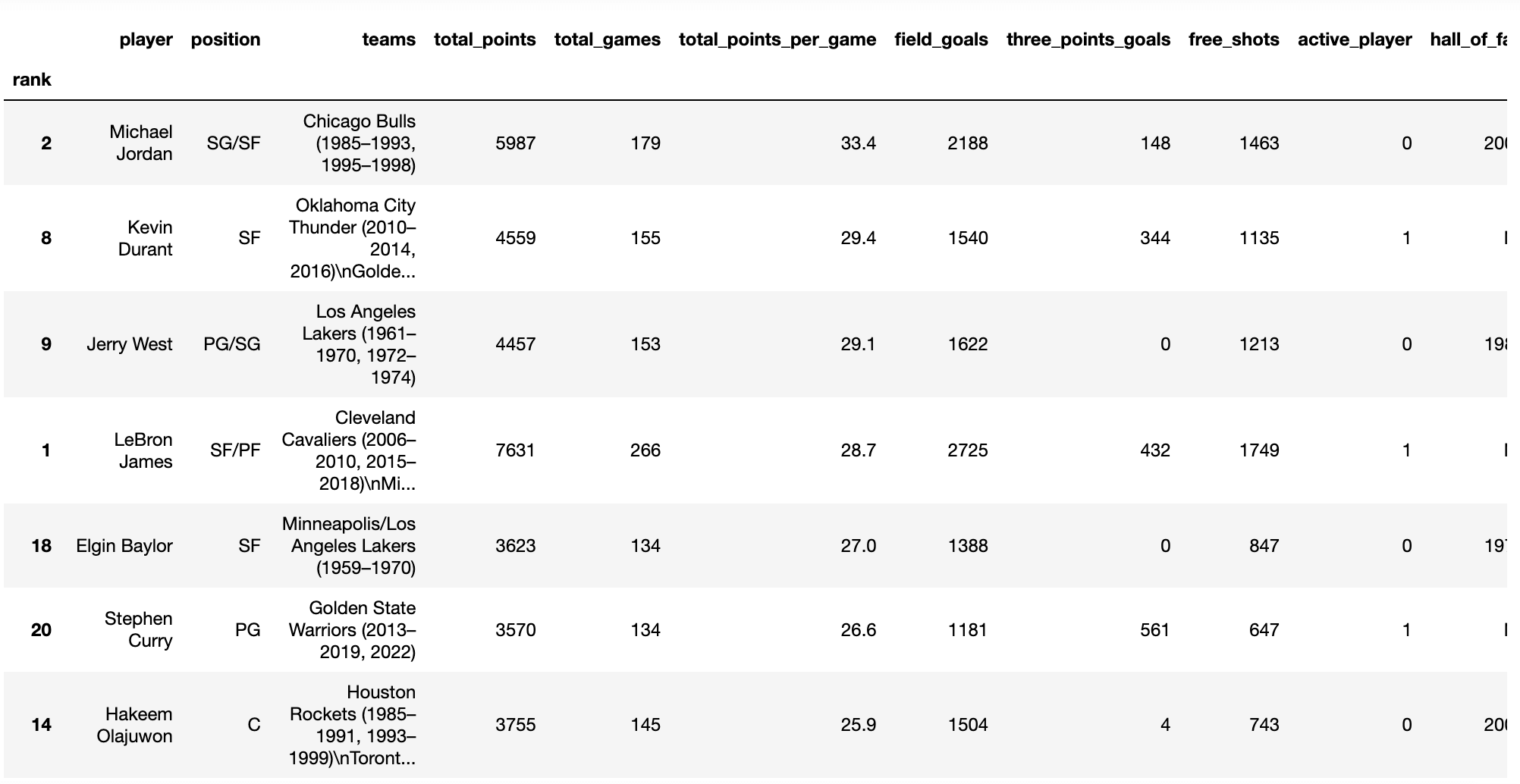
The dropped columns should no longer be there.
LeBron is number one on the list since he holds the title for most points scored in the post-season, as of today. However, since we've established that post-season scoring can be pretty difficult, it would be interesting to graph our dataset based on the most points averaged, highlighting the players who have consistently scored the most. Doing this is as simple as applying the .sort_values method to our dataset. We must specify three parameters:
* by - column to sort by
* ascending - sort ascending vs descending
* in_place - whether to return a copy or to alter the current dataset
Our command looks like this:
nba.sort_values(by='total_points_per_game', ascending=False, inplace=True)
And our dataset is now organized in descending order by points averaged:
Now that our dataset is organized as we want it to be, it's time to introduce Seaborn to the mixture. Part of the brilliance of Seaborn is its ability to simplify graphing data. We will use Seaborn’s .barplot method to create a bar plot. Using it is as simple as calling Seaborn, specifying the plot we want to use, and passing the necessary parameters. Let's graph the top 5 players who averaged the most points; we must specify the following parameters:
* data - the dataset to plot
* x - the value from the dataset to display in the x-axis
* y - the value from the dataset to display in the y-axis
This is the command:
sns.barplot(data=nba.head(), x='total_points_per_game', y='player')
Note: The .head method above returns the first n rows (defaults to 5).
The graph looks like this:
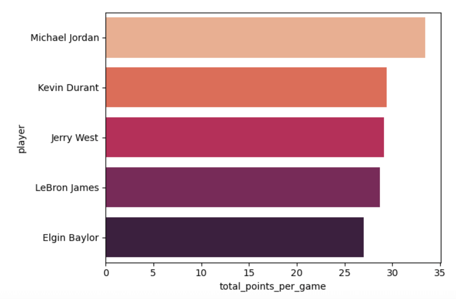
Since the players’ names are long, I chose to display them on the y-axis for clarity, however, player names could have been on the x-axis if the values of the x and y parameters had been inverted. That's how simple plotting with Seaborn can be - we just need to call seaborn, specify the plot we want, and provide the parameters. If we wanted to visualize another statistic (e.g the number of 3-pointers, who shot free throws the most, etc.) we would simply change the value of x to the specific column we wanted and continue to set y as the player column, like so:
sns.barplot(data=top_5, x='three_points_goals', y='player')
sns.barplot(data=top_5, x='free_shots', y='player')
The power of Seaborn goes beyond simple plots, the library is able to intuitively group and color-code to highlight visualizations. Let's say we wished to plot total scoring, accounting for 3-pointers made during a player's career (adding what Seaborn calls a hue to our plot). We would not have to do any groupings ourselves, Seaborn would do it for us. Based on the number of 3-points made, Seaborn would know to either associate players or distinguish them using color. A command that graphs the top 10 NBA all-time scorers by total points and accounts for 3-pointers on a scatter plot looks like this:
sns.relplot(
   data=nba.head(10),
   x="total_points",
   y='player',
   kind="scatter",
   hue="three_points_goals"
)
Note: Notice the use of .head again to return the first 10 rows.
Our graph is the following (sorted by most points scored and accounting for 3-points made):
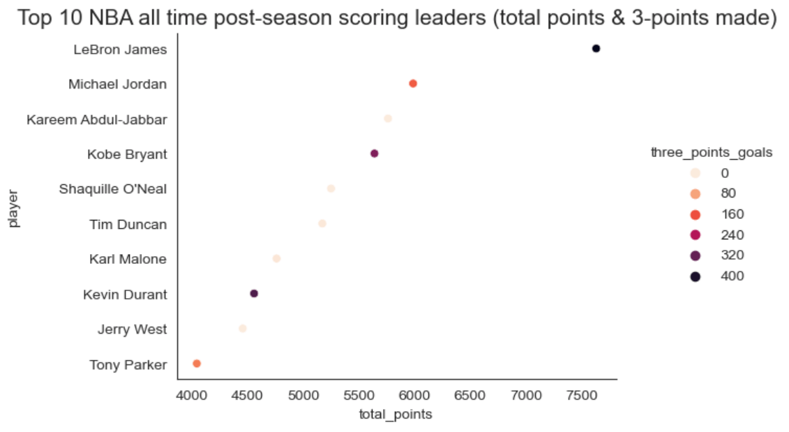
The x-axis accounts for the number of points scored and the color denotes 3-points made. Seaborn gave LeBron’s and Jordan's markers different colors, since they have not scored the same number of 3-pointers. It also gave Kareem, Shaq, and Jerry West’s markers the same color because they scored 0 3-pointers in the post-season. If we hadn’t explicitly sorted by a column, it would have graphed players based on the correlation of the highest number of points scored and the most 3-points made - Seaborn did all this extra work for us just with a simple extra argument (hue).
I hope this post showed you how easy and fun Pandas can be. Thanks to its comprehensive yet simple documentation, you no longer have to be a data analyst to work with data. Analyzing data can help us understand it deeply, just like writing on a subject can. Once you better understand and make your data digestible, Seaborn is there to help you visualize things.