
In its short existence, Sir Jony Ive’s studio, LoveFrom, has demonstrated that it is prepared to go above and beyond in its creative endeavours. Bringing together designers, architects, musicians, filmmakers, writers, engineers and artists, LoveFrom is based out of San Francisco and London.

Early work includes the Terra Carta Seal, and ongoing work with Ferrari, as well as the announcement of a series of scholarships at CCA and RISD in the US, and London’s RCA.

Sir Jony Ive
Before any of that work had been announced, Ive and his key collaborators, Marc Newson and Peter Saville, set to work on shaping LoveFrom’s identity. Working with Chris Wilson, former head of UI design at Apple (and an old university friend of Ive), engineer Patch Kessler and Milan-based typographer Antonio Cavedoni, the team began a multi-year design and research project.

The Terra Carta Seal
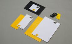
The making of LoveFrom, Serif
Jony Ive: Marc and I started a conversation with Peter, who became a part of LoveFrom. He had a really lovely sense of [how to use] our identity, which wasn’t to constrain it with a traditional logotype, but to use it in order to invite a dialogue.
Peter Saville: My most active contribution came when Jony asked me what the LoveFrom logotype should be. I was actually really surprised they’d managed to register ‘LoveFrom’ as almost every combination of words has been taken.

LoveFrom, Serif
Starting back in autumn 2019, the initial discussions were about the words themselves, and how they should be presented.
Peter Saville: Jony asked me about how it should look. It was difficult at the beginning because of the familiarity of these two words, ‘love’ and ‘from’. I initially thought it should be in a modest typeface, maybe a neutral sans serif. However, the most significant thing I contributed was the comma. This gives the words a sincerity and places them on one side of a dialogue. It performs this kind of inclusive act.
Jony Ive: Peter’s insight was that LoveFrom’s approach could be defined by the comma in the logotype. Chris and Antonio’s work on our website makes it very clear how that works in practice.

LoveFrom, Serif, italic
One of the first jumping-off points for the project was a Saville-designed album cover. The 1981 album by Blackpool band Section 25, Always Now, featured a full-bleed typographic composition set in Bembo.
Peter Saville: I knew that cover had made a big impact on Jony. The idea of using a comma was very well received by the team, so from that point on it became a question of typography. I’m not familiar with many logotypes that have commas in them. Full stops, yes.
Jony Ive: The first typefaces we looked at weren’t crafted in a way that satisfied our creative nature. We started with Bembo before looking at Baskerville and then realised that we’d never find something that we totally loved, so why [not] develop one for ourselves?

LoveFrom, Serif: weights
LoveFrom, Serif was born. Its first official public outing was on the LoveFrom website, and its first appearance in print in the recent limited-edition Steve Jobs book, Make Something Wonderful; the typeface is also used in the Terra Carta Seal and the LoveFrom design for the official emblem of the Coronation of King Charles III. Years in the making, the effortless simplicity of the letterforms belies a hugely complex, long-winded process.
Marc Newson: It struck me at the outset as a really curious endeavour – when you really manipulate and play with fonts. Fonts are really, really technical things. Even being a graphic designer doesn’t entitle you to understand typesetting. It’s an old-school preoccupation.

The archive collection of original Baskerville (Reproduced by kind permission of the Syndics of Cambridge University Library)
Peter Saville: When Chris, Patch and Antonio came on board, it moved from Bembo to Baskerville. At which point I just sat back in wonder and admired their attention to detail. They have delivered their own extraordinary iteration of it. For the last 30 years at least there’s been a remarkable enthusiasm for typography. It didn’t used to be that way. Typography was once seen as boring. When I was at college, I remember falling asleep in the type-setting room.
Marc Newson: Typography is a very analogue medium – a true craft. Jony and I find that craft compelling. Some might perceive it as anachronistic to even think about fonts. But that’s OK, because we love to do things that maybe other people don’t. It was a very conscious decision to focus on typography and have people like Chris and Antonio on board and give them these opportunities.

An original Baskerville punch (Reproduced by kind permission of the Syndics of Cambridge University Library)
There are many reasons why John Baskerville’s eponymous typeface attracted the LoveFrom team. Baskerville (1707-1775) was an artistic and creative pioneer in many spheres, from paper-making to printing. Throughout his life, he printed numerous books, with a quality and simplicity of presentation that looked forward to the modern era. The original punches used for his most celebrated typeface are remarkable survivors, now in the care of Cambridge University.
Cavedoni already owned a collection of antiquarian volumes set in Baskerville, whilst Robin Hull at Cambridge took exquisite macro photographs of these precise, tiny steel punches, with some letters just 1mm tall. Cavedoni, whose typographic credits include designing Apple’s seminal San Francisco font, describes Hull’s images as ‘an enormous breakthrough’. They revealed the shapes and eccentricities of the typeface in meticulous detail.

An original Baskerville punch (Reproduced by kind permission of the Syndics of Cambridge University Library)
Chris Wilson: A lot of people do custom typefaces these days just for the sake of it. We didn’t want to jump on this bandwagon. My intuition was that Baskerville felt like the right balance. There was a really interesting synergy with modern design throughout its history. I also quite enjoy the constraints.
Antonio Cavedoni: [John] Baskerville was always in search of perfection. He talked at length about his love of letterforms. He was someone who made everything – the press, the ink, the paper, and of course the original punches for all the different sizes of type. His almost obstinate preoccupation with getting it right was very attractive.
Jony Ive: I consider myself fairly ignorant of typography. But even though I don’t have Antonio’s exhaustive knowledge, I was still drawn to this beautiful face. Our approach was one of respect and reverence to Baskerville’s work.

LoveFrom, Serif, individual characters and letterforms
The long research and development process, which occupied Cavedoni and Wilson throughout the Covid lockdown, involved drafting and redrafting endless subtle variations of John Baskerville’s forms. As well as the printed page, Cavedoni researched slate letters cut by Baskerville, in addition to contemporary lettering manuals and the work of the typographer’s peers.

LoveFrom, Serif, optical sizing
LoveFrom, Serif is supremely flexible. The project included working on very light and very heavy iterations of the font, styles that simply wouldn’t have existed in the 18th century. Then there were numbers to design (John Baskerville only used old-style numerals), as well as italic weights, which have a flatter, more two-dimensional character. A set of alternate shapes for many characters was also created, taking advantage of Baskerville’s different iterations of forms like the ‘R’, and ‘Q’.
The typeface is optically sized – depending on the point size, the space between letters is dynamically adjusted to deal with different print quality or monitor resolution. There’s also a complex algorithmic approach to the curves, that blends them seamlessly into the straight lines of the descenders.

LoveFrom, Serif. The evolution of the curves
Patch Kessler: At Apple, we spent a lot of time on curves to get things just right on things like the app tiles. It’s the same principal here, just massively more complicated, involving math, optics, and geometry.
Marc Newson: Continuous curvature is a new concept to implement in type, the sort of thing that would once have required a super-computer. It’s a very compelling way to explore digital technology in a craft-based sense. You don’t often get examples where the two can harmoniously benefit each other.
Jony Ive: These forms are so extraordinarily beautiful, so pure, with a serenity and fluidity. The typeface was intended to be scalable and useful in many different manifestations, particularly digitally. We also wanted to share it for special collaborations, some of which I can’t talk about.

LoveFrom, Serif, individual letterforms
Chris Wilson: There’s so much we can do when expressing it in the digital world. It’s something you can’t do with an off-the-shelf product.
Antonio Cavedoni: The typeface can be a platform for making bespoke pieces of lettering.
Jony Ive: I’ve always felt really strongly that you hope a design solution gets to the point where it doesn’t feel like there’s any other alternative. And that there’s no sense of a designer wagging their tail in your face.

Another early, under the radar outing for LoveFrom, Serif was in a self-published memorial book for Richard Rogers’ final project at Château La Coste, a project undertaken to ‘honour a dear friend’, according to Ive. Work is also apace to design a complementary sans serif (no prizes for guessing the name), all part of Ive’s desire to give LoveFrom the ultimate bespoke tool kit.
Jony Ive: At its heart LoveFrom is about gathering together experts, people who are pre-eminent in their various fields. The tools we use as creatives tend to establish and reinforce the differences in our practice, not the similarities. When you make things with love and care you express your gratitude to humanity, to our species.
Peter Saville: In a way, I made my contribution 40 years ago when I realised that typography triggers certain contextual and cultural associations. I saw how it could be very evocative in creating a certain gravitas as well as a sense of cultural significance. I think pop culture in the 1980s turned a young generation on to type. But it’s also something that either works or it doesn’t.

LoveFrom, Serif, numbers
Marc Newson: On a project like this, we can spend as much time as we want – we are the client. Luxury is the wrong word, but we don’t often have this kind of opportunity in our line of work. There’s always space, not necessarily to improve, but to refine something. It’s simply about the detail.
Peter Saville: Jony has that obsessive mania for everything – he’s very particular. You can obviously see that in his work for Apple. It results in extraordinary things. His approach is to say, ‘Let’s do it until there’s no more that can be done.’ LoveFrom, Serif evokes art and craftsmanship, values that Jony wanted to associate with LoveFrom.
Jony Ive: Designers often talk about how we work, but not why. Our name describes our motivation, which is to be in service of humanity. It’s great to have a motivation of that gravity. LoveFrom, Serif speaks perfectly to our collective approach and to our experience. It has its basis in the physical world – via the original steel punches – and it has its final manifestation in the digital space. I can’t think of a better first product.
-
 The moments fashion met art at the 60th Venice Biennale
The best fashion moments at the 2024 Venice Biennale, with happenings from Dior, Golden Goose, Balenciaga, Burberry and more
-
 Crispin at Studio Voltaire, in Clapham, is a feast for all the senses
New restaurant Crispin at Studio Voltaire is the latest opening from the brains behind Bistro Freddie and Bar Crispin, with interiors by Jermaine Gallagher
-
 Vivienne Westwood’s personal wardrobe goes up for sale in landmark Christie’s auction
The proceeds of ’Vivienne Westwood: The Personal Collection’, running this June, will go to the charitable causes she championed during her lifetime


-
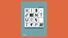 ‘Mid-Century Type’ surveys the best graphic design from 1945 to 1965
This must-have manual of post-war graphic design tracks the evolution of midcentury visual culture and the people and studios that shaped it
-
 LoveFrom shapes Astra Carta seal’s elegant typography and forms
LoveFrom aims for the stars with its new design for the Astra Carta seal, pointing the way towards a sustainable approach to space with regal approval
-
 Fix up look sharp: Balmond Studio launches new brand identity


