Needless to say this has been quite a challenging year for everyone. I certainly hope you and your loved ones are in good health and that your business is on its road to recovery.
Since we've reached the mid-way point of 2020, I thought it would be good time to describe what we've accomplished so far this year and what we expect to release by year's end.
v20.1
Here's a brief summary of a few DevExpress BI Dashboard related features we released last month (You can find additional information within our What's New v20.1 webpage).
Ongoing Enhancements
Thanks to some insightful feedback in our "Are we on the Same Page – 2019" survey, we were able to extend the capabilities of our Dashboard API in the first release of 2020. Specifically, we:
I want to extend my thanks to everyone who contributed to the evolution of DevExpress Dashboard. Your feedback and engagement matters. We are definitely listening and doing everything we can to meet your expectations.
Lifecycle API
We delivered about 50 new APIs (methods, events, extended event arguments, enumerations) in 12 groups. Together, they offer new opportunities for those using DevExpress Dashboard. Simply said, our new API allows you to embed new end-user options and commands for DevExpress Dashboard's Designer controls.
We also reworked our documentation and created a single-entry point that lists all current customization options:
Еach help topic refers to the samples that demonstrate capabilities. You can download and modify these samples as needed.
The Dashboard's Lifecycle API was first released as an EAP. Once again, your feedback helped us shape its direction. Thank you.
Week-Year Group Interval
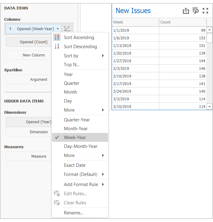
Yes, here's another feature that was driven by customer feedback.
We discovered that our default approach to divide time into Weeks based on current Culture Settings, sounded logical but did not effectively address user requirements. Basically, we learned that users do not expect that a week at the beginning of the year can be divided into two parts.
So this lesson forced us into a breaking change (v20.1.4). Our new group interval will always break a timeline into equal periods. Of course, we sincerely apologize for the breaking change and the fact that unexpected behavior made its way into production code. Thanks to everyone who helped us fix this error.
Card Conditional Formatting

This was a highly demanded feature. Once incorporated into your Dashboard, you'll have more opportunities to focus user attention on unexpectedly bad (or good, or just… unexpectedly unexpected) KPIs.
You can use Formatting Styles – styles that mirror those of the DevExpress Data Grid/Pivot Grid - as needed. You can change selected Card element Font, add an Icon or apply a background color to the entire Card.
Parallel Periods

When investigating this feature, we dropped our intent to introduce a new Window Calculation. We made this choice because we found that it was both overcomplicated inflexible. Instead, we added two new methods to visualize and compare your data:
- With Measure Filter, you can compare data between predefined DateTime periods.
- If using calculated fields, you can use the joinRule function (extends Aggr syntax) to shift the Measure value by the DateTime axis.
You can review both methods in our YTD Performance demo.
Are we on the same page?
Before we move to v20.2, we'd like to gauge the overall effectiveness of our v20.1 development efforts. Please take a moment and tell us which of the following v20.1 features you've used or plan to use in an upcoming project.
Ok – time to focus on our upcoming release.
What we expect to ship in v20.2
Additional API enhancements

"Great things are done by a series of small things brought together." (Vincent Van Gogh)
Just last week I came across this quote and thought that it describes our new API set quite well.
We have already adopted this approach in the Lifecycle API. 50 members, used together, create a complete picture.
Real-Time Dashboards
Just like with our Lifecycle API, we want to introduce a series of enhancements and customization options. Together they will allow you to better monitor real-time values using DevExpress Dashboard.
We are considering the following enhancements:
- Reworked and configurable loading indicators.
- Improved data update mechanisms.
- Cache management API for real-time scenarios.
Web Dashboard – Wrappers for Modern Web Frameworks
We want to better support those who develop modern web apps using popular client frameworks.
We plan to introduce platform-specific wrappers for our Web Control. These wrappers will simplify how you add our Dashboard control to your application and bind it's options to your View Models. We'll make it easier to configure the Dashboard control and connect it to your .NET backend (MVC or ASP.NET Core).
Filtering Enhancements
We believe that the DevExpress Dashboard Master-Filtering system is one of the simplest and one of the most powerful data filtering systems available today. Of course, we still want to extend its capabilities and make it even more flexible. While working on the Measure Filter last year, we came across ways to retain simplicity and increase flexibility at the same time.
We expect to introduce the following filtering options this year.
- Allow the use of Master-Filter values as a part of Filter expression for Dashboard Item Filter / Measure Filter;
- Introduce a new Post-Calculation step or a "Final Filter." This can be applied to data when all calculations, grouping and aggregation are finalized.
We are prototyping so we can't be certain that this will be delivered in exactly this shape. We'll share some of our results with you soon.
Trends & Regression Lines for Chart Item
We are investigating the best way to use Trends Lines and / or Regression Lines within applications powered by DevExpress Dashboard.
We've concluded that in addition to visual elements, customer requirements vary greatly (variances in the type and parameters and trends calculation logic). This led us to the following feature – post-processing…
Custom Calculation Step
We are considering a new API that allows you to post-process data prepared by our Data Processing Engine (to add additional columns with data calculated on your side). This should give you maximum flexibility during data preparation.
Better Async Support in WinForms Dashboard Designer
Based on feedback, we expect to improve Async support for WinForms / WPF Dashboards. This work has already begun.
Data Source – Unfolding Nested Arrays
Like most analytical tools, DevExpress Dashboard works natively with so called flat Fact Tables.
This is great but does not help if your JSON/Object/XPO formatted objects have nested arrays and require you to unfold as a preprocessing step.
In v20.2, we expect to introduce a new option designed to transform data on our end (part of our ETL engine).
Chart Conditional Formatting
With conditional formatting, Dashboard Charts will be able to highlight values that correspond to specific criteria.
Before we let you go
Your feedback matters a great deal. Please help us further improve DevExpress Dashboard by answering the following survey questions:
Free DevExpress Products - Get Your Copy Today
The following free DevExpress product offers remain available. Should you have any questions about the free offers below, please submit a ticket via the
DevExpress Support Center at your convenience. We'll be happy to follow-up.