
It’s our third run in General Assembly. We know the drill. Let’s get straight to business.
The Brief
Work in a team to identify problems and/or opportunities with an existing mobile application and utilise your knowledge to design a solution.
The Team
Project Managing/Research: Drew Yu
UX Researcher: Nicholas Gwee
Product Research & Design: Ivy Huang
Tools
User research, UX, Sketch, usability testings
Project Duration
2 weeks (due to the short period of time, the accuracy of project outcome is based on a smaller pool of user research and testing
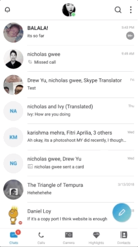
In order to understand where Skype stands in the market and within their users, the team split into 3 types of research methods. We discussed a set of user survey and interview questions on Survey Monkey. Nicholas and Drew head off to speak to users while I dived into the internet to see what people are talking about on a worldwide scale.
Skype Research
The History
Skype was one of the first few long-standing and successful telecommunications application software product that specialises in providing video chat and voice calls between computers, tablets and mobile devices via the Internet and to regular telephones. It was founded in 2003 by Niklas Zennström, from Sweden, and Janus Friis, from Denmark. The Skype software was created by Estonians Ahti Heinla, Priit Kasesalu, and Jaan Tallinn.
Then VS Now/strong>
On 10 May 2011, Microsoft Corporation acquired Skype Communications. Shortly after its acquisition, Microsoft began integrating the Skype service with its own products. In 2013, Microsoft phased out its long-standing Windows Live Messenger instant messaging service in favour of Skype. in the following year of 2014, Microsoft announced that in 2015, Lync would be replaced by Skype for Business.
When we interviewed our users, more than 80% of them weren’t aware that Skype was acquired by Microsoft. The most drastic change that was ever done to this application is probably the revamp in mid-2017
-

- Good old Skype VS
-

- new interface in 2017

The radical revamp of Skype’s interface and new list of features wasn’t too receptive by their long-term and loyal users. Microsoft’s efforts to battle with other messaging services have taken the lead for today’s conversations was ruthlessly bashed by the internet (Here, here and here). The question is, why?
What Microsoft says: Skype and Microsoft have big Dreams
They are bringing innovative technology to friends, family and colleagues everywhere. They will enable more people to connect in more ways that transform and enhance their lives. Skype is for doing things together, whenever you’re apart. With Skype, you can share a story, celebrate a birthday, learn a language, hold a meeting, work with colleagues — just about anything you need to do together every day. You can use Skype on whatever works best for you — on your phone or computer or a TV with Skype on it.
Great dreams push you to go to great lengths. Microsoft’s plans for Skype is rational and innovative while pushing their users to the modern era of technology. It all seems good and cool, so now, what are the users saying and how are they behaving?
User Survey & Results
The team sent out an online questionnaire of 10 questions and collected 26 responses. The questions focuses on the type of communications app users are exposed to, their engagement with Skype and what they expected out of communication apps. In summary of our findings:
- The participants ranged from 20 to 40, with 47.83% of them at the age of 25 to 35.
- Many users used more than 3 communication apps.
- 96.15% uses WhatsApp, 65.38% uses Facebook Messenger, 42.31% uses Skype and 38.46% uses Google Hangouts and Discord.
- 29.17% uses Skype for personal only, 20.83% uses Skype for work only and 50% uses for work and personal.
- Less than 5% of the users engage in social media and sharing features in the current Skype app.
- Majority of the uses interchange between mobile app and desktop app, but only 8.33% uses mobile only.
- The most used features are video calling (80.77%), messaging (73.08%), audio calling (65.38%) and screen sharing (50.00%).
On top of that, we interviewed 9 users to find out their engagement, views, usage and experience with Skype. With the information we gathered from the user interviews, we listed them out on post-its and did an affinity mapping to identify the trends.

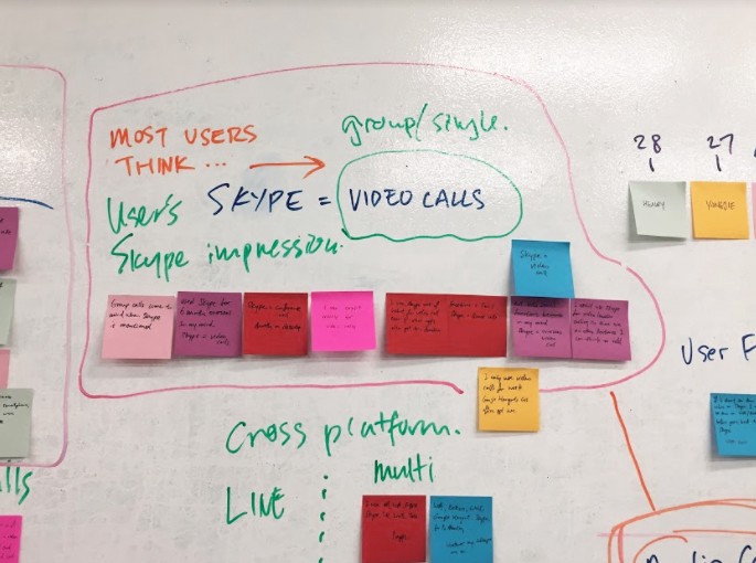
-

- Affinity Mapping
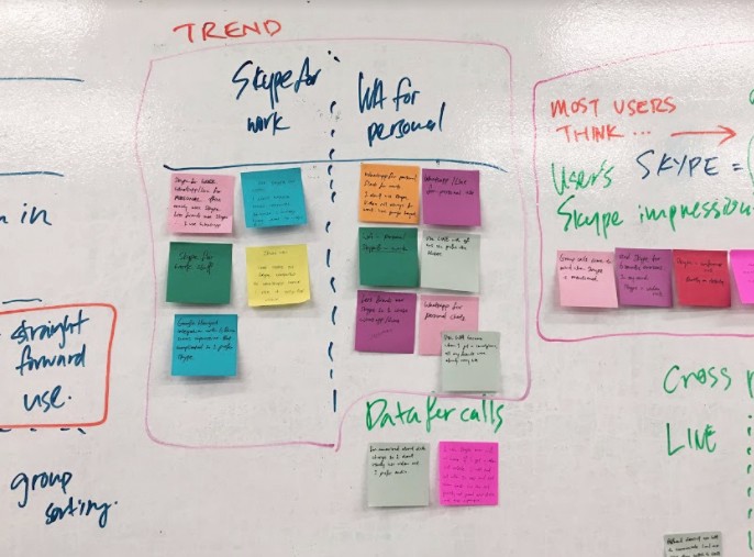
The data that we got in our affinity mapping was quite sparse due to the vast number of communication apps available, differences in expectations and needs of users and level of engagement with the app. The results in summary:
- Users recognised Skype as a video call platform.
- Users primarily use WhatsApp for personal usage and intuitively recognise Skype as a work usage tool.
- Users are concern with how the bandwidth affects their call qualities, hence they use desktop for calls over mobile.
- The feature that users valued and used the most in Skype is video calling (single and group).
Skype vs WhatsApp vs Facebook Messenger
With a sea of choices of communication apps available in the market, Skype, WhatsApp and Facebook Messenger emerged as the dominant market within our pool of users. In order to get a clear understanding of how each app function, I whipped up a screen flow heuristic evaluation of all 3 apps:
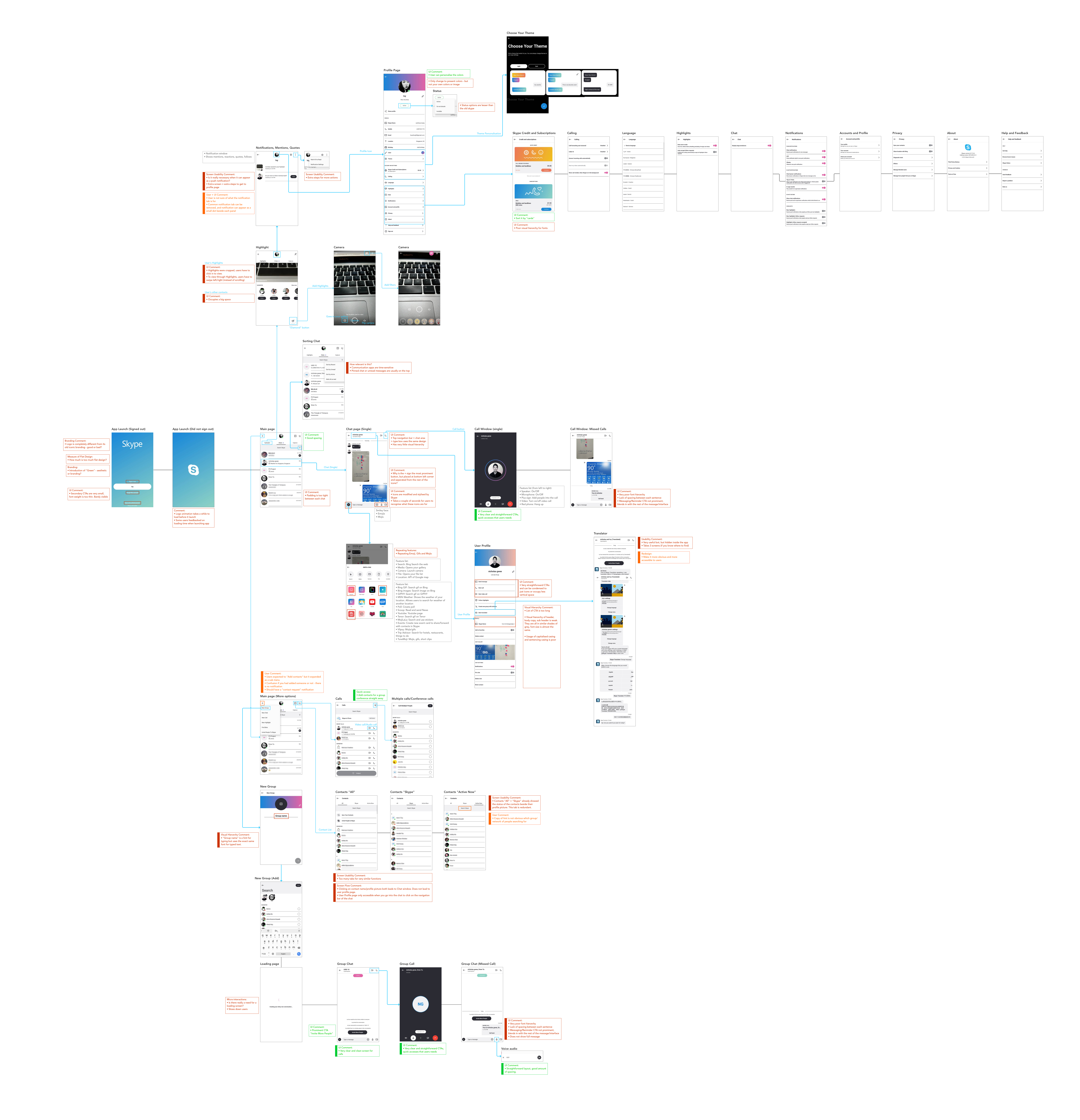
-

- Skype, WhatsApp and Facebook Messenger’s heuristic evaluation.
The heuristic evaluation between the 3 apps can be summarised in the following points:
Skype:
- Use of space/padding is inconsistent — some have very tight spacing that makes it difficult to read, while others have a good distribution of space.
- Very poor visual hierarchy of font usage. Poor differentiation of headers, sub headers, main body text, CTA and icons.
- It is a form over function app at present.
- Some necessary features are a few screens deeper — users need to click to different screens to get to what they want. It can be a very frustrating process for the users.
- Redesigned icons is not as intuitive as global visual language.
- The way Skype delivers the functions does not align with user’s expectations e.g “+” sign gives a dropdown menu of various functions instead of adding contacts.
WhatsApp:
- The most attractive attribute of WhatsApp is the ease of use.
- The app does not have micro interactions and loads straight to the screen/task, which makes it really quick and easy for users to know what they need/want
- WhatsApp’s UI allows users to get what they need to quickly. Good visual hierarchy fonts: Headers, sub headers, body text, text hints, CTAs. Users know where to look and where to click.
- It still fulfils its primary role as a communication app despite their integration of Moments.
- It does not have a group call option.
Facebook Messenger
- Clarity in UI, easy to use.
- Facebook Messenger is a different form of communication app from Skype and WhatsApp as it taps on the user’s social media account and has features for gaming.
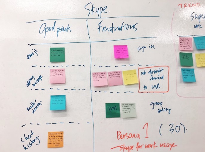
Research Conclusion on Skype
After a very detailed research of understanding Skype, we could see the logic behind its revamp and why users are overwhelmed with its changes. When Skype joined Microsoft, the business goal was shifted from its primary function as a communication tool to an application that engages with the user’s lifestyle, events and activities. It was a bold move that many users were unable to comprehend as they were overwhelmed with the changes. However, it does not mean that it’s a wrong move. In fact, Microsoft was trying to push its users to a modern era, and this is necessary for any business development or user’s benefits of keeping up with the advancement in technology.
What went wrong here is how the features were positioned. The UI design became modern and in line with the still-popular flat design trend, but was at the sacrificed of the visual hierarchy and usability of the app. It was also a radical change for their long-term users. Users now need to go through more screens to access a feature. Basic functions like adding a contact has more than 3 ways to do it, and advance features like conversation translator are buried and not easily discoverable by users. Multiple fancy micro interactions reminds users that their “actions are loading”.
Key User Frustrations
With all these complications, users might find it difficult to navigate through the apps and get what they need to be done fast. Currently, most users do not have a clear sense of what or where the features are in Skype. Current users had to take the time to relearn the app while new users express their frustrations on how complicated it is as compared to other communication apps. Both parties take many steps to accomplish their goals.
Our Solution
The solution to this problem will be to study what the are the basic needs of the users and making them easy to understand and readily accessible without moving from screens to screens. Improving the UI and visual hierarchy will help users to digest the information they need and learn how to use the app in a shorter time. Hence, we will design an update to the app that provides a better user flow for our users through a reorganised user interface, and a reorganisation of key elements.
User Personas
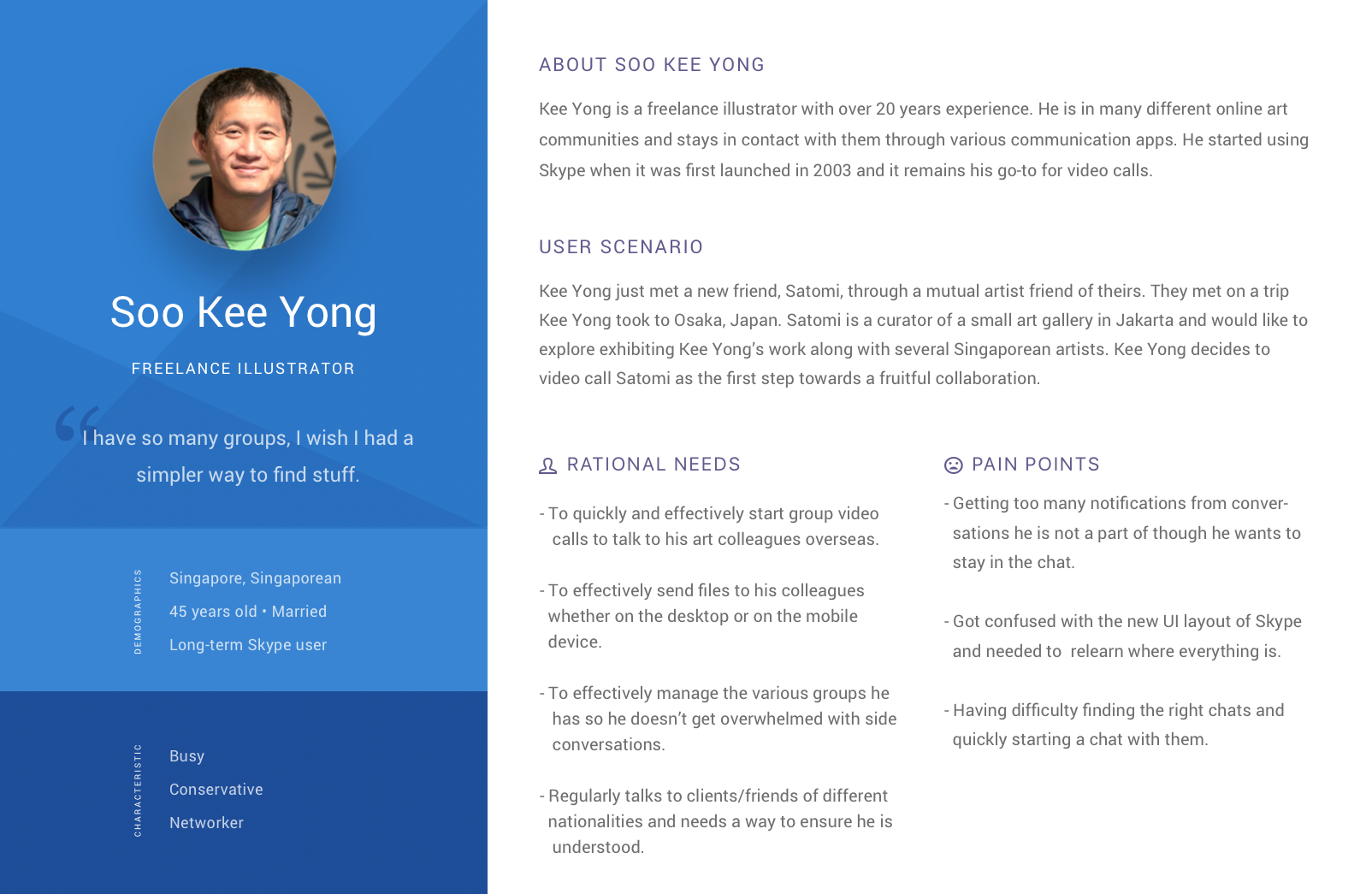
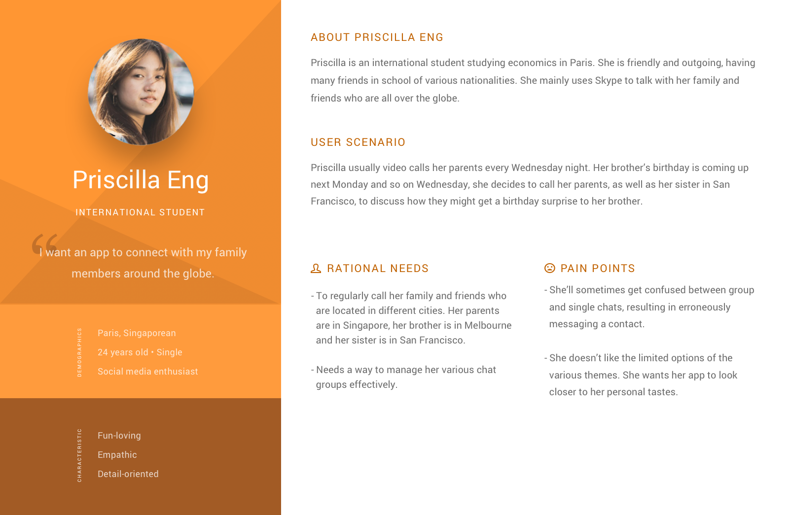
With our research and analysis in place, the team gathered for the next step. We formulated our user personas from the user research and affinity mapping: Soo Kee Yong and Priscilla Eng (pun intended).
The users can be defined as the following:
- Soo Kee Yong: Long-term Skype user who works as an illustrator with multiple clients across the globe. Uses Skype messaging, video and voice call to communicate with his clients.
- Priscilla Eng: Young and energetic international student away from her friends and families. Uses Skype audio and video calls to stay connected with her loved ones. Also a social media enthusiast.
User Journey
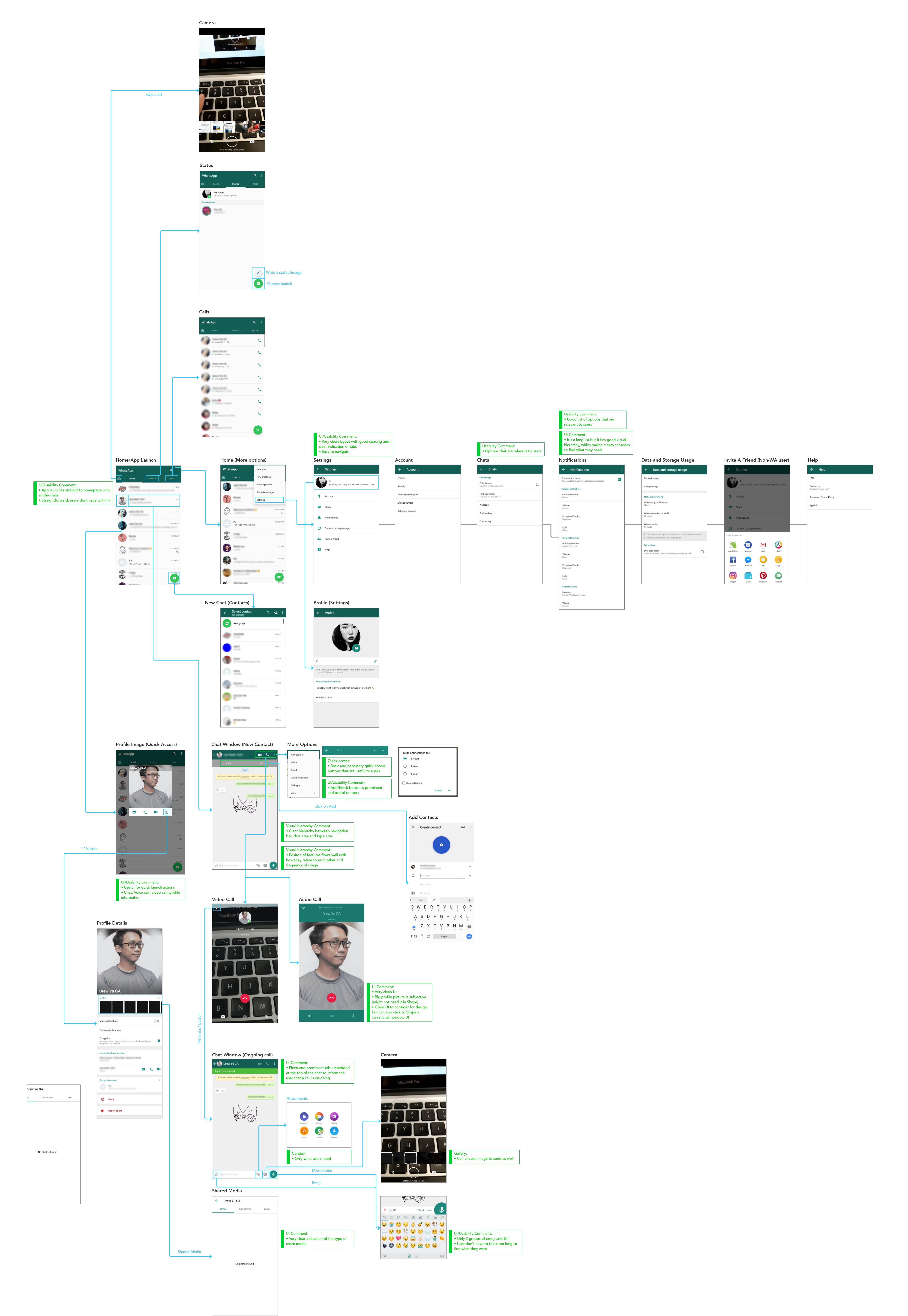
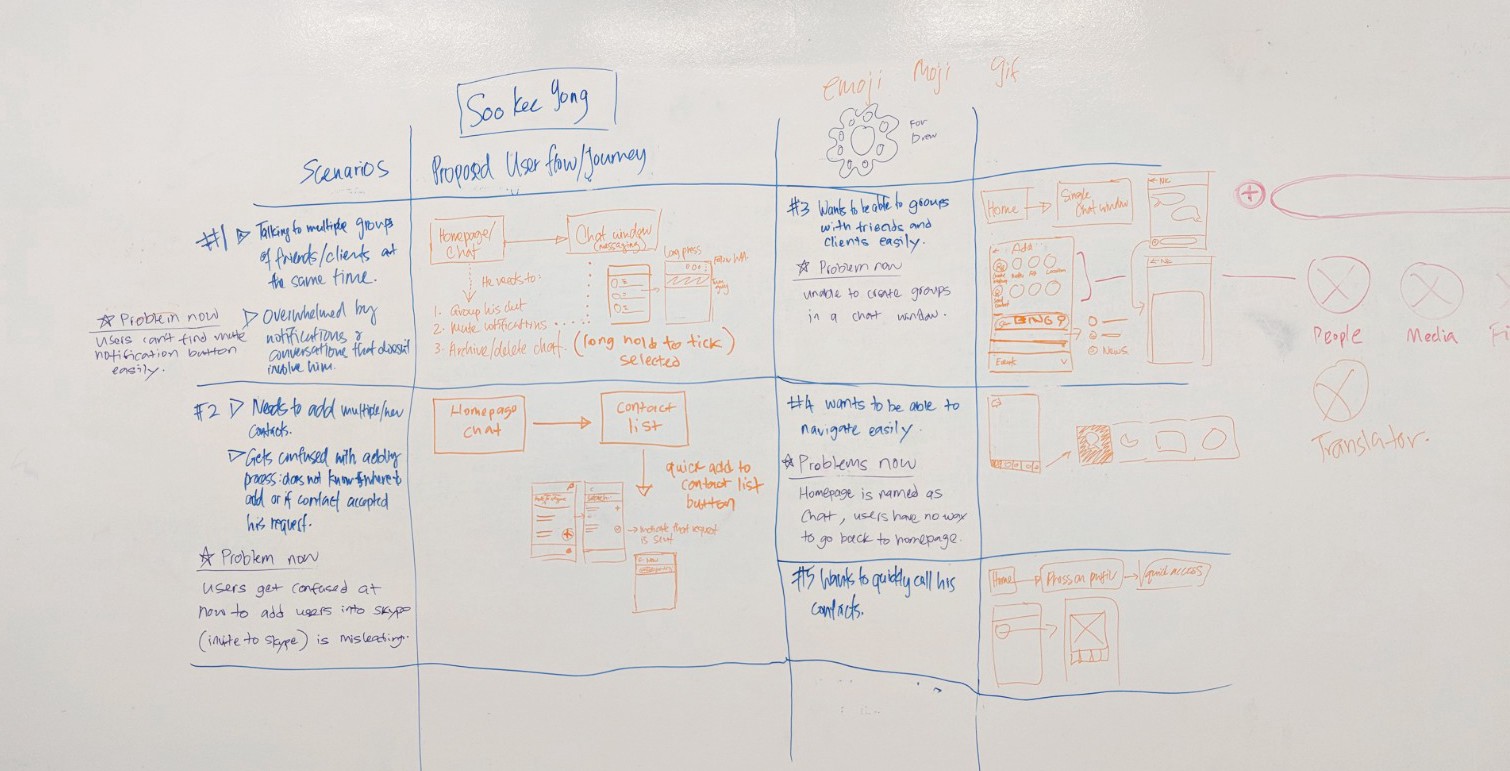
After coming up with the user personas, we proceed to discuss the redesigning of Skype app. We came up with a list of scenarios of our user’s frustrations and how we would go about solving it. The solutions are in the form of screen flows and rough sketches of wireframe.
-

- Problem scenarios, proposed solutions and wireframes of Soo Kee Yong + Priscilla Eng.
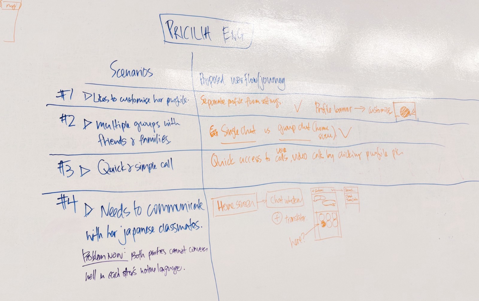
While working on this, we discovered that Skype made an update to their app with multiple improvements in their UI that we intended to design. Despite the new update, a number of usability problem still persisted. We had a discussion and decided to stick to the current UI instead of redesigning the app.
We also noticed that there were several cross over in their pain points despite that being different individuals. Hence, I created the following user experience map that is applicable to our pool of users who shared a common goal of using Skype to communicate through text messaging, audio call or video call:

With our research in place, I proceeded with a high-fi prototyping of our new Skype mobile app.
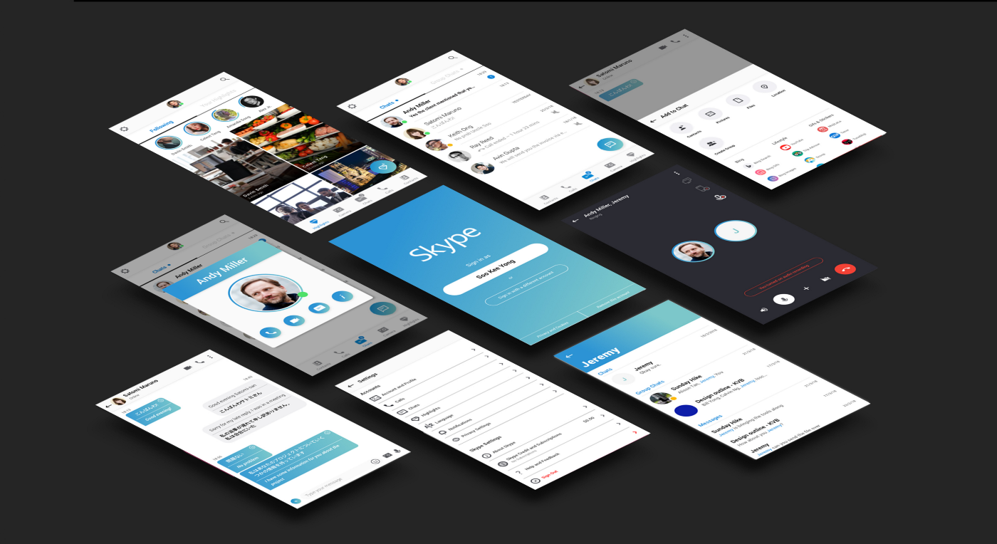
The New Design

Skype Redesign. Template by Jordi Manuel.
Some major changes made in our redesign:
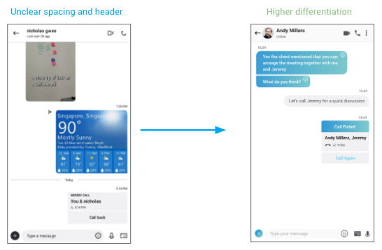
Removing barriers in user flow:

- In the current version, users can’t add another user in the call screen. This barrier is removed and now users can add another person to the call even if the first line did not pick up. We understand that this might be a technical issue but it is one of the most highlighted problems raised by our users that we think should be resolved.
- Users can now share their screen, record conversation videos and audio calls.
- Notification bell on the top left hand corner is replaced with app settings (previously together with profile settings). It is redundant as all notifications can be accessed with the bottom navigation.
Do it now, do it quickly:


Quick access (left), group actions (center), chat tabs (right).
- A quick access button can be triggered by clicking on the profile picture in the chat screen. Users can do an audio call, video call, message and view user’s profile.
- Long press gesture is introduced and it triggers group selection actions e.g mute, delete, pinning.
- Quick button for adding contacts is included, which was previously missing.
- Users now have 2 tabs of “Chats” and “Group Chat” to differentiate their chat groupings, a feature that is lacking in WhatsApp and Facebook Messenger.
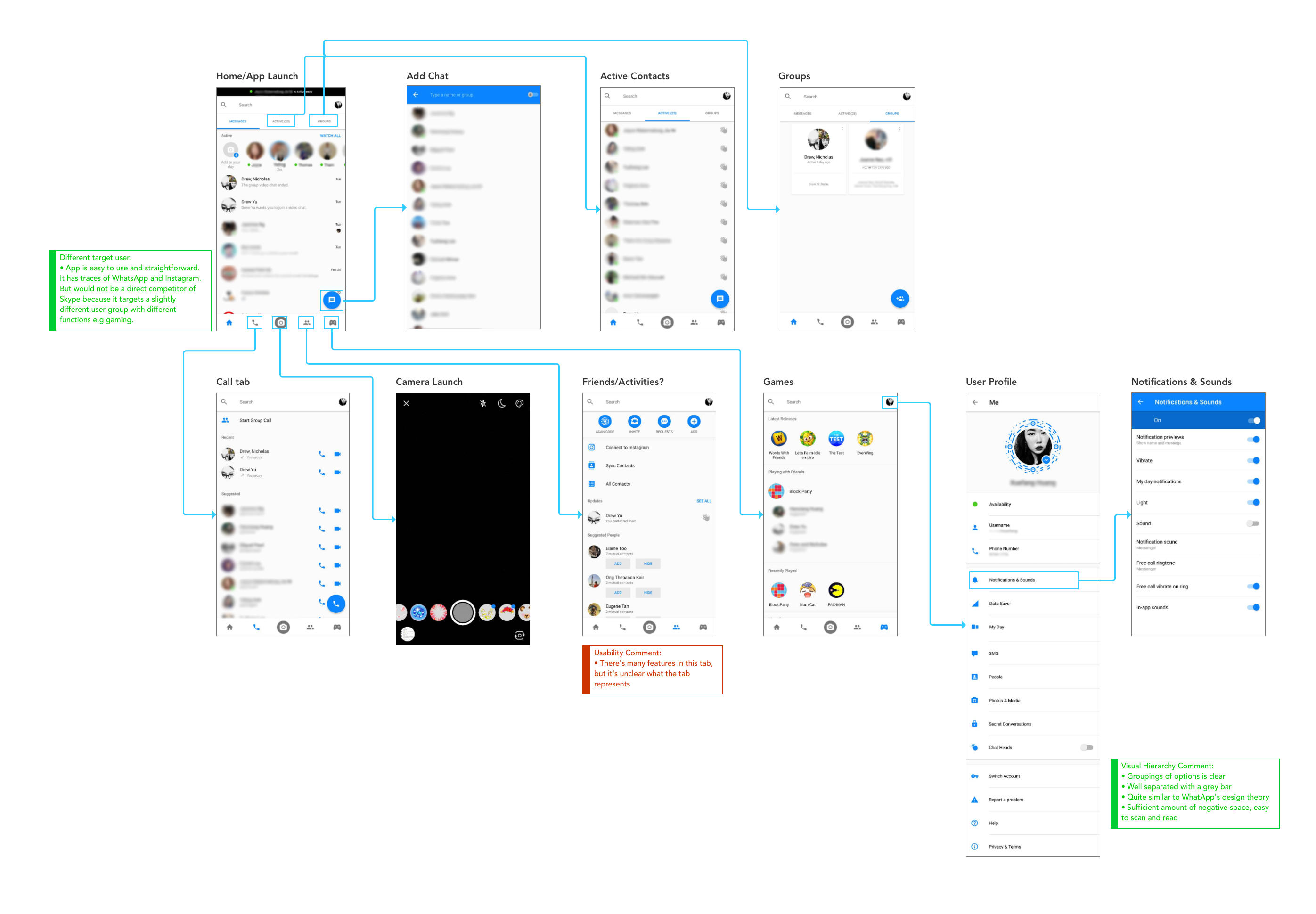
Skype Translator:
-

- Current app’s translator (left), our proposed translator (center), revised translator after usability testing (left).
- Skype Translator can be accessed from individual chat windows by clicking the “+” button, instead of it being buried in another user’s profile.
- Skype Translator now works as the app system, instead of a chat bot as a third party participant to the chats.
Customisation:
- Users can now personalise their profile banners with colours and images, which is one of the most requested feature from our user interviews.
Better visual hierarchy, easier for your eyes:

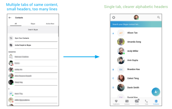
- Contacts list is redesigned with lesser tabs and better visual hierarchy.
- Highlights screen is completely redesigned to allow users to browse efficiently and pleasantly.They can view by users of view by timeline.
Usability Testing
With our prototype in place, we conducted a series of usability testing. We gave our participants Soo Kee Yong’s persona. Users have to complete 12 tasks. Some tasks are specific instructions, while some are more conversational and feedback based.
The Results
After testing 4 users, we noticed a trend of consistent fail rate. We decided to pause the tests and make iterations before we proceed for another round of testing.
Usability tests: 4 users
Average time take: 15.5 mins
Successful rate: 53.1%
From the results sheet above, the 3 tasks had extremely low success rates. We identified the errors and made the following iterations:
- 1) Where to sign out (0%)
Sign out was set under profile, but users head to settings intuitively for sign out. We migrated the sign out button to settings. - 2) Dropdown button at call window (0%)
The drop down button was a downward pointing arrow, but users did not realised that it is an actionable button. Hence, we changed it to the 3 dot, which is a more conventional and widely recognised CTA. - 3) Where to launch Translator (25%)
The Skype translator button was originally placed in the “+” button, but users head to the 3 dot to launch translator. A few users feedback that the “+” was more of adding something into the conversation. We shifted the translator to 3 dots.
We did another around of testing with new users and saw a significant improvement in our results:
Usability tests: 4 users
Average time take: 13.9 mins
Successful rate: 82.8%
The success rate of those 3 questions increased by the following:
- 1) Where to sign out: 0% > 62.5%
- 2) Dropdown button at call window: 0% > 75%
- 3) Where to launch Translator: 0% > 62.5%
Next Steps
As user experience designers and product designers, we would love to develop a fully functional prototype and conduct more interviews and usability tests in order to discover more issues with the current development and iterate them. Problems such as ambiguity of icons still exist in our second iteration. More discussion is required to further improve the usability of the app.
Skype is an app with very large user pool and a lot of potential, but most users aren’t aware of the full features that Skype provides, especially social features such as Highlights, Events, etc. We recommend launching marketing campaign(s) to raise product awareness. With more users, there will be a wider database for future testings and development. Features with low usage will require data and click-through-rates to justify if these features should be retained to optimise app maintenance.
That’s all folks, stay tuned for the next project.

This article was originally published on Ivy's Medium page.