SaaS Best Practices: Password Rules to Boost your Signup Rates
7 MIN READ
|
Updated on November 17, 2021
“Ali Baba and the Forty Thieves.”
You read that sentence, and the very next phrase to pop up in your mind would be “Open Sesame!”- the “secret phrase” which gets the poverty-stricken woodcutter Ali Baba into the treasure cave, which then makes him filthy rich.
In the modern era of technology, privacy, and the dire need for security, such “secret phrases” have assumed the title of “Passwords”. They have become an integral component of our lives, right from unlocking our phones to firing nuclear missiles.
SaaS businesses are not an exception to this rule either. We have to ensure that our customers’ data are safe and sound, so no Ali Baba can barge his way in by brute force.
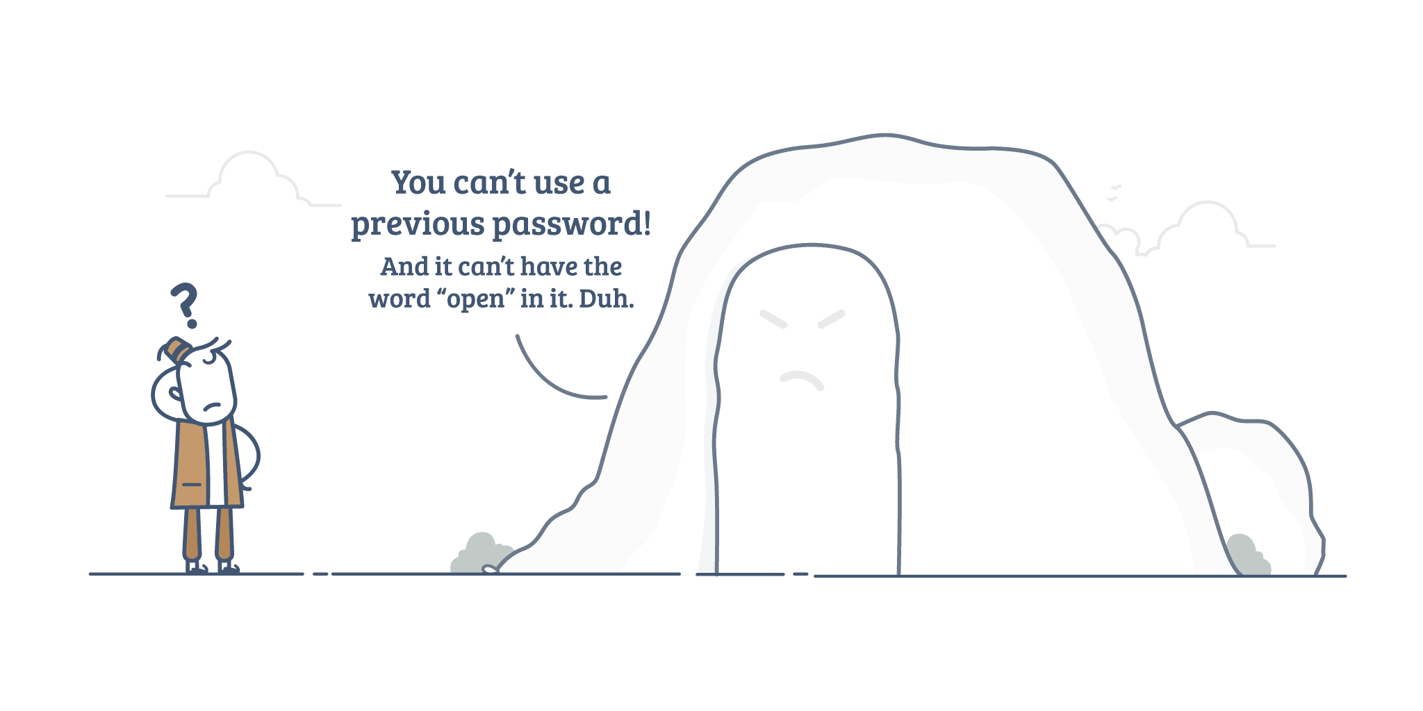
In an effort towards achieving that rather serious objective, most of the SaaS vendors tend to go overboard and make the password requirements very complex and absurd. Make a huge list of password do’s and dont’s for your users, heave a sigh of relief, and feel proud that you have saved the day. What skipped your attention here though, is how it’s going to affect a prospect’s state of mind.
Imagine that you find yourself really digging a SaaS product, and have decided to give it a spin. Upon clicking the big, prominent CTA button on the homepage, you’re taken to a form with two empty boxes – one for your email address and the other for your you-know-what (most companies have more than two boxes to be filled up, like the address, card details, etc. But let’s consider a less intricate scenario for now).
You just breeze your way through the first box, especially if you have the Autofill option enabled in your browser, or if the vendor offers you an option to sign up using a social media account of yours. Now you confront the second empty box, and it gets you into some serious contemplation – you have to key-in a password that’s easy to remember but is difficult for others to figure out and complies with the dozen password instructions mentioned below the box.

You sometimes seek the help of your Password Manager that generates a “strong” password for you, or you sometimes come up with a password on your own, and enter that incoherent collection of alphabets, numbers, and symbols, finally completing your onboarding. Oh wait, you most likely will be asked to verify your email account before you could access the app as well, so you’ll have to finish that.
Summarising this experience in three words:
Here’s what a popular SaaS founder had to tweet about a startup’s signup flow: (Note: We’ve made the identities obscure to protect the company from unwarranted negative publicity. If the startup founder gives us a thumbs up, the blur will be removed.)

I’d like to remind you that the signup operation is among the very first touch-points where your user interacts with your product, and as we all know, first impressions can make or break your customer relationship.
So, how much is too much? How do you make the signup flow as smooth as possible, and not leave the user’s account too vulnerable at the same time? In fact, how do you create a good first impression in the user’s mind and avoid receiving hate tweets from them?
Firstly, let’s get this straight – complex passwords are way too overrated. Turns out it makes more sense to have them for LANs than for web applications. Passwords aren’t the sole means by which one could bypass an app authentication process and hence, the complexity of a password has little or no role in protecting an account.
Now that we’ve managed to burst the bubble, and we’re clear about the fact that insisting on your users to come up with a complex password would only backfire, worry not. There’s a solution to this.
Check out this strip by the webcomic site xkcd:

Dan Wheeler from Dropbox supports this idea that by prompting the users to include numbers and symbols in their password, we end up creating passwords that are only “slightly harder for a computer to crack, and yet frustratingly harder for a human to remember”.
His solution to that – a considerably long passphrase with random common words, like “correcthorsebatterystaple” for instance, that’s difficult for computers to guess, and easier for humans to remember. He even went a step further by developing an open-source password strength estimator called “zxcvbn”, that doesn’t tell-off such complex passphrases.
If you’re still leaning towards alphanumeric passwords, your attention must then be spent on making the action equally unchallenging. Take a look at MailChimp’s signup form, for instance:

They have the usual gruelling list of criteria to be met. But the design makes it look simple and easy to accomplish – the conditions are listed out, and they fade when fulfilled.

And here’s yet another approach in handling signup flows that’s worth talking about. With OAuth, you give your users the option to sign up using their existing Facebook, LinkedIn, Twitter, Google, or Microsoft accounts. Here the password factor is completely out of the picture and you needn’t bother about your customers’ identity management anymore. But like any other approach, this might or might not suit your business, depending on what you do, how you do it, and who you cater to.
And finally, here’s our personal experience.
Initially, we started off with one of the traditional formats – ask the visitor to give an email address and a password, and to verify their email address before they got welcomed by the app. One fine day we got bit by the experimentation bug, and some drastic changes were made:
When a visitor opts to sign up for a free sandbox, we just get their email address. No more, no less.
The first time round, the user explores the app, checks out all the features, and gets a good hang of it. And the next time they try to login, we cue them to complete the procedure by verifying the email address.
Only and only then, we make them provide their company’s name, their name, and yes, the password (the single rule that we impose: It has to be alphanumeric and at least 8 characters long). And there’s just a single, blank rectangle for the password; there’s no please-enter-your-password-again-to-confirm business. (Tip: a “Show Password” button is another best practice that adds to the convenience and ease quotient.)
Note that requiring a unique account name can be as demanding and time consuming as asking for a strong password. Therefore a more clever (and considerate) move would be to push these tasks towards the far end of the signup flow.
What came next, only proved that we were on the right track. The signups doubled almost immediately. I rest my case.
The point is to make the journey effortless, so that by the end of it, your visitor-turned-customer sports an upward curve on their face and a pleasant state of mind. And for that, have some realistic password expectations!
There’s no one right method. And that gives all the more reason to keep experimenting and testing. The ultimate target should however be this – you shouldn’t look irresponsible, nor should your procedure be too burdensome. You just need to know where to draw the line; to land that optimal balance.
You and your SaaS product are here to make your customer’s life easier and not otherwise, and that promise must begin right from the very first point-of-contact, aka your signup flow.