Why You Should Drop Your Drop Down Menu
There’s something you should know about drop-down menus. They’re dying. Slowly but surely, these stalwarts of web design are fading off the web. Drop-downs are relics of our point-and-click past, replaced by minimalist navigation schemes designed around mobile-friendly taps and swipes.
But don’t cry for the website drop-down menu. It’s been a crutch for too long, enabling silos of loosely connected topic pages. Far better to drop the drop down and embrace cornerstone content, supported by and integrated with a robust content strategy.
Plus, drop-downs are ugly.
What Is a Drop-down Menu?
Menus will never go away. While we still use words, we need menus to navigate the collections of words we’re interested in. Characterized by a list of choices, menus let users identify the web page they think has the information they’re looking for. Like a table of contents, website menus are a shortcut to the information readers seek.
When websites have many pages of content related to a topic, they often collect these pages under one label, and put the single label name in the main menu. The drop-down collects the related pages in a list box that appears when you mouse over the label.
Website designed and produced by Roundpeg.
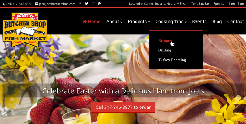
The menu pictured above takes it nice and easy. There’s generous padding between the text links, high contrast between the text and background, and a short list of choices. Someone’s taken the time write and edit website copy that chunks into skimmable sections.
But not all websites get the same careful treatment.
We abuse drop-downs. Writers and designers take advantage of the list format to give every new thing its own page. Just pop it in the menu, no harm. At least, until there are 16 pages, eight of which are so short they should all be on one and five pages no one sees because they’re too busy with 11 others.
Home
About
– Meet John
– Office Staff
– Qualifications
– Memberships
– Giving Back
– Careers
– Visual Office Tour
Residential Services
– Residential Estimates
– Residential Service Rates
— Exceptions
– Schedule Residential Service Appointment
Commercial Services
– Commercial Estimates
– Commercial Service Rates
– Contract Renewal
– Schedule Commercial Service Appointment
And so on as the navigation comes to each new section and its clutch of isolated pages. This approach fragments your website content, encouraging you to tack on information without considering the context. It’s the easiest navigation to make and laziest to maintain.
But sitemap-mimicking navigation is hard on your visitors. These deep navigation schemes presume high familiarity with your business. They require your customer’s careful attention and the will to open menus until he finds the right page. For these reasons and more, drop downs don’t work for mobile device users looking to tap just once or twice to get their info.
Minimize Your Menu
Want to make your navigation easy to use? Minimize the choices. Think of it this way: The Cheesecake Factory has hundreds of items in its menu book. This only works because their wait-staff can describe each one as they check on the table and customers are accustomed to choosing over three or four minutes.
If your website needs to make sales when you’re not around and customers don’t have time, you can’t show every option up front. You must prioritize your objectives and organize the navigation to suit.
Check out Advanced OrthoPro’s site for an example of minimal navigation that pairs well with the homepage navigation to support their main objective: getting customers in the door.
Website designed and produced by Roundpeg.
The rules below will help you build a site that accommodates the short fuse of today’s consumers without sacrificing in-depth business info.

Start with Broad Targets
Like a backwards address, help visitors find their information’s neighborhood, then their street and finally their destination. The homepage and primary navigation should guide users to general areas of interest.

Use Landing Pages
A landing page like Services is the neighborhood. For a specialized business, this page might have everything about what you do. More complex businesses with lots of service areas should provide a brief description of each service area and link to a break-out page for more information.

Title Your Pages with Action
Discover what customers want to do on your site and create pages that facilitate their activity. For example, a plumbing site could use page titles like Meet Joe’s Plumbing, Get Service and Reviews.

Link Ancillary Pages in Context
Avoid depending on drop-down menus. Not only are they difficult on mobile devices, but they encourage poor SEO. Your pages should link to and refer to each other in context. This helps visitors find your info just when they’re ready for it and helps Google know more about each page.
Let me clarify that not all drop-down menus are bad. Sometimes there’s no way around it, you gotta have that list box. But like chocolate cake, it’s only good in moderation. Keep any drop down list short and sweet.

Build Depth by Blogging
While your site may only need five or six main pages and a few break-outs, that’s not enough to score with Google. Regularly posting articles of high-quality, useful information builds opportunity for other websites to link to yours. This is a key signal to Google that your site delivers the answers customers look for.
Blogging also lets you build landing pages for specific topics and themes that don’t fit with your main pages. Say a painter has a special technique he wants to be known for. There’s limited opportunity on the Services page to go into that. But an article or two explaining the benefits belongs on the blog. And you can easily link to these posts from Services.
Reorganizing your site to remove drop-downs is no small task. But it shouldn’t be intimidating, it should be energizing. Like a trim haircut, this exercise renews your perspective and freshens up your look.
Editors Note: Even though this post is four years old it is still valid today. We still see many websites depending on layer, upon lay of clutter in their menu. One tool we have found really helpful is a plug in called Mhmm – Mighty Header & Menu Maker.
With Mhmm, we are able to make internal menus that help visitors more quickly through a particular path. Simplifying the menus improves the User Experience and hopefully keeps visitors on your website longer.
got a project?
Whether you need a new website or some help with your social media we are ready to start the conversation.

Call to Action Do’s and Don’ts
There is such a thing as a bad call to action The goal of any page on a website, whether it's the...
Let’s Talk Web Navigation
The Web Navigation Bar (aka, the nav & primary menu) The web navigation bar is a custom-built...
Canning Cookies, Creating Cohorts: Google’s Advertising Shift, Explained
The devs over at Alphabet are not just trying to bolster their profit; they’re trying to make something that could be problematic better and more secure.
A Deep Dive into Web Scams
What exactly are web scams? Web scams are illegitimate internet websites used to deceive users...


