We’ve made it.
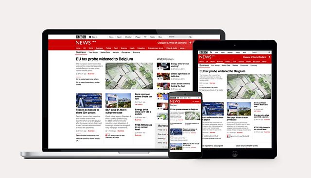
We’ve finally crossed the line. After almost 4 years, 5000 pull requests from 50 contributors, we’ve migrated the BBC News site to a totally new stack. We now have a single code base for all devices, in 30 different languages thanks to RWD.
How can it possibly take 4 years? Let’s start from the beginning …
The BBC News site is big. Not just in terms of the number of pages and micro sites but the sheer number of stakeholders involved. We started with a small team overseen by Matt Chadburn in 2011, and thanks to his guidance we moved fast. The old mobile site which we replaced, was not much better than WAP and had minimal interest from the stakeholders. We were free to innovate and release with little interference from outside the team. It was like a startup without the bean bags.
We were lucky to have people who were comfortable taking risks. People like Julian Kirby and Tom Maslen broke the mould and defined new approaches. One example being “Cuts The Mustard” which at the time was totally new and is now common knowledge in our industry.
Based on a User Agent lookup from a DB we were able to redirect device types to different domains. We used this to incrementally move device types to the new site. Starting from old school feature phones we built the basic story and index pages.
Looking back, using Mobile First was genius. We were able to strip everything back to the core content, the stuff that mattered to users. No JavaScript. No cruft. Just the good stuff. Journalism at its best.
Feature phones were also a small part of our traffic, just around 2%. This allowed us to innovate with low risk. We simply couldn’t take the same risks with BBC News as we can with other products, it’s an institution.
Progressive Enhancement
As we built up features and confidence we redirected all smartphone users to the new site. At this point we started to layer on JavaScript aka progressive enhancement. Performance was always a key driver for us. We made hard decisions to ensure we kept page weight low and JS enhancement quick. This is where “cuts the mustard” came in. We were able to check the ability of the JS engine and only load the enhanced experience if it was a modern browser. Older browsers with poor rendering got a simple but content complete experience.
CTM freed us from jQuery and other large frameworks, we just used HTML and native JS. We were also hostile to other teams front end components, we built stuff from scratch where ever we could unless they met our high standard. Another reason was backend API calls in the PHP stack. We built the site on the existing BBC PHP framework that allowed you to pull in modules from other teams at run time – they could do anything. Such as making the page uncacheable and slowing the request by making a barmy number of API calls.
This led us to another key decision. Based on our limited servers and the load on News, each PHP request should only make 1 API call, even with Memcache. This however makes it difficult to build rich page with data from multiple sources. However resilience was for obvious reasons, pretty important. We got round this by loading components client side. Core components that had core content were always baked into the page, but other stuff like “Stories from this section” were pulled in with JS and were cached by Varnish separately.
So onto Varnish. Thank goodness for that. We’ll eventually be moving to cloud compute, but for now its traditional in-house stuff. These servers also serve up iPlayer, Sport, homepage and everything from CBBC to Gardening. With News traffic, every page needs to be cached at the edge to protect our front-end servers. This affected how we architected pages, all personalisation was client side, everyone got the same core page from cache. If you CTM we then enhance the experience on top, pulling in further components with XHR. For the core experience we’d simply link to another page with the same content on.
The slow down
As the Responsive News team became integrated with the desktop team and world service, things started to slow. We gained more people and far more stakeholders. Scaling up was painful and for the few of us who started it all, it felt like things were changing for the worse. We lost a few of of our core team and we were dealt some rough tasks to add features to the old desktop site (still serving 90% of users). For example, we were asked to build a new video experience, oh and by the way please make it work in the old static published site with velocity and SSI templates! In retrospect we should have made a harsh decision to stop development on the old site. It sucked resources and morale and that cost us dearly by delaying our strategic move to “Responsive News”. We should have carefully considered expensive projects that were not aligned with our strategic technical direction.
If you haven’t heard about the BBC World Service, go Google it. It’s the jewel in our crown and delivers the only native unbiased journalism available in some parts of the world. Previously every one of the 30 language sites had a separate site. As WS became integrated, we used the Responsive News code base to power them instead. This was a massive undertaking, WS use a different CMS and there’s plenty of front-end challenges including right to left and custom script fonts such as Burmese. The World Service team did a great job of updating the code base to support multi languages from a completely different CMS. I’m still amazed at how well it has worked.
One downside of Mobile First is you can end up waiting until the end to solve some of the most difficult problems. How do you support a wide navigation and mobile style nav on the same page? How do you load a wide experience while maintaining a performant mobile experience? What do you do about IE