The Ultimate Guide to User Onboarding for Mobile

User onboarding is the process of setting up first-time users to be successful with your product.
When users first install an app, what do they notice?
- They don’t see how much time and effort your team spent building the perfect solution.
- They don’t see how your app will change their lives for the better.
- They don’t see how much excitement and joy it will bring once they’re invested.
All they know is how they feel about the app and what they’re able to do within just a few minutes or even seconds of opening it.
If you don’t excite them, inject value, and create hooks to re-engage them, they’re going to drop off, uninstall, and get on with their lives.
If you don’t nail onboarding, your developers may as well have been drinking beers instead of building those features that no one saw.”
-Nancy Hua, CEO of Apptimize
The Problem Isn’t Acquisition, It’s Activation
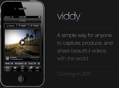
Let’s take an example: In 2012, Viddy was coveted in the press as “Instagram for video.” Raising over $36 million at a $300 million valuation, the media attention and Facebook campaign caused downloads to soar. They also had the most powerful and feature-filled product on the market. Yet today, few users would even recognize the name. So what happened?
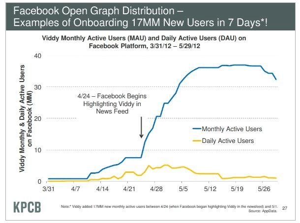
Users simply weren’t retaining.
While the MAU count drastically increased, the number of users engaging on the app on a daily basis barely saw a blip. Users just didn’t get why they should use the app.
They didn’t see the value they’d get out of it.
They didn’t get onboarded effectively.
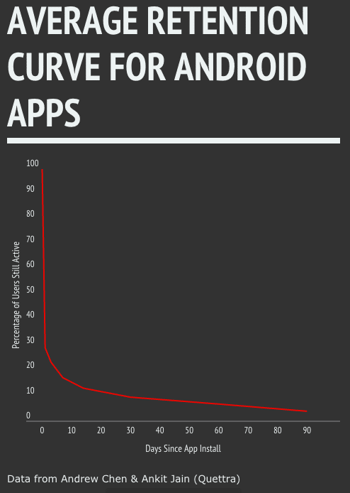
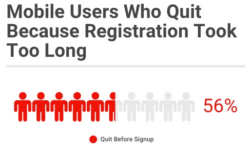
The average app loses 71% of its users just one day.
This isn’t an uncommon problem, but it’s definitely one that separates top apps from the rest of the pack. The average app loses 71% of its users just one day after a download. After 30 days, that number jumps to 90%. Within 90 days, most apps have lost 96%.
What every mobile team quickly learns is that having a great product and marketing strategy alone aren’t enough to grow and sustain a mobile app.
The app stores are overcrowded and mobile users are dropping off like flies just moments after install. Apps have to clearly demonstrate their value and drive the core actions and retention behaviors if they want to survive.
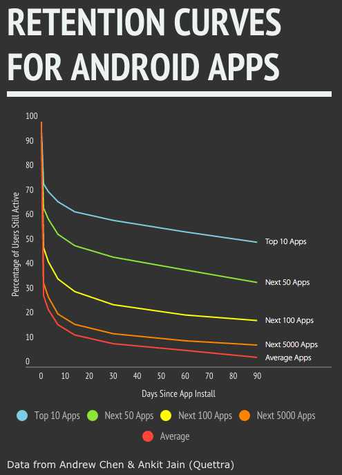
While the average app loses 71% of it’s users after one day of use, the top apps do much better.
Top 10 apps only lose 25% of their users after one day.
Top 50 apps: 35%.
So how is it that top apps are able to retain so many more users?
The Key is Activating New Users Through User Onboarding
“The best way to bend the retention curve is to target the first few days of usage, and in particular the first visit. That way, users set up themselves up for success.”
– Andrew Chen, Supply Growth, Uber
That’s why we set out to create the most in-depth and comprehensive guide on mobile user onboarding available.
We’ve jam packed it full of actionable methods and ideas you can start applying to your app today to activate and engage first time users and transform them into devoted users.
What Is User Onboarding?
User Onboarding is the process of setting up first-time users to be successful with your product.
For mobile apps, that means the experience from the first time they open their app, up until they become an engaged, invested, and successful user.
- Every single user will encounter the user onboarding experience. While not all of your users will see the amazing features you’ve built, all of them will at least go through onboarding.
- It affects the highest volume segment of users. With 71% of your users dropping off in just one day, making improvements to that first experience affects the most users possible.
- Mobile users are much more easily disengaged than their web counterparts. Unlike web, mobile users are often engaging in environments filled with distractions. They’re constantly on the go, so ensuring that they can complete their tasks with as little friction as possible is a must.
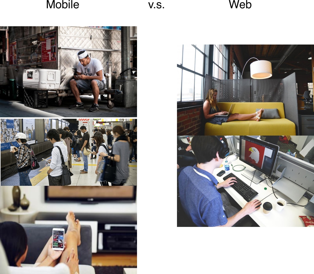
“My thought on mobile v.s. Web has always been akin to ‘poetry v.s. Prose.’ It has to be a really compressed, elegant experience….Ideally the web experience can be held to the same high regard, but it seems like there’s a little more room for error.”
-Samuel Hulick, Creator of UserOnboard
User onboarding goes beyond Tutorial Screens and Tool Tips. As we’ve seen Vevo, tutorial screens (a near-ubiquitous onboarding technique) don’t work for every app. In our experiments with them, we found that removing their mobile user onboarding screens actually increased key conversions by ~10%.
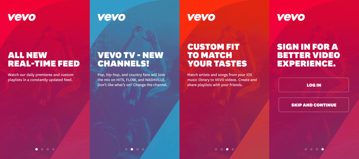
Removing Tutorial Screens Increased Key Conversions for Vevo by 10%.
“The Road to Mediocrity is Paved with Best Practices”

As Austin Knight so eloquently stated, what works for other apps doesn’t necessarily apply to your own. Oftentimes we spend hours reading up on what other companies are doing and trying to learn from their tests, but we have to keep in mind that each app’s users and value are unique, so blindly applying best practices and making assumptions can hurt you long term.
So what we want to find specifically is what user onboarding process works for YOUR app—not what works for someone else. That starts by finding your app’s Aha! Moment.
User Onboarding – Where do I start?
Start by finding your app’s Aha! Moment, your North Star.
Definition: Aha! Moment – “a set of actions that separates customers who find value in your product from those who don’t,” says Benn Stancil of Mode Analytics.
For many growth teams, the Aha! Moment is their guiding light, highlighting the actions that users need to take to dramatically increase the chances of retaining. We can clearly see that not only have these companies clearly defined their Aha! Moments, they also focus on driving users toward these behaviors in the apps.
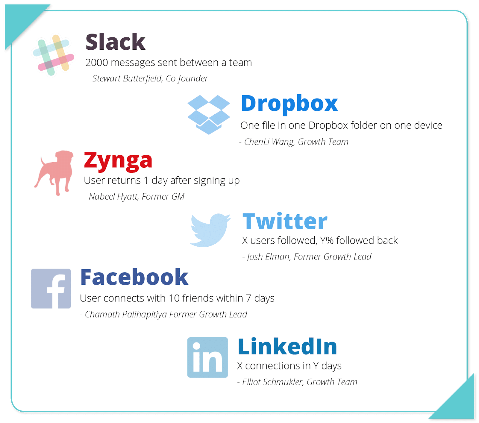
Facebook – 7 Friends within 10 Days
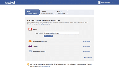
We can see that in Facebook’s user onboarding, they push users to connect with as many friends as possible by adding contacts through email, filling out profile information, and adding an easily recognizable picture
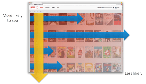
Netflix – User finds something to watch within 60-90 seconds

For Netflix, having a user find something to watch within 60-90 seconds makes a humongous difference as to whether they’ll retain or not. As a result, they’ve done extensive testing on their personalization system to show each user one of tens of thousands of possible “rows.” For more into the topic, they’ve written in depth about their personalization engine on the Netflix Techblog.
Characteristics of Aha! Moments:
- Highly common action(s) among users that retain
- Uncommon among users who don’t
- Vital for increasing retention
Once you have an Aha! Moment, you can formulate a testing strategy to drive user behavior to complete these actions. If done correctly, these new users will be much more likely to retain than users who don’t.
Drive Users to the Aha! Moment
Once you’ve determined the core actions that drive retention is to start driving users toward this behavior. Now, you can start running experiments to draw attention to these actions and get users to complete the actions.
How Twitter Drives Aha! – (X Users Followed, Y% Followed Back)
Since Twitter’s Aha! Moment is all about users following other users, they take every opportunity they can to drive users toward this behavior in their user onboarding flow
As soon as you create an account, they ask about your interests, then auto-select popular users to follow. Users actually have to manually unfollow these auto-populated channels.Right after that, they prompt new users to add their contacts to find others they may know already on Twitter.
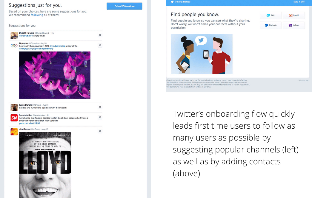
Notice that Twitter specifically doesn’t focus on other actions such as filling out a user description, adding a profile, or any other feature. This ensures that they’re completing the core actions FIRST, and are therefore more likely to retain.
User Onboarding Doesn’t Have to Be Complicated
A simple experiment you can run is just changing the copy of your onboarding, hiding other functionality (to draw attention to the one you want), or adding a modal or tooltip to highlight a specific action. Let’s take an example.
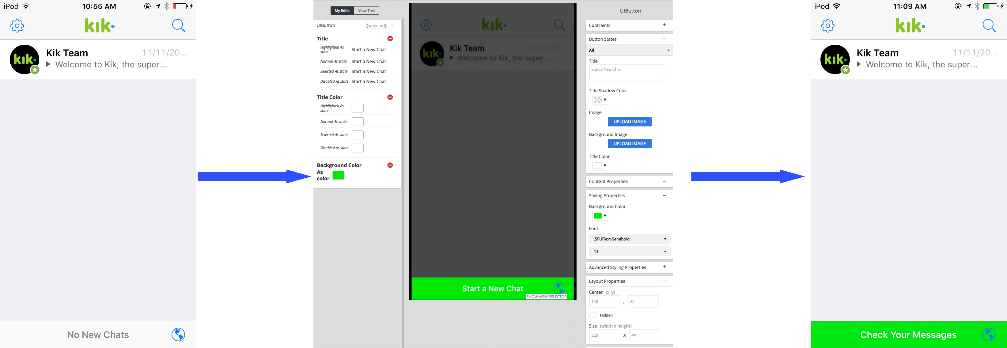
If I knew that the Aha! Moment for messaging app Kik was engaging with the new chat button X times, I could easily highlight the create a message button on the home screen by changing the copy, color, or even positioning of the button to draw more attention and more clicks. In the example above, I’ve simply used Apptimize to quickly change the background color, copy, and text color to make it more obvious what the next step is.
Even a simple change such as this can have a significant impact on user behavior, if you’re driving to the right actions. Additionally, if you use a tool like Apptimize, you can make these changes instantly using a visual editor and even run an experiment to see the actual effects on user behavior.
Running experiments such as these allow you to test out how a new change will (or wont) drive the user behaviors you want. But in order to drive the right behaviors and make key changes in our app, we have to examine what drives user behavior, and how we can translate that into specific updates to our apps.
Utilizing Psychology to Drive the Right User Behaviors

The goal is to drive users to take the Aha! Moment actions. To do this, let’s take a look at what drivers user behaviors using BJ Fogg’s Behavioral Model.
Stanford Psychologist BJ Fogg’s Behavioral Model

There are 3 elements that must be present for an action to occur:
B = Behavior – The desired action that you wish to occur.
M = Motivation– Demonstrating value to users
A = Ability – Make a behavior simpler to complete
T = Trigger– Cues for users to take a specific action
The main idea is this:
- A user must have sufficient motivation and ability to complete an action
- If these are present, then a trigger (cue to take an action) will produce the desired behavior
- Else a trigger will fail
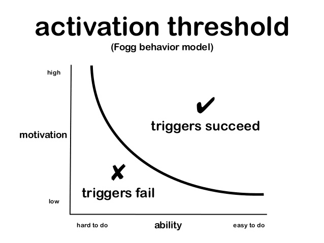
That means, to increase the likelihood of a user taking a specific action, we have to increase motivation and ability, and provide a trigger at the right moment.
Increasing Motivation

In order for users to complete a desired action (subscribe to 3 channels), they need to have enough motivation to complete the action. This means that your app has to convince users that the effort required is worth the value they will receive in return.
For a deeper dive into increasing motivation, we’ve created a convenient PDF that breaks down specific examples and case studies and gives you actionable ideas on methods for increasing motivation.
Methods of Increasing Motivation:
- Write clear and compelling copy – You can harness the power of writing by identifying key pain points or desires, then demonstrating how your app solves them. I highly recommend Neville Medhora’s Kopywriting Kourse or Shanelle Mullin from ConversionXL’s post on Copy People Will Actually Read. Both will give you a great primer on how to get users excited and speak in a relatable voice.
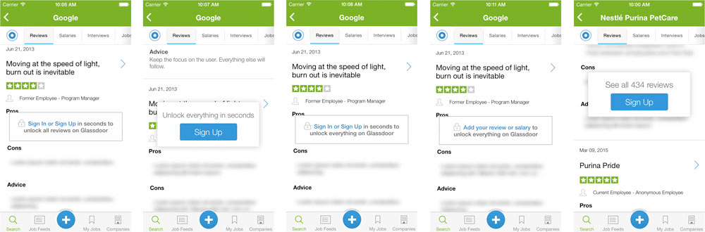
In our case study, Glassdoor shares their experiments on in-app CTAs.
- Harness social proof – 84% of consumers say that they either completely or somewhat trust recommendations from family, colleagues, and friends about products—significantly higher than any other source. Using this to your advantage can have dramatic benefits. 2 great examples include Venmo’s feed & add friends functionality, as well as Branch’s personalized referral onboarding for mobile. Sujan Patel from Narrow.io has also written a fantastic post about How and How Not to Use Social Proof, which I highly recommend for those interested in digging deeper into the topic.
- Product Demos – Sometimes all it takes is a demo of how easy and cool your product is, before they invest by inputting their personal information or otherwise. You can use videos, tutorials, or even a full fledged in-app demo. If you’re looking to create immersive and engaging product videos, check out Wistia’s resource library, as well as specific tips for recording screens.
- Share Use Cases – Even if you have a really wonderful product, it’s likely that not all your users will know how to harness its full capabilities. Providing a wide swatch of use cases will help them determine the concrete benefits of what they can do. Lookout is an example of a company that does this incredibly smoothly.
https://youtu.be/_b5ad_ED72w
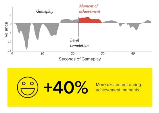
- Surprise and Delight Users – An unorthodox method of increasing user motivation is to unexpectedly delight users with rewards. In a study by Kiip and IPG Media labs, researchers found that moment-based rewards are 14x more effective at increasing purchase intent, which we can reasonably assume increases conversion intent as well. To learn more about how to put this into practice, check out our case study in the PDF below.
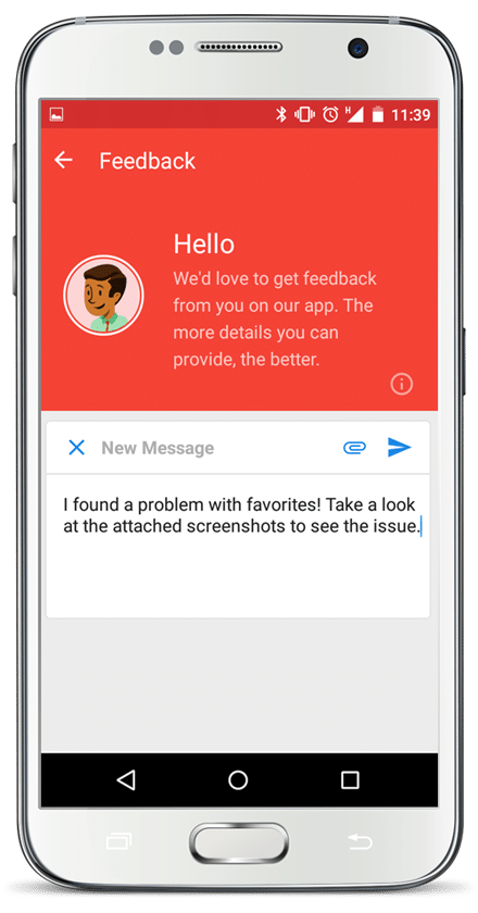
- Translate Qualitative Feedback Into Features – When your users talk, listen and give them what they want. Utilizing tools like Apptentive can give you a direct channel of communication with your users to gain deeper insights on their interests.
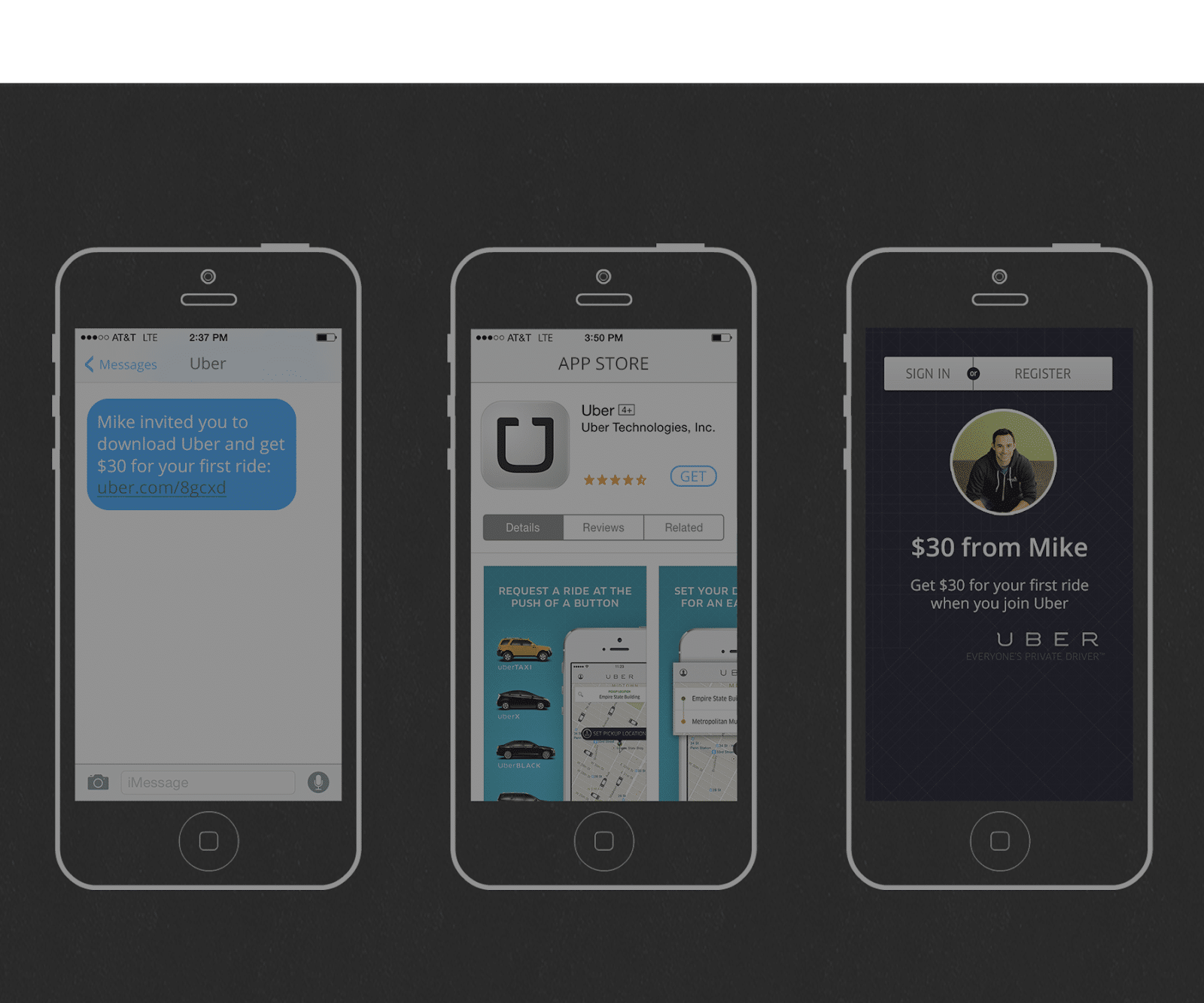
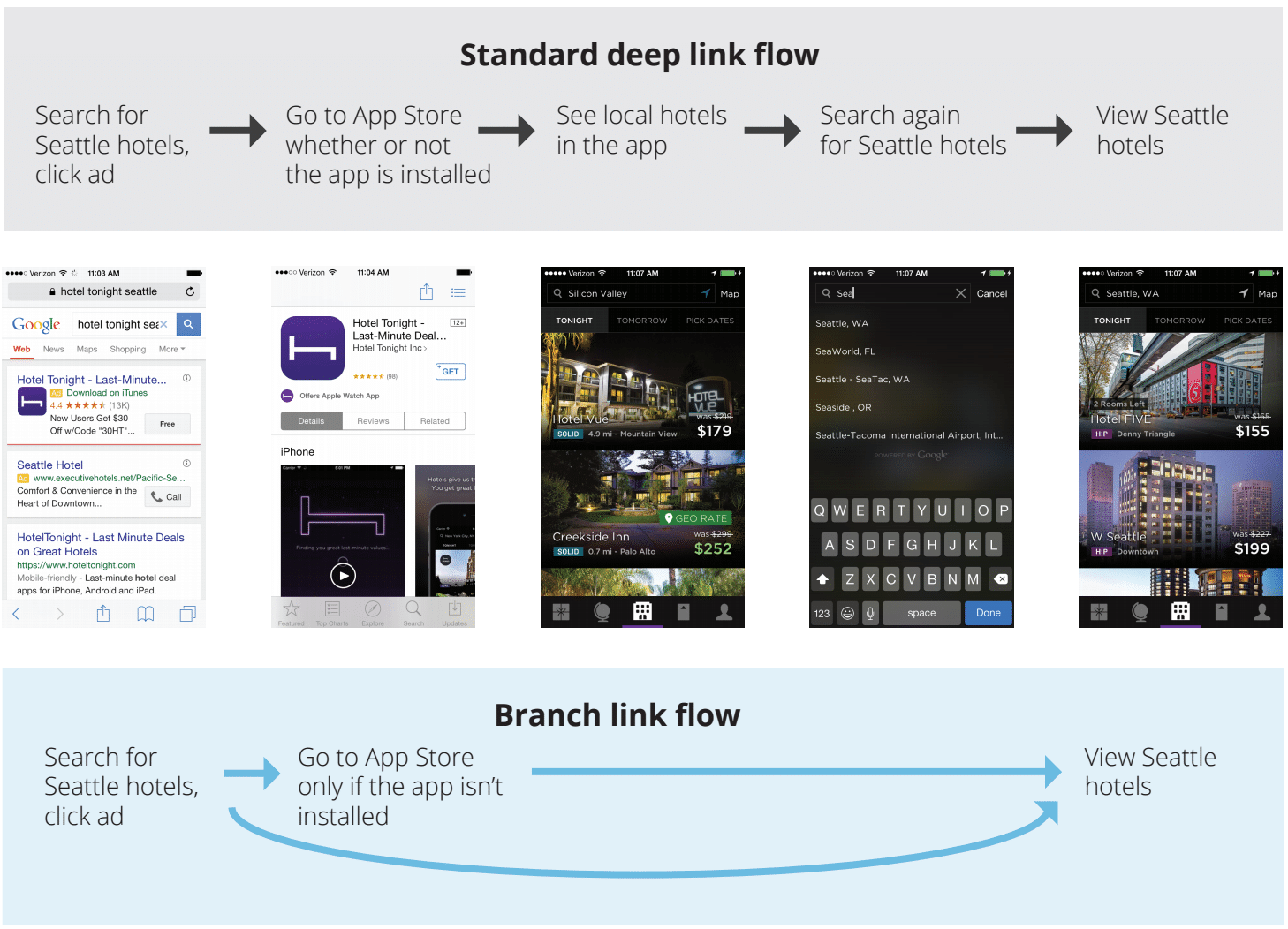
- Driving new users straight to the right value – As we’ve seen with our Branch + Gametime case study, driving users straight to the value is a powerful way to increase motivation. Utilizing deep links can ensure that they get maximum value as soon as humanly possible.
- Reinforce Your Value Early and Often – Even something as simple as a tagline can have profound effects on your userbase. Nike’s “Just do it,” slogan evokes more emotion than just shoes and clothing. In the same way, companies like Waze are reinforcing their existence whenever possible. Rather than “get from point A to B quickly,” they focus on the bigger picture of “Outsmarting traffic, together.”
- Utilize Customer Testimonials – 84% of consumers say that they either completely or somewhat trust recommendations from family, colleagues and friends about products. This means that harnessing that trust is a powerful way to build motivation and ease their concerns.


Maximizing Ability
The second part of this equation is increasing user ability or making it as easy as possible to complete the desired action.
Think of it like conversion rate optimization (CRO), but focused on key actions rather than conversions.
Methods to Increase Ability:
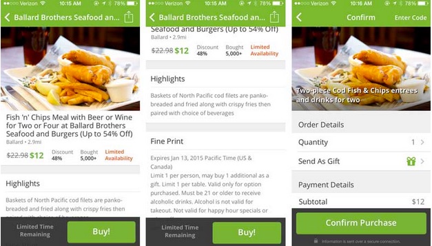
- Optimize CTAs – Make them clear and easy to find. That way, users don’t have to go searching for the actions you want them to complete. Groupon provides a fantastic example of this, providing a persistent CTA that’s always visible to the user.
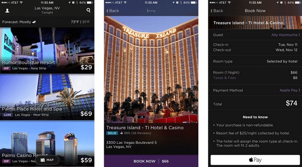
- Remove Extraneous Steps – Another simple way of increasing ability is to remove extra steps required for a user to complete your core actions. Vevo found that onboarding tutorial simply increased the amount of steps a user needed to take to complete the core actions, and removing them increased conversions by ~10%. Additionally, native payments such as Apple or Google Pay can also go a long way in helping users complete actions quickly as we’ve seen in our case study with HotelTonight.
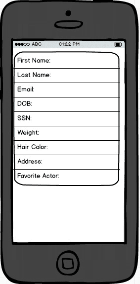
- Simplify Necessary Steps – On mobile, we’re forced to deal with the clunkiness of mobile keyboards and controls. While collecting personal and financial information is often critical to moving forward, it places a huge burden on users who are forced to tedious enter information on a keyboard clearly made for leprechauns.
Some simple solutions are to streamline your mobile login process using techniques such as password reveals, integrations (such as 1password), or email verifications. A great way to reveal friction is to conduct user tests through a service such as UserTesting.com.
- Decrease the Cognitive Load – Are you making users confused and expend mental energy? Or is it easy to understand and follow?
Cognitive Load – Cognitive load refers to the total amount of mental effort being used in the working memory.
One great example of this is the hamburger menu. It’s a commonly confused UI icon, and can be improved or replaced by far superior navigational patterns. Read more about the shortcomings of hamburger menus and superior alternatives here.
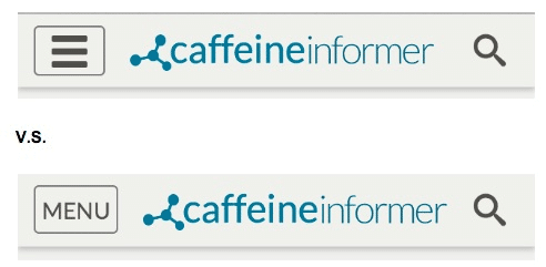
With a simple change such as changing the hamburger menu to an easily understandable “Menu” icon like above, you can greatly decrease the cognitive load on your users, and help them make better decisions.
As it turns out, your willpower is like a muscle. And similar to the muscles in your body, willpower can get fatigued when you use it over and over again.
Every time you make a decision, it’s like doing another rep in the gym. And similar to how your muscles get tired at the end of a workout, the strength of your willpower fades as you make more decisions.
- Avoid Decision Fatigue – Decision fatigue is the tendency of individuals to make poorer decisions than they normally do after being subjected to repeated decision making.To make sure users aren’t dropping off before completing the desired actions, give users fewer choices. Move your Aha! Moment actions earlier in the funnel before users become affected by decision fatigue.
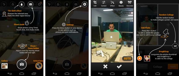
In the example above, we can see that there are a LOT of options to choose from, which confuses users by not giving them obvious cues what they should do next.
- Don’t Ask for Non-Essential Information – “Whenever asking for information from a user, I filter every decision through the lens of ‘can this credibly be represented as being to the user’s’ benefit in providing this?” says Samuel Hulick. Otherwise, just leave it out.
- Refine Your Homescreen Layout – Mobile comprehension scores were 48% of the desktop level when using a mobile screen. Because there’s less context (due to less available information on the screen), users must move around the screen more.

- Create Logical Drop-off and Pick-up Points – If you have a particularly long onboarding flow, try breaking it up into sections. Since mobile users are far more distracted than web users, have one key objective for each login session, rather than trying to get everything done at once.

- Prioritize Responsiveness – 78% of users expect mobile apps to be as fast or faster than mobile websites. So if you can’t deliver on that, what’s the point of keeping your app? Not only that, most users are on the go and need to accomplish their tasks as quickly as possible. Any moments of unnecessary lag or confusion create opportunities for disengagement.
“Mobile users are in a hurry and get visibly angry at verbose sites that waste their time,” says Jakob Nielsen.
Triggers
Triggers are cues or reminders that prompt users to take a specified action.
The last component of driving user behaviors is to create triggers. Remember, triggers are only effective if users already have sufficient motivation and ability to complete the action.
There are 2 categories of triggers as defined by Nir Eyal and Jason Hreha: external and internal.
External Triggers
External triggers are external cues or reminders for a user to complete a desired action.
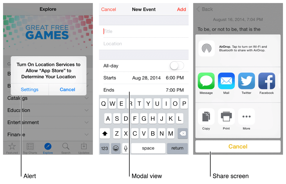
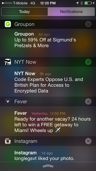
These can often take the forms we recognize as advertisement or marketing techniques such as: Push notifications, app icons, modals, CTAs, emails, etc.
In-app external triggers such as CTAs should be easily accessible for users. As we talked about previously, this greatly increases the ability of users to complete their tasks. If you’re going to use modals as a trigger (which take over the screen), use them sparingly when users stray away from the core tasks needed.
Outside of an app, you have a few different options to prompt users to open your app including push notifications, email, text, and QR codes. Push can be a great way to engage if paired with the correct messaging. However, they are a supplement for onboarding and retention, not the main meal.
Some recommendations for external trigger providers:
- Push Notifications:
- Email:
And of course utilizing the red dot icon always helps grab attention.

External triggers alone won’t drive retention. That’s why it’s important to utilize the plethora of techniques in this guide to make sure your triggers succeed.
Internal Triggers
Internal triggers “manifest automatically in the mind. They are reminders that are user generated without prompting. Oftentimes, these triggers are closely tied to emotions or habits, and once set up, are far more compelling than their external cousins.
An example of this would be the compulsion users often feel to check Facebook, Instagram, or Twitter when they’re bored. These habits have been closely tied to emotion so that users create their own triggers and take action.
For a full primer on triggers and why they’re effective, check out our in-depth article:
A Primer on Driving Retention with Triggers
Creating an Agile Iteration Strategy
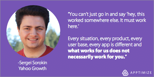
“What works for us does not necessarily work for you. The one thing you should not do is assume you know something.” – Sergei Sorokin, Product Manager @ Yahoo! Growth
As we mentioned before, blindly following best practices is a surefire way to a mediocre product. That’s why creating an iterative testing strategy is so vital.
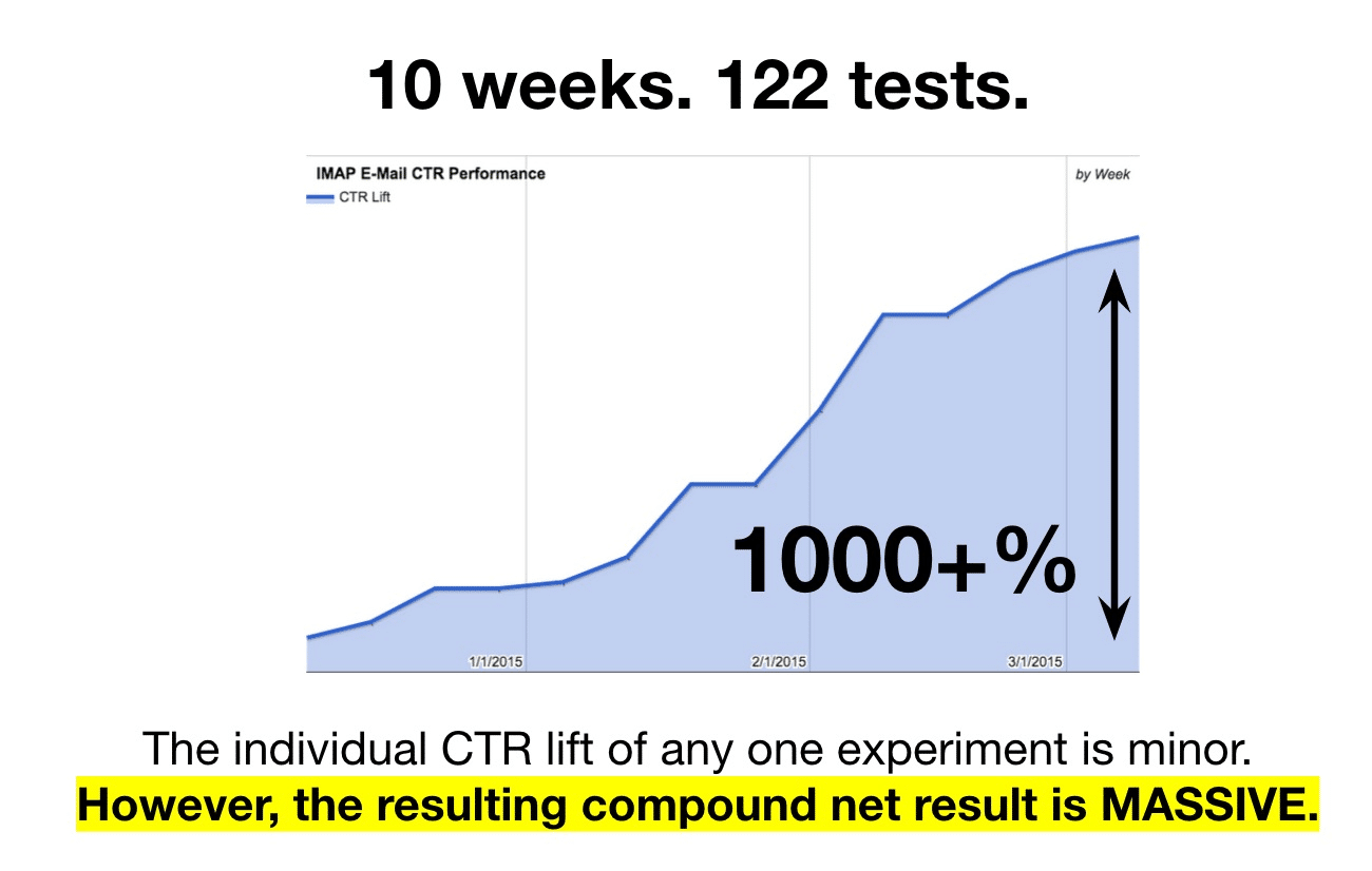
A/B testing helps support this methodology by allowing you to cheaply validate any changes or new features in your app, before deploying to your entire userbase.
This allows you to make iterative improvements that compound for massive growth, similar to what we’ve seen at Yahoo! Mail.
Even the effects of small, simple tests can really add up.
Action Steps:
So now that you’ve gotten a strong foundation for what user onboarding is (and how to apply it to mobile apps), it’s time to take action. You want to first figure out what your app’s Aha! Moment is, then create experiments to drive users toward that moment.
- Use behavioral cohorting to find your app’s Aha! Moment
- Use the guide to create 2-5 tests that you think will help drive core actions
- Set up an experiment to test on a small % of your users
- Track the differences between the two groups
- Push out the winning variant instantly to all users
- Keep on going.
Thanks for
reading!
More articles you might be interested in:
The 4 Best Mobile User Onboarding Flows We’ve Seen So Far
We look at a lot of apps on a daily basis here at Apptimize. Some are good, some are bad, and the average is not too pretty. Still, we come across quite a few gems; teams that have put an...
Read MoreBest Practices for Refining Mobile Onboarding Flows
If you’re not retaining your users, all other effort is a waste of time and money. – Nancy Hua Click To Tweet By now, you know that onboarding is the most important element of mobile growth. You know that it...
Read MorePersonalizing Mobile User Onboarding
Feel like going to the Giants game at the last minute? Gametime is an app that let’s do just that and buy last minute tickets with just two taps on your phone. It avoids the hassle of printing or picking...
Read More