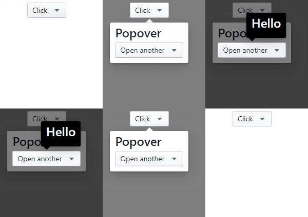
Starting with v5.0.0, this component is no longer based on Popper.js, which used react-popper. to use react-popper based popover you must use version 4.1.0
via NPM
npm i react-awesome-popover
via CDN (unpkg)
https://unpkg.com/react-awesome-popover@latest/build/index.umd.js
UMD library exposed as ReactAwesomePopover
const Popover = ReactAwesomePopover;ReactDOM.render(
<Popover>
<button>The Target</button>
<div>The content</div>
</Popover>,
document.body
);The component supports server-side rendering
ReactDOM.render(
  <Popover>
    <button>The Target</button>
    <div>
      ...
      <Popover>
        <button>The Target</button>
        <div>
          ...
          <Popover>
            <button>The Target</button>
            <div>The content</div>
          </Popover>
          ...
        </div>
      </Popover>
      ...
    </div>
  </Popover>,
  document.body
);<Popover>
<button>Click</button>
<Motion defaultStyle={{ opacity: 0 }} style={{ opacity: spring(1) }}>
{style => {
return (
<div style={style}>
<h3>Popover</h3>
</div>
);
}}
</Motion>
</Popover>Very simple!.
<Popover>
  <button>The Target</button>
  <div>
    Lorem ipsum dolor sit amet, consectetur adipisicing elit. Voluptatibus error
    laudantium incidunt vitae dignissimos praesentium nesciunt,
    <Popover action="hover" placement="top">
      <b>pariatur provident natus</b>
      <div>Wow man</div>
    </Popover>
    aperiam, corporis, quo libero sapiente recusandae! Distinctio deserunt dolor
    sequi, i
  </div>
</Popover>| Prop | Type | Description | Default |
|---|---|---|---|
| arrow | Boolean | If false, the arrow is removed |
true |
| placement | String | The placement of the popover.top-start,top-center,top-end,left-start,left-center,left-end,right-start,right-center,right-end,bottom-start,bottom-center,bottom-end |
auto |
| action | String | click or hover. Supports touch event |
click |
| onOpen | Function | The callback is called when the content is mounted | |
| onClose | Function | The callback is called after the content is unmounted from the dom | |
| open | Boolean | Whether the popover is visible. Passing this prop puts the popover in controlled mode. To make the popover completely manageable, you must pass the null value to the action prop |
false |
| zIndex | Number | Initial number for zIndex | 1000 |
| overlayColor | String | Set the background color of an overlay element | rgba(0,0,0,0.5) |
| arrowPropss | Object | Pass any prop to the div element that wraps the arrow | {} |
| preventDefault | Boolean | Cancels the event if it is cancelable, meaning that the default action that belongs to the event will not occur.more | false |
| stopPropagation | Boolean | Stops the bubbling of an event to parent elements, preventing any parent event handlers from being executed. more | false |


