Naming Things In CSS Grid Layout

Email Newsletter
Weekly tips on front-end & UX.
Trusted by 200,000+ folks.
 Flexible CMS. Headless & API 1st


 Register!
When first learning how to use Grid Layout, you might begin by addressing positions on the grid by their line number. This requires that you keep track of where various lines are on the grid, and also be aware of the fact the line numbers reverse if your site is displayed for a right-to-left language.
Built on top of this system of lines, however, are methods that enable the naming of lines and even grid areas. Using these methods enables easier placement of items by name rather than number, but also brings additional possibilities when creating systems for layout. In this article, I’ll take an in-depth look at the various ways to name lines and areas in CSS Grid Layout, and some of the interesting possibilities this creates.
Naming Lines
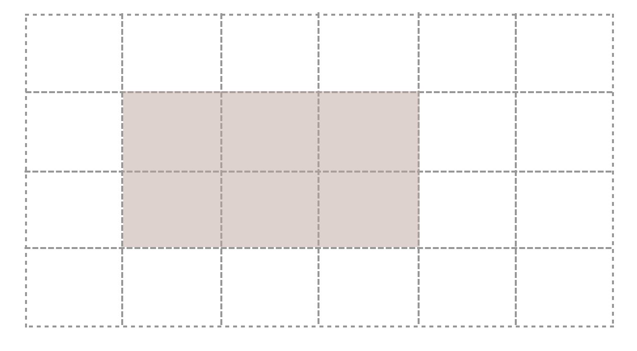
We can make a start by naming the lines on a grid layout. If you take the example below, we have a grid with six explicit column tracks and one explicit row track. Items are placed on this grid by way of line numbers.
.grid {
  display: grid;
  grid-gap: 20px;
  grid-template-rows: 20vh ;
  grid-template-columns: 1fr 2fr 1fr 2fr 1fr 2fr;
}

.header {
  grid-row: 1;
  grid-column: 1 / -1;
}

.sidebar {
  grid-row: 2;
  grid-column: 1 / 3;
}

.content {
  grid-row: 2;
  grid-column: 3 / -1;
}
If we want to name the lines, we do so inside square brackets in the track listing. The key thing here is to remember that you are naming the line, not the track that follows. Having named the lines you can swap line numbers for names when positioning items.
.grid {
  display: grid;
  grid-gap: 20px;
  grid-template-rows: [header-start] 20vh [header-end] ;
  grid-template-columns: [sidebar-start] 1fr 2fr [sidebar-end] 1fr 2fr 1fr 2fr;
}

.header {
  grid-row: header-start;
  grid-column: 1 / -1;
}

.sidebar {
  grid-row: 2;
  grid-column: sidebar-start / sidebar-end;
}
You can name lines anything you like other than the span keyword. For reasons which you will discover later in this article, it is a good idea to name them with the suffix -start for start lines (whether row or column and -end for end lines). You might have main-start and main-end, or sidebar-start and sidebar-end.
Quite often the end line of one part of your grid and the start line of another coincide, and this is not a problem as lines can have multiple names. Create multiple names by adding them separated by a space — inside the square brackets.
.grid {
  display: grid;
  grid-gap: 20px;
  grid-template-rows: [header-start] 20vh [header-end] ;
  grid-template-columns: [full-start sidebar-start] 1fr 2fr [sidebar-end main-start] 1fr 2fr 1fr 2fr [main-end full-end];
}

.header {
  grid-row: header-start;
  grid-column: full-start / full-end;
}

.sidebar {
  grid-row: 2;
  grid-column: sidebar-start / sidebar-end;
}

.content {
  grid-row: 2;
  grid-column: main-start / main-end;
}
This example also demonstrates that you don’t need to name every single line of the grid, and you always still have numbers to use in addition to names.
See the Pen 1. Naming things: line names by rachelandrew (@rachelandrew) on CodePen.
Lines With The Same Name
We have seen how lines can have multiple names, but you can also have multiple lines with the same name. This will happen if you use repeat notation and include named lines in the track listing. The next example creates six named lines, alternately named col-a-start and col-b-start.
.grid {
  display: grid;
  grid-gap: 20px;
  grid-template-columns: repeat(3, [col-a-start] 1fr [col-b-start] 2fr);
}
If you place an item using col-a-start, it will be placed against the first instance of col-a-start (in this example, that would be the first line of the grid). If you place it against col-b-start, it will be positioned against the second line of the grid.
To target later lines, add a number after the line name to indicate which instance of that line you are targeting. The following CSS will place the item starting on the second line named col-a-start and finishing on the third line named col-b-start.
.box3 {
  grid-row: 2;
  grid-column: col-a-start 2 / col-b-start 3;
}
See the Pen 2. Naming things: multiple lines with the same name by rachelandrew (@rachelandrew) on CodePen.
The specification describes this behaviour as “creating a named set of grid lines” which can be a helpful way of looking at the grid you have created with multiple lines of the same name. By adding the number you are then selecting which line of the set you wish to target.
Maintaining Line Names While Redefining A Responsive Grid
Whether you choose to use line numbers or named lines is completely down to you. In general, lines can be useful where you wish to change the grid definition within media queries. Rather than needing to keep track of which line number you are placing things against at different breakpoints, you can have consistently named lines. Only the definition then needs to change and not the positioning of items.
In the following simple example, I define my grid columns for narrow widths, then redefine them at a width of 550 pixels. The positioned items continue to place themselves against the same named line, despite the fact the location of the line on the grid has changed.
See the Pen 3. Naming things: redefining the position of named lines by rachelandrew (@rachelandrew) on CodePen.
Named Areas
We have so far had a good look at named lines, however, there is another way of naming things on the grid. We can name grid areas.
A grid area is a rectangular area consisting of one or more grid cells. The area is defined by four grid lines marking out the start and end lines for columns and rows.
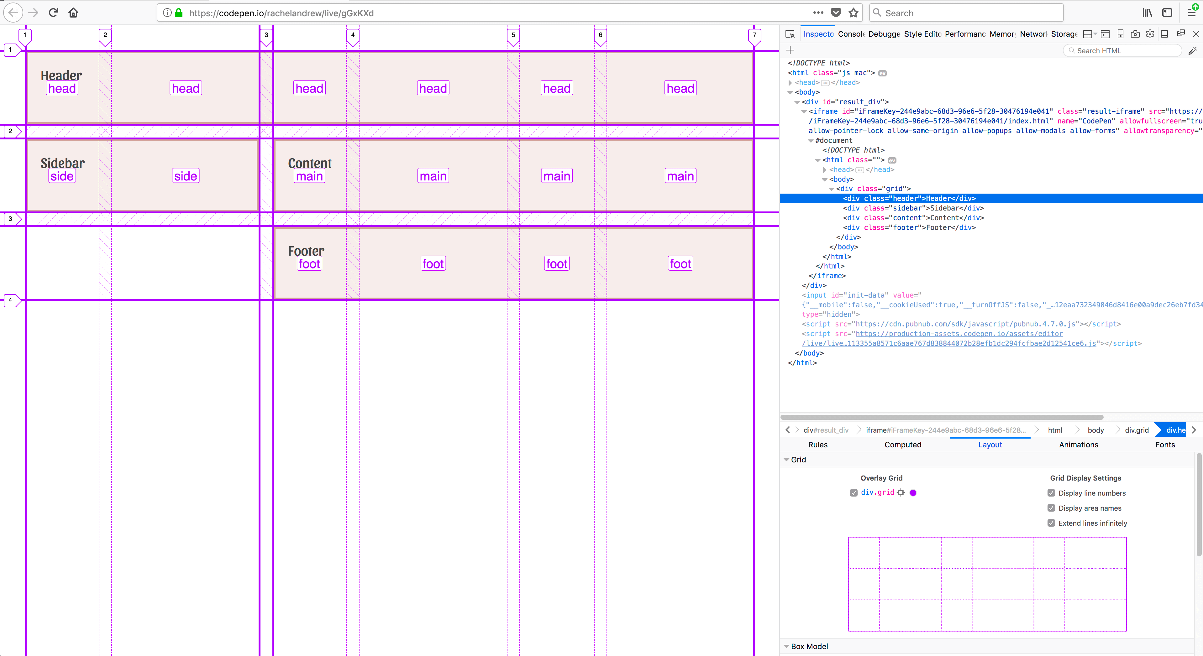
We name areas of the grid using the grid-template-areas property. This property takes a somewhat unusual value (a set of strings, one for each row) which describe our layout in ascii-art style.
.grid {
  display: grid;
  grid-template-columns: repeat(3, 1fr 2fr) ;
  grid-template-areas:
"head head head head head head"
"side side main main main main"
"foot foot foot foot foot foot";
}
The names we use in the strings for grid-template-areas are assigned to the direct child elements of the grid using the grid-area property. The value of this property when used to assign a name is what is known as a custom identifier, so it should not be quoted.
.header {
  grid-area: head;
}

.sidebar {
  grid-area: side;
}

.content {
  grid-area: main;
}

.footer {
  grid-area: foot;
}
Whenever we describe our layout as the value of grid-template-areas, it will cause an area to cover more than one cell of the grid we repeat the ident along the row or down the columns. The area created must be a complete rectangle — no L or T-shaped areas. You may also only create one rectangular area per name — disconnected areas are not possible. The specification does note that:
“Non-rectangular or disconnected regions may be permitted in a future version of this module.”
– The grid-template-areas-property
When creating our grid description, we also need to create a complete representation of our grid, otherwise the whole declaration is thrown away as invalid. That means that every cell of the grid needs to be filled.
grid-template-areas:
"head head head head head head"
"side side main main main main"
"foot foot foot foot foot foot";
}
As you might want to leave some cells empty in your design, the spec defines a full-stop character . or a sequence .... with no white space between as a null cell token.
  grid-template-areas:
"head head head head head head"
"side side main main main main"
"....... ....... foot foot foot foot";
}
See the Pen 4. Naming things: Grid Template Areas by rachelandrew (@rachelandrew) on CodePen.
If you haven’t already downloaded Firefox Nightly in order to benefit from all the newest features of the Firefox DevTools Grid Inspector, I can recommend doing so when working with named areas.
From Named Lines Come Areas
Now we come to an interesting part of all of this naming fun. You might remember that when we looked at naming lines I suggested you use the convention of ending the line which begins an area with -start and the end line -end. The reason for this is that if you name lines like this, you will get a named area of the main name used into which you can position an item by giving it a name with grid-area; in the same way that you position items in grid-template-areas by assigning the ident using grid-area.
In this next example, I am naming lines for both rows and columns panel-start and panel-end. This will give me a named area called panel. If I assign that as the value of grid-area to an element on my page it will be placed into the area defined by those lines.
.grid {
  display: grid;
  grid-gap: 20px;
  grid-template-columns: 1fr  [panel-start] 2fr 1fr 2fr 1fr [panel-end] 2fr;
  grid-template-rows: 10vh [panel-start] minmax(200px, auto) 10vh [panel-end];
  grid-template-areas:
 "head head head head head head"
 "side side main main main main"
 ".... .... foot foot foot foot";
}

.panel {
  grid-area: panel;
}
See the Pen 5. Naming things: From named lines come named areas by rachelandrew (@rachelandrew) on CodePen.
From Named Areas Come Lines
We can also do the reverse of the above, and use lines created from our named areas. Each area creates four named lines using the same -start and -end convention. If you have a named area called main, then you have row lines main-start and main-end for the start and end row lines, and column lines main-start and main-end for the start and end column lines. You can then position an item using line-based placement and the named lines.
In this example, I am positioning the overlay panel using these created named lines.
.grid {
  display: grid;
  grid-template-areas:
 "head head head head head head"
 "side side main main main main"
 ".... .... foot foot foot foot";
}

.panel {
  grid-column: main-start / main-end;
  grid-row: head-start / foot-end;
}
See the Pen 6. Naming things: From named areas come named lines by rachelandrew (@rachelandrew) on CodePen.
Line Names Equivalent To The Area Name
In addition to line names for start and end, a line is created for the start edge of any named grid area which uses the main name. Therefore, if you have an area called main, you could use the ident main as a value for grid-row-start or grid-column-startand the content would start at the start line of that area. If you used the value for grid-row-end or grid-column-end, then the end line of that area is chosen. In the below example, I am stretching the overlay panel from the start of main to the end of main for columns, and the start of main and the end of foot for rows.
.panel {
  grid-column: main;
  grid-row: main / foot ;
}
See the Pen 7. Naming things: Line names equivalent to area name by rachelandrew (@rachelandrew) on CodePen.
The Grid-Area Property Explained
To wrap up all of this magical line business, it is also useful to know something about grid-area. Essentially what we are doing when using grid-area with an ident like main is defining all four lines of the area. A valid value for grid-area is also to use line numbers.
.main {
  grid-area: 2 / 1 / 4 / 3;
}
This would be the same as writing:
.main {
  grid-row-start: 2;
  grid-column-start: 1;
  grid-row-end: 4;
  grid-column-end: 3;
}
When you set:
.main {
  grid-area: main;
}
This is really:
.main {
  grid-area: main / main / main / main ;
}
The grid-area property behaves a little differently when you use a custom ident rather the a number. If you use line numbers for the start values in grid-area, any end line number you do not set will be set to auto, therefore grid auto placement will be used to work out where to put your item.
If, however, you use a custom ident and omit some of the lines, then the missing lines are set as follows.
Set Three Line Names
.main {
  grid-area: main / main / main ;
}
If you set three line names, then you are essentially missing grid-column-end. If grid-column-start is a custom ident then grid-column-end is also set to that ident. As we have already seen, an -end property will use the end edge of the area when using the main name to set a line, so with grid-column-start and grid-column-end set to the same name, the content stretches over the columns of that area.
Set Two Line Names
.main {
  grid-area: main / main  ;
}
With only two names are set, you are setting the row and column start lines. If grid-column-start is a custom ident then grid-column-end is also set to that ident. If grid-row-start is a custom ident, then grid-row-end will be set to that ident.
Set One Line Name
.main {
  grid-area: main  ;
}
Setting one line name is what you do when you set grid-area to the main name of your area. In this case, all four lines are set to that value.
Note: This works for grid-column and grid-row, too.
This technique essentially means you can target a set of columns of rows on the grid to place items. As just as the -end values of grid-area are set to the same index as the start values when they are omitted, so too are the end values of grid-column and grid-row. This means you can place an item between the start and end column lines of main by using:
.main {
  grid-column: main  ;
}
In the blog post Breaking Out with CSS Grid explained, I showed how this capability is used to create a useful design pattern of full-width areas breaking out of a constrained content area.
A Grid Can Have A Lot Of Named Lines!
What all of the above means is that a grid can end up with a huge number of named lines. In most cases, you don’t need to worry about this. Pick the ones you want to use and ignore the fact there are others. They will just sit quietly with their names, causing you and your layout no problems at all.
Naming And The grid And grid-template Shorthands
CSS Grid Layout has two shorthands which enable the use of many grid properties in one compact syntax. Personally, I find this quite hard to read. Opinion is divided when I discuss this with other developers - some people love it, and others would rather use the individual properties. Have a look and see which camp you fall into! As with all shorthands, the key thing to remember is that properties you do not use will be reset when you use the shorthand.
The grid-template Shorthand: Creating The Explicit Grid
You can use the grid-template shorthand to set all of the explicit grid properties at once.
grid-template-columns
grid-template-rows
grid-template-areas
This means that you can define named lines and named areas in one. To create the syntax combining named areas and lines, I would first define your grid-template-areas value as in the section above.
Then you might want to add row names. These are placed at the beginning and end of each string - remember that a string represents a row. The row name or names needs to be inside the square brackets, just as when you named lines in grid-template-rows and should be outside of the quotes wrapping the string defining the row.
I have named two row lines in the code example: panel-start comes after the header line (row line 2 of the grid), while panel-end comes after the end footer line (line 4 of our three row track grid). I have also defined the row track sizing for named and un-named rows, adding the value after the string for that row.
.grid {
  display: grid;
  grid-gap: 20px;
  grid-template:
" head head head head head head" 10vh
[panel-start] "side side main main main main" minmax(200px, auto)
".... .... foot foot foot foot"  10vh [panel-end];
}
If we also want to name columns, we can’t do this inside the string so we need to add a / separator and then define our column track listing. We name the lines in the same way we would if this listing were the value of grid-template-columns.
.grid {
  display: grid;
  grid-gap: 20px;
  grid-template:
" head head head head head head" 10vh
[panel-start] "side side main main main main" minmax(200px, auto)
".... .... foot foot foot foot" 10vh  [panel-end]
/ [full-start ] 1fr  [panel-start] 2fr 1fr 2fr 1fr [panel-end] 2fr [full-end];
}
In this example, which you can see in the codepen below, I am creating an additional set of lines for rows and columns, these lines define an area named panel as I have used the panel-start and panel-end syntax. So I can place an item by giving it a grid-area value of panel.
This looks pretty obscure at first glance, however what we are doing here is creating a column listing that lines up with our ascii-art definition above. You could carefully add white space between everything in order to make the template-areas and template-columns definitions align, if you wanted.
See the Pen 8. Naming things: The grid-template shorthand by rachelandrew (@rachelandrew) on CodePen.
Thegrid Shorthand: The Explicit And Implicit Grid
The specification suggests that unless you want to define the implicit grid separately you should use the grid rather than the grid-template shorthand. The grid shorthand will reset all of the implicit values that you do not set. So this shorthand allows the setting, and resets the following properties:
grid-template-columns
grid-template-rows
grid-template-areas
grid-auto-columns
grid-auto-rows
grid-auto-flow
For our purposes, using the grid shorthand would look identical to using the grid-template shorthand as we are creating an explicit grid definition. The only difference would be the resetting of the grid-auto-* properties. The grid shorthand can either be used to set the explicit grid — resetting the implicit properties, or the implicit grid — resting the explicit properties. Doing both at once doesn’t make much sense!
.grid {
  display: grid;
  grid-gap: 20px;
  grid:
" head head head head head head" 10vh
[panel-start] "side side main main main main" minmax(200px, auto)
".... .... foot foot foot foot" 10vh  [panel-end]
/ [full-start ] 1fr  [panel-start] 2fr 1fr 2fr 1fr [panel-end] 2fr [full-end];
}
Note: In the initial Candidate Recommendation of the CSS Grid spec, this shorthand also resets the gutter properties grid-column-gap and grid-row-gap. However, this has been changed. Browsers are updating their implementations, but at the time of writing you may find the gap properties being reset to 0 when using this shorthand, so you would need to define them afterwards.
Which Method Should I Use?
Which of all of these different methods, you might be wondering, is the best to use for any given task. Well, there are no hard and fast rules. Speaking personally, I love using grid-template-areas for components while working in my pattern library. It is nice to see the shape of the component right there in the CSS and grid-template-areas makes it easy to try out different layouts as I test a component. Something I have discovered is that, due to it being so easy to move things around, it is really important to check you haven’t disconnected the visual and logical order of your component. A user navigating your site with a keyboard, tabbing between items will be following the order of elements as defined in the source. Make sure that you do not forget to rearrange the source once you have worked out the best way to display your content. For more information about this issue, I advise you to read CSS Grid Layout and Accessibility.
I have been finding that I tend to use named lines for the larger sections of the layout, on the main page grid where I may well be placing different types of components for different layouts. With that said, I’m still exploring how best to use grid in production — probably just like everyone else. I’ve been creating small examples and playing with the ideas for several years, yet it has only been recently that I could use the techniques on real websites. Try not to get hung up on what is “right” or “wrong”. If you find a method confusing, or it doesn’t seem to work in your context, simply don’t use it. The beauty of this is that we can choose the ways that make the most sense for the projects we are working on. And, if you do come up with some guidelines for your own projects based on experience, write them up. I’m really keen to see what is working well for people in the real world of production grid layouts.
Quick Rules When Naming Things
To round up this article, here are some quick rules to remember when naming lines or areas of your grid:
When Naming Lines
- You can use almost any name you like (other than the word span), however, you might want to use a named area created from your lines and name them ending in
-startand-end. - Lines can have multiple names, space separated inside a single set of square brackets.
- Multiple lines can have the same name; just add the number of the line instance that you want to target after the line name.
When Creating Named Areas
- When defining an area using
grid-template-areas, the shape must be a complete rectangle. - Each row of your grid needs to be wrapped in quotes inside the value of
grid-template-areas. You are creating a collection of strings, i.e. one string per grid row. - Each cell needs to be filled. If your design requires some cells to be left empty, then use a full-stop
.or multiple...with no white space to indicate this. - Your named areas create lines with the same name as the area, plus lines named with the area name and
-startand-endappended. You can use these to place items.
Further Reading
- The Complex But Awesome CSS border-image Property
- CSS Blurry Shimmer Effect
- Building Web Layouts For Dual-Screen And Foldable Devices
- How To Build A Magazine Layout With CSS Grid Areas
 (vf, il, mrn)

