
A Xamarin.Forms library for Xamarin.Android and Xamarin.iOS to implement Google's Material Design.
- Feel free to open an issue. Make sure to use one of the templates!
- Commercial support is available. Integration with your app or services, samples, feature request, etc. Email: hello@baseflow.com
- Powered by: baseflow.com
- Getting Started
- Features
- Android Compatibility Issues
- Thanks and Appreciation
- Download the current version through NuGet and install it in your Xamarin.Forms projects.
- Call the
Material.Init()method in each project:
//Xamarin.Forms

public App()
{
    this.InitializeComponent();
    XF.Material.Forms.Material.Init(this);
}

//Xamarin.Android

protected override void OnCreate(Bundle savedInstanceState)
{
    TabLayoutResource = Resource.Layout.Tabbar;
    ToolbarResource = Resource.Layout.Toolbar;

    base.OnCreate(savedInstanceState);

    Xamarin.Forms.Forms.Init(this, savedInstanceState);
    XF.Material.Droid.Material.Init(this, savedInstanceState);

    this.LoadApplication(new App());
}

//Xamarin.iOS

public override bool FinishedLaunching(UIApplication app, NSDictionary options)
{
    Xamarin.Forms.Forms.Init();
    XF.Material.iOS.Material.Init();
    this.LoadApplication(new App());

    return base.FinishedLaunching(app, options);
}- Configure your application's color and font resources. Read more about it here.
In order to be able to change the status bar's colors using this or by setting your app colors here, add this to your info.plist file:
<key>UIViewControllerBasedStatusBarAppearance</key>
<false/>Note: If some of the controls like progressbar, checkbox and radio buttons are not showing in iOS then add all the files from here to iOS project's Resources folder.
Under the XF.Material.Forms.UI namespace, the library offers a number of controls available.
You can customize the appearance of the App Bar by using the MaterialNavigationPage control.
| Code | Android | iOS |
|---|---|---|
<ContentPage .... xmlns:material="clr-namespace:XF.Material.Forms.UI;assembly=XF.Material" material:MaterialNavigationPage.AppBarColor="#2c3e50" material:MaterialNavigationPage.AppBarTitleTextFontFamily="Roboto" material:MaterialNavigationPage.AppBarTitleTextFontSize="14" material:MaterialNavigationPage.StatusBarColor="#1B3147" material:MaterialNavigationPage.AppBarTitleTextAlignment="Start" /* Content goes here * </ ContentPage> |
 |
 |
These are attached properties that can be used on pages that are navigated through the MaterialNavigationPage control.
-
AppBarColor- The color of the app bar. -
AppBarTitleTextAlignment- The text alignment of the app bar title. The default value isTextAlignment.Start. -
AppBarTitleTextColor- The text color of the app bar title. The default value isMaterial.Color.OnPrimary. -
AppBarTitleFontFamily- The font family of the app bar title. The default value isMaterial.FontFamily.H6. -
AppBarTitleFontSize- The font size of the app bar title. The default value is24. -
AppBarElevation- The size of the shadow below the app bar. The default value is4. -
StatusBarColor- The color of the status bar.
This control uses the new feature of Xamarin 3.3, the TitleView property, to be able to change the appearance of the app bar title.
But when the TitleView property is set on a page, the attached properties will not work.
Cards contain content and actions about a single subject.
| Code | Android | iOS |
|---|---|---|
<material:MaterialCard CornerRadius="2" Elevation="1" HeightRequest="80" HorizontalOptions="FillAndExpand" /> |
 |
 |
MaterialCard inherits the Frame class.
-
Elevation- The virtual distance along the z-axis. The value determines the importance of the content pesented in this view. The default value is1. -
IsClickable- When set totrue, the card displays a ripple-effect when touched. -
ClickCommand- The command that will run when this card was touched and the propertyIsClickableis set totrue. -
ClickCommandParameter- The parameter to pass inClickCommandwhen it is executed.
Clicked- The event that is raised when this card was touched and the propertyIsClickableis set totrue.
Cards are surfaces that display content and actions on a single topic. They should be easy to scan for relevant and actionable information. Elements, like text and images, should be placed on them in a way that clearly indicates hierarchy.
Read more about cards here.
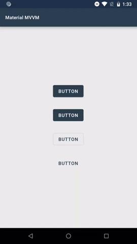
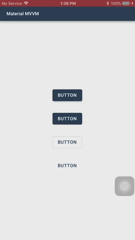
Buttons allow users to take actions, and make choices, with a single tap.
There are two types of buttons you can use: MaterialButton and MaterialIconButton
| Code | Android | iOS |
|---|---|---|
<material:MaterialButton BackgroundColor="#EAEAEA" HorizontalOptions="Center" Text="Elevated Button" TextColor="Black" VerticalOptions="Center" /> |
 |
 |
MaterialButton inherits the Button class. MaterialIconButton inherits the ContentView class.
Both of these controls have these common properties:
-
ButtonType- The type of the button. The default value isElevated.Elevated- This button will cast a shadow.Flat- This button will have no shadow.Outlined- This button will have no shadow, has a transparent background, and has a border.Text- This button will only show its label. It will not have a shadow, has a transparent background, and no border. Text buttons has a smaller inner padding as compared to the other button types.
-
BackgroundColor- The color of the button's background. Outlined and Text button types will always have a transparent background color. Flat and elevated buttons have a default background color based on the value ofMaterialColorConfiguration.Secondary. -
PressedBackgroundColor- The color of the button's background when it is pressed. -
DisabledBackgroundColor- The color of the button's background when it is disabled. -
Elevation- The virtual distance along the z-axis.
MaterialButton have these properties:
-
Image- The icon to be displayed next to the button's label. The color of the icon will be based on theTextColorproperty value of the button. -
AllCaps- Whether the letters in the label of the button should be in upper case or not. By default, this is set totrue.
MaterialIconButton has this property:
-
Image- The image of the button. -
TintColor- The tint color of the image.
Buttons communicate actions that users can take. They are typically placed throughout your UI.
-
ElevatedandFlat
These are high-emphasis buttons that are distinguished by their fill color and/or shadow. The actions bound to them are primary to your app.
-
Outlined
These are medium-emphasis buttons. The actions bound to them are important, but are not the primary action in an app.
-
Text
These buttons are typically used for less-pronounced actions, which are located in modal dialogs or in cards.


You can set the Elevation property of the button using XAML or C# code. You can also set values when the button is in normal state or pressed state.
Using XAML
<!-- Button with a normal and pressed elevation of `4` -->
<material:MaterialButton Elevation="4" Text="Click" />

<!-- Button with a normal elevation of `4` and pressed elevation of `8` -->
<material:MaterialButton Elevation="4, 8" Text="Click" />
Using C#
// Button with a normal and pressed elevation of `4`
var button1 = new MaterialButton()
{
    Elevation = new MaterialElevation(4),
    Text = "Click"
};

// Button with a normal and pressed elevation of `4` using implicit operator
var button2 = new MaterialButton()
{
    Elevation = 4,
    Text = "Click"
};

// Button with a normal elevation of `4` and pressed elevation of `8`
var button3 = new MaterialButton()
{
    Elevation = new MaterialElevation(4,8),
    Text = "Click"
};
On press, buttons display touch feedback (ripple effect).
Read more about buttons here.
Text fields allow users to enter and edit text.
| Code | Android | iOS |
|---|---|---|
<material:MaterialTextField Placeholder="Placeholder" HelperText="Helper Text" ErrorText="Error Text" Text="Input Text" InputType="Default" /> |
 |
 |
MaterialTextField inherits the ContentView class.
-
AlwaysShowUnderline- Boolean flag determines whether the underline accent of this text field should always show or not. The default value isfalse. -
BackgroundColor- The background color of the text field. Default hex color value is#DCDCDC. -
ErrorColor- The color to indicate an error in the text field. The default value is based on the color value ofMaterialColorConfiguration.Error. -
ErrorText- The text that will show to indicate an error in this text field. This will replaceHelperTextwhenHasErroris set totrue. -
ErrorIcon- The icon that will show to indicate an error in this text field. Will show whenHasErroris set totrue. -
FocusCommand- The command that will be executed when this text field receives or loses focus. -
HasError- Boolean flag that indicates whether an error has occurred or not in this text field. -
HelperText- The text that appears below the text field to indicate additional hints for the text field. -
HelperTextColor- The color of the helper text. The default hex color value is#99000000. -
HelperTextFontFamily- The font family of the helper text. TheErrorTextwill use this as its font family. -
LeadingIcon- The image icon that will show on the left side of this text field. -
LeadingIconTintColor- The color to be used to tint the icon image of this text field. The default hex color value is#99000000. -
InputType- The keyboard input type to be used for this text field. -
MaxLength- The maximum allowed number of characters in this text field. -
Placeholder- The placeholder text of this text field. This property must never be null or empty. -
PlaceholderColor- The color of the placeholder text. The default hex color value is#99000000. -
ReturnType- The appearance of the return button of the keyboard. -
ReturnCommand- The command that will run when the user returns the input. -
ReturnCommandParameter- The parameter to be passed inReturnCommandproperty when it is executed. -
Text- The input text of this text field. -
TextChangeCommand- The command that executes when there is a change in this text field's input text. -
TextColor- The color of the input text. The default hex color value is#D0000000. -
TextFontFamily- The font family of the input text. By default, it uses theMaterialFontConfiguration.Body2font family. -
TintColor- The tint color of the underline accent and the placeholder of this text field when focused. The default color is set to the value ofMaterialColorConfiguration.SecondaryColor. -
FloatingPlaceholderEnabled- Determines whether the placeholder should float above when the text field is focused. -
Choices- When theInputTypeproperty is set toMaterialInputType.Choice, provides the list of choices from which the user will select one. -
ChoicesBindingName- The name of the property of the items in theChoicesproperty to display. -
ChoiceSelectedCommand- The command that will execute when an item is selected using the input typeChoice. The parameter that will be passed to this command is the selected item. -
HorizontalPadding- The value that determines the left and right padding of the text field. -
IsSpellCheckEnabled- Boolean flag determines whether spell checking is enabled in this text field. -
IsTextPredictionEnabled- Boolean flag determines whether text prediction is enabled in this field. -
TextFontSize- The font size of the text field's input text. -
FloatingPlaceholderFontSize- The font size of the text field's floating placeholder. -
FloatingPlaceholderColor- The color of the text field's floating placeholder. -
IsAutocapitalizationEnabled- Boolean value that determines whether to autocapitalize the input text or not. -
IsMaxLengthCounterVisible- Boolean value that determines whether to show the max input length counter on not. -
ShouldAnimateUnderline- Boolean value that determines whether to anumate the underline indicator or not.
-
Focused- Raised when this text field receives focus. -
Unfocused- Raised when this text field loses focus. -
TextChanged- Raised when the input text of this text field has changed. -
ChoiceSelected- The event that will be raised when an item is selected using the input typeChoice. Gives the item that was selected. -
Completed- The event that will be raised when the user completes the input using the return key.
A text field container, by default, has a fill. You can make the text field's BackgroundColor transparent and AlwaysShowUnderline to true.
The placeholder text should always be visible, because it is used to inform users as to what information is requested for a text field.
Helper text conveys additional guidance about the input field, such as how it will be used. It should only take up a single line, being persistently visible or visible only on focus.
When input text isn�t accepted, an error text can display instructions on how to fix it. Error messages are displayed below the input line, replacing helper text until fixed.
Read more about text fields here.
Selection controls allow users to complete tasks that involve making choices such as selecting options, or switching settings on or off. Selection controls are found on screens that ask users to make decisions or declare preferences such as settings or dialogs.
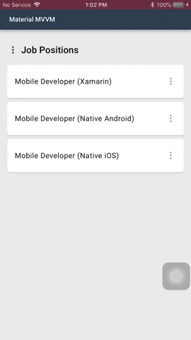
Allow users to select one option from a set.
| Code | Android | iOS |
|---|---|---|
<material:MaterialRadioButtonGroup x:Name="radioButtonGroup" Choices="{Binding Jobs}" /> |
 |
 |
-
Choices- The list of string the user will choose from. -
FontFamily- The font family of the text of each radio buttons. The default is the value ofMaterialFontConfiguration.Body1. -
FontSize- The font size of the text of each radio buttons. The default value is16. -
HorizontalSpacing- The spacing between the radio button and its text. -
SelectedColor- The color that will be used to tint this control whe selected. The default is the value ofMaterialColorConfiguration.Secondary. -
SelectedIndex- The index of the selected choice. -
SelectedIndexChanged- Raised when there is a change in the control's selected index. -
SelectedIndexChangedCommand- The command that wil run if there is a change in the control's selected index. The parameter is the selected index. -
TextColor- The color of the text of each radio button. The default value is#DE000000. -
UnselectedColor- The color that will be used to tint this control when unselected. The default value is#84000000. -
VerticalSpacing- The spacing between each radio buttons.
Use radio buttons when the user needs to see all available options. The orientation of the radio buttons is limited to vertical position, since
the custom view used to present the radio buttons is a ListView, but the scroll bars will not show since the ListView's height is based on the number
of choices. Each radio button has a fixed height of 48.
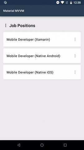
Checkboxes allow the user to select one or more items from a set.
| Code | Android | iOS |
|---|---|---|
<material:MaterialCheckboxGroup x:Name="checkBoxGroup" Choices="{Binding Jobs}" /> |
 |
 |
-
Choices- The list of string the user will choose from. -
FontFamily- The font family of the text of each checkboxes. The default is the value ofMaterialFontConfiguration.Body1. -
FontSize- The font size of the text of each checkboxes. The default value is16. -
HorizontalSpacing- The spacing between the checkbox and its text. -
SelectedColor- The color that will be used to tint this control whe selected. The default is the value ofMaterialColorConfiguration.Secondary. -
SelectedIndices- The indices of the selected choices. -
SelectedIndicesChanged- Raised when there is a change in the control's selected inices. -
SelectedIndicesChangedCommand- The command that wil run if there is a change in the control's selected indices. The parameter is the list of selected indices. -
TextColor- The color of the text of each radio button. The default value is#DE000000. -
UnselectedColor- The color that will be used to tint this control when unselected. The default value is#84000000. -
VerticalSpacing- The spacing between each checkboxes.
It has the same limitations as MaterialRadioButtonGroup.
Checkboxes can be used to turn an option on or off. If there is only one option, you can use MaterialCheckbox instead.
MaterialCheckbox has the property IsSelected, you can use this to determine whether the option was selected or not.
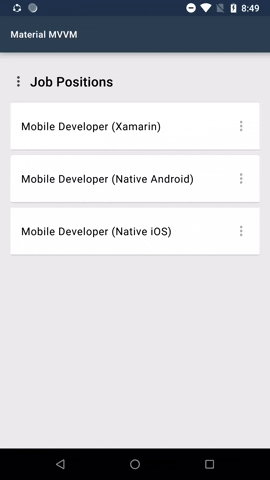
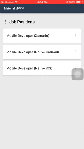
Menus display a list of choices on temporary surfaces.
| Code | Android | iOS |
|---|---|---|
<material:MaterialMenuButton ButtonType="Text" CornerRadius="24" Choices="{Binding Actions}" Command="{Binding MenuCommand}" /> |
 |
 |
MaterialMenuButton inherits the XF.Material.Forms.UI.MaterialIconButton class.
-
Choices- The list of items from which the user will choose from. You can either assign a collection ofstringorMaterialMenuItem. -
MenuBackgroundColor- The background color of the menu. -
MenuCornerRadius- The corner radius of the menu. -
Command- The command that will execute when a menu item was selected. The type isCommand<MaterialMenuResult>. The result will contain the index of the selected menu and the parameter, if any. -
CommandParameter- The parameter to pass inCommandproperty. -
MenuTextColor- The text color of the menu items. -
MenuTextFontFamily- The text font family of the menu items.
MenuSelected- Raised when a menu item was selected.
Menus are positioned relative to both the element that generates them and the edges of the screen. They can appear in front of, beside, above, or below the element that generates them.
Menus can be dismissed by tapping outside, when an item was selected, or when the back button was pressed in Android.
Be sure to always match the width and height of the child view to the width and height of the menu.
Menu is by default a button. In the menu sample shown above the 3 dots is an added image. This is one of the possibilities how the menu can look like.
Sliders allow users to make selections from a range of values.
<mat:MaterialSlider Value="{Binding CurrentValue}" MinValue="0" MaxValue="100" />MaterialSlider inherits the ContentView class.
-
Value- The current value selected. -
MinValue- The minimum value allowed to select. -
MaxValue- The maximum value allowed to select. -
ValueChangedCommand- The command that will execute when the current value has changed. -
TrackColor- The track color of the slider. -
ThumbColor- The thumb color of the slider.
ValueChanged- The event that is raised when the current value has changed.
Switches allow the user to toggle between two states.
<mat:MaterialSwitch IsActivated="{Binding IsTracking}" />MaterialSwitch inherits the ContentView class.
-
ActiveTrackColor- The track color of the switch when it is in active state. -
ActiveThumbColor- The thumb color of the switch when it is in active state. -
InactiveTrackColor- The track color of the switch when it is in inactive state. -
InactiveThumbColor- The thumb color of the switch when it is in inactive state. -
IsActivated- Boolean flag whether the switch was activated or not.
Activated- The event that is raised when the switch was activated or not.
A view that displays a text. Allows customizations to conform with the typography guidelines.
MaterialLabel inherits the Label class.
-
TypeScale- In material design, these are categories on how the text are displayed. Each type scale has its own font family, font weight, font size, and letter spacing. For more info about type scale, read here. -
LineHeight- The factor to multiply that will identify the distance between the base of a line of text to another. The default value is1.4.
Chips are compact elements that represent an input, attribute, or action.
| Code | Android | iOS |
|---|---|---|
<material:MaterialChip BackgroundColor="#F2F2F2" Image="im_google" Text="Google" TextColor="#DE000000" /> |
 |
 |
MaterialChip inherits the ContentView class.
-
Text- The chip's label to be displayed. -
TextColor- The color of the chip's label. -
FontFamily- The font family of the chip's label. -
BackgroundColor- The color of the chip's background. -
Image- The chip's image to be displayed. -
ActionImage- The chip's action image to be displayed. -
ActionImageTappedCommand- The bindable command that executes when theActionImageof the chip is tapped.
ActionImageTapped- The event that is called when theActionImageof the chip is tapped.
Chips allow users to enter information, make selections, filter content, or trigger actions.
Read more about chips here.
An indeterminate progress indicator that express an unspecified wait time of a process.
<material:MaterialCircularLoadingView WidthRequest="56"
    HeightRequest="56"
TintColor="#6200EE" />MaterialCircularLoadingView inherits the Lottie.Forms.AnimationView class.
TintColor- The color of the circular progress indicator.
Circular progress indicators display progress by animating an indicator along an invisible circular track in a clockwise direction. They can be applied directly to a surface, such as a button or card.
Loading Dialog uses this to indicate a process running.
Read more about circular progress indicator here.
A tintable image view.
<material:MaterialIcon WidthRequest="56"
    HeightRequest="56"
    Source="ic_save"
TintColor="#6200EE" />MaterialIcon inherits the Image class.
TintColor- The tint color of the image.
Under the XF.Material.Forms.UI.Dialogs namespace, you can display modal views to notify users by using MaterialDialog.Instance.
Handling the Back Button on Android
In order for the back button to work on Android for dismissing dialogs, override the OnBackPressed method in your MainActivity class and add this:
public override void OnBackPressed()
{
    XF.Material.Droid.Material.HandleBackButton(base.OnBackPressed);

    //No need to call  Rg.Plugins.Popup.Popup.SendBackPressed();
}
Important
If you are using Rg.Plugins.Popup, using XF.Material.Droid.Material.HandleBackButton(base.OnBackPressed) will call Popup.SendBackPressed when
there is a modal page that is not a shown using MaterialDialog.Instance.
Alert dialogs interrupt users with urgent information, details, or actions.
| Android | iOS |
|---|---|
 |
 |
You can show an alert dialog using any of the following overload methods of MaterialDialog.Instance.AlertAsync() or MaterialDialog.Instance.ConfirmAsync().
There are two common parameters in this method:
-
message- The message of the alert dialog. -
title- The title of the alert dialog.
-
Shows an alert dialog for acknowledgement. It only has a single, dismissive action used for acknowledgement.
await MaterialDialog.Instance.AlertAsync(message: "This is an alert dialog.");

await MaterialDialog.Instance.AlertAsync(message: "This is an alert dialog",
                                    title: "Alert Dialog");

await MaterialDialog.Instance.AlertAsync(message: "This is an alert dialog",
                                    title: "Alert Dialog",
                                    acknowledgementText: "Got It");
acknowledgementText- The text of the alert dialog's acknowledgement button. The default string value isOk.
-
Showing an alert dialog for confirmation of action. Returns true when the confirm button was clicked, false if the dismiss button was clicked or if the alert dialog was dismissed.
await MaterialDialog.Instance.ConfirmAsync(message: "Do you want to sign in?",
                                    confirmingText: "Sign In");

await MaterialDialog.Instance.ConfirmAsync(message: "Do you want to sign in?",
                                    confirmingText: "Sign In",
                                    dismissiveText: "No");

await MaterialDialog.Instance.ConfirmAsync(message: "Discard draft?",
                                    title: "Confirm",
                                    confirmingText: "Yes",
                                    dismissiveText: "No");
-
confirmingText- The text of the alert dialog's confirmation button. -
dismissiveText- The text of the alert dialog's dismissive button. The default string value isCancel.
-
An alert dialog is displayed by pushing a modal window. This will appear in front of the content of the app to provide critical information or ask for a decision.
Alert dialogs are interruptive. This means that it disables all app functionality when they appear, and remain on screen until confirmed, dismissed or a required action has been taken.
Alert dialogs may be dismissed by tapping outside of the dialog, tapping the dismissive button (e.g. "Cancel" button), or by tapping the system back button (for Android).
Read more about alert dialogs here.
You can show a custom dialog content by using the MaterialDialog.Instance.ShowCustomContentAsync().

var choices = new string[]
{
    "Biology",
    "Psychology",
    "Phsyics",
    "Chemistry"
};

var view = new MaterialRadioButtonGroup()
{
    Choices = choices
};

bool? wasConfirmed = await MaterialDialog.Instance.ShowCustomContentAsync(view, "What field of science is considered as the study of life?", "Question 1");
This method returns a nullable bool. Returns true when the user dismisses the dialog using the confirm button, false when using the dismiss button, and null when using the back button or when the background was clicked.
You can pass parameters as like what you would do in when using MaterialDialog.Instance.ConfirmAsync(). The only
difference is that it takes a View as a parameter and this will be shown inside the dialog.
You can remove the negative button by passing null to the dismissiveText parameter.
Simple dialogs can display items that are immediately actionable when selected. They don’t have text buttons.
| Android | iOS |
|---|---|
 |
 |
You can show a simple dialog by using any of the overload methods of MaterialDialog.Instance.SelectActionAsync().
//Create actions
var actions = new string[]{ "Open in new tab", "Open in new window", "Copy link address", "Download link" };

//Show simple dialog
var result = await MaterialDialog.Instance.SelectActionAsync(actions: actions);

//Show simple dialog with title
var result = await MaterialDialog.Instance.SelectActionAsync(title: "Select an action",
actions: actions);Simple dialogs are dismissed by tapping an action, or by tapping outside the dialog.
Read more about alert dialogs here.
Confirmation dialogs give users the ability to provide final confirmation of a choice before committing to it, so they have a chance to change their minds if necessary.
| Android | iOS |
|---|---|
 |
 |
You can show two types of confirmation dialog: Choose one of listed choices using MaterialDialog.Instance.SelectChoiceAsync(), and choose one or more of listed choices using MaterialDialog.Instance.SelectChoicesAsync().
//Create choices
var jobs = new string[]
{
    "Mobile Developer (Xamarin)",
    "Mobile Developer (Native)",
    "Web Developer (.NET)",
    "Web Developer (Laravel)",
    "Quality Assurance Engineer",
    "Business Analyst",
    "Recruitment Officer",
    "Project Manager",
    "Scrum Master"
};

//Show confirmation dialog for choosing one.
var result = await MaterialDialog.Instance.SelectChoiceAsync(title: "Select a job",
                                                             choices: jobs);

//Show confirmation dialog for choosing one or more.
var result = await MaterialDialog.Instance.SelectChoicesAsync(title: "Select a job",
                                                              choices: jobs);
You can also define pre-selected choice/s by supplying the parameters selectedIndex and selectedIndices for MaterialDialog.Instance.SelectChoiceAsync() and MaterialDialog.Instance.SelectChoicesAsync(), respectively.
...

//Show confirmation dialog for choosing one, with pre-selected choice.
var result = await MaterialDialog.Instance.SelectChoiceAsync(title: "Select a job",
                                                             selectedIndex: 1,
                                                             choices: jobs);

//Show confirmation dialog for choosing one or more, with pre-selected choices.
var result = await MaterialDialog.Instance.SelectChoicesAsync(title: "Select a job",
                                                              selectedIndices: new int[] { 1, 0 },
choices: jobs);Confirmation dialogs provide both confirmation and cancel buttons. After a confirmation button is tapped, a selection is confirmed. If the cancel button is tapped, or the area outside the dialog, the action is cancelled.
The confirmation button will only be enabled when an item is selected.
A type of confirmation dialog that allow users to input text and confirm it.
| Android | iOS |
|---|---|
 |
 |
You can show an input dialog by calling any of the overload methods of MaterialDialog.Instance.InputAsync().
var input = await MaterialDialog.Instance.InputAsync();Just like confirmation dialogs, input dialogs also provide confirmation and cancel buttons. It will return the string value of the input field if the confirm button was clicked. If the cancel button is tapped, or the area outside the dialog, the action is cancelled.
A modal dialog that is displayed to inform users about a process that is running for an unspecified time.
| Android | iOS |
|---|---|
 |
 |
You can show a loading dialog using either of two ways:
- Show in a
usingblock. The loading dialog will automatically dispappear when the task/s are done.
using(await MaterialDialog.Instance.LoadingDialogAsync(message: "Something is running"))
{
    await Task.Delay(5000) // Represents a task that is running.
}- Show by calling the method and assign the return value to a variable, then call the
Disposemethod of the variable to hide the loading dialog after all task/s are done.
var loadingDialog = await MaterialDialog.Instance.LoadingDialogAsync(message: "Something is running");

await Task.Delay(5000) // Represents a task that is running.

await loadingDialog.DismissAsync();- Change the dialog's text.
using(var dialog = await MaterialDialog.Instance.LoadingDialogAsync(message: "Something is running"))
{
    await Task.Delay(5000) // Represents a task that is running.
    dialog.Text = "Something else is running now!";
    await Task.Delay(5000) // Represents a task that is running.
}Show a loading dialog to inform users of a running process in your app.
A loading dialog can never be dismissed by user interaction, even by using Android's back button.
Snackbars provide brief messages about app processes at the bottom of the screen.
| Android | iOS |
|---|---|
 |
 |
You can show a snackbar by using either of the two overload methods of MaterialDialog.Instance.SnackbarAsync().
Both methods have this default parameter message, which is the message that will display on the snackbar.
-
Shows a snackbar with no action.
await MaterialDialog.Instance.SnackbarAsync(message: "This is a snackbar.",
                                            msDuration: MaterialSnackbar.DurationLong);
msDuration- The duration, in milliseconds, before the snackbar will disappear. There are pre-defined constants which you can use in theMaterialSnackbarclass.-
MaterialSnackbar.DurationShort- Snackbar will show for 1500 milliseconds. -
MaterialSnackbar.DurationLong- Snackbar will show for 2750 milliseconds. The default value ofmsDuration. -
MaterialSnackbar.DurationIndefinite- Snackbar will show indefinitely.
-
-
Shows a snackbar with an action. Returns true if the snackbar's action button was clicked, or false if the snackbar was automatically dismissed.
await MaterialDialog.Instance.SnackbarAsync(message: "This is a snackbar.",
                                            actionButtonText: "Got It",
                                            msDuration: 3000);
actionButtonText- The text that will appear on the snackbar's button.
You can also use a snackbar to indicate a task/s running without interrupting the user. You can use the MaterialDialog.Instance.LoadingSnackbarAsync() method.
There are two ways to display a loading snackbar.
- Show in a
usingblock. The loading dialog will automatically dispappear when the task/s are done.
using(await MaterialDialog.Instance.LoadingSnackbarAsync(message: "Something is running"))
{
    await Task.Delay(5000) // Represents a task that is running.
}- Show by calling the method and assign the return value to a variable, then call the
Disposemethod of the variable to hide the snackbar after all task/s are done.
var snackbar = await MaterialDialog.Instance.LoadingSnackbarAsync(message: "Something is running");

await Task.Delay(5000) // Represents a task that is running.

await snackbar.DismissAsync();- Change the snackbar's text.
using(var snackbar = await MaterialDialog.Instance.LoadingSnackbarAsync(message: "Something is running"))
{
    await Task.Delay(5000) // Represents a task that is running.
    snackbar.Text = "Something else is running now!";
    await Task.Delay(5000) // Represents a task that is running.
}Snackbars can be used to inform users of a process that an app has performed, will perform, or is performing. They can appear temporarily towards the bottom of the screen. Only one snackbar may be displayed at a time.
A snackbar can contain a single action. When setting the duration of how long before it disappears automatically, the action shouldn't be "Dismiss" or "Cancel".
Read more about snackbars here.
You can customize modal dialogs that are shown using MaterialDialog.Instance.
BaseMaterialDialogConfiguraion, which the classes MaterialAlertDialogConfiguration, MaterialLoadingDialogConfiguration, and MaterialSnackbarConfiguration inherits, has these properties:
-
BackgroundColor- The background color of the dialog. The default value isColor.White. -
CornerRadius- The roundness of the dialog's corners. The default value is2. ForMaterialSnackbarConfiguration, the value is4. -
MessageFontFamily- The font family of the dialog's message. The default value is set to the value ofMaterialFontConfiguration.Body1. ForMaterialSnackbarConfiguration, the default value is set to the value ofMaterialFontConfiguration.Body2. -
MessageTextColor- The color of the dialog's message. The default value is#99000000. ForMaterialSnackbarConfiguration, the default value is#DEFFFFFF. -
ScrimColor- The color that will appear at the back of this dialog. The default value is#51000000. ForMaterialSnackbarConfiguration, the value isColor.Transparent. -
TintColor- The color to tint views such as buttons and images. The default value is set to the value ofMaterialColorConfiguration.Secondary. ForMaterialSnackbarConfiguration, the default value isColor.Yellow.
MaterialAlertDialogConfiguration class provides properties to be used for customizing an alert dialog. You can pass an instance of this class to any overload methods of MaterialDialog.Instance.AlertAsync().
The properties of MaterialAlertDialogConfiguration class are:
-
TitleTextColor- The color of the alert dialog's title. The default color hex value is#DE000000; -
TitleFontFamily- The font family of the alert dialog's title. The default value is set to the value ofMaterialFontConfiguration.H6. -
ButtonFontFamily- The font family of the alert dialog's button/s. The default value is set to the value ofMaterialFontConfiguration.Button. -
ButtonAllCaps- The boolean value whether the text of the alert dialog's button/s should all be capitalized or not. The default value istrue.
var alertDialogConfiguration = new MaterialAlertDialogConfiguration
{
    BackgroundColor = XF.Material.Forms.Material.GetResource<Color>(MaterialConstants.Color.PRIMARY),
    TitleTextColor = XF.Material.Forms.Material.GetResource<Color>(MaterialConstants.Color.ONPRIMARY),
    TitleFontFamily = XF.Material.Forms.Material.GetResource<OnPlatform<string>>("FontFamily.Exo2Bold"),
    MessageTextColor = XF.Material.Forms.Material.GetResource<Color>(MaterialConstants.Color.ONPRIMARY).MultiplyAlpha(0.8),
    MessageFontFamily = XF.Material.Forms.Material.GetResource<OnPlatform<string>>("FontFamily.OpenSansRegular"),
    TintColor = XF.Material.Forms.Material.GetResource<Color>(MaterialConstants.Color.ONPRIMARY),
    ButtonFontFamily = XF.Material.Forms.Material.GetResource<OnPlatform<string>>("FontFamily.OpenSansSemiBold"),
    CornerRadius = 8,
    ScrimColor = Color.FromHex("#232F34").MultiplyAlpha(0.32),
    ButtonAllCaps = false
};

await MaterialDialog.Instance.AlertAsync(message: "This is an alert dialog",
                                         title: "Alert Dialog",
                                         acknowledgementText: "Got It",
                                         configuration: alertDialogConfiguration);
You can also pass the same configuration when you want to style alert dialogs with custom content. But you would have to update also the style of the custom view separately.

MaterialSimpleDialogConfiguration class provides properties to be used for customizing a simple dialog. You can pass an instance of this class to any overload methods of MaterialDialog.Instance.SelectActionAsync().
var simpleDialogConfiguration = new MaterialSimpleDialogConfiguration
{
    BackgroundColor = XF.Material.Forms.Material.GetResource<Color>(MaterialConstants.Color.PRIMARY),
    TitleTextColor = XF.Material.Forms.Material.GetResource<Color>(MaterialConstants.Color.ON_PRIMARY),
    TitleFontFamily = XF.Material.Forms.Material.GetResource<OnPlatform<string>>("FontFamily.OpenSansSemiBold"),
    TextColor = XF.Material.Forms.Material.GetResource<Color>(MaterialConstants.Color.ON_PRIMARY).MultiplyAlpha(0.8),
    TextFontFamily = XF.Material.Forms.Material.GetResource<OnPlatform<string>>("FontFamily.OpenSansRegular"),
    CornerRadius = 8,
    ScrimColor = Color.FromHex("#232F34").MultiplyAlpha(0.32)
};

var result = await MaterialDialog.Instance.SelectActionAsync(title: "Select an action",
                                                             actions: new string[] { "Open in new tab", "Open in new window", "Copy link address", "Download link" },
                                                             configuration: simpleDialogConfiguration);
MaterialConfirmationDialogConfiguration class provides properties to be used for customizing a confirmation dialog. You can pass an instance of this class to any overload methods of MaterialDialog.Instance.SelectChoiceAsync() or Material.Instance.SelectChoicesAsync().
var confirmationDialogConfiguration = new MaterialConfirmationDialogConfiguration
{
    BackgroundColor = XF.Material.Forms.Material.GetResource<Color>(MaterialConstants.Color.PRIMARY).AddLuminosity(-0.1),
    TitleTextColor = XF.Material.Forms.Material.GetResource<Color>(MaterialConstants.Color.ON_PRIMARY),
    TitleFontFamily = XF.Material.Forms.Material.GetResource<OnPlatform<string>>("FontFamily.OpenSansSemiBold"),
    TextColor = XF.Material.Forms.Material.GetResource<Color>(MaterialConstants.Color.ON_PRIMARY).MultiplyAlpha(0.8),
    TextFontFamily = XF.Material.Forms.Material.GetResource<OnPlatform<string>>("FontFamily.OpenSansRegular"),
    CornerRadius = 8,
    ButtonAllCaps = false,
    ButtonFontFamily = XF.Material.Forms.Material.GetResource<OnPlatform<string>>("FontFamily.OpenSansSemiBold"),
    ControlSelectedColor = Color.White,
    ControlUnselectedColor = Color.White.MultiplyAlpha(0.66),
    TintColor = Color.White,
    ScrimColor = Color.FromHex("#232F34").MultiplyAlpha(0.32)
};

var result = await MaterialDialog.Instance.SelectChoiceAsync(title: "Select a  job",
                                                             choices: /*choices list*/,
                                                             configuration: confirmationDialogConfiguration);
MaterialInputDialogConfiguration class provides properties to be used for customizing an input dialog.
You can pass an instance of this class to any overload methods of MaterialDialog.Instance.InputAsync().
The input type of the input field can be set by using this configuration.
var config = new MaterialInputDialogConfiguration()
{
    InputType = MaterialTextFieldInputType.Password,
    CornerRadius = 8,
    BackgroundColor = Color.FromHex("#2c3e50"),
    InputTextColor = Color.White,
    InputPlaceholderColor = Color.White.MultiplyAlpha(0.6),
    TintColor = Color.White,
    TitleTextColor = Color.White,
    MessageTextColor = Color.FromHex("#DEFFFFFF")
};

var input = await MaterialDialog.Instance.InputAsync(title: "Deactivate account",
                                                     message: "To continue, please enter your current password",
                                                     inputPlaceholder: "Password",
                                                     confirmingText: "Deactivate",
                                                     configuration: config);
MaterialLoadingDialogConfiguration class provides properties to be used for customizing a loading dialog. You can pass an instance of this class to any overload methods of MaterialDialog.Instance.LoadingDialogAsync().
var loadingDialogConfiguration = new MaterialLoadingDialogConfiguration()
{
    BackgroundColor = XF.Material.Forms.Material.GetResource<Color>(MaterialConstants.Color.PRIMARY),
    MessageTextColor = XF.Material.Forms.Material.GetResource<Color>(MaterialConstants.Color.ONPRIMARY).MultiplyAlpha(0.8),
    MessageFontFamily = XF.Material.Forms.Material.GetResource<OnPlatform<string>>("FontFamily.OpenSansRegular"),
    TintColor = XF.Material.Forms.Material.GetResource<Color>(MaterialConstants.Color.ONPRIMARY),
    CornerRadius = 8,
    ScrimColor = Color.FromHex("#232F34").MultiplyAlpha(0.32)
};

await MaterialDialog.Instance.LoadingDialogAsync(message: "Something is running...",
                                                 configuration: loadingConfiguration);
MaterialSnackbarConfiguration class provides properties to be used for customizing a snackbar. You can pass an instance of this class to any overload methods of MaterialDialog.Instance.SnackbarAsync() or MaterialDialog.Instance.LoadingSnackbarAsync().
var snackbarConfiguration = new MaterialSnackbarConfiguration()
{
    BackgroundColor = XF.Material.Forms.Material.GetResource<Color>(MaterialConstants.Color.PRIMARY),
    MessageFontFamily = XF.Material.Forms.Material.GetResource<OnPlatform<string>>("FontFamily.OpenSansRegular"),
    ButtonAllCaps = true,
    ButtonFontFamily = XF.Material.Forms.Material.GetResource<OnPlatform<string>>("FontFamily.OpenSansSemiBold"),
    TintColor = Color.White,
    MessageTextColor = XF.Material.Forms.Material.GetResource<Color>(MaterialConstants.Color.ONPRIMARY).MultiplyAlpha(0.8)
}

await MaterialDialog.Instance.SnackbarAsync(message: "This is a snackbar."
                                            actionButtonText:  "Got It",
                                            configuration: snackbarConfiguration);
You can set the global styles of each dialog by using the MaterialDialog.Instance.SetGlobalStyles() method.
You can still override these styles be passing the configuration object when showing an alert dialog, loading dialog, simple dialog, confirmation dialog, and snackbar.
You can create Material-based resources which will be used by your app. This library strictly follows Google's Material Design, following principles of good design while maintaining a common UI across platforms.
The MaterialConfiguration class allow you to define your theme and combine it along with the built in resource dictionary to your app.
You can fully express your branding with the use of the baseline Material color theme, while creating a uniform, cross-platform design.
Use the Color Tool to create your palette. This tool provides a preview of what your UI will look like while keeping accessibility.

You can define your color theme with the MaterialColorConfiguration class. The properties of the class are:
-
Primary- Displayed most frequently across your app.MaterialNavigationPageuses this color as its defaultBarBackgroundColor. -
PrimaryVariant- A tonal variation of thePrimarycolor. Used for coloring the status bar. -
Secondary- Accents select parts of your UI. If not defined, it will use thePrimarycolor.MaterialButton(including the buttons in Alert Dialogs),MaterialTextFieldandMaterialCircularLoadingViewuses this color value as their default accent color. -
SecondaryVariant- A tonal variation of theSecondarycolor. -
Background- The underlying color of an app's content. The root page and pages pushed by theMaterialNavigationPagecontrol will have theirBackgroundColorproperty set to this value by default, unless there is already a value defined in the page. -
Error- The color used to indicate error status. -
Surface- The color of surfaces such as cards.MaterialCarduses this color value as itsBackgroundColor. -
OnPrimary- A color that passes accessibility guidelines for text/iconography when drawn on top of thePrimarycolor.MaterialNavigationPageuses this color as itsBarTextColorby default. -
OnSecondary- A color that passes accessibility guidelines for text/iconography when drawn on top of theSecondarycolor.MaterialButtontypesElevatedandFlatuse this color value as their defaultTextColor. -
OnBackground- A color that passes accessibility guidelines for text/iconography when drawn on top of theBackgroundcolor. -
OnError- A color that passes accessibility guidelines for text/iconography when drawn on top of theErrorcolor. -
OnSurface- A color that passes accessibility guidelines for text/iconography when drawn on top of theSurfacecolor.
If you did not set the ColorConfiguration property of the MaterialConfiguration class in here, it will use a default color theme.
As stated here, you can use typography to present your design and content as clearly and efficiently as possible.
The Material Design type scale includes a range of contrasting styles that support the needs of your product and its content. These are resusable categories of text, each with an intended application and meaning.
This library offers the same type scales, each can be applied and reused in your app.

| TypeScale | Font Size | Font Attribute | Letter Spacing |
|---|---|---|---|
MaterialTypeScale.H1 |
96 | Regular | -1.5 |
MaterialTypeScale.H2 |
60 | Regular | -0.5 |
MaterialTypeScale.H3 |
48 | Regular | 0 |
MaterialTypeScale.H4 |
34 | Regular | 0.25 |
MaterialTypeScale.H5 |
24 | Regular | 0 |
MaterialTypeScale.H6 |
20 | Bold | 0.15 |
MaterialTypeScale.Subtitle1 |
16 | Regular | 0.15 |
MaterialTypeScale.Subtitle2 |
14 | Bold | 0.1 |
MaterialTypeScale.Body1 |
16 | Regular | 0.5 |
MaterialTypeScale.Body2 |
14 | Regular | 0.25 |
MaterialTypeScale.Button |
14 | Bold | 0.75 |
MaterialTypeScale.Caption |
12 | Regular | 0.4 |
MaterialTypeScale.Overline |
10 | Regular | 1.5 |
-
Headlines - The largest text on the screen, and used for short, important text or numerals.
-
Subtitles - Smaller than headlines. Typically used for medium-emphasis text that is shorter in length.
-
Body - Used for long-form writing as it works well for small text sizes.
-
Caption and Overline - Smallest font sizes. Used sparingly to annotate imagery or to introduce a headline.
-
Button - Used for different types of buttons.
MaterialButtonautomatically applies this style.
Read more about applying the type scale here.
You can apply a type scale to a text using MaterialLabel.
The MaterialFontConfiguration class allows you to set a specific font to a type scale.
The code below shows a complete example on how to include the MaterialColorConfiguration and MaterialFontConfiguration.
<Application x:Class="XF.MaterialSample.App"
    xmlns="http://xamarin.com/schemas/2014/forms"
    xmlns:x="http://schemas.microsoft.com/winfx/2009/xaml"
    xmlns:mtrl="clr-namespace:XF.Material.Forms.Resources;assembly=XF.Material"
    xmlns:mtrltypo="clr-namespace:XF.Material.Forms.Resources.Typography;assembly=XF.Material">
    <Application.Resources>

        <OnPlatform x:Key="FontFamily.RobotoRegular"
            x:TypeArguments="x:String"
            Android="Fonts/Roboto-Regular.ttf#Roboto-Regular"
            iOS="Roboto-Regular" />
        <OnPlatform x:Key="FontFamily.RobotoMedium"
            x:TypeArguments="x:String"
            Android="Fonts/Roboto-Medium.ttf#Roboto-Medium"
            iOS="Roboto-Medium" />

        <mtrltypo:MaterialFontConfiguration x:Key="Material.Font"
            Body1="{StaticResource FontFamily.RobotoRegular}"
            Body2="{StaticResource FontFamily.RobotoRegular}"
            Button="{StaticResource FontFamily.RobotoMedium}"
            Caption="{StaticResource FontFamily.RobotoRegular}"
            H1="{StaticResource FontFamily.RobotoRegular}"
            H2="{StaticResource FontFamily.RobotoRegular}"
            H3="{StaticResource FontFamily.RobotoRegular}"
            H4="{StaticResource FontFamily.RobotoRegular}"
            H5="{StaticResource FontFamily.RobotoRegular}"
            H6="{StaticResource FontFamily.RobotoMedium}"
            Overline="{StaticResource FontFamily.RobotoRegular}"
            Subtitle1="{StaticResource FontFamily.RobotoRegular}"
            Subtitle2="{StaticResource FontFamily.RobotoMedium}" />

        <mtrl:MaterialColorConfiguration x:Key="Material.Color"
            Background="#EAEAEA"
            Error="#B00020"
            OnBackground="#000000"
            OnError="#FFFFFF"
            OnPrimary="#FFFFFF"
            OnSecondary="#FFFFFF"
            OnSurface="#000000"
            Primary="#011A27"
            PrimaryVariant="#000000"
            Secondary="#063852"
            SecondaryVariant="#001229"
            Surface="#FFFFFF" />

        <mtrl:MaterialConfiguration x:Key="Material.Configuration"
            ColorConfiguration="{StaticResource Material.Color}"
            FontConfiguration="{StaticResource Material.Font}" />

    </Application.Resources>
</Application>
Then in your App.xaml.cs, pass the resource key of the MaterialConfiguration object.
MaterialFontConfiguration's and MaterialColorConfiguration's properties are optional, they always have a default value. For MaterialFontConfiguration the default font is the system font.
// Xamarin.Forms

public App()
{
    InitializeComponent();
    XF.Material.Forms.Material.Init(this, "Material.Configuration");
}
You can also instantiate the MaterialConfiguration object via C# code.
// Xamarin.Forms

public App()
{
    InitializeComponent();
    XF.Material.Forms.Material.Init(this, new MaterialConfiguration
    {
        ColorConfiguration = new MaterialColorConfiguration
        {
            // Set properties
        },
        FontConfiguration = new MaterialFontConfiguration
        {
            // Set properties
        }
    });
}The static properties ColorConfiguration and FontConfiguration of Material class allows you to retrieve the resource values that you have set.
You can also useXF.Material.Forms.Material.GetResource<T>(string key) method that allows you to get a resource value of the specified type.
The static MaterialConstants class provides a list of constant Material resource keys.
//Get color resource, use either
Color primaryColor = XF.Material.Forms.Material.GetResource<Color>(MaterialConstants.Color.PRIMARY);
Color primaryColor = XF.Material.Forms.Material.Color.Primary;

//Get font family resource, use either
string body1Font = XF.Material.Forms.Material.GetResource<string>(MaterialConstants.FontFamily.BODY1);
string body1Font = XF.Material.Forms.Material.FontFamily.Body1;You can change the color of the status bar by using the Material.PlatformConfiguration.ChangeStatusBarColor(Color color) method.
The status bar color is automatically changed depending on the value of MaterialColorConfiguration.PrimaryVariant.
It is recommended to use this library for applications targeting Android 5.0 (Lollipop) or higher for better rendering.
If targeted below Android 5.0, the following issues can be seen:
- Material shadows, like that of
MaterialCardandMaterialButton, will not show. - On Android 4.2 (Jellybean),
MaterialButtonis larger. Explanation is provided in this issue. - Letter spacing of typescale effects won't work for devices running below Android 5.0 (Lollipop). The API for setting the letter spacing was added in Android 5.0.
Special thanks to the following libraries I used for this project: