
At the beginning of 2020, DoorDash’s Design Infrastructure team introduced a Theming feature to our Prism design language system, an internal library that makes frontend development projects more efficient while ensuring consistent design across all of our products. Theming provided an API for engineers to define how Prism components would appear on the screen. With the introduction of this new feature, any team building a product for the web could easily bring the Prism design language system into their project and take advantage of the large number of pre-built components, typography elements, and visual color definitions.
Our design language system, which we call Prism, is one of the most powerful tools that our frontend engineers utilize in their projects. Prism’s centralized web, iOS, Android, and Figma libraries contain definitions for the lowest-level elements of our design ecosystem (like our color systems and typography sets) all the way up to higher-level components for utilization in the most common UI interaction patterns (from buttons to navigation bars and alert dialogues).
Designers and engineers alike can use the Prism’s components to quickly build projects with a consistent and cohesive look and feel matching the DoorDash brand. Rather than ten separate teams building ten custom implementations of a “DoorDash-y” button, Prism provides a single implementation that teams can quickly drop into their projects, freeing them to focus on the designs and features that make their project unique.
When first built, Prism was primarily focused on the visual designs and use cases of a small number of DoorDash products. This narrow focus meant teams building projects outside of this scope were unable to leverage the benefits of the system, and had to create their own versions of common UI elements. Narrow adoption of Prism created tech debt, introduced the potential for design drift, and created inefficiencies as teams not using Prism had to use resources creating their own UI elements.
The introduction of Theming to the design language system supported all of our existing projects, while also providing the extensibility to support future products. This innovation played a huge role when we acquired Caviar in 2019, helping us integrate it with our platform.
The advantages and limitations of Prism
When Prism was first introduced, it was built around the main components and patterns that supported our consumer use cases. “Consumer” in this case refers to the set of apps and products used to place orders from restaurants. These consumer-facing apps are how most people experience DoorDash. However, DoorDash is actually a three-sided marketplace, building and supporting an entire ecosystem. These three sides include:
- The consumer side, where users can open up the DoorDash app or website to place a delivery or pickup order (mentioned above).
- The merchant side, which provides tools and products for businesses to sign up with and fulfill orders through DoorDash.
- The Dasher side, which provides the Dasher app and other tools for drivers to deliver orders from the merchant to the consumer.
Engineering teams supporting each side of this marketplace are responsible for an entire suite of unique tools, products, and services. And each has different needs and priorities to ensure that what they build provides the best experience for their end users. To that end, the look and feel of a button that’s used by the consumer iOS app might not match the needs of a button that’s used by the merchant desktop web application.
With Prism’s initial focus on the consumer side, teams building projects outside of this scope, such as merchant, Dasher, or tools used by support agents, were unable to leverage the benefits of the design language system. Instead, they had to create their own custom implementations of common UI elements, such as buttons, input fields, and pagination controls. These one-off custom components meant lost productivity for the teams as they built these patterns from scratch, created tech debt through maintenance and upkeep of these custom elements, and introduced risk that code implementations could drift farther and farther away from a cohesive DoorDash design and experience with every update.
Another significant risk of designers and engineers creating their own custom implementations of these common components was that there is no central “source of truth” for how a component looks and behaves. Prism components don’t only align with visual and interactive patterns that we’ve established for DoorDash products, but they’re also built with key concepts like accessibility and internationalization in mind.
On the interactivity side, if two separate teams are building their own versions of a button then it’s possible that one of those implementations will be missing a key accessibility feature, which could hurt some end users’ abilities to use the application. On the visual side, any updates or refreshes to design patterns in our products would have to be manually, rather than programmatically, updated across every single project using those components and patterns. Visual updates would take excess time and resources for each team, and could very quickly cause design drift between products where one team has updated their designs to the latest look and feel, but the other hasn’t, resulting in a jarring experience for the end user between screens or applications.
As DoorDash continues to grow in size and scope, we want to grow the design language system alongside it. The system is meant to make the lives of our engineering and design partners easier, providing libraries they can easily drop into their projects so they don’t have to spend precious time building and re-building common components and patterns.
Engineers don’t have to make any changes to their code, merely needing to bump the version number in their project dependencies. However, because the design system had minimal support for visual needs other than consumer use cases, many teams were unable to leverage this powerful tool in their code bases. Prism wasn’t meeting our core goal: to make the lives of all our partners easier. So back in the fourth quarter of 2019, we knew we had to introduce Theming to Prism to take it to the next level.
How Theming extends Prism
Theming within our design system means the ability for an engineer using Prism in their code to adjust one or more visual aspects of a common component to align with the look and feel of the rest of the application. In other words, Theming would enable our design system to be used in any DoorDash product, because it could be adjusted to match the visual styles of the product. Before Theming was introduced, an engineer working on a merchant product would have to choose between either:
- Making their own implementation of a Prism component (with all of the drawbacks listed above), or
- Use a Prism component not specifically designed for their use case, which might not align with the rest of the color scheme or other visual patterns in the rest of the project.
In the first quarter of 2020 we released a major new version of Prism for web that had Theming built in. But introducing something as intricate and expansive as Theming to a robust system that’s already being widely used by developers is a huge challenge. To understand what we faced, we have to look back to October of 2019.
Laying the groundwork: Tokens and Semantics
Before we get into the bones of how we built Theming into our design language system, let’s take a step back and talk about two foundational concepts that exist in Prism (and many other design systems): “Tokens” and “Semantics”.
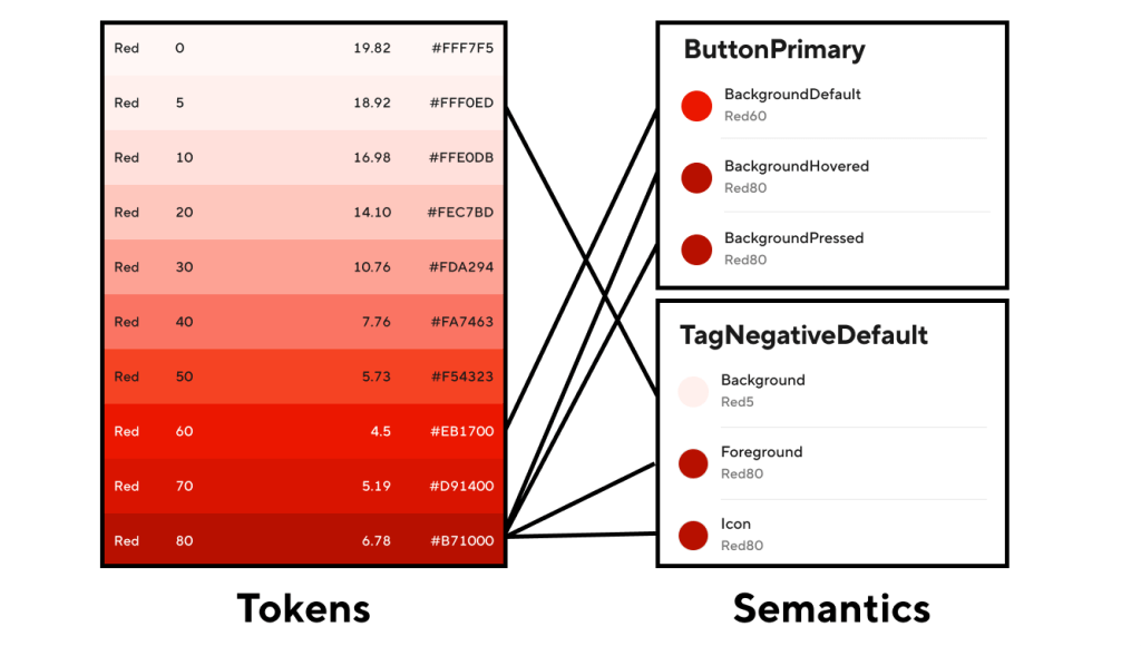
Tokens refer to the lowest level of detail within the system; the very basic “atoms” that everything else is built on top of. Tokens provide the final “source of truth” for things like color, spacing, and other design concepts. So within the Prism Color system, for example, Tokens comprise the entire suite of color options available for use in our UI. These Tokens have names like “SystemBlue80” and “SystemBlack”, where the name itself refers to the value it represents. And unlike Semantics, higher-level components, and system-wide patterns, Token values don’t change: they stay the same no matter how or when they’re used.
Semantics, on the other hand, reside in the next level up in the system and are built on top of Tokens. Their values map to a Token’s given value. So for example, no part of a Semantic name like “ButtonPrimaryBackground” indicates what the color value is, but under the hood that Semantic could be mapped to “SystemRed60”. Semantic names are used to describe their context in the system, but have no indication of what their value is mapped to.
Figure 1, above, shows how this relationship works for the colors in Prism: the value of each color Semantic is mapped to a Token, and each Token value is set to a specific hex color value.
(One important note about these Semantics: because Prism is integrated across all four of the platforms we support, Figma for designers, Android, iOS, and web libraries for engineers, we have to make sure any new Semantic or Token we introduce to the system will work for every platform. This means close collaboration within the Design Infrastructure team: Design System Designers and Design Technologists work hand-in-hand to update Prism everywhere.)
So let’s say we want to update a “Button” component in our system to be themeable. The first thing we have to do is update any styles we’ve set on that component to map to a Semantic, and not a Token. So we took the existing Prism libraries and updated any references to Color and Border Radius Tokens to now reference Semantics.
Here’s an example const declaration from our tooltip component before, when it was using Tokens:
 const TooltipColors = {
  Informational: {
    Normal: {
      Background: Colors.SystemGrey90,
      Foreground: Colors.SystemGrey20,
    },
    Hovered: {
      Background: Colors.SystemGrey80,
      Foreground: Colors.SystemGrey10,
    },
    Pressed: {
      Background: Colors.SystemGrey70,
      Foreground: Colors.SystemGrey5,
    },
  },
 }
And here is that same declaration updated to use Semantics:
 const TooltipColors = {
  Informational: {
    Normal: {
      Background: Colors.TooltipInformationalBackground,
      Foreground: Colors.TooltipInformationalForeground,
    },
    Hovered: {
      Background: Colors.TooltipInformationalBackgroundHovered,
      Foreground: Colors.TooltipInformationalForegroundHovered,
    },
    Pressed: {
      Background: Colors.TooltipInformationalBackgroundPressed,
      Foreground: Colors.TooltipInformationalForegroundPressed,
    },
  },
 }
Notice that the logic hasn’t been changed at all, we just updated the tooltip’s colors to use Semantics instead of Tokens. But by making these small changes across the library (and across any web projects that were using these color Tokens directly in their custom components), we were now set up to create a tool for dynamically updating what Token a given Semantic was referencing, based on whatever theme was currently being applied.
By using Semantics instead of Tokens for visual aspects of components, we were in a place to say things like “For the default theme, we want this button’s background to be ‘SystemRed60’. But for the Merchant theme, we want this button’s background to be ‘SystemBlue60’.” In both cases, the code under the hood in `component-button` would set the button’s background color to “ButtonPrimaryBackground”. But the Token the Semantic pointed to would be different between theme definitions, because we were no longer pointing to a specific hex value for the color.
Now that all of the packages and components in our web system code were using Semantics instead of Tokens for their Color and Border Radiuses, it was time to officially start building Theming.
Supporting independent packages with React Context
The way our design system is built and used in web projects is actually pretty interesting. While the code lives in a single repository, there are actually separate and independent packages that engineers can download into their projects. If an engineer needs to add Prism Buttons to their page, but doesn’t need a navigation bar, they need only add the “component-button” package to their project’s dependencies. This setup minimizes the amount of additional code engineers have to add to build their features, reducing bundle size and complexity.
But with this independence came a unique challenge for Theming: how do we create a system that customizes the look and feel of any Prism component, when we have no guarantees about what packages engineers are using?
Luckily for us, React includes a first-class Context API. This feature provided exactly what we needed: a way to set global information in a project and to share that information between components, without relying on layered property passing (something that, again, wouldn’t work because of our independent package setup).
As we were investigating how to set up Theming, we looked at several options. One option we considered was using CSS variables, but because Prism is built to support IE11 we did not pursue this avenue. We decided on the Context API for its straightforward way to define a propagating theme across packages and components in one place, the flexibility it would give to allow engineers to set multiple themes within a single project, and because it encouraged us to keep our system up to date with the latest versions and concepts of React, the framework that the majority of our web projects are built on.
Using this API, we set up a brand-new Context Provider in our main Prism package (called “design-language”, which exports the foundational pieces of the system like “Colors”, “Text”, and “Spacing” that are used across all other Prism packages) called “Theming”. In the first introduction of Theming, we set up an export with an “overrides” API that would allow engineers to define any custom overrides to Semantic Colors and BorderRadius values.
So one team could set their project’s Theming overrides to something like this:
 <Theming overrides={{
    BorderRadius: {
      ModalDefault: 4,
      PaginationDefault: 4,
    },
    Colors: {
      ButtonPrimaryBackground: 'SystemGreen60',
      ButtonPrimaryBackgroundHovered: 'SystemGreen70',
      ButtonPrimaryBackgroundPressed: 'SystemGreen80',
    },
 }}>
   {...}
 </Theming>
While another team could set their Theming overrides to this:
 <Theming overrides={{
    BorderRadius: {
      ModalDefault: 8,
      PaginationDefault: 8,
   },
   Colors: {
     ButtonPrimaryBackground: 'SystemBlue60',
     ButtonPrimaryBackgroundHovered: 'SystemBlue70',
     ButtonPrimaryBackgroundPressed: 'SystemBlue80',
   },
 }}>
  {...}
 </Theming>
And both projects could use the same Prism button component, but with the button styled the way they wanted.
Update Prism components to use Theme overrides
Now that we have a way to define themes in the system, we need to put those themes and contexts to use. The next step was to create ways for a component to access the overrides set in Theming, and to use those overrides when rendering.
To that end, we created a set of exports that could be used for gaining access to theme values: “ThemingContext” (for use with contextType in Class components, or with the modern useContext hook for non-class components), and “ThemingConsumer” (a Context Consumer which returns a function with our Context values). Once these were created alongside the “Theming” Context Provider, we began going through every single Prism package and updating all of them to use the theme’s values instead of the original values found in the “Colors” and “BorderRadius” exports.
In a Class Component, we set the class’s contextType property as ThemingContext:
 class Tooltip extends React.Component {
   static contextType = ThemingContext
    ...
    tooltipColors = {
     Informational: {
       Normal: {
         Background: get(this.context, 'Colors.TooltipInformationalBackground'),
         Foreground: get(this.context, 'Colors.TooltipInformationalForeground')
       }
     }
   }
   ...
 }
In a Function Component, we leverage the useContext hook to define and access ThemingContext:
 const Loading = ({
  state,
  color,
  size,
  onAnimationEnd,
  onAnimationLoopEnd,
 }) => {
  const theme = React.useContext(ThemingContext)
  return (
    <LoadingRoot color={color || theme.Colors.LoadingDefault}>
      ...
    </LoadingRoot>
  )
 }
With the implementation of Theming to Prism, there’s the potential that engineers would have to use Theming in their projects and define every single semantic value in their overrides.
To avoid this scenario (and keep our engineers happy), we built this addition to Prism so that Theming was (and still is) completely optional. There is a default definition for ThemingContext, which contains the original values for all of the Semantics used across our system. We wrote Theming in such a way that the engineer only has to override the properties they want overridden, and it will fall back to the original, default values for everything else. So an engineer could just set an override for a specific button type’s background color (or not set Theming in their project at all), and every package and component in Prism (Tooltips, Modals, Tables, etc.) will continue to work exactly as expected.
The biggest benefit from how we updated the system with Theming is that all an engineer has to do is set any overrides they want set in a single place, and all Prism components they’re using below in their application will automatically be themed, as shown in Figure 2:

Leveraging Theming for Caviar integration
By the end of 2019 we had Theming set up using the React Context API, all of the packages in the Web Prism repo had been updated to use Theming, and we were close to having the final, new major version ready for release so engineers could start theming Colors and BorderRadius values.
And then a very cool and exciting thing happened: Caviar officially joined the DoorDash family at the end of 2019. Now we faced the monumental task of integrating the suite of Caviar products into DoorDash’s platform.
As each team assessed how they would approach integration, we on the Design Infrastructure team realized that, expectedly, Caviar looked nothing like DoorDash. It had a different logo, a different color suite, a different set of icons, and even used a different typography system. In its current form the Prism DLS would not meet Caviar’s needs.
To get over this hurdle, the Design Infrastructure team and the Caviar Design and Engineering teams spent the first quarter of 2020 working closely together, on our side gaining an understanding of their product, and on theirs building an understanding of our design system. All teams worked hand-in-hand to figure out what had to change in order to support Caviar’s distinct brand in a single system that had, until this point, only ever had to support the DoorDash brand.

Figure 3, above, shows the difference between the two experiences, and how many pieces we needed to update in Prism to support both the DoorDash and Caviar web applications. Check out the Caviar applications on Android, iOS, and web, and know that all of those projects are built using the Prism Design Language System.
Building the system to meet user needs
When building a design system, the top priority should be creating a product that’s high quality, useful, and meets the needs of the products it serves.
To that end, we had to consider not only the base-level ability to customize Prism components, but how to build the tools and APIs to make this new and powerful feature exciting for everyone to use. So in addition to providing a straightforward place to set overrides, we also provided:
- Multiple ways for engineers to access the current theme (through the ContextType and Context Consumers mentioned earlier)
- A HOC that users could leverage for their custom elements using styled-components (to avoid theme property passing)
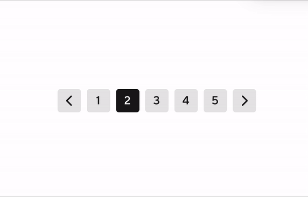
- Preset themes such as “Caviar” and “Merchant” that engineers could use to make setting common override sets that much simpler. Figure 4, below, shows how application of these themes changes the visual treatment for the Prism Numbered Pagination component.
By providing these tools in Prism, engineers are able to leverage something as powerful as Theming for the Prism components they were already using, can now use components they couldn’t before because they didn’t meet their design needs, and they can apply Prism concepts and values to the custom features they’re building to make DoorDash products great.
Looking to the future
Theming, like the rest of Prism, is a living organism. The very first version of Theming that we released included the ability to theme Colors, BorderRadius, and Logos. The second one added the ability to customize Typography and also introduced a preset “Merchant” theme. The third version added a preset “Caviar” theme, and included a “withTheming” HOC for enhanced styled-components integration. And with almost thirty minor versions released since we first published Theming to Web Prism in February 2020, the system has only grown and expanded. Even as we write this article, we’re working on integrating new Theming levers like “Shapes” and “BorderWidths” to provide even more flexibility and customization for all of our internal partners.
“Theming” was an incredible project to take on: we learned so much, got to work closely with so many amazing people, and at the end introduced a major upgrade for Prism to be an even more powerful tool for the incredible designers and engineers we get to work with every day.
Acknowledgements
I want to give a huge thank you to the following people who helped make Theming a reality:
- Kathryn Gonzalez: my incredible manager and the leader of Design Infrastructure, for all of her guidance as I built Theming for Web, for creating the original design system our team works on today, and giving me the chance to write this article!
- Matt Lew and Gerardo Diaz: the amazing Design System Designers on our team who drove the expansion of our Semantics suite and its integration into our designs
- Keith Chu and Ting Shen: two incomparable Caviar engineers for working so closely with me during Project Fusion, providing insight and feedback as I updated Theming to meet their needs.
- Gaby Andrade, Ezra Berger, Helena Seo, and Wayne Cunningham: for providing feedback and being beta-readers for this article.
- Everyone across Web Engineering who has brought Theming and the Prism system into their projects!
Header image courtesy of Unsplash.


 Vince
Chau
Vince
Chau

 Marina
Mukhina
Marina
Mukhina

 Nishant
Soni
Nishant
Soni

 WayneCunningham

 Noah
Zempsky
Noah
Zempsky
 Ethan
Myers
Ethan
Myers
 Siddhartha
Kakarla
Siddhartha
Kakarla
 Winston
Zhao
Winston
Zhao
 Bryan
Huang
Bryan
Huang
 Xilin
Liu
Xilin
Liu

 Paul
Zabelin
Paul
Zabelin
 Erich
Douglass
Erich
Douglass
 Wei
Lin
Wei
Lin
 Steven
Liu
Steven
Liu
 Yen
Pai
Yen
Pai

 Md
Al Mamun
Md
Al Mamun
 Michael
Thole
Michael
Thole

 Mike
Zaslavskiy
Mike
Zaslavskiy
 Anthony
Williams
Anthony
Williams
 Ryan
Zhang
Ryan
Zhang