

 As far as desktop applications are concerned, the hamburger should have no place. Rarely is a design so lacking in screen space that a navigation overflow is required. Google is one of the main culprits, seemingly including this component simply to provide consistency across their products and between desktop and mobile devices. In reality, it’s a useless and inconvenient user experience practice, particularly when it includes primary navigation items too.
 Similarly, the same logic applies to traditional websites such as portfolios, landing pages, and corporate sites. On a desktop computer, there is no excuse for entirely obscuring primary or secondary navigation items.
[pullquote]The hamburger menu is simply an aesthetic consideration, and often a lazy solution[/pullquote]
There is so much screen space to play with at the design stage, even when considering small laptops and tablet devices. Even the most complex and extensive navigation menus can be displayed outright, given some careful consideration. There are no set guidelines like on mobile apps, allowing designers to get creative with positioning, sizing, and user-friendly solutions like hover dropdowns and tiered structures.
The hamburger menu is simply an aesthetic consideration, and often a lazy solution unfit for circumstance and device. It makes it difficult to switch between pages, and is outright confusing to even the most computer-literate individuals.
Similarly, the same logic applies to traditional websites such as portfolios, landing pages, and corporate sites. On a desktop computer, there is no excuse for entirely obscuring primary or secondary navigation items.
[pullquote]The hamburger menu is simply an aesthetic consideration, and often a lazy solution[/pullquote]
There is so much screen space to play with at the design stage, even when considering small laptops and tablet devices. Even the most complex and extensive navigation menus can be displayed outright, given some careful consideration. There are no set guidelines like on mobile apps, allowing designers to get creative with positioning, sizing, and user-friendly solutions like hover dropdowns and tiered structures.
The hamburger menu is simply an aesthetic consideration, and often a lazy solution unfit for circumstance and device. It makes it difficult to switch between pages, and is outright confusing to even the most computer-literate individuals.
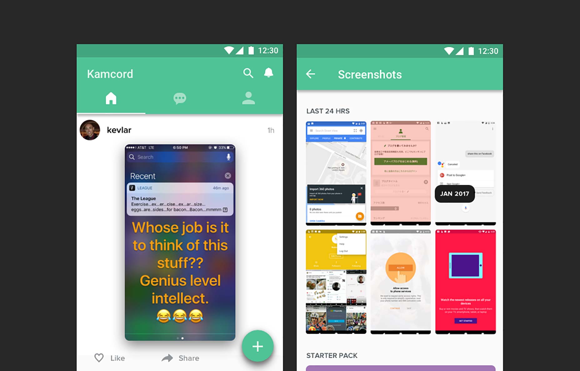
 As screen sizes reduce down to tablet and mobile device resolutions, the hamburger menu begins to solve the issue of space limitations. It provides a quick and easy solution to a lack of screen real estate, and one that is consistent across mobile websites and Android apps. iOS essentially offers the same solution, but in the form of an overflow tab icon, typically titled ‘More’. It’s more accessible, given its positioning at the foot of the screen, within reach of your hand.
But in a setting where design thinkers and creatives are devising and considering new alternatives to the most key components of design, is the hamburger menu really the optimal solution?
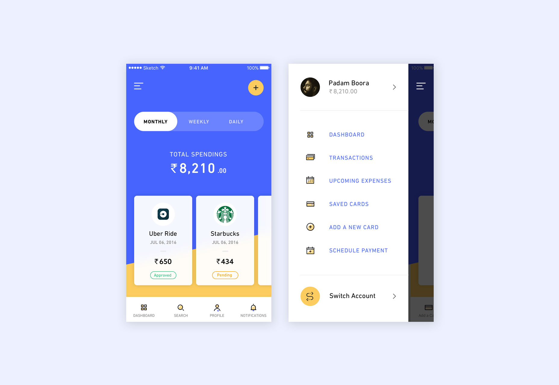
What the hamburger menu lacks in terms of user experience, is its requirement to be opened each and every time an item within it needs to be accessed. Where navigation drawers are included, this extends to two taps, each time a user wishes to navigate to a different screen. Some of these items can be classed as secondary, less-important items which are accessed far less often. Others, even in Google’s own apps, are most certainly primary actions.
[pullquote]If the hamburger menu is to disappear for good, a suitable and improved solution has to be presented[/pullquote]
From Reminders in Google Keep, to Watch Later in YouTube, the hamburger menu frequently provides overlap into key navigation items. As a design component, it’s a compromise. Were each app to devise its own navigation structure based on its own unique needs, users, and layout, a more optimal solution would be reached. But in an ecosystem such as iOS or Android, consistency is crucial in providing a simple solution for developers, and ensuring users are able to understand the functionality of an app, regardless of whom it has been designed by.
If the hamburger menu is to disappear for good, a suitable and improved solution has to be presented. It has to be one which can be applied to each and every app consistently across an ecosystem, with scope for a variety of differing needs and complexities.
The first potential solution is to shift the app title leftward, opening up space for up to four icons grouped in the upper right of the title bar. This covers a majority of hamburger menu use-cases, which often only include between two and four items. For cases with more navigation items, an ellipsis overflow icon could be introduced. This moves away from the one-size-fits-all approach, instead providing a quick-access solution for all apps, while also catering for those more complex cases with greater than four items.
The other solution is to introduce redesigned icon tab bars. Where Material Guidelines currently encourage designers to use text label tabs, these could easily be switched to icons. This would open up enough space to remove the secondary navigation menu for most apps, and encourage designers and developers to simplify the number of primary screens in their app. Similarly, with increasing iOS real estate and a rethink of spacing practices inside the tab bar, apps could fit more items while including any secondary items within each as secondary tabs.
As screen sizes reduce down to tablet and mobile device resolutions, the hamburger menu begins to solve the issue of space limitations. It provides a quick and easy solution to a lack of screen real estate, and one that is consistent across mobile websites and Android apps. iOS essentially offers the same solution, but in the form of an overflow tab icon, typically titled ‘More’. It’s more accessible, given its positioning at the foot of the screen, within reach of your hand.
But in a setting where design thinkers and creatives are devising and considering new alternatives to the most key components of design, is the hamburger menu really the optimal solution?
What the hamburger menu lacks in terms of user experience, is its requirement to be opened each and every time an item within it needs to be accessed. Where navigation drawers are included, this extends to two taps, each time a user wishes to navigate to a different screen. Some of these items can be classed as secondary, less-important items which are accessed far less often. Others, even in Google’s own apps, are most certainly primary actions.
[pullquote]If the hamburger menu is to disappear for good, a suitable and improved solution has to be presented[/pullquote]
From Reminders in Google Keep, to Watch Later in YouTube, the hamburger menu frequently provides overlap into key navigation items. As a design component, it’s a compromise. Were each app to devise its own navigation structure based on its own unique needs, users, and layout, a more optimal solution would be reached. But in an ecosystem such as iOS or Android, consistency is crucial in providing a simple solution for developers, and ensuring users are able to understand the functionality of an app, regardless of whom it has been designed by.
If the hamburger menu is to disappear for good, a suitable and improved solution has to be presented. It has to be one which can be applied to each and every app consistently across an ecosystem, with scope for a variety of differing needs and complexities.
The first potential solution is to shift the app title leftward, opening up space for up to four icons grouped in the upper right of the title bar. This covers a majority of hamburger menu use-cases, which often only include between two and four items. For cases with more navigation items, an ellipsis overflow icon could be introduced. This moves away from the one-size-fits-all approach, instead providing a quick-access solution for all apps, while also catering for those more complex cases with greater than four items.
The other solution is to introduce redesigned icon tab bars. Where Material Guidelines currently encourage designers to use text label tabs, these could easily be switched to icons. This would open up enough space to remove the secondary navigation menu for most apps, and encourage designers and developers to simplify the number of primary screens in their app. Similarly, with increasing iOS real estate and a rethink of spacing practices inside the tab bar, apps could fit more items while including any secondary items within each as secondary tabs.
 In both cases, it does away with the carelessness of the hamburger menu. Instead, designers and developers would be forced to condense the number of navigation items into more structured and understandable tabs.
It’s all too easy to push items into this obscured menu, at the expense of the end user. It’s often unnecessary, and the icon wastes a large portion of the title bar in Android apps.
Over time, systems like Material Design are likely to devise simpler solutions to move past the hamburger menu. It is at that point where users will be presented with easier-to-use mobile products with simpler, more accessible navigational structures.
In both cases, it does away with the carelessness of the hamburger menu. Instead, designers and developers would be forced to condense the number of navigation items into more structured and understandable tabs.
It’s all too easy to push items into this obscured menu, at the expense of the end user. It’s often unnecessary, and the icon wastes a large portion of the title bar in Android apps.
Over time, systems like Material Design are likely to devise simpler solutions to move past the hamburger menu. It is at that point where users will be presented with easier-to-use mobile products with simpler, more accessible navigational structures.


Read Next

20 Best New Websites, April 2024
Welcome to our sites of the month for April. With some websites, the details make all the difference, while in others,…

Exciting New Tools for Designers, April 2024
Welcome to our April tools collection. There are no practical jokes here, just practical gadgets, services, and apps to…

14 Top UX Tools for Designers in 2024
User Experience (UX) is one of the most important fields of design, so it should come as no surprise that there are a…
By Simon Sterne

What Negative Effects Does a Bad Website Design Have On My Business?
Consumer expectations for a responsive, immersive, and visually appealing website experience have never been higher. In…

10+ Best Resources & Tools for Web Designers (2024 update)
Is searching for the best web design tools to suit your needs akin to having a recurring bad dream? Does each…
By WDD Staff

3 Essential Design Trends, April 2024
Ready to jump into some amazing new design ideas for Spring? Our roundup has everything from UX to color trends…

How to Plan Your First Successful Website
Planning a new website can be exciting and — if you’re anything like me — a little daunting. Whether you’re an…
By Simon Sterne

15 Best New Fonts, March 2024
Welcome to March’s edition of our roundup of the best new fonts for designers. This month’s compilation includes…
By Ben Moss

LimeWire Developer APIs Herald a New Era of AI Integration
Generative AI is a fascinating technology. Far from the design killer some people feared, it is an empowering and…
By WDD Staff

20 Best New Websites, March 2024
Welcome to our pick of sites for March. This month’s collection tends towards the simple and clean, which goes to show…

Exciting New Tools for Designers, March 2024
The fast-paced world of design never stops turning, and staying ahead of the curve is essential for creatives. As…

Web Tech Trends to Watch in 2024 and Beyond
It hardly seems possible given the radical transformations we’ve seen over the last few decades, but the web design…
By Louise North