Xamarin.Forms Segmented Control with Sharpnado 1.7

 |
https://github.com/roubachof/Sharpnado.Tabs |
 |
A fresh new version of the Sharpnado lib is here \o/
Featuring:
- Segmented Control (iOS style)
TabHostViewwith custom shadows- Sharpnado.Shadows
v1.0.2 - MaterialFrame with AcrylicBlur
v1.1.1
As always find all the following code in the Silly! app repo here:
https://github.com/roubachof/Xamarin-Forms-Practices
Breaking changes
Starting from 1.7, the TabHostView inherits directly from Shadows. It means you can add as many shades as you like to your tab bar.
It behaves exactly the same as the Shadows component.
Since shadows are now handled by Shades, the old shadow renderers have been removed.
The ShadowType property is gone.
For more information about custom shades, visit the Sharpnado.Shadows repo.
Segmented Control
The TabHostView is now exposing some new properties such as:
IsSegmented |
Enables segmentation thus clipping for the TabHostView. |
CornerRadius |
Sets the corner radius for the view. Only works if IsSegmented is set to true. |
SegmentedOutlineColor |
Sets the corner radius for the view. Only works if IsSegmented is set to true. |
SegmentedHasSeparator |
Sets a separator between each tab item, the color is given by the SegmentedOutlineColor property. |
Example
<tabs:TabHostView x:Name="TabHost"
                    Grid.Row="4"
                    HeightRequest="40"
                    Margin="20,15,20,0"
                    VerticalOptions="Center"
                    BackgroundColor="#F0F0F3"
                    Shades="{sh:SingleShade Offset='0,8',
                                            BlurRadius=10,
                                            Color={StaticResource Accent}
                                            Opacity=0.2}"
                    CornerRadius="20"
                    IsSegmented="True"
                    SegmentedHasSeparator="True"
                    SegmentedOutlineColor="{StaticResource Accent}"
                    TabType="Fixed"
                    SelectedIndex="{Binding Source={x:Reference Switcher}, Path=SelectedIndex, Mode=TwoWay}">
    <tabs:TabHostView.Tabs>
        <tabs:SegmentedTabItem Style="{StaticResource SegmentedTabStyle}" Label="Quote" />
        <tabs:SegmentedTabItem Style="{StaticResource SegmentedTabStyle}" Label="Movies" />
        <tabs:SegmentedTabItem Style="{StaticResource SegmentedTabStyle}" Label="Meme" />
    </tabs:TabHostView.Tabs>
</tabs:TabHostView>
<Style x:Key="SegmentedTabStyle" TargetType="tabs:SegmentedTabItem">
    <Setter Property="SelectedTabColor" Value="{StaticResource Accent}" />
    <Setter Property="FontFamily" Value="{StaticResource FontSemiBold}" />
    <Setter Property="LabelSize" Value="14" />
    <Setter Property="SelectedLabelColor" Value="#F0F0F3" />
    <Setter Property="UnselectedLabelColor" Value="Gray" />
</Style>

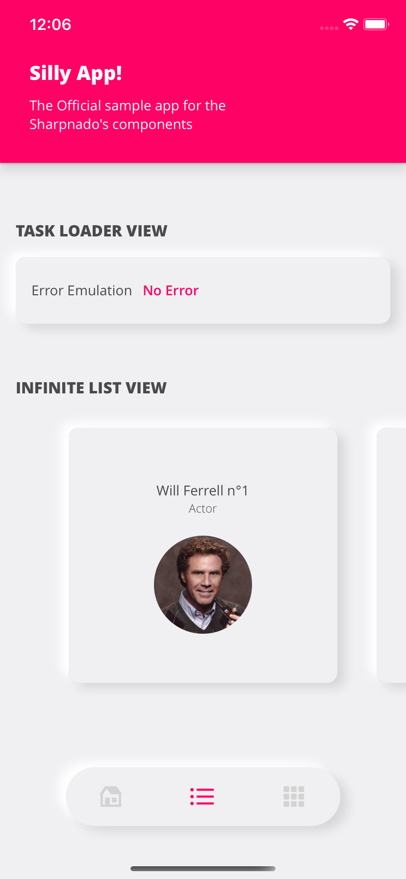
Neumorphic Tabs
Since the TabHostView has now its own set of Shades, you can easily implement Neumorphism.
<Grid ColumnSpacing="0" RowSpacing="0"
      BackgroundColor="#F0F0F3">
    <Grid.RowDefinitions>
        <RowDefinition Height="{StaticResource ToolbarHeight}" />
        <RowDefinition Height="*" />
        <RowDefinition Height="95" />
    </Grid.RowDefinitions>

   ...

    <tabs:TabHostView Grid.Row="2"
                      HorizontalOptions="Center"
                      VerticalOptions="Start"
                      HeightRequest="60"
                      WidthRequest="280"
                      TabType="Fixed"
                      IsSegmented="True"
                      CornerRadius="30"
                      Margin="15"
                      BackgroundColor="#F0F0F3"
                      Shades="{sh:NeumorphismShades}"
                      SelectedIndex="{Binding Source={x:Reference Switcher}, Path=SelectedIndex, Mode=TwoWay}">
        <tabs:TabHostView.Tabs>
            <tabs:BottomTabItem Style="{StaticResource BottomTabStyle}"
                                IconImageSource="house_96"
                                Label="{localization:Translate Tabs_Home}" />
            <tabs:BottomTabItem Style="{StaticResource BottomTabStyle}"
                                IconImageSource="list_96"
                                Label="{localization:Translate Tabs_List}" />
            <tabs:BottomTabItem Style="{StaticResource BottomTabStyle}"
                                IconImageSource="grid_view_96"
                                Label="{localization:Translate Tabs_Grid}" />
        </tabs:TabHostView.Tabs>
    </tabs:TabHostView>

</Grid>
<ContentPage.Resources>
    <ResourceDictionary>
        <Style x:Key="BottomTabStyle" TargetType="tabs:BottomTabItem">
            <Setter Property="SelectedTabColor" Value="{StaticResource Accent}" />
            <Setter Property="UnselectedLabelColor" Value="Gray" />
            <Setter Property="UnselectedIconColor" Value="LightGray" />
            <Setter Property="FontFamily" Value="{StaticResource FontLight}" />
            <Setter Property="LabelSize" Value="14" />
            <Setter Property="IconSize" Value="28" />
            <Setter Property="IsTextVisible" Value="False" />
        </Style>
    </ResourceDictionary>
</ContentPage.Resources>