Let’s play a game.
I will present you with five UI/UX design patterns, in the most horrific way possible.
You carefully consider my arguments, and then pick the pattern you hate the most.
Shall we?
Disclaimer: There won’t be any dark UX patterns in this post, like a fake hair on the screen or a non-working unsubscribe button. I think those are in a league of their own and deserve a standalone article.
Hamburger Icon

There’s so much controversy around this icon – where do I even start? Designers are unsure of whether using it increases or decreases… something; and users are unsure of what’s waiting for them behind these three bars in every new application they use.
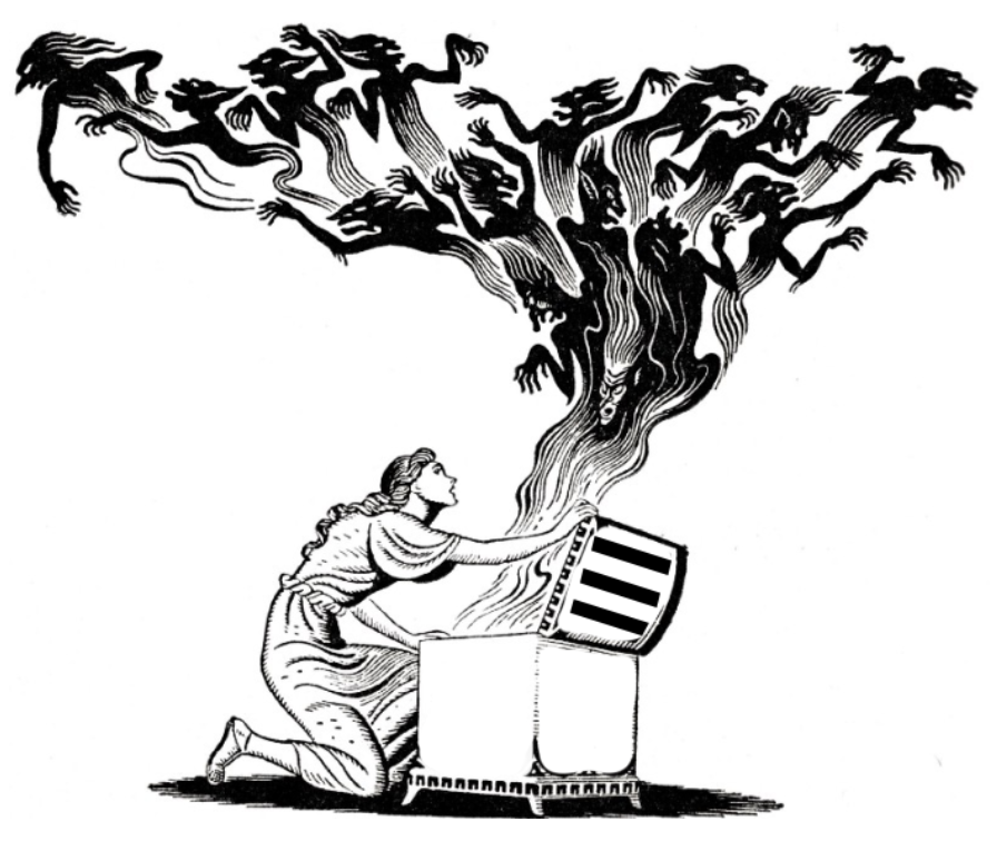
21st Century Pandora’s Box
Fortunately, the case was settled in 2014. The data gathered from 240,000 unique mobile users showed that the menu button had been clicked 20% more than the hamburger icon.
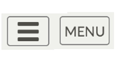
So the hamburger is bad? Actually, no, wait. Subsequent research proved that the engagement level of users is the same in both cases. But hold on, there’s more. If you combine the hamburger icon and the word “Menu” in one button, you will get 5% more revenue.
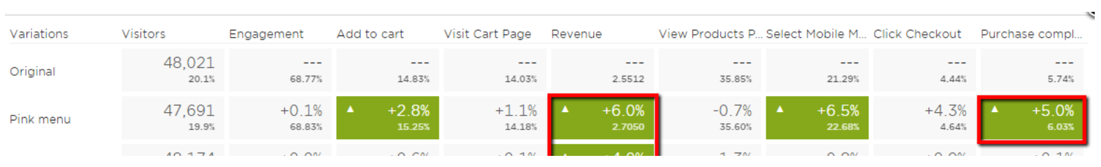
Just don’t forget to make the button pink:

Boy, some articles even go as far as how hamburger menus can increase your conversion rate.
Let’s see what authorities have to say.
Nielsen Norman Group: Hamburger Menus and Hidden Navigation Hurt UX Metrics
Techcrunch: Kill The Hamburger
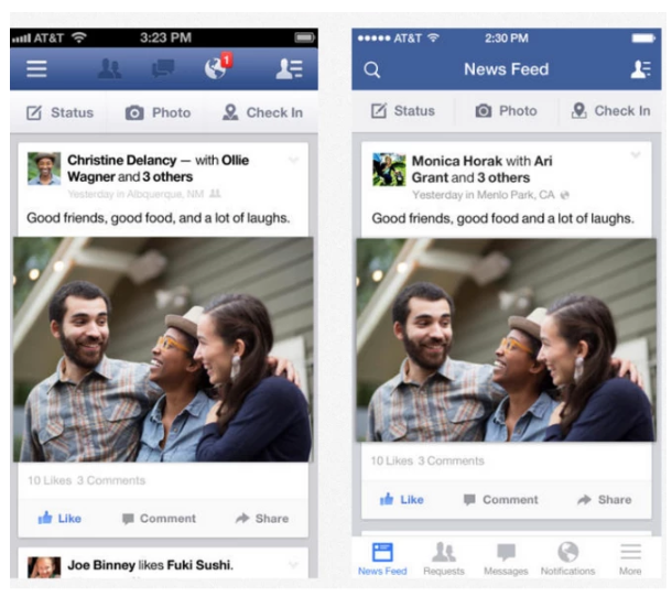
Apparently, you can die by hamburger as well. What are companies doing about this? Facebook kicked out their burger to the bottom tab bar (they lately brought the tab bar up, but the hamburger is still not the core of their navigation):
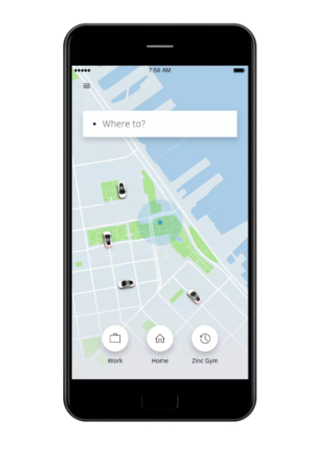
Uber is using to hide profile and history operations:
Some apps use it as their core navigational button, others as a container for non-important or rarely used features. Why should we hate the hamburger icon, then?
Because the hamburger is simple. Deceptively simple. Have numerous features in your app? Converting your web page into a mobile one? No need to re-evaluate UX – just sweep everything under one button, make it look clean and trendy. No user research, no statistics, no polls. Yes, it works. In some cases, it works well (see Uber). But it doesn’t when all the app features are cluttered under one button just to make the UI look clean and trendy.
To top it off, the controversy around this icon just facilitates poor design decisions. You want to prove your point – send all the green articles to your stakeholders. Easy.
Level of hate: Chewing gum on jeans
Summary: If you hate poor design decisions, manured by controversy – vote for this item.
Infinite Scrolling

I can’t tell you who invented infinite scrolling (IS). There are a few suspects (1, 2, 3, 4,). But I am damn sure about who made it popular:

Ok, maybe it’s them:

Perhaps. The point is that it’s done. Somewhere around 2011 everyone suddenly realized that this is exactly what they were missing from their lives.
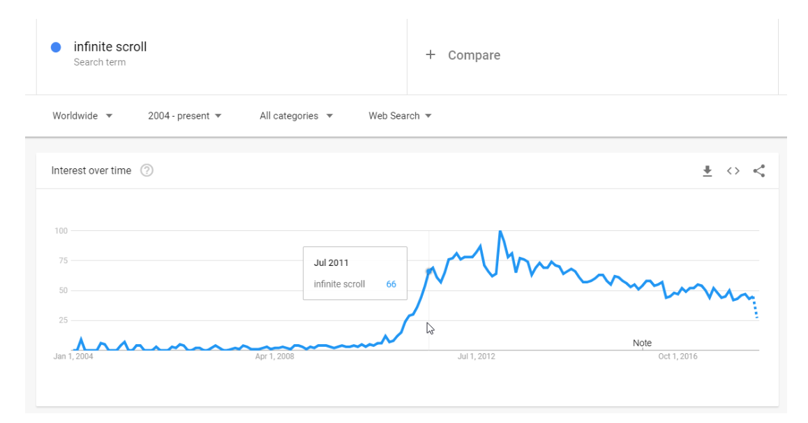
Now it’s seven years later and we’re still counting bodies. Some companies realised their mistake after proper research (Why did infinite scroll fail at Etsy? Hint: infinite scroll negatively impacted their user engagement). Others, like USA Today, ditched the pattern after recognising its major effect on performance. Time.com boasted 15% decline in user bounce rates in 2014 after implementing IS, though you wouldn’t find the feature there today.
Yet many websites still use infinite scrolling. What’s their line of defence? It’s engaging, and bounce rates are lower.
I don’t buy it. At least, not at face value. There are different kinds of engagement. As Nielsen Norman Group research puts it, infinite scrolling is not for every website.
We can spend hours investigating what happens in the lives of our interesting friends on Facebook, or to our genetically gifted friends on Instagram.
Facebook, Twitter and Instagram are all created to kill our time. Their only goal is to make us stay, and somehow it became a baseline for other web services. It’s like the longer you stay somewhere, the more valuable the website will become to you. Nope. Sometimes people have clear goals and want to achieve them ASAP. Don’t stand in their way.
Level of hate: Missing font
Summary: If you hate out of context, copycat designs, vote for this item
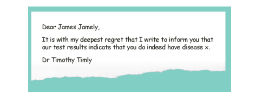
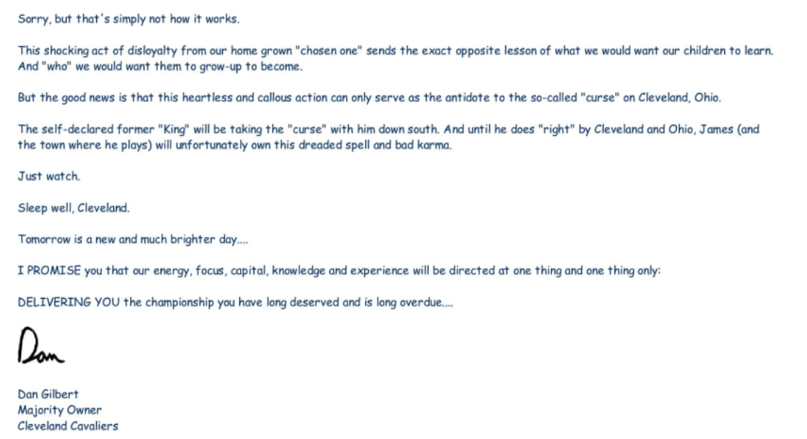
Comic Sans
This is very serious.
To love Comic Sans is to suffer. If you want to crush your parents and you don’t have a guy to go to for nipple piercings, come out as a Comic Sans lover.
To love Comic Sans is to live in constant fear of rejection and unemployment.
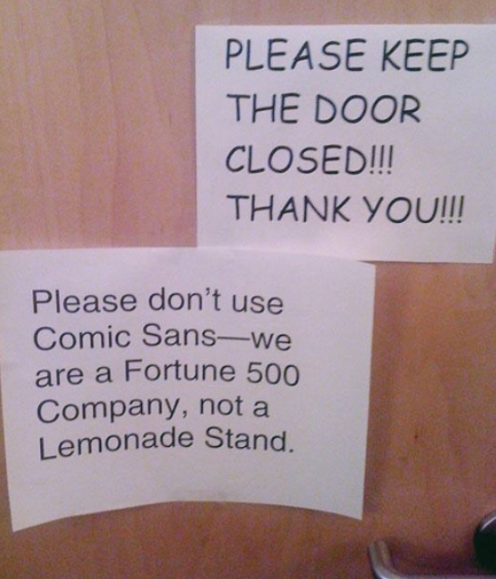
Generation X designers created Comic Sans. Other Generation X designers made every possible effort to get Millenials to hate Comic Sans. But we no longer hate when people use Comic Sans in inappropriate situations:
Or when they are making an NBA-level announcement:
No. We hate Comic Sans itself. But Comic Sans did nothing wrong.
Can you find it in your heart to forgive Comic Sans? We shall see.
Level of hate: Comic Sans
Summary: If you hate Comic Sans, you know what to do
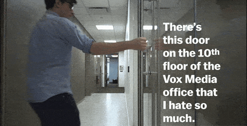
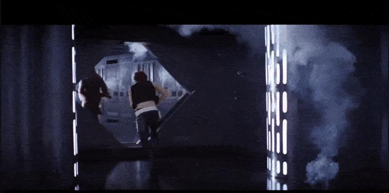
Norman’s Door
Doors are paramount. Without a door, you would not be able to leave your family. Without a door, you wouldn’t be able to come back to retrieve your forgotten mobile phone, and then leave your family again.
In some cultures there are even door gods. Some iconic characters were created specifically to hold doors. Doors are a crucial part of our society.
And yet, somehow, we still manage to f**k them up.
Full video here
These doors were even given a name: Norman’s doors.
“A Norman door is a poorly designed door that confuses or fails to give you an idea whether to push or pull. It was named after Don Norman, the author of The Design of Everyday Things, which explored the phenomenon.”
You’ve probably seen these doors. Some of us have to deal with them on a daily basis. If you have one of these doors in your office or beloved coffee house, it’s a never-ending nightmare.
As a community of designers, UX-professionals and enthusiasts, we can influence certain things – just look what we did with Comic Sans. But sometimes we just… can not. There are too many evil doors in the world, and too many people who created them having no idea what they were doing.
So I encourage you to vandalise every such door you’ll meet on your way. All we can do is suffer silently and hate patiently. Just a few thousand more years and there won’t be any doors anyway.
Level of hate: Neighbour’s dog
Summary: If you unexpectedly kissed a door at least once in the recent month, this is your item.
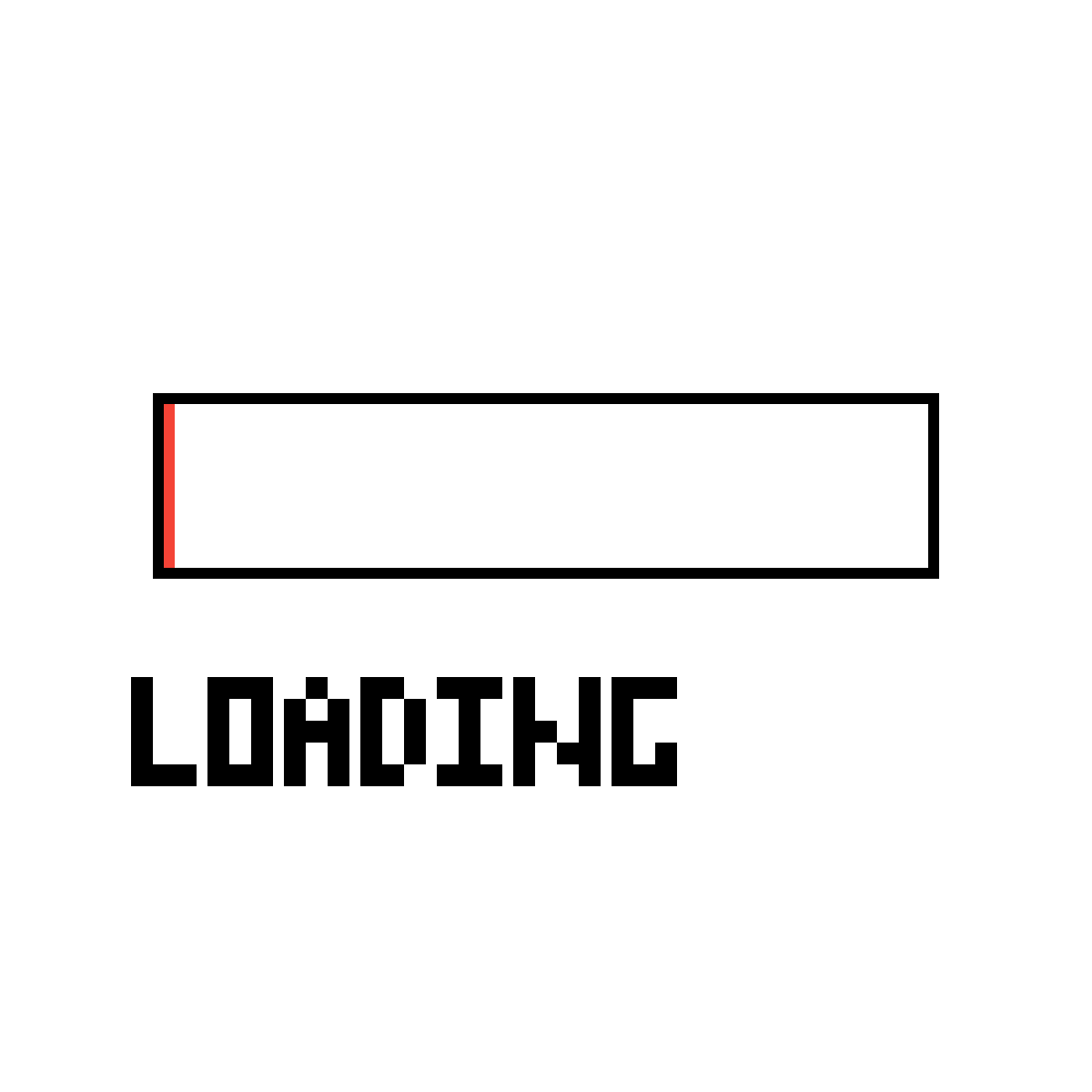
Fake Preloaders
Please, wait for a moment. The rest of the article is loading…

Adding text…
Choosing font…

Thank you for your patience. You may now continue reading.
Preloaders in a nutshell:
You either die a hero or you live long enough to see yourself become the villain
-Harvey Dent, The Dark Knight
Page preloaders started as a good thing. In times when the internet was slow and website contents were bulky, users had to wait. If a user waits longer than 10 seconds, she switches tasks (leaves your website). So page-preloaders were created as an indication that something is loading, and you just need to wait for a bit.
Nowadays preloaders are everywhere, but they no longer serve users. They are now a smoke screen for poor performance.
Don’t get me wrong – preloaders are viable in some scenarios. For example, artistic purposes:

However, when we’re talking about real performance, preloaders are an impediment. Instead of optimizing a website and getting rid of unnecessary response time, it’s much easier to cover everything with a preloader. I have no beef with using it as a quick, temporary fix. But as a permanent solution?
Every second matters.
- Google estimated that 400 ms delay reduces the average number of searches by 0.59%, which amounted to $40.5 Million in 2011.
- Amazon has calculated that a page slowdown of one second costs the company $1.6 Billion every year. In 2006, 100ms delay cost them 1% of sales.
Seconds of waiting amount to weeks and months as a website gets more and more popular.
But we don’t see preloaders that way. We don’t want our users to be more efficient. We want them to wait.
Level of hate: The last mosquito in the room
Summary: If you hate when users are duped with style and creativity, this is your item
I hope you’ve made up your mind. Let’s see what you think:
[yop_poll id=”-1″]
Have something to say? I’ll see you in the comments.
About the author: Andrew started at Icons8 as a usability specialist, conducting interviews and usability surveys. He desperately wanted to share his findings with our professional community and started writing insightful and funny (sometimes both) stories for our blog.
Title image: Oleg Shcherba for Icons8 illustration project
Check our recent article Usability: Practical Definition. Hard Core of UX Design and grab the free collection of stylish and minimalist wallpapers for desktop and mobile