


Beginning in early 2020, the Xamarin team started collaborating with the Surface and Windows developer teams to think about a new dual screen device that we were about to launch at Microsoft, and which you have no doubt heard about by now, the Surface Duo. This new device, which also makes phone calls, poses some unique opportunities to create new, productive mobile experiences. Our engineering team leapt at the chance to showcase how powerful Xamarin development can be for Android and cross-platform developers alike. How do you display controls on one screen which then spans to another screen? Where do you put navigation? Should content flow below the hinge, or space evenly? So many questions…
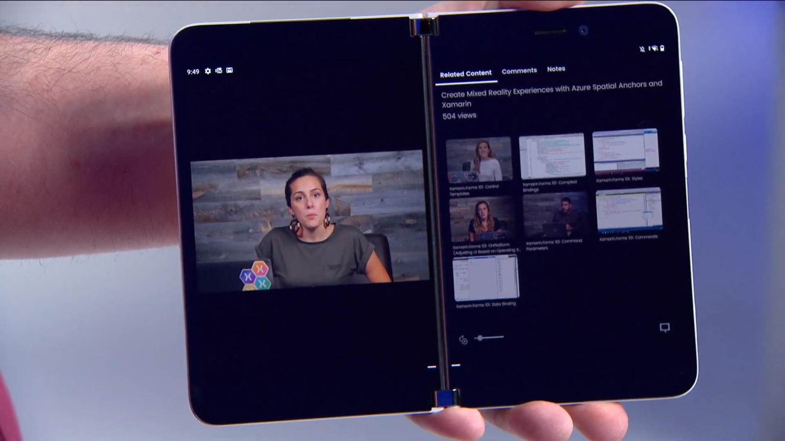
At our Developer Day launch event in early February, we delivered a fully functional native application built with Xamarin.Forms. The most remarkable thing about this application is that no core modifications to Xamarin.Forms were needed in order to achieve this. It's a strong validation to the design of the product. You can explore the source at https://aka.ms/app-xamarintv.
During six years in the market, Xamarin.Forms has spanned six versions of iOS and Android, run on Windows Phones, tablets, and desktops from WPF to UWP and now WinUI, and even been extended by contributors to macOS, Linux, and Samsung's Tizen platform. Thousands of companies of all sizes are using Xamarin.Forms to power mobile and desktop apps used in the consumer market as well as suites of line-of-business needs.
For the Surface Duo, we added a TwoPaneView layout (based on work by our Windows team), and a whole bunch of new state triggers to help you adapt to new screen sizes, orientations, and postures. Xamarin.Forms 5 also introduces drag-and-drop gestures. What we've done in Xamarin.Forms 5 to make your experience developing for dual-screens more delightful is just the beginning of what you can do with this release. Xamarin.Forms 5 contains the simplicity and productivity we've added based on your constant feedback to make it easier and faster for you to deliver beautiful cross-platform applications that share more code than ever before.
To give you the whirlwind tour of the development power you'll experience using Xamarin.Forms 5, I'll run you through the Fly Me sample app I built in the hopes that one day soon I'll again be able to board a plane and travel the globe. Xamarin.Forms 5 uses Shell to simplify the top-level things that every app needs. It also adds new design features such as shapes and brushes; combined with control templates; these new features speed up your UI development.
Simplicity Is Primary
Simplicity starts at the container level of your application, commonly referred to as the app shell. In Xamarin.Forms 5, every app template starts with a simple Shell in a file named AppShell.xaml. This is where you describe the visible navigation structure for your application, whether using a flyout menu, tab menus, or any combination, as you can see in Figure 2.
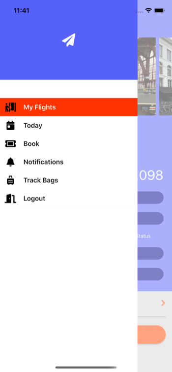
Login and Flyout Navigation
Fly Me uses a flyout menu that flies out from the side of the UI over the app content. In Figure 2 you can see a header, flyout items to navigate to pages throughout the app, and a logout menu item. The code begins simply with the Shell container.
<Shell xmlns="..."
       xmlns:x="..."
       xmlns:views="clr-namespace:FlyMe.Views"
       xmlns:vm="clr-namespace:FlyMe.ViewModels"
       FlyoutHeaderTemplate="{DataTemplate views:HeaderView}"
       x:Class="FlyMe.AppShell">

       <Shell.BindingContext>
   <vm:AppViewModel />
       </Shell.BindingContext>
</Shell>
To begin populating the Shell, you add nodes for each item you wish to appear in the flyout. Each item can take a variety of properties including a named route for URI navigation, and the title and icon you wish to display. The content, of type ContentPage, that's displayed when the user selects the item, is contained in the ShellContent. The DataTemplate is used to make sure that the content is only created when you need it, thus keeping your application load time minimal.
<FlyoutItem Route="home" Title="My Flights" Icon="{StaticResource IconTabMyFlights}">
    <ShellContent ContentTemplate="{DataTemplate views:MyFlightsPage }" />
</FlyoutItem>
<FlyoutItem Title="Today" Icon="{StaticResource IconTabToday}">
    <ShellContent ContentTemplate="{DataTemplate views:TodayPage}" />
</FlyoutItem>
If all you have are a series of FlyoutItems, the application will load the first ShellContent and display the flyout menu icon in the upper left. In this application, you'll first display a log in page, and make sure that the rest of the application isn't accessible until the user authenticates. In order to do this, place a ShellItem before the FlyoutItems in the AppShell.xaml.
<ShellItem Route="login" IsVisible="{Binding IsNotLoggedIn}">
    <ShellContent ContentTemplate="{DataTemplate views:LoginPage}" />
</ShellItem>
<FlyoutItem Route="home" Title="My Flights" Icon="{StaticResource IconTabMyFlights}">
    <ShellContent ContentTemplate="{DataTemplate views:MyFlightsPage}" />
</FlyoutItem>
In XAML, the order of items matters, and you use that to your benefit here by making sure the ShellItem for the LoginPage appears before the FlyoutItem. This tells Shell to display just the first and not the second item. The same pattern is useful for displaying onboarding sequences and the like before the rest of your application is displayed. If you've used XAML before, this mixing of visual and non-visual elements may seem a bit odd. The AppShell is a unique use of XAML that both expresses the content of the application and some UI expectations (that you want Shell to render a flyout or tabs or both). A ContentPage, by comparison, explicitly describes UI elements.
If you've used XAML before, this mixing of visual and non-visual elements may seem a bit odd.
In order to hide the log in page and let Shell proceed with displaying the rest of the application, you use the new ShellItem.IsVisible property. Any item in your Shell that should not be navigable may be protected by setting that property to false.
Styling Your Flyout
You could create renderers to completely replace all the content of the flyout, but that tends to be a lot more code than you really need. Xamarin.Forms 5 simplifies adding content to the header, styling the flyout item templates, and even styling the backdrop that appears behind the flyout but over the page. You can instead add your own header content using the Shell's FlyoutHeaderTemplate property, which in this example, is simply a grid and an image:
<Grid RowDefinitions="66,120" BackgroundColor="#5561F9">
<Image Grid.RowSpan="2" VerticalOptions="Center" HorizontalOptions="Center"
Source="{FontImage FontFamily=FontAwesome, Glyph=, Color=GhostWhite, Size=32}"/>
</Grid>
Each FlyoutItem has a title and icon. When you wish to style them further, changing the font size, colors, and selected states, you can now use new style classes to achieve the look you desire. Three classes and two element names are now available, as shown in Table 1.
Using these style classes, you can style the layout for each flyout item and use VisualStateManager with the new TargetName property to change the color of the label based on selection, as seen in Listing 1.
Listing 1: Styling the layout of the flyout items
<Style TargetType="Layout" ApplyToDerivedTypes="True" Class="FlyoutItemLayoutStyle">
    <Setter Property="HeightRequest" Value="44" />
    <Setter TargetName="FlyoutItemLabel" Property="Label.FontSize" Value="16" />
    <Setter TargetName="FlyoutItemLabel" Property="Label.TextColor" Value="{StaticResource TextOnLightColor}" />
    <Setter TargetName="FlyoutItemLabel" Property="Label.HeightRequest" Value="44" />
    <Setter Property="VisualStateManager.VisualStateGroups">
<VisualStateGroupList>
    <VisualStateGroup x:Name="CommonStates">
<VisualState x:Name="Normal">
    <VisualState.Setters>
    </VisualState.Setters>
</VisualState>
<VisualState x:Name="Selected">
    <VisualState.Setters>
<Setter Property="BackgroundColor" Value="#FF3300" />
<Setter TargetName="FlyoutItemLabel" Property="Label.TextColor" Value="White" />
    </VisualState.Setters>
</VisualState>
    </VisualStateGroup>
</VisualStateGroupList>
    </Setter>
</Style>
Before I finish discussing Shell, one last styling challenge to conquer is changing the color and opacity of the flyout's backdrop. The backdrop is the layer that sits behind the flyout and in front of the content page. The new FlyoutBackdrop takes a color or brush and is applied to any ShellItem via an attached property.
<Style TargetType="ShellItem" ApplyToDerivedTypes="true">
    <Setter Property="Shell.FlyoutBackdrop" Value="#CC333333"/>
</Style>
Limitless Design
Xamarin.Forms 5 introduces several new design-focused capabilities, including embedded fonts, font image support, shapes and paths, and brushes. These enhancements combine to bring any UI design within easy reach by using simple APIs shipping “in the box.”
Embedded Fonts and Font Image Source
Adding fonts is now easier than ever, whether for beautifying your text or for using font icon glyphs. Add any mobile-supported font file such as TTF or OTF to your Xamarin.Forms .NET Standard Library and set the build type to “Embedded Resource.” You can then add an assembly tag that tells the build tasks to make that font available by name or alias to your app, no matter which platform it's running on.
Fly Me uses Font Awesome, a popular free font with useful icons. In any *.cs file in the project, you can add the assembly attribute ExportFont. Although you could use the filename to refer to the font, it's helpful to provide an alias to declare your preferred name.
[assembly: ExportFont("fa-solid-900.ttf", Alias = "FontAwesome")]
To then display icons using the embedded font, assign your FontImageSource to any control that accepts an image source. You need only provide the font family, the glyph to be displayed, and styling information such as color and size. The flyout header demonstrates this using the handy FontImage markup extension.
Shapes, Paths, and Clipping
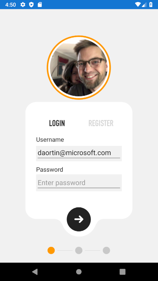
With shapes and paths, you have a whole new way to achieve your designs in Xamarin.Forms. Paths are a series of vector points and lines that can describe complex shapes. Due to their complexity, you won't really want to type the path data by hand. From almost any design tool (I like Figma) you can copy path data for a vector shape and copy it right into your code. In Figure 3 you can see a different style of login screen that uses an interesting shape for the form background.
<Path Fill="#333333"
      Data="M251,0 C266.463973,-2.84068575e-15 279,12.536027 279,28 L279,276 C279,291.463973 266.463973,304 251,304 L214.607,304 L214.629319,304.009394 L202.570739,304.356889 C196.091582,304.5436 190.154631,308.020457 186.821897,313.579883 L186.821897,313.579883 L183.402481,319.283905 C177.100406,337.175023 160.04792,350 140,350 C119.890172,350 102.794306,337.095694 96.5412691,319.115947 L96.5273695,319.126964 L92.8752676,313.28194 C89.5084023,307.893423 83.6708508,304.544546 77.3197008,304.358047 L65.133,304 L28,304 C12.536027,304 1.8937905e-15,291.463973 0,276 L0,28 C-1.8937905e-15,12.536027 12.536027,2.84068575e-15 28,0 L251,0 Z"
/>
Be glad that you don't have to type that data string yourself, though with some practice you'll get pretty good understanding what's going on. SVG images also commonly use path data, and you can use your favorite text editor to read and copy the data string.
You can also draw primitive shapes like ellipse, line, polygon, polyline, and rectangle. Each of these shapes support common styling properties such as aspect, fill, and a variety of stroke options.
<StackLayout Orientation="Horizontal" HorizontalOptions="Center">
    <Ellipse Fill="#FF9900" />
    <Line />
    <Ellipse />
    <Line />
    <Ellipse />
</StackLayout>
One of the most powerful uses of shapes is the ability to clip other controls, also known as “masking.” A square profile image can become a circle by applying an EllipseGeometry to the Image.Clip property. The same can be done with a path or any other shape, and clipping can be applied to any control or layout in Xamarin.Forms!
<Image HorizontalOptions="Center" VerticalOptions="Center" WidthRequest="150" HeightRequest="150" Source="profile.png">
    <Image.Clip>
        <EllipseGeometry Center="75,75" RadiusX="75" RadiusY="75"/>
    </Image.Clip>
</Image>
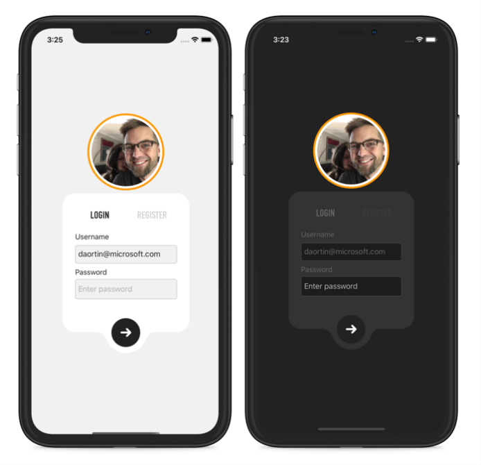
Dark Mode
Modern operating systems all now have some form of support for light and dark modes, like those seen in Figure 4. These modes may be triggered by ambient light sensors, time of day, or by user preference. You can make your colors and styles aware of appearance modes using a new binding extension appropriately called AppThemeBinding. If you use the default colors provided by the platform, and you make no customization, and then your application uses the platform default colors for light and dark appearance modes. To take more creative control, update your application styles and set the colors directly.
<Style TargetType="Page" ApplyToDerivedTypes="True">
    <Setter Property="BackgroundColor" Value="{AppThemeBinding Dark=#222222, Light=#f1f1f1}" />
</Style>
Now when appearance mode changes on the devices for any reason, the application updates at runtime. How can you then opt-out of this behavior and allow the user to set their own appearance mode preference? Xamarin.Forms 5 provides App.Current.UserAppTheme that you can set from anywhere in the application. You can choose from OSAppTheme.Dark, OSAppTheme.Light, or OSAppTheme.Unspecified. Choosing Unspecified gives control back to the platform to trigger appearing changes.
App.Current.UserAppTheme = OSAppTheme.Dark;
New Control Customizations
Windows desktop platforms have long enjoyed “lookless controls” that allow you to skin parts of a control by supplying a control template. You may not realize this, but Xamarin.Forms has supported control templates since version 2! In Figure 5, you can see the default RadioButton control without any styling applied. As you would expect the XAML is plain.
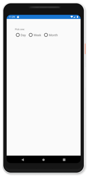
<StackLayout RadioButtonGroup.GroupName="SimpleRadios" Orientation="Horizontal">
    <RadioButton Content="Day" />
    <RadioButton Content="Week" />
    <RadioButton Content="Month" />
</StackLayout>
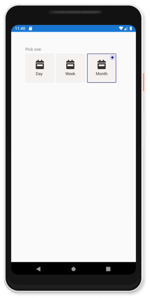
The main difference between control templates in Xamarin.Forms versus other platforms is that, because the controls have adhered closely to the native experience, we didn't provide the ability to supply a template that works seamlessly with core controls...until now. In Xamarin.Forms 5, we're introducing support for control templating on the new RadioButton control.
We didn't provide the ability to supply a template that works seamlessly with core controls...until now
You can apply a control template, such as Listing 2, directly to the RadioButton.ControlTemplate property, or better yet by setting a style. And because RadioButton takes any content, you can provide layout and controls that will be applied to the ContentPresenter in the template. Check out how much better this looks now in Figure 6!
Listing 2: Control template for a RadioButton
<ControlTemplate x:Key="CalendarRadioTemplate">
    <Frame HasShadow="False" HeightRequest="100" WidthRequest="100" HorizontalOptions="Start" VerticalOptions="Start" Padding="0">
        <VisualStateManager.VisualStateGroups>
            <VisualStateGroupList>
                <VisualStateGroup x:Name="CommonStates">
                    <VisualState x:Name="Normal">
                        <VisualState.Setters>
                            <Setter Property="BackgroundColor" Value="#f3f2f1"/>
                            <Setter Property="BorderColor" Value="DarkBlue"/>
                            <Setter Property="Grid.IsVisible" TargetName="RadioIcon" Value="False"/>
                        </VisualState.Setters>
                    </VisualState>
                    <VisualState x:Name="Checked">
                        <VisualState.Setters>
                            <Setter Property="BorderColor" Value="DarkBlue"/>
                            <Setter Property="Grid.IsVisible" TargetName="RadioIcon" Value="False"/>
                        </VisualState.Setters>
                    </VisualState>
                </VisualStateGroup>
            </VisualStateGroupList>
        </VisualStateManager.VisualStateGroups>

        <Grid Margin="4" WidthRequest="100">
            <Grid x:Name="RadioIcon" WidthRequest="18" HeightRequest="18" HorizontalOptions="End" VerticalOptions="Start">
                <Ellipse Stroke="DarkBlue" WidthRequest="16" HeightRequest="16" StrokeThickness="0.5" VerticalOptions="Center" HorizontalOptions="Center" Fill="White" />
                <Ellipse WidthRequest="8" HeightRequest="8" Fill="DarkBlue" VerticalOptions="Center" HorizontalOptions="Center" />
            </Grid>
            <ContentPresenter></ContentPresenter>
        </Grid>
    </Frame>
</ControlTemplate>
<RadioButton ControlTemplate="{StaticResource CalendarRadioTemplate}">
<RadioButton.Content>
<StackLayout HorizontalOptions="Center" VerticalOptions="Center">
<Image Source="{FontImage FontFamily=FontAwesome, Glyph=, Color=#323130, Size=32}"/>
<Label Text="Day" TextColor="#323130"/>
</StackLayout>
</RadioButton.Content>
</RadioButton>
Although this is traditionally something you'd only think of doing in XAML, and I know that many of you do just that, control templates are equally powerful directly from C#. You just need to assign a custom template to the control's template property; described in C# or XAML, it doesn't matter.
Supplying a control template is a very powerful and convenient way to fully customize a control. When you do this, be aware that the control no longer uses the native platform control but only the cross-platform features. In most cases, this flexibility and control far outweighs that trade-off. For special cases, you can always adopt the custom renderer strategy.
What's Next
Xamarin.Forms 5 is a monumental release, and it wouldn't be that without amazing work from our many contributors. In this release, as compared to the last, contributions have increased nearly 34%. In 2020, Xamarin.Forms has twice set new high marks for usage, and you've reported to us the highest satisfaction ratings the platform has ever seen. This is really a celebration of you and your continued contributions and collaboration. Thank you!
Much of Xamarin.Forms 5 has been in preview for several months while we worked through your feedback to make it ready for a stable release. This article showcases only some the new features at your disposal. See the documentation at https://docs.microsoft.com/xamarin/whats-new/ for details about many more features, such as those shown in Table 2.
Our .NET team is already working on .NET 6 and the next release that will focus on surmounting significant challenges in app performance, improved desktop support, and advanced control customizations. It's encouraging that everything you invest today in .NET and Xamarin.Forms 5 has a future path for many years to come within .NET.
To get started today with Xamarin.Forms 5, you can quickly update your existing projects via your favorite NuGet package manager. The new project templates in Visual Studio will also be updated to use Xamarin.Forms 5 by default, so you get the very best experience. Continue to send us feedback and let us know how we're doing. Happy coding!
Table 1: The `available` classes and elements
| Flyout Item Part | Style Class Name | Element Name |
| Text | FlyoutItemLabelStyle | FlyoutItemLabel |
| Icon | FlyoutItemIconStyle | FlyoutItemIcon |
| Container | FlyoutItemLayoutStyle |
Table 2: There are many more features to explore.
| In Xamarin.Forms 5 you'll also find: | ||
| Accessibility - TabIndex | FontImageSource | RefreshView |
| AdaptiveTrigger | GIF support | Shapes & Paths |
| AndroidX | Grid Row/Col simplificiation | Shell Modals |
| AppTheme (Dark Mode) | HTML Label | SourceLink |
| Brushes - gradient and solid | Image loading and error source | SpanModeStateTrigger |
| Bug fixes | IndicatorView | StateTrigger |
| CarouselView | Kerning / Character Spacing | SwipeView |
| CheckBox | Label padding | Switch VisualStates |
| Clipping | Label Transform | Transparent background modals |
| CollectionView | Map Shapes | TwoPaneView |
| CompareStateTrigger | MultiBindings | Various markup extensions |
| DeviceStateTrigger | MultiTriggers | Various Platform Specifics |
| Drag & Drop gestures | Native enhancements to Maps and WebView | VisualStateManager Target |
| DualScreen SDK | OrientationStateTrigger | WebView Cookies |
