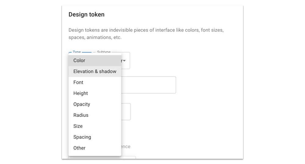
Design Tokens beyond colors, typography, and spacing.
In recent months, I couldn’t help but notice how many people (and companies) when referring to “design tokens” what they actually mean is colors, typography, spacing (and in some cases elevation, timing, and sizing).
While this is perfectly true, I think a key part of the picture is missing: design tokens can be much more than this.
As Sarah Federman puts it perfectly:
In this post, I share my point of view and my experience on this topic, showing why so much more can be done with them, and how.
A little preamble…
“Design tokens are so hot right now!” has become a meme in the Design Systems community, so you probably already know what they are. But if you don’t, or want to know more, I suggest you check out Jina Anne’s online course and talk, Danny Banks’ blog post, Stuart Robson’s repository, or Robin Rendle’s article. There is also a brand new W3C Working Group if you fancy contributing.
For an overview of how we use them in our company (MagicLab), check out this post of mine: How to manage your Design Tokens with Style Dictionary
Design tokens for colors, typography and spacing
As I said above, many people think of design tokens as “a set of core design properties of an application or website”. While this is pretty intuitive it can also be quite misleading and reductive.
Take a look at this playground, and see how the only things you can tweak are colors and typography: Design System Playground
Try this management tool for design tokens, and see how it’s built around the idea of “core” values of design properties:
Look at the many existing plugins for Figma, Sketch or Framer, that exist for exporting design tokens: they’re all based on the idea of exporting granular and isolated values for colors, font-sizes/line-heights, spacing, etc.
Open the “design tokens” page of the many design systems available online, and in most cases what you see are colors, typography, spacing, elevation, timing, sizing, etc.
Let me be clear: there is nothing wrong with this.
But, as I said before, I think design tokens can do much more than this.
In my experience, design tokens’ great potential and power are fully expressed when two other things form part of the equation, when they are:
- used to express properties and values for components;
- annotated with meta-information.
Design tokens for components
There’s no reasons why design tokens can’t be used to describe a component’s properties.
From a purely technical point of view, design tokens are organised lists of key-value pairs that describe design decisions. So it’s just a matter of convenience (and context) what are the boundaries that we assume when describing a UI via design tokens.
In some cases, especially when a design system is in its early stages, limiting ourselves to just core values (eg. colors, typography, spacing) makes perfect sense. But once the system becomes more complex, and starts to include more and more components, there are a lot of good reasons for using design tokens for these as well.
Moreover, basic colors and typography don’t change very frequently (re-branding exercises are a case in point). But by contrast, in my experience, components are constantly evolving.
In recent months, many new components have been added to our design system; some existing ones have been fine-tuned (and in some cases even refactored); a few others have been extended for use in different contexts or visual states. By contrast, only a couple of colors and one font size have been changed.
How we use them in MagicLab
Whenever a component is created, we discuss — with the designers and developers involved in the design system — the possible states and variants of the component, and its specific design decisions. Then we translate all these specifications into specific design tokens.
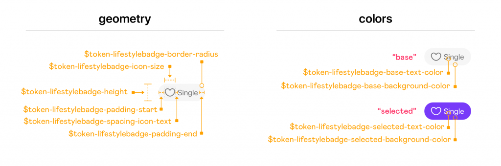
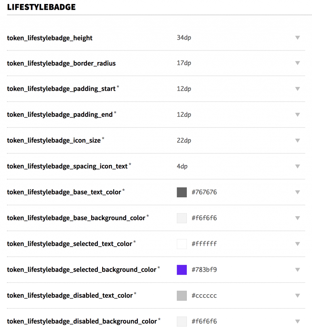
Here, for example, is what the JSON file for the LifestyleBadge component looks like (we use Style Dictionary to manage our design tokens):
{
    "lifestylebadge": {
        "height": {
            "value": "34",
            "type": "size"
        },
        "border_radius": {
            "value": "17",
            "type": "size"
        },
        "padding": {
            "start": {
                "value": "{spacing.md.value}",
                "type": "size"
            },
            "end": {
                "value": "{spacing.md.value}",
                "type": "size"
            }
        },
        "icon_size": {
            "value": "{icon.size.md.value}",
            "type": "size"
        },
        "spacing_icon_text": {
            "value": "{spacing.xsm.value}",
            "type": "size"
        },
        "base": {
            "text_color": {
                "value": "{color.gray_dark.value}",
                "type": "color"
            },
            "background_color": {
                "value": "{color.gray_light.value}",
                "type": "color"
            }
        },
        "selected": {
            "text_color": {
                "value": "{color.white.value}",
                "type": "color"
            },
            "background_color": {
                "value": "{color.primary.value}",
                "type": "color"
            }
        }
    }
}
These values are processed in different output formats, and then distributed to multiple platforms (mobile web, iOS, Android) and products (we currently support four main brands plus a few white-labels).
Once the tokens for a component are added to the system, the developers that assume the task of implementing it will immediately have at hand all the necessary design specifications:
At first sight, this may look like a case of over-engineering, adding a lot of complexity to the system. But actually, what we’ve found is that this allows us to distribute information to the “consumers” (the developers) in a reliable, well-established way. This in turns reduces opportunities for confusion, misunderstandings and (human) error.
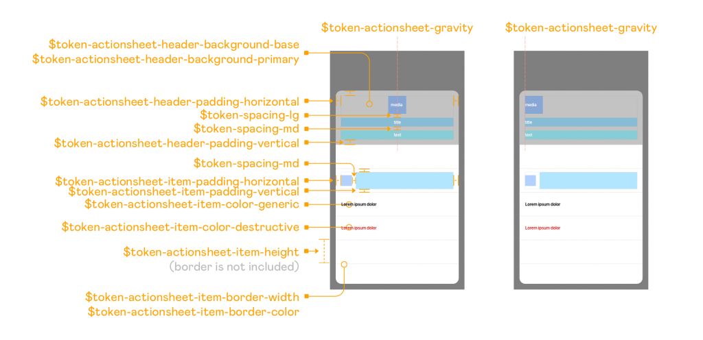
The developers themselves have started demanding specific tokens whenever a component is added to the system. This is because it obviates the need for them to open a Sketch file (or a Sympli page), and then figure out all the sizes, colors, and component specs. Instead, all they have to do is update the version of the design tokens package in their codebase, launch a sync/update script, and all these specs are automatically there for them, abstracted in easy-to-read variable names. (Plus, we use illustrations like the one below, to show how/where a component’s design tokens are defined and used).
Another important aspect of this approach is that you derive the same benefits as when the design tokens are used for core design properties:
- In a multi-product design system like ours it makes easy to achieve multi-product components, where the same component (with exactly the same code) has a different look and feel for different products/brands. Doing this helps us keep the cost of scaling down (eg. when adding new applications to our portfolio)!
- Whenever a designer decides to update the visual styling of a component (eg. the background color) or its layout/geometry (eg. the horizontal padding) all that these changes require is an update of a few values in a single JSON file, and the change of a version number for the imported tokens in the codebase, and nothing else: the cost of change is extremely low!
If we see design tokens as a way to convey information, then it makes absolute sense to use them for components as well.
Design tokens meta-information
Both of the main management tools for design tokens (Theo & Style Dictionary) support the addition of meta-data to the key-value pairs. While they can be used for adding comments and annotations, their real power manifests when they’re used to add an extra layer of meaning.
For example, you can add type information to the values, for use later on, when they are processed to generate specific outputs. You can add grouping information which can be used later for organising or filtering them in very specific ways. Many other kinds of information can be added, depending on context and needs. The key here is to add what has meaning for you, your context/usage/need.
How do we use them in MagicLab
The first meta-information that we introduced, once we had adopted the design tokens in our design system, was “documentation/comment”. This was used to enable the addiction of extra information to a token, that would appear in the design system website. We decided to use the documentation namespace for it, rather than just using a comment property, in case we needed to add even more information (eg. if a design token is deprecated, and what it needs to be replaced with).
Here, for example, is how we add a comment to a design token:
{
    "actionsheet": {
        …
        "item": {
            "height": {
                "value": "48",
                "type": "size",
                "documentation": {
                    "comment": "Notice: this is the 'internal' size, the border will be added as extra"
                }
            },
            …
        }
    }
}
And this is rendered in the documentation of the design token in this way:
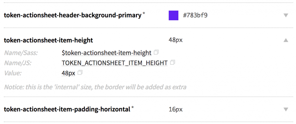
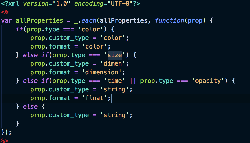
The second piece of meta-information that we added immediately after was “type”. This is not strictly a type in the “programming-language” sense, but rather in a a semantic way.
Below some examples of types we’re using:
{
    "color": {
        "primary": {
            "value": "{color.palette.purple_grape.value}",
            "type": "color"
        }
    },
    "icon": {
        "size": {
            "xsm": {
                "value": "10",
                "type": "size"
            }
        }
    },
    "tooltip": {
        "shadow": {
            "opacity": {
                "value": "0.08",
                "type": "opacity"
            }
        },
        "animation": {
            "timing_bounce": {
                "value": "0.9",
                "type": "time",
                "unit": "s"
            }
        }
    },
    "chat": {
        "bubble": {
            "relative_width": {
                "value": "0.8",
                "type": "ratio"
            }
        }
    },
    "actionsheet": {
        "gravity": {
            "value": "center",
            "type": "string"
        }
    }
}
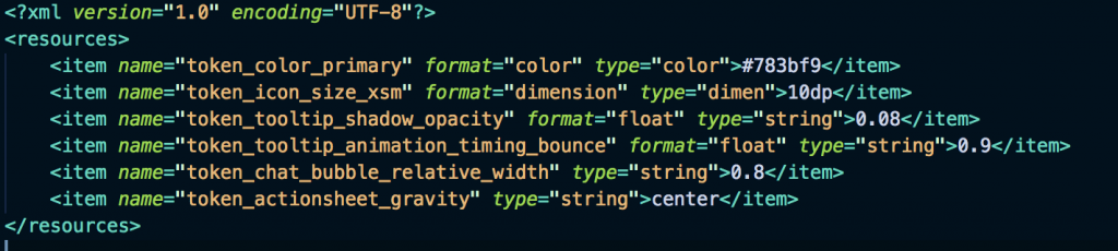
The “type” meta-data is used in the post-processing script to create custom output for different platforms. Below you can see a piece of code relating to the template used to generate the XML file for Android:
And this is the custom formatted output:
More recently, we have added a third kind of meta-data to our set of design tokens: “group” information. This is one of the most important ones, and it’s used for multiple reasons.
Filtering
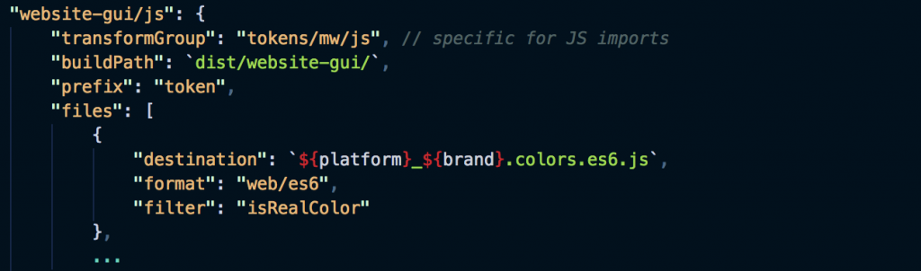
For some products/targets, we only want to release a subset of tokens (eg. just the colors). In this case, it was quite easy for us to add a custom filter to Style Dictionary like this:
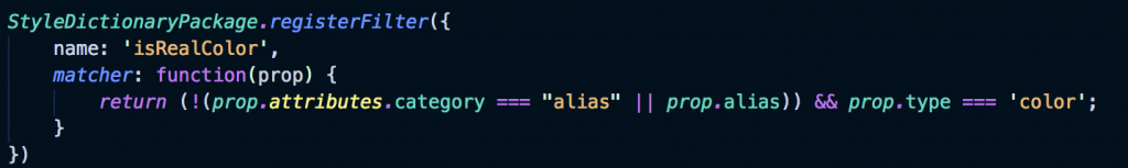
If you notice, we are applying two filters here: one for the “color” token “type”, and one to filter out any “aliases”. This is because we make use of special colors (like color-palette-purple-grave) as pointers to hex color values, but because we don’t need them as generated tokens, we flag them with a meta-data called isAlias.
This filter is then used to generate color-only specific files:
This is just one example of how you can use meta-data to filter tokens and generate specific outputs. I can imagine many other instances where this could be used, depending on your context and needs.
Grouping
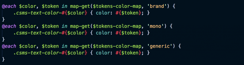
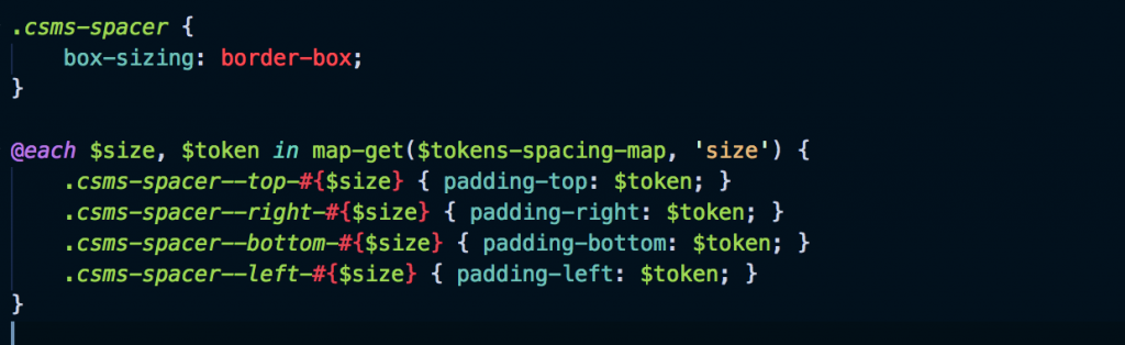
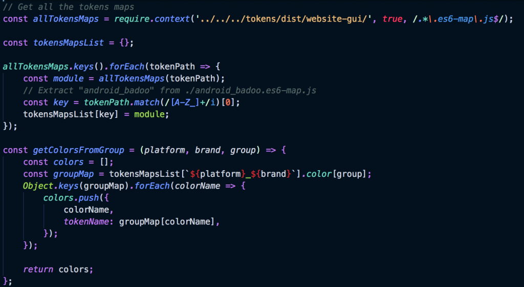
Another way in which we’re using the meta-data of design tokens is for grouping them in specific ways.
For example, using the “group” attribute we can create lists of tokens that share the same group, and later use these lists (or maps) in our codebase.
Assigning a different “group” to the design tokens for color values, icons sizes, like here:
// color/xxx.json
{
    "color": {
        "primary": {
            "value": "{color.palette.purple_grape.value}",
            "type": "color",
            "group": "brand"
        },
        …
        "generic_red": {
            "value": "{color.palette.pink_salmon.value}",
            "type": "color",
            "group": "generic"
        },
        …
        "gray_dark": {
            "value": "#767676",
            "type": "color",
            "group": "mono"
        },
        "feature": {
            "verification": {
                "value": "{color.palette.blue_neon.value}",
                "type": "color",
                "group": "features"
            },
            …
        },
        "provider": {
            facebook": {
                "value": "#4867aa",
                "type": "color",
                "group": "providers"
            },
            …
        },
        "others": {
            error": {
                "value": "{color.generic_red.value}",
                "type": "color",
                "group": "others"
            },
            …
        }
    }
}// icon.json
{
    "icon": {
        "size": {
            "xsm": {
                "value": "10",
                "type": "size",
                "group": "size"
            },
            "sm": {
                "value": "16",
                "type": "size",
                "group": "size"
            },
            "md": {
                "value": "22",
                "type": "size",
                "group": "size"
            },
            "lg": {
                "value": "30",
                "type": "size",
                "group": "size"
            },
            "xlg": {
                "value": "36",
                "type": "size",
                "group": "size"
            },
            "xxlg": {
                "value": "46",
                "type": "size",
                "group": "size"
            }
        },
        "jumbo-size": {
            "sm": {
                "value": "{brick.size.sm.value}",
                "type": "size",
                "group": "size"
            },
            "md": {
                "value": "{brick.size.md.value}",
                "type": "size",
                "group": "size"
            },
            "lg": {
                "value": "{brick.size.lg.value}",
                "type": "size",
                "group": "size"
            }
        }
    }
}// spacing.json
{
    "spacing": {
        "xsm": {
            "value": "4",
            "type": "size",
            "group": "size"
        },
        "sm": {
            "value": "8",
            "type": "size",
            "group": "size"
        },
        "md": {
            "value": "12",
            "type": "size",
            "group": "size"
        },
        "lg": {
            "value": "16",
            "type": "size",
            "group": "size"
        },
        "xlg": {
            "value": "24",
            "type": "size",
            "group": "size"
        },
        "xxlg": {
            "value": "32",
            "type": "size",
            "group": "size"
        },
        "gap": {
            "value": "{spacing.lg.value}",
            "type": "size",
            "group": "size"
        }
    }
}
we can generate Sass maps like this one:
$tokens-color-map: (
    providers: (
        provider-facebook: $token-color-provider-facebook,
        …
    ),
    mono: (
        black: $token-color-black,
        gray-dark: $token-color-gray-dark,
        gray: $token-color-gray,
        gray-light: $token-color-gray-light,
        white: $token-color-white
    ),
    others: (
        error: $token-color-error,
        …
    ),
    brand: (
        primary: $token-color-primary,
        …
    ),
    generic: (
        generic-red: $token-color-generic-red,
        …
    ),
    features: (
        …
        feature-verification: $token-color-feature-verification
    ),
);$tokens-icon-map: (
    size: (
        size-xsm: $token-icon-size-xsm,
        size-sm: $token-icon-size-sm,
        size-md: $token-icon-size-md,
        size-lg: $token-icon-size-lg,
        size-xlg: $token-icon-size-xlg,
        size-xxlg: $token-icon-size-xxlg,
        jumbo-size-sm: $token-icon-jumbo-size-sm,
        jumbo-size-md: $token-icon-jumbo-size-md,
        jumbo-size-lg: $token-icon-jumbo-size-lg
    ),);$tokens-spacing-map: (
    size: (
        xsm: $token-spacing-xsm,
        sm: $token-spacing-sm,
        md: $token-spacing-md,
        lg: $token-spacing-lg,
        xlg: $token-spacing-xlg,
        xxlg: $token-spacing-xxlg,
        gap: $token-spacing-gap
    ),
);...
These maps now allow us to write declarations such as these:
In this way we’re not merely abstracting away the declaration of lists of classes/properties based on color/size/etc. More importantly for us, different products can have different lists of colors, or different spacing scales, or icon sizes, etc. but the same Sass code, now works for any list of colors, spacing, sizing, etc.
These Sass files are now universal, and can be used for multi-product and multi-platform components!
Whenever a color is added, or removed, the list automatically gets updated. No code change is required at either component or application level. Everything is controlled by the design tokens declarations.
And this is not only for CSS/Sass. The same benefit of having “lists of tokens associated by the same group” can also be applied to JavaScript code:
Which leads to another possible application, for CSS-in-JS. In this case, the list of possible colors (or spaces, or sizes) for a component, simply becomes a loop/map on a list of key-value objects, directly generated by the design tokens tooling.
Following the same approach, we have also recently used the “group” property to generate TypeScript definitions. Using a custom template in Style Dictionary we have been able to generate an output file like this:
declare namespace Tokens {namespace Color {
        enum Providers {
            PROVIDER_FACEBOOK = 'provider-facebook',
            …
        }
        enum Mono {
            BLACK = 'black',
            GRAY_DARK = 'gray-dark',
            GRAY = 'gray',
            GRAY_LIGHT = 'gray-light',
            WHITE = 'white'
        }
        enum Others {
            ERROR = 'error',
            …
        }
        enum Brand {
            PRIMARY = 'primary',
            …
        }
        enum Generic {
            GENERIC_RED = 'generic-red',
            …
        }
        enum Features {
            …
            FEATURE_VERIFICATION = 'feature-verification'
        }        type Color = Providers | Mono | Others | Brand | Generic | Features;}namespace Icon {
        enum Size {
            XSM = 'xsm',
            SM = 'sm',
            MD = 'md',
            LG = 'lg',
            XLG = 'xlg',
            XXLG = 'xxlg',
            JUMBO_SM = 'jumbo-sm',
            JUMBO_MD = 'jumbo-md',
            JUMBO_LG = 'jumbo-lg'
        }
    }namespace Spacing {
        enum Size {
            XSM = 'xsm',
            SM = 'sm',
            MD = 'md',
            LG = 'lg',
            XLG = 'xlg',
            XXLG = 'xxlg',
            GAP = 'gap'
        }
    }}export default Tokens;
These TypeScript definitions and enums can then be consumed directly by the client codebases, to ensure strict type safety (and autocomplete in the IDEs).
One last possible use of meta-data to add extra semantic meaning to design tokens, especially relationships, is for example to declare text styles. We all know that to have a minimum viable text style, you need at least a font-family, a font-size, a line-height, and a font-weight. How can you define the relationship between distinct design tokens, and explicitly declare their relationship, to create an “H1 text style”? One can imagine using the naming (so all the properties of the same style have the same prefix/suffix). Why then not use some meta-data associated with the tokens, to identify them and filter/group them at process time? This is not something we needed to implement, but if we had I would have certainly used a meta-data attribute associated with the different style values.
Conclusions
The key takeaways of this post are the following:
- Design tokens are not only a way to store information, but also a way to convey information.
- Design tokens are useful for describing core design values, but their full power emerges when used to describe the specs of UI components
- There are many ways in which adding meta-data to the design tokens addsextra meaning to them. This meaning can be processed to determine and convey even more information, beyond the mere key/value definition.
For example, using such meta-data it is possible to:
- annotate a design tokenwith useful information
- selectively generate output according to specific filters
- generate dynamic lists driven by tokens for Sass, JavaScript, TypeScript
- making use of these dynamic lists, use the same component (with the same code) for multiple products/platforms
I have tried to show real use cases of how we are using this approach to design tokens in our design system. But this is how we use them, to satisfy our needs.
I’m sure many of you will have (or find) dozens and dozens of other examples of how design tokens can be used, beyond colors, typography, and spacing.
It’s a matter of imagining. Think about what you can do, when you add meta-information to the tokens, that has special meaning for you, and in the context of how and where these tokens are used.
And having done so, do please share them with the community :)
Updates:
In the meantime, Sarah Federman has published the slides of her recent talk at WebDirections about “Customizability in Design Systems”. In her talk Sarah shows how far they have pushed their design tokens’ architecture, to support Atlassian’s design system theming and customizability. And the slide “Future possibilities” is simply mind blowing. Brava Sarah! 🙌
Originally published on Medium on November, 12 2019