

1. Rainbow Colors
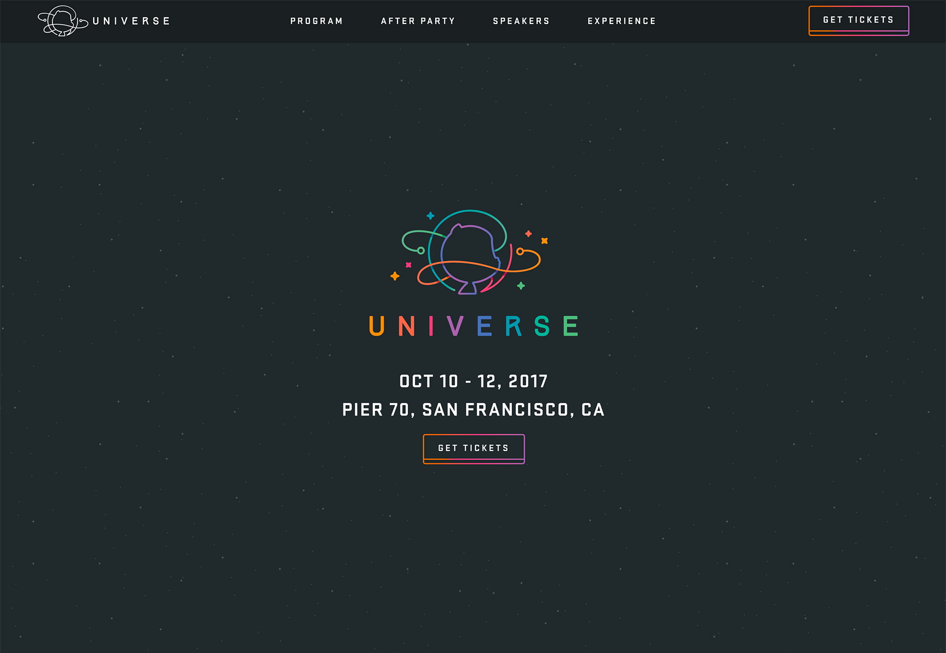
When you hear “rainbow colors,” the first thing that comes to mind is probably not good design. There are too many glaring examples of garish projects with rainbow-themed color palettes that are overwhelming and, quite frankly, design disasters. Today’s rainbow colors are anything but disastrous. They are classy, simple and provide just the right amount of color to a surprising number of projects. Rainbow palettes aren’t just for small websites either; big brands including the Github Universe Conference, Southwest Airlines and London Grammar’s Spotify channel all use interesting rainbow patterns. Even more interesting is that every design uses the same color concept in very different ways.- Rainbow text elements in a dark aesthetic: Github uses a simple dark aesthetic with rainbow colored text and user interface elements to draw the eye from key information (such as the date) to the main call to action (ticket sales). The rainbow gradient is simple and subtle, while setting mood of opportunity and optimism. This seems like just the right combination to encourage users to register for a conference.
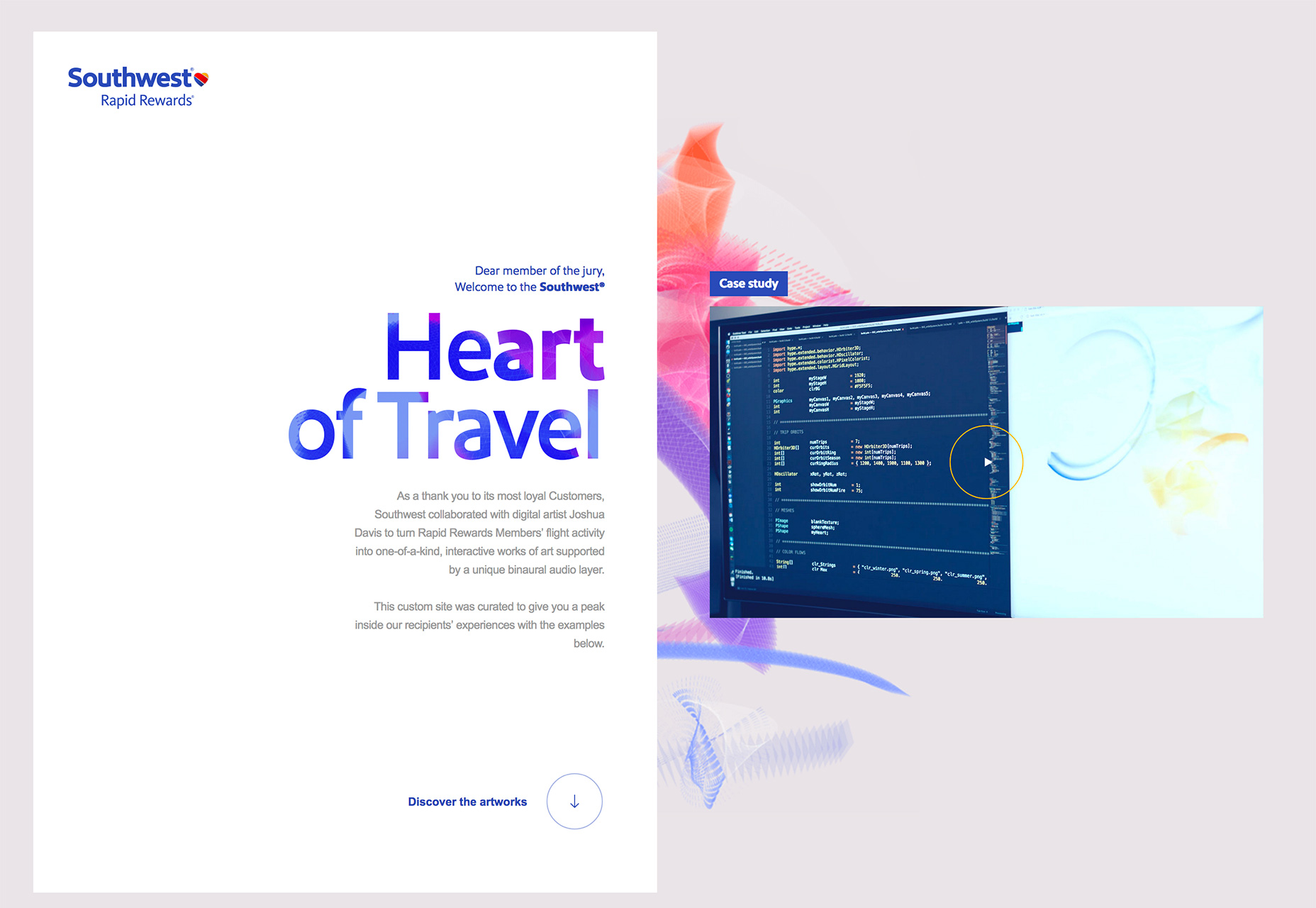
- Southwest Airlines takes another approach with rainbow background elements and text fill in a lighter container element. The rainbow accent provides a visual reference point for a site that has content that could be construed as boring. Color gives the case study a little more life to help encourage clicks.
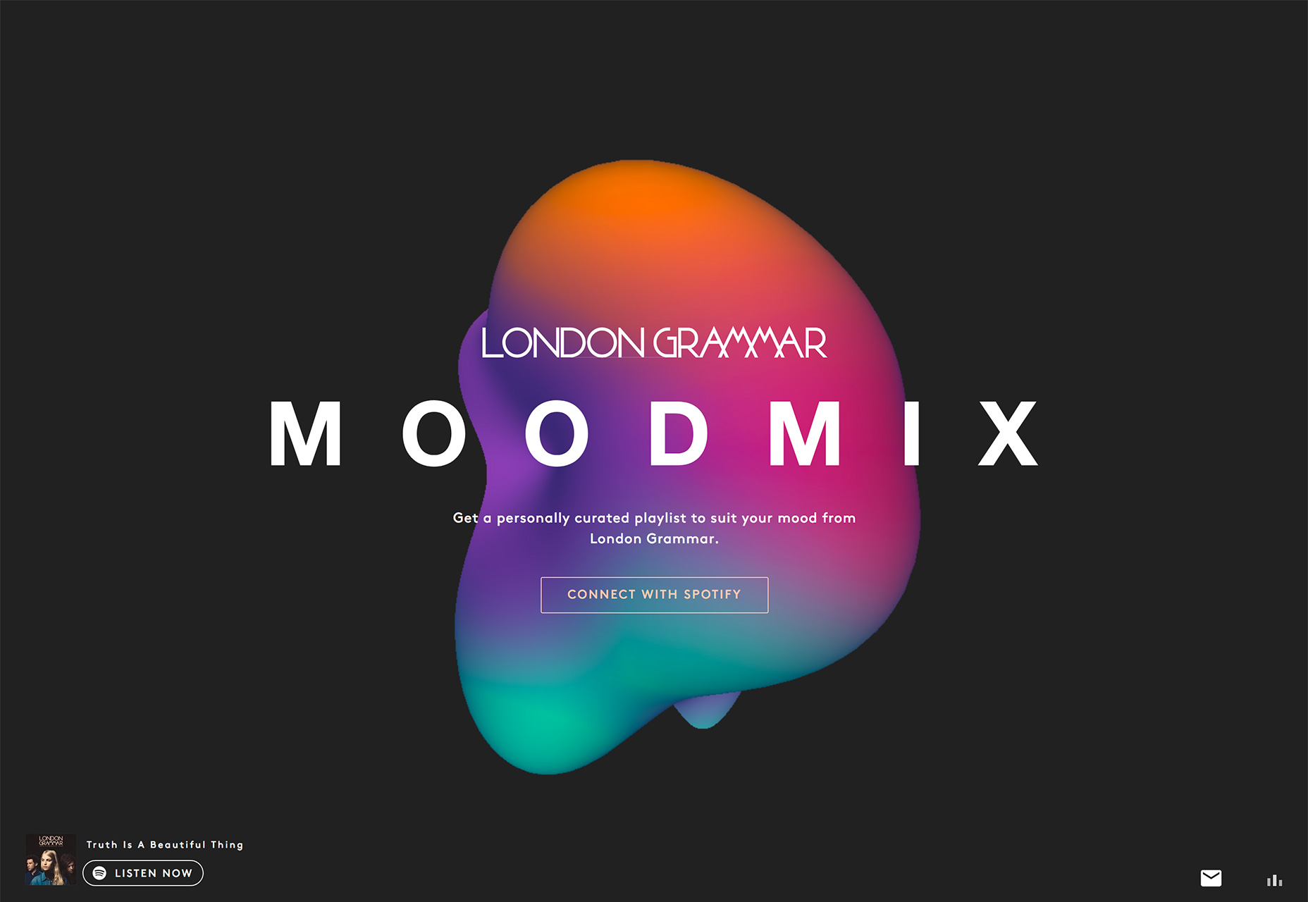
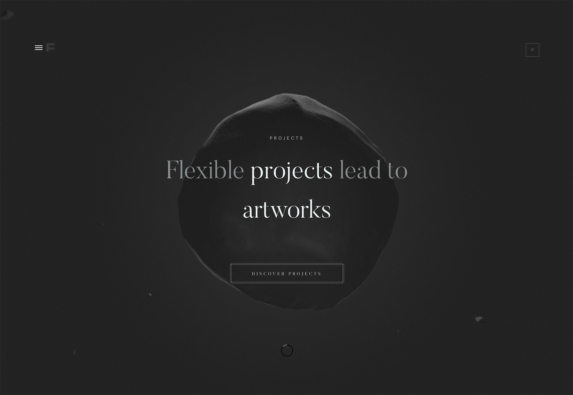
- London Grammar uses a giant rainbow orb to draw users into the sound-mixing experience collaboration with Spotify. The rainbow blob shifts and moves with a slow animation that feels like gel in water. The colors move and merge and it is something you could look at all day if you aren’t careful. The gamification aspect of the colored element is also interesting, but the color is definitely what draws users in first.
2. Collapse of the Hero Header
The oversized photo or slider hero header has been a website design staple for years. But there’s a trend to get away from the pattern with more designers opting for a more minimal above the scroll structure with more elements and a less constructed feel. The result seems to be a trend with more white or light headers that have a smattering of parts floating around. This trend gets somewhat mixed reviews. Some of the visuals are interesting, but overall there seems to be an overall lack of focal point for users and clearly defined set of actions to take. What’s nice about the collapse of the hero header is that the minimal approach makes users look. It is different. The question is whether there is enough messaging to carry their interest for long or if users will respond positively to a less visual website experience. This is a trend to watch, because it is likely in the early stages of evolution. Designers are ready to do something different with the tops of pages (and understandably so). This iteration of projects is just the first step toward something new. Some designers might be perturbed by the odd combination or parts of elements above the scroll in most of these design concepts so far. It remains to be seen where the trend goes next, but it is worth keeping an eye on for sure.
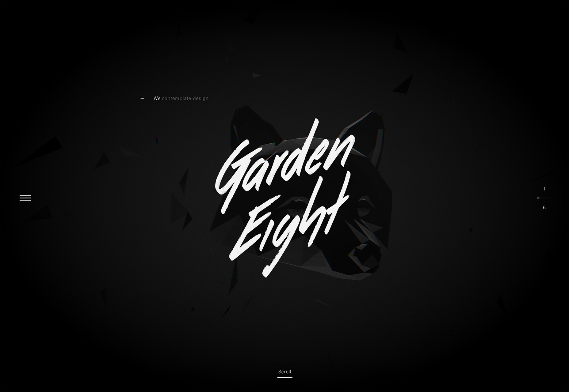
3. Dark Animated Patterns
This might be the most fun trend in website design right now: Dark animated effects layered on top of dark color schemes. The dark on dark concept is mysterious, visually interesting and really makes the user look and engage with the design. Plus, it can work in so many different ways. There’s no set to the size or type of animation or what the effect does. Each of the examples below use dark animated effects in different ways that all encourage some sort of interaction from automated movement to mouse over effects to flashes of surprise (you’ll have to click the links to find that one). While these design look really cool, they can pose some challenges as well. Not all users are keen on such a dark aesthetic. It might not render well in all environmental conditions. These designs definitely look and function better on desktop screens than smaller devices. But the design trend does have a place for designers that want to create something a little different, with a certain mood and trendy aspect. There’s also something about combinations of dark hues without a lot of color that just draws you in. (It’s kind of unexplainable.) To make the most of the dark on dark trend, make sure to use enough variance in dark hues to make sure elements can be seen and that movements are discernable. Use rich blacks with plenty of undertones to set the right mood for each project. While the examples below all completely lack color, consider a contrasting hue other than white for key points of emphasis. (A colored call to action button would really stand out with the amount of contrast all the black imagery provides.) The other commonality with this trend is in the simplicity of the animations used. None of the movement is overly complex. It is as simple and streamlined as the color palette, which is a key contributor to the overall success of the design trend.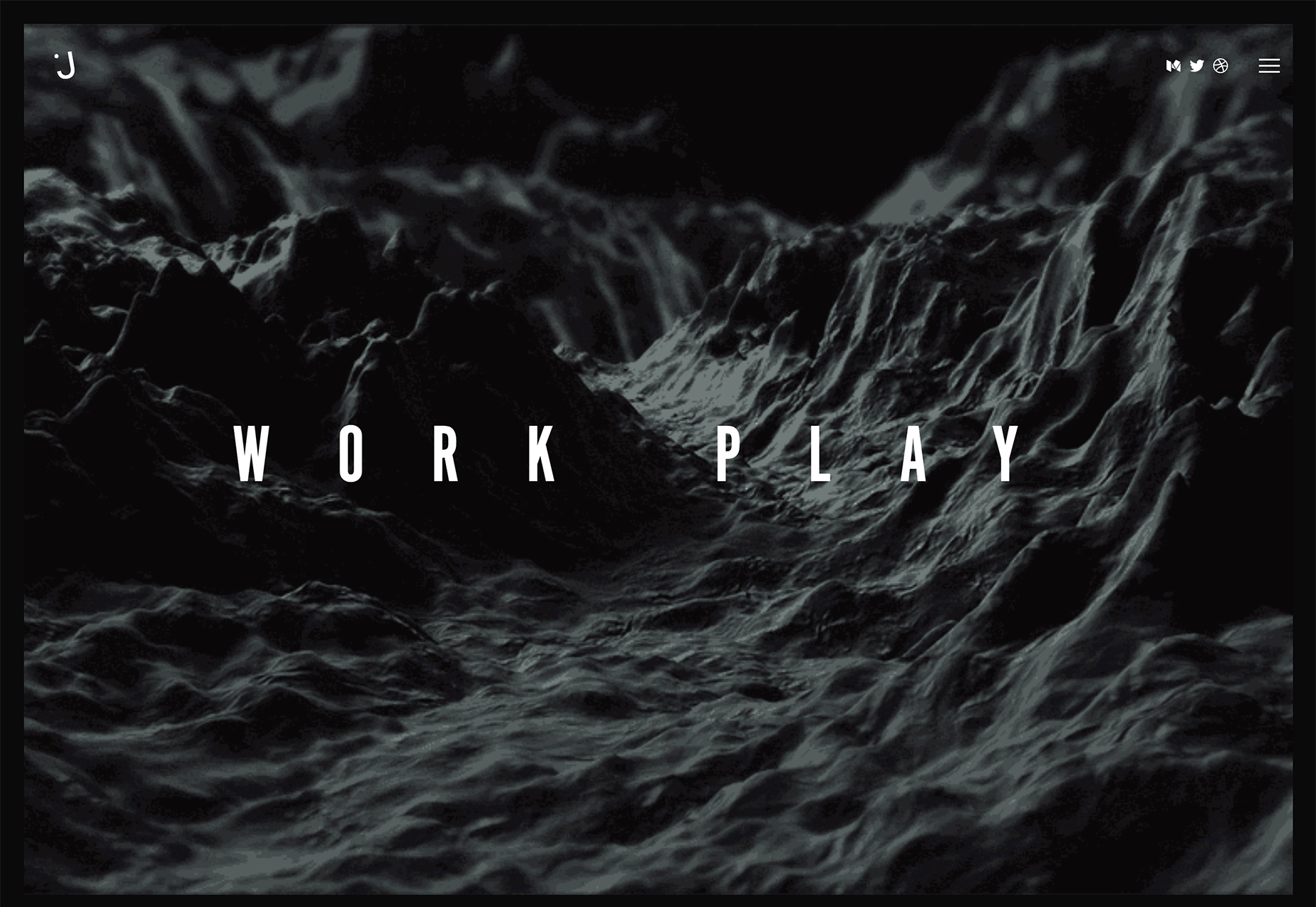
Conclusion
The shift in color usage showcased by this month’s trends is both interesting and effective. Rainbow colors are a lot of fun and uplifting while minimal white and dark patterns both provide plenty of room for introspection and reflection. Color choices really do connect to how designers feel about a project. What trends are you loving (or hating) right now? I’d love to see some of the websites that you are fascinated with. Drop me a link on Twitter; I’d love to hear from you.Carrie Cousins
Carrie Cousins is a freelance writer with more than 10 years of experience in the communications industry, including writing for print and online publications, and design and editing. You can connect with Carrie on Twitter @carriecousins.


Read Next

3 Essential Design Trends, May 2024
Integrated navigation elements, interactive typography, and digital overprints are three website design trends making…

How to Write World-Beating Web Content
Writing for the web is different from all other formats. We typically do not read to any real depth on the web; we…
By Louise North

20 Best New Websites, April 2024
Welcome to our sites of the month for April. With some websites, the details make all the difference, while in others,…

Exciting New Tools for Designers, April 2024
Welcome to our April tools collection. There are no practical jokes here, just practical gadgets, services, and apps to…

How Web Designers Can Stay Relevant in the Age of AI
The digital landscape is evolving rapidly. With the advent of AI, every sector is witnessing a revolution, including…
By Louise North

14 Top UX Tools for Designers in 2024
User Experience (UX) is one of the most important fields of design, so it should come as no surprise that there are a…
By Simon Sterne

What Negative Effects Does a Bad Website Design Have On My Business?
Consumer expectations for a responsive, immersive, and visually appealing website experience have never been higher. In…

10+ Best Resources & Tools for Web Designers (2024 update)
Is searching for the best web design tools to suit your needs akin to having a recurring bad dream? Does each…
By WDD Staff

3 Essential Design Trends, April 2024
Ready to jump into some amazing new design ideas for Spring? Our roundup has everything from UX to color trends…

How to Plan Your First Successful Website
Planning a new website can be exciting and — if you’re anything like me — a little daunting. Whether you’re an…
By Simon Sterne

15 Best New Fonts, March 2024
Welcome to March’s edition of our roundup of the best new fonts for designers. This month’s compilation includes…
By Ben Moss

LimeWire Developer APIs Herald a New Era of AI Integration
Generative AI is a fascinating technology. Far from the design killer some people feared, it is an empowering and…
By WDD Staff