
If you’ve read my blog, taken one of my classes, or sat next to me on an airplane, you probably know I’m a big fan of Hadley Wickham’s ggplot2 package, especially compared to base R plotting.
Not everyone agrees. Among the anti-ggplot2 crowd is JHU Professor Jeff Leek, who yesterday wrote up his thoughts on the Simply Statistics blog:
…one place I lose tons of street cred in the data science community is when I talk about ggplot2… ggplot2 is an R package/phenomenon for data visualization. It was created by Hadley Wickham, who is (in my opinion) perhaps the most important statistician/data scientist on the planet. It is one of the best maintained, most important, and really well done R packages. Hadley also supports R software like few other people on the planet.
But I don’t use ggplot2 and I get nervous when other people do.
Jeff is a great statistician, an excellent and experienced educator, and among my favorite scientific communicators. He and I agree strongly on a wide variety number of topics, ranging from peer review to p-values.
In short, I’ve learned a lot from him. So I appreciate the chance to return the favor. I’m going to try crossing this one last disagreement off the list.
Where base plotting is better
I’ll start by giving credit: there are plenty of cases that base plotting tools are superior. The tools were developed over many years by very smart people. While some methods haven’t stood the test of time, others have.
As one example (which Jeff brings up in his post), take clustered heatmaps. Heatmaps are in fact easy to make in ggplot2 with geom_tile or geom_raster, but not with row- and column-clustering built-in, which is essential in applications such as genomics. You’ll see that I use a base-plotting heatmap in my “Love Actually” post, as well as a base-plotted dendrogram.1
But it’s worth noting that in many cases, ggplot2 extensions have sprung up even to replace those areas where base plotting had an advantage. For example, plotting networks used to be base R’s territory, led by plotting methods in the igraph package. But I recently started using the ggraph package and been blown away by how much easier it is to control visual aesthetics of a network.
Is base R better for quick, exploratory plots?
Jeff:
Exploratory graphs don’t have to be pretty. I’m going to be the only one who looks at 99% of them. But I have to be able to make them quickly and I have to be able to make a broad range of plots with minimal code… The flexibility of base R comes at a price, but it means you can make all sorts of things you need to without struggling against the system.
First of all, having exploratory plots be pretty, even if it’s not necessary, is clearly a bonus. My exploratory analyses aren’t publication ready, but they’re definitely ready to send to a colleague or to share on my company’s internal chat.
But in any case, when making quick, exploratory graphs, I find using base R absolutely involves struggling against the system. I’ll give three examples, though they’re far from unique.
-
Creating legends. Any time you use colors, shapes, transparency, etc in base plotting, you need to specify the mappings in the legend yourself, while ggplot2 generates it for you. For me, this is simply a no-brainer, and Jeff agress that “ggplot2 crushes base R for simplicity” when working with, for example, a color scale.
Building your own legend slows down exploratory analysis in two ways. First, time spent specifying legends is time and attention you’re not putting towards your data and your scientific question. Second, it introduces room for error, like an off-by-one or transposition in your legend colors. These are dangerous when you’re working quickly and not proofreading.
-
Grouped lines: If I want to show, say, the price of six stocks or the expression level of six genes over time, I probably want to show them as six line plots. In ggplot2, you add a
group = stockorgroup = geneaesthetic. In base plotting, you write a loop, subset the data each time, and calllines- but you’ll have to have created a blank plot beforehand with the appropriate axes.2 -
Faceting (creating a subplot for each subset of your data) is one of the primary tools I use when constructing a plot- it’s another way to spot relationships. In base R you’d have to construct each plot in a loop.
The fact that graphs are “quick-and-dirty” doesn’t mean that these features stop being useful. In the next section I show a plot I made as part of an exploratory analysis that needs all three.
I’m not sure that base R plotters even realize how powerful and important legends, faceting and grouping are in exploratory analysis, simply because they’re so painful that they never become a habit. If adding a legend takes effort, you may think it’s natural in exploratory plotting to keep looking back to the code to check which color means what. If faceting is challenging, you might lean towards use other aesthetics such as shape (making a plot more crowded), or to look only at one facet at a time. This loses out on potential conclusions you could make in your exploratory analysis.
To paraphrase Wayne Gretzky, “you miss 100% of the plots you don’t make.”
Are ggplot2 and base plotting equally easy?
By way of showing how ggplot2 and base plotting are about equally easy, Jeff makes a comparison between two Tufte-style bar plots. Since they use about the same amount of code, he argues:
This is one where neither system is particularly better, but the time-optimal solution is to stick with whichever system you learned first.
This particular comparison is stacking the deck in a few ways.
- It’s a simple bar plot plotted from a named vector. This is a special case for the
barplotobject. - It also has a large amount of customization for a very specific theme.3
Let’s instead try a figure I ran into during one of my own analyses, from this blog post about tidying. A quick setup just to show where it comes from:
# bit of setup
library(ggplot2)
library(dplyr)

load(url("http://varianceexplained.org/files/ggplot2_example.rda"))
top_data <- cleaned_data %>%
    semi_join(top_intercept, by = "systematic_name")
I want to compare expression by growth rate in twenty genes in six conditions, the kind of analysis I did many times in that and the previous post. Here’s how I’d make such a figure in ggplot2:
ggplot(top_data, aes(rate, expression, color = nutrient)) +
    geom_point() +
    geom_smooth(method = "lm", se = FALSE) +
    facet_wrap(~name + systematic_name, scales = "free_y")
Now, here’s what a rough equivalent looks like in base R:
par(mar = c(1.5, 1.5, 1.5, 1.5))

colors <- 1:6
names(colors) <- unique(top_data$nutrient)

# legend approach from http://stackoverflow.com/a/10391001/712603
m <- matrix(c(1:20, 21, 21, 21, 21), nrow = 6, ncol = 4, byrow = TRUE)
layout(mat = m, heights = c(.18, .18, .18, .18, .18, .1))

top_data$combined <- paste(top_data$name, top_data$systematic_name)
for (gene in unique(top_data$combined)) {
    sub_data <- filter(top_data, combined == gene)
    plot(expression ~ rate, sub_data, col = colors[sub_data$nutrient], main = gene)
    for (n in unique(sub_data$nutrient)) {
        m <- lm(expression ~ rate, filter(sub_data, nutrient == n))
        if (!is.na(m$coefficients[2])) {
            abline(m, col = colors[n])
        }
    }
}

# create a new plot for legend
plot(1, type = "n", axes = FALSE, xlab = "", ylab = "")
legend("top", names(colors), col = colors, horiz = TRUE, lwd = 4)
That’s something like 5x as much code, and the bulk comes at the pain points I discussed earlier: adding a legend, faceting, and grouping. And even with that difference, the ggplot2 version is still closer to being publication-ready. (The main thing to be fixed is the labels and facet titles).
But counting lines of code is not the point. The point is that when you’re building a base plot, you’re thinking about:
- programming logic: There’s two nested loops and an if statement, dealing with issues like subsets of subsets of your data, and checking that each regression had enough points to fit a line.
- graphics devices: If you don’t reset the margins first with
par, the plots aren’t going to fit. You have to initialize a new empty plot just to add the legend in its own space, not to mention that mess of alayoutfunction. (Does anyone know a better way?)
As a result, here’s a few things you’re not thinking about:
- Plotting choices: You had to have decided on those choices right away. If you decide you wanted 30 genes instead of 20, or that you’re going to facet on nutrient instead of gene, you’re doing some rewriting. Whereas that exact same ggplot2 code will work on 1 gene or on 50 (try it!).
- Your scientific question: Talk about getting taken out of the flow. When you get a
figure margins too largeerror because you’re trying to plot too many genes at once and start adjustingpararguments, you’re certainly not focusing on what those genes represent.
This is not an isolated case. I use faceting in a substantial portion of my plots, and legends in the vast majority. And while I’m out of practice with base plotting, I don’t think my base R solution was unusual. I’d challenge base R users to come up with a plot of the above top_data that doesn’t involve as much hassle, and that is as informative as the above ggplot2 plot.
Is ggplot2 too pretty and easy to use?
Jeff shows an example of a ggplot2 graph, and argues:
What often happens with students in a first serious data analysis class is they think that plot is done. But it isn’t even close. Here are a few things you would need to do to make this plot production ready: (1) make the axes bigger, (2) make the labels bigger, (3) make the labels be full names (latitude and longitude, ideally with units when variables need them), (4) make the legend title be number of stations reporting…. a very common move by a person who knows a little R/data analysis would be to leave that graph as it is and submit it directly….
The one nice thing about teaching base R here is that the base version for this plot is either (a) a ton of work or (b) ugly. In either case, it makes the student think very hard about what they need to do to make the plot better, rather than just assuming it is ok.
Here Jeff explicitly argues that ugliness and difficulty-of-use are features, not bugs.
I really didn’t set out to make fun of Jeff, but in this case it was a bit hard to resist.
Short version of why @jtleek uses base plotting instead of ggplot2:https://t.co/gUQvhEsjWv #rstats pic.twitter.com/cDVbIpe1sS
— David Robinson (@drob) February 11, 2016
But here I’ll address the substance. For one thing, I don’t think the example he presents is a particularly convincing one: as Ben Moore notes, issues (1) and (2) are entirely the consequence of Jeff plotting the figure at a large size then scaling it down, and issues (3) and (4) are solvable with + labs(x = "Latitude", y = "Longitude", color = "# of stations"). But I understand it as a theoretical possibility. If your defaults are too good, you might not be inspired to improve them.
But Jeff is presenting a false dichotomy between “Get a pretty good plot in ggplot2, submit it immediately,” and “Get an ugly plot in base R, spend time to make it into a great plot”. Here are other possibilities I’d argue are far more relevant:
-
Someone gets an ugly graph in base R, sticks with it. I used to teach base plotting to beginners (not anymore!) and I can tell you that having ugly output does not stop people from thinking they’re finished. Even if they do add a color scale, there’s no reason to believe they’ll follow it by fixing the x- and y- axis labels. Putting more energy into one part of your plot doesn’t make you put more energy in everywhere.
Indeed, it should be pretty clear that having ugly plots by default is more likely to hurt your goal of spreading good graphing practices, because it sets a poor example for the user (the “broken window” effect). Jeff can recognize problems in a plot because he has years of experience in data visualization. If the first R plots a student sees are ugly, he’s not going to spontaneously strive towards beauty. If every plot starts without a legend, he’s going to start thinking of legends as optional.
-
Someone gets a pretty good plot in ggplot2, and uses the saved time making it great. You’re getting a head start! Comparing base R used perfectly to ggplot2 used sloppily is unfair.
-
Someone gets a pretty good plot in ggplot2, then discards it or iterates on it. There’s nothing quite as dreadful as spending twenty minutes building a plot only to realize it doesn’t communicate what you want. It’s easier to try multiple if each one is less effort, and if each result is pretty close to the final version. For instance, suppose you discovered that there’s nothing informative to be gained from a color scale. In ggplot2 you’d know that immediately, while in base plotting you’ll first have to go through the effort of adding one.
-
Someone gets a pretty good plot in ggplot2, and that’s enough for their current purpose. I’ve submitted plenty of ggplot2 figures in assignments and manuscripts. But I also use ggplot2 for tweeting, blogging, or for sharing preliminary work with with colleagues and coworkers. For those, having an x-axis named “lat” instead of “latitude” is no big deal- but not having a legend would be completely unacceptable.
There’s one particular danger I’d argue is an order of magnitude more common and more dangerous than all the others.
-
Someone discovers that making a basic plot in R is a ton of work, gives up, goes back to Excel. It’s pleasant to imagine that people start an R course thinking “Whatever it takes, I will make publication-quality figures in R.” Then, any challenge along the way is a valuable learning experience for them: they’ll spend the time to get their legend perfect, and at the end they’ll appreciate that legend, because by golly they worked for it!
But the truth is we have limited educational bandwidth to spend. If making a good plot takes a lot of effort, people will leave the course with a negative impression of R, and they won’t bother learning more. I made this point in my original “teach ggplot2 to beginners” post:
Why does it matter how the plot looks? Because you’re not just teaching students how to program in R, you’re teaching them that they should. Learning to program takes effort and investment, and the more compelling the figures you can create very early in the course, the more easily you can convince them it is worth the effort.
In fact, going back to Excel isn’t the worst case: the worst case is that they stop bothering with data visualizations altogether. And when they think of graphs as either “(a) a ton of work or (b) ugly”, who could blame them?
Why I use ggplot2
I originally titled this post “Why I don’t use base R plotting.” But I realized that, appearances to the contrary, I don’t actually want to talk about what’s bad about base plotting, I want to talk about what’s so great about ggplot2. (To say the least, ggplot2 does not need my defense, but I’d still like to share. This isn’t a polemic, it’s a gospel).
To Jeff, the difference between base R and ggplot2 is just a difference between one bag of tricks and another:
…I learned all the stupid little tricks for that system, it was a huge pain, and it would be a huge pain to learn it again for ggplot2, to make very similar types of plots.
Base R plotting is indeed a bag of tricks. They’re often great tricks (especially for their time, and relative to what came before!). But why does plot expect one row per observation, while matplot expects one column per group? Because they’re two different ways to build two different plots. Why do you call plot(..., type = "l") to add the first line to a graph, then lines to add each additional one? Because that’s what those two different tricks are for.
So to Jeff, faceting, color scales, legends, and all the things that made the above example shorter are useful tricks that ggplot2 has that that base R doesn’t. They’re “points scored” in the ggplot2 column.
But ggplot2 isn’t a bag of tricks.
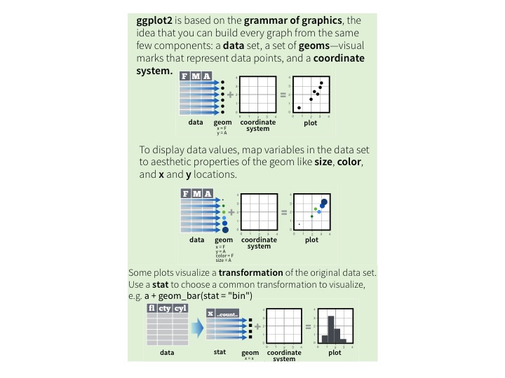
The above is adapted from RStudio’s (terrific) ggplot2 cheat sheet, which in turn is based principles from Wickham 2010, A Layered Grammar of Graphics. (If you haven’t read it, it is well worth the time, even if you’re an experienced ggploter).
This grammar defines what we need to explain how a plot is organized and arranged. When you follow the grammar of graphics, the syntax of the code involves only important decisions- choices that directly impact a user’s interpretation of the data.

Could you imagine a shorter version of this code for making the by-gene plot? (Not by, say, making function names shorter: I mean a version with fewer symbolic tokens). Not particularly.4 This is a compact encoding of the rules for creating this graph from this data. Viewed that way, the base plot code is a decompressed version: it’s an attempt at fulfilling this specification.
The difference comes down to this:
- Base plotting is imperative, it’s about what you do. You set up your
layout(), then you go to the first gene. You add the points for that gene along with a title. Then you fit and plot a best-fit-line for the first nutrient, then the second nutrient, and so on. Then you go on to the next plot. After 20 of those, you end with a legend. - ggplot2 plotting is declarative, it’s about what your graph is. The graph has
ratemapped to the x-axis,expressionmapped to the y, andnutrientmapped to the color. The graph displays both points and best-fit lines for each gene. And it’s faceted into one-plot-per-gene, with a gene described by its systematic ID and common name.
Once you have the latter description, the idea of writing loops, if statements, grid statements, and so on is superfluous. It’s not giving you more control over the graph, it’s giving you busywork.
Conclusion: Challenge me
Jeff makes the claim, in this post and elsewhere, that ggplot2 is restrictive: that there is some superset of graphs that cannot be expressed in ggplot2 but can in base plotting. I’m skeptical of this, simply because I’ve been looking for such a graph in several years of professional ggplot2 use and it’s pretty rare to run into one.5 I have, however, found a rather extraordinary range of things you can express in them. For instance, consider this gganimation:
This animation has a lot going on. But it fits naturally into a ggplot2 + gganimate call (check out the code!). Jeff credits ggplot2 for its animation package (thanks Jeff!) but doesn’t consider why it’s so easy to extend ggplot2 with animation (just a frame = argument), while an equally concise version in base plotting (adding a frame argument to plot, boxplot, points, etc) would be basically impossible.6 It’s because once you think of a graph as mapping data to aesthetics, rather than a set of separate tools applied in sequence, adding an additional aesthetic- that of time- is straightforward.
But it’s impossible to prove a negative- I can’t say “you can make some complicated plots, so there’s no plots you can’t make”. So I’ll ask Jeff and others who consider ggplot2 overly restrictive. What are examples of plots that are more difficult in ggplot2 than in base?
I’ve already made the concession of clustered heatmaps, and I’m sure there are other types I’m willing to concede. But I suspect a lot of plots are much easier than he thinks. For instance, Jeff links to this plot as one that requires “quite a bit of work” in ggplot2, and I’m not sure why. If he could find the raw data for that plot, I’d be happy to try it.
So what do you say?
-
For production-ready heatmaps cases I’ll typically use
heatmap.2from gplots instead, but that is built on base plotting as well. ↩ -
A base R user may bring up the
matplotfunction, which is sort of a special case for such plots, but that function causes more problems than it solves. Among other issues, its input format, a matrix with one column per group, is inconsistent with almost all other plotting functions in base or ggplot2. And as soon as you want to add (say) a smoothing curve, you’re going to start fiddling with loops andapplys or just reshaping your data into a tidy form anyway. ↩ -
I am a bit puzzled by Jeff’s accusation that “without [the ggthemes package] for some specific plot, it would require more coding.” Well, yes, that’s why it’s nice that the package exists! ↩
-
You could have replaced the first two lines with
qplot(rate, expression, color = nutrient, data = top_data, geom = "point"), but that encodes exactly the same information while saving just a few characters. One other way it could have been appreciably more compact: if the defaults formethod,se, andscaleshad been closer to our choices. Of these, I think there's a case to be made thatgeom_smooth'sseargument should have been false by default.ggplot2` is far from perfect! ↩ -
Except two y axes on the same plot! That is absolutely impossible in ggplot2. But I agree with Hadley that they’re a bad idea anyway. ↩
-
In fact, the animation package by Yihui Xie works equally well with either base plotting or ggplot2, and gganimate uses the package to create its own animations. But there’s a reason Jeff appreciates gganimate’s approach: you’re getting rid of an extra step of programming loops and logic, just as ggplot2 does with faceting, grouped lines, and so on. ↩