Session given in the 2nd Front-end Egypt meetup on 26th of November 2016. Discussing the common methodologies followed to write CSS that can easily be maintained and scame without troubles.
years ago using Netscape Composer. • Converted a lot of designs, PSDs, Origamis to HTML/CSS/JS. • Worked with different sized companies and organizations as a front- end developer, a trainer and a consultant. • Currently work as head of software development and front-end developer at robusta. • When I am not fixing bugs or building web applications; I spend time trying to be a good parent.
started with. • One of the goals author had in mind while making CSS was backward compatibility. That meant when a parser encounter a rule it do not understand; it would simply skip that declaration and move on to the next. Unlike other languages which will throw exceptions and exit the program. • The problem with CSS is that it becomes hard to work with at any reasonable scale because picking class name is surprisingly extremely difficult.
matched against everything in the DOM. We need naming strategies to combat against this and keep things efficient (which are hard to enforce and easy to break). • It’s highly dependent on Source order. What an inexperienced developer can write at the end of the document can override and break rules written before it. • CSS grows over time. Smart people on great teams cede to the fact that they are afraid of their own CSS. You can't just delete things as it's so hard to know if it's absolutely safe to do that. So, they don't, they only add.
authors to get browsers out of the equation. We began to see this popular pattern emerging. • It began in 2004 when Tantek Celik wrote a blog about a CSS snippet he's been using called undohtml.css (http://tantek.com/log/2004/09. html#d06t2354) It was a pretty light reset by today's standards.
resets emerged, the global YUI reset and Eric Meyer's reset. • Eric continued working on his reset year after year till 2009 then he decided to stop. • In 2011 Nicolas Gallagher and Jonathan Neal started working on Normalize.css It wasn't trying to remove the browser style instead it was trying to make all browsers have the same underlying defaults. It made it lighter and made it put far less coding on the frameworks and as a result it is nearly included on almost every open source project today.
A Touch of Class (http://tantek.com/log/2002/12.html#L20021216). His article recommended a few practices to write what he called "Good CSS". He suggested a few things like ₋ using semantic HTML. ₋ using context before classes. ₋ using structural class names over presentational class names like sidebar instead of right-bar and error instead of redtext. ₋ lowercase class names.
CSS conference. A naming convention that means (Block, Element & Modifier). It looks bizarre and ugly at the beginning but it's the basis for building a great, solid and scalable CSS. • BEM consists of: - Block is the root class like a tweet - Elements are the elements inside a block ... The pieces that construct that block. Like (tweet author, tweet text, tweet buttons) ... It consists of the block class name in addition to __ - Modifier can be added to a block or element and is meant to provide alternative states for the element (like promoted tweets) and they consist of the block/element name in addition to --
difficult problem with CSS; naming. • Gives you context for what this selector is used for. BEM unambiguously defines which CSS belongs to a piece of interface and so using it gives answers to questions "Can I remove this piece of code?”. • Provide self documented code. • Promote modularity and reusability. • Provide common terminologies between developers. • Eliminate subtree matches
modifiers corresponding to what they have in CSS? .block__element--border-bottom-5px Naming the modifiers corresponding to their CSS representation is not recommended. Indeed it looks not very nice but there are also practical reasons against it. Lately then the view of your components is changed, you will need to fix not only CSS but also the selectors.
name for an element inside another element? .block__el1__el2? According to BEM method, block structure should be flattened; you do not need to reflect nested DOM structure of the block. So, the class names for this case would be: .block {} .block__elem1 {} .block__elem2 {} .block__elem3 {}
problem. BEM challenges the cascade by forcing the authors (us) to be incredibly mindful when it comes to naming limiting the wrong number of CSS classes through block namespaces and establishing relationships between blocks and elements rather than writing generic complex names.
calling OOCSS. Nichole was saying that CSS authors where trying to protect themselves from the cascade by sandboxing their styles using ID driven modules. Nicole encouraged people to start writing low level reusable components. • Nichole explained on her post how she saved hundreds of lines of code by the module component. (http://www.stubbornella.org/content/2010/06/25/ the-media-object-saves-hundreds-of-lines-of-code/)
about CSS architecture introduced a project he was working on called SMACSS (Scalable and Modular Architecture for CSS) SMACSS is all about categorization: 1. Base -> Basic style for the elements (like links, paragraphs, headers) 2. Layout -> For the components that divide the page into sections and they have the (l-) prefix 3. Module -> Components on the webpage and they have no prefixes 4. State -> (is-) prefixed classes like (is-open, is-active) when a module is in a particular state. 5. Theme -> for other different styles that cannot really fit within the previous categories.
writing component- based UI development. Nicolas Gallagher was trying to combine all these efforts by using BEM and state/utility prefixes (is- and u-) like SMACSS!
a group of thoughts for writing a sane, scalable and managed architecture. It is compatible with CSS methodologies like BEM, SMACSS or OOCSS. The key principles of ITCSS is that it separates your CSS codebase to several sections (called layers), which take form of the inverted triangle
definitions, etc. • Tools – globally used mixins and functions. It’s important not to output any CSS in the first 2 layers. • Generic – reset and/or normalize styles, box-sizing definition, etc. This is the first layer which generates actual CSS. • Elements – styling for bare HTML elements (like H1, A, etc.). These come with default styling from the browser so we can redefine them here. • Objects – class-based selectors which define undecorated design patterns, for example media object known from OOCSS • Components – specific UI components. This is where majority of our work takes place and our UI components are often composed of Objects and Components • Trumps – utilities and helper classes with ability to override anything which goes before in the triangle, eg. hide helper class
you need them. No preprocessors? Remove the first two layers Want to add a testing layer? Add it before the Trumps • No longer have to worry about the end of the file. • Things never get more complicated, only bigger. • The specificity graph keep going upward.
class names. Example: .side-bar over .right-bar • Avoid using ID selectors. • Avoid nesting too deep. Example: .article > p:first-child > a + span[lang=“en”]
CSS feature will prevent you from writing redundant unnecessary code like: 1. applying display block or width 100% to a block element. 2. setting an element position to absolute value or floating it automatically shift its display to become a block. You don’t need to declare that it is a block again. 3. inline elements are not affected by width and height values. You shouldn’t apply width or height to an inline element. 4. vertical margins have no effect except on absolutely positioned elements and items inside a flex container.
to your stylesheet. Examples: 1. jQuery UI 2. Libraries that lack the flexibility to define your mark up for the elements (e.g. sliders, tabs … etc). 3. Libraries with poorly written CSS. You should check its stylesheet and be picky. • When using a framework, make sure that you are not including something it already include (like a reset). • Use only the parts of the frameworks that you need. Don’t include additional 100KB file just because you need a tooltip. • Use SVG or icon fonts for icons. They are super simple to style.
Flexbox to achieve layout enhancements instead of manually adding specific markup or magic numbers here an there. Don’t waste your time on old browsers
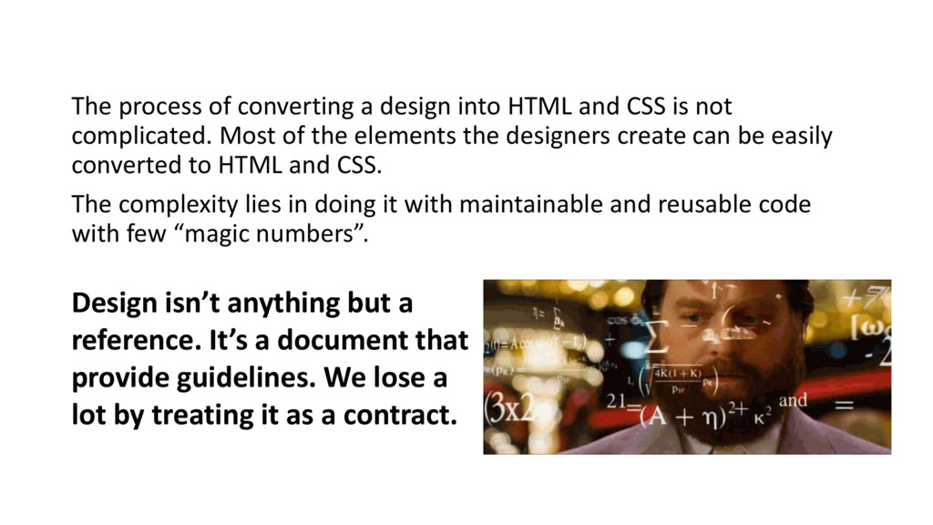
is not complicated. Most of the elements the designers create can be easily converted to HTML and CSS. The complexity lies in doing it with maintainable and reusable code with few “magic numbers”. Design isn’t anything but a reference. It’s a document that provide guidelines. We lose a lot by treating it as a contract.
fights between graphic designers and user interface developers. They both hate each other instead of working together. Your job as a user interface or front-end developer is to help the graphic designer understand why adding this particular component with shadows is bad for maintainability and the graphic designer job is to listen to you and help you find a less complicated solution.
are no significant differences between 11px and 12px; pick one. The numbers go higher for padding and margin. There aren’t significant difference between 18px, 20px and 22px on padding.
colors and the dimensions of the elements you are using. “Can we make *this* button bigger”? It’s a common question we get everyday. It isn’t technically difficult. But it would require me to add one class just to satisfy this request. Why? Is it really worth it?
 ahmad
ahmad
 linew_official
 pyama86
 kasacchiful
 jaguar_imo
.JPG) ymd65536
ymd65536
 konifar
 fsubal
 bkuhlmann
 nekowen
 hinakko2
 gunnarmorling
 faithandbrave
 myddelton
 tammielis
 trishagee
 jponch
 lara
lara
 sferik
 schacon
 productmarketing
 morganepeng
 addyosmani
 bermonpainter
 eileencodes
![Thank you! ahmadalfy [email protected]](https://files.speakerdeck.com/presentations/22af337aa00b465eb5074ce2b28ad9b4/slide_88.jpg)