
Scaling design within an application is a struggle. Design systems help alleviate problems that arise with scaling by making it easier to find inconsistent interactions or conflicting messaging. However, it can be extremely difficult to introduce a new system to teams that are already functioning without one. Here's how we got started.
We took the initial step towards establishing our own system by creating a pattern library of reusable components that can be shared and reused across the application.
Design as a language
Consistency within the UI and increased iteration speed are clear benefits for using a design library. This helps keep the application DRY and allows designers to focus their efforts on solving user needs, rather than recreating elements and reinventing solutions. In an effort to create a library that is understood by multiple teams, it's important to begin thinking about design as a language.
Your design language is an integral part of a design system that clearly defines the semantics of your visual designs and allows your team to thoroughly document guidelines. It's important that the team not only understands how the system is built, but also the reasoning behind the choices made. This will ultimately help enable your team to build a library of components that support the semantics you have established.
Getting started
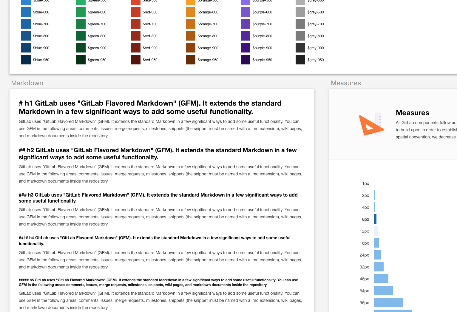
Knowing where to start can be daunting. We began by first understanding the current state of our application. By auditing current designs that were implemented, we found numerous inconsistencies across our interface and determined that we lacked a solid design language to build from. A search within our variables revealed that we had 82 different gray values defined within the UI. We also had an undefined type scale that included at least 30 different values in pixels, rems, and percentages.
By understanding the problems our current system had, we were able to start building a solid foundation to work from. We defined and documented our perceptual patterns which included styles that aid in the aesthetic of the brand: typography, icons, colors, and a measurement system.
{: .text-center}
Once our perceptual patterns were defined, we started applying them to our components. We took a couple core pieces of our application and mocked them up using our new guidelines to ensure that our new rules were not too rigid and would be flexible enough to still encourage the creation of new ideas and methods while designing new components.
Once we nailed down our styles, we were able to start identifying functional patterns that needed to be built out using our new guidelines. Functional patterns include global modules that can be reused throughout your application, such as buttons, dropdowns, and tabs.
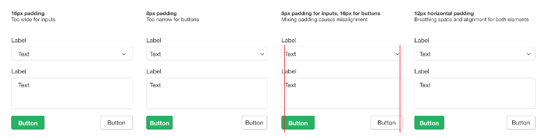
There were a few instances where our newly defined styles did not work well in our actual designs. For example, we determined that our 8px measurement system was too strict for right and left padding on horizontal tabs, buttons, and inputs. Although it was not a part of our measurement system, we decided as a team to create a new rule that would allow for a 12px measure in order better align stacked items while giving elements enough room to breathe.
{: .text-center}
Building out these components gave us the opportunity to alter and add to our new perceptual patterns. It is okay to allow some flexibility within your design library, so long as the rules and use cases are clearly defined.
Structure
We set up our design library using a primary sketch file that includes all the components and styles that have been added to our team library. As we began building out multiple components, it was important to define a structure that would mimic the way components are implemented on the frontend. This would allow the design and frontend teams to work more closely together, ensuring that components were DRY and reusable. We chose to implement Brad Frost's Atomic Design principles in order to accomplish this. Atomic design "break[s] entire interfaces down into fundamental building blocks," ensuring that everything is constructed in a methodical way. These building blocks consist of:
Atoms: Elements that cannot be broken down further. This can include type styles, buttons, labels, and inputs
Molecules: A group of atoms that function as a unit, such as a form.
Organisms: A high-level component that consists of several molecules to make up its own structure. This can include a header or a sidebar.
There has been a lot written on Atomic Design. To learn more I recommend:
Following this structure forces the team to think carefully about what each part of a design is made up of, as well as easily define global components. If a modifier consists of atoms that are not used elsewhere, we encourage designers to think about whether a specific atom is necessary for that paradigm or if an existing global component would work in its place.
In the following example, we've built out our left navigational sidebar. This organism comprises molecules, and these molecules comprise globally used atoms (an avatar, badge, typography, and icons). We also include molecule modifiers, which make it easy to see the different states that a molecule can have. These together build the basis of the sidebar.
{: .text-center}
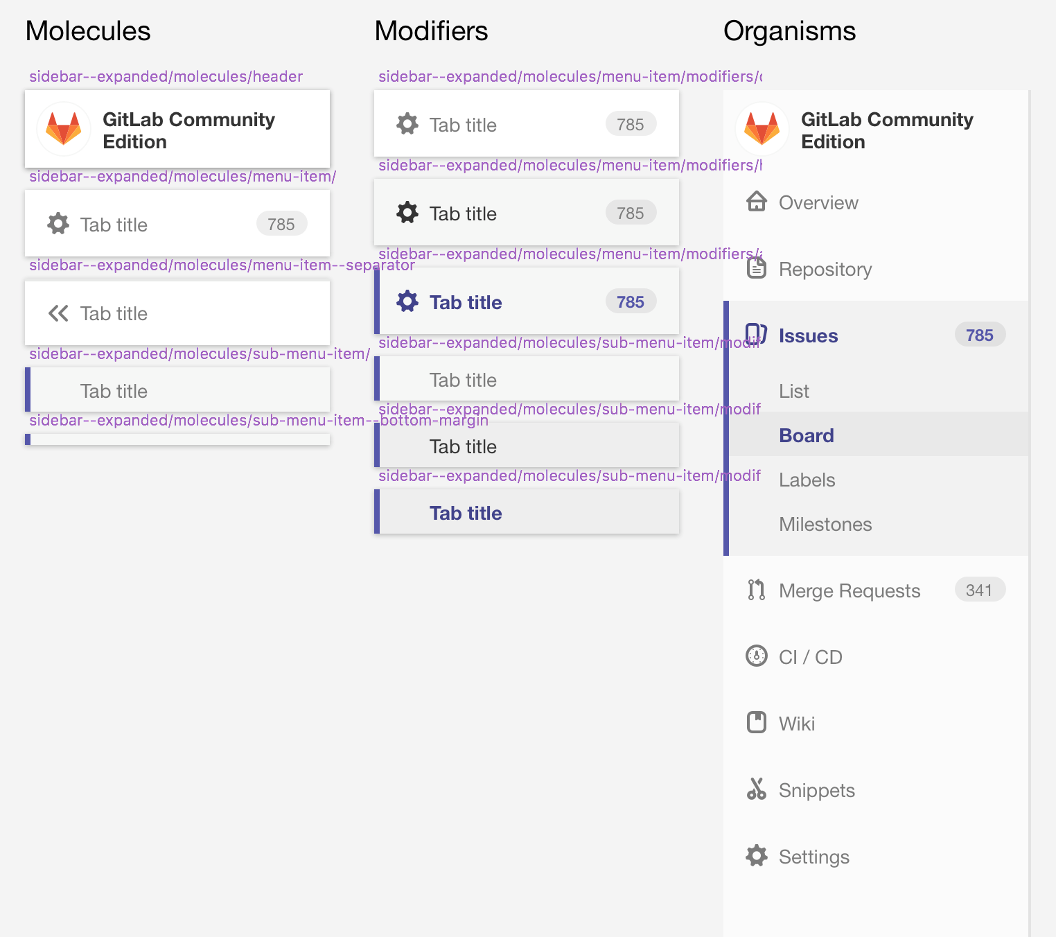
We use symbols within Sketch to create our atoms and molecules, while leaving organisms as groups so that we can easily modify and override specific aspects to fit the design we are working on.
Tooling
Choosing tools can be an arduous task, especially with the number of options available for designers today. It is easy to get caught up in the latest tool and turn progress into tool churn. At GitLab, we took the time to evaluate multiple tools that would assist in the creation of a team library.
Some of the issues we ran into while evaluating plugins were:
- Slow performance, as well as bugs, when adding, changing, and renaming components
- Overriding options when adding symbols to a new document were not pulled in or included automatically
- Text styles weren't being saved or included in symbols that were pulled into a new document
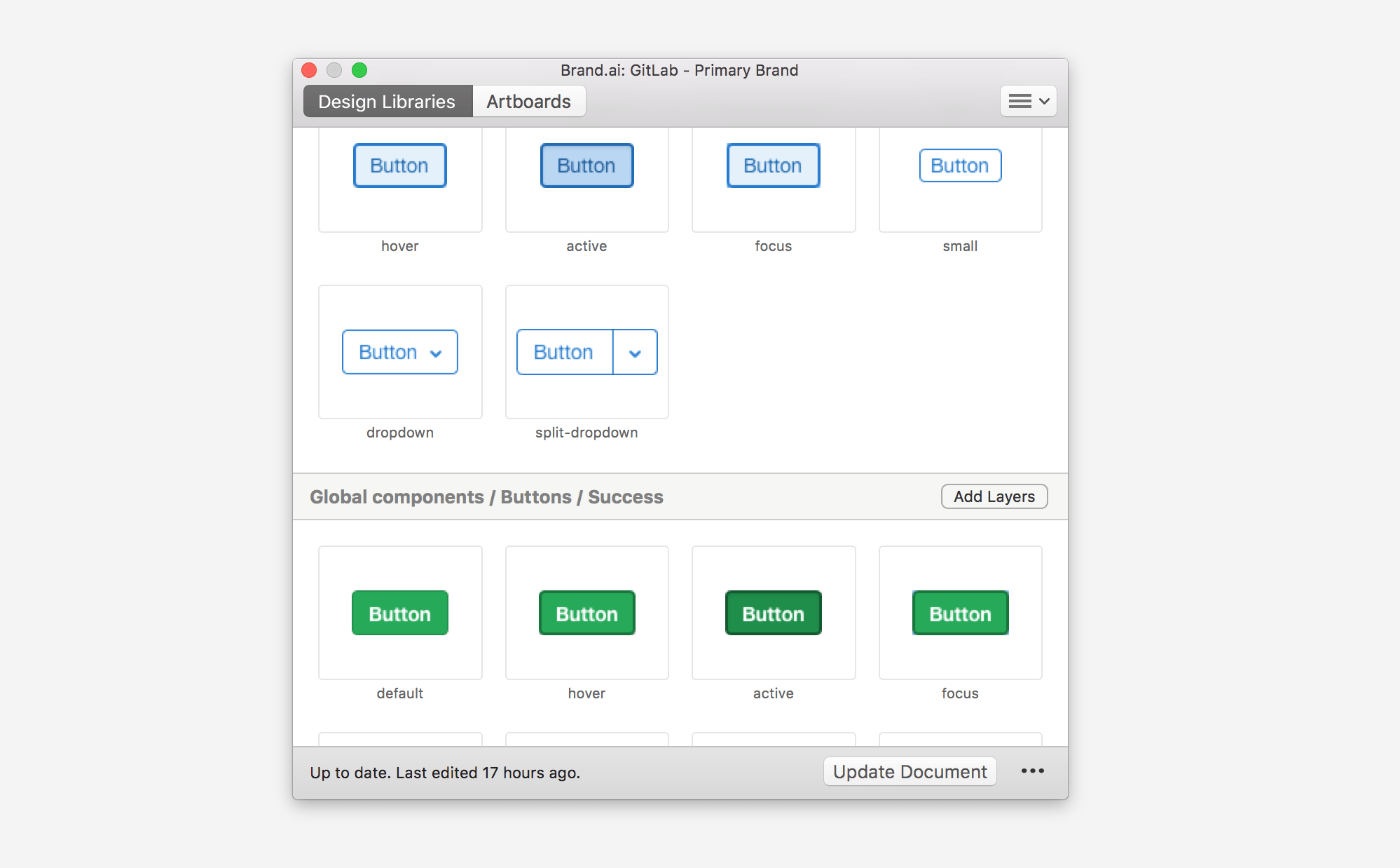
We eventually decided to move forward using Brand.ai as a plugin for Sketch. This plugin solved many of the issues we were running into with other tools. However, while this plugin was the best that we found at the time, no tool is perfect:
- Brand. ai limits the organization of components to one level deep
- While faster and less buggy than other plugins, Brand.ai is still not as fast as we would like :rocket:
{: .text-center}
At GitLab, we don't look at Brand.ai as the answer. It is solely a tool to help aid us in the creation process. Since deciding on using Brand.ai, Sketch has released their own library feature, Brand.ai was acquired by InVision, and Figma has added numerous new features to aid in the creation of a design library. Tools are constantly transforming, but it's important to keep in mind that constantly changing tools may slow progress. Evaluate your tools carefully and decide what is best for your team at this moment. Remember that pattern libraries are only one aspect of a design system that helps make it more effective. The tools and technologies you use to create the library are meant to help your team, not act as the solution.
Moving forward
Conversations around design systems have exploded in recent years. Just over the last few months, Figma has begun sponsoring Design System Dinners, InVision has created a Design Systems Handbook, and Smashing Magazine released Design Systems as their newest book.
At GitLab, we have only just begun the work on our design system. A design library is only the first part of our overall goal and it is our first step towards ensuring that our design will scale within the growing organization. We have begun thinking about design with a system in mind by creating a design language that captures the visual styles of our brand, as well as creating reusable and robust components. We've chosen tools and technologies that help aid us in this process while remembering that they are always evolving and are not the system itself.
Beyond continuing to build out new paradigms within our design library, our next step is to begin linking our design library with our frontend code. This will allow us to include not only our designs and documentation, but also code snippets that can be used and referenced in our application. We have only just started this process and are in the very early stages of setting up a repository to showcase our system.
If you have any tips, tricks, or lessons that you discovered while building out your own design library or system, we would love to hear from you!

