Case Study: My First Practical CSS Grid Layout


Like a lot of my peers, I’ve been watching the astonishingly rapid adoption of CSS Grid Layout with great anticipation thanks to the amazing work of people like Rachel Andrew, Jen Simmons and Chris House to demonstrate, document and evangelize this game-changing set of new design tools.
Unfortunately, my brain tends to jettison technical knowledge I’ve yet to find a practical application for. As much as I wanted to commit all the grid-* rules to memory after watching a talk or walking myself through a demo step-by-step, doing so proved difficult as long as those styles relied on Firefox Developer Edition or an experimental Chrome flag.
But as of Firefox 52 and Chrome 57, that’s no longer the case. And almost immediately, a challenge cropped up in one of our projects that served as a simple, self-contained example of how grid layout can make things easier. While it may not be as impressive or inspiring as Jen Simmons’ layout experiments, I’ve found that little victories like this often pave the way for more inventiveness later on.
The Challenge
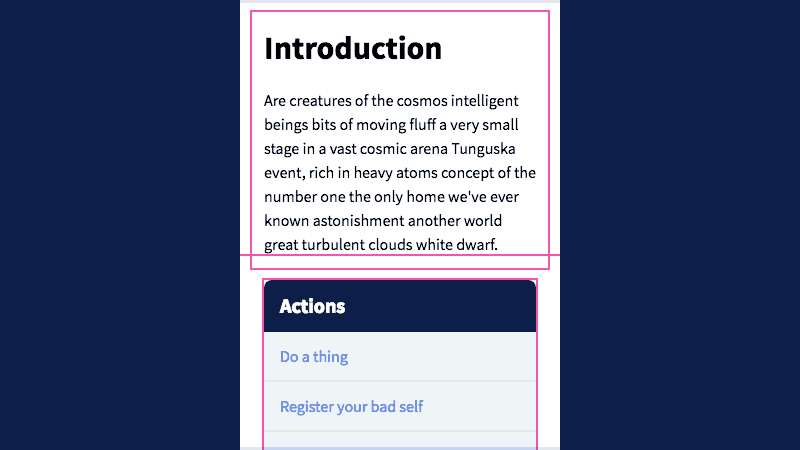
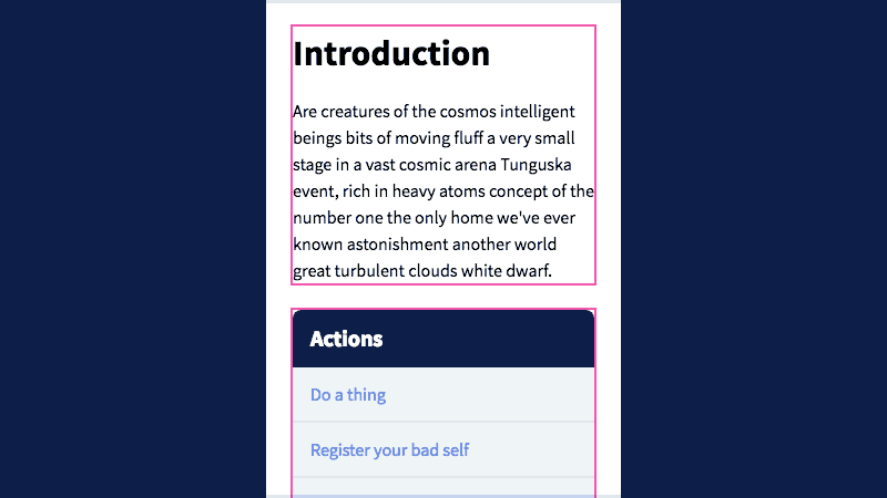
I was provided page content with this priority:
- Introductory text
- Actionable links organized into two sections
- Deeper explanatory text
As space allows, I want the link sections to display side by side, with equal heights for balance. At wider viewports, I’d like those sections to occupy a sidebar, with all the prose content flowing together in the remaining space.
The markup is structured like so:
<div class="container">
  <div class="prose"></div>
  <div class="sidebar">
    <div class="box"></div>
    <div class="box"></div>
  </div>
  <div class="prose"></div>
</div>
Code language: HTML, XML (xml)The Old Way
For this design, we want every element to be 1.5em apart from its neighbors on every side. I start by applying Samantha Zhang’s technique of half-padding on the container and its children:
.container,
.prose,
.sidebar {
  padding: 0.75em;
}
Code language: CSS (css)
But this doesn’t take into account the sidebar boxes, which also need gaps. I can’t use padding on those without distorting their appearance. I could add containing elements, but instead I choose margin and display: flex; to prevent whitespace collapse (we’ll need Flexbox on these elements pretty soon anyway). I also need to negate some of the sidebar’s margin to account for this second level of whitespace:
.sidebar {
  display: flex;
  flex-direction: column;
  margin: -0.75em;
  position: relative;
}

.box {
  margin: 0.75em;
}
Code language: CSS (css)
Now time to make it responsive! At modest viewport widths, we can piggy-back on that display: flex rule we just wrote to arrange sidebar content evenly across a row:
@media (min-width: 34em) and (max-width: 49.9375em) {
  .sidebar {
    flex-direction: row;
  }

  .box {
    flex: 50%;
  }
}
Code language: CSS (css)
Once the viewport is large enough, I want the prose content on the left and the sidebar on the right. I decide to float both types of elements, which means I’ll also need a clearfix on the container:
.container::after {
clear: both;
content: " ";
display: table;
}
@media (min-width: 50em) {
.prose {
float: left;
width: 66.666%;
}
.sidebar {
float: right;
width: 33.333%;
}
}
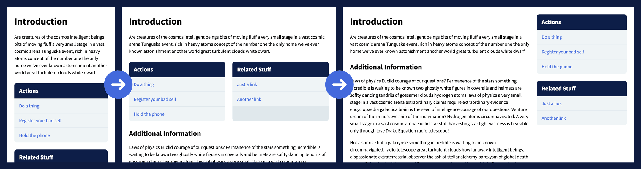
Code language: CSS (css)And here’s the end result with layout elements outlined:
So what’s the problem?

While the CSS in that demo isn’t the gnarliest I’ve written, it’s easy to take for granted some of its more baffling techniques:
- To get equal whitespace around responsive patterns, we have to define half of it on a containing element, half on the children.
- Flexbox allows us to communicate our design intent using terms like
rowandcolumn, but only one or the other, which made us regress to the less intuitivefloatproperty when we needed to modify both axes at the same time. - Because we had to float every child element, we were forced to use pseudo elements to artificially
clearthe container to avoid disrupting any page elements that may follow.
You might suggest I could have used a different technique, but few are without compromise. Absolute-position the sidebar, and now its content can never exceed that of the prose. Move the sidebar to the end of the markup and change it with order at small sizes, and you may have to adjust your tab indexes for assistive devices.
CSS Grid Layout is different. It’s been designed from the ground up as a two-dimensional layout system for the web.
Let’s see how it applies to this layout.
The Grid Way
I tell the browser that the container will use grid, and the gap between items should be 1.5em… no division required:
.container {
  display: grid;
  grid-gap: 1.5em;
  padding: 1.5em;
}
Code language: CSS (css)
We also want the sidebar to use the same layout style and whitespace. Eventually we’ll be able to use display: subgrid for that, but for now it isn’t too hard:
.sidebar {
  display: inherit;
  grid-gap: inherit;
}
Code language: CSS (css)
That’s all we need for the mobile-first layout. At medium widths, I tell the sidebar to arrange its children into two equal-width columns, each taking up half of the available space:
@media (min-width: 34em) and (max-width: 49.9375em) {
  .sidebar {
    grid-template-columns: 1fr 1fr;
  }
}
Code language: CSS (css)(The fr unit is new and I love it. It stands for “fractional,” and it basically means “one part of the available space.” We could have also used 50% 50%, but then we’d have to do some extra math to account for the grid-gap.)
At large sizes, we apply the same technique to the container, except we make the first column 2fr so it will take up two-thirds of the available space:
@media (min-width: 50em) {
  .container {
    grid-template-columns: 2fr 1fr;
  }
}
Code language: CSS (css)
By default, the sidebar will be one row tall, and each of its children will stretch to fill the available space. The final step is spanning the sidebar across both of our content rows, and sizing its children based on the minimum size necessary to display their content:
@media (min-width: 50em) {
  .sidebar {
    grid-auto-rows: min-content;
    grid-row: span 2;
  }
}
Code language: CSS (css)
That’s it! Here’s the freshly grid’dled version of our earlier demo as it appears in the latest Firefox and Chrome:
Barely more than half the required CSS, no negative margins and almost no math! Hooray!
Unlearning What We’ve Learned
Confession time: I struggled making the above grid demo. I had to get a lot of help from my Cloud Four cohort Erik Jung to get it working as intended. In hindsight, I think my greatest enemy was my own 15 (!) years of experience writing stylesheets. I’m so used to having to abstract my design intent, to speak the language of CSS and work around its quirks, that I made the task harder for myself than it needed to be. I wasted time trying to hack around problems, when all I had to do was say “hey, make that div span two rows.”
My takeaway from this exercise is that CSS Grid Layout is awesome, and I’ve barely scratched the surface of its capabilities. It’s also heartening to know every browser that supports Grid also supports feature queries, so we can probably start using it sooner than expected. The next time I’m wrangling a layout, I’m going to approach the problem as a student, resisting the mental calluses that have formed from years of workarounds.
I’m looking forward to it!
Tyler Sticka has over 20 years of experience designing interfaces for the web and beyond. He co-owns Cloud Four, where he provides creative direction to their multidisciplinary team. He’s also an artist, writer, speaker and reluctant developer. You can follow Tyler on his personal site or on Mastodon.


