Willey House Stories Part 11 – Origins of Wright’s Cherokee Red
Steve Sikora | Feb 22, 2019
Every house has stories to tell, particularly if the house was designed by Frank Lloyd Wright. Some stories are familiar. Some are even true. Some, true or not, have been lost to time, while others are yet to be told. Steve Sikora, owner of the Malcom Willey House, continues his exploration of the home and its influence on architecture and society.
All photos by Steve Sikora unless otherwise noted.
Let’s be clear about this. There are many Cherokee reds. The color Frank Lloyd Wright immortalized by name, evolved over time – from a deep, earthy-brown red, to a dusty orange-tinged, clay red. It is judicious to say that Cherokee Red is less a specific hue than it is a quality of color. If I learned anything in my decades as a designer, I know that reproducing color is daunting, to say the least. One must expect an acceptable range of variations. What you see on your screen won’t match what the next person sees on theirs. When applied to ink on paper, accurate color reproduction is an even greater challenge because the CMYK color space in process printing is severely limited. Describing color it seems is hardly easier to do than reproducing it, but here goes. The particular character evident in all of Wright’s Cherokee reds, is that of a scorched, rusty tomato, owing to the fact that the essence of this extraordinary color is a particular earth pigment that constitutes every member of this family of reds.
Red it seems has always been Frank Lloyd Wright’s signature color. His earliest reds were rich, vibrant hues. A brilliant, Chinese red was the color of Wright’s signature square in the title blocks of his drawings, the glazed tiles he assigned to the completed buildings he deemed a total work of art, and the innumerable versions of the Taliesin letterhead. The red painted signature square on the Willey House fireplace armature was drawn directly from the Taliesin letterhead circa in 1934, as specified by Wright.
Many of the iconic associations we make with the second half of Frank Lloyd Wright’s career, coalesced around the period of planning, construction and furnishing of the Willey House, as if these personal affectations, preoccupations and inspirations arose all at once. Publication of Wright’s autobiography, the formation of the Taliesin Fellowship, development of the Usonian house, his ideas on the disappearing city, the advent of winter migrations to Arizona, the founding of Taliesin West, all are nascent topics appearing within in the body of correspondence between Nancy Willey and Taliesin. Notable among these subjects is a color specification for what has come to be known as Cherokee Red. Mr. Wright identifies the color variously over the years, but his fascination starts at Willey, somewhere between the kitchen linoleum, a shingle stain and a post-construction rug plan.
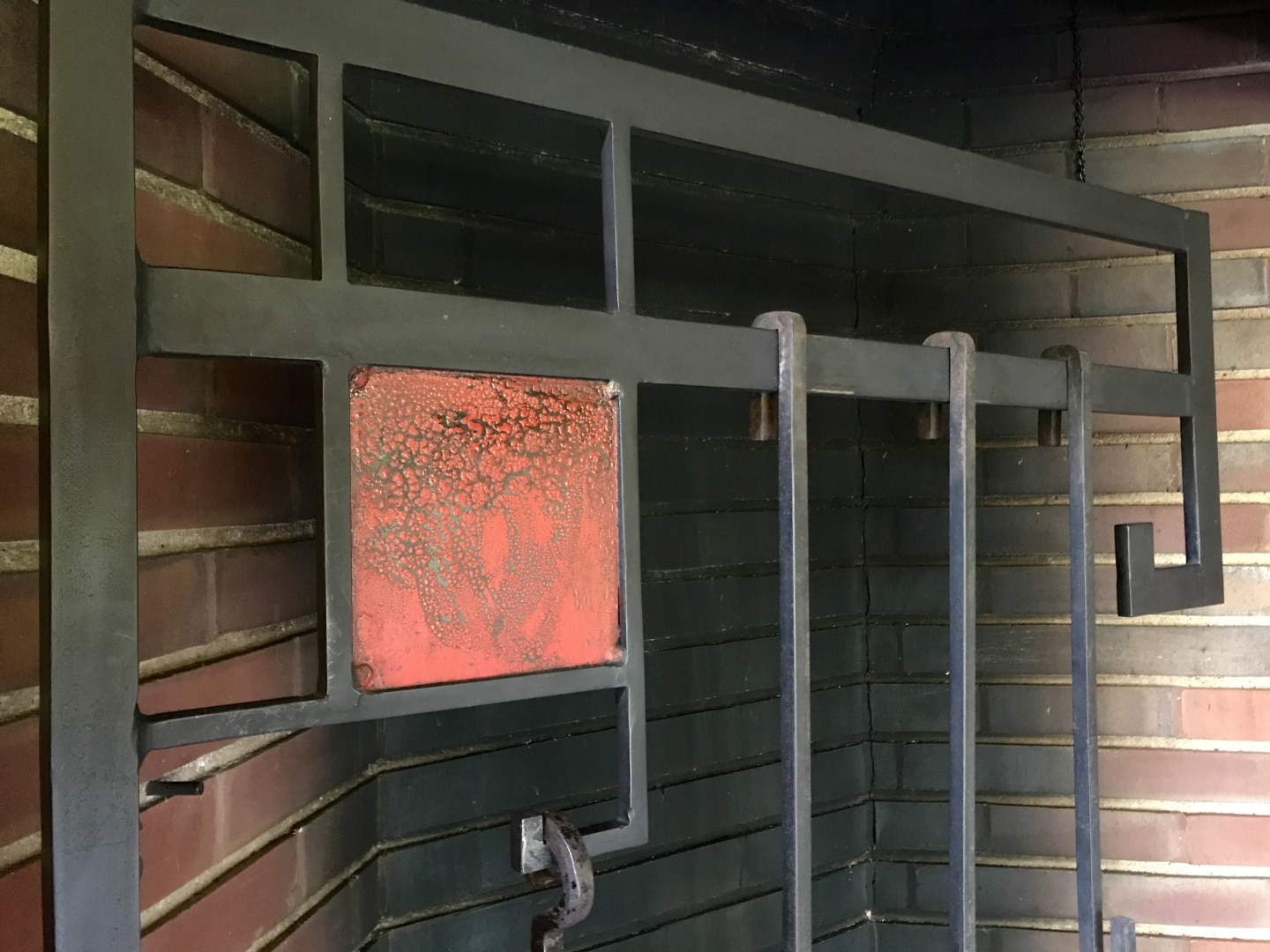
Red signature square on Willey House fireplace crane.
Cherokee Red first appears in a letter from Gene Masselink to Nancy Willey dated February 26, 1936. The Willeys moved into their dream home in November 1934. But plans and specifications continued to roll in over the next several years as Wright’s attention was diverted to bigger and more lucrative commissions, specifically Fallingwater, the Johnson Administration Building, and Wingspread.
Curious about the provenance of Cherokee Red as a specification during Wright’s resurgence, I studied the commissions that immediately followed. I first reached out to Scott Perkins, Director of Preservation at Fallingwater, to investigate how Wright identified the red he used there, and what it was called during the planning and construction period, 1936-37. Even here, the legendary color proves to be a bit hard to pin down. Scott told me “We have three Cherokee Red colors in circulation at Fallingwater, based on what was painted when. In house, we call them out as Venetian Red, Old Red, and Cherokee Red.” As you’d expect they have a custom color standard for each.
But how were these reds referred to during design and construction? A search of the Fallingwater/Taliesin correspondence database for Cherokee Red produces only three references to the color:
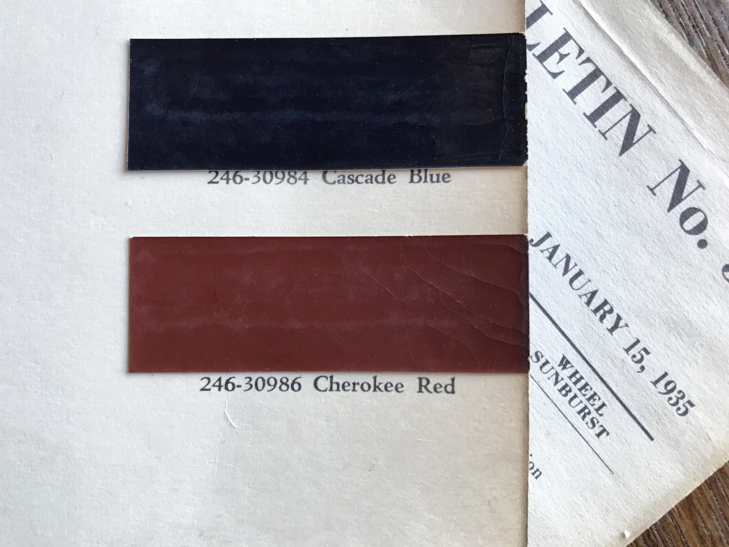
Cherokee Red paint chip from the January 15, 1935 Olds Motor Works Duco paint chart.
October 11, 1936 – In a letter from Edgar Kaufmann to Wright, he mentions the color by name, “The sash comes in ‘shop grey’ – I remember you once said you wanted Cherokee Red – could the information be sent to Hopes at Jamestown N.Y. or to me.”
October 14, 1936 – Gene Masselink wrote to apprentice Edgar Taffel who was supervising the construction of Fallingwater at the time, “Dear Edgar; Mr. Wright has okayed the enclosed drawing and the sash is to be a Cherokee Red.”
March 27, 1937 – From Edgar Taffel to Wright came a note on the application of the color, “Duco (Cherokee Red) will have to be sprayed on as it is impossible to brush. Have tried it.”
Cherokee Red is called out by name in the 1936 building specifications for Fallingwater. The same color reference source Gene Masselink sent to Nancy Willey was cited here as well:
PAINTING
All outside and inside members of all metalwork of windows and putty of same are to have two coats of Duco paint put on with a spray gun – Cherokee Red – in color. Outside doors and their wood frames wherever exposed are to match.
Scott Perkins also shared correspondence from Ken Goldberg, a man who had just seen an article in Old House Journal. He says the article, “implies that a color based on 1990 research has identified the original specification for Cherokee Red.” Cara Armstrong, then Curator of Buildings and Collections, wrote back, “Over the past 60 years there has been a slight shift in colors that Wright specified for Fallingwater. This can be attributed to changes in paint manufacturers and color styles. In 1990, Frank Welsh, a historic paint color consultant, was hired to investigate the original colors of the historic coatings used on the concrete and metal surfaces at Fallingwater.”
She goes on to say, “Cherokee Red, which also has been referred to as dark Venetian red, was said to be Wright’s personal favorite. In fact, most, if not all, of his automobiles were painted the same color. Various sources say that the architect saw Cherokee red as a primal, earth color that paid homage to the Native Americans who made pots out of the red earth of the west.
We believe Wright limited his use of Cherokee Red at Fallingwater to metal sashes, railings, shelves and other ironwork because steel and iron are products of iron ore created through fire. Even the pipes in the basement of the home were painted this color. Although Cherokee Red is found in many Wright buildings, the true color actually varies from location to location, depending on he light, climate and the material on which it is used.” That Cherokee Red was only applied to metal may be true at Fallingwater but certainly not at Taliesin and Taliesin West. But Cara Armstrong’s suggestion that Cherokee Red variations are driven by “light, climate and material” is a fascinating thought. She also alludes to Indian pottery as an inspiration I agree with. However, Native Americans in the desert Southwest rarely had access to red clay. Instead, a red-pigmented slip was applied over white clay pots.
Visiting Fallingwater in person should be on everyone’s list, but if you just want to see their interpretation of the 1936 Cherokee Red (PPG 13-02), it is in the paint palette PPG created of Fallingwater colors. You can find it on the PPG website or at your local Pittsburgh Paint dealer.
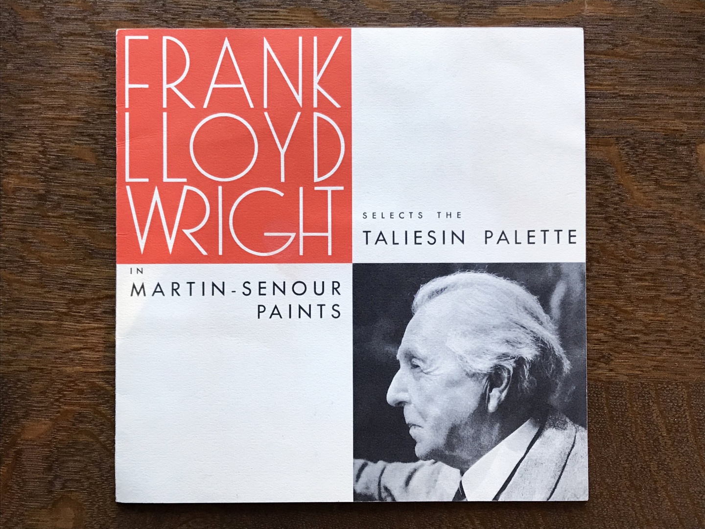
Cover of the 1955 Martin-Senour Taliesin Color Palette.

The original 1955 Martin-Senour Color Palette in folder.
In 2017 PPG revived the Original 1955 Taliesin Color Palette. This palette was first offered by Martin-Senour Paints and promoted by House Beautiful Magazine. The colors were selected to harmonize with product lines created by: Heritage-Henredon furniture, Karastan rugs, Minic accessories, and F. Schumacher & Co. fabrics and wallpapers.
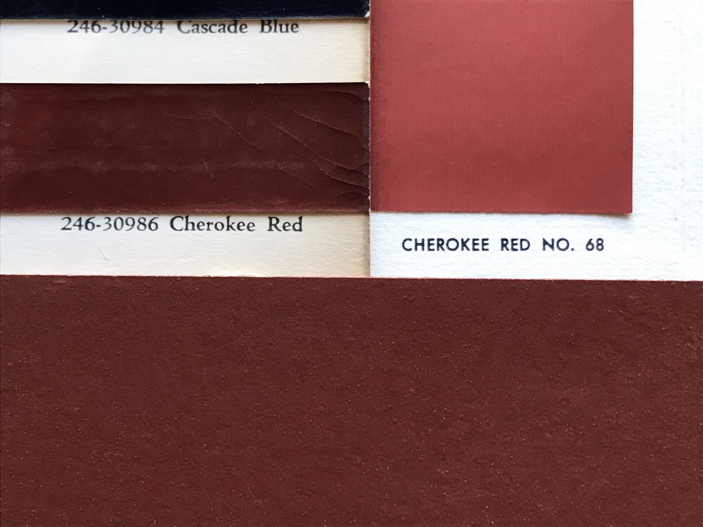 The 1935 Oldsmobile Duco Cherokee Red (left), Cherokee Red from the 1955 Martin-Senour palette (right), Willey House, Uni-Walton linoleum (bottom).
The Original 1955 Taliesin Palette features a later interpretation of Cherokee Red. The 2017 PPG colors use the same names as the 1955 Martin-Senour original. Most colors are excellent matches to the original set with a few exceptions. I’m not sure why some colors digress from the originals. I have a pristine 1955, swatch folder and when viewed side-by-side, certain colors are decidedly aberrant. The Cherokee Red is one of those hues. It is similar in general character but is of a slightly lighter shade. The original appears to be a hair’s breadth redder as well. That said, I suppose any color mix or mass-produced paint swatch is subject to some margin of error.
Circling back to the thesis of this story, PPG also created what they call a Modern 2017 Frank Lloyd WrightTM Palette. It includes a third Cherokee Red. This one is named Cherokee Red (PPG13-02), darker and closer to the original Duco color.
The Modern 2017 Frank Lloyd Wright Palette does not have a promotional folder but the collection can be seen online. The Jacobs 1 house built two years after Willey did not employ Cherokee Red, except perhaps for the red brick, famously repurposed from the Johnson Wax Administration Building. The original concrete mat at Jacobs 1 was not color tinted in its original, as-built state. Though Wright had intended to paint the floor, it somehow never happened. However, after a catastrophic heating zone failure and subsequent floor replacement powdered Colorundum pigment was added to the new concrete mat. Sometime after, owner, Jim Dennis had the good fortune to meet the founder of Lindsey Paint, a Madison paint store. Mr. Lindsey was an old friend of Frank Lloyd Wright and had a record of the formula that Wright planned to use in 1936, which is the red color in evidence today at Jacobs 1. Lindsey had a long history of working with Wright and claimed that he had some 16 different shades of red in is repertoire! If only we could see that palette.
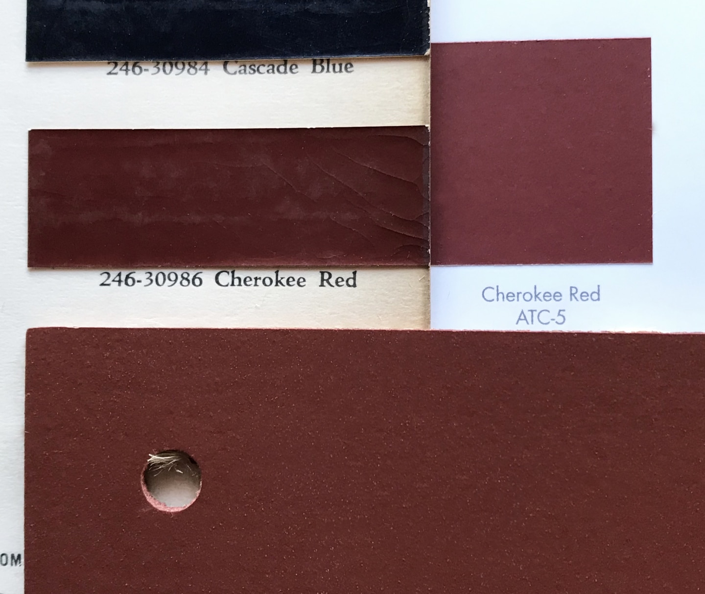
The 1935 Oldsmobile Duco Cherokee Red (left), PPG Cherokee Red ATC-5 from the Fallingwater Palette (right), Willey House, Uni-Walton linoleum (bottom).

Cherokee Red painted metalwork at the Johnson Wax Administration Building, Racine, Wisconsin.
Concurrent with Jacobs 1, the Johnson Wax Campus in Racine, Wisconsin, is viscerally about as Cherokee red as it gets. The residual impression left after a visit there, is that of a warm red-hued, high temple of commerce. Metalwork details, the tubular office furniture, foyer floor, the bases of the dendriform columns and even the bricks seem to be vat-dipped in Cherokee Red. The color is as closely associated with Wright as his porkpie hat, cape and cane. Yet the Jonathan Lipman book on the Johnson Administration Building makes no mention of Cherokee Red by name. The color specification was obviously communicated in correspondence between Taliesin, the client and Steelcase who was coordinating the manufacture of the furniture. The earliest written record I have found appears in a letter from Gene Masselink to Nancy concerning her rug design, dated February 25, 1936.
In it he says “Mr. Wright wants the background to be Cherokee Red, (an Indian red color)” His descriptor, “Indian red” is a clue to its origin. In a subsequent letter he specifies the source Nancy is to provide to the Klearflax Rug Company as a reference.
The evolution of Wright’s proposed reds for the Willey House (not limited to Cherokee Red) can be traced over the course the Willey correspondence, where the color is frequently a topic.
September 20, 1934 – Frank Lloyd Wright mentions a red signature tile, “the block with red-square, lags but will come.” (The signature tile will be addressed in a future story of its own.)
September 21 – A plan for the fireplace crane, featuring an integrated red square was sent by Gene Masselink. On the drawing of the pivoting armature is the label “RED GALVANIZED PLATE” where the signature square appears suspended within the framework.
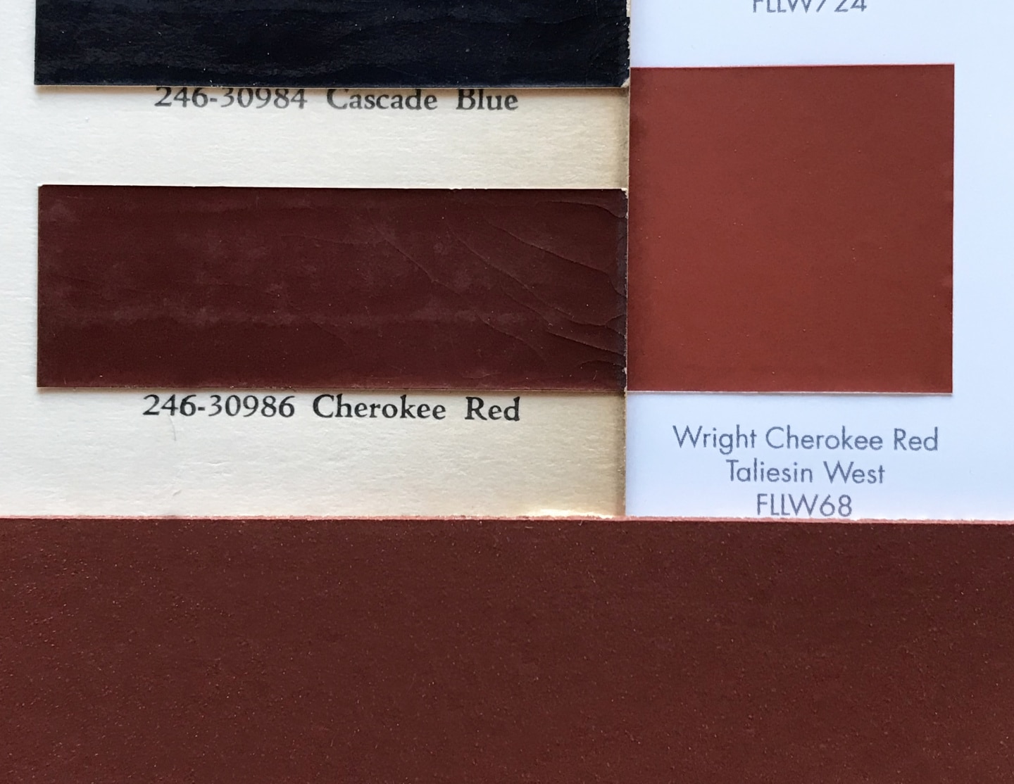
The 1935 Oldsmobile Duco Cherokee Red (left), 2017 PPG Cherokee Red Taliesin West FLLW 68 (right), Willey House, Uni-Walton linoleum (bottom).
September 22 – “Mr. Wright thinks red curtains and red rugs on the inside will harmonize with the red brick, the sumac – and the tawny color of the plaster.” “The enclosed color arrangements are for your assistance in picking out materials for rugs – cushions – curtains – cover for ottomans etc. The colors should all be like these to harmonize. The materials are up to you entirely.” In this letter Masselink included a color palette for the furnishings of the home, which unfortunately, has been lost to time. But Nancy does describe the reds contained in that palette, in a letter the following month.
September 23 – Nancy Willey questions the need for shutters on the gallery windows. “Should they be habitually closed…covering up the adorable brick grill openings?, or habitually open, covering over the brick walls in between the windows…this is impossible, as the space between the windows is not large enuf.” She goes on to ask “When Mr. Wright says ‘edges of shutters painted red’…which edges does he mean?”
September 24 – Masselink responds. “These shutters are set to open – perpendicular in the wall (they open in the middle) – and will make a very pretty effect looking down the corridor. Mr. Wright has the same thing in his living room at Taliesin and thought it would be tremendously effective in your house.” “When Mr. Wright says ‘edges of shutters painted red’…he means ‘ALL edges.’”
September 25 – Plan for the picture rack with painted red squares is sent by Gene Masselink. “Another detail – this time the picture rack for the Living Room.” The drawing of the Cypress easel specifies the color red painted over the end grain of two square profile, front-facing wood brackets. “TO BE PAINTED RED.”
October 6 – A Cabot’s exterior stain color specification was sent to Nancy by Gene Masselink. Some confusion results when a color Mr. Wright suggests for coating the shingles is confused with the trim stain color. “Dear Mrs. Willey: Enclosed the folder with the stain you are to use: THIS MIXTURE: 2/3RDS OF NO. 220 AND 1/3RD OF NO. 343.” Working with consultants from the Samuel Cabot’s Stain Company in the early years of the restoration, Stafford Norris was able to procure conversions from 1934 code numbers to equivalents in the modern color palette. The archaic number 220 was a color corresponding with a Cabot’s color called Tile Red and 343 was identified as a medium gray.
October 11 – Nancy’s reply, “Why in the name of the saints of architecture must you leave out important words like shingles…it’s just a little word, only seven letters…how was I to know the directions applied to shingles…they were not EVER mentioned. – at this point it occurs to me that the card I sent for colors did say shingle stains. I will have to climb down a little bit. It was the merest accident, the only color card I could get. Please put in all the words, especially words like shingles, don’t take anything for granted, for you know I follow his directions even when they seem…odd.” (Handwritten note: “& this was a near tragedy!”) Accidental or not, what it nearly became, was an early red roof by Wright, color matched to the brick. In the test Stafford performed using the formula outlined by Masselink, a combination of rich tile red and a warm grey, resulted in a dusty red. However, it is important to consider, the earliest Cabot stains were translucent shingle stains, not the solid colors we are familiar today, so the warm brown character of cedar would have contributed immensely to the color balance of this formulation. The inclusion of a base color of warm brown cedar shingles would result in something approaching, you guessed it, Cherokee Red. A red brick house with a red roof, was an idea Wright was soon to explore at Wingspread for Herbert Johnson in Racine. Ultimately, Nancy Willey opted not to stain her shingles as one of several cost-saving measures.
October 27 – Nancy asks, “I can have the square in the fireplace irons lacquered red, if I can determine the color now. Do you advise this? Shall I take the red red from your stationery? The reds in the color scheme for the house are either an orange red or a brick red.” She refers to the lost palette and describes the reds included in it. In the same letter she sends linoleum samples. “Here are linoleum samples. Shall I use the red so that the break with the brick won’t be so apparent?”
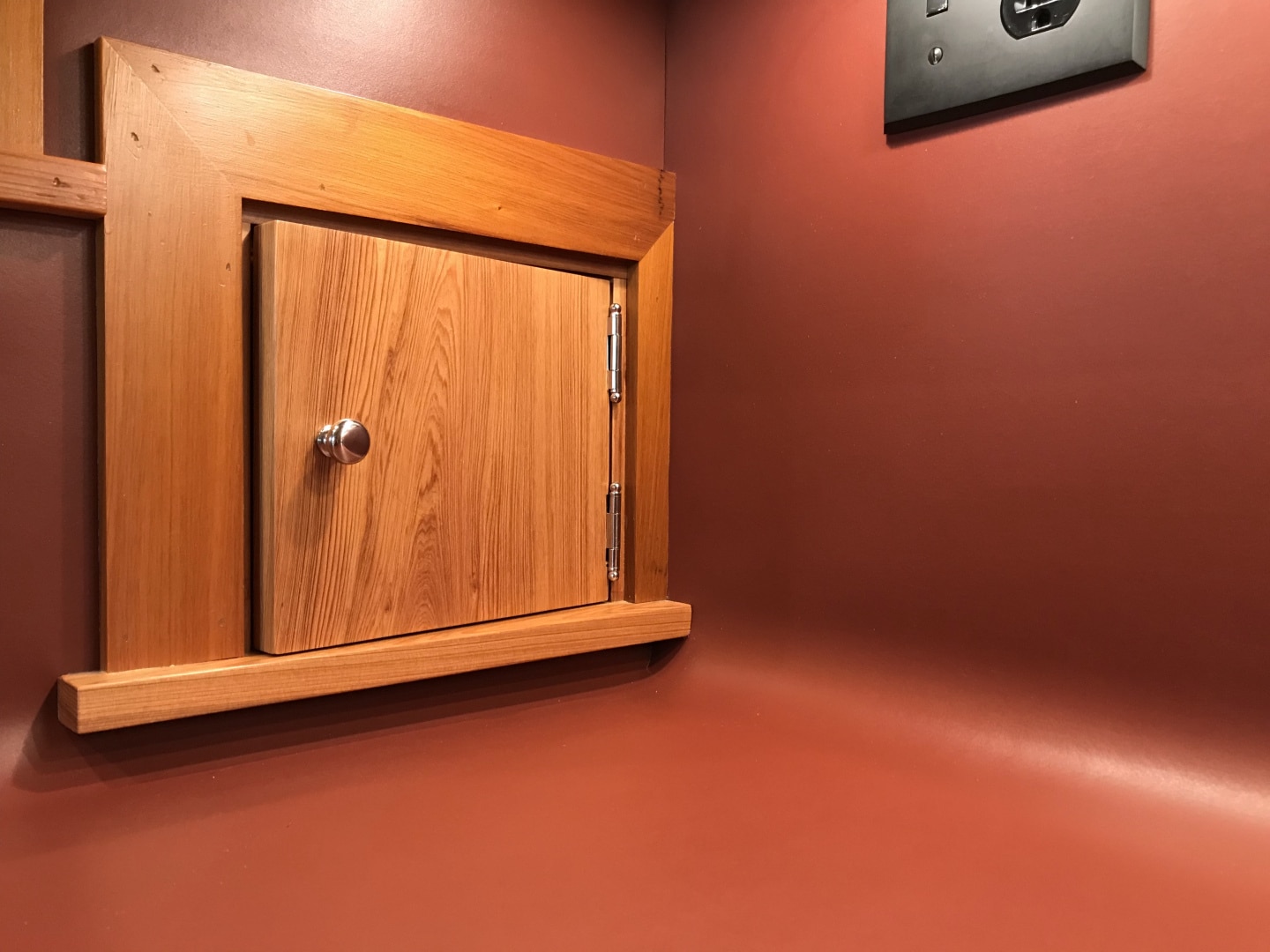
The red Uni-Walton linoleum countertop in the Willey House kitchen.
October 29 – Gene responds with “A red as in the stationery is all right for the square in the fire irons to make a bright spot out of it.” That red is a bright red consistent with Wright’s signature squares. Gene also writes, “Use the red linoleum.” The red linoleum specified was well within spitting distance of Cherokee Red. Linoleum, immensely popular at the time was invented in Great Britain by Frederick Walton in the year 1855. He failed to trademark the name “linoleum” and subsequently it became a generic term for the flooring material just 14 years after its invention. Walton founded the first U.S. manufacturing plant on Staten Island in the year 1872, the American Linoleum Manufacturing Company. The factory closed in 1928, but up until 1930 the factory town was called Linoleumville. In 1887 a competitor arose in Kearny, New Jersey, Michael Nairn & Co, later to be renamed The Congoleum Corporation of America. In 1906, Thomas Armstrong the world’s largest cork supplier, also joined the fray and built a factory in Lancaster, Pennsylvania. We cannot be sure which company produced the linoleum first used at the Willey House. According to Wikipedia, heavy gauge linoleum like that used in the Willey House was known as “battleship linoleum” for its primary use “originally manufactured to meet the specifications of the U.S. Navy for warship deck covering on enclosed decks instead of wood, hence the name.” It was used in most navy warships until the attack on Pearl Harbor, when the material was deemed too flammable. Linoleum is a natural product. It’s what we’d call a “green” material today. It is made from solidified linseed oil (linoxyn), pine rosin, ground cork dust, wood flour (sawdust), calcium carbonate and pigment, laid on a canvas backing. Although a wide color palette and assorted patterns existed in linoleum by the 1930s, Wright’s choice was a solid red – simultaneously noble and earthen. We sourced our linoleum from Armstrong. They distributed a product made by Uni-Walton in Germany. I carried a sample of our linoleum to Fallingwater. It was a good match the red of their kitchen linoleum and was near-identical to the red paint on the metalwork door and window frames throughout the house.
Somewhere between autumn of 1934 and autumn of 1936 Wright became enthralled with a new shade of red. A palette for the furnishings for the Willey House, the color of the linoleum, the formula for the shingle stain all demonstrate a significant new addition to Wright’s palette of reds. The rug design confirms his new direction and he ordains it Cherokee Red.
December 26 – A letter was sent from Edgar Taffel to Nancy. It included plans for two ottoman to be upholstered in red leather. Taffel wrote “Enclosed are the drawings for the ottoman…On the original sketch of the ottoman is a note to you from Mr. Wright.” On the drawing appears a hand-written note that read: “Nancy Willey! We will take ten of these (one large and 10 small) if you can get a good price on them. The material for the covering should be substantial and colorful – we will look at samples. Happy New Year to you and Malcolm – F.L.L.W.”
February 25, 1936 – A rug plan was sent by Gene Masselink from La Hacienda, Chandler, Arizona. “Mr. Wright has decided that the color of your rugs should be a light Cherokee Red” to be made by the Klearflax Linen Looms Company, Duluth, Minnesota, “….Send a sample of the Cherokee Red for approval.”
March 26 – In a note to Wright, Nancy inquires “Will you ask Gene to send a sample of your Cherokee Red. There is no such color in the rug catalogues. (But there soon will be!)”
March 31 – Gene responds to her with “Dear Mrs. Willey: CHEROKEE RED is an “Indian“ Red. It is the color all Taliesin’s Fords are painted. Mr. Wright saw it out on the coast last winter and we finally discovered it as one of Oldsmobile’s standard Duco colors. Mr. Wright says that this should give you the general tone-the value should be lighter. The color of the cars has faded and is more what Mr. Wright means to be used.”
This letter from Gene provides three interesting clues: 1) it states that Wright noticed the color somewhere on the coast (presumably the West Coast) in 1935, 2) that he identified the hue in a Duco automotive paint swatch, and lastly, 3) that he preferred a faded version of the paint swatch color.
I don’t know enough about Wright’s travels in 1935 to understand where on the West Coast business may have taken him. There are no lectures or exhibitions I am aware of, and likewise, no un-built, coastal projects from that time. For the sake of argument, let’s say he encountered the beautiful, abstract art of the Tlingit people who lived in the Pacific Northwest. The Tlingit as well as other Northern tribes, Haida and Tsmshian, shared a common color palette consisting of three colors: black, red with blue, sometimes green. Further to the South, the Salish employed a broadened palette including yellow and white in their artworks. The Northern Coast tribes are known for their strong graphic abstractions of animal and human forms. The outlined subject or formline filled with ovoid shapes, u-forms, l-forms and s-forms to complete the design, is a style unique to this region. Their ornate abstract depictions are applied to wooden artifacts; totem poles, masks, and other carvings. While to the south, California peoples were better known for their extraordinary basketry and beadwork, neither employing earth pigments.
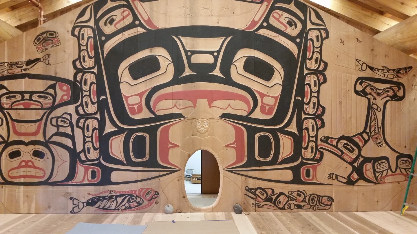
Glacier Bay National Park Hoonah Tlingit Tribal House interior. Credit: Courtesy Wikimedia Commons
Coastal indigenous peoples used locally occurring natural pigments to make their colors. The palette of the Northern tribes used pigments found in regional clays and stone. The pigments were finely ground and mixed with proteins and oils from sources like salmon eggs combined with human spit as a binder for the oils and pigments.
The colors we are concerned with are derived from mineral sources. Their yellow came from yellow ochre clays, red from red ochre clays. The color range of mineral pigments owe their coloration to hydrated ferric (iron) oxides in the clay. Red ochre as it was commonly known, today is usually called red iron oxide. This mineral is responsible for the color character of Cherokee Red. Reds and yellows from iron oxide sources are readily available and widespread. In fact, they were commonly used by almost every culture on earth at one time or another – red ochre probably being the oldest pigment used by Homo sapiens, was even ground for use in cave art. Which brings us back to where Wright was first exposed to the color.
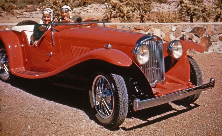
Frank Lloyd Wright and wife Olgivanna, 1948 Taliesin West. The late Cherokee red car is a British 1937 AC Sports Tourer. Credit: The Frank Lloyd Wright Foundation Archives (The Museum of Modern Art | Avery Architectural & Fine Arts Library, Columbia University, New York)
There are Native American influences far more available to Wright than a chance encounter on the West coast. One thing is certain. His interest and eventual obsession with Cherokee Red coincides with the Taliesin Fellowship making their annual winter migrations to the desert Southwest. Wright was most definitely influenced by the graphic forms and abstractions, found in Native American art of the Southwest and was an avid collector. Both of the Taliesins are home to beautiful examples of polychrome pueblo pottery. Historic photos of Wright’s Ocatilla Desert Camp show what appear to be second and third Phase Navajo Chief’s Blankets casually draped on furniture and covering the floor. Taliesin Fellow Curt Bessinger, recounts that the apprentices purchased native arts, “For decorating our tents (or if we were lucky, our rooms), our favorite items were things made by the Indians of the Southwest. The acquisition of these items was made easy not only by the many shops in Phoenix which sold Indian handicrafts, but by the visits to camp of Elmer Shupe, the Indian trader. His visits had the festive air of a market. When he arrived at the camp he would open the rear doors of his panel-body truck and proceed to take out his wares and to spread them on the terrace and steps between Mr. Wright’s office and the drafting room.
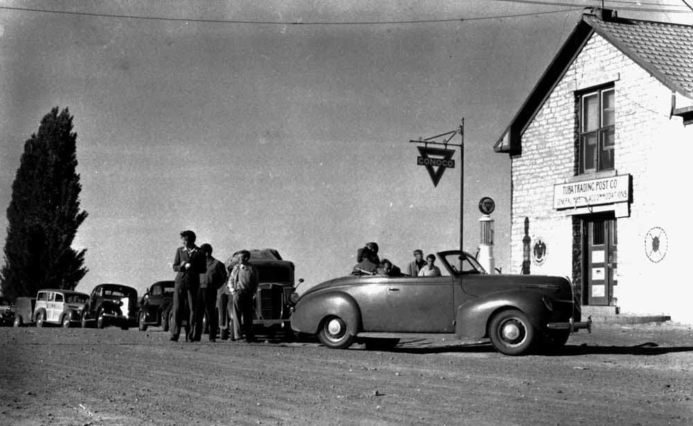 Taliesin Fellowship at Tuba Trading Post enroute to the Desert Camp “Tuba City Trading Post on the Road to Taliesin #50, 1940”. Credit: © Pedro E Guerrero Archives
It was not long before a group would gather to see his rich collection of baskets, blankets, santos, and pawn jewelry made of turquoise and silver. He has an easy familiarity with members of the group, including Mr. and Mrs. Wright, whom he knew and who had bought things from him on previous visits.” In another passage Bessinger wrote about configuring the migration routes in order to visit trading posts. “From there we drove to the Tuba City Trading Post having been introduced to Indian rugs and silver by the shops of Phoenix and by Elmer Shupe’s visit to camp during the winter, we all hoped we might spot some rug or bit of silver that we could afford.”
It is no surprise, that Wright’s interest in Cherokee Red would blossom simultaneous to his seasonal sojourns to the American Southwest, beginning in the winters of 1935 and 1936. There, he found himself immersed in a fairytale landscape of vivid red- orange colorations saturating the peaks, canyons, gorges, mesas, arroyos, cisterns and washes throughout the region. Quite naturally, Wright responded to the American Southwest, as millions of visitors still do. He was captivated with an acute case of “Southwestisme”, an affliction that inevitably sparks a fever for collecting Native American artifacts.
A tragically ironic passion for all things Native American swept the country in the early 1900’s, just as the last of the Indian Nations had succumbed to the pressures of European colonialism. It’s evident in vintage railway and travel posters promoting the great American Southwest and its National Parks. Unabated, it continues to this day. During the 1990’s our design firm worked for a number of department store clients. A retail trend director once told me that Santa Fe was struggling, trying to figure out what to do next, now that “Southwest style” was post peak. I understood what he was talking about in the shallow, retail trend sense, but was astounded to think he might actually believe it. Southwest culture, like its geography, is a rich amalgam of disparate, complimentary and contradictory forces at work. The foundation of the Southwest is a panoply of ancient cultures, languages, belief systems, awe-inspiring ancient architecture, eloquent artworks and handicrafts.
Blended with Mexican, Mestizo influence, itself an amalgam, tainted with the suffering and oppression of the Spanish conquest, and later still, further pain inflicted during the “winning of the west” by the Anglos, pushing ever westward seeking gold, grazing land, religious freedom, and anything else of value that could be laid claim to. A clear historical record of Southwestern culture goes back at least 500 years, but is far more ancient than that. Its underpinnings unaffected by retail trends or the vicissitudes of fashion. It was the beckoning of these authentic and supremely ancient cultural ideals that Wright responded to. And why wouldn’t he? This regional culture is the oldest and truest preserved idea, indigenous to the North American continent. It includes a distinctive palette indicative of its earthy roots. No surprise that Wright would find a color here that attracted him. No surprise it would be a red. Not one derived from the vegetal dyes used in woven rugs and blankets nor the plant materials employed in basketry, but an earth element drawn from the surrounding landscape and used in the polychrome pottery of native peoples, both prehistoric and contemporary.

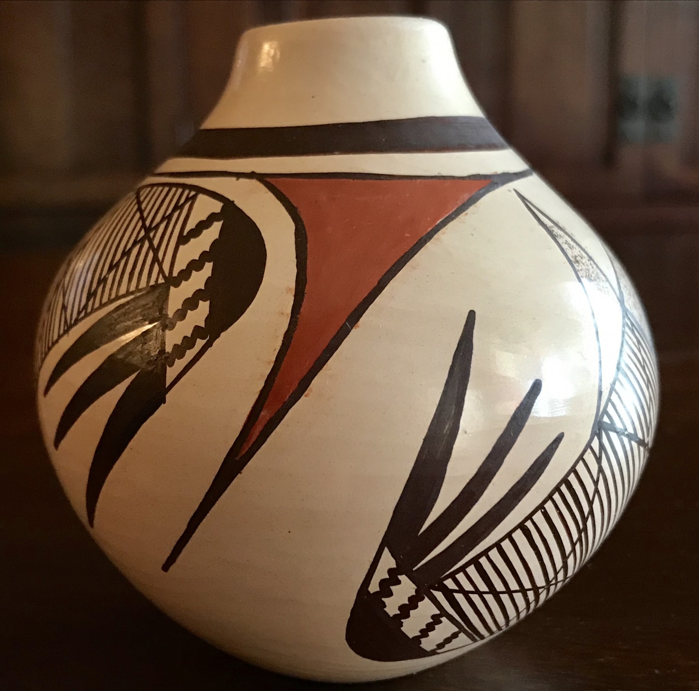
Acoma Pueblo Olla, circa 1940, collection of the author.
Most First Peoples of the American Southwest had strong traditions of weaving, basketry, and pottery. The polychrome pottery of the Southwest employs a simple palette of three colors black, red and white, all mineral colors. The reds, like those of the Pacific Northwestern tribes, are in line with what Wright defined as Cherokee Red and are derived from the same earth pigment source, iron oxide. The pueblos of Acoma, Laguna, Zia, Zuni, Casas Grandes and Santo Domingo all use a simple palette of red, white and black. In many cases “redware” pottery is achieved using a slip of pigmented clay. The red colorant used in polychrome pottery is always derived from yellow or red iron oxide pigments. Hopi pottery tends to have a lighter version of this red, most closely approximating Wright’s later Cherokee Red. Its character is due to the yellow ochre or yellow iron oxide ground together with limonite to achieve their favored hue. So why was this color called Cherokee Red? The Cherokee Nation did not inhabit the great American Southwest, nor the Pacific Northwest. The Pre-Columbian Cherokee were a Middle Mississippian tribal family. Their expansive dominion extended from what is now Kentucky through Tennessee, parts of Virginia, Alabama, and the Carolinas to Georgia.
A modern Hopi Olla in the traditional style, collection of the author.
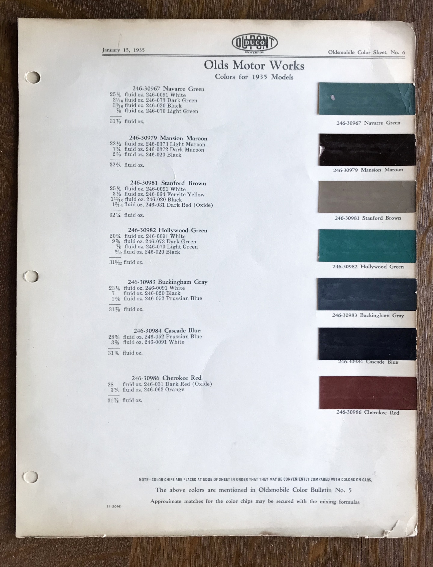
The Olds Motor Works Duco Color Chart for 1935, Oldsmobile Color Bulletin No. 5.
In 1838, the Cherokee were involuntarily relocated from the Southeastern part of the continent on a forced march shamefully known as the “Trail of Tears” to a reservation in the state of Oklahoma. The Cherokee did not have a pottery tradition that boasted elaborate decoration, nor did they make use of their namesake color, Cherokee Red. The name is most definitely attributable to some romantic soul in marketing who formulated the Olds Motor Works Duco color chart for 1935. I located a copy of the chart that Gene Masselink referred Nancy Willey to. Cherokee Red appears alongside a scant palette, of six other somber colors of the Depression era. Presumably, it was not a particularly popular option, because the 1936 Olds color chart fails to include it. This car color never caught on with Oldsmobile buyers but it certainly captivated the attention of Frank Lloyd Wright. Whatever Wright’s original inspiration, the 1935 Olds Motor Works Duco color chart is the authentic source for his initial specification to clients. It seems to me, the remarkable color known as Cherokee Red, is a metaphor for Wright’s organic approach to architecture. He “discovers it” during the Great Depression. A time of soul-searching, that humbled America, as the bottom fell out of the financial system and dreams collapsed. To survive and prosper, Wright was questing to find the deepest and most essential starting point from which to begin anew.
Cherokee Red is literally a color of the earth. It is grounded, simple, and common, but at the same time it is aesthetically beautiful, timeless, and universal. A living contradiction, as is always true in the best of Wright’s work, where a single building can possesses qualities startlingly modern yet undeniably primal.
I had an art professor in college who believed we were all affected by the visual stimuli we were exposed to as infants. Whatever fluffy, avian or angelic forms and colors dangled above our cribs, likely burned themselves into our subconscious minds. His assertion to the class is now borne out as scientific fact, in a recent book Welcome to Your World: How the Built Environment Shapes Our Lives by Sarah Williams Goldhagen. She writes about how the physical environment is central to our autobiographical memories and ultimately our sense of identity. “Our very sense of who we are and have been, are inextricable from our sense of where we have been and are.” Goldhagen says “Recalling an autobiographical memory includes mentally simulating something of the place where it originally occurred.”
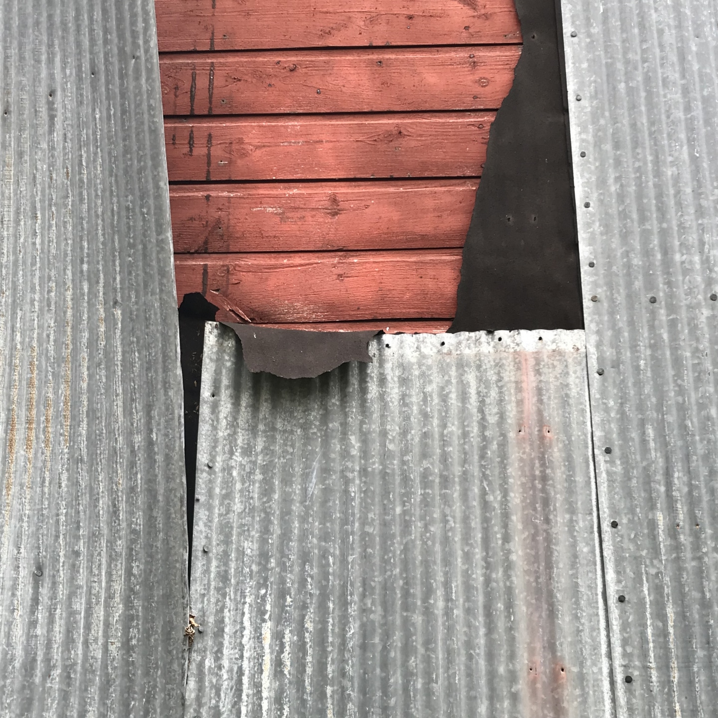
Abandoned Wisconsin barn on the farmstead of the author’s wife’s grandparents’ farmstead outside Grantsburg, Wisconsin. Sheet metal siding peeled away to reveal original barn paint.
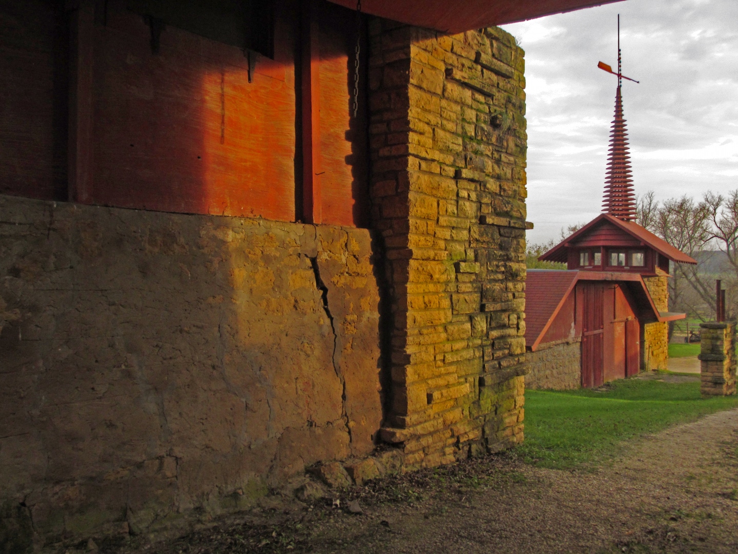
Midway Barn at Taliesin, Spring Green, Wisconsin.
Though Frank Lloyd Wright was nearly 70 years old before “discovering” Cherokee Red, ironically, a hue approaching that color may have been lingering in Wright’s subconscious from his earliest years. His first exposure to what he later called Cherokee Red would have been part and parcel of the experience of visiting the Lloyd Jones’ farmsteads as a child, the simple visceral impression of standing before a Wisconsin barn.
The takeaway is something quite marvelous. Wright makes us see and appreciate a color we may not have noticed before. Like his approach to organic architecture, where mundane building materials are arranged to create spaces of extraordinary beauty, this commonest of earth elements, in pigment form is elevated to an exalted hue. He draws it, literally out of the ground and into the light. Its true beauty is its own simple, organic truth.
READ THE REST OF THE SERIES
Part 1: The Open Plan Kitchen
Part 2: Influencing Vernacular Architecture
Part 3: The Inner City Usonian
Part 4: A Bridge Too Far
Part 5: The Best of Clients
Part 6: Little Triggers
Part 7: Step Right Up
Part 8: A Rug Plan
Part 9: Hucksters, Charlatans, and Petty Criminals
Part 10: Lo on the Horizon