


7 Soothing Spaces: How to Use Color to Create Calm at Home
Started your new year on the wrong foot? Feeling the February blahs? Maybe you need a color fix in your home
Jennifer Ott
February 25, 2016
San Francisco-based architectural color specialist and design writer. Jennifer's work has been featured in many print and online publications. Her recently-published book, "1000 Ideas for Color Schemes," is a beautifully illustrated and easy-to-navigate guide that takes the guesswork out of selecting the perfect color palette for your home or special event. For more information on Jennifer Ott Design, visit http://jenottdesign.com/.
San Francisco-based architectural color specialist and design writer. Jennifer's... More
I’ve spoken with far too many friends who have had a rough start to the year. I say anyone who needs it should get a do-over and begin anew and make it better. One way to ease your way through tough and turbulent times is to create soothing spaces in your home. Specifically, I think bedrooms and bathrooms ought to be made into sanctuaries. That way you start and end your day in a good place. My favorite way to make a quick, cheap and easy change in a room is through the elimination of clutter and then the addition of color. Featured here are seven rooms awash in soothing color, along with paint color palettes inspired by each space.
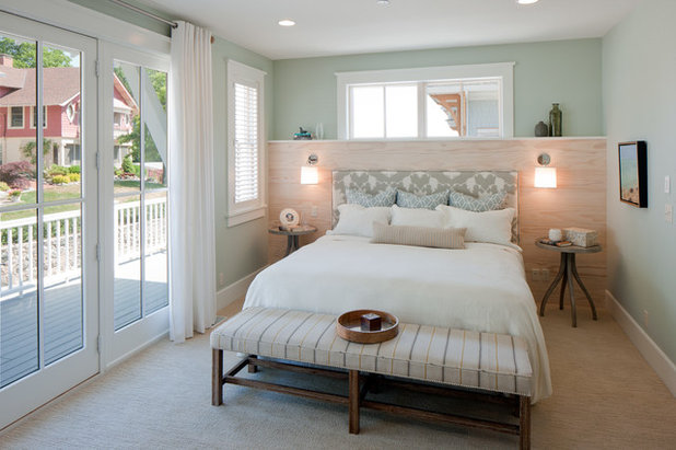
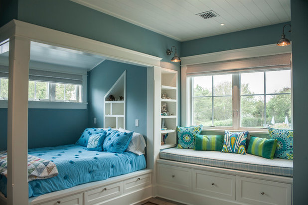
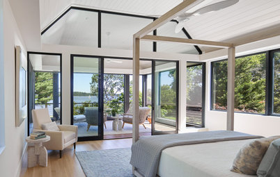
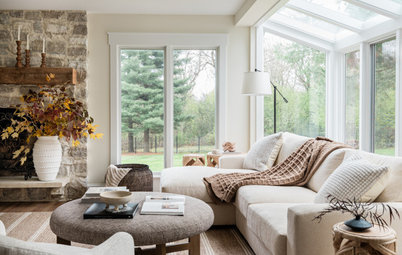
This room showcases a few of my favorite soft and soothing hues for bedrooms: a light sea-glass green, a warm gray and an ethereal blue. Any of these would work well as a main wall color; simply mix in one or more of the other hues for a soft and pleasing punch of color. White linens are clean and classic, but it’s nice to add pillows, art and accessories in colors from the palette. Keep the room free of excessive clutter and you’ll have a stress-zapping bedroom sanctuary.
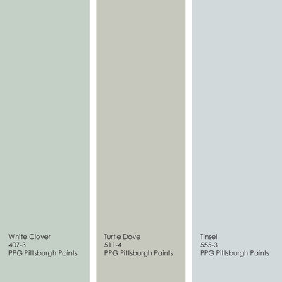
Sample palette: Get a similar look with White Clover, Turtle Dove and Tinsel, all from PPG Pittsburgh Paints.
Sample palette: Get a similar look with White Clover, Turtle Dove and Tinsel, all from PPG Pittsburgh Paints.
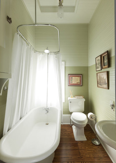
Most bathrooms have one small window, or no windows at all, which can make an already small space feel even more confined. If this is the case in your home, think about using color to lighten things up. I like to select two or three shades of my chosen hue and use the darkest color sparingly, and preferably near the lower areas of the room, then go lighter as I work my way up toward the ceiling. This makes the room feel more open, expansive and light-filled, and can help start the day on a cheerful note.
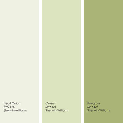
Sample palette: Get a similar look with Pearl Onion, Celery and Ryegrass, all from Sherwin-Williams.
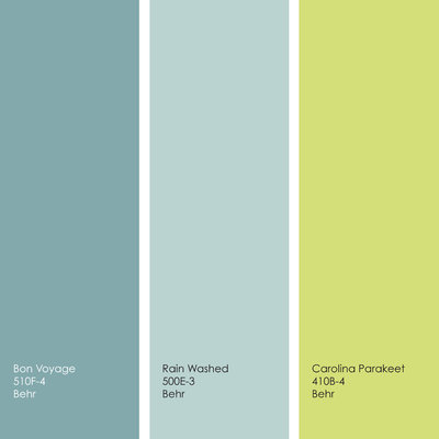
Soothing color need not be limited to light and wispy shades. But if you go with bolder hues, I recommend sticking to those on the cooler side of the color wheel: greens, blues and purples. These cool hues, along with gray shades, have been shown to help lower blood pressure and are associated with rest and relaxation. You can always punch up the palette with a small accent of a warmer hue, such as the shocking yellow-green here, via a painted accent area or art and accessories.
Sample palette: Get a similar look with Bon Voyage, Rain Washed and Carolina Parakeet, all from Behr.
Sample palette: Get a similar look with Bon Voyage, Rain Washed and Carolina Parakeet, all from Behr.
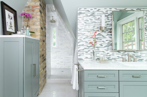
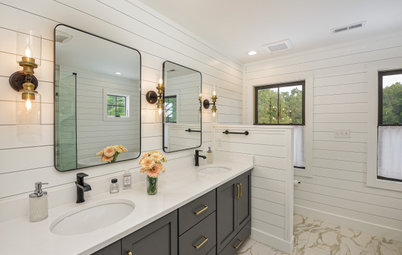
Take the stress out of selecting paint colors for a bathroom by pulling a favorite hue or hues from your tile. The cabinet color here is an excellent selection. Paired with plenty of white, it looks crisp and clean against the brick.
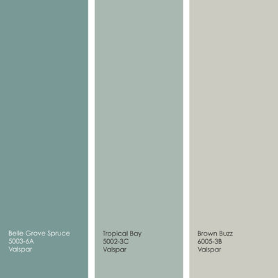
Sample palette: Get a similar look with Belle Grove Spruce, Tropical Bay and Brown Buzz, all from Valspar.
Sample palette: Get a similar look with Belle Grove Spruce, Tropical Bay and Brown Buzz, all from Valspar.
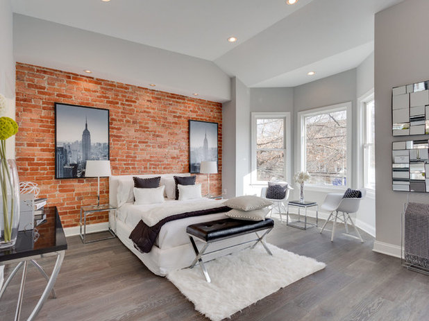
If all these cool color palettes are leaving you cold, here’s an example of a warmer palette that maintains a relaxed vibe. In bedrooms I like to make the headboard wall a focal point by covering it in an interesting material or color. This room features a brick wall, but you can get a similar look with reclaimed wood or, even easier, the right shade of paint. Contrast the hot hues with a soothing wash of light gray on the remaining three walls.
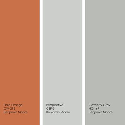
Sample palette: Get a similar look with Hale Orange, Perspective and Coventry Gray, all from Benjamin Moore.
Sample palette: Get a similar look with Hale Orange, Perspective and Coventry Gray, all from Benjamin Moore.
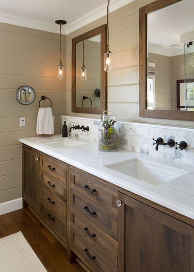
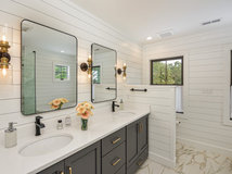
I’ve joked in the past about waging a one-woman battle against beige, but in all seriousness, if you love beige you should absolutely decorate your house in it as you wish, without a care as to what anyone else thinks. For those who want to move beyond beige without straying too far, a medium tan shade can be a great way to get a little more oomph. It’s a bit more dramatic than light beige and looks fantastic with almost any other color — including other brown tones, such as the dark tobacco-stained wood in this bathroom. Keep the ceiling a warm shade of white to lighten and brighten the room.
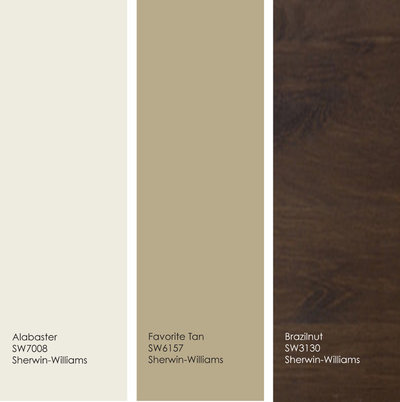
Sample palette: Get a similar look with Alabaster, Favorite Tan and Brazilnut wood stain, all from Sherwin-Williams.
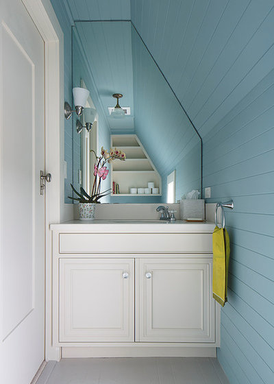
Using color is one of the best ways to highlight interesting architecture. This bathroom is by no means a large, light-filled space, so it might have been tempting to stick to an all-white palette, but then the interesting angles would have been lost. And while this is a fairly bold shade of blue, it has a good amount of gray in it, so it doesn’t feel heavy or overly bright. Mix in other light neutral shades and perhaps a dash or two of color via linens and accessories, as shown here.
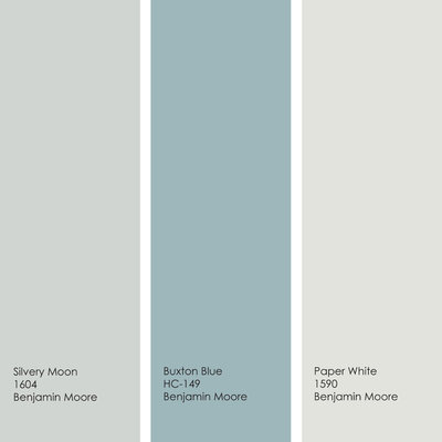
Sample palette: Get a similar look with Silvery Moon, Buxton Blue and Paper White, all from Benjamin Moore.
Tell us: How have you created a sanctuary in your home?
More: How to Add Color if You’re Color Shy
Tell us: How have you created a sanctuary in your home?
More: How to Add Color if You’re Color Shy
We believe that the transition of a house into a home is a sense of history and a piece of the future. It tells... Read More

Related Products


With over 50 years of experience, we take pride in what we do, and we work hard to meet each client's... Read More
Related Stories
Housekeeping
How to Clean Your Windows and Keep Them Streak-Free
Try these tips, tricks and tools to wash your windows so they’re crystal clear
Full Story
Housekeeping
Choose Your Own Spring Cleaning Plan
Instead of trying to do it all, pick one of these six cleaning approaches that’s right for you now
Full Story
Bathroom Workbook
How to Remodel a Bathroom
Create a vision, make a budget, choose your style and materials, hire the right pros and get the project done
Full Story
Monthly Home Checklists
To-Dos: Your April Home Checklist
Kick spring cleaning into high gear, and troubleshoot cooling and irrigation systems for the warmer months ahead
Full Story
Trending Now
The 10 Most Popular Kitchens So Far in 2024
Get inspired by the warm neutral palettes, ample storage and inviting islands in these most-saved new photos on Houzz
Full Story
Kitchen Backsplashes
Where to Start and Stop Your Backsplash
By tidgboutique
Consider these designer tricks to work around cabinets, windows and other features for a finished look in your kitchen
Full Story
Kitchen Workbook
How to Remodel Your Kitchen
Follow these start-to-finish steps to achieve a successful kitchen remodel
Full Story
Decluttering
10 Decluttering Projects You Can Do in 15 Minutes or Less
Try these ideas to get organized at home one small step at a time
Full Story
Decorating Guides
7 Major Decorating Mistakes and How to Avoid Them
By tidgboutique
Gain confidence to start your interior design project with this advice from a professional designer
Full Story
Working With Pros
6 Reasons to Hire a Home Design Professional
Doing a construction project without an architect, a designer or a design-build pro can be a missed opportunity
Full Story
Get rid of the yellowy beige...it doesn't go with the rest of the colors in the room, which lean more toward a taupe, greyish beige or neutral brownish beige.
Sandy Schmitt Allen. Take a look at Barnboard by Benjamin Moore I have it in my Den which has beams like yours, seems to tone down the warm woods. Revere Pewter is a great neutral too. You could use both. This is not my den just a pic I found.
Great colors and the blend is great too.