Around two years ago I wrote a tutorial to show how to build custom controls in iOS.
That tutorial was really appreciated by the dev community, so I’ve decided to update it to Swift and to add the designable/inspectable properties support to design the control directly through Interface Builder.
Before letting you dive into the tutorials let’s have a sneak peek of the final result:
Let’s go!
Whether you design your super custom user interfaces yourself, or a designer does the job for you, UIKit standard controls won’t likely be enough for your needs.
For example, what if you want to build a control to help the user select an Angle value between 0 and 360?
A solution would be to create a circular slider and let the user drag the knob to select the angle value. This is something you’ve probably already seen in many other interfaces but nothing similar is available in UIKit.
That’s why this is the perfect example we can use to set aside UIKit and build something special.
Subclassing UIControl
The UIControl class is subclass of UIView and it is the parent of every UIKit control (such as UIButton, UISlider, UISwitch and so on).
The main role of UIControl instances is to create a logic to dispatch actions to their targets, mainly (like 90% of the times) using a specific user interface which draws the control depending on its state (i.e. Highlighted, Selected, Disabled…).
With UIControl we manage three important tasks:
• Drawing the user interface
• Tracking user’s interaction
• Managing the Target-Action pattern
In the Circular Slider we’re going to build we define a User Interface (the circular slider itself) the user can interact with (he moves the knob). User’s decisions are then converted into actions for the control’s target (The control converts the knob frame origin in a value from 0 to 360 and it applies the target/action pattern).
We are ready to open XCode. I suggest you to download the full project at the end of this article and follow this tutorial reading my code.
We will go through the three steps that I have listed previously.
These steps are completely modular, it means that if you are not interested in the way I drew the component, you can just skip to steps 2 and 3.
Open the file BWCircluarSlider.swift to follow the next sections.
1) Drawing the user Interface
I love Core Graphics and I want to create something that you can customise further in your experiments. The only part that I want to draw with UIKit is the textfield which presents the slider value.
Warning: some Core Graphics knowledge is needed, but you should be able to read the code anyway, I will explain as much as I can along the way.
Let’s analyse the different parts of the control to have a better view of how it’s drawn.
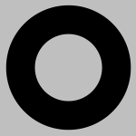
First, a black circle which defines the slider background.
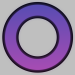
The active area filled with a gradient from blue to violet.

The handle which is dragged by the user to choose the value .
And last, a TextField to indicate the selected angle. In the next version it will also receive values from the keyboard.
To draw the interface we mainly use the drawRect function, where the first action is to get the current graphic context.
[code lang=”obj-C”]
let ctx = UIGraphicsGetCurrentContext()
Drawing the Background
The background is defined by a 360° Arc. This can be simply drawn adding the right path to the context CGContextAddArc and adding a stroke to it.
This is the code used to achieve this simple task:
[code lang=”obj-C”]
//Build the circle
CGContextAddArc(ctx, CGFloat(self.frame.size.width / 2.0), CGFloat(self.frame.size.height / 2.0), radius, 0, CGFloat(M_PI * 2), 0)
// Set fill/stroke color
UIColor(red: 0.0, green: 0.0, blue: 0.0, alpha: 1.0).set()
// Set line info
CGContextSetLineWidth(ctx, 72)
CGContextSetLineCap(ctx, kCGLineCapButt)
Draw it!
CGContextDrawPath(ctx, kCGPathStroke)
The function CGContextArc takes the coordinates for the center of the Arc and the radius (a private int variable). Then it needs the start and the end angle expressed in Radians (you can find a list of Math helpers at the top of the file BWCircularSlider.swift) and the last parameter is the drawing direction, 0 means counterclockwise.
The other rows are just settings, like colour and line-width. And finally we draw the path using the function CGContextDrawPath.
Drawing the active area
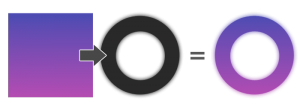
This part is a little tricky. We draw a linear gradient masked by an image. Let’s see how it works.
The mask image works as a hole through which we can see only a portion of the original gradient rectangle.
An interesting aspect is that this time the arc is drawn with a shadow, that creates a mask with a sort of blur effect.
Creating the mask image:
[code lang=”objC”]
UIGraphicsBeginImageContext(CGSizeMake(self.bounds.size.width,self.bounds.size.height));
let imageCtx = UIGraphicsGetCurrentContext()
CGContextAddArc(imageCtx, CGFloat(self.frame.size.width/2) , CGFloat(self.frame.size.height/2), radius, 0, CGFloat(DegreesToRadians(Double(angle))) , 0);
UIColor.redColor().set()
//Use shadow to create the Blur effect
CGContextSetShadowWithColor(imageCtx, CGSizeMake(0, 0), CGFloat(self.angle/15), UIColor.blackColor().CGColor);
//define the path
CGContextSetLineWidth(imageCtx, Config.TB_LINE_WIDTH)
CGContextDrawPath(imageCtx, kCGPathStroke)
//save the context content into the image mask
var mask:CGImageRef = CGBitmapContextCreateImage(UIGraphicsGetCurrentContext());
UIGraphicsEndImageContext();
First, we create an image context, then we activate the shadows. The function CGContextSetShadowWithColor helps us choosing:
• The context
• Offset value (which we don’t need)
• Blur value(we parameterised this value using the current angle divided by 15 to obtain a simple animation on the blurred area during user interaction)
• The colour
Again we draw an arc, this time depending on the current angle.
For example if the instance variable angle is equal to 360° we draw a full arc, whereas if it is 90° we only draw a portion of it. At the end we obtain an image from the current drawing using the function CGBitmapContextCreateImage. This image will be the mask.
Clipping the Context:
Now that we have the mask we can define “the hole” through which we’ll see the gradient.
We clip the context using the function CGContextClipToMask and passing to the function the mask we have just created.
[code lang=”obj-C”]
CGContextClipToMask(ctx, self.bounds, mask);
And finally we can draw the gradient:
[code lang=”obj-C”]
// Split colors in components (rgba)
let startColorComps:UnsafePointer<CGFloat> = CGColorGetComponents(startColor.CGColor);
let endColorComps:UnsafePointer<CGFloat> = CGColorGetComponents(endColor.CGColor);
let components : [CGFloat] = [
startColorComps[0], startColorComps[1], startColorComps[2], 1.0, // Start color
endColorComps[0], endColorComps[1], endColorComps[2], 1.0 // End color
]
// Setup the gradient
let baseSpace = CGColorSpaceCreateDeviceRGB()
let gradient = CGGradientCreateWithColorComponents(baseSpace, components, nil, 2)
// Gradient direction
let startPoint = CGPointMake(CGRectGetMidX(rect), CGRectGetMinY(rect))
let endPoint = CGPointMake(CGRectGetMidX(rect), CGRectGetMaxY(rect))
// Draw the gradient
CGContextDrawLinearGradient(ctx, gradient, startPoint, endPoint, 0);
CGContextRestoreGState(ctx);
Drawing the gradient is quite a long process, but it’s basically divided in 4 parts (just like the comments in the code):
• Defining the colour steps
• Defining the gradient direction
• Choosing a colour space
• Creating and Drawing the gradient
Thanks to the mask only a part of this gradient rectangle will be visible.
Drawing the Handle
Now we want to draw the handle at the right position for the current angle.
This step is really simple in terms of drawing (we just draw a white circle), but it needs some calculations to obtain the handle position.
We have to convert a scalar number into a CGPoint using trigonometry. Fear not, it’s just a matter of using Sin and Cos prebuilt functions.
[code lang=”obj-C”]
func pointFromAngle(angleInt:Int)->CGPoint{
//Circle center
let centerPoint = CGPointMake(self.frame.size.width/2.0 – Config.TB_LINE_WIDTH/2.0, self.frame.size.height/2.0 – Config.TB_LINE_WIDTH/2.0);
//The point position on the circumference
var result:CGPoint = CGPointZero
let y = round(Double(radius) * sin(DegreesToRadians(Double(-angleInt)))) + Double(centerPoint.y)
let x = round(Double(radius) * cos(DegreesToRadians(Double(-angleInt)))) + Double(centerPoint.x)
result.y = CGFloat(y)
result.x = CGFloat(x)
return result;
}
Given an angle, to find a point on a circumference, we also need the center of the circumference and its radius.
Using the sin function we obtain the value for the Y coordinate and using the cos function the value for the X coordinate.
Remember that each function returns a value for an hypothetic radius of 1. We just have to multiply these results for our radius and move those in relation to the centre of the circumference.
I hope this formula will help you better understand:
[code lang=”obj-C”]
point.y = center.y + (radius * sin(angle));
point.x = center.x + (radius * cos(angle));
Now that we know how to get the knob position, we can draw it using the function we have just built:
[code lang=”obj-C”]
func drawTheHandle(ctx:CGContextRef){
CGContextSaveGState(ctx);
//I Love shadows
CGContextSetShadowWithColor(ctx, CGSizeMake(0, 0), 3, UIColor.blackColor().CGColor);
//Get the handle position
var handleCenter = pointFromAngle(angle)
//Draw It!
UIColor(white:1.0, alpha:0.7).set();
CGContextFillEllipseInRect(ctx, CGRectMake(handleCenter.x, handleCenter.y, Config.TB_LINE_WIDTH, Config.TB_LINE_WIDTH));
CGContextRestoreGState(ctx);
}
The steps now are:
• Saving the current context (it is a good practice to save the context state when you do drawing actions in a separate function).
• Setting some shadows for the knob.
• Defining the knob colour and draw it using the function CGContextFillEllipseInRect.
We call this function at the end of the drawRect function.
[code lang=”obj-C”]
drawTheHandle(ctx)
We are done with the drawing part.
2) Tracking user’s interaction
Subclassing the UIControl class, we can override 3 special methods providing a custom tracking behaviour.
Begin tracking
When a touch event happens in the control bounds, the method beginTrackingWithTouch is first sent to the control.
Let’s see how to override it:
[code lang=”obj-C”]
override func beginTrackingWithTouch(touch: UITouch, withEvent event: UIEvent) -> Bool {
super.beginTrackingWithTouch(touch, withEvent: event)
return true
}
It returns a Bool which determines if the control needs to responds when touch is dragged. In our case we need to track dragging, so we return true.
This method takes 2 params, the touch object and the event.
Continuing the tracking
In the previous method we have specified that we want to track a continuous event, so a specific method, continueTrackingWithTouch, will be fired when the user performs drag[ging]:
[code lang=”obj-C”]
func continueTrackingWithTouch(touch: UITouch, withEvent event: UIEvent) -> Bool
This method return a Bool indicating if touch tracking should continue or not.
We can use this method to filter user’s actions depending on the touch locations. For example, we can choose to activate the control only if the touch location intersects the handle position. Not the case of this control, though, because we want to move the handle in response of any touch position.
For this tutorial this method is responsible for changing the handle’s position (and as we’ll see in the next section it sends the action to the target).
We override it with this code:
[code lang=”obj-C”]
override func continueTrackingWithTouch(touch: UITouch, withEvent event: UIEvent) -> Bool {
super.continueTrackingWithTouch(touch, withEvent: event)
let lastPoint = touch.locationInView(self)
self.moveHandle(lastPoint)
self.sendActionsForControlEvents(UIControlEvents.ValueChanged)
return true
}
At first we take the touch position using locationInView. Then we pass it to the function moveHandle which converts the value to a valid handle position.
What I mean with “a valid position”?
The handle should be moved only within the circumference boundaries defined by the background arc. But we don’t want to force our user to move his finger within this little space to be able to move the handle. The experience would be really frustrating. So we’ll accept any touch position and translate it to the slider’s circumference.
The function moveHandle does the job, plus, in this function, we perform the conversion which gives us the angular value of the slider.
[code lang=”obj-C”]
func moveHandle(lastPoint:CGPoint){
//Get the center
let centerPoint:CGPoint = CGPointMake(self.frame.size.width/2, self.frame.size.height/2);
//Calculate the direction from a center point and a arbitrary position.
let currentAngle:Double = AngleFromNorth(centerPoint, p2: lastPoint, flipped: false);
let angleInt = Int(floor(currentAngle))
//Store the new angle
angle = Int(360 – angleInt)
//Update the textfield
textField!.text = "\(angle)"
//Redraw
setNeedsDisplay()
}
Most of the work is done by AngleFromNorth. Given 2 points, it returns the angle of the imaginary line to connect them.
[code lang=”obj-C”]
func AngleFromNorth(p1:CGPoint , p2:CGPoint , flipped:Bool) -> Double {
var v:CGPoint = CGPointMake(p2.x – p1.x, p2.y – p1.y)
let vmag:CGFloat = Square(Square(v.x) + Square(v.y))
var result:Double = 0.0
v.x /= vmag;
v.y /= vmag;
let radians = Double(atan2(v.y,v.x))
result = RadiansToDegrees(radians)
return (result >= 0 ? result : result + 360.0);
}
(Note: I’m not the author of angleFromNorth, I took it directly from an example by Apple for OSX called clockControl).
Now that we have the value expressed in degrees, we store it in the property angle and we update the textfield value.
The function setNeedDisplay ensures that the method drawRect will be called, as soon as possible, with these new values.
End tracking
This is the function fired when tracking ends.
[code lang=”obj-C”]
override func endTrackingWithTouch(touch: UITouch, withEvent event: UIEvent) {
super.endTrackingWithTouch(touch, withEvent: event)
}
For this example we don’t need to override this function, but it would be useful if we needed to perform operations when the user finishes interacting with the control.
3) Target-Action pattern
At this point the Circular Slider is working. You can drag the knob and see the value changing in the textfield. Now.
Sending actions for control events
If we want to be consistent with the UIControls’ behaviour we have to notify when the control value changes. To do that we use the function sendActionsForControlEvents specifying the event type, in this case UIControlEventValueChanged.
There is quite a long list of possible values (cmd+mouse click on UIControlEventValueChanged from Xcode to see the list). For example, if your control is a subclass of UITextField, you will be interested in UIControlEventEdigitingDidBegin, or, if you want to notify a touch Up action, you can use UIControlTouchUpInside.
If you look back at section 2 you’ll see that we call
sendActionsForControlEvents just before the return within function continueTrackingWithTouch.
[code lang=”obj-C”]
self.sendActionsForControlEvents(UIControlEvents.ValueChanged)
Thanks to that, when the user moves the handle changing the slider value, each registered object will be notified about this change.
How to use the Control
We have now a custom control that we can use in our applications.
Since the control is a subclass of UIControl, it can’t be directly used with Interface Builder. But don’t worry, we can just use a UIView as bridge and attach the UIControl as view’s child.
Open the file BWCircularSliderView.swift to follow this part and check the awakeFromNib function:
[code lang=”obj-C”]
override func awakeFromNib() {
super.awakeFromNib()
// Build the slider
let slider:BWCircularSlider = BWCircularSlider(startColor:self.startColor, endColor:self.endColor, frame: self.bounds)
// Attach an Action and a Target to the slider
slider.addTarget(self, action: "valueChanged:", forControlEvents: UIControlEvents.ValueChanged)
// Add the slider as subview of this view
self.addSubview(slider)
}
We instantiate a circular slider object adding colors and frame information thanks to the function init:startColor:endColor:frame.
This is a custom initializer that stores the gradient colors and a frame equal to the bounds of the “bridge” view. This means that the control will inherit the size of the view (you can achieve the same result using AutoLayout).
We can now define how we want to interact with the control thanks to the method addTarget:action:forControlEvent:
This method just sets the target-action pattern for a specific control’s event. If you remember, the circular slider sends a UIControlEventValueChanged every time the user moves the handle. So we can register an action for this event using the code:
[code lang=”obj-C”]
slider.addTarget(self, action: "valueChanged:", forControlEvents: UIControlEvents.ValueChanged)
And we can build the function valueChanged to do something with the Value-Changed information:
[code lang=”obj-C”]
func valueChanged(slider:BWCircularSlider){
// Do something with the new value…
println("Value changed \(slider.angle)")
}
We are working with the Target-Action pattern, so the function receives the sender which has called the action, in this case the slider. We can directly access the angle value and, for this simple example, just log it.
Now check the override of the function willMoveToSuperview
[code lang=”obj-C”]
#if TARGET_INTERFACE_BUILDER
override func willMoveToSuperview(newSuperview: UIView?) {
let slider:BWCircularSlider = BWCircularSlider(startColor:self.startColor, endColor:self.endColor, frame: self.bounds)
self.addSubview(slider)
}
#else
This code, together with the @IBInspectable and @IBDesignable keywords, is needed to see a preview of the UIView directly into Interface Builder (check this tutorial for more info on IBDesignable).
(The TARGET_INTERFACE_BUILDER specifies that we want to execute this code only in InterfaceBuilder and not when the App runs).
Now we can just add an instance of BWCircularSliderView through the Storyboard, changing the startColor and endColor property directly in interface builder, and the control preview will be immediately available on screen.
Conclusions
You can create WHATEVER YOU WANT, starting from the steps I have shown you in this tutorial.
There are probably many other ways to build something like this, but I’ve tried to follow Apple’s suggestions, showing you only the 100% “documented way”.
For any questions, suggestions or if you want to share your ideas on custom controllers, ping me on twitter
Ciao!
Yari D'areglia
https://www.thinkandbuild.itSenior iOS developer @ Neato Robotics by day, game developer and wannabe artist @ Black Robot Games by night.


