Designing Imaginative Style Guides

(Living) style guides and (atomic) patterns libraries are “all the rage,” as my dear old Nana would’ve said. If articles and conference talks are to be believed, making and using them has become incredibly popular. I think there are plenty of ways we can improve how style guides look and make them better at communicating design information to creatives without it getting in the way of information that technical people need.
Guides to libraries of patterns
Most of my consulting work and a good deal of my creative projects now involve designing style guides. I’ve amassed a huge collection of brand guidelines and identity manuals as well as, more recently, guides to libraries of patterns intended to help designers and developers make digital products and websites.
“Style guide” is an umbrella term for several types of design documentation. Sometimes we’re referring to static style or visual identity guides, other times voice and tone. We might mean front-end code guidelines or component/pattern libraries. These all offer something different but more often than not they have something in common. They look ugly enough to have been designed by someone who enjoys configuring a router.
OK, that was mean, not everyone’s going to think an unimaginative style guide design is a problem. After all, as long as a style guide contains information people need, how it looks shouldn’t matter, should it?
Inspiring not encyclopaedic
Well here’s the thing. Not everyone needs to take the same information away from a style guide. If you’re looking for markup and styles to code a ‘media’ component, you’re probably going to be the technical type, whereas if you need to understand the balance of sizes across a typographic hierarchy, you’re more likely to be a creative. What you need from a style guide is different.
Sure, some people1 need rules:
“Do this (responsive pattern)” or “don’t do that (auto-playing video.)”
Those people probably also want facts:
“Use this (hexadecimal value)” and not that inaccessible colour combination.”
Style guides need to do more than list facts and rules. They should demonstrate a design, not just document its parts. The best style guides are inspiring not encyclopaedic. I’ll explain by showing how many style guides currently present information about colour.
Colours communicate
I’m sure you’ll agree that alongside typography, colour’s one of the most important ingredients in a design. Colour communicates personality, creates mood and is vital to an easily understandable interactive vocabulary. So you’d think that an average style guide would describe all this in any number of imaginative ways. Well, you’d be disappointed, because the most inspiring you’ll find looks like a collection of chips from a paint chart.
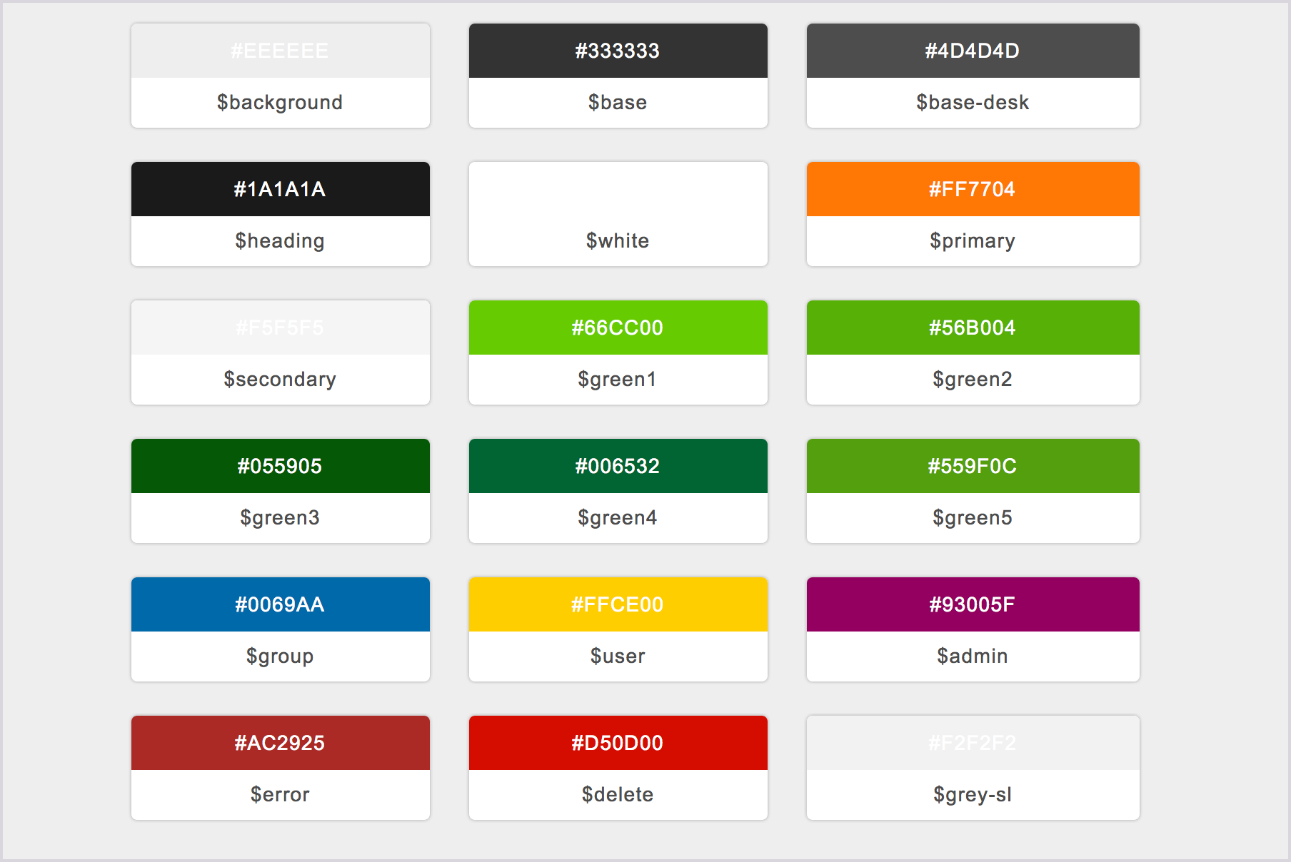
Lonely Planet’s Rizzo does a great job of separating its Design Elements from UI Components, and while its ‘Click to copy’ colour values are a thoughtful touch, you’ll struggle to get a feeling for Lonely Planet’s design by looking at their colour chips.
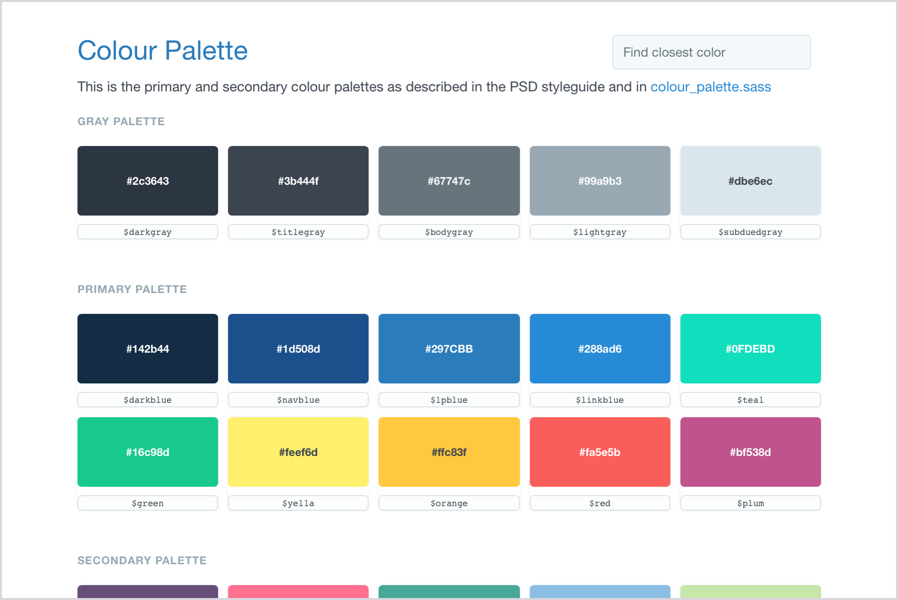
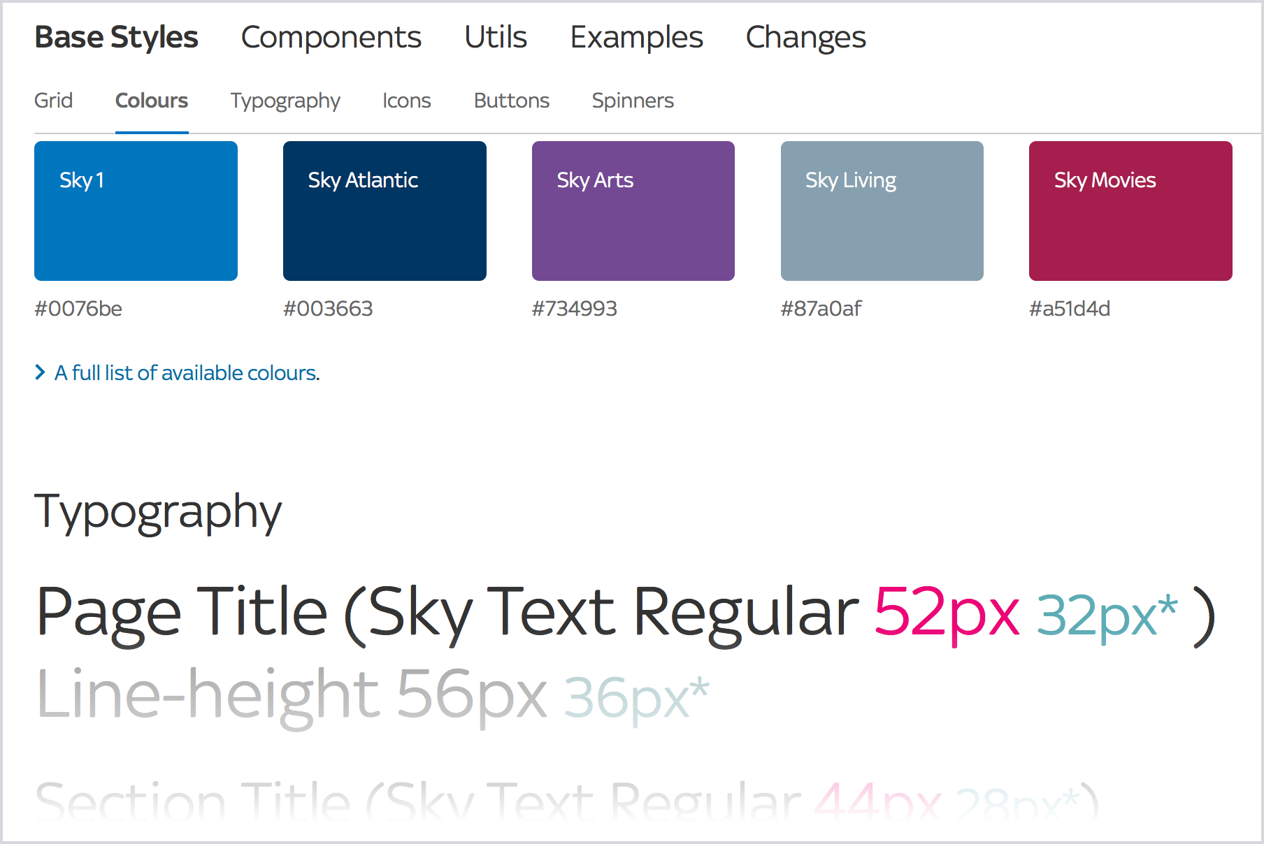
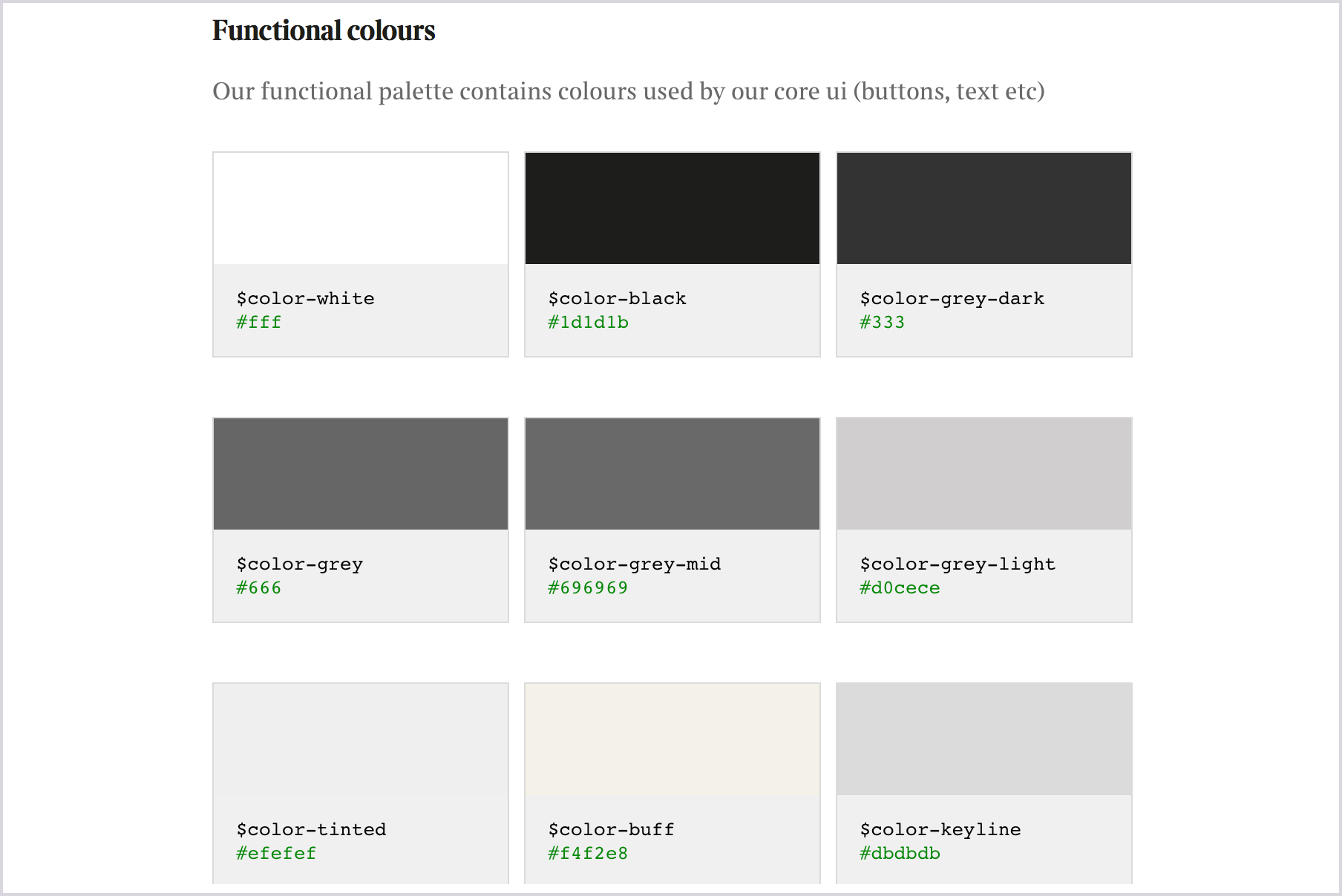
Lonely Planet approach is a common way to display colour information and it’s one that you’ll also find at Greenpeace, Sky, The Times and on countless more style guides.
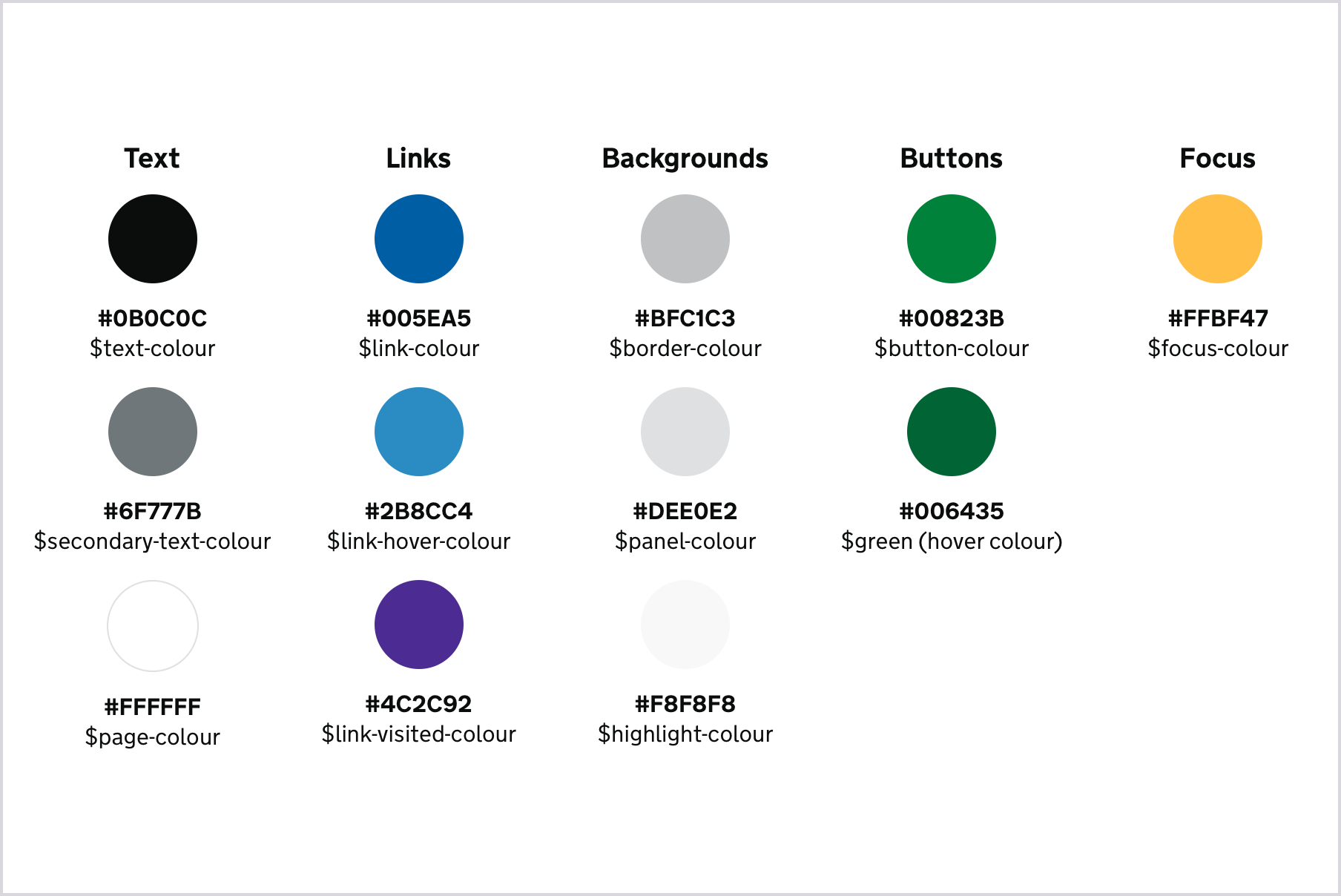
GOV.UK—not a website known for its creative flair—varies this approach by using circles, which I find strange as circles don’t feature anywhere else in its branding or design. On the plus side though, their designers have provided some context by categorising colours by usage such as text, links, backgrounds and more.
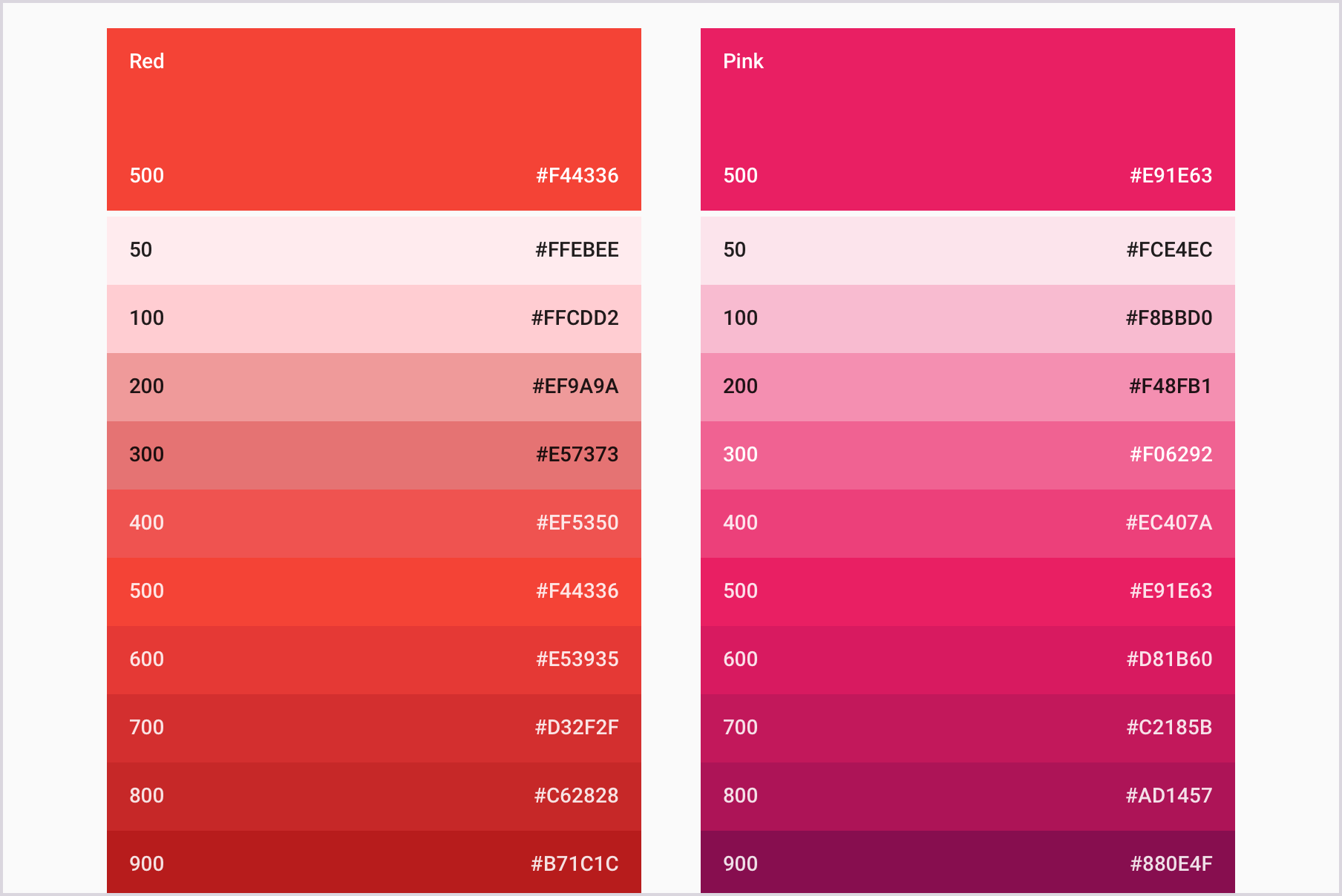
Google’s Material Design offers an embarrassment of colours but most helpfully it also advises how to combine its primary and accent colours into usable palettes.
While the ability to copy colour values from a reference might be all a technical person needs, designers need to understand why particular colours were chosen as well as how to use them.
Inspiration not documentation
Few style guides offer any explanation and even less by way of inspiring examples. Most are extremely vague when they describe colour:
“Use colour as a presentation element for either decorative purposes or to convey information.”
The Government of Canada’s Web Experience Toolkit states, rather obviously.
“Certain colors have inherent meaning for a large majority of users, although we recognize that cultural differences are plentiful.”
Salesforce tell us, without actually mentioning any of those plentiful differences.
I’m also unsure what makes the Draft U.S. Web Design Standards colours a “distinctly American palette” but it will have to work extremely hard to achieve its goal of communicating “warmth and trustworthiness” now.
In Canada, “bold and vibrant” colours reflect Alberta’s “diverse landscape.”
Adding more colours to their palette has made Adobe “rich, dynamic, and multi-dimensional” and at Skype, colours are “bold, colourful (obviously) and confident” although their style guide doesn’t actually provide information on how to use them.
The University of Oxford, on the other hand, is much more helpful by explaining how and why to use their colours:
“The (dark) Oxford blue is used primarily in general page furniture such as the backgrounds on the header and footer. This makes for a strong brand presence throughout the site. Because it features so strongly in these areas, it is not recommended to use it in large areas elsewhere. However it is used more sparingly in smaller elements such as in event date icons and search/filtering bars.”
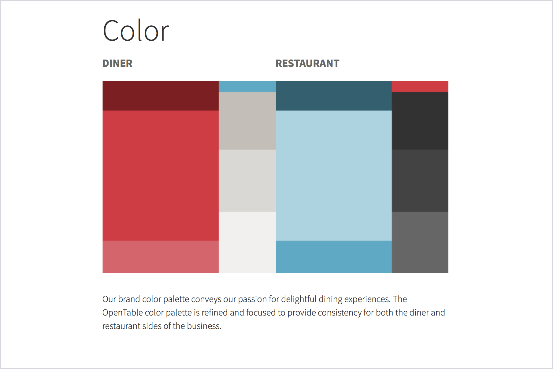
The designers at OpenTable have cleverly considered how to explain the hierarchy of their brand colours by presenting them and their supporting colours in various size chips. It’s also obvious from OpenTable’s design which colours are primary, supporting, accent or neutral without them having to say so.
Art directing style guides
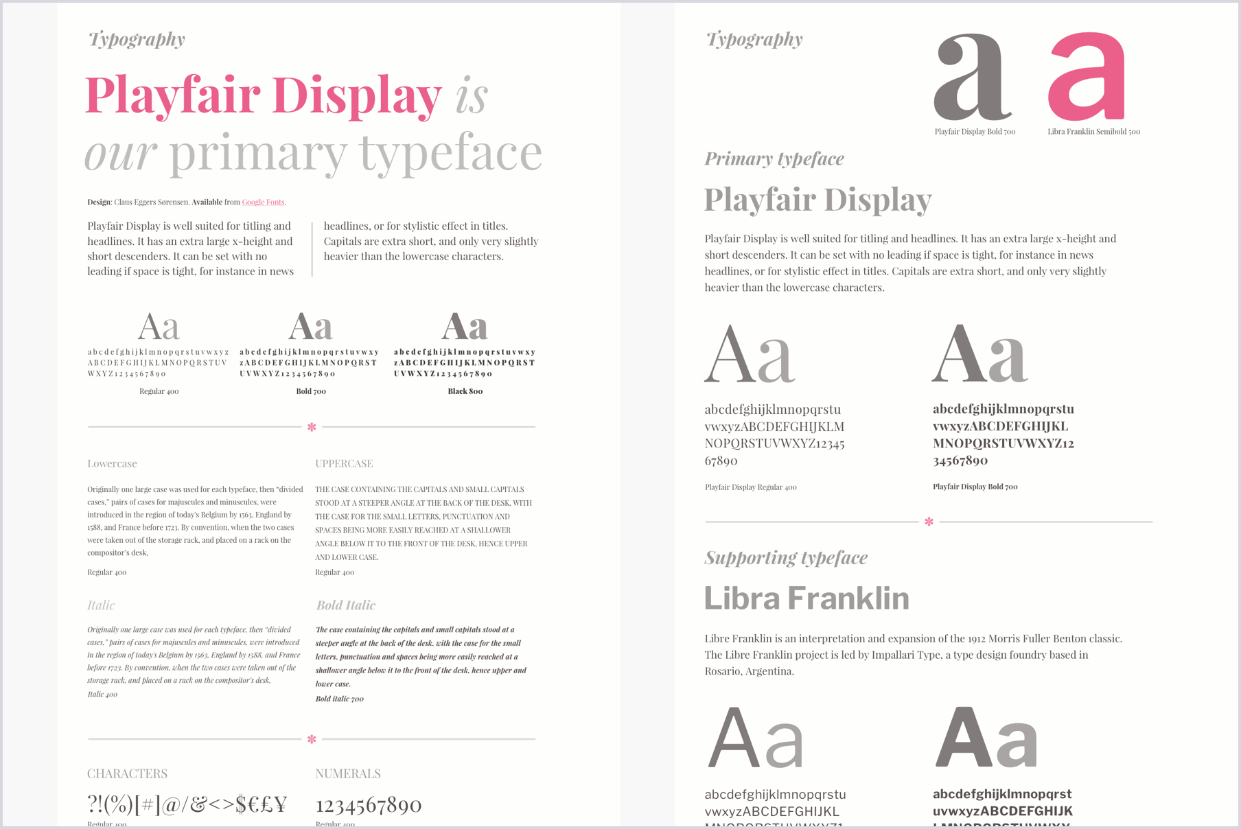
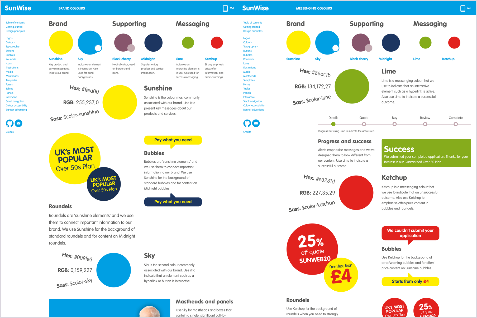
For the style guides I design for my clients, I go beyond simply documenting their colour palette and type styles and describe visually what these mean for them and their brand. I work to find distinctive ways to present colour to better represent the brand and also to inspire designers.
For example, on a recent project for SunLife, I described their palette of colours and how to use them across a series of art directed pages that reflect the lively personality of the SunLife brand. Information about HEX and RGB values, Sass variables and when to use their colours for branding, interaction and messaging is all there, but in a format that can appeal to both creative and technical people.
Purposeful style guides
If you want to improve how you present colour information in your style guides, there’s plenty you can do.
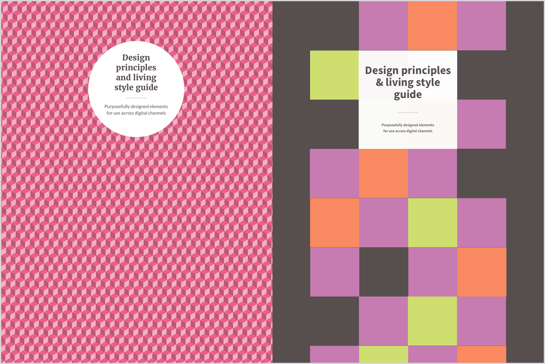
For a start, you needn’t confine colour information to the palette page in your style guide. Find imaginative ways to display colour across several pages to show it in context with other parts of your design. Here are two CSS gradient filled ‘cover’ pages from my Purposeful style sheets.
Colour impacts other elements too, including typography, so make sure you include colour information on those pages, and vice-versa.
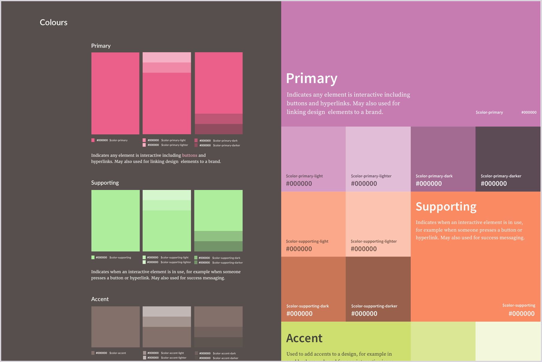
A visual hierarchy can be easier to understand than labelling colours as ‘primary,’ ‘supporting,’ or ‘accent,’ so find creative ways to present that hierarchy. You might use panels of different sizes or arrange boxes on a modular grid to fill a page with colour.
Don’t limit yourself to rectangular colour chips, use circles or other shapes created using only CSS. If irregular shapes are a part of your brand, fill SVG silhouettes with CSS and then wrap text around them using CSS shapes.
Summing up
In many ways I’m as frustrated with style guide design as I am with the general state of design on the web. Style guides and pattern libraries needn’t be dull in order to be functional. In fact, they’re the perfect place for you to try out new ideas and technologies. There’s nowhere better to experiment with new properties like CSS Grid than on your style guide.
The best style guide designs showcase new approaches and possibilities, and don’t simply document the old ones. Be as creative with your style guide designs as you are with any public-facing part of your website.
Purposeful are HTML and CSS style guides templates designed to help you develop creative style guides and pattern libraries for your business or clients. Save time while impressing your clients by using easily customisable HTML and CSS files that have been designed and coded to the highest standards. Twenty pages covering all common style guide components including colour, typography, buttons, form elements, and tables, plus popular pattern library components. Purposeful style guides will be available to buy online in January.
-
Boring people ↩
About the author
Andy Clarke is one of the world’s best-known website designers, consultant, speaker, and writer on art direction and design for products and websites. Andy founded Stuff & Nonsense in 1998 and for 20 years has helped companies big and small to improve their website and product designs. Andy’s the author of four web design books including ‘Transcending CSS,’ ‘Hardboiled Web Design’ and ‘Art Direction for the Web’. He really, really loves gorillas.
Brought to you by
Related articles
-
Animating Your Brand
Donovan Hutchinson stamps his snow-caked boots, unwinds his scarf and eases [See what we did there? Did you?] us into December with some tips and resources on integrating animation into our website style guides. A warm animated welcome to 24 ways 2015!
-
Beyond the Style Guide
Paul Robert Lloyd runs his finger along the seam between interface patterns and design systems, exploring how a visual design language can underpin and inform a web style guide, with judicious use of CSS preprocessing. Like a good Christmas jumper, sometimes you need to get creative with the rules.
-
Design Systems and CSS Grid
Stuart Robson tackles the thorny issue of integrating modern CSS Grid layouts into an existing design system, but in doing so reaps the benefits of leaner, more easily maintainable markup. It goes to show that with careful planning, there’s no reason old and new CSS layout methods cannot meet under the mistletoe.
-
Four Ways Design Systems Can Promote Accessibility – and What They Can’t Do
Amy Hupe prepares a four bird roast of tasty treats so we can learn how the needs of many different types of users can be served through careful implementation of components within a design system.
-
Refactoring Your Way to a Design System
Mina Markham brings a ray of hope that flitters in the sky with advice on refactoring an existing codebase into a design system. Greenfield projects are rare, so can we move forward with legacy styles in place? All across the land dawns a brand new morn, this comes to pass when a new design system is born.
-
There Is No Design System
Jina Anne silences the night to talk about how we talk about Design Systems. Can the language we use impact the effectiveness of the solution? Fear not, if mighty dread has seized your troubled mind. Design systems of great joy we bring to you and all mankind.