[css-grid][css-flexbox] Pinterest/Masonry style layout support #945
Comments
|
Yeah, I was asked this question twice this week. As people start to expand their imagination for what's possible in layout with CSS, they are reaching for the things they've seen... Pinterest and other sites use this layout. It is a Flexbox-like layout, but with different content order than what's possible using multicolumn. |
|
I'm new to this process, so please point me in the right direction if I've misunderstood anything or should be proposing solutions somewhere else, or at a later point in time. In order to fit the Masonry style layout in Flexbox, This approach would still have the problem of flex-items not being "intuitively placed" i.e. a flex item might be before another in order, but be farther from the |
|
You can have Grid do Masonry if you know the heights of the items ahead of time. It's a bit hacky, but you set the grid container to The dense placement will put each item into whichever column is the least filled (has the highest open row). There's not currently any way to make this work with auto heights. We might do this in the future. |
|
This kind of layout isn't very well suited for Grid, so I don't think we should try to squeeze it in there. It seems multicol layout is a better fit for the example in rachelandrew/cssgrid-ama#19 (comment) |
|
MatsPalmgren, the column layout is not good, because reordering the content, when you add more items, and basically vertically flowing across the columns, in a typographically correct way. tabatkins, currently this grid feature is promised: This testcase is a lazy load picture gallery, when you scroll down, it loads more items as flowed. Only 1 issue causes discussion: the maximum number of rows is too limited in firefox and crhomium. |
|
for a final solution the float: top left; can ce 1 possible way to make cheap and responsive masonry, but this one doesn't exist currently. |
|
At the V&A we're currently using columns as a "solution". This is fine, until we need to add more items into the DOM. Because columns items are displayed in the order of the HTML elements, when you add more at the bottom the resulting transition is a very unexpected user experience. Example: https://www.vam.ac.uk/collections/renaissance Clicking the 'show more' button reveals more items, but how the items appear to be ordered is very odd.
|


|
This is a very common layout, in any case, I hope to have the relevant norms as soon as possible. |

|
@yisibl it is pretty easy with flex only currently: https://jsfiddle.net/utasir/t0a1dnq1/ |
|
@hunboy That's not the same.In particular, the last element is stretched. |
|
Just wanted to put in my support for the implementation of masonry style layout through css grid. Column does not work when adding more content. |
|
Would it work to have a keyword for So, for example, in @jamesdoc 's example above I would have something like: .figure-list {
display: grid;
grid-template-columns: 1fr 1fr 1fr;
grid-template-rows: flow;
}Does that make sense? I'm not sure how I'd expect this to behave if you used that keyword for both axes, though...something like this, perhaps, simply packing boxes into the next available space horizontally/vertically based on
I'm sure I'm missing some reason why this wouldn't work, but wanted to suggest it in case it helps move the conversation along. :) Thanks! |
|
There's no "simple" way to adapt Grid into Masonry - anything would involve non-trivial edits to the layout algorithm. Packery, in particular, really needs things to have a defined width. ^_^ |
|
Why not just add a new display property value of masonry or comic (like a comic book), e.g. |
|
There's no such thing as "just add[ing] a new display property value". ^_^ Layout specs are the most complicated specs in all of CSS; even one that can borrow heavily from an existing spec, like Masonry could from Grid, will still have significant amounts of divergence and complication. |
|
@tabatkins, I understand that adding a new display property is not that easy. I just see all other options as a hack. If you knew the height of each element of the 'masonry' layout, then you could easily implement a grid system. However, most of the time, the height is unknown. I am still suggesting that a new display property be created. Idk how to get that ball rolling so I did some Google searching and watched a talk from @rachelandrew, and decided to come here. In my opinion, neither Grid or Flexbox is the right option. They both sound like a hack. |
|
@MrGrigri The thing is we can't create a brand new value of display for every distinct design pattern. I hope that this is an issue we can solve in Level 2 of grid, or at least explore doing so. |
|
Not sure if I'm missing something, but it seems the Flexbox spec already allows this kind of layout, and it works perfectly on Firefox. Does not work on other browser yet because they don't support forced line breaks in flexbox. The steps are simple:
See the details in https://stackoverflow.com/a/35097136/1529630 Edit: Actually, breaking flex lines with |
|
You have to manually calculate where the items will go, and manually pre-balanced the columns, for that to work. |
|
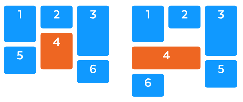
@Loirooriol That is not the same thing...albeit close. Masonry, in a left-to-right language like English, is ordered from left-to-right and top-to-bottom in a comic book style frame. See the below image for details. Green is correct, and red is incorrect.
|

|
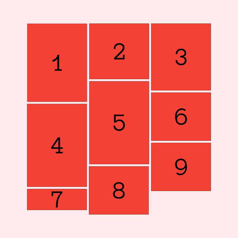
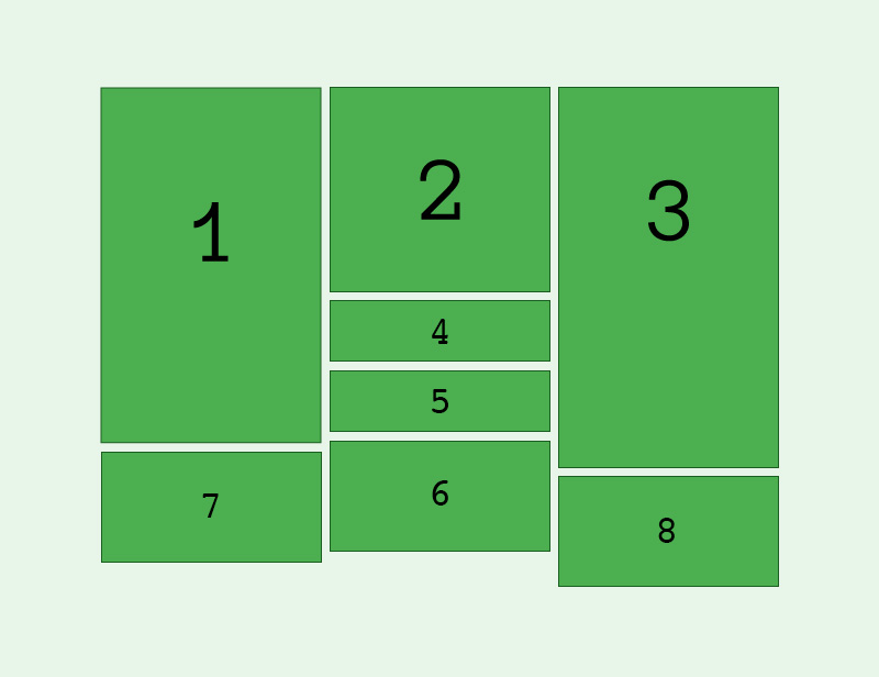
The above image from @MrGrigri illustrates the problem well, but for clarity's sake I've adjusted it to clearly demonstrate the problem we faced when attempting a masonry layout with columns containing variable height children. Rather than appending grid items strictly from left to right, the grid needs to append children to the column with the lowest height - thus conserving vertical space as well as (roughly) achieving uniform column heights. Particularly with lazy loading content you can very quickly start to see a strict left-to-right solution fail.
|

|
It's true that appending to the shortest column is a greedy approach to minimize the height of the container. But it also has downsides, e.g. you animate the height of an item a little bit, and bam!, the order of the following items completely changes. It's not a stable layout. Recalculating it all seems more expensive for browsers, and as an user I get confused by these spooky actions at a distance. |
|
From my perspective Masonry layouts run counter to the core premise of grid layouts as layout-in. For a Masonry layout to be created, the grid must be laid out to fit the grid items which is the opposite of how grid layouts work (define a grid, then place contents within that grid). Working with various Masonry solutions including original Masonry, Isotope, and Packery I constantly encounter the challenge of having to either wait for all the items (in particular images etc) to be loaded into the browser before painting the Masonry layout, or forcing a Masonry layout at the onset and then repainting it once the items are fully loaded to correctly size each item and avoid overlaps. Either way is clunky and creates a sub-optimal user experience, especially on image heavy sites and slow connections. On top of this comes RWD which makes things all the more challenging, especially if the columns are fluid. To me, while Masonry may look like a grid layout, it's actually an item-out layout modality with unified horizontal sizing + margin/padding/gutter properties applied. As @MrGrigri and @simonlayfield demonstrate in their visual examples, the items in Masonry are laid out using something akin to a scanline approach where the browser paints horizontally from left to right, top to bottom, and places items at the first available space. A pure CSS method for building the example above could be to define pseudo-columns for the parent container stating "descendants will be displayed three across" and then telling the browser that each descendant item is a Masonry item with pre-defined horizontal and vertical gutters. The browser then places each item within the first open vertical area of the first available pseudo-column from the top down. I have no idea what that would look like markup wise, but I don't think it would fall under the grid spec. |
Should not |
|
No, the problem isn't related to aspect ratios. |
|
Masonry layout is the next big step for CSS grid IMHO. |
|
I think I have a solution that could work. Masonry layout is essentially a series of display: flex; columns with flex-direction set to column that sit next to one another. The main issue we have right now is that elements in flex as no way of controlling columns when flex-direction is set to column. There is another css-property that does a similar thing to masonry layout. It's column-count. Think about this. What if a new flexbox property was introduced that allowed us to control flex-items in a similar sort of way to how column-count works? We can't really use column-count since flex-direction can be set to column which won't make sense. Just for now let's call the new property Let's say we apply This alone wouldn't create masonry layout yet since it would stack things in the wrong order by default: .flex-container {
display: flex;
flex-direction: column;
flex-block-count: 2;
}Masonry requires this: So to achieve that we would need another property. Let's call it 1 - 2 .flex-container {
display: flex;
flex-direction: column;
flex-block-count: 2;
flex-block-flow: cross;
}You would then use the proposed row-gap and column-gap properties to apply the gaps between flex items. |
…ng in #945 and it's not entirely clear it's a Grid issue.
|
Just dropping this here: |
|
I don't think we can effectively define a masonry layout as an extension of either flexbox or grid layout. There needs to be a new But I do think that it can be defined without any new properties, by re-using column layout properties. A But the sizing of those columns would be defined by That said, a few properties from grid/flex could be borrowed for more control:
But other than the column assignments for items, this isn't new layout math, just re-using existing properties in different combinations. Column widths are defined by the properties on the container. Item sizes are defined by the normal block layout rules when fit into a column of that width. (@bfgeek How hard would it be for you to tweak your Houdini demo to use the multicol properties to define the column sizes, instead of custom props?) As an important side benefit to reusing the existing properties, a basic column layout is an acceptable fallback for most masonry layouts. (It looks similar, but the reading/tab order requires scrolling down a column then back up, and the column assignments are not stable if you add new elements to the end of the list.). So in most cases you wouldn't need any fallback code for browsers that don't recognize Of course, as a few people have mentioned, the other missing piece of the puzzle is a way to define aspect ratios for fit-to-available-width replaced content elements, so that the layout doesn't jump around erratically as images download and change the heights of the masonry items. But that's a feature that is useful well beyond Masonry layout, and should be defined separately. <aside> I started playing with existing CSS today, trying to fake Masonry, in a constrained case, as a flexbox layout with I even started to write up a full proposal defining masonry as a new value for </aside> |
|
@AmeliaBR That sounds like it would work, except if you want multiple columns of different sizes. Is the demand for that low enough that we can defer it to whenever multicol gets columns of different sizes (which might be never), or would that be a deal breaker? |
|
@frivoal Most of the examples I've seen use a consistent width for all columns, so I wasn't considering an option of different sizes as part of the layout requirement. David DeSandro's Masonry library, which is also used in Isotope, supports multi-column spanning objects (within a grid of fixed column sizes), in addition to the simpler layout I was focusing on. The packing algorithm works most effectively if the item heights are also multiples of a grid row height, so that it becomes very much like a densely packed auto-fit grid. However, the number of row spans is calculated by the JS, and there may be gaps created by one element filling multiple columns that weren't the same height. So, this could be a basis for using In contrast, Oracle Jet's masonry layout and the Nested JQuery plugin are densely-packed grid layouts as defined in CSS grid, with each item given fixed row and column spans; they don't support arbitrary or auto-height items. Other masonry JS libraries/plugins (that I found in a search for "masonry layout") all use columns with the same width, each item in a single column, and heights determined by the content items: Macy.js, Wookmark JQuery plugin, WordPress Masonry Layout. This SitePoint article also includes horizontal flow layouts in the category of "masonry", but they are more like wrapping flexbox: fill one row, then wrap to the next, with flexible size adjustments to fill the row width. (One limitation of using A comment on this entire topic: The goal of the extensible web & of the Houdini project is to allow web authors to implement custom features, and let actual use determine which new web platform features are most wanted. Once an idea is proved popular, and a consensus has been achieved about its key features, then it would be standardized. I'm not a huge fan of the masonry layout, but I do believe that it has met this standard. I just listed four different JS implementations of Masonry that implement the same basic layout rules. There are also numerous search results promising "Pure CSS" masonry, which use multicol or flexbox columns to create something that is visually similar to the column-based masonry layout. But as mentioned elsewhere in this thread, these solutions are sub-optimal because the DOM order doesn't match the normal LTR reading order & the layout is unstable when you add new items to the container. To me, the only confusions / questions about features (separate from debating the actual API) are:
|
|
For a demo of my usage see https://trondolsen.github.io/dashboard/dashboard.html. Items have variable height, are filled left-to-right, prioritized.
|

|
A console warning would be marvellous for debugging the 1000 row grid limit on Chrome, especially for people who don't develop in Chrome. It's a stupid limit anyway, because without it grid would be fine for masonry. Computers have tons of memory. |
|
@SabineWren thanks for mentioning this, I thought I'd finally found a simple solution for a masonry layout with CSS grid... both Safari and Firefox seem to handle 1,000+ rows just fine. I left a comment on the related issue and had a response saying hopefully they'll have a fix "in the following weeks"... not quite sure what that means but hopefully we'll be able to use this soon! https://bugs.chromium.org/p/chromium/issues/detail?id=688640 |
|
Note that we've decided to add a SHOULD-level requirement (implementations must honor it, unless they have a good reason to do otherwise) for browsers to support at least 10k rows/columns (plus another 10k in the negative direction). https://drafts.csswg.org/css-grid/#overlarge-grids |
|
@SabineWren @gethinoakes #2261 - [css-grid] Re "Clamping Overly Large Grids": Perhaps have a minimal required track count
|
 tabatkins
added
unknown/future spec
and removed
css-flexbox-2
css-grid-2
tabatkins
added
unknown/future spec
and removed
css-flexbox-2
css-grid-2
|
Hi. I imagine a new property to define how the items are placed in the cells. Currently, if two elements are in the same cell, they are overlapping. This new property, let's call .masonry {
display: grid;
grid-template-column: repeat(3, 300px);
grid-column-gap: 20px;
}
.item:nth-child(3n+1) {
grid-area: 1 / 1;
area-placement: flow;
}
.item:nth-child(3n+2) {
grid-area: 2 / 1;
area-placement: flow;
}
.item:nth-child(3n) {
grid-area: 3 / 1;
area-placement: flow;
}This brings more flexibility, not only to build masonry layouts, but also for more other use cases. |
|
I don't see why you force a specific column in your example, you can achieve the exact same example like this: (and when you have subgrid, you will be able to wrap this niceline in one row of the parent grid if you want, yet reusing the grid lines for your columns) |
|
Sorry, I have explained myself badly. https://codepen.io/oscarotero/pen/yEgawv A way to archieve a masonry-style grid could be allowing to customize this behavior and instead place all elements in the same position, they respect the natural flow, as they where placed in different containers like in this example: https://codepen.io/oscarotero/pen/LrxRoK Your example is not valid because the cells of the same row have the same height: https://codepen.io/oscarotero/pen/JZERgq AFAIK, subgrid cannot be applied to grid areas, but html element. If subgrid could be applied to grid areas or cells, that would be great because opens the door to an endless number of possibilities. |
|
Hi, I am the author of Masonry JavaScript plugin. Just seeing this thread now. I would love to see Masonry layouts be added to the CSS spec The Masonry plugin will turn 10 years old next year. It has remained widely popular through the years. Even with the addition of flexbox & grid layout specs, the Masonry use case remains to be supported natively. It deserves to be added to the spec. I regret not advocating for its adoption earlier (hindsight 20/20). A couple items to think about: Loading imagesThe Masonry layout algorithm works by iterating through a collection of item elements, measuring each, and placing them in a column. If the size of an item changes (loading media like images and video) the entire layout may need to change — placing items in different columns. This can lead disorientation while you watch the page load. Multi-column spanning itemsWill the layout support items that can occupy more than one column?
Filling gapsIf multi-column items are supported, does the algorithm support filling gaps that may be filled by subsequent items? I had to develop a separate plugin, Packery, to hand this much requested feature.
Retaining horizontal orderLots of users still expect horizontal order to be maintained even with the Masonry layout. See desandro/masonry#873. Counter-intuitive to a developer, I realized, but its what the people wanted.
That said, I think a Masonry layout spec that at least supports the basic single-column layout would be a great feature that satisfies 80% of use cases. I'm happy to provide my experience & discuss this more. |

|
I believe that this comment is underrated in this thread. I can't help seeing that the behavior of the Packery algorithm is to the usual behavior of |
|
This should now be supported with the CSS.layoutWroklet -- Aka Houdini -- in at lease Chrome for now. I have created a pen here that demonstrates this functionality. Because of the way that Codepen works, there is another supporting file found here that is the actual layoutWorklet. The whole point of the layoutWorklet is so that the W3C doesn't have to come up with a new layout every time it becomes popular. |
|
This spec provides direct access to the layout portion of the JavaScript event loop. Thus making it highly performant. |
|
A clever and recent technique which uses flexbox: https://tobiasahlin.com/blog/masonry-with-css/. (Posting here because it's not been posted yet, and it might be a good workaround for anyone who lands here.) |
|
@OliverJAsh Isn't that the same as what I proposed 2 years ago in this same thread? #945 (comment) |
|
@Loirooriol Yes, you're right. Apologies. |
|
I've experimented a bit with implementing masonry layout inside a grid container and I've summarized my conclusions in #4650. |
I think you have a good point. Like this example over there : http://www.castlecodeweb.com/mediaboxes/example/gallery.html |

 and others
I'm getting frequent questions about whether Grid can handle a Masonry style layout using auto-placement.
You can see a good example, along with some author use cases here.
Currently the closest you can get with CSS to this type of layout is to use multi-col however the items then flow top to bottom rather than across the rows.
This feels more like a behaviour of flexbox than grid, as the solution is very much based on the size of the items. Opening this in order to record the feature request/use case for future discussion.
The text was updated successfully, but these errors were encountered: