Recent years have seen two trends on the web:
- Web pages are getting bigger and bigger in terms of consumed bandwidth and loaded assets (CSS, JS, images, fonts).
- The share of users who surf the web with mobile phones and tablets is increasing.
Sure, at home you have your desktop computer with a really fast internet connection. Yet, a lot of people out there probably don’t visit your site with that same setup. Even a nice 4G connection on the road only solves the problem of available bandwidth. There still remain the problems of network overhead and mobile latency.
This has led to a whole new thinking about page speed and optimization. Nowadays, Google ranks pages higher if they render in less than a second. This is supposed to be an optimal response time, considering that 10ms is perceived as an instant reaction, 3s lets users drift off, and 10s is a reason to never visit your site again.
But how can you accomplish this ambitious goal without cutting off features or dramatically disfiguring your site?
The idea is not only to put your pages on a decent server and trim the site’s weight as much as possible, but to optimize the chain of events that take place to render your web site in the browser window. This chain is called the Critical Rendering Path.
From Page Loading to Page Rendering
Google defined the critical rendering path as the sequence of steps the browser goes through to turn “the code and resources required to render the initial view of a web page” into actual pixels on the screen.
This changes the notion of page speed completely. It is not enough to load a whole page as fast as possible. The crucial part is to deliver mobile users a fast visible response to guarantee a seamless experience. The term critical is key here, since not everything in your code is needed to produce something in the browser window.
In order to optimize the critical path and thus the page rendering speed, let’s have a look at those mentioned steps and how they interact with each other.
From Blank to Content
Imagine a user visits our (admittedly simple) web site. After entering the URL, the browser sends a request to the server and will eventually get the following HTML as a response.
<!DOCTYPE html>
<html lang="en">
  <head>
    <title>Sample Site</title>
    <link href="style.css" rel="stylesheet">
  </head>
  <body>
    <p>
      Hello <span>there</span> SitePoint!
      <img src="photo.jpg">
    </p>
  </body>
</html>
The browser is parsing this stream of code bytes into the Document Object Model, or DOM. The DOM is a full tree representation of the HTML markup:
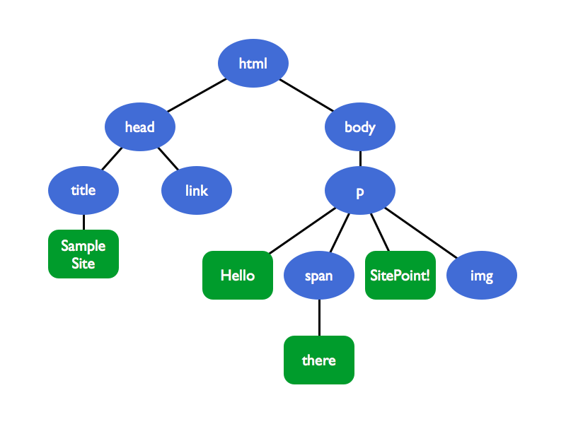
Note: The browser builds up the DOM incrementally. That means it can start to parse the HTML as soon as the first chunks of the code come in and it will then add nodes to the tree structure as needed. This can be leveraged for some advanced but effective optimizations (which are out of the scope of this article).
At this point, the browser window is still blank. Note how a CSS file is referenced inside the <head> tag. The styling of a site is definitely critical for rendering and hence has to be downloaded as soon as the HTML parser reaches the <link> tag.
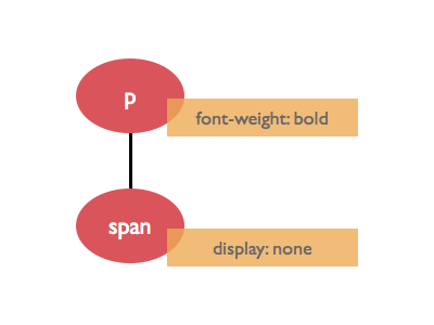
p { font-weight: bold; }
p span { display: none; }
This small CSS file is then parsed into the CSS Object Model, or CSSOM.
Unfortunately, the CSSOM cannot be built incrementally like the DOM. Imagine if there was a third line in the stylesheet, for example p { font-weight: normal; }, which overrides the first p declaration. This demonstrates that we have to wait until all the CSS is downloaded and processed before we can move on with the rendering step. CSS is render blocking.
As soon as the browser has a machine-readable representation of both the markup and CSS, it can build the render tree. This structure combines DOM and CSSOM while only capturing visible elements:
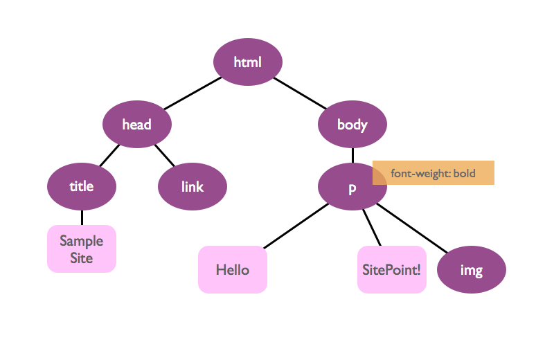
Note how the span tag is not part of the render tree (another reason why CSS is render blocking; only CSS tells the browser ultimately what should be part of the render tree).
The render tree is a good representation of the content we will later see in the browser window. The actual pixels appear after the two remaining steps: Layout and paint. The layout step handles calculating position and dimension of every element with respect to the current viewport. Finally, the browser paints everything and displays the complete rendered page.
Every time the render tree is changed (for example by interactive JavaScript) or the viewport is changed (maybe by resizing the browser window or rotating your mobile device), the layout and paint step have to be rerun.
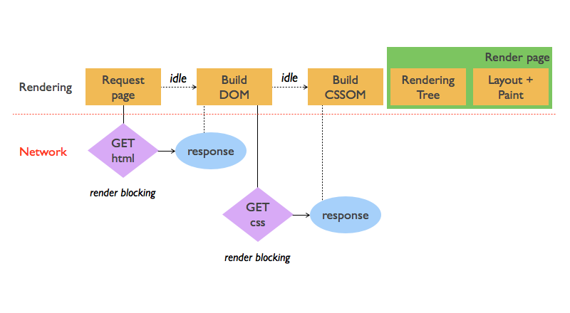
The complete critical rendering path for this simple example looks like this:
What about the image?
Actually, only HTML, CSS and JavaScript are considered critical resources (that is, assets that might block page rendering). It turns out, images neither block the DOM construction nor the initial rendering of the page. Have a look at the network timeline of our simple web site, provided by the Chrome’s DevTools:
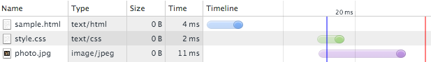
The blue vertical bar marks the DOMContentLoaded event. This event is fired as soon as the DOM is ready. The image is downloaded later, which proves that images don’t block parsing – or even rendering, for that matter. They do block the Load event (the red vertical line), though. This event signals that all resources the requested page needs have been downloaded and processed. That being said, image loading should of course be optimized. But images are not critical in terms of the rendering path.
Spicing Things Up with JavaScript
JavaScript is a powerful tool and has a huge impact on the critical path. Let’s expand our paragraph tag with an inline script:
<p>
  Hello <span>there</span>, SitePoint!
  <script>
    document.write('How are you?');
    var color = elem.style.color;
    elem.style.color = 'red';
  </script>
  <img src="photo.jpg">
</p>
Even this simple code snippet demonstrates that scripts can both query and change the DOM as well as the CSSOM. (For the sake of simplicity, assume that elem holds a reference to some particular HTML element on the page.) Since JavaScript can add things to the DOM (like the ‘How are you?’ text node), the parser has to stop its work until the script is fully executed. JavaScript is parser blocking.
The second JavaScript line above asks for the element’s color. Consequently, the CSSOM has to be present before the script can be run. CSS is therefore also script blocking.
Let’s see how the critical rendering path looks when we get rid of the inline script and replace it with a reference to an external JavaScript file:
<!DOCTYPE html>
<html lang="en">
  <head>
    <title>Sample Site</title>
    <link href="style.css" rel="stylesheet">
  </head>
  <body>
    <p>
      Hello <span>there</span> SitePoint!
      <img src="photo.jpg">
    </p>
    <script src="app.js"></script>
  </body>
</html>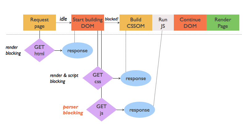
The external JavaScript file demands an additional request – the inline script would not have needed that. Also, don’t let the flow chart fool you: No matter which file, CSS or JS, arrives first in the browser, the CSS has to be parsed first. As soon as the CSSOM is present, the script content can be executed. Only after that, the DOM parser gets unblocked and can finish its work. Even our fairly simple web site example has some serious blocking and interfering going on under the hood.
Now that we know what steps are necessary to render a page and how the critical resources – HTML, CSS, and JavaScript – are intercepting each other, we can derive some optimization measures.
Three Steps to Optimizing the Critical Rendering Path
There are three spots where you can optimize the critical rendering path and thus the speed with which the browser produces a visible result for the user. Keep in mind that optimization is all about careful measurement and trade-offs. Unfortunately, there is never a right answer that fits all scenarios. Don’t hesitate to use help like the Chrome DevTools to see what’s going on.
1. Minimize the Bytes that Go Down the Network
This might be a no-brainer but you would be surprised how many web sites still don’t follow the easiest rule in speed optimization: The smaller your site, the faster it loads and renders. It is as easy as this!
Minify, compress, and cache your assets as well as your HTML. Yes, HTML is also render blocking. A lot of build tools, like Grunt or Gulp, come with minifying/uglifying plugins. These clear your code of whitespace, comments and more to prepare your files for production.
Compression decreases your page load even more while caching spares the browser network round trips to the server and back. Instead of requesting every critical resource at every page reload, it can use a cached, local copy.
Note: If you minify your HTML, you may risk content and styles not displaying correctly. For example, if you use natural white space to separate inline-block elements, that white space would disappear on minification. So use HTML minification carefully.
2. Minimize Render Blocking CSS
Our beloved styling language is an important part of every rendering path. Remember that CSS both blocks rendering and JS execution. It comes as no surprise that the golden rule for CSS is: Get CSS to the user as soon and as fast as possible! Make sure all the CSS link tags are in the head of your HTML code so the browser can dispatch the requests immediately.
Another strategy is to lower the amount of render blocking CSS with media queries. Say our sample web site has styles for printing and also special rules for devices in landscape mode. You could use this knowledge to split the CSS into several files and let the browser parse them conditionally.
<!DOCTYPE html>
<html lang="en">
  <head>
    <title>Sample Site</title>
    <link href="style.css" rel="stylesheet">
    <link href="print.css" rel="stylesheet" media="print">
    <link href="landscape.css" rel="stylesheet" media="orientation:landscape">
  </head>
  ...
The original style.css file should be significantly smaller now and is the only CSS resource that is always render blocking. The print stylesheet is only used for printing and not for displaying the page in the browser. Thus, it is not render blocking. The third CSS file has a dynamic media query and it is decided on page load and depending on the device’s orientation whether it is render blocking or not.
Apparently, we can use media queries to kind of outsource CSS code which is only needed under special circumstances or conditions. That decreases the file size of our critical main style file and consequently the time it takes the browser to parse it and continue with the rendering process.
Note: The browser will still download all the stylesheets, but this happens on lower priority and in parallel to the rendering process.
Last but not least you can also inline your render blocking CSS and put it directly into the HTML file. This spares the browser a network roundtrip and only leaves the HTML file (and maybe scripts) to be processed.
<!DOCTYPE html>
<html lang="en">
  <head>
    <title>Sample Site</title>
    <style>
      p { font-weight: bold; }
      p span { display: none; }
    </style>
    <!-- No link tag needed! -->
  </head>
  ...
As mentioned before, it is all about trade-offs. The trick above might buy you a decreased network latency, but potentially blows up your total load in case the critical CSS has to be inserted in many files.
There are tools to help you do this automatically too. Here are a few options:
- Critical Path CSS Generator, which can also be used as a Node module or Grunt task.
- critical
- CriticalCSS
3. Minimize Parser Blocking JavaScript
The same is true for JavaScript: If you need some lines of code for the initial page rendering, you might consider to inline them into your HTML file to save round trips over the network.
In an optimal case, you drop JavaScript all together for the initial rendering of the page. If that is not possible, try to defer the JavaScript execution and postpone it until the load event.
Also, check your scripts or third party plugins carefully. If they don’t interact with the DOM and CSSOM in any way, chances are good that you can load them asynchronously, or short async. Achieving this is easy:
...
    <script src="app.js" async></script>
  </body>
</html>
By doing so, you just told the browser it is OK to not execute the script at the exact point where it is referenced in the HTML document. This would allow the browser to continue to build the DOM and execute the script when the DOM is ready. Imagine app.js only contains setup code for Google Analytics and several social media features. If the code leaves DOM and CSSOM untouched, it is a perfect candidate for being made async and thus unblock the parsing.
Conclusion
Much of the research on this piece was taken from a few different sources:
- Google’s excellent Web Fundamentals documentation, and in particular the section on the critical rendering path.
- Udacity’s Website Performance Optimization course.
- The free online book High Performance Browser Networking by Ilia Grigorik
So be sure to check out those sources for more details on the stuff covered above.
For a summary of this article, here comes the TL;DR:
- The notion of page speed has shifted from simple page loading to page rendering
- The Critical Rendering Path comprises all steps to turn critical resources into a visible browser output: DOM and CSSOM, JavaScript, render tree, layout and paint phase
- HTML is render blocking, but the DOM can be built incrementally
- CSS is render and script blocking, treat it carefully and optimize it with inline styles or media queries
- JS is parser blocking, use it sparingly during the initial page load, defer execution or try to load it asynchronously
- Don’t forget that size still matters and minify, compress, cache
Don’t be afraid to fire up tools like the Chrome DevTools, PageSpeed Insights, or WebPagetest to find out what is going on before your web site gets displayed.
The page rendering speed of your web site is crucial for your visitors who typically don’t treat your pages with patience. Keep that in mind when you are tweaking your site’s performance to the fullest. It sure is rewarding!
Frequently Asked Questions on Optimizing Critical Rendering Path
What is the Critical Rendering Path and why is it important?
The Critical Rendering Path (CRP) is a sequence of steps that a browser goes through to convert HTML, CSS, and JavaScript into pixels on the screen. It’s crucial because it directly impacts the performance of a website. The faster a browser can render content, the better the user experience. Optimizing the CRP can significantly improve the loading speed of a webpage, leading to better user engagement, retention, and conversion rates.
How does the browser render a webpage?
The browser rendering process involves several steps. First, it parses HTML to construct the Document Object Model (DOM) tree. Next, it parses CSS to create the CSS Object Model (CSSOM) tree. The browser then combines the DOM and CSSOM into a render tree, which includes all visible DOM content on the screen and the styles applied to them. After that, it calculates the layout of each visible element and finally paints the pixels on the screen.
What are render-blocking resources and how do they affect the CRP?
Render-blocking resources are files that prevent the webpage from being displayed until they are fully downloaded and processed. These typically include external CSS and JavaScript files. They affect the CRP by delaying the rendering of the page, leading to a slower perceived load time for the user. Optimizing these resources can significantly improve page load speed.
How can I optimize render-blocking CSS for a faster CRP?
There are several strategies to optimize render-blocking CSS. One common method is to inline critical CSS directly into the HTML document. This allows the browser to render the page more quickly. Another method is to defer non-critical CSS by using media queries or loading them asynchronously. This ensures that non-critical CSS doesn’t block the rendering of the page.
How can I optimize render-blocking JavaScript?
To optimize render-blocking JavaScript, you can defer or asynchronously load JavaScript files. Deferring a script means it won’t be executed until the HTML document has been fully parsed. Asynchronously loading a script allows it to be downloaded in the background without blocking the rendering of the page. Another strategy is to inline small scripts to avoid additional network requests.
What is the role of the Document Object Model (DOM) in the CRP?
The DOM is a tree-like representation of the webpage’s content. It’s created by parsing the HTML document. The DOM is crucial in the CRP because it’s used together with the CSSOM to create the render tree, which is used to compute the layout and paint the webpage.
What is the CSS Object Model (CSSOM) and how does it impact the CRP?
The CSSOM is a representation of the webpage’s styles. It’s created by parsing all the CSS of the page. The CSSOM is important in the CRP because it’s used with the DOM to create the render tree. If the CSSOM is not ready, the browser can’t render the page, which is why CSS is considered a render-blocking resource.
How does the browser use the render tree in the CRP?
The render tree is a combination of the DOM and CSSOM. It includes all visible DOM content on the screen and the styles applied to them. The browser uses the render tree to compute the layout of each visible element and finally paint the pixels on the screen. Optimizing the construction of the render tree can improve the speed of the CRP.
What is the layout step in the CRP?
The layout step, also known as reflow, involves calculating the exact position and size of each element on the page. This step is computationally intensive and can impact performance. Minimizing layout changes and avoiding forced synchronous layouts can help optimize the layout step in the CRP.
What happens during the paint step in the CRP?
During the paint step, the browser fills in pixels into layers. It involves drawing out text, colors, images, borders, and shadows, essentially every visual part of the elements. The painting process can be optimized by promoting elements to their own layer to minimize repaints, and by avoiding layout changes which can trigger additional paints.
 Stephan Max
Stephan is a Dublin-based developer originally from Germany. Holding a degree in computer science and being a code wrangler at heart, he works as a technical cloud adviser inside the IBM Bluemix team by day and moonlights as a front-end developer and JavaScript engineer. He loves traveling, writing, music, and building stuff that helps people.