
Displaying big data on a small screen is a daunting challenge. How do we make a large amount of data fit on a small screen? Other than limiting the number of rows or columns of data, what other options are available to display tables on small screens? What does a usable table look like on mobile?
(The general problem of having more data than fits on the screen is not specific to mobile: information-visualization researchers have struggled for years with the topic of showing data that has more columns (or rows) that can fit on the user’s screen — be it a large monitor, an array of monitors, or a small mobile display. However, the smaller the screen, the more likely that we’ll get into trouble with any given dataset and will need to design carefully to minimize usability problems.)
In our article on comparison tables, we covered key elements in presenting data, such as the need for consistency of content and presenting meaningful attributes to users. Both are equally, if not even more important for mobile tables, due to the small amount of data visible at one time. You must first create a usable table for a large screen before translating it to a small one. The need to make a table work on a smaller screen may be a good reason, excuse, or impetus to reevaluate the content and attributes in your table, regardless of screen size, and to improve content for all users.
Columns Large Enough to Be Legible
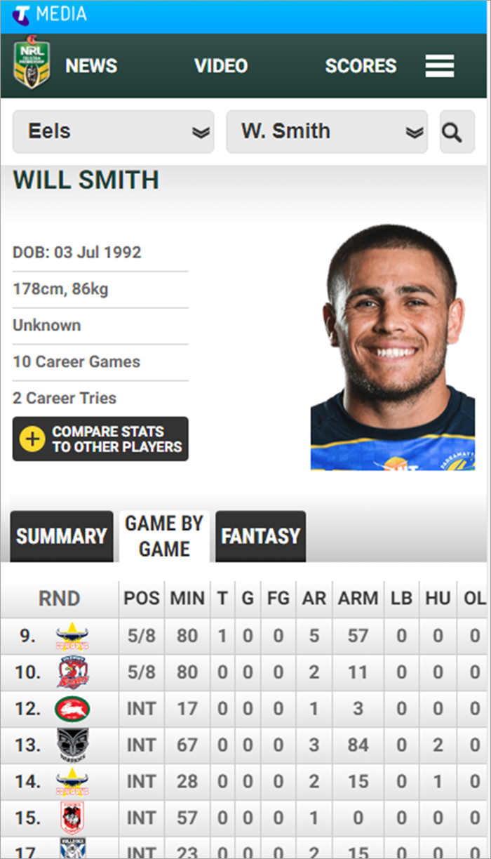
The number of columns that fit on a mobile screen without scrolling will depend on the width of those columns. Items need to be legible without requiring the user to zoom in.
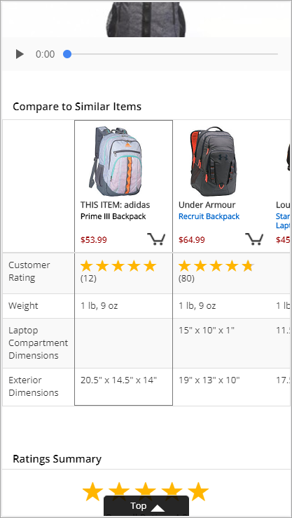
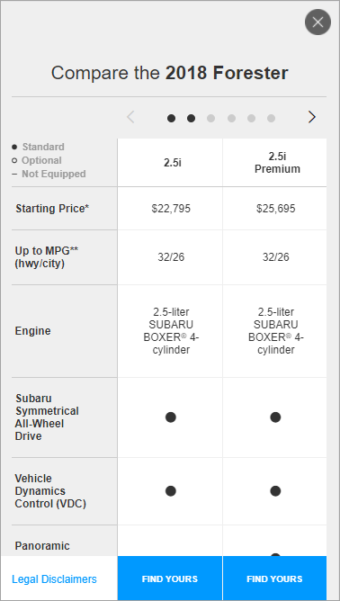
For complex or wordy entries, such as those in comparison tables, only 2 columns may fit legibly on a narrow mobile screen. For a number-heavy table, narrower columns may work, allowing more columns to be visible.
Rotating the Phone Is a Last Resort
Rotating the phone allows more columns of information to be visible at once. However, what you gain in column space, you lose in row space. In addition, it can be an annoyance to users if you dictate how they must hold their phone. Carefully consider if the payoff of gaining width balances the downside of annoying the user and losing space for data rows.

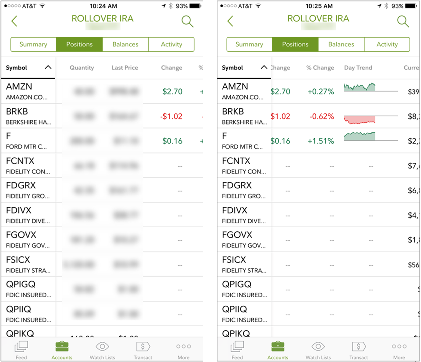
Stick Column Headers in Place
For any table that fills more than a single vertical screen, sticky column headers help users know what they are looking at. Without sticky headers, it is easy to lose the context of what the table is displaying.
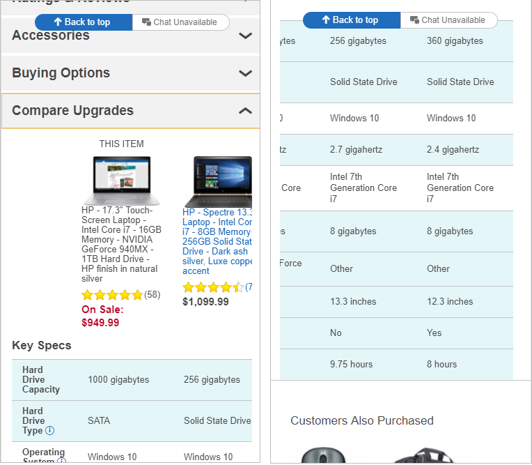
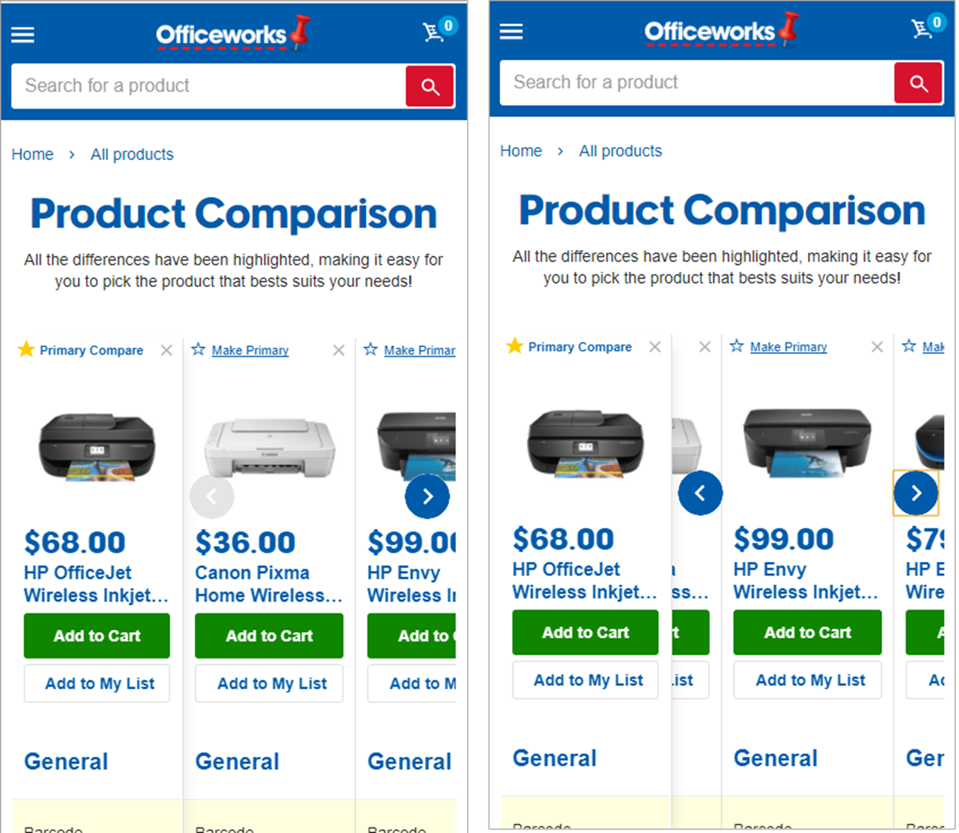
Clearly Indicate if Horizontal Scrolling Is Needed
When data doesn’t fit the width of a portrait-view mobile screen, users may need to scroll horizontally to see the full information. (While horizontal scrolling in general is nasty for desktop and mobile users, it’s somewhat acceptable for large tables on mobile screens.)
However, for such scrolling to work, it must be apparent that there is more data beyond the horizontal fold. Like for carousels, arrows or cut-off elements convey this information best. Dots are sometimes used, but are typically harder for users to notice and understand than arrows or cut-off elements.
Stick the Left Column in Place
If users must scroll horizontally to see all the data, the leftmost column, which is typically a column of row headers, should be locked in place, so users can see the necessary labels at all times.
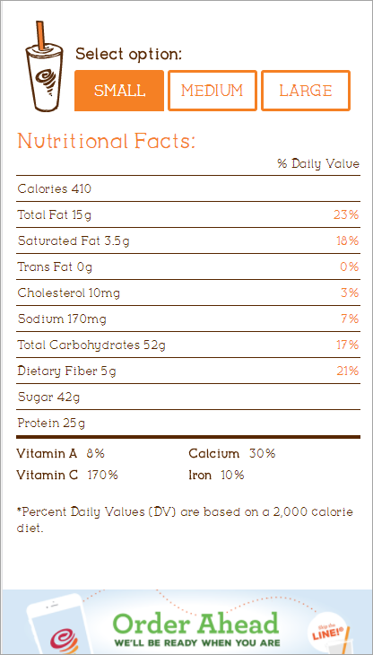
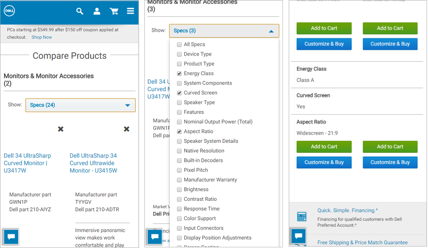
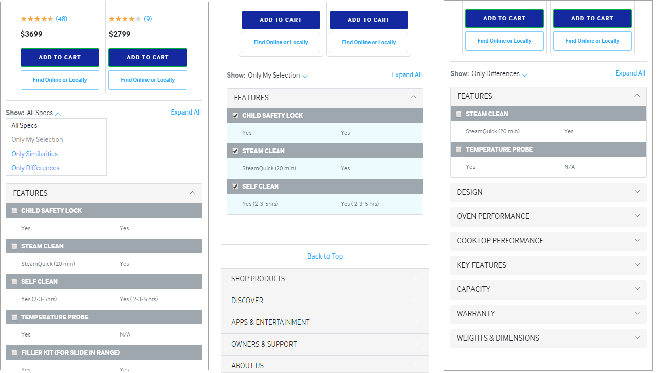
Let Users Select the Data to View
If the data won’t fit on the screen, chances are that users won’t have the time or desire to see all of it. So the question becomes how to provide them the information that is relevant to their needs.
The answer to that question depends on the user task and the type of data, and often is more complex than a mobile interface would allow. (Learn more about information-visualization solutions in our Application Design course). Here are two strategies that limit the amount of data displayed on the screen and work in a variety of situations:
- Allowing the user to refine exactly which data set is needed before seeing data
- Giving users control of the view of data as they are seeing the data
The first approach works if users need to see data, but don’t need to compare it. They can narrow the choice of data down to the specific information they need before displaying. For instance, users may only want the features of a specific model of car, the nutrition information for a specific food item, or the statistics for a particular player, rather than comparing that information across multiple items.
The second solution is to provide users control over the specific details they see. For instance, some may be interested in the similarities or differences between two products; others may care only about certain attributes of your data — for example, they may need to compare the trunk capacity or safety features, but not the noise level of two vehicles. The ability to select what rows or columns are shown on the screen lets users focus on the subset of data that is of interest to them.
Accordions for Groups of Data
If the table includes data that can be grouped into logical categories, use accordions to allow mobile users to:
- See an overview of the type of data that’s available in the table
- Have direct access to information of interest
Help Users Find What They Need
On small screens, users can only see a small portion of a large data table. Signposts such as locked headers orient users when they scroll through the data, and tools that narrow down content according to user-specified criteria allow them to view the data in a meaningful way.
Learn more in our day-long course on designing for different screen sizes.


