


Large software organizations (such as Apple, Microsoft, and Google) create design guidelines to help both users and designers.
- On the one hand, designers and developers can get a head start on creating interfaces that will hopefully be good, without needing to invent (and test) all-new UI elements.
- On the other hand, users get a consistent look-and-feel across applications running on the same operating system if all designers comply with these guidelines.
Following style guides is almost always recommended. But there are some cases where the official design does not work well in practice. Nonetheless, for reasons unknown — maybe the recommendation was a trade-off, it wasn't thoroughly researched, or it seemed to be the best possible a solution to a very difficult design challenge — it still made it in the style guide.
The following are 4 common iOS patterns that Apple has used extensively in its apps and that have been followed by many other designers. Some of them are part of the iOS human-interface guidelines. Time and again, we have seen these designs cause usability problems. The Apple gods may strike us down with lightning, but we recommend against following these patterns because they fail in usability testing:
- Page control: dots to indicate pages
- Form Submit button at the top
- Plus (+) icon
- Move icon
1. Page Control: Dots to Indicate Pages
Many iOS users are familiar with the page control. The iOS page control is a line of horizontal dots that represent open views or pages. The currently selected page is represented with an opaque dot and the other pages are represented with translucent dots.

Some apps and sites use this interface element to indicate that users can swipe through pages of content while others use it in a partial area of the page to show a carousel of content. It’s a popular pattern in both mobile-web and app design, but it is also one commonly overlooked by users. In usability testing, these dots are often too subtle in the interface to clearly indicate to users that there is another view of content available. As such, they should never be used for key functionality, such as navigating between features, or as the sole method for accessing information.

While designers and developers can select what colors to use for the tint of the circles, it is difficult to make a small, subtle, and translucent design element stand out on a page. Many designs use these circles on top of busy images, which causes an already subtle design to further fade into the background. If using the dots, help users notice them by increasing the color contrast between the dots and background and placing the dots on a solid color background when possible.
Some sites and apps take liberties even with the existing iOS conventions, using squares or other shapes or moving the dots around the page. Users struggle to locate and use these dots even when they follow the design conventions described by the iOS guidelines. Changing the elements to diverge from these standards makes them that much more difficult to identify and understand. If using the dots, center them and place them directly below the elements they control.

Even if users do notice the dots, an essential usability problem remains. The dots allow only sequential access to content, and provide no indication of what the content is. Whether the dots indicate items in a carousel or stand for separate pages in a deck-of-cards pattern, the same usability concerns apply. In particular, carousels using symbols to represent pages limit users’ control over their experience. Users have no way to know what’s coming next and no way to navigate directly to content of interest.
Instead, we recommend:
- Consider if content should even be accessed via swiping. It may be better accessed via navigation or text links.
- Cut off a piece of content (text or image) to visually indicate that users can swipe to reveal more information.
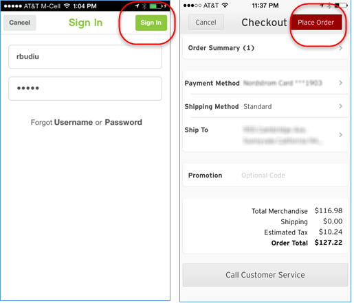
2. Form Submit Button (or Equivalent) at the Top
On iOS, the Done button is often displayed in a navigation bar at the top of the page. Sometimes the form Submit button (whether called Submit or something else — for instance, Place Order) is also placed at the top of the form. This pattern has started to trickle into Android apps as well.

Even in iOS apps we recommend against following this pattern for the simple reason that it goes against the natural top–bottom workflow on the page. As users fill in the form, they usually do it top to bottom. When they get to the end of it, they expect to find a Submit button right there, next to the last field they have completed. Most of the time, when people don’t find it there, they get confused and start looking around, not knowing what to do.
In the examples below (Pinkberry and Nordstrom), the Sign In and Place Order buttons need to be pressed after the user has filled in the form. Placing these buttons at the top of the screen is against the natural flow of filling in the form: once done with all the fields of the form, users find themselves at the bottom of the page, left with nothing to do next. Even on a small mobile screen, looking for and finding the corresponding Submit button requires unnecessary extra effort that could be saved if that button was placed at the bottom of the page, under the last field, as it is customary on most forms on the desktop.
(The generally accepted design guideline for any GUI — mobile or not — is proximity between actions and objects, not to place the action button as far away as possible from the data it acts upon.)
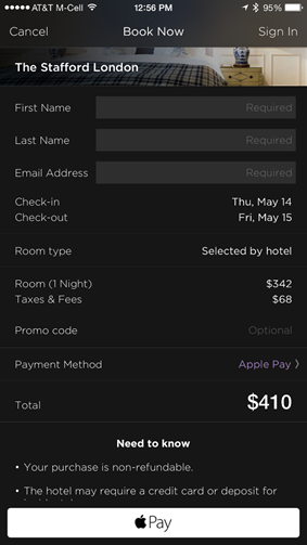
One of the advantages of having the Submit button in the page header is that, because this header is sticky in iOS apps, users can access the button easily at all times — whether they have filled in all the form fields and reached the bottom of the list, or not. (For the Calendar app it may be reasonable to assume that users won’t bother with all fields, but for a login form it’s not.) In any case, if having the button accessible at all times is important for you, consider instead a sticky Submit button at the bottom of the page, like in the Hotel Tonight app. Yes, you will sacrifice some screen real estate, but in return you will gain a better, more usable interaction flow.
Instead, we recommend:
Display the form Submit button (or equivalent) under the form fields rather than at the top of the page.
3. Plus (+) Icon
Throughout many mobile apps, the Plus icon is used to represent a variety of functions. When placed within a top navigation bar, it most commonly means “Add,” but when placed within a table or list of items the icon can signify either adding that item to some sort of list or group, or expanding that list item for more detailed information. When multiple interpretations exist, it becomes difficult for users to consistently understand an icon's meaning.
The usability of the Plus icon is highly dependent on where it is located within a UI. When found in a common place, such as a navigation bar, the meaning is usually correctly understood as long as adding new items makes sense for the type of content shown on that screen. However, when the Plus icon appears within the main content of an interface, it can have multiple meanings, which creates confusion for users.
For example, a previous version of the app Any.do displayed the Plus icon alongside the label of existing to-do lists. In this context, it is unclear whether tapping the Plus icon would expand the list to view the items it contained, or if it would trigger adding a new to-do item to the corresponding list. The current version of the app has solved this ambiguity by relocating the Plus to the navigation bar: however it is now used to add an entirely new to-do list.

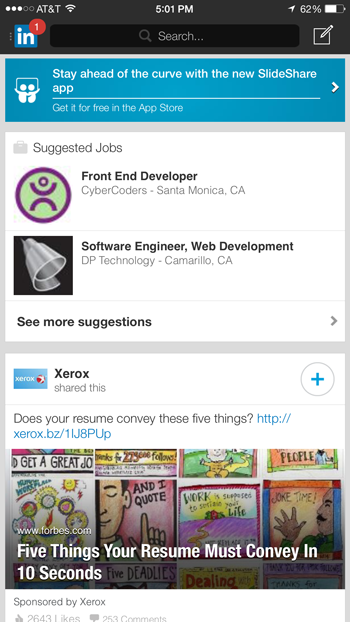
Leveraging the Plus icon to trigger actions is particularly harmful when the user misinterprets what will occur. Since the Plus icon is regularly used on the web and in mobile apps to communicate that a list can be expanded — together with the arrow (>) and the caret (^) — users often do not expect that same Plus icon to actually perform some sort of action. In the LinkedIn mobile app, a Plus icon in a circle is used to Follow a company or Join a group depending on where it is located. In usability testing, several users were surprised when they accidentally joined groups they were intending to merely get more information about.
Avoid adding the Plus icon haphazardly throughout an app, as it can be interpreted in several different ways depending on its exact context within the interface.
Instead, we recommend:
- While the navigation bar is a fairly safe location, displaying the + icon in other areas in a design must be tested with users to ensure the meaning is correctly understood.
- The only way to fully avoid the issue is to also avoid the icon, and to use an arrow or caret for expandable lists, and text labels for buttons triggering any action associated with a list item.
4. Move Icon

Like many icons for mobile devices, the move icon does not clearly reveal what it does. By looking at it you probably will not recognize that this icon will move an item in a list. The 3 horizontal lines used for the Move icon may represent a list, or maybe, as one reader pointed out, "ridges preventing the finger from slipping off the item while dragging it." When this icon appears within a row of a list, users are supposed to tap the icon and hold it while dragging the related item to its rightful place in the list. There are a few usability issues with this pattern.
When items are movable in a list, users expect to tap directly on an item (word, button, etc.) and drag it. They don’t expect to need to touch a small, hard-to-decipher icon instead and drag that. The icon is a much smaller and harder to tap target than the item in the list itself is. So it increases the interaction cost and makes users work harder to tap and drag than they should need to. Additionally, in list views, users expect all the elements in a row to be associated with the same action: in other words, they think that dragging the item or the icon should do the same thing.
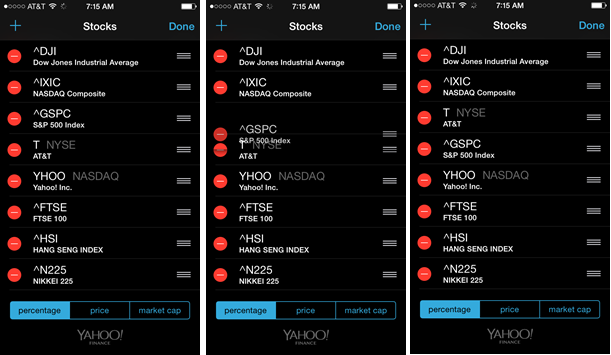
Finally, nearly the exact same icon recommended in the iOS style guide has come to mean something completely different on the mobile web and elsewhere: The hamburger icon looks incredibly similar to the move icon.

It can be disconcerting and confusing to people when the same thing, or what is perceived to be the same thing, is used to invoke different commands. If the hamburger menu continues to gain traction, more users will learn that clicking three horizontal lines opens a menu (even if they may still overlook this feature more often than we would like). But this is not how the move icon works. This disagreement hurts users’ ability to recall what the icons do after they have already used them.
Instead, we recommend:
- Make it possible to tap and drag items in place without needing to click a particular icon to do so.
- Instead of the hamburger icon alone for a menu, display it with the word "Menu" to indicate that a menu will open, or use the word "Menu" alone.
Conclusion
Deviating from well-researched interface patterns is usually not recommended. It is better to follow the probable best practices, knowing that consistency and knowledge transferred from use of other iOS apps will prime users’ expectations. With any guidelines or style guides, doing usability testing can demonstrate or disprove if the guideline works well in your own design. Through watching people use these designs, we have witnessed enough consistent issues to recommend against using these 4 patterns.


