:format(webp)/cdn.vox-cdn.com/uploads/chorus_image/image/55904719/1_wa99VXlZdrEqMcGsFYlSxQ.0.jpeg)
On Thursday, Twitter threw us a curveball (sorry) and smoothed out the once-square avatar photos into orbs floating around the timeline. The change is notable, but the circle vs. square debate is far from new. There are arguments in favor of both when applied to internet design; circles indicate a person rather than content, which typically comes in a grid-like shape. So what is the current state of shapes on the social web?
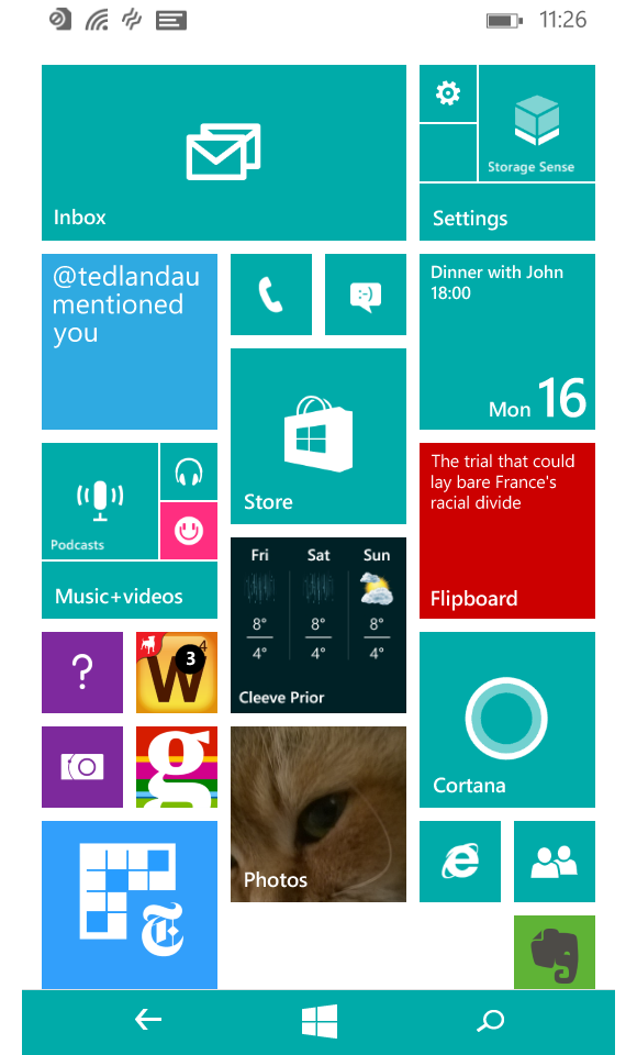
Instagram ditched its hard rule for square posts in 2015. Instagram Stories and profile icons are circles. Snapchat chat icons are circles; profiles are ghosts within squares. Google Hangout profile icons (are these Google+ icons? Does anyone know anymore?) are circles. App icons are squares. The Facebook profile photo is a square. Slack avatars are square. The Square app is a square inside the app icon (which, to review, is also square). Despite Twitter’s change, the world is still safe for squares, or so I thought. I was wrong. There are no squares. (Just ask Windows Phone, a now-defunct defender of squares.) Squares are dead. The entire internet is now just a series of curvy, swoopy lines.
Cliff Kuang, the director of product at Fast Company and author of a forthcoming book about design, pointed out to me exactly how wrong I was about squares. I started running down the avatar inventory in my iPhone. Facebook, for example, was one of the very few square holdouts. “I imagine Facebook has tested this like crazy, but I bet you if you looked at it hard enough that it’s rounded in some way.” So I zoomed in, and there they were: rounded edges.
:format(webp):no_upscale()/cdn.vox-cdn.com/uploads/chorus_asset/file/8927389/0_9vEAwVFEdUGeluVj..0.jpeg)
The same is true of app icons. Most of the favicons I checked — same. Facebook post boxes — those too. Even Instagram, formerly the most aggressive purveyor of square culture, has rounded edges on its web viewer. Slack avatars, as it turns out, are not square. Nearly every “square” on the internet is not actually a square.
“A lot of this talk about rounded corners began with, as you can expect, Steve Jobs,” says Kuang. “There’s a famous anecdote about him berating one of the original engineers of macOS about button shape. The engineer was like, ‘Let’s just do squares; it’s a lot easier to render,’ and Jobs took him on a tour of the parking lot and pointed at everything that was a rounded shape. The yield sign, the parking sign, everything. If you think about it, it’s very rare to find a straight, pointy corner in the natural world. It’s a very rare shape.”
“He always wanted his interface to essentially look as natural as possible, so he had a philosophical bias toward that,” Kuang continued. “The world is made of rounded corners. Sharp corners hurt you; sharp corners are things to be avoided. So [Jobs] has this almost spiritual take that rounded corners were friendlier.”
True circles, Kuang explains, are the superior eye-grabbing form. “You’ll notice that a lot of things that are supposed to be perceived very quickly tend to be round. There’s something about circles that draw our attention more easily.” A trick he asked me to try: Draw a square with rounded corners and draw something inside of it, then draw a square with sharp corners with something inside of it. “You’ll see the rounded one makes you pay attention to what’s in the center of it.”
One more trick Kuang suggests: Trace your eyes around something round and then something square. “Notice your eyes following the edge of something if it’s round, versus if it’s straight. Notice how your eyes move and how your head moves. You naturally follow the contour of something when it’s rounded, it’s very easy to follow the contour of something when it’s rounded.”
According to research, it’s harder for the brain to process sharp edges — the cognitive load is lessened with rounded shapes. Essentially, softening things allows the brain to be a little lazier and more easily interpret what it’s seeing. A useful explainer from UX Movement puts it this way: “The sharper the corner, the brighter it appears. And the brighter a corner appears, the harder it is to look at.”
The explainer also features this effective illustration to demonstrate the point:
:format(webp):no_upscale()/cdn.vox-cdn.com/uploads/chorus_asset/file/8927391/0_7ccTjPHzBzxbw2cS..0.png)
(My answer: neither! You can’t trust children.)
The rounded shapes vs. hard edges debate also informs visual cues in the internet’s history; when I think of boxy squares, I think of pixelated Oregon Trail games. (Kuang thinks of the Prodigy log-on button.) Back then, hard edges were easier to render because we had such low resolution, but as resolution becomes greater, it’s easier to soften shapes — so designers have. Taking this line of thinking to its ultimate conclusion, circles are an indicator of the most sophisticated, accessible execution of web design.
Writing seriously about Twitter design feels sort of … silly. That the smoothing of some hard edges can inspire outrage and adoration is dumbfounding. But there is one line of defense for such reactions, and it’s that we simply cannot help ourselves. Our brains are what they are, and the way our eyes interpret and react to the things we stare at everyday matters deeply to the parts of our mind we don’t know, and it’s why shapes and colors make us feel things. Even if the things we’re feeling are, again, sort of silly. But this is a roundabout (again, I’m sorry) way of saying that Twitter’s new design choice is rooted in what we already neurologically prefer — whether we realize it or not.
“[Rounded corners] create a visual order,” says Kuang. “It’s something you can perceive, but you can’t put your finger on it right away.”


