What's the weirdest logo in the history of each Major League team?
Major League history is full of classic looks: Boston's English "B," the Cardinals' birds on the bat, the Dodgers' script. Of course, "Major League history" encompasses some 150 years or so, which means that it's also full of some ... not-so-classic looks.
From New York to California, Minnesota to Texas, no team (well, almost no team) has been immune from the occasional bizarre design detour. And so, in perpetual appreciation of the wackiness of our national pastime, we present: the single weirdest logo in the history of each MLB team.
Angels: Primary logo, 1961-64
The Angels played with several versions of the wing theme through the years, but none were as imposingly biblical as the team's very first logo.
Astros: Primary logo, 1977-93
When it first opened in 1965, the Astrodome -- the world's first domed stadium, with artificial turf and an animated scoreboard -- was so futuristic that even the grounds crew looked like astronauts. So of course the team's logo went full outer space.
Athletics: Alternate logo, 1999
Turn Ahead the Clock Night -- in which MLB teams imagined what the game would look like decades into the future -- created some, uh, interesting aesthetic choices. For our money, though, the A's robot elephant is tough to beat.
Blue Jays: Primary logo, 2003
It's one of the iron laws of baseball logos: At some point, every team with an animal mascot creates an unsettlingly buff version of said mascot. Here's Toronto's version, which served as the team's primary logo for exactly one year.
Braves: Cap logo, 1972-80
For the most part, the Braves have stuck with the same look since moving to Atlanta in 1966. The exception? The lowercase "a" they rocked on their caps for much of the 70s, showcased here by the inimitable Dale Murphy.
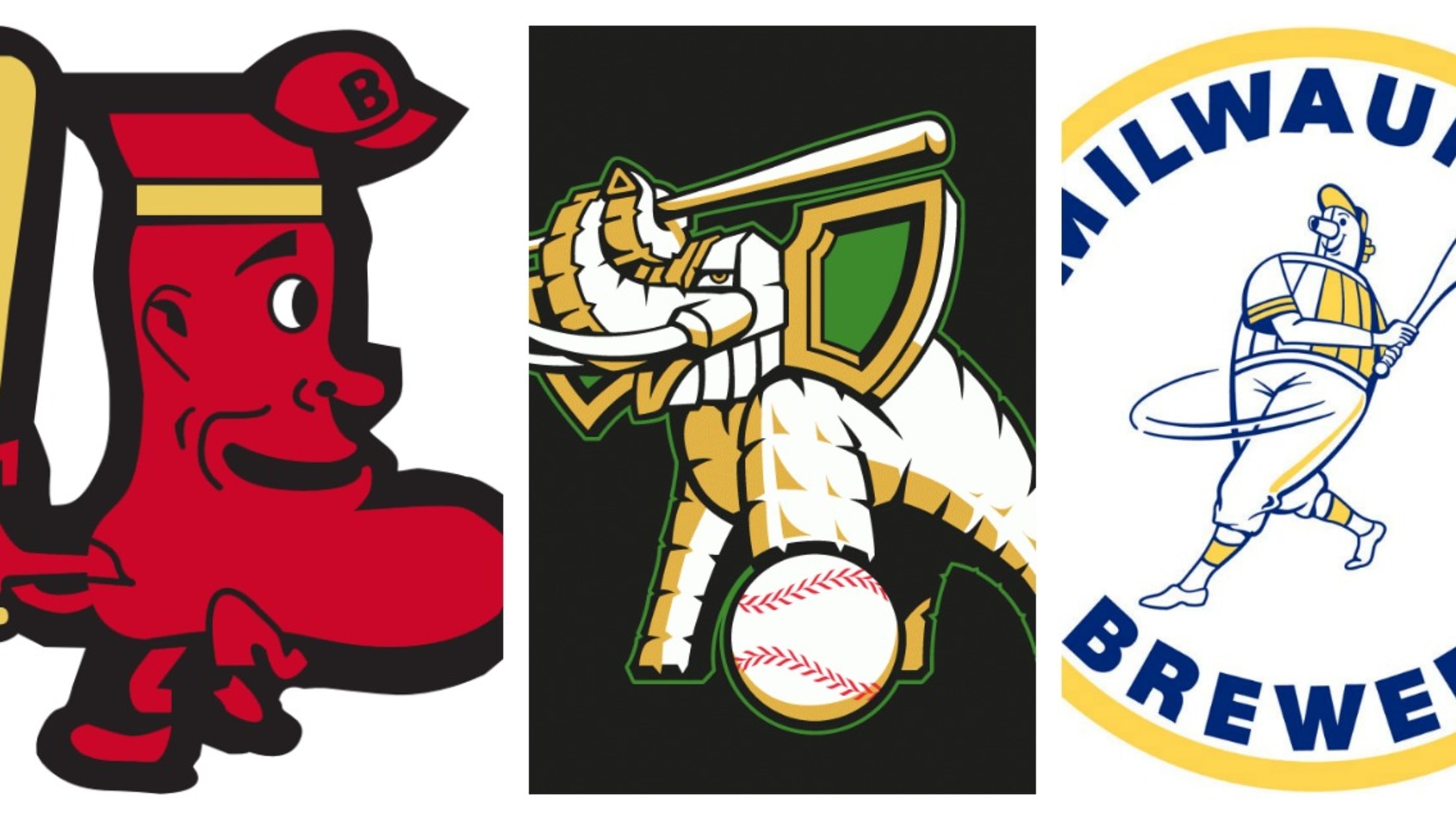
Brewers: Primary logo, 1970-77
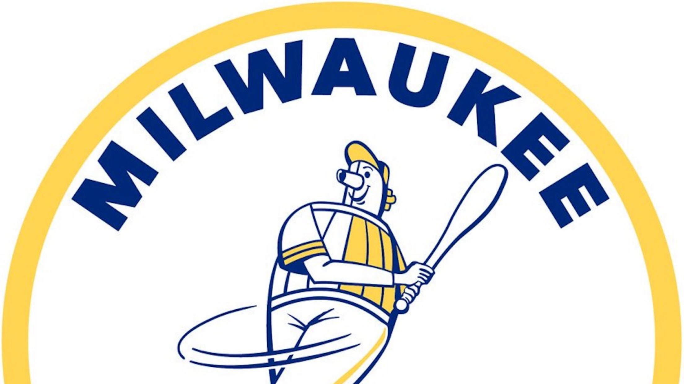
You may be familiar with the MB fielder's mitt, and while that's admittedly timeless, there's another classic look we'd like to introduce you to: Say hello to Barrelman, who served as the Brew Crew's first logo. Yes, his nose is a tap.
Cardinals: Alternate logo, 1960-64
For nearly 100 years -- Sluggerbird experiment aside -- the Cardinals have stuck with the bird on the bat as their primary logo. The alternate logos, however, are full of all sorts of weirdness -- like this cardinal from the early 60s, who looks like he's about to brush you back.
Cubs: Primary logo, 1941-45
The Cubs' aesthetic over the years has, for the most part, skewed cute and cuddly -- they're the Lovable Losers, after all. And besides, how intimidating could a baby bear possibly be? The answer, as their early 40s look attests: very.
D-backs: Alternate logo, 1998-2006
As always, points to the D-backs for willing to get all kinds of weird with their color scheme, and points specifically to this logo -- which the team wore on its sleeve -- for answering the eternal question "what would a snake look like if it tried to eat a baseball?"
Dodgers: Primary logo, 1937
Do not adjust your screens. The Dodgers are so synonymous with the color blue that they have their own shade -- there's a Wikipedia page and everything! -- but in 1937, a hard-luck Brooklyn team was in need of a change of fortune ... so they switched up their uniforms to kelly green. The fans never really bought it (at least if this cartoon in the Daily Eagle is any indication), and after a sixth-place finish, the team went back to blue the next year.
Giants: Primary logo, 1947-57
The Giants are another team with a time-honored aesthetic, but everything about the team's logo in the 40s and 50s -- from the slanted, futuristic cursive to the baseball that's shaded like the moon -- was wonderfully space-agey. Who knows, maybe they were inspired by the 1939 World's Fair over in Queens.
Indians: Jersey logo, 1974-77
The lettering above is outstanding on its own, but to properly appreciate the Indians' mid-70s look, you need the full, all-red get-up -- dubbed the "blood clot" uniform by Cleveland first baseman
Mariners: Primary logo, 1977-80
Sure, there's no teal, but there is a trident -- because why settle for being a mere Mariner when you can be Poseidon, God of the Sea?
Marlins: Primary logo, 2012-16
Sure, the Marlins have only been around since 1993, so they don't have the vintage weirdness that older franchises might. But their inaugural Marlins Park look was one of the wildest things ever put on a baseball diamond, and we are forever grateful for it.
Mets: Alternate logo, 1999
The Mets have undergone as little logo change as any team in baseball -- once they saw that iconic blue and orange skyline, they justifiably decided to call it a day. But the Mercury Mets, the team's Turn Ahead the Clock Night alter ego? That's another story.
Nationals: Primary logo, 1957-60
The Nationals only have 15 years' worth of logos, while the Expos never strayed from their classic red, white and blue. So we're going to cheat a bit here and give you a Washington Senators logo, because 1) they were the last team prior the Nats to play in D.C., calling the nation's capital home from 1901 to 1960 before heading north to become the Twins and 2) we can't in good conscience deny you this drawing of a senator mid-windup.
Orioles: Alternate logo, 1955-62
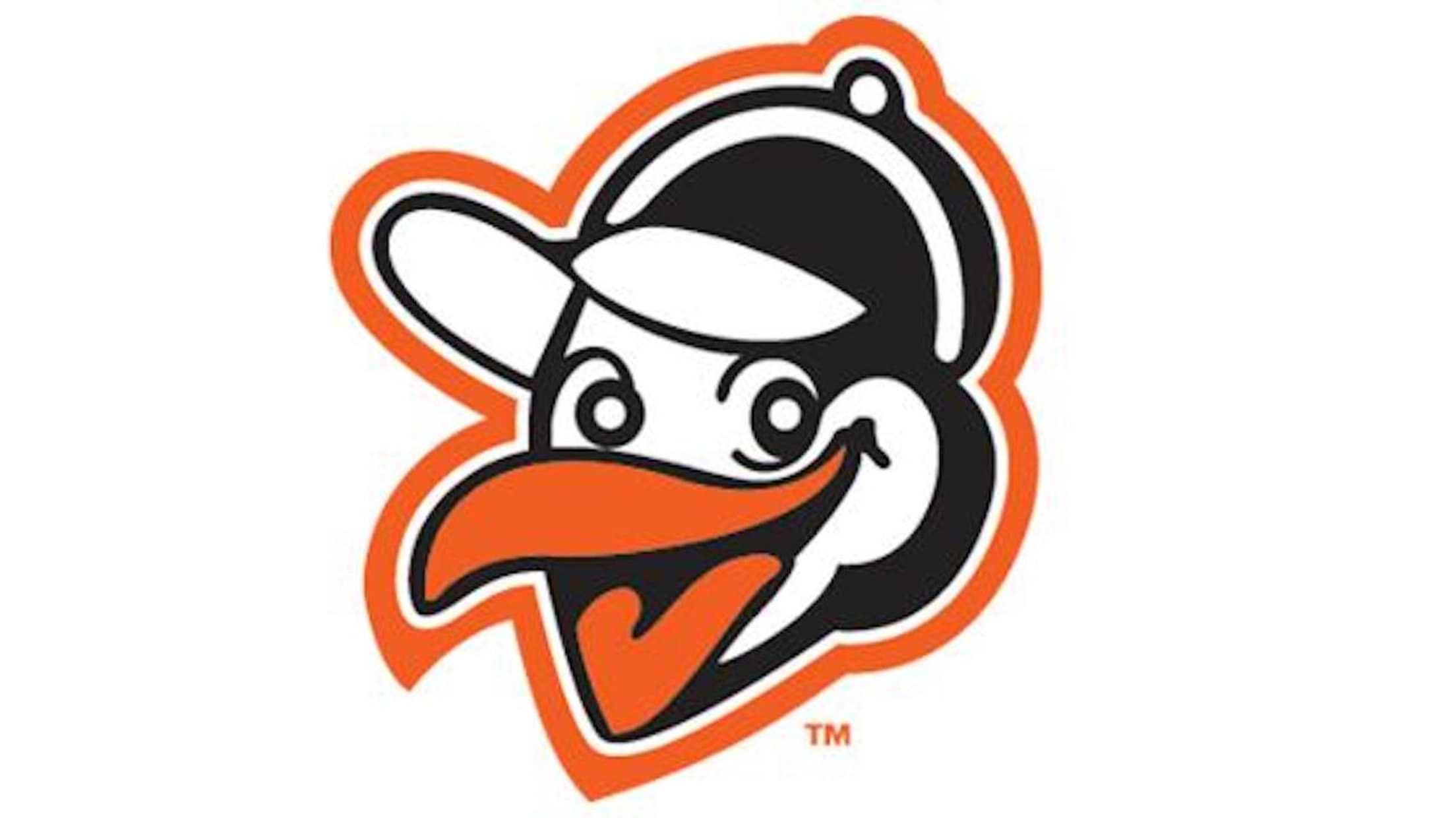
The cartoon bird is quite possibly the greatest logo ever devised, and we thank the Baseball Gods every day that Baltimore brought it back in 2012. As for our favorite edition? Cuckoo Bird is a strong (if terrifying) choice, but he can't match the cartoon zaniness of the bird that graced the O's sleeve patches from 1955-62.
Padres: Primary logo, 1969-1984
We already know that San Diego will bring back the brown in 2020, but more importantly: Will they bring back the Swingin' Friar, the team's logo for its first 15 years of existence?
Phillies: Primary logo, 1976-80
Before the Phillie Phanatic, there was Phil and Phillis -- 15-foot, animatronic twins that stood outside Veterans Stadium dressed in colonial garb, an attempt to connect the Phillies with their city's revolutionary past. After a few years as mascots, the pair made their way onto Philly's logo for a few years in the late 70s.
Pirates: Primary logo, 1958-66
The Pittsburgh Pirate has been through a lot over the years. He's been grizzled. He's been handsome. He's been spectacularly mustachioed. For our money, though, it's hard to beat the delightful cartoon pirate that the team went with in the late 50s and early 60s.
Rangers: Primary logo, 1972-80
The only thing more Lone Star State than "naming your expansion team after the Texas Rangers" is "putting a cowboy hat on a baseball and making it your first logo."
Rays: Primary logo, 1998-2000
The Rays don't have a ton of history to pull from, but who needs variety when you have a neon devil ray? And yes, these babies are coming back again in 2019.
Red Sox: Alternate logo, 1950-59
You probably thought that Boston would be one of the more unremarkable entries on the list. The English B and the dangling pair of socks have seemingly existed since time immemorial. Which is why we're so pleased to inform you that, in the 50s, the Red Sox anthropomorphized a sock and turned it into a slugging Jay Leno caricature.
Reds: Primary logo, 1968-92
Remember the axiom about weirdly muscular mascots? The Reds spent a couple decades with a logo that was about to barrel into your living room and yell at you about Crossfit.
Rockies: Spring Training logo, 2018
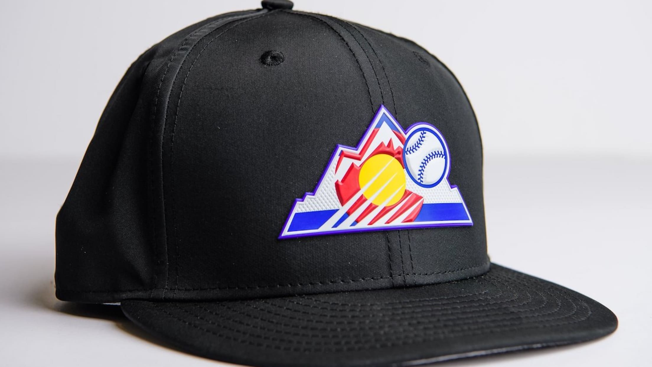
The Rockies have only ever had two logos: the silver "CR" wordmark and the baseball soaring over the Rocky Mountains. That doesn't give us much to work with, but it does give us an excuse to heap praise upon Colorado's awesome, state flag-inspired Spring Training caps introduced last season.
Royals: Hallmark submission, 1968
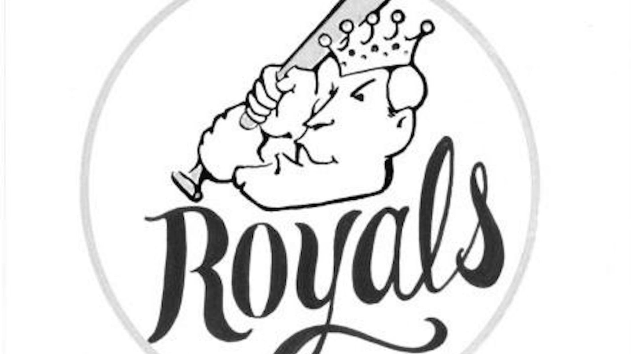
Speaking of teams that knew better than to mess with a good thing: Kansas City has more or less the same logo now that it had when it played its first game back in 1969. Seriously, look at this. So instead, let's pivot to what the logo could have been.
In 1968, the team asked Hallmark to hold a company-wide submission contest. Our favorite is the Lord Farquaad interpretation above, but we highly recommend checking them all out.
Tigers: Primary logo, 1927-28
An honorable mention to the late-50s version that will stare into the depths of your soul, but it's hard to top the all-consuming weirdness of this Tigers logo. Where are his pupils?!
Twins: Primary logo, 1976-86
This one checks every iconographical box, then filters it all through an old Archie comic. Minnesota turned the Twin Cities into literal twins, with Minneapolis and St. Paul shaking hands over the Mississippi River -- all below a reference to one of the best baseball jingles out there.
White Sox: Primary logo, 1939-48
The South Siders have given us plenty to choose from, both good and, well, decidedly less so. But in the end, we just couldn't say no to this fantastically swole baseball player doing what appear to be lunges, for some reason?
Yankees: N/A
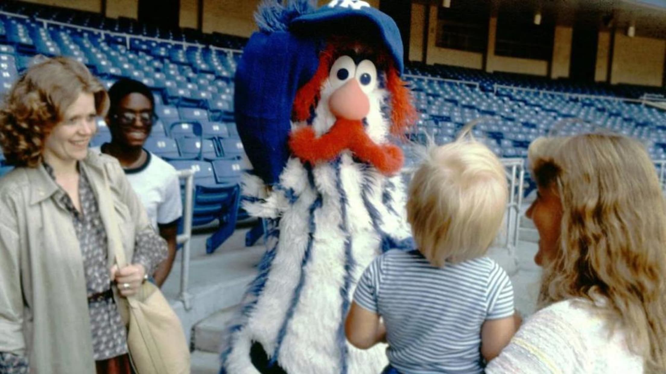
In true Yankees fashion, New York has had exactly one logo for the entirety of its existence as the Yankees: the stars-and-stripes top hat sitting atop a baseball bat. So here's a photo of Dandy instead, because you can never have enough Dandy.