There is no denying the influence of responsive approaches in our design and implementation efforts. What was once new and unknown is now the assumed standard. When I started down the path of understanding the impact of responsive web design, I had an easy time finding out how to do something with media queries, but I had a harder time finding out why I should do it a certain way. This article is an attempt to remedy this situation.
My intent is that it will serve as a helpful introduction for those of you attempting to understand the massive implications of the mobile-first approach and for those more experienced with the approach it can serve as a good refresher.
I will focus on the details of writing mobile-first media queries, and this will also include why we should do this and close with guidance for starting out. However, first we should look at some important distinctions in the phrase “mobile-first”.
Shades of Mobile-First
It is important for our discussion to distinguish that “mobile-first” has two distinct senses. Some might see this as unnecessary, but for the guidance I will share at the end of the article it is important.
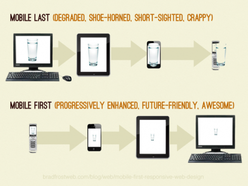
Many are familiar with the philosophical approach put forth by Luke Wroblewski in his book entitled Mobile First. Luke writes about the design advantages of a mobile-first strategy, the biggest impact being the imposed constraints of mobile devices that force us to focus on the essentials. He also talks about how mobile devices have capabilities that allow us to enhance the experience (e.g. GPS, accelerometer, etc.). This is what I will refer to as mobile-first design.
However, this is not the only sense, and this article will focus on the second sense. The second sense I will refer to as mobile-first implementation. This uses the technical tenets of responsive design, as coined by Ethan Marcotte. This means that when we actually implement the interface (prototype or production), we start out designing at the smallest viewport possible (which we will call a “mobile viewport,” but someday this might be “watch viewport” as the smallest) and we then progressively add styles and sometimes other enhancements as the viewport increases.
Let’s now look at the how and the benefits of mobile-first media queries.
Creating Mobile-First Media Queries
Rather than explaining all the ins and outs of media queries in this section, I want to focus specifically on how the technique is technically accomplished. Let’s look at two different media queries and dissect their implementation. Please note that I’m keeping this simple so I will avoid any specific class naming structure or style.
.sidebar {
  float: left;
  width: 25%;
}

.content {
  float: left;
  width: 75%;
}

@media (max-width: 40em) {
  .sidebar, .content {
     float: none;
     width: auto;
  }
}
You can see this simple example at work in this CodePen demo. Resize the window to see the change take place.
In this sample, I have two elements that are using floats so that they are lined up horizontally, and I have percentage-based widths on both of them. Then I have a media query breakpoint where the floats are disabled and the width is restored to full width using the “auto” value.
What are the problems with this approach?
- It forces us to “undo” styles through our media queries. This is not an efficient approach to managing your styles, but we should instead be adding styles.
- Our original float styles go against the natural flow of HTML elements. Block elements naturally clear on the top and bottom and flow at 100%, so the “undo” styles are merely declaring explicitly what the elements already do naturally.
- This does not allow us to embrace the same constraints that we may have used in our mobile-first design. We essentially are going in two different philosophical directions.
You can usually spot the implementations that start at large viewports and go down by the presence of “max-width” in the media queries. This is not always the case, but it is usually a pretty strong indicator. Now let’s look at another example:
@media (min-width: 40em) {
  .sidebar {
     float: left;
     width: 25%;
  }

  .content {
     float: left;
     width: 75%;
  }
}
Now let’s look at the advantages of this model, which are really the opposite of the problems we started with above (a demonstration of this is on CodePen as well).
- Instead of undoing the floats as we go down, we only need to add the floats when we need them. This reduces a lot of unnecessary CSS.
- In this instance we are taking what HTML gives us by default and not going against it unnecessarily. By default, browsers us give us what we want and need in smaller viewport so we utilize those defaults (i.e. block elements are set to
width: autoby default). - Using this method we are philosophically on the same page of our mobile-first design.
Source Ordering: A More Complex Example
The example above is very simple and on purpose, but let’s look at a more complex example. One of the first things you will learn about and have to deal with is the problem of DOM source ordering.
Source ordering refers to how a document is rendered as a result of the DOM structure. The DOM renders top to bottom, and until the advent of flexbox we didn’t have a pure CSS method to decouple rendering from source order. Even though flexbox is exciting, we will never get away from considering source order as we create responsive interfaces.
In this third CodePen example you can see priority highlighted from left to right.
Source ordering is a very important concept to understand as you move into responsive web design. From the example above you can see when the viewport dips below 40em the most important content (labeled “first priority”) is on top. This is what we want to happen given the importance of limited space in small viewports.
Now you could get something similar in the desktop-down implementation, but what I’ve seen people do is fall into old tendencies of not thinking first about the importance of source ordering. Mobile-first design and implementation makes it an inescapable reality, and when these are paired together the result is a powerful solution. Then technologies like flexbox can be used as an enhancement when needed if the need to change the rendering order exists.
A Couple More Advantages
The mobile-first code above is a great example of responsible implementation through progressive enhancement. It is important to note that there are still old mobile browsers that do not support media queries, and it is helpful that they will receive the smaller viewport layout. There are other browsers that have issues with media queries, most importantly IE8 and below. You can polyfill media queries, or use a preprocessor solution.
There is another important benefit to structure our media queries in this way, and that is performance. Tim Kadlec has done the research to show that using media queries in this manner can avoid unnecessary downloads. So, for instance, if you wanted to add a background image only at larger viewports or even swap out a smaller for a larger one, you save downloads and loading time. If I were to add an image to my sidebar in the example above, it would download and show up only when the viewport reaches at least 40em.
Manage Your Media Queries with Sass
Before I conclude, I recommend that you use a preprocessor to help you manage your media queries. There are countless options and even preprocessor syntaxes for handling this (Sass, Less, Stylus). I prefer a simpler approach and Chris Coyier has demonstrated a Sass mixin that I use in my projects. I will update it to use my preferred language.
@mixin mquery($size) {
  if $size == small {
    @media (min-width: 30em) {
      @content;
    }
  }

  else if $size == medium {
    @media (min-width: 40em) {
      @content;
    }
  }
}
Then we can reference it this way.
.sidebar, .content {
  @include mquery(medium) {
    float: left;
  }
}
This is great because we can centrally control our media query values, and we can always see how our elements are changing throughout all of our media queries. It used to bother me that my compiled CSS output contained repetitive media query syntax, but with minification and GZIP it is not a big increase. If it really bothers you and you use Grunt then Grunt can combine your media queries after the Sass processing.
Conclusion
When you are ready to go further in your reading and studies, start with 7 Habits of Highly Effective Media Queries, a great post by Brad Frost.
This article was meant to be a quick primer on the definitions, approach, and benefits to using mobile-first media queries. I wish you all the best as you continue to grow and embrace these new and exciting approaches that help better serve our clients and customers.
Frequently Asked Questions on Mobile-First Media Queries
What is the significance of mobile-first media queries in responsive web design?
Mobile-first media queries are a crucial aspect of responsive web design. They allow developers to create a basic layout for smaller screens (like mobile devices) and then progressively enhance the design for larger screens (like tablets and desktops). This approach ensures that your website is accessible and user-friendly across all devices, which is increasingly important as mobile internet usage continues to rise. It also improves performance on mobile devices, as they won’t have to load unnecessary code intended for larger screens.
How do I implement mobile-first media queries in my CSS?
To implement mobile-first media queries, you start by writing CSS rules for mobile devices. Then, you use media queries to add rules for larger screens. Here’s a basic example:/* CSS rules for mobile devices */body {
background-color: lightblue;}/* CSS rules for tablets and desktops */@media (min-width: 768px) {
body {
background-color: lightgreen;
}}
In this example, the background color of the body will be light blue on mobile devices and light green on tablets and desktops.
What are the best practices for using mobile-first media queries?
When using mobile-first media queries, it’s important to keep a few best practices in mind. First, always start with the smallest screen size and work your way up. This ensures that your design is truly mobile-first. Second, use relative units like percentages or ems instead of absolute units like pixels. This makes your design more flexible and adaptable to different screen sizes. Finally, test your design on multiple devices and screen sizes to ensure it looks good and functions well everywhere.
How do I choose the right breakpoints for my media queries?
Choosing the right breakpoints for your media queries can be a bit tricky. It’s best to base your breakpoints on the content of your website rather than specific devices. Start by designing your website for a small screen. Then, gradually increase the screen size until your design starts to look bad or break down. This is your first breakpoint. Repeat this process to find any additional breakpoints.
Can I use mobile-first media queries with CSS frameworks like Bootstrap?
Yes, you can use mobile-first media queries with CSS frameworks like Bootstrap. In fact, Bootstrap is built with a mobile-first approach and includes a set of predefined media queries for common device sizes. However, you can also add your own custom media queries if needed.
What are the benefits of a mobile-first approach over a desktop-first approach?
A mobile-first approach has several benefits over a desktop-first approach. It ensures that your website is accessible and user-friendly on mobile devices, which is important given the increasing prevalence of mobile internet usage. It also improves performance on mobile devices, as they won’t have to load unnecessary code intended for larger screens. Finally, it encourages a more streamlined and focused design, as you have to prioritize the most important content and features.
How does a mobile-first approach affect SEO?
A mobile-first approach can have a positive impact on SEO. Google uses a mobile-first indexing approach, which means it primarily uses the mobile version of a website for indexing and ranking. Therefore, having a mobile-friendly website can improve your search engine rankings. Additionally, a mobile-first approach can improve user experience, which can lead to lower bounce rates and higher engagement, further boosting SEO.
What are some common challenges when implementing mobile-first media queries and how can I overcome them?
Some common challenges when implementing mobile-first media queries include choosing the right breakpoints, ensuring compatibility across different devices and browsers, and maintaining performance. To overcome these challenges, it’s important to base your breakpoints on your content, test your design on multiple devices and browsers, and optimize your code for performance.
Can I use mobile-first media queries to hide or show content on certain devices?
Yes, you can use mobile-first media queries to hide or show content on certain devices. However, this should be done sparingly, as it can lead to a disjointed user experience and potential SEO issues. It’s generally better to restructure or rearrange content for different screen sizes rather than hiding it completely.
How can I learn more about mobile-first media queries and responsive web design?
There are many resources available to learn more about mobile-first media queries and responsive web design. Online tutorials, courses, and articles can provide a wealth of information. Additionally, practicing and experimenting with your own projects is one of the best ways to learn and improve your skills.
 Chris Poteet
Chris Poteet is a senior user experience consultant working for Portal Solutions. One of his primary interests is helping others grow in their professional development. He is on Twitter @chrispoteetpro and blogs at www.siolon.com.