
Matthew Butterick knows how to present a case. A Harvard-trained designer turned civil litigation lawyer, Butterick is on a one-man mission to bring better design and typography to the legal profession.
His recent book Typography for Lawyers (Nov. 2015, 2nd edition) opens with a startling fact: With over a million prolific “writers,” the legal industry is the biggest publisher in the United States, eclipsing the entire media and print publishing industry, according to the 2014 Bureau of Labor Statistics.”Lawyers are the most consequential writers in America,” writes Butterick, echoing lawyer-lexicographer Bryan Gardner’s foreword to his book. “No offense to writers and journalists.”
As lawyers churn out briefs, petitions, contracts, memos—a mountain of legal documents that impact laws and lives—the right fonts, layout, and typographic marks can affect each document’s persuasiveness, Butterick contends.
“Good writing is part of good lawyering,” he writes. “So good typography is part of good lawyering.” Like everything else in life, it all boils down to presentation.
“I reject the notion that people don’t notice [how documents are formatted],” Butterick tells Quartz. He explains that as much as jurors attend to the material evidence and as well as physical cues on a trial, readers too notice visual presentation of text, whether they comment about it or not. “After all, we are perception-gathering machines,” he says. Content and form are inseparable, two sides of the same coin.
But perhaps Butterick’s most convincing argument for learning about good design lies in the fact that writers of all trades—journalists, bloggers, novelists, pen pals and attorneys—have to compete in today’s media-saturated attention economy. “Typography matters because it helps conserve the most valuable resource you have as a writer—reader attention,” writes Butterick. “I believe that most readers are looking for reasons to stop reading.” By spending time to finesse the layout of a document, he argues, a writer can eliminate distractions so readers can actually focus on its content.
Sound design advice from a lawyer
Butterick’s 240-page volume is packed with tips that apply beyond the legal community. Unlike most design instructional books that only reference professional layout software, Butterick goes into the weeds of desktop publishing and actually provides practical tips for improving Microsoft Word documents on Windows platform nonetheless. Among the great ironies (or travesties) of the graphic design profession is that most designers weaned in Adobe are squeamish about or unskilled with Microsoft Office—the world’s most used publishing tool.
In comparison, many typography tutorials are either slaves to strict grid systems or provide fuzzy advice, espousing the “I’ll know it when I see it” criteria.
But good typography, as Butterick explains, is a matter of skill, not taste. Perhaps anticipating skeptical, overburdened lawyers who are alien to the tenets (or purpose) of typography, Butternick distills its principles in refreshingly efficient and practical instructions:
Point size should be 10–12 points in printed [legal] documents.
Page margins should be larger than one inch on 8.5 x 11 paper.
Use bold or italic as little as possible, and not together
Never underline.
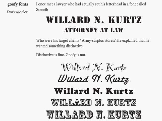
Avoid goofy fonts and monospaced fonts.
The examples he provides are useful for all—not just lawyers. Illustrative ”before and after” makeovers demonstrate that the best practices for formatting court opinions also apply to résumés, business cards and PowerPoint presentations. For articulating design logic in plain language alone, Typography for Lawyers is among the best graphic design text books we’ve come across lately. (Butterick has also since adapted the book for a general audience called Practical Typography.)
Font patrol
Before studying law at UCLA and passing the California bar in 2012, Butterick began his career designing fonts at the prestigious foundry Font Bureau working alongside esteemed type designer like Matthew Carter and Tobias Frere-Jones. His chapter on font recommendations reflects 25 years in the business and is among the most informative parts of the book. “If you have a choice about using Times New Roman, please stop,” he writes extolling on the value of looking beyond system installed fonts for solutions.
For the book’s second edition, Butterick designed four font families for legal writers. One curious typewriter-like like font called Triplicate is his alternative for Courier, which tends to have weird space issues between letters.
These days, Butterick is often invited to speak at conferences and big shot law firms around the country. Inevitably, he’ll encounter a dissenting view in the room, unconvinced about the place of typography in the law profession. Butterick knows he has a long way to go before he becomes the Kate Turabian of legal design, and that’s fine too, he says. “Once everyone adopts good typography, it will no longer be our secret weapon.”