Slopes Diaries #9: For the Good of the Business
Slopes Diaries is my ongoing journey to turn my indie app into a more sustainable part of my business. First time reading? Catch up on the journey so far.
What is Slopes? Think Nike+, Runkeeper, Strava, MapMyRun, etc for skiers and snowboarders.
If you're anything like me you usually start off a project with some pure ideals in mind: great engineering, Apple Design Award worthy design, wonderful user experience where everything is done to benefit the user. The great engineering goes out the window pretty quickly when you actually have to ship the damn thing, but the idea of a pure UX and wonderful design? You hold onto that, you fight for it (good design is never easy).
After all, the idea of prioritizing great UX is why we love Apple.
Then one day someone with authority on your team comes over and asks you to implement something so gut-wrenchingly terrible that you draw a line in the sand. "We just don't do that on iOS. Here, I have 10 studies that show why users hate it!" You fight the good fight.
What happens when the developer, designer, and the "evil" business/marketing person are all one in the same? You get a blog post out of it! Welcome to my inner struggles with Slopes as I've tried to turn it into a serious business.
Over the last few months I've learned that there is a need to compromise on some of my ideals. Well, compromise might not be the right word. I think some of the things that we think compromise our ideals actually don't, when done right. I think as a designer / developer I was too quick to dismiss things I needed to implement to help my business be healthy just because of some preconceived "Apple would never do this" notion.
(And, the dirty little secret? Apple does tons of stuff to benefit themselves that aren't the best for the user. They're #1 because they know when to make these tradeoffs.)
App Store Rate Prompt
When you mention a ratings prompt to most iOS developers / designers they instantly want to go take a shower. Somewhat rightfully so, as the most popular implementations of a prompt (using alerts dialogs, akin to the web's popup ads in the early 2000s) show a terrible disrespect for users. No user likes having their workflow disrupted by a popup which forces them to dis-engage from what they were trying to do to either rate the app or frustratingly dismiss the prompt and move on.
Just because the popular implementation is bad doesn't mean a ratings prompt is bad in and of itself. We've seen many best practices come up: only asking for a prompt after they complete a task and are free to context switch, leaving a prompt link on the about screen (which Slopes has always done), or asking for ratings in the release notes shown in the app store. Most of these best practices exist to remove the biggest problem of the alert-based prompt: interruption to the user. The tradeoff, though, is that the rating prompt is usually buried away and most users won't see it.
As Marco and David pointed out on episode 5 of Under the Radar your users fit into a bell curve: some hate the app enough to complain and some love it enough to gush, but the vast majority just use your app frequently while never thinking to speaking up about how they feel. When you hear from users, good or bad, it's a vocal minority. Most users certainly are not seeking out a way to rate the app, or noticing when you ask them to in the release notes (some do, but not that many). This is why alert-based prompts work so well: it captures the attention users that are just normally going about their day never thinking to give feedback about your app. The alert gets them to think about it.
In Slopes I had been relying on the unprompted good will of vocal users to maintain my five-star average, but I've realized that as a free app I'm going to attract some users that just flat-out hate my app, hit an annoying bug, or have an axe to grind though one-star reviews. I need to balance that vocal minority of upset users against all the users that are using Slopes every week happily, but never think to rate it.
Using an ask on the about screen, an ask at the bottom of customer support emails, and an ask in the release notes got me very few reviews over the lifetime of Slopes v1. ~50 written reviews in 2 years out of ~2,900 downloads.
So how to up my review rate without creating a terrible user experience?
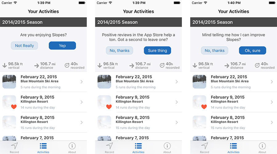
This is Slopes v2.1 with my strategy implemented. It's your standard ratings prompt, but it's part of the UITableView, so no user interaction is required to ignore it. If the user is too busy to care, that's fine, it won't force them to acknowledge the prompt. But every user (as long as they're actually using the app) will see it at some point, unlike all the other methods.
This technique is one of my secret weapons; I've used this approach on clients' apps before. Like Slopes, one such app was free and had a few vocal people leaving one, two, and three-star reviews because v1 didn't launch with every possible feature they wanted. I added in this prompt and the rating went from ~50 reviews over the span of 3 months at a 3 star average to ~250 reviews in 2 weeks with a 4.5 star average. We were also able to directly engage with the users that weren't happy with the app, helping them know we actually cared about what they thought, avoiding many potential one-stars.
It was amazing, and I'm hopeful I'll see a similar effect with Slopes.
What's New
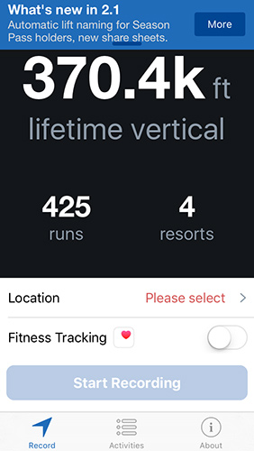
Since the business model of Slopes is based on subscriptions converting a free user to a paid user is one of the most important things I can do. I made sure as I was designing version 2.0 to take every advantage (without being annoying) to up-sell and point out what a Season Pass would get them.
But a user might have decided they were happy with the free version and never check out the "About Season Pass" screen after that first time, even after updates come out and I add new Pass-exclusive features. After all, why would they? They read the benefits, figured it wasn't for them and now that choice is made. It isn't like they'll keep checking the about page to see what new features I've added for Pass-holders lately.
The frustration is that a certain new Pass-exclusive feature could be the one that would tip them over to thinking a subscription was worth it. I'm constantly trying to add new premium features for Pass-holders to make sure it's compelling and I need free users, and Pass-holders, to be aware of them.
"The release notes!" you might cry, but far fewer people read them than you think (I'd venture less than 50% of users). For many users iOS is updating their apps as they sleep and they never see the release notes. I include my release notes in my about tab too, but I have the numbers to show many never seek that out.
Some apps solve this problem by including a full-screen "What's New" on major updates, but like the ratings prompt issue I wanted to avoid any forced interactions. Some, like 1Password, badge the icon in the tab bar with a notification dot until the user reads the release notes.
I wanted something a bit more passive.
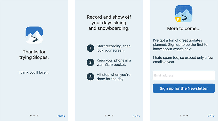
I was chatting with Greg Pierce at Release Notes and this approach came up (we forgot which app we had seen do it originally). A small little notification that pops down on the first launch of a new version for ~10 seconds, which when tapped takes them to my normal what's new screen with full release notes. Otherwise they can ignore it, or swipe it, and it goes away.
I think it's a great compromise. I get 2 quick lines to up-sell or call out an awesome new free feature, all users are kept aware that they're using an app that hasn't been abandoned, all users now might have the "hey, did you see they added this!" conversation with their friends, and no user is prevented from just going about their day.
As long as I don't spam this (maybe use it twice a year) users hopefully won't grow to ignore it, especially since it doesn't get in the way.
Mailing List
Before Slopes v1 I started a mailing list for users who were interested in the launch, and I maintained it over the years. People were able to sign up for it on the Slopes homepage and the release notes page. I got 68 signups over two years for that list, most of which were for launch. I think it's good to offer the signup on the web site, but the truth is most people probably aren't visiting your site (and if they are, you're hopefully optimizing to have them download your app, not join your mailing list).
With Slopes v2 I wanted to try something new and get a higher signup rate. I knew having customers to direct market to was important, and I needed to find a way to do better.
I heard Jeremy Olson talk about how he included a newsletter signup screen during the onboarding for his app Hours, and he saw great results. My first thought was "ick", but then I gave it some serious thought. There were some other things I wanted to tackle during onboarding that a tutorial overlay wouldn't hit, so despite the "dirty" feel to adding a newsletter signup to the onboarding process (again, possibly holding onto my pure design ideals to the detriment of my business), I figured I'd give it a shot and be as tasteful as I could with it.
(Aside: many apps try to get around this problem by forcing a user to create an account to even use the freaking app. I figured an optional newsletter signup was a nice compromise vs that.)
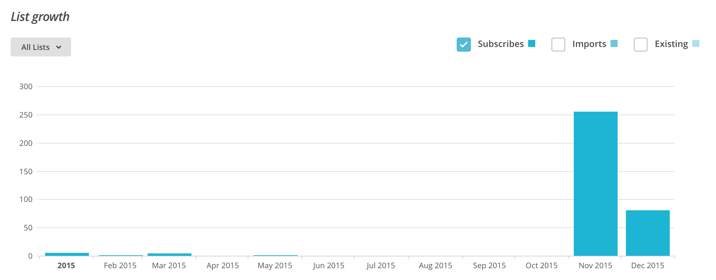
Slopes v2 has added an average of 11 users a day to my list via the in-app form. That's roughly a 10-15% opt-in rate from new users and it's adding up fast: I've gone from 68 users to 405 in just a month. In an environment where I have no access to users' email this is huge.
I've come to realize there's a healthy balance to be had between the needs of my business and my users' experience. That might be me selling out to the dark side, but I'd like to think it's really just me being less stubborn about some pure ideal of UX that many of us maintain to a fault, usually the detriment of our businesses.
After all, what good is great UX if we can't stay in business?