
Designing Farrago
Posted By Neale Van Fleet on February 3rd, 2018
![]() Since I started working as the designer here at Rogue Amoeba in 2015, I’ve contributed to several major updates. However, our new soundboard app Farrago is the first Rogue Amoeba app I’ve designed from the ground up.1 The design process for a new application is very involved, with countless discussions, hours of research, and even plenty of guesswork. A long sequence of hundreds (or even thousands) of little choices is required, with each decision impacting choices made later on. Ultimately, designing a new app feels more akin to pruning a bonsai tree than to simply drawing a picture. The design lives and grows in ways you can’t always predict.
Since I started working as the designer here at Rogue Amoeba in 2015, I’ve contributed to several major updates. However, our new soundboard app Farrago is the first Rogue Amoeba app I’ve designed from the ground up.1 The design process for a new application is very involved, with countless discussions, hours of research, and even plenty of guesswork. A long sequence of hundreds (or even thousands) of little choices is required, with each decision impacting choices made later on. Ultimately, designing a new app feels more akin to pruning a bonsai tree than to simply drawing a picture. The design lives and grows in ways you can’t always predict.
Planning for Farrago began in 20162 with a simple pitch: “We want to provide users with a fast way to play short audio clips”. Building on that, we prepared a rough list of features the app would require, including basic playback, looping, volume control, and much more. With that, we began to flesh out what the app would look like, and how it would work. Farrago went through many iterations to get to the version we shipped late last month. I thought it would be interesting to share a look at a few different parts of our design process.
Early Sketches
From its very first mock-up, Farrago focused on easily arrangeable tiles. The rigidity of other grid-based interfaces was something we wanted to avoid. While many things changed from my initial sketches, there’s still a clear resemblance to the Farrago we shipped almost 2 years later.
 The earliest sketch of Farrago I could find. The top bar and tiles were present from day one. The idea of sets on the bottom was abandoned not too much later (phew!).
Early on, we also decided we wanted to split the app into two modes: a nonlinear mode shown as a grid, and a sequential mode shown as a list. To quickly work out a basic transition between the grid and list views, I used Keynote and its indispensable Magic Move transition. This ultra-fast tool provides a quick sense of how an idea will work (or fail).
The five-second movie above shows the first mockup of the transition between grid and list views. We eventually went one step further, making the tiles follow arced paths that don’t overlap as much while transitioning.
Tile Troubles
Farrago’s UI is built around tiles, with each tile containing a single audio file to be played, along with many controls and settings for playback. My initial planning had each tile’s face containing multiple click zones to enable different functions. These early drafts show different click areas for playback, ducking, scrubbing, and editing settings.
 Assorted sketches of sound tiles, with controls on the tiles itself.
A good amount of time was spent tweaking the layout of the tile face, but the ideas were all excessively busy. These sketches were fussy, filled with too many click areas and tiny icons. The design went in circles, as I repeatedly tried to cram the functionality I wanted on the tile’s face. We wound up stuck on how this critical aspect of the design would work.
 There were a lot of conflicting sketches like this. We couldn’t decide how to proceed.
Ultimately, we realized tiles with multiple click areas were a dead end. Getting there, however, actually required us to reevaluate some of our base assumptions for the app.
User Interviews Cut Through the Clutter
Despite a key element of the app being up in the air, work was progressing in many other areas. Eventually, I knew we needed to figure out a way to solve the problem of how tiles would look. To break out of my rut, I decided to bring in outside viewpoints.
I reached out to my social network here in Montreal, and sought out the sort of people who might use a soundboard app — podcasters, radio folks, theatre techs, and more. I bribed several of them with free lunches, during which I showed them mockups and got their responses.
The feedback I got was immediate and consistent: Prospective users didn’t want to rely on a mouse or trackpad to play clips at all! They wanted to use their Mac’s physical keyboard to play sounds. Though I’d been focused on providing access to many controls right on the tile face, it turned out that mouse-based controls should be secondary.
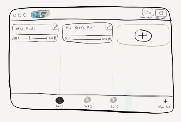
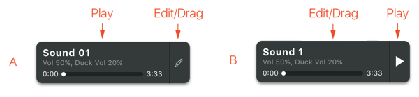
This pivotal insight gave us a clear path forward, and in fact, it now forms the basis of how we expect Farrago to be used by most people. At this point, we decided the tiles would be mapped directly to the keyboard, and this would be the primary way to trigger sounds. Rather than being cluttered with on-face controls, each tile would consist of one large click area. A simple click anywhere selects the tile, while a double-click provides an alternate method of triggering playback.
 The final tile design is all one big click area.
This change led us to move many secondary controls into our Inspector area. In that location, they’re still easy enough to reach, without being obtrusive.
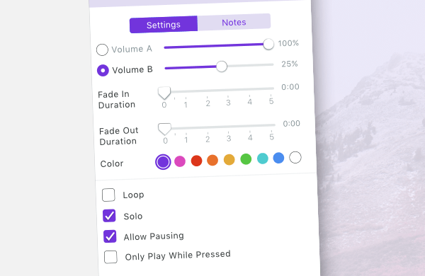 The inspector in its final form.
Close(r) to Complete
At this point, my mockups really started to resemble the Farrago 1.0 we eventually shipped. The keyboard-focused interaction model seems clear to us in hindsight, but it took a serious amount of work to arrive there. The outside feedback we solicited was invaluable in helping us move forward.
 A mock-up from spring 2017 that pretty closely matches the final design.
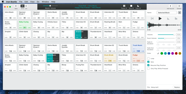
Zooming in on this mockup will show you the ridiculous placeholder names nobody was ever meant to see, such as “Onions” and “Fudge”. Ugh. You’ll also see the code name under which Farrago was developed: Iron Beetle.
The above mock is similar to our final product, though we still made many smaller adjustments and tweaks after this. The value of outside feedback continued to be proven during our private beta period as well, as testers forced us to reconsider more of our assumptions, and make changes based on real-world usage.
While our design was getting pretty close to what we eventually shipped, actually getting it all coded and tested would take many more months of work. From this point though, the design work was more about making things look nice, as well as solving smaller functional nitpicks.
Farrago’s Icon
After the design was largely complete, I took some time to work on nailing down Farrago’s app icon. While the design of the actual application is crucial for long-term use, the application’s icon is often the very first thing people see, and we all know how much first impressions count . Ideally, the icon should be distinctive and pleasing to look at, while also conveying something about the software itself. Farrago’s icon went in several different directions before arriving at its final form.
Most of the iterations riffed on the general idea of tiles and playback in some form. Here’s an assortment of different sketches I toyed with:
![]() Very early rough sketches done on paper or iPad.
Very early rough sketches done on paper or iPad.
A key part of my design philosophy is to put designs in place as soon as I can. I created icons from these early hand-draw sketches, so we could use them in early builds of Farrago. This way, we could see how well they worked in places like the Dock.
![]() One of the very rough hand-drawn drafts actually being used in the app.
One of the very rough hand-drawn drafts actually being used in the app.
Later designs began to look a lot more like what we eventually shipped. The final icon design started out purple, temporarily took a sidetrack into a rainbow neon phase, and ultimately returned to our toned-down final purple shade.
![]() The design on the left looks pretty similar to the finished icon, while the design on the right shows a temporary experimentation with neon colours.
The design on the left looks pretty similar to the finished icon, while the design on the right shows a temporary experimentation with neon colours.
Icon design is less scientific than application design. While feedback on icon designs is useful, in the end it makes sense to just go with what feels best. After numerous iterations, we landed on the final Farrago icon. It’s not too flashy, but its distinct shape and colour make it easy to differentiate.
![]() The final icon design is quite a bit more subdued than its livelier neon predecessor.
The final icon design is quite a bit more subdued than its livelier neon predecessor.
A Team Effort
I led the design for Farrago, but I was very lucky to be able to work with fantastic teammates. No designer wants to hear that their design is “impossible” to implement, particularly when the developer actually means it’s merely “impractical”, or even just “difficult”. Farrago’s lead developer Grant never once backed down from hard problems I threw at him. In fact, he frequently went the extra mile to make the Farrago interface really shine.
To show just one example, we could have only allowed dragging tiles into open spots on the grid. Instead, tiles dynamically rearrange themselves when needed, to make space.
As a result, you can do ridiculous stuff like dragging 15 tiles at once, and it just works:
In addition to Grant’s great work, Rogue Amoeba co-founders Quentin and Paul did everything they could to help the project succeed. They served as the final decision makers on the app, but they also gave us the time and space needed to complete the project, while keeping distractions to a minimum. Working as an ad-hoc team of four, with one designer, one developer, and two “editors”, proved quite successful.
Beyond 1.0
After many months of work, Farrago shipped to the world on January 24th, 2018. We’re very happy with the 1.0 version of Farrago, but we also look forward to making it even better. At this point, the design process will be more externally influenced. More and more people are using the app in real situations and giving us great feedback.
Over time, we’ll gather more data and discern trends in how the app is used, and how it can be improved. I’m looking forward to the next iterations of Farrago’s design. For now, we hope you’ll check out the first version of our new soundboard app, and keep an eye out for updates as well!
Footnotes:
-
In an amusing coincidence, this is not the first app I’ve worked on with the name “Farrago”. That distinction belongs to a now-defunct augmented reality app. ↩︎
-
The idea of a soundboard app from Rogue Amoeba was actually several years old at this point. Prior to my joining Rogue Amoeba, development was done on a soundboard plugin for Audio Hijack called QuickSounds. This work never made it past the early stages of development. In fact, I didn’t see it until after Farrago shipped!
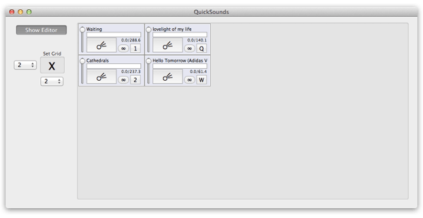 QuickSounds in all its glory, circa 2011
While this app didn’t influence my own thinking directly, years of folks at Rogue Amoeba mulling the idea undoubtedly helped our final product. ↩︎